Earthquake Report: Indonesia

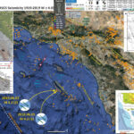
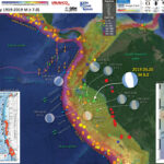
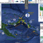
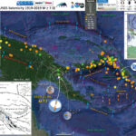
I had been making an update to an earthquake report on a regionally experienced M 5.6 earthquake from coastal northern California when I noticed that there was a M 7.3 earthquake in eastern Indonesia.

https://earthquake.usgs.gov/earthquakes/eventpage/us600044zz/executive

This earthquake is in a region of strike-slip faulting (if in downgoing plate for example) or subduction thrusting, so I thought it may or may not produce a tsunami. There are also intermediate depth quakes here (deeper than subduction zone megathrust events), like this earthquake (which reduces the chance of a tsunami). While we often don’t think of strike-slip earthquakes as those that could cause a tsunami, they can trigger tsunami, albeit smaller in size than those from subduction zone earthquakes or locally for landslides. But, I checked tsunami.gov just in case (result = no tsunami locally nor regionally). I also took a look at the tide gages in the region here and here (result = no observations).

South of this earthquake is a convergent plate boundary, where the Australia plate dives northwards beneath a part of the Sunda plate (Eurasia) forming the Java and Timor trenches (subduction zones). Far to the west, on 2 June 1994 there was a subduction zone megathrust earthquake along the Java Trench. Earlier, on 19 August 1977 there was an M 8.3 earthquake, but it was not a subduction zone thrust event, but an extensional earthquake in the downgoing Australia plate (Given and Kanamori, 19080). Both 1977 and 1994 events are shown on one of the maps below. The 1977 earthquake was tsunamigenic, creating a wave observed on tide gages at Damier, Hampton, and Port Hedland in Australia (Gusman et al., 2009).

To the north of the subduction zone, there is a parallel fault system that dips in the opposite direction as the subduction zone. This is referred to as a backthrust fault (it is a thrust fault and “backwards” to the main fault). The Wetar and Flores faults are both part of this backthrust system. In July and August of 2018 there was a series of earthquakes near the Island of Flores associated with this backthrust. Here is my final of 3 reports on those earthquakes.

The Timor trough wraps around to the north on its eastern end and eventually forms the Seram Trench, which dips to the south. The shape of these linked trenches forms a “U” shape with the open part of the U pointing to the west. Recently it has been published that the basin formed by these fault systems is the deepest forearc basin on Earth (Pownall et al., 2016). There was a subduction zone earthquake in 1938, called the Great Banda Sea Earthquake. Okal and Reymond (2003) prepared an earthquake mechanism for this M 8.5 earthquake.

To complicate matters, there is a large strike-slip system that comes into the area from the east (Papua New Guinea) and bisects the crest of the “U” shape. This strike slip system feeds into the backthrust so that the backthrust is both a thrust fault and a strike-slip fault. There are probably separate faults that accommodate these different senses of motion. There have been a series of strike-slip earthquakes in the 20th century associated with the strike-slip motion along this boundary. For example, Osada and Abe (1981) uses seismologic records (e.g. from seismometers) to prepare an earthquake mechanism for this M 8.1 earthquake. They found that it was an oblique strike-slip earthquake. The depth was pretty shallow compared to the M 7.3 earthquake I am reporting about today.

On 17 June 1987 there was another relatively shallow M 7.1 strike-slip earthquake on this strike-slip fault system.

However, there is also a deeper strike-slip fault within the Australia plate. This fault is probably what ruptured on 2 March 2005 (M 7.1) and 10 December 2012 (M 7.1). The M 7.3 earthquake from a day ago had a similar magnitude, depth, mechanism, and location as these earlier quakes. These may have all ruptured the same fault (or not).

Below is my interpretive poster for this earthquake

I plot the seismicity from the past month, with color representing depth and diameter representing magnitude (see legend). I include earthquake epicenters from 1919-2019 with magnitudes M ≥ 7.0 in one version.
I plot the USGS fault plane solutions (moment tensors in blue and focal mechanisms in orange), possibly in addition to some relevant historic earthquakes. Some earthquakes have older focal mechanisms plotted in black and white.

  • I placed a moment tensor / focal mechanism legend on the poster. There is more material from the USGS web sites about moment tensors and focal mechanisms (the beach ball symbols). Both moment tensors and focal mechanisms are solutions to seismologic data that reveal two possible interpretations for fault orientation and sense of motion. One must use other information, like the regional tectonics, to interpret which of the two possibilities is more likely.
  • I also include the shaking intensity contours on the map. These use the Modified Mercalli Intensity Scale (MMI; see the legend on the map). This is based upon a computer model estimate of ground motions, different from the “Did You Feel It?” estimate of ground motions that is actually based on real observations. The MMI is a qualitative measure of shaking intensity. More on the MMI scale can be found here and here. This is based upon a computer model estimate of ground motions, different from the “Did You Feel It?” estimate of ground motions that is actually based on real observations.
  • I include the slab 2.0 contours plotted (Hayes, 2018), which are contours that represent the depth to the subduction zone fault. These are mostly based upon seismicity. The depths of the earthquakes have considerable error and do not all occur along the subduction zone faults, so these slab contours are simply the best estimate for the location of the fault.

    Magnetic Anomalies

  • In the map below, I include a transparent overlay of the magnetic anomaly data from EMAG2 (Meyer et al., 2017). As oceanic crust is formed, it inherits the magnetic field at the time. At different points through time, the magnetic polarity (north vs. south) flips, the North Pole becomes the South Pole. These changes in polarity can be seen when measuring the magnetic field above oceanic plates. This is one of the fundamental evidences for plate spreading at oceanic spreading ridges (like the Gorda rise).
  • Regions with magnetic fields aligned like today’s magnetic polarity are colored red in the EMAG2 data, while reversed polarity regions are colored blue. Regions of intermediate magnetic field are colored light purple.
  • We can see the roughly east-west trends of these red and blue stripes in the Caroline and Australia plates. These lines are parallel to the ocean spreading ridges from where they were formed. The stripes disappear at the subduction zone because the oceanic crust with these anomalies is diving deep beneath the Sunda plate (part of Eurasia), so the magnetic anomalies from the overlying Sunda plate mask the evidence for the Australia plate.

    Global Strain

  • In a map below, I include a transparent overlay of the Global Strain Rate Map (Kreemer et al., 2014).
  • The mission of the Global Strain Rate Map (GSRM) project is to determine a globally self-consistent strain rate and velocity field model, consistent with geodetic and geologic field observations. The overall mission also includes:
    1. contributions of global, regional, and local models by individual researchers
    2. archive existing data sets of geologic, geodetic, and seismic information that can contribute toward a greater understanding of strain phenomena
    3. archive existing methods for modeling strain rates and strain transients
  • The completed global strain rate map will provide a large amount of information that is vital for our understanding of continental dynamics and for the quantification of seismic hazards.
  • The version used in the poster(s) below is an update to the original 2004 map (Kreemer et al., 2000, 2003; Holt et al., 2005).

    I include some inset figures. Some of the same figures are located in different places on the larger scale map below.

  • In the upper left corner, I include a map from Benz et al. (2011) that shows historic earthquake locations (epicenters) along with some of the plate boundary faults. Note the strike slip fault (with the opposing black arrows) that cross the location of the 1938 earthquake (labeled in yellow on that map). I placed a blue star in the location of the M 7.3 quake. There is a cross section to the right of the map that shows how earthquakes dive down with a westward trend (following the plate down the subduction zone). The cross section location is shown on the map (B-B’).
  • In the upper right corner is a larger scale tectonic map from Audley (2011) showing the major thrust faults and the large forearc basin is labeled “Weber Deep.”
  • Hangesh and Whitney (2016) did lots of work on the faulting in the region to the south of the M 7.3. They show block boundaries and relative plate motion arrows in white. Note how they extend strike-slip motion along the Timor trough. This may be in addition to the strike-slip along the backthrust.
  • Here is the map with a month’s seismicity plotted. I included MMI contours from a recent M 6.3 earthquake in PNG, which led to a sequence of additional M~6 quakes to the southeast of that main shock. I won’t be writing a report for those quakes, even though it is interesting (check it out!). Sorry to have misspelled Hengesh as Hangesh.

  • Here is the map with a century’s seismicity (M ≥ 7.0) plotted.

  • Here is the map with a month’s seismicity (M ≥ 0.5) plotted with the Global Strain data plotted. We can see the 2018 Flores swarm show up here.

Other Report Pages

Some Relevant Discussion and Figures

  • Here is a tectonic map for this part of the world from Zahirovic et al., 2014. They show a fracture zone where the M 7.3 earthquake happened. I left out all the acronym definitions (you’re welcome), but they are listed in the paper.

  • Regional tectonic setting with plate boundaries (MORs/transforms = black, subduction zones = teethed red) from Bird (2003) and ophiolite belts representing sutures modified from Hutchison (1975) and Baldwin et al. (2012). West Sulawesi basalts are from Polvé et al. (1997), fracture zones are from Matthews et al. (2011) and basin outlines are from Hearn et al. (2003).

  • This is a great visualization showing the Australia plate and how it formed the largest forearc basin on Earth (Pownall et al., 2014).
  • The maps on the left show a time history of the tectonics. The low angle oblique view on the right shows the dipping crust (north is not always up, as in this figure).
  • In the lower right, they show how there is strike-slip faulting along the Seram trough also (I left out the figure caption for E).

  • Reconstructions of eastern Indonesia, adapted from Hall (2012), depict collision of Australia with Southeast Asia and slab rollback into Banda Embayment. Yellow star indicates Seram. Oceanic crust is shown in purple (older than 120 Ma) and blue (younger than 120 Ma); submarine arcs and oceanic plateaus are shown in cyan; volcanic island arcs, ophiolites, and material accreted along plate margins are shown in green. A: Reconstruction at 15 Ma. B: Reconstruction at 7 Ma. C: Reconstruction at 2 Ma. D: Visualization of present-day slab morphology of proto–Banda Sea based on earthquake hypocenter distribution and tomographic models

  • Here is a map and some cross sections showing seismic tomography (like C-T scans into the Earth using seismic waves instead of X-Rays). The map shows the location of the cross sections (Spakman et al., 2010).

  • The Banda arc and surrounding region. 200 m and 4,000 m bathymetric contours are indicated. The numbered black lines are Benioff zone contours in kilometres. The red triangles are Holocene volcanoes (http://www.volcano.si.edu/world/). Ar=Aru, Ar Tr=Aru trough, Ba=Banggai Islands, Bu=Buru, SBS=South Banda Sea, Se=Seram, Sm=Sumba, Su=Sula Islands, Ta=Tanimbar, Ta Tr=Tanimbar trough, Ti=Timor, W=Weber Deep.


    Tomographic images of the Banda slab. Vertical sections through the tomography model along the lines shown in Fig. 1. Colours: P-wave anomalies with reference to velocity model ak135 (ref. 30). Dots: earthquake hypocentres within 12 km of the section. The dashed lines are phase changes at ~410 km and ~660 km. The sections are plotted without vertical exaggeration; the horizontal axis is in degrees. The labelled positive anomalies are the Sunda (Su) and Banda (Ba) slabs: BuDdetached slab under Buru, FlDslab under Flores, SDslab under Seram, TDslab under Timor. a, The Sunda slab enters the lower mantle whereas the Banda embayment slab is entirely in the upper mantle with the change under Sulawesi. b–e, Banda slab morphology in sections parallel to Australia plate motion shows a transition from a steep slab with a flat section (fs) (b) to a spoon shape shallowing eastward (c–e).

  • Here is the tectonic map from Hengesh and Whitney (2016)

  • Illustration of major tectonic elements in triple junction geometry: tectonic features labeled per Figure 1; seismicity from ISC-GEM catalog [Storchak et al., 2013]; faults in Savu basin from Rigg and Hall [2011] and Harris et al. [2009]. Purple line is edge of Australian continental basement and fore arc [Rigg and Hall, 2011]. Abbreviations: AR = Ashmore Reef; SR = Scott Reef; RS = Rowley Shoals; TCZ = Timor Collision Zone; ST = Savu thrust; SB = Savu Basin; TT = Timor thrust; WT =Wetar thrust; WASZ = Western Australia Shear Zone. Open arrows indicate relative direction of motion; solid arrows direction of vergence.

  • Here is the Audley (2011) cross section showing how the backthrust relates to the subduction zone beneath Timor. I include their figure caption in blockquote below.

  • Cartoon cross section of Timor today, (cf. Richardson & Blundell 1996, their BIRPS figs 3b, 4b & 7; and their fig. 6 gravity model 2 after Woodside et al. 1989; and Snyder et al. 1996 their fig. 6a). Dimensions of the filled 40 km deep present-day Timor Tectonic Collision Zone are based on BIRPS seismic, earthquake seismicity and gravity data all re-interpreted here from Richardson & Blundell (1996) and from Snyder et al. (1996). NB. The Bobonaro Melange, its broken formation and other facies are not indicated, but they are included with the Gondwana mega-sequence. Note defunct Banda Trench, now the Timor TCZ, filled with Australian continental crust and Asian nappes that occupy all space between Wetar Suture and the 2–3 km deep deformation front north of the axis of the Timor Trough. Note the much younger decollement D5 used exactly the same part of the Jurassic lithology of the Gondwana mega-sequence in the older D1 decollement that produced what appears to be much stronger deformation.

  • Here is a figure showing the regional geodetic motions (Bock et al., 2003). I include their figure caption below as a blockquote.

  • Topographic and tectonic map of the Indonesian archipelago and surrounding region. Labeled, shaded arrows show motion (NUVEL-1A model) of the first-named tectonic plate relative to the second. Solid arrows are velocity vectors derived from GPS surveys from 1991 through 2001, in ITRF2000. For clarity, only a few of the vectors for Sumatra are included. The detailed velocity field for Sumatra is shown in Figure 5. Velocity vector ellipses indicate 2-D 95% confidence levels based on the formal (white noise only) uncertainty estimates. NGT, New Guinea Trench; NST, North Sulawesi Trench; SF, Sumatran Fault; TAF, Tarera-Aiduna Fault. Bathymetry [Smith and Sandwell, 1997] in this and all subsequent figures contoured at 2 km intervals.

  • Whitney and Hengesh (2015) used GPS modeling to suggest a model of plate blocks. Below are their model results.

  • Plate boundary segments in the Banda Arc region from Nugroho et al (2009). Numbers inside rectangles show possible micro-plate blocks near the Sumba Triple Junction (colored) based on GPS velocities (black arrows) with in a stable Eurasian reference frame.

  • Here is the conceptual model from Whitney and Hengesh (2015) that shows how left-lateral strike-slip faulting can come into the region.

  • Schematic map views of kinematic relations between major crustal elements in the Sumba Triple Junction region. CTZ= collisional tectonic zone. Red arrow size designates schematic plate motion relations based on geological data relative to a fixed Sunda shelf reference frame (pin).

Geologic Fundamentals

  • For more on the graphical representation of moment tensors and focal mechanisms, check this IRIS video out:
  • Here is a fantastic infographic from Frisch et al. (2011). This figure shows some examples of earthquakes in different plate tectonic settings, and what their fault plane solutions are. There is a cross section showing these focal mechanisms for a thrust or reverse earthquake. The upper right corner includes my favorite figure of all time. This shows the first motion (up or down) for each of the four quadrants. This figure also shows how the amplitude of the seismic waves are greatest (generally) in the middle of the quadrant and decrease to zero at the nodal planes (the boundary of each quadrant).

  • Here is another way to look at these beach balls.
  • There are three types of earthquakes, strike-slip, compressional (reverse or thrust, depending upon the dip of the fault), and extensional (normal). Here is are some animations of these three types of earthquake faults. The following three animations are from IRIS.
  • Strike Slip:

    Compressional:

    Extensional:

  • This is an image from the USGS that shows how, when an oceanic plate moves over a hotspot, the volcanoes formed over the hotspot form a series of volcanoes that increase in age in the direction of plate motion. The presumption is that the hotspot is stable and stays in one location. Torsvik et al. (2017) use various methods to evaluate why this is a false presumption for the Hawaii Hotspot.

  • A cutaway view along the Hawaiian island chain showing the inferred mantle plume that has fed the Hawaiian hot spot on the overriding Pacific Plate. The geologic ages of the oldest volcano on each island (Ma = millions of years ago) are progressively older to the northwest, consistent with the hot spot model for the origin of the Hawaiian Ridge-Emperor Seamount Chain. (Modified from image of Joel E. Robinson, USGS, in “This Dynamic Planet” map of Simkin and others, 2006.)

  • Here is a map from Torsvik et al. (2017) that shows the age of volcanic rocks at different locations along the Hawaii-Emperor Seamount Chain.

  • Hawaiian-Emperor Chain. White dots are the locations of radiometrically dated seamounts, atolls and islands, based on compilations of Doubrovine et al. and O’Connor et al. Features encircled with larger white circles are discussed in the text and Fig. 2. Marine gravity anomaly map is from Sandwell and Smith.

  • Here is a great tweet that discusses the different parts of a seismogram and how the internal structures of the Earth help control seismic waves as they propagate in the Earth.

    Social Media

    References:

  • Audley-Charles, M.G., 1986. Rates of Neogene and Quaternary tectonic movements in the Southern Banda Arc based on micropalaeontology in: Journal of fhe Geological Society, London, Vol. 143, 1986, pp. 161-175.
  • Audley-Charles, M.G., 2011. Tectonic post-collision processes in Timor, Hall, R., Cottam, M. A. &Wilson, M. E. J. (eds) The SE Asian Gateway: History and Tectonics of the Australia–Asia Collision. Geological Society, London, Special Publications, 355, 241–266.
  • Baldwin, S.L., Fitzgerald, P.G., and Webb, L.E., 2012. Tectonics of the New Guinea Region in Annu. Rev. Earth Planet. Sci., v. 41, p. 485-520.
  • Benz, H.M., Herman, Matthew, Tarr, A.C., Hayes, G.P., Furlong, K.P., Villaseñor, Antonio, Dart, R.L., and Rhea, Susan, 2011. Seismicity of the Earth 1900–2010 New Guinea and vicinity: U.S. Geological Survey Open-File Report 2010–1083-H, scale 1:8,000,000.
  • Given, J. W., and H. Kanamori (1980). The depth extent of the 1977 Sumbawa, Indonesia, earthquake, in EOS Trans. AGU., v. 61, p. 1044.
  • Gusnman, A.R., Tanioka, Y., Matsumoto, H., and Iwasakai, S.-I., 2009. Analysis of the Tsunami Generated by the Great 1977 Sumba Earthquake that Occurred in Indonesia in BSSA, v. 99, no. 4, p. 2169-2179, https://doi.org/10.1785/0120080324
  • Hall, R., 2011. Australia-SE Asia collision: plate tectonics and crustal flow in Geological Society, London, Special Publications 2011; v. 355; p. 75-109 doi: 10.1144/SP355.5
  • Hangesh, J. and Whitney, B., 2014. Quaternary Reactivation of Australia’s Western Passive Margin: Inception of a New Plate Boundary? in: 5th International INQUA Meeting on Paleoseismology, Active Tectonics and Archeoseismology (PATA), 21-27 September 2014, Busan, Korea, 4 pp.
  • Frisch, W., Meschede, M., Blakey, R., 2011. Plate Tectonics, Springer-Verlag, London, 213 pp.
  • Hayes, G., 2018, Slab2 – A Comprehensive Subduction Zone Geometry Model: U.S. Geological Survey data release, https://doi.org/10.5066/F7PV6JNV.
  • Holt, W. E., C. Kreemer, A. J. Haines, L. Estey, C. Meertens, G. Blewitt, and D. Lavallee (2005), Project helps constrain continental dynamics and seismic hazards, Eos Trans. AGU, 86(41), 383–387, , https://doi.org/10.1029/2005EO410002. /li>
  • Kreemer, C., J. Haines, W. Holt, G. Blewitt, and D. Lavallee (2000), On the determination of a global strain rate model, Geophys. J. Int., 52(10), 765–770.
  • Kreemer, C., W. E. Holt, and A. J. Haines (2003), An integrated global model of present-day plate motions and plate boundary deformation, Geophys. J. Int., 154(1), 8–34, , https://doi.org/10.1046/j.1365-246X.2003.01917.x.
  • Kreemer, C., G. Blewitt, E.C. Klein, 2014. A geodetic plate motion and Global Strain Rate Model in Geochemistry, Geophysics, Geosystems, v. 15, p. 3849-3889, https://doi.org/10.1002/2014GC005407.
  • Meyer, B., Saltus, R., Chulliat, a., 2017. EMAG2: Earth Magnetic Anomaly Grid (2-arc-minute resolution) Version 3. National Centers for Environmental Information, NOAA. Model. https://doi.org/10.7289/V5H70CVX
  • Müller, R.D., Sdrolias, M., Gaina, C. and Roest, W.R., 2008, Age spreading rates and spreading asymmetry of the world’s ocean crust in Geochemistry, Geophysics, Geosystems, 9, Q04006, https://doi.org/10.1029/2007GC001743
  • Okal, E. A., & Reymond, D., 2003. The mechanism of great Banda Sea earthquake of 1 February 1938: applying the method of preliminary determination of focal mechanism to a historical event in EPSL, v. 216, p. 1-15.
  • Osada, M. and Abe, K., 1981. Mechanism and tectonic implications of the great Banda Sea earthquake of November 4, 1963 in Physics of the Earth and Plentary Interiors, v. 25, p. 129-139
  • Pownall, J.M., Hall, R., Armstrong,, R.A., and Forster, M.A., 2014. Earth’s youngest known ultrahigh-temperature granulites discovered on Seram, eastern Indonesia in Geology, v. 42, no. 4, p. 379-282, https://doi.org/10.1130/G35230.1
  • Spakman, W. and Hall, R., 2010. Surface deformation and slab–mantle interaction during Banda arc subduction rollback in Nature Geosceince, v. 3, p. 562-566, https://doi.org/10.1038/NGEO917
  • Whitney, B.B. and Hengesh, J.V., 2015. A new model for active intraplate tectonics in western Australia in Proceedings of the Tenth Pacific Conference on Earthquake Engineering Building an Earthquake-Resilient Pacific 6-8 November 2015, Sydney, Australia, paper number 82
  • Zahirovic, S., Seton, M., and Müller, R.D., 2014. The Cretaceous and Cenozoic tectonic evolution of Southeast Asia in Solid Earth, v. 5, p. 227-273, doi:10.5194/se-5-227-2014

Return to the Earthquake Reports page.


Earthquake Report: Mendocino triple junction

Well, I was on the road for 1.5 days (work party for the Community Village at the Oregon Country Fair). As I was driving home, there was a magnitude M 5.6 earthquake in coastal northern California.
https://earthquake.usgs.gov/earthquakes/eventpage/nc73201181/executive
I didn’t realize this until I was almost home (finally hit the sack around 4 am).
This earthquake follows a sequence of quakes further to the northwest, however their timing is merely a coincidence. Let me repeat this. The M 5.6 earthquake is not related to the sequence of earthquakes along the Blanco fracture zone.
Contrary to what people have posted on social media, there was but a single earthquake. This earthquake happened beneath the area of Petrolia, nearby the 1991 Honeydew Earthquake. More about the Honeydew Earthquake can be found here.
This region also had a good sized shaker in 1992, the Cape Mendocino Earthquake, which led to the development of the National Tsunami Hazard Mitigation Program. More about the Cape Mendocino Earthquake can be found on the 25th anniversary page here and in my earthquake report here.
The regional tectonics in coastal northern California are dominated by the Pacific-North America plate boundary. North of Cape Mendocino, this plate boundary is convergent and forms the Cascadia subduction zone (CSZ). To the south of Cape Mendocino, the plate boundary is the right-lateral (dextral) San Andreas fault (SAF). Where these 2 fault systems meet, there is another plate boundary system, the right-lateral strike-slip Mendocino fault (don’t write Mendocino fracture zone on your maps!). Where these 3 systems meet is called the Mendocino triple junction (MTJ).
The MTJ is a complicated region as these plate boundaries overlap in ways that we still do not fully understand. Geologic mapping in the mid- to late-20th century provides some basic understanding of the long term history. However, recent discoveries have proven that this early work needs to be revisited as there are many unanswered questions (and some of this early work has been demonstrated to be incorrect). Long live science!
Last night’s M 5.6 temblor happened where one strand of the MF trends onshore (another strand bends towards the south). But, it also is where the SAF trends onshore. At this point, I am associating this earthquake with the MF (so, a right-lateral strike-slip earthquake). The mechanism suggest that this is not a SAF related earthquake. However, it is oriented in a way that it could be in the Gorda plate (making it a left-lateral strike-slip earthquake). However, this quake is at the southern edge of the Gorda plate (sedge), so it is unlikely this is a Gorda plate event.

Below is my interpretive poster for this earthquake

I plot the seismicity from the past month, with color representing depth and diameter representing magnitude (see legend). I include earthquake epicenters from 1918-2018 with magnitudes M ≥ 5.0 in one version.
I plot the USGS fault plane solutions (moment tensors in blue and focal mechanisms in orange), possibly in addition to some relevant historic earthquakes.

  • I placed a moment tensor / focal mechanism legend on the poster. There is more material from the USGS web sites about moment tensors and focal mechanisms (the beach ball symbols). Both moment tensors and focal mechanisms are solutions to seismologic data that reveal two possible interpretations for fault orientation and sense of motion. One must use other information, like the regional tectonics, to interpret which of the two possibilities is more likely.
  • I also include the shaking intensity contours on the map. These use the Modified Mercalli Intensity Scale (MMI; see the legend on the map). This is based upon a computer model estimate of ground motions, different from the “Did You Feel It?” estimate of ground motions that is actually based on real observations. The MMI is a qualitative measure of shaking intensity. More on the MMI scale can be found here and here. This is based upon a computer model estimate of ground motions, different from the “Did You Feel It?” estimate of ground motions that is actually based on real observations.
  • I include the slab 2.0 contours plotted (Hayes, 2018), which are contours that represent the depth to the subduction zone fault. These are mostly based upon seismicity. The depths of the earthquakes have considerable error and do not all occur along the subduction zone faults, so these slab contours are simply the best estimate for the location of the fault.

    Magnetic Anomalies

  • In the map below, I include a transparent overlay of the magnetic anomaly data from EMAG2 (Meyer et al., 2017). As oceanic crust is formed, it inherits the magnetic field at the time. At different points through time, the magnetic polarity (north vs. south) flips, the North Pole becomes the South Pole. These changes in polarity can be seen when measuring the magnetic field above oceanic plates. This is one of the fundamental evidences for plate spreading at oceanic spreading ridges (like the Gorda rise).
  • Regions with magnetic fields aligned like today’s magnetic polarity are colored red in the EMAG2 data, while reversed polarity regions are colored blue. Regions of intermediate magnetic field are colored light purple.
  • We can see the roughly ~north-south trends of these red and blue stripes in the Pacific plate. These lines are parallel to the ocean spreading ridges from where they were formed. The stripes disappear at the subduction zone because the oceanic crust with these anomalies is diving deep beneath the North America plate, so the magnetic anomalies from the overlying Sunda plate mask the evidence for the Juan de Fuca and Gorda plates.

    Global Strain

  • In a map below, I include a transparent overlay of the Global Strain Rate Map (Kreemer et al., 2014).
  • The mission of the Global Strain Rate Map (GSRM) project is to determine a globally self-consistent strain rate and velocity field model, consistent with geodetic and geologic field observations. The overall mission also includes:
    1. contributions of global, regional, and local models by individual researchers
    2. archive existing data sets of geologic, geodetic, and seismic information that can contribute toward a greater understanding of strain phenomena
    3. archive existing methods for modeling strain rates and strain transients
  • The completed global strain rate map will provide a large amount of information that is vital for our understanding of continental dynamics and for the quantification of seismic hazards.
  • The version used in the poster(s) below is an update to the original 2004 map (Kreemer et al., 2000, 2003; Holt et al., 2005).

    I include some inset figures. Some of the same figures are located in different places on the larger scale map below.

  • n the upper left corner is a map of the Cascadia subduction zone (CSZ) and regional tectonic plate boundary faults. This is modified from several sources (Chaytor et al., 2004; Nelson et al., 2004)
    Below the CSZ map is an illustration modified from Plafker (1972). This figure shows how a subduction zone deforms between (interseismic) and during (coseismic) earthquakes.
  • In the lower right corner is a map that shows a comparison between the USGS Did You Feel It? reports and the USGS Modified Mercalli Intensity shakemap model. This comparison shows that the model is a decent fit for the reports from real people. If you felt the earthquake, please submit a report to the USGS here.
  • In the upper right corner I include a larger scale view of seismicity for this area. I highlight the important historic events (e.g. the 1991 Honeydew Earthquake and the 1992 Cape Mendocino Earthquake sequence.
  • Here is the map with a month’s seismicity plotted.

  • Here is the map with a century’s seismicity plotted.

  • Here is the map with a century’s seismicity plotted along with the Global Strain Map with a 30% transparency.

  • Here is the educational interpretive poster from the 1992 Cape Mendocino Earthquake (report here).

  • The USGS has been increasing the list of products that are produced in association with their earthquake pages. One of these products is an earthquake forecast (not a prediction as nobody can predict earthquakes yet) that lists the chance of an earthquake with a given magnitude over a certain period of time. The forecast for the M 5.6 earthquake is found here. These forecasts are updated periodically, so the information will change with time. Below is a table where I present the forecast as it was when I checked the page this morning (would be nice if the USGS would produce an easy to read table).
  • From the USGS:

    Be ready for more earthquakes

    • More earthquakes than usual (called aftershocks) will continue to occur near the mainshock.
    • When there are more earthquakes, the chance of a large earthquake is greater which means that the chance of damage is greater.
    • The USGS advises everyone to be aware of the possibility of aftershocks, especially when in or around vulnerable structures such as unreinforced masonry buildings.
    • This earthquake could be part of a sequence. An earthquake sequence may have larger and potentially damaging earthquakes in the future, so remember to: Drop, Cover, and Hold on.

    What we think will happen next

    • According to our forecast, over the next 1 Week there is a < 1 % chance of one or more aftershocks that are larger than magnitude 5.6. It is likely that there will be smaller earthquakes over the next 1 Week, with 0 to 11 magnitude 3 or higher aftershocks. Magnitude 3 and above are large enough to be felt near the epicenter. The number of aftershocks will drop off over time, but a large aftershock can increase the numbers again, temporarily.

    About our earthquake forecasts

    • No one can predict the exact time or place of any earthquake, including aftershocks. Our earthquake forecasts give us an understanding of the chances of having more earthquakes within a given time period in the affected area. We calculate this earthquake forecast using a statistical analysis based on past earthquakes.
    • Our forecast changes as time passes due to decline in the frequency of aftershocks, larger aftershocks that may trigger further earthquakes, and changes in forecast modeling based on the data collected for this earthquake sequence.


  • Gosh, almost forgot to include this photo of the seismic waves recorded on the Humboldt State University Department of Geology Baby Benioff seismometer. Photo Credit: Amanda Admire.

USGS Landslide and Liquefaction Ground Failure data products

  • Below I present a series of maps that are intended to address the excellent ‘new’ products included in the USGS earthquake pages: landslide probability and liquefaction susceptibility (a.k.a. the Ground Failure data products).
  • First I present the landslide probability model. This is a GIS data product that relates a variety of factors to the probability (the chance of) landslides as triggered by this earthquake. There are a number of assumptions that are made in order to be able to produce this model across such a large region, though this is still of great value (like other aspects from teh USGS, e.g. the PAGER alert). Learn more about all of these Ground Failure products here.
  • There are many different ways in which a landslide can be triggered. The first order relations behind slope failure (landslides) is that the “resisting” forces that are preventing slope failure (e.g. the strength of the bedrock or soil) are overcome by the “driving” forces that are pushing this land downwards (e.g. gravity). I spend more time discussing landslides and liquefaction in this recent earthquake report.
  • This model, like all landslide computer models, uses similar inputs. I review these here:
    1. Some information about ground shaking. Often, people use Peak Ground Acceleration, though in the past decade+, it has been recognized that the parameter “Arias Intensity” is a better measure of the energy imparted by the earthquake across the land and seascape. Instead of simply accounting for the peak accelerations, AI integrates the entire energy (duration) during the earthquake. That being said, PGA is a more common parameter that is available for people to use. For example, when I was modeling slope stability for the 2004 Sumatra-Andaman subduction zone earthquake, the only model that was calibrated to observational data were in units of PGA. The first order control to shaking intensity (energy observed at any particular location) is distance to the earthquake fault that slipped.
    2. Some information about the strength of the materials (e.g. angle of internal friction (the strength) and cohesion (the resistance).
    3. Information about the slope. Steeper slopes, with all other things being equal, are more likely to fail than are shallower slopes. Think about skiing. Beginners (like me) often choose shallower slopes to ski because they will go down the slope slower, while experts choose steeper slopes.
  • Areas that are red are more likely to experience landslides than areas that are colored blue. I include a coarse resolution topographic/bathymetric dataset to help us identify where the mountains are relative to the coastal plain and continental shelf (submarine).

  • Landslide ground shaking can change the Factor of Safety in several ways that might increase the driving force or decrease the resisting force. Keefer (1984) studied a global data set of earthquake triggered landslides and found that larger earthquakes trigger larger and more numerous landslides across a larger area than do smaller earthquakes. Earthquakes can cause landslides because the seismic waves can cause the driving force to increase (the earthquake motions can “push” the land downwards), leading to a landslide. In addition, ground shaking can change the strength of these earth materials (a form of resisting force) with a process called liquefaction.
  • Sediment or soil strength is based upon the ability for sediment particles to push against each other without moving. This is a combination of friction and the forces exerted between these particles. This is loosely what we call the “angle of internal friction.” Liquefaction is a process by which pore pressure increases cause water to push out against the sediment particles so that they are no longer touching.
  • An analogy that some may be familiar with relates to a visit to the beach. When one is walking on the wet sand near the shoreline, the sand may hold the weight of our body generally pretty well. However, if we stop and vibrate our feet back and forth, this causes pore pressure to increase and we sink into the sand as the sand liquefies. Or, at least our feet sink into the sand.
  • The liquefaction susceptibility map for the M 5.6 earthquake did not suggest that there would be possibly much liquefaction from this earthquake (probably due to the small magnitude). I discuss liquefaction more in my earthquake report on the 28 September 20018 Sulawesi, Indonesia earthquake, landslide, and tsunami here.
  • Here is a map that shows shaking intensity using the MMI scale (mentioned and plotted in the main earthquake poster maps). I present this here in the same format as the ground failure model maps so we can compare these other maps with the ground shaking model (which is a first order control on slope failure).

Other Report Pages

Some Relevant Discussion and Figures

  • Here is a map of the Cascadia subduction zone, modified from Nelson et al. (2006). The Juan de Fuca and Gorda plates subduct norteastwardly beneath the North America plate at rates ranging from 29- to 45-mm/yr. Sites where evidence of past earthquakes (paleoseismology) are denoted by white dots. Where there is also evidence for past CSZ tsunami, there are black dots. These paleoseismology sites are labeled (e.g. Humboldt Bay). Some submarine paleoseismology core sites are also shown as grey dots. The two main spreading ridges are not labeled, but the northern one is the Juan de Fuca ridge (where oceanic crust is formed for the Juan de Fuca plate) and the southern one is the Gorda rise (where the oceanic crust is formed for the Gorda plate).

  • This figure shows how a subduction zone deforms between (interseismic) and during (coseismic) earthquakes.

  • This figure shows how a subduction zone deforms between (interseismic) and during (coseismic) earthquakes. We also can see how a subduction zone generates a tsunami. Atwater et al., 2005.

  • Here is an animation produced by the folks at Cal Tech following the 2004 Sumatra-Andaman subduction zone earthquake. I have several posts about that earthquake here and here. One may learn more about this animation, as well as download this animation here.
  • This is the map used in the animation below. Earthquake epicenters are plotted (some with USGS moment tensors) for this region from 1917-2017 with M ≥ 6.5. I labeled the plates and shaded their general location in different colors.
  • I include some inset maps.
    • In the upper right corner is a map of the Cascadia subduction zone (Chaytor et al., 2004; Nelson et al., 2004).
    • In the upper left corner is a map from Rollins and Stein (2010). They plot epicenters and fault lines involved in earthquakes between 1976 and 2010.


Geologic Fundamentals

  • For more on the graphical representation of moment tensors and focal mechanisms, check this IRIS video out:
  • Here is a fantastic infographic from Frisch et al. (2011). This figure shows some examples of earthquakes in different plate tectonic settings, and what their fault plane solutions are. There is a cross section showing these focal mechanisms for a thrust or reverse earthquake. The upper right corner includes my favorite figure of all time. This shows the first motion (up or down) for each of the four quadrants. This figure also shows how the amplitude of the seismic waves are greatest (generally) in the middle of the quadrant and decrease to zero at the nodal planes (the boundary of each quadrant).

  • Here is another way to look at these beach balls.
  • There are three types of earthquakes, strike-slip, compressional (reverse or thrust, depending upon the dip of the fault), and extensional (normal). Here is are some animations of these three types of earthquake faults. The following three animations are from IRIS.
  • Strike Slip:

    Compressional:

    Extensional:

  • This is an image from the USGS that shows how, when an oceanic plate moves over a hotspot, the volcanoes formed over the hotspot form a series of volcanoes that increase in age in the direction of plate motion. The presumption is that the hotspot is stable and stays in one location. Torsvik et al. (2017) use various methods to evaluate why this is a false presumption for the Hawaii Hotspot.

  • A cutaway view along the Hawaiian island chain showing the inferred mantle plume that has fed the Hawaiian hot spot on the overriding Pacific Plate. The geologic ages of the oldest volcano on each island (Ma = millions of years ago) are progressively older to the northwest, consistent with the hot spot model for the origin of the Hawaiian Ridge-Emperor Seamount Chain. (Modified from image of Joel E. Robinson, USGS, in “This Dynamic Planet” map of Simkin and others, 2006.)

  • Here is a map from Torsvik et al. (2017) that shows the age of volcanic rocks at different locations along the Hawaii-Emperor Seamount Chain.

  • Hawaiian-Emperor Chain. White dots are the locations of radiometrically dated seamounts, atolls and islands, based on compilations of Doubrovine et al. and O’Connor et al. Features encircled with larger white circles are discussed in the text and Fig. 2. Marine gravity anomaly map is from Sandwell and Smith.

  • Here is a great tweet that discusses the different parts of a seismogram and how the internal structures of the Earth help control seismic waves as they propagate in the Earth.

    Social Media

    References:

  • Atwater, B.F., Musumi-Rokkaku, S., Satake, K., Tsuju, Y., Eueda, K., and Yamaguchi, D.K., 2005. The Orphan Tsunami of 1700—Japanese Clues to a Parent Earthquake in North America, USGS Professional Paper 1707, USGS, Reston, VA, 144 pp.
  • Goldfinger, C., Nelson, C.H., Morey, A., Johnson, J.E., Gutierrez-Pastor, J., Eriksson, A.T., Karabanov, E., Patton, J., Gràcia, E., Enkin, R., Dallimore, A., Dunhill, G., and Vallier, T., 2012 a. Turbidite Event History: Methods and Implications for Holocene Paleoseismicity of the Cascadia Subduction Zone, USGS Professional Paper # 1661F. U.S. Geological Survey, Reston, VA, 184 pp.
  • Dengler, L.A., and McPherson, R.C., 1993. The 17 August 1991 Honeydew Earthquake, North Coast California: A Case for Revising the Modified Mercalli Scale in Sparsely Populated Areas in BSSA, v. 83, no. 4, pp. 1081-1094
  • Frisch, W., Meschede, M., Blakey, R., 2011. Plate Tectonics, Springer-Verlag, London, 213 pp.
  • Hayes, G., 2018, Slab2 – A Comprehensive Subduction Zone Geometry Model: U.S. Geological Survey data release, https://doi.org/10.5066/F7PV6JNV.
  • Holt, W. E., C. Kreemer, A. J. Haines, L. Estey, C. Meertens, G. Blewitt, and D. Lavallee (2005), Project helps constrain continental dynamics and seismic hazards, Eos Trans. AGU, 86(41), 383–387, , https://doi.org/10.1029/2005EO410002. /li>
  • Kreemer, C., J. Haines, W. Holt, G. Blewitt, and D. Lavallee (2000), On the determination of a global strain rate model, Geophys. J. Int., 52(10), 765–770.
  • Kreemer, C., W. E. Holt, and A. J. Haines (2003), An integrated global model of present-day plate motions and plate boundary deformation, Geophys. J. Int., 154(1), 8–34, , https://doi.org/10.1046/j.1365-246X.2003.01917.x.
  • Kreemer, C., G. Blewitt, E.C. Klein, 2014. A geodetic plate motion and Global Strain Rate Model in Geochemistry, Geophysics, Geosystems, v. 15, p. 3849-3889, https://doi.org/10.1002/2014GC005407.
  • McCrory, P.A., 2000, Upper plate contraction north of the migrating Mendocino triple junction, northern California: Implications for partitioning of strain: Tectonics, v. 19, p. 11441160.
  • McCrory, P. A., Blair, J. L., Oppenheimer, D. H., and Walter, S. R., 2006, Depth to the Juan de Fuca slab beneath the Cascadia subduction margin; a 3-D model for sorting earthquakes U. S. Geological Survey
  • Meyer, B., Saltus, R., Chulliat, a., 2017. EMAG2: Earth Magnetic Anomaly Grid (2-arc-minute resolution) Version 3. National Centers for Environmental Information, NOAA. Model. https://doi.org/10.7289/V5H70CVX
  • Müller, R.D., Sdrolias, M., Gaina, C. and Roest, W.R., 2008, Age spreading rates and spreading asymmetry of the world’s ocean crust in Geochemistry, Geophysics, Geosystems, 9, Q04006, https://doi.org/10.1029/2007GC001743
  • Nelson, A.R., Kelsey, H.M., Witter, R.C., 2006. Great earthquakes of variable magnitude at the Cascadia subduction zone. Quaternary Research 65, 354-365.
  • Oppenheimer, D., Beroza, G., Carver, G., Dengler, L., Eaton, J., Gee, L., Gonzalez, F., Jayko, A., Ki., W.H., Lisowski, M., Magee, M., Marshall, G., Murray, M., McPherson, R., Romanowicz, B., Satake, K., Simpson, R., Somerille, P., Stein, R., and Valentine, D., The Cape Mendocino, California, Earthquakes of April, 1992: Subduction at the Triple Junction in Science, v. 261, no. 5120, p. 433-438.
  • Patton, J. R., Goldfinger, C., Morey, A. E., Romsos, C., Black, B., Djadjadihardja, Y., and Udrekh, 2013. Seismoturbidite record as preserved at core sites at the Cascadia and Sumatra–Andaman subduction zones, Nat. Hazards Earth Syst. Sci., 13, 833-867, doi:10.5194/nhess-13-833-2013, 2013.
  • Plafker, G., 1972. Alaskan earthquake of 1964 and Chilean earthquake of 1960: Implications for arc tectonics in Journal of Geophysical Research, v. 77, p. 901-925.
  • Rollins, J.C. and Stein, R.S., 2010. Coulomb stress interactions among M ≥ 5.9 earthquakes in the Gorda deformation zone and on the Mendocino Fault Zone, Cascadia subduction zone, and northern San Andreas Fault: Journal of Geophysical Research, v. 115, B12306, doi:10.1029/2009JB007117, 2010.
  • Stein, R.S., Marshall, G.A., Murray, M.H., Balazs, E., Carver, G.A., Dunklin, T.A>, McLaughlin, R.J., Cyr, K., and Jayko, A., 1993. Permanent Ground Movement Associate with the 1992 M=7 Cape Mendocino, California, Earthquake: Implications for Damage to Infrastructure and Hazards to navigation, U.S. Geological Survey Open-File Report 93-383.
  • Wang, K., Wells, R., Mazzotti, S., Hyndman, R. D., and Sagiya, T., 2003, A revised dislocation model of interseismic deformation of the Cascadia subduction zone Journal of Geophysical Research, B, Solid Earth and Planets v. 108, no. 1.

Return to the Earthquake Reports page.


Earthquake Report: Kermadec Trench

There was just an earthquake associated with the plate boundary that forms the Kermadec Trench, a deep oceanic trench that extends north from New Zealand, towards the Fiji Islands.
https://earthquake.usgs.gov/earthquakes/eventpage/us6000417i/executive
A minor tsunami (~25 cm in size) has been recorded at Raoul Island, due west of the earthquake, the closest gage to the temblor. Tide gages in New Zealand just began recording a small tsunami the moments I started writing this report (about an hour ± after the earthquake).
This tsunami is small enough that it probably won’t cause much damage. However, tidal inlets and harbors can have currents that are higher in response to even small tsunami, if the shape of the seafloor/harbor is optimal for this. However, further away from the earthquake, the tsunami will be even smaller; so small that it may not be observable in tide gage data.

  • These are the tide gage data from Raoul Island.
  • These are data from 15 Jun 22:30 UTC until 16 Jun 02:48 UTC.

In this part of the world, there is a convergent plate boundary where the Pacific plate dives westward beneath the Australia plate forming the Kermadec megathrust subduction zone fault. This fault has a history of earthquakes with magnitudes commonly exceeding M 7 and some exceeding M 8.
There was recently an M 6.9 earthquake in this same area and here is my earthquake report for that shaker.

While we cannot predict earthquakes, based on the historic record, this earthquake may be all that happens right now. But our historic record is incredibly short, so people must remain vigilant at all times.

Below is my interpretive poster for this earthquake

I plot the seismicity from the past month, with color representing depth and diameter representing magnitude (see legend). I include earthquake epicenters from 1919-2019 with magnitudes M ≥ 6.0 and 7.0 in two versions.

I plot the USGS fault plane solutions (moment tensors in blue and focal mechanisms in orange), possibly in addition to some relevant historic earthquakes (including a M 6.1 earthquake that happened about an hour prior to the M 7.2. This is very close in time. The M 6.1 is too small of a magnitude to change the static coulomb stress significantly. It seems possible that there was dynamic triggering though (???). I will need to think about this a little more (check out the literature on dynamic triggering, to see what time window that may be a relevant trigger).

  • I placed a moment tensor / focal mechanism legend on the poster. There is more material from the USGS web sites about moment tensors and focal mechanisms (the beach ball symbols). Both moment tensors and focal mechanisms are solutions to seismologic data that reveal two possible interpretations for fault orientation and sense of motion. One must use other information, like the regional tectonics, to interpret which of the two possibilities is more likely.
  • I also include the shaking intensity contours on the map. These use the Modified Mercalli Intensity Scale (MMI; see the legend on the map). This is based upon a computer model estimate of ground motions, different from the “Did You Feel It?” estimate of ground motions that is actually based on real observations. The MMI is a qualitative measure of shaking intensity. More on the MMI scale can be found here and here. This is based upon a computer model estimate of ground motions, different from the “Did You Feel It?” estimate of ground motions that is actually based on real observations.
  • I include the slab 2.0 contours plotted (Hayes, 2018), which are contours that represent the depth to the subduction zone fault. These are mostly based upon seismicity. The depths of the earthquakes have considerable error and do not all occur along the subduction zone faults, so these slab contours are simply the best estimate for the location of the fault.

    Magnetic Anomalies

  • In the map below, I include a transparent overlay of the magnetic anomaly data from EMAG2 (Meyer et al., 2017). As oceanic crust is formed, it inherits the magnetic field at the time. At different points through time, the magnetic polarity (north vs. south) flips, the North Pole becomes the South Pole. These changes in polarity can be seen when measuring the magnetic field above oceanic plates. This is one of the fundamental evidences for plate spreading at oceanic spreading ridges (like the Gorda rise).
  • Regions with magnetic fields aligned like today’s magnetic polarity are colored red in the EMAG2 data, while reversed polarity regions are colored blue. Regions of intermediate magnetic field are colored light purple.
  • We can see the roughly east-west trends of these red and blue stripes. These lines are parallel to the ocean spreading ridges from where they were formed. The stripes disappear at the subduction zone because the oceanic crust with these anomalies is diving deep beneath the Sunda plate (part of Eurasia), so the magnetic anomalies from the overlying Sunda plate mask the evidence for the Australia plate.

    Global Strain

  • In a map below, I include a transparent overlay of the Global Strain Rate Map (Kreemer et al., 2014).
  • The mission of the Global Strain Rate Map (GSRM) project is to determine a globally self-consistent strain rate and velocity field model, consistent with geodetic and geologic field observations. The overall mission also includes:
    1. contributions of global, regional, and local models by individual researchers
    2. archive existing data sets of geologic, geodetic, and seismic information that can contribute toward a greater understanding of strain phenomena
    3. archive existing methods for modeling strain rates and strain transients
  • The completed global strain rate map will provide a large amount of information that is vital for our understanding of continental dynamics and for the quantification of seismic hazards.
  • The version used in the poster(s) below is an update to the original 2004 map (Kreemer et al., 2000, 2003; Holt et al., 2005).

    I include some inset figures. Some of the same figures are located in different places on the larger scale map below.

  • In the lower right corner is a map that shows the major islands, the major plate tectonic boundaries (the faults, the volcanoes), and the location of two profiles shown above (Ballance et al., 1999. I place a blue star in the general location of the earthquake.
  • In the upper right corner are these two profiles (17-1 & 17-2). These profiles show how the elevation changes (solid line) and how the geomagnetic properties intensity, declination, inclination (dashed) vary across the plate boundary.
  • In the lower left corner is a map from Benz et al. (2010) that shows earthquakes with circles that represent magnitude (diameter) and depth (color). Deeper = blue & shallower = red. There is a cross section (cut into the earth) profile through this seismicity that uses a source area as shown by a rectangle (the green line J-J’).
  • In the upper left corner is cross section J-J’ that shows earthquake hypocenters (3-D locations) in the region of the M 7.2 earthquake.
  • there is a cross section of the Kermadec trench that includes bathymetry of the region (topography of the sea floor). This graphic was created by scientists at Woods Hole. I label the Louisville Seamount Chain for reference to compare with the main map.
  • Here is the map with a month’s seismicity M ≥ 0.5 plotted (and magnetic anomalies).

  • Here is the map with a years’s seismicity M ≥ 2.0 plotted (and magnetic anomalies).

  • Here is the map with a century’s seismicity M ≥ 6.0 plotted (and strain).

  • Here is the map with a century’s seismicity M ≥ 7.0 plotted (and strain).

Other Report Pages

Tide Gage Data

  • First I present a tide gage summary map with the earthquakes from the past month shown transparently. Below are some of the tide gage data plots. These are all available from the International Oceanographic Commission.


  • here is a map that shows cross sections of seismicity, along with the tide gage data from the nearest station.

  • Here I have congregated all the tide gage data onto a single figure, each aligned relative to GMT time. Note which sites have up-first tsunami waves, relative to those that have down-first waves. Can you make sense of this?

Some Relevant Discussion and Figures

  • Here is the tectonic map from Ballance et al., 1999.

  • Map of the Southwest Pacific Ocean showing the regional tectonic setting and location of the two dredged profiles. Depth contours in kilometres. The presently active arcs comprise New Zealand–Kermadec Ridge–Tonga Ridge, linked with Vanuatu by transforms associated with the North Fiji Basin. Colville Ridge–Lau Ridge is the remnant arc. Havre Trough–Lau Basin is the active backarc basin. Kermadec–Tonga Trench marks the site of subduction of Pacific lithosphere westward beneath Australian plate lithosphere. North and South Fiji Basins are marginal basins of late Neogene and probable Oligocene age, respectively. 5.4sK–Ar date of dredged basalt sample (Adams et al., 1994).

  • Here is a great visualization of the Kermadec Trench from Woods Hole.

Kermadec Trench from Woods Hole Oceanographic Inst. on Vimeo.

  • Here is another map of the bathymetry in this region of the Kermadec trench. This was produced by Jack Cook at the Woods Hole Oceanographic Institution. The Lousiville Seamount Chain is clearly visible in this graphic.

  • I put together an animation of seismicity from 1965 – 2015 Sept. 7. Here is a map that shows the entire seismicity for this period. I plot the slab contours for the subduction zone here. These were created by the USGS (Hayes et al., 2012).

  • Here is the animation. Download the mp4 file here. This animation includes earthquakes with magnitudes greater than M 6.5 and this is the kml file that I used to make this animation.

Geologic Fundamentals

  • For more on the graphical representation of moment tensors and focal mechanisms, check this IRIS video out:
  • Here is a fantastic infographic from Frisch et al. (2011). This figure shows some examples of earthquakes in different plate tectonic settings, and what their fault plane solutions are. There is a cross section showing these focal mechanisms for a thrust or reverse earthquake. The upper right corner includes my favorite figure of all time. This shows the first motion (up or down) for each of the four quadrants. This figure also shows how the amplitude of the seismic waves are greatest (generally) in the middle of the quadrant and decrease to zero at the nodal planes (the boundary of each quadrant).

  • Here is another way to look at these beach balls.
  • There are three types of earthquakes, strike-slip, compressional (reverse or thrust, depending upon the dip of the fault), and extensional (normal). Here is are some animations of these three types of earthquake faults. The following three animations are from IRIS.
  • Strike Slip:

    Compressional:

    Extensional:

  • This is an image from the USGS that shows how, when an oceanic plate moves over a hotspot, the volcanoes formed over the hotspot form a series of volcanoes that increase in age in the direction of plate motion. The presumption is that the hotspot is stable and stays in one location. Torsvik et al. (2017) use various methods to evaluate why this is a false presumption for the Hawaii Hotspot.

  • A cutaway view along the Hawaiian island chain showing the inferred mantle plume that has fed the Hawaiian hot spot on the overriding Pacific Plate. The geologic ages of the oldest volcano on each island (Ma = millions of years ago) are progressively older to the northwest, consistent with the hot spot model for the origin of the Hawaiian Ridge-Emperor Seamount Chain. (Modified from image of Joel E. Robinson, USGS, in “This Dynamic Planet” map of Simkin and others, 2006.)

  • Here is a map from Torsvik et al. (2017) that shows the age of volcanic rocks at different locations along the Hawaii-Emperor Seamount Chain.

  • Hawaiian-Emperor Chain. White dots are the locations of radiometrically dated seamounts, atolls and islands, based on compilations of Doubrovine et al. and O’Connor et al. Features encircled with larger white circles are discussed in the text and Fig. 2. Marine gravity anomaly map is from Sandwell and Smith.

  • Here is a great tweet that discusses the different parts of a seismogram and how the internal structures of the Earth help control seismic waves as they propagate in the Earth.

Return to the Earthquake Reports page.


Earthquake Report: Chile

This morning (my time) there was a magnitude M 6.4 earthquake offshore of Chile. While it was in the correct location to possibly cause a tsunami, the magnitude was too small.
https://earthquake.usgs.gov/earthquakes/eventpage/us600040ja/executive
The major plate boundary here is the megathrust subduction zone that forms the Peru-Chile trench. Here, the Nazca plate dives eastwards beneath the South America plate.
Many people are familiar with subduction zone earthquakes which are responsible for the largest size temblors possible, as well as tsunami capable of travelling across the entire Pacific Ocean. The largest earthquake recorded on modern instruments is the 22 May 1960 M 9.5 Chile earthquake. There have been 2 large transoceanic tsunami caused by subduction zone earthquakes in 2010 and 2015. At the bottom of this report is a list of other earthquakes in this region.
A few months ago, there was an earthquake with a magnitude of M 6.7. However, this earthquake was an extensional earthquake, instead of a compressional earthquake that we typically associate with subduction zones.
This M 6.7 was down-dip (east) of today’s quake. It is possible that the M 6.7 terremoto caused “static coulomb” stress changes in the surrounding region that may have led to today’s earthquake. Someone would need to conduct some numerical analyses to test this hypothesis (I don’t currently have a matlab license, so cannot run Coulomb software to do this analysis myself). I wrote about the M 6.7 earthquake in an earthquake report, as well as for a Temblor article.
There have been several sequences in this same area of the subduction zone that people have used to suggest other types of stress changes from earlier quakes that led to later quakes (e.g. a sequence in 1997, e.g. Leyton et al., 2009 and Gardi et al., 2006).
There are a number of examples at other subduction zones where extensional and compressional earthquakes in different regions can trigger earthquakes of the opposite type. In 2009 earthquakes along the Kuril subduction zone and in 2011 earthquakes east of Japan are good examples.

Below is my interpretive poster for this earthquake

I plot the seismicity from the past year, with color representing depth and diameter representing magnitude (see legend), for earthquakes M ≥ 4.0. I include earthquake epicenters from some specific historic earthquakes with magnitudes M ≥ 4.0 in one version.
I plot the USGS fault plane solutions (moment tensors in blue and focal mechanisms in orange), possibly in addition to some relevant historic earthquakes.

  • I placed a moment tensor / focal mechanism legend on the poster. There is more material from the USGS web sites about moment tensors and focal mechanisms (the beach ball symbols). Both moment tensors and focal mechanisms are solutions to seismologic data that reveal two possible interpretations for fault orientation and sense of motion. One must use other information, like the regional tectonics, to interpret which of the two possibilities is more likely.
  • I also include the shaking intensity contours on the map. These use the Modified Mercalli Intensity Scale (MMI; see the legend on the map). This is based upon a computer model estimate of ground motions, different from the “Did You Feel It?” estimate of ground motions that is actually based on real observations. The MMI is a qualitative measure of shaking intensity. More on the MMI scale can be found here and here. This is based upon a computer model estimate of ground motions, different from the “Did You Feel It?” estimate of ground motions that is actually based on real observations.
  • I include the slab 2.0 contours plotted (Hayes, 2018), which are contours that represent the depth to the subduction zone fault. These are mostly based upon seismicity. The depths of the earthquakes have considerable error and do not all occur along the subduction zone faults, so these slab contours are simply the best estimate for the location of the fault.

    Magnetic Anomalies

  • In one map below, I include a transparent overlay of the magnetic anomaly data from EMAG2 (Meyer et al., 2017). As oceanic crust is formed, it inherits the magnetic field at the time. At different points through time, the magnetic polarity (north vs. south) flips, the North Pole becomes the South Pole. These changes in polarity can be seen when measuring the magnetic field above oceanic plates. This is one of the fundamental evidences for plate spreading at oceanic spreading ridges (like the Gorda rise).
  • Regions with magnetic fields aligned like today’s magnetic polarity are colored red in the EMAG2 data, while reversed polarity regions are colored blue. Regions of intermediate magnetic field are colored light purple.
  • We can see the roughly northwest-southeast trends of these red and blue stripes. These lines are parallel to the ocean spreading ridges from where they were formed. The stripes disappear at the subduction zone because the oceanic crust with these anomalies is diving deep beneath the South America plate, so the magnetic anomalies from the overlying Sunda plate mask the evidence for the Nazca plate.

    I include some inset figures. Some of the same figures are located in different places on the larger scale map below.

  • In the upper right corner I include a figure that includes a variety of interesting information (Horton, 2018). From left to right are (a) the tectonic features, (b) the topography, and (c) features the South America plate that reflect the response to changes in the subduction zone over time. I include a blue star in the general location of today’s earthquake.
  • In the lower right corner is a map that shows the relative seismic hazard for this plate boundary (Rhea et al., 2010). I plot both 2019 earthquakes.< The numbers (“80”) indicate the rate at which the Nazca Plate is subducting beneath South America. 80 mm/yr = 3 in/yr.
  • In the upper left corner is a profile slicing into the Earth showing earthquakes as they get deeper as the Nazca plate dives deeper beneath the South America plate (Leyton et al., 2009). This cross section is located just to the south of today’s earthquake. I plot both M 6.7 and M 6.4 earthquakes on this section.
  • This is an illustration showing some locations where earthquakes may happen along subduction zones in general. The M 6.4 earthquake is probably a megathrust subduction zone earthquake, while the M 6.7 is probably in the downgoing oceanic crust of the Nazca plate.
  • This is a composite figure from several figures from Metois et al., 2016. On the left is a panel that shows the latitudinal range of earthquake ruptures (I fixed it in places as the original figure did not extend the 2010 rupture sufficiently to the north). The panel on the right shows how much the subduction zone fault is “locked” (or, seismically coupled). Darker colors represent parts of the fault that are storing more energy over time and are possibly places where the fault will slip (compared to parts of the fault that are white or yellow, which may be places where the fault is currently slipping and would not generate earthquakes in the future). This is simply a model and there is not way to really know where an earthquake will happen until there is an earthquake.
  • Here is the map with a years’s seismicity plotted.

  • Here is the map with a seismicity plotted that is associated with specific earthquakes. I plot earthquakes for the 3 months following the mainshock listed for these example earthquakes (e.g. 1960, 1985, 2007, 2014, and 2015.

Other Report Pages

Some Relevant Discussion and Figures

  • Here is the overview figure from Horton, 2018.

  • Maps of (A) tectonic framework, (B) topography, and (C) sedimentary basin configuration of South America. (A) Map of plate boundaries, Andean magmatic arc (including the northern, central, and southern volcanic zones), regions of flat slab subduction, modern stress orientations from earthquake focal mechanisms, eastern front of Andean fold-thrust belt, and key segments of the retroarc foreland basin system. Plate velocities are shown relative to stable South American plate (DeMets et al., 2010). (B) DEM topographic map showing the Andes mountains and adjacent foreland region, including the Amazon, Parana, Orinoco, and Magdalena (Mag) river systems. (C) Map of Andean retroarc basins, showing isopach thicknesses (in km) of Cretaceous-Cenozoic basin fill, forebulge axis (from Chase et al., 2009), and locations of 13 sites (8 foreland basins, 5 hinterland basins) considered in this synthesis

  • Here is the seismic hazard map is from Rhea et al. (2010).

  • Here is the seismicity map and space time diagram from Métois et al. (2016). The subduction zone fault in the region of Coquimbo, Chile changes geometry, probably because of the Juan Fernandez Ridge (this structure controls the shape of the subduction zone). This figure shows a map and cross section for two parts of the subduction zone (Marot et al., 2014). The example on the left is the in the region of both the M 6.7 and M 6.4 earthquakes. Note how the subduction zone flattens out with depth here. The M=6.7 quake was shallower than this, but the shape of the downgoing slab does affect the amount of slab pull (tension in the down-dip direction) is exerted along the plate.

  • Left estimated extent of large historical or instrumental ruptures along the Chilean margin adapted from ME´ TOIS et al. (2012). Gray stars mark major intra-slab events. The recent Mw[8 earthquakes are indicated in red. Gray shaded areas correspond to LCZs defined in Fig. 3. Right seismicity recorded by the Centro Sismologico Nacional (CSN) during
    interseismic period, color-coded depending on the event’s depth. Three zones have been defined to avoid including aftershocks and preshocks associated with major events: (1) in North Chile, we plot the seismicity from 2008 to january 2014, i.e., between the Tocopilla and Iquique earthquakes; (2) in Central Chile, we plot the seismicity on the entire 2000–2014 period; (3) in South-Central Chile, we selected events that occurred between 2000 and 2010, i.e., before the Maule earthquake.

  • This figure is the 3 panel figure in the interpretive poster showing how seismicity is distributed along the margin, how historic earthquake slip was distributed, and how the fault may be locked (or slipping) along the megathrust fault.

  • a Histogram depicts the rate of Mw>3 earthquakes registered by the CSN catalog during the interseismic period defined for each zone (see Fig. 2) on the subduction interface, on 0.2° of latitude sliding windows. Stars are swarm-like sequences detected by HOLTKAMP et al. (2011) depending on their occurrence date. Swarms located in the Iquique LCZ and Camarones segment are from RUIZ et al. (2014). Empty squares are significant intraplate earthquakes. b Red curve variations of the average coupling coefficient on the first 60 km of depth calculated on 0.2° of latitude sliding windows for our best model including an Andean sliver motion. Dashed pink curves are alternative models with different smoothing options that fit the data with nRMS better than 2 (see supplementary figure 6): the pink shaded envelope around our best model stands for the variability of the coupling along strike. Green curves coseismic distribution for Maule (VIGNY et al. 2011), Iquique (LAY et al. 2014) and Illapel earthquakes (RUIZ et al. 2016). Gray shaded areas stand for the identified low coupling zones (LCZs). LCZs and high coupling segments are named on the left. The apparent decrease in the average coupling North of 30°S is considered as an artifact of the Andean sliver motion (see Sect. 5.2). c Best coupling distribution obtained inverting for Andean sliver motion and coupling amount simultaneously. The rupture zones for the three major earthquakes are indicated as green ellipses. White shaded areas are zones where we lack resolution.

  • This is a figure that shows details about the coupling compared to some slip models for the 2010, 2014, and 2015 earthquakes. Today’s M=6.4 earthquake happened near the city of La Serena. Notice the location of this city compared to the slip on the subduction zone during the 20015 M=8.4 [8.43] earthquake.

  • Left coupling maps (color coded) versus coseismic slip distributions (gray shaded contours in cm) for the last three major Chilean earthquakes (epicenters are marked by white stars). From top to bottom Iquique area, white squares are pre-seismic swarm event in the month before the main shock, green star is the 2005, Tarapaca´ intraslab earthquake epicenter, blue star is the Mw 6.7 Iquique aftershock; Illapel area, green squares show the seismicity associated with the 1997 swarm following the Punitaqui intraslab earthquake (green star); Maule area, green star is the epicenter of the 1939 Chillan intraslab earthquake. Right interseismic background seismicity in the shallow part of the subduction zone (shallower than 60 km depth) for each region (red dots) together with 80 and 90 % coupling contours. White dots are events identified as mainshock after a declustering procedure following GARDNER and KNOPOFF (1974). Yellow areas extent of swarm sequences identified by HOLTKAMP et al. (2011) for South and Central Chile, and RUIZ et al. (2014) for North Chile.

  • This is the fault locking figure from Saillard et al. (2017), showing the percent coupling (how much of the plate convergence contributes to deformation of the plate boundary, which may tell us places on the fault that might slip during an earthquake. We are still learning about why this is important and what it means.

  • Comparison between the uplift rates, interseismic coupling, major bathymetric features, and peninsulas along the Andean margin (10°S–40°S). (a) Uplift rates of marine terraces reported in the literature (we present the average rate since terrace abandonment; Table S1 in the supporting information [Jara-Muñoz et al., 2015]). Each color corresponds to a marine terrace assigned to a marine isotopic stage (MIS). Gray dots are the uplift rates of the central Andean rasa estimated from a numerical model of landscape evolution [Melnick, 2016]. (b) Major bathymetric features and peninsulas and pattern of interseismic coupling of the Andean margin from GPS data inversion (this study). Gray shaded areas correspond to the areas where the spatial resolution of inversion is low due to the poor density of GPS observations (see text and supporting information for more details). The Peru-Chile trench (thick black line), the coastline (thin black line), and the convergence direction (black arrows) are indicated. We superimposed the curve obtained by shifting the trench geometry eastward by 110 km (trench-coast distance of 110 km; blue line) with the curve reflecting the 40 km isodepth of the subducting slab (red line; Slab1.0 from Hayes and Wald [2009]), a depth which corresponds approximately with the downdip end of the locked portion of the Andean seismogenic zone (±10 km) [Ruff and Tichelaar, 1996; Khazaradze and Klotz, 2003; Chlieh et al., 2011; Ruegg et al., 2009; Moreno et al., 2011; Métois et al., 2012]. The two curves are spatially similar in the erosive part of the Chile margin (north of 34°S), whereas they diverge along the shallower slab geometry in the accretionary part of the Chile margin (south of 34°S), where the downdip end of the locked zone may be shallower (Figure 4b). Red arrows indicate the low interseismic coupling associated with peninsulas and marine terraces and evidence of aseismic afterslip (after Perfettini et al. [2010] below the Pisco-Nazca Peninsula; Pritchard and Simons [2006], Victor et al. [2011], Shirzaei et al. [2012], Bejar-Pizarro et al. [2013], and Métois et al. [2013] for the Mejillones Peninsula; Métois et al. [2012, 2014] below the Tongoy Peninsula; and Métois et al. [2012] and Lin et al. [2013] for the Arauco Peninsula). FZ: Fracture zone. Horizontal blue bands are the areas where coastline is less than 110 km (light blue) or 90 km (dark blue) from the trench (see Figure 1).

  • The following figures from Leyton et al. (2009) are great analogies, showing examples of interplate earthquakes (e.g. subduction zone megathrust events) and intraplate earthquakes (e.g. slab quakes, or events within the downgoing plate). The first figures are maps showing these earthquakes, then there are some seismicity cross sections.

  • Maps showing the location of the study and the events used ((a)–(c)). In red we present interplate earthquakes, while in blue, the intermediate depth, intraplate ones. We used beach balls to plot those events with known focal and circles for those without. White triangles mark the position of the Chilean Seismological Network used to locate the events; those with names represent stations used in the waveform analysis (either accelerometers or broadbands with known instrumental response). Labels over beach balls correspond to CMT codes.

  • Here are 2 cross sections showing the earthquakes plotted in the maps above (Leyton et al., 2009).

  • Cross-section at (a) 33.5◦S and (b) 36.5◦S showing the events used in this study. In red we present interplate earthquakes, while in blue, the intermediate depth, intraplate ones.We used beach balls (vertical projection) to plot those events with knownfocal and circles for those without. In light gray is shown the background seismicity recorded from 2000 to 2006 by the Chilean Seismological Service

Geologic Fundamentals

  • For more on the graphical representation of moment tensors and focal mechanisms, check this IRIS video out:
  • Here is a fantastic infographic from Frisch et al. (2011). This figure shows some examples of earthquakes in different plate tectonic settings, and what their fault plane solutions are. There is a cross section showing these focal mechanisms for a thrust or reverse earthquake. The upper right corner includes my favorite figure of all time. This shows the first motion (up or down) for each of the four quadrants. This figure also shows how the amplitude of the seismic waves are greatest (generally) in the middle of the quadrant and decrease to zero at the nodal planes (the boundary of each quadrant).

  • Here is another way to look at these beach balls.
  • There are three types of earthquakes, strike-slip, compressional (reverse or thrust, depending upon the dip of the fault), and extensional (normal). Here is are some animations of these three types of earthquake faults. The following three animations are from IRIS.
  • Strike Slip:

    Compressional:

    Extensional:

  • This is an image from the USGS that shows how, when an oceanic plate moves over a hotspot, the volcanoes formed over the hotspot form a series of volcanoes that increase in age in the direction of plate motion. The presumption is that the hotspot is stable and stays in one location. Torsvik et al. (2017) use various methods to evaluate why this is a false presumption for the Hawaii Hotspot.

  • A cutaway view along the Hawaiian island chain showing the inferred mantle plume that has fed the Hawaiian hot spot on the overriding Pacific Plate. The geologic ages of the oldest volcano on each island (Ma = millions of years ago) are progressively older to the northwest, consistent with the hot spot model for the origin of the Hawaiian Ridge-Emperor Seamount Chain. (Modified from image of Joel E. Robinson, USGS, in “This Dynamic Planet” map of Simkin and others, 2006.)

  • Here is a map from Torsvik et al. (2017) that shows the age of volcanic rocks at different locations along the Hawaii-Emperor Seamount Chain.

  • Hawaiian-Emperor Chain. White dots are the locations of radiometrically dated seamounts, atolls and islands, based on compilations of Doubrovine et al. and O’Connor et al. Features encircled with larger white circles are discussed in the text and Fig. 2. Marine gravity anomaly map is from Sandwell and Smith.

  • Here is a great tweet that discusses the different parts of a seismogram and how the internal structures of the Earth help control seismic waves as they propagate in the Earth.

    Social Media

    References:

  • Beck, S., Barrientos, S., Kausel, E., and Reyes, M., 1998. Source Characteristics of Historic Earthquakes along the Central Chile Subduction Zone in Journal of South American Earth Sciences, v. 11, no. 2, p. 115-129, https://doi.org/10.1016/S0895-9811(98)00005-4
  • Frisch, W., Meschede, M., Blakey, R., 2011. Plate Tectonics, Springer-Verlag, London, 213 pp.
  • Gardi, A., A. Lemoine, R. Madariaga, and J. Campos (2006), Modeling of stress transfer in the Coquimbo region of central Chile, J. Geophys. Res., 111, B04307, https://doi.org/10.1029/2004JB003440
  • Hayes, G., 2018, Slab2 – A Comprehensive Subduction Zone Geometry Model: U.S. Geological Survey data release, https://doi.org/10.5066/F7PV6JNV.
  • Horton, B.K., 2018. Sedimentary record of Andean mountain building< in Earth-Science Reviews, v. 178, p. 279-309, https://doi.org/10.1016/j.earscirev.2017.11.025
  • Kreemer, C., G. Blewitt, E.C. Klein, 2014. A geodetic plate motion and Global Strain Rate Model in Geochemistry, Geophysics, Geosystems, v. 15, p. 3849-3889, https://doi.org/10.1002/2014GC005407.
  • Leyton, F., Ruiz, J., Campos, J., and Kausel, E., 2009. Intraplate and interplate earthquakes in Chilean subduction zone:
    A theoretical and observational comparison in Physics of the Earth and Planetary Interiors, v. 175, p. 37-46, https://doi.org/10.1016/j.pepi.2008.03.017
  • Marot, M., Monfret, T., Gerbault, M.,. Nolet, G., Ranalli, G., and Pardo, M., 2014. Flat versus normal subduction zones: a comparison based on 3-D regional traveltime tomography and petrological modelling of central Chile and western Argentina (29◦–35◦S) in GJI, v. 199, p. 1633-164, https://doi.org/10.1093/gji/ggu355
  • Métois, M., Vigny, C., and Socquet, A., 2016. Interseismic Coupling, Megathrust Earthquakes and Seismic Swarms Along the Chilean Subduction Zone (38°–18°S) in Pure Applied Geophysics, https://doi.org/10.1007/s00024-016-1280-5
  • Meyer, B., Saltus, R., Chulliat, a., 2017. EMAG2: Earth Magnetic Anomaly Grid (2-arc-minute resolution) Version 3. National Centers for Environmental Information, NOAA. Model. https://doi:10.7289/V5H70CVX
  • Müller, R.D., Sdrolias, M., Gaina, C. and Roest, W.R., 2008, Age spreading rates and spreading asymmetry of the world’s ocean crust in Geochemistry, Geophysics, Geosystems, 9, Q04006, https://doi.org/10.1029/2007GC001743
  • Rhea, S., Hayes, G., Villaseñor, A., Furlong, K.P., Tarr, A.C., and Benz, H.M., 2010. Seismicity of the earth 1900–2007, Nazca Plate and South America: U.S. Geological Survey Open-File Report 2010–1083-E, 1 sheet, scale 1:12,000,000.
  • Ruiz, S. and Madariaga, R., 2018. Historical and recent large megathrust earthquakes in Chile in Tectonophysics, v. 733, p. 37-56, https://doi.org/10.1016/j.tecto.2018.01.015
  • Saillard, M., L. Audin, B. Rousset, J.-P. Avouac, M. Chlieh, S. R. Hall, L. Husson, and D. L. Farber, 2017. From the seismic cycle to long-term deformation: linking seismic coupling and Quaternary coastal geomorphology along the Andean megathrust in Tectonics, 36, https://doi:10.1002/2016TC004156.

Return to the Earthquake Reports page.


Earthquake Report: San Clemente Island

Well, yesterday was the start of a sequence of earthquakes offshore of San Clemente Island, about 100 km west of San Diego, California. The primary tectonic player in southern CA is the Pacific – North America plate boundary fault, the San Andreas (SAF).

    Here are the earthquakes in this sequence:

  • 2019.06.05 10:47:18 (UTC)M 4.3
  • 2019.06.05 14:32:09 (UTC)M 4.3
  • 2019.06.05 14:37:35 (UTC)M 4.3
  • 2019.06.05 16:13:43 (UTC)M 4.3
  • 2019.06.05 22:33:25 (UTC)M 3.3
  • 2019.06.06 01:44:33 (UTC)M 2.4
  • 2019.06.06 02:21:17 (UTC)M 2.3
  • 2019.06.06 11:18:09 (UTC)M 2.8
  • 2019.06.06 11:25:36 (UTC)M 3.5
  • 2019.06.06 17:19:10 (UTC)M 1.6

The region offshore where this ongoing sequence is called the California Continental Borderlands (CCB). There exists an excellent record of how the North America – Pacific plate margin boundary has evolved through time (remember, prior to about 29 million years ago, this plate boundary in southern CA was a subduction zone).
There was an earthquake offshore of Los Angeles last year. Check out my earthquake report and report update.
In places the SAF is a single thoroughgoing fault (e.g. in the southern San Joaquin Valley), in others it splays into multiple strands (in Orange County between the Santa Ana Mtns and Lake Elsinore), and in other places it bends to create regions of uplift (like in Ventura or the Santa Monica Mtns). The active faulting in the CCB is basically a series of right-lateral faults that step and bend to form uplifted islands and terraces, along with pull-apart sedimentary basins.
San Clemente Island is a region of uplifted non-marine Tertiary volcanic rocks (andesite and dacite) with ages ranging from 14.8 – 16.5 million years ago (Yeats, 1968; Merifield et al., 1971; Ward and Valenise, 1996). These rocks are overlain by Tertiary (Miocene) sediments (limestone, siltstone, shale, and diatomite; correlates to the Monterey Formation) and Plio-Pleistocene sediments (sandstones and conglomerates; correlates to the Fernando Formation found onshore; Stadum & Susuki, 1976; Ward and Valenise, 1996).
The bedrock is folded into a northwest trending anticline (rocks are folded upwards with the crest in the center of the island, forming a convex upward fold). Moore (1969) use regional compilations of seismic reflection data to show that this type of tectonic folding is ubiquitous throughout the CCB.
Ward and Velensise (1996) suggest that the San Clemente island formed via uplift during progressive slip on two, southeast striking, southwest dipping, blind thrust faults. These faults initiated movement between 3 and 5 Ma. There are a suite of Pleistocene marine terraces (2.56 Ma and younger) that provide evidence that uplift is continuing. Using fossil age determinations and correlation of marine terrace elevations with global eustatic sea level curves, the island is currently uplifting at rates between 0.2 and .5 mm/year. So, the underlying thrust faults are slipping at about 0.6-1.5 mm/yr (Ward and Velensise, 1996).
Muhs et al. (2014) used numerical ages (uranium-series analysis of corrals and amino acid geochronology of mollusks) to calculate marine terrace uplift rates in the CCB. When compared to uplift rates from different tectonic regimes, the terrace uplift rates in CCB is comparable to regions where strike-slip tectonics are dominant. These authors suggest that uplift like that found at the Big Bend (e.g. Ventura and Santa Monica Mtns) is not influencing terrace uplift rates in the CCB.
Along with this compression, there is a right-lateral (dextral) strike-slip fault on the east side of the island, the San Clemente fault, which has a slip rate of about 1 – 4 mm.yr (Ward and Valensise, 1996). The Southern California Earthquake Center suggests the slip rate is about 1.5 mm/yr for the SCF.
The ongoing sequence of earthquakes near the San Clemente Island are small in magnitude. If these were foreshocks to a larger earthquake, this would be felt across the southland, possibly cause damage on the island (where there is a U.S. Naval base), could possibly trigger submarine landslides or a small tsunami. Strike-slip earthquakes are not always considered a significant source for large tsunami, but there is abundant evidence that they do, though often much smaller than tsunami generated from thrust or subduction zone earthquakes. It is possible, if not probable, that this sequence will fizzle out.

Below is my interpretive poster for this earthquake

I plot the seismicity from the past month, with color representing depth and diameter representing magnitude (see legend). I include earthquake epicenters from 1918-2018 with magnitudes M ≥ 3.0 in one version.
I plot the USGS fault plane solutions (moment tensors in blue and focal mechanisms in orange), possibly in addition to some relevant historic earthquakes.

  • I placed a moment tensor / focal mechanism legend on the poster. There is more material from the USGS web sites about moment tensors and focal mechanisms (the beach ball symbols). Both moment tensors and focal mechanisms are solutions to seismologic data that reveal two possible interpretations for fault orientation and sense of motion. One must use other information, like the regional tectonics, to interpret which of the two possibilities is more likely.
  • I also include the shaking intensity contours on the map. These use the Modified Mercalli Intensity Scale (MMI; see the legend on the map). This is based upon a computer model estimate of ground motions, different from the “Did You Feel It?” estimate of ground motions that is actually based on real observations. The MMI is a qualitative measure of shaking intensity. More on the MMI scale can be found here and here. This is based upon a computer model estimate of ground motions, different from the “Did You Feel It?” estimate of ground motions that is actually based on real observations.

    I include some inset figures. Some of the same figures are located in different places on the larger scale map below.

  • In the lower right corner is a map from Wallace (1990) that shows the plate boundary and major faults overlain upon a topographic/bathymetric map. Check out the patterns made by the uplifted regions and the faulting (e.g. pull-apart basins). I placed a blue star in the general location of this ongoing sequence.
  • In the upper right corner there is a map that shows more detailed fault mapping and bathymetric contours (Chaytor et al., 2008).
  • In the upper left corner, there is a map from Legg et al. (2015) that shows how the strike-slip faults transect the CCB. Select earthquake mechanisms are shown (use legend at the top of the poster to help interpret these symbols) for some historic earthquakes. These authors collected and interpreted a number of seismic reflection profiles, including C-C.’
  • Below the Chaytor et al. (2008) map is seismic reflection profile C-C’ which shows how the basins are filled with sediment, the islands and terraces are also constructed of sedimentary rocks, and there are some steeply dipping faults. This profile is not travel time corrected, so depth is in two-way-travel-time (in seconds), not in depth. The faults probably dip more shallowly than is shown on the figure. The faults in this figure are aligned with the San Clemente fault system labeled on the map. Note that there are some faults that bound the Santa Nicolas Basin.
  • In the lower left corner is a figure that shows how a right-lateral strike-slip fault can create a geometry (e.g. in a step over) where there is extension that forms a pull-apart basin. This is one way to explain the formation of the Santa Cruz, Santa Nicolas, and Catalina basins shown on the maps.
  • Here is the map with a month’s seismicity plotted.

  • Here is the map with a century’s seismicity plotted.

  • Here is a map that shows detailed bathymetry data for the region (Dartnell et al., 2016, 2017) overlain on GEBCO coarser bathymetry data downloaded from GMRT. The land data are at 10 m resolution from The National Map (NED).
  • I plot USGS Quaternary Fault and Fold Database faults as faint white lines. Earthquakes include the past month for magnitudes M ≥ 0.5 and events since 1919 for M ≥ 4.0.
  • Look at the bathymetry surrounding the island. We can clearly see the SCF to the east of the island. There is evidence for a north-south striking fault to the west of the island. In the area just southeast of the earthquakes, there appears bedrock sticking up out of the continental shelf. This bedrock aligns with a ridge in the slop to the south of the island. This ridge may just be sediment, but it may also be tectonic in origin.

  • This map has the USGS MMI contours. The two M 4.3 temblors were felt across the southland.

  • Here is a larger scale map so that we can look at the bathymetry surrounding San Clemente Island in greater detail. I updated the USGS seismicity for 2019.06.06 at 20:00 Pacific time.

Other Report Pages

Some Relevant Discussion and Figures

  • Here is the figure showing the evolution of the SAF since its inception about 29 Ma. I include the USGS figure caption below as a blockquote.

  • EVOLUTION OF THE SAN ANDREAS FAULT.
    This series of block diagrams shows how the subduction zone along the west coast of North America transformed into the San Andreas Fault from 30 million years ago to the present. Starting at 30 million years ago, the westward- moving North American Plate began to override the spreading ridge between the Farallon Plate and the Pacific Plate. This action divided the Farallon Plate into two smaller plates, the northern Juan de Fuca Plate (JdFP) and the southern Cocos Plate (CP). By 20 million years ago, two triple junctions began to migrate north and south along the western margin of the West Coast. (Triple junctions are intersections between three tectonic plates; shown as red triangles in the diagrams.) The change in plate configuration as the North American Plate began to encounter the Pacific Plate resulted in the formation of the San Andreas Fault. The northern Mendicino Triple Junction (M) migrated through the San Francisco Bay region roughly 12 to 5 million years ago and is presently located off the coast of northern California, roughly midway between San Francisco (SF) and Seattle (S). The Mendicino Triple Junction represents the intersection of the North American, Pacific, and Juan de Fuca Plates. The southern Rivera Triple Junction (R) is presently located in the Pacific Ocean between Baja California (BC) and Manzanillo, Mexico (MZ). Evidence of the migration of the Mendicino Triple Junction northward through the San Francisco Bay region is preserved as a series of volcanic centers that grow progressively younger toward the north. Volcanic rocks in the Hollister region are roughly 12 million years old whereas the volcanic rocks in the Sonoma-Clear Lake region north of San Francisco Bay range from only few million to as little as 10,000 years old. Both of these volcanic areas and older volcanic rocks in the region are offset by the modern regional fault system. (Image modified after original illustration by Irwin, 1990 and Stoffer, 2006.)

  • Here is a map that shows the tectonic provides in this region (Legg et al. (2015). While the region inherits topography and geologic structures from past tectonic regimes, the dominant tectonic control here is currently the North America – Pacific plate boundary.

  • Map of the California Continental Borderland showing major tectonic features and moderate earthquake locations (M >5.5). The dashed box shows area of this study. The large arrows show relative plate motions for the Pacific-North America transform fault boundary (~N40° ± 2°W; RM2 and PA-1 [Plattner et al., 2007]). BP = Banning Pass, CH = Chino Hills, CP = Cajon Pass, LA = Los Angeles, PS = Palm Springs, V = Ventura, ESC = Santa Cruz Basin, ESCBZ = East Santa Cruz Basin fault zone, SCI = Santa Catalina Island, SCL = San Clemente Island, SMB = Santa Monica Basin, and SNI = San Nicolas Island. Base map from GeoMapApp/Global Multi-Resolution Topography (GMRT) [Ryan et al., 2009].

  • This map (Legg et al., 2007) shows an interpretation of the tectonics in this area. Note the location of the seismic reflection profile 116. San Clemente Island is on the southern edge of this map.

  • Shaded relief map of Santa Catalina Island and vicinity, where several restraining-bend pop-ups and releasing-bend basins exist along major fault zones. Epicentres for two moderate earthquakes (1981 Santa Barbara Island, M 6.0; 1986 Oceanside, M 5.8) and aftershocks bound the Santa Catalina Island restraining bend (locations by Astiz & Shearer 2000; focal mechanism from Corbett 1984). Other restraining-bend pop-ups include the Palos Verdes Hills (PVH) and Lasuen knoll along the Palos Verdes fault zone, and Signal Hill (SH) and possibly the San Joaquin Hills (SJH) along the Newport–Inglewood fault zone. Small pop-ups and pull-apart basins in the vicinity of Crespi knoll are shown in Figure 14. Total relief across the Catalina Fault is almost 2000 m, from Catalina Basin to Mt Orizaba. From 60 to 72 km of right-slip on San Clemente Fault is inferred from offset of Emery Knoll crater rim (Legg et al. 2004b).

  • Here is the USGS seismic reflection profile 116 (Legg et al., 2007). The San Clemente fault zone and the Catalina fault are shown. Check out the pull-apart basin.

  • Seismic-reflection profile USGS-116 across the Catalina basin (see Fig. 12 for profile location). Note the thin sediment cover over an irregular basement surface. A pull-apart basin exists where the San Clemente Fault steps to the NE to eventually merge with the Catalina Fault. The major faults have subvertical dips, typical of strike-slip faults. Convergence across the Catalina Fault has elevated Santa Catalina Island, and uplift occurs on both sides of the PDZ. Seismic data from USGS (J. Childs 2005, pers. comm.) FK migration at 4800 fps velocity was applied to 22-fold USGS stacked data.

  • Here is the figure with more details about the tectonic interpretation of the area (Legg et al., 2015)

  • Map showing bathymetry, Quaternary faults, and recent seismicity in the Outer Borderland. Fault locations are based on the high-resolution bathymetry, available high-resolution seismic reflection profiles, and published fault maps [cf. California Geological Survey (CGS), 2010]. The red symbols show magnitude-scaled (M>4) epicenters for seismicity recorded for the period of 1932 to 2013. Seismicity data and focal mechanisms are derived from the Southern California Seismograph Network catalogs, National Earthquake Information Center [2012–2013], and Legg [1980]. Focal mechanism event numbers correspond to Table S2 in the supporting information. The black rectangle shows location of Figure 10. The light blue lines show tracklines of multichannel seismic profiles—the labeled white profiles are shown in Figures 12 (124) and 13 (108 and 126).

  • Here is the summary figure from Legg et al. (2015). This helps us put these faults systems into context. Seismic reflection profiles from their publication are shown here (profile C-C’ is located in the rectangle labeled Fig 6 and plotted below).

  • Map showing major active tectonic elements of the northern part of the California Continental Borderland. Major active (Quaternary) faults are shown in red (SAF = San Andreas fault, ABF = Agua Blanca fault, SCF = San Clemente fault, and SCCR = Santa Cruz-Catalina Ridge, Ferrelo). Major strike-slip offsets are shown by shaded areas with estimated displacement (EK = Emery Knoll crater; Tanner Basin near DB = Dall Bank; and SDT = San Diego Trough, small pull-apart near Catalina). Other symbols show oblique fault character including transpressional restraining bends (CAT = Santa Catalina Island, CB = Cortes Bank, and TB = Tanner Bank), uplifts (SRI = Santa Rosa Island, SCz = Santa Cruz Island, SNI = San Nicolas Island, CB = Cortes Bank, TB = Tanner Bank, and SBM = San Bernardino Mountains), and transtensional pull-apart basins (SD = San Diego, ENS = Ensenada, SCB = San Clemente Basin, and SIB = San Isidro Basin). The large arrows show Pacific-North America relative plate motions with the blue dashed line (PAC-NAM) along a small circle for the RM2 [Minster and Jordan, 1978] plate motions model through San Clemente Island (SCL). Boundary between the Inner and Outer Borderland follows the East Santa Cruz Basin fault zone (dotted line; modified from Schindler [2010] and De Hoogh [2012]). Holocene volcanoes exist along the coast (SQ= San Quintín) and within the Gulf of California Rift (CP = Cerro Prieto and Obsidian Buttes, Salton Trough). Dates show year of earthquakes with mapped focal mechanisms (see Table S2 in the supporting information). SB = Santa Barbara, LA = Los Angeles, and PS = Palm Springs.

  • Here is the seismic reflection profile C-C’ shown on the poster (Legg et al., 2015).

  • High-resolution 24-channel 4 kJ sparker seismic profiles along the Santa Cruz-Catalina Ridge (C. Goldfinger, personal communications, 2001). The profiles are arranged from north to south along the southern part of the ridge (see Figure 6a for profile locations). Profile OSU-128 located near the bifurcation of the Santa Cruz-Catalina Ridge east of Santa Barbara Island. The colored horizons are correlated to stratigraphy mapped by Sorlien et al. [2013] (see Figure 6 for profile location). The East San Clemente fault zone merges with the Catalina Ridge fault zone within the eastern valley (Figure 5a). Reverse slip is evident on several steep faults that bound blocks of sedimentary rocks that were squeezed up in this transpressional fault system.

  • Here is a map from Maier et al. (2018) that shows how the faults are configured, as well as the sedimentary distribution systems (the focus of their paper). I grew up on the [concrete] banks of the San Gabriel River and this is where the submarine canyon and channels send their sediment loads.

  • Color-contoured slope-shaded multibeam bathymetry gridded at 10 meters. A) The Catalina Basin and the San Gabriel Canyon–Channel depositional system. Dashed line in the Catalina Basin indicates approximate extent of channels resolved on the seafloor.

  • Below are seismic reflection profiles plotted on the above map (Maier et al., 2018)

  • Northwest channels and lobes. See Figure 1A for profile locations. Gray lines represent profile intersections. A) Chirp profile across the northwestern Catalina Basin shows the stacking of lobes that do not reach the Kimki Fault (KF). B) An obliquely oriented chirp profile shows that the lobe deposits originate from the northwest channels, end before reaching the San Clemente Fault (SCF), and do not overlap in extent with lobe b.

  • This shows the timeline of what has controlled the tectonics in this region (Legg et al., 2015).

  • Chronology of major Cenozoic events in the Southern California region (after Wright [1991] and Legg and Kamerling [2012]). Intensity of tectonic deformation is represented by the curve. Local (Los Angeles Basin) biostratigraphic zonation is shown. The slanted labels for Neogene stages represent the time-transgressive nature of these boundaries.

Pleistocene Marine Terraces

    • Schematic cartoon illustrating the cutting and abandonment of marine terraces in an actively uplifting landscape in relation to sea level fluctuation. (a) Marine terrace cut during a relative sea level high stand. (b) Sea level drops and the marine terrace is uplifted. (c) During the next relative sea level high stand a new marine terrace is cut into the landscape below the older terrace. Modified after Nalin et al., (2007).

    • Here is a figure that shows the geomorphic features of a marine terrace (Wikipedia).

    • Here is a beautiful low angle oblique photo of the marine terraces on San Clemente Island (Yatsko, 2000). These authors studied the archaeological deposits on this island.

    • Emergent Pleistocene marine terraces on the west side of the island between Norton and Box canyons.

    • Here are some views of the terraces on San Clemente Island as photographed by Daniel Muhs (USGS).


    • Here is a map I prepared using the 2016 USGS Topobathy data (LiDAR and historic bathymetry mosaic).
    • I present these data as a shaded relief (hillshade) beneath an elevation raster with color representing height or depth. I also use a slopeshade raster to help highlight the changes in slope.
    • The 100 meter topographic contours are labeled. The inset shows the location of the main map in relation to the CCB with a pink polygon.

    • UPDATE: 2019.06.07
    • I prepared a couple maps that show the entire island. These are below, with 2 different color ramps.


    • Below is a fantastic summary showing the uplift rates for Pleistocene marine terraces along the North America – Pacific plate boundary system(Legg et al., 2015). Note the high uplift rates at the Big Bend and the Mendocino triple junction (another plate where there is a major change in SAF tectonics).

    • Map showing the plate tectonic setting of western North America (simplified from Drummond (1981) and Simkin et al. (2006)). SAF, San Andreas Fault; MTJ, Mendocino Triple Junction; CSZ, Cascadia subduction zone. Also shown are marine terrace localities with reliably dated ~120 ka, ~80 ka, or ~49 ka corals, or amino acid ratios in mollusks that permit correlation to ~120 ka, ~80 ka, or ~49 ka terrace localities, and elevation data that allow calculations of late Quaternary uplift rates. Paleo-sea levels, relative to present, used for uplift rate calculations are þ6 m (~120 ka), 11 m (~80 ka), and 62 m (~49 ka), derived from data in Muhs et al. (2012). Abbreviations and sources of data, south to north: CP, Cabo Pulmo (Muhs et al., 2002a); LP, La Paz (Sirkin et al., 1990); BH, Bahía Magdalena (Omura et al., 1979); IC, Isla Coronados and PC, Punta Chivato (Johnson et al., 2007; see also Table 2); MU, Mulege (Ashby et al., 1987); BT, Bahía de Tortugas (Emerson et al., 1981); PB, Punta Banda (Rockwell et al., 1989; Muhs et al., 2002a); PL, Point Loma (Kern, 1977; Muhs et al., 2002a); SCI, San Clemente Island (Muhs et al., 2002a, 2014); NB, Newport Bay (Grant et al., 1999); SNI, San Nicolas Island (Muhs et al., 2012); PV, Palos Verdes Hills (Muhs et al., 2006); NCI, Northern Channel Islands (this study); V, Ventura (Lajoie et al., 1979; Kennedy et al., 1982;Wehmiller, 1982); IV, Isla Vista (Gurrola et al., 2014; see also Table 2); SB, Shell Beach (Stein et al., 1991; Hanson et al., 1994); PSL, Point San Luis (Hanson et al., 1994; Muhs et al., 1994); C, Cayucos (Stein et al., 1991; Muhs et al., 2002a); AN, A~no Nuevo (Muhs et al., 2006); PA, Point Arena (Muhs et al., 2006); PD, Point Delgada (McLaughlin et al., 1983a, 1983b; Merritts and Bull, 1989); CC, Crescent City (Kennedy et al., 1982; Polenz and Kelsey, 1999); CB, Cape Blanco (Kelsey, 1990; Muhs et al., 1990); B, Bandon (McInelly and Kelsey, 1990; Muhs et al., 1990, 2006); YB, Yaquina Bay (Kennedy et al., 1982; Kelsey et al., 1996).

Geologic Fundamentals

  • For more on the graphical representation of moment tensors and focal mechanisms, check this IRIS video out:
  • Here is a fantastic infographic from Frisch et al. (2011). This figure shows some examples of earthquakes in different plate tectonic settings, and what their fault plane solutions are. There is a cross section showing these focal mechanisms for a thrust or reverse earthquake. The upper right corner includes my favorite figure of all time. This shows the first motion (up or down) for each of the four quadrants. This figure also shows how the amplitude of the seismic waves are greatest (generally) in the middle of the quadrant and decrease to zero at the nodal planes (the boundary of each quadrant).

  • Here is another way to look at these beach balls.
  • There are three types of earthquakes, strike-slip, compressional (reverse or thrust, depending upon the dip of the fault), and extensional (normal). Here is are some animations of these three types of earthquake faults. The following three animations are from IRIS.
  • Strike Slip:

    Compressional:

    Extensional:

  • This is an image from the USGS that shows how, when an oceanic plate moves over a hotspot, the volcanoes formed over the hotspot form a series of volcanoes that increase in age in the direction of plate motion. The presumption is that the hotspot is stable and stays in one location. Torsvik et al. (2017) use various methods to evaluate why this is a false presumption for the Hawaii Hotspot.

  • A cutaway view along the Hawaiian island chain showing the inferred mantle plume that has fed the Hawaiian hot spot on the overriding Pacific Plate. The geologic ages of the oldest volcano on each island (Ma = millions of years ago) are progressively older to the northwest, consistent with the hot spot model for the origin of the Hawaiian Ridge-Emperor Seamount Chain. (Modified from image of Joel E. Robinson, USGS, in “This Dynamic Planet” map of Simkin and others, 2006.)

  • Here is a map from Torsvik et al. (2017) that shows the age of volcanic rocks at different locations along the Hawaii-Emperor Seamount Chain.

  • Hawaiian-Emperor Chain. White dots are the locations of radiometrically dated seamounts, atolls and islands, based on compilations of Doubrovine et al. and O’Connor et al. Features encircled with larger white circles are discussed in the text and Fig. 2. Marine gravity anomaly map is from Sandwell and Smith.

  • Here is a great tweet that discusses the different parts of a seismogram and how the internal structures of the Earth help control seismic waves as they propagate in the Earth.

    Social Media

    References:

  • Chaytor, J.D., Goldfinger, C., Meiner, M.A., Huftile, G.J., Romsost, C.G., Legg, M.R., 2008. Measuring vertical tectonic motion at the intersection of the Santa Cruz–Catalina Ridge and Northern Channel Islands platform, California Continental Borderland, using submerged paleoshorelines in GSA Bulletin, v. 120, no. 7/8, p. 1053-1071, https://dx.doi.org/10.1130/B26316.1
  • Dartnell, P., Driscoll, N.W., Brothers, D., Conrad, J.E., Kluesner, J., Kent, G., and Andrews, B., 2015, Colored shaded-relief bathymetry, acoustic backscatter, and selected perspective views of the inner continental borderland, Southern California, U.S. Geological Survey Scientific Investigations Map 3324, 3 sheets, https://dx.doi.org/10.3133/sim3324.
  • Dartnell, P., Roland, E.C., Raineault, N.A., Castillo, C.M., Conrad, J.E., Kane, R.R., Brothers, D.S., Kluesner, J.W., Walton, M.A.L., 2017, Multibeam bathymetry and acoustic-backscatter data collected in 2016 in Catalina Basin, southern California and merged multibeam bathymetry datasets of the northern portion of the Southern California Continental Borderland: U.S. Geological Survey data release, https://doi.org/10.5066/F7DV1H3W.
  • Du, X., Hendy, I., Schimmelmann, 2018. A 9000-year flood history for Southern California: A revised stratigraphy of varved sediments in Santa Barbara Basin in Marine Geology, v. 397, p. 29-42, https://doi.org/10.1016/j.margeo.2017.11.014
  • Frisch, W., Meschede, M., Blakey, R., 2011. Plate Tectonics, Springer-Verlag, London, 213 pp.
  • Fuis, G.S., Ryberg, T., Godfrey, N.J., Okaya, D.A., Murphy, J.M., 2001. Crustal structure and tectonics from the Los Angeles basin to the Mojave Desert, southern California in Geology, v. 29, no. 1, p. 15-18
  • Hayes, G., 2018, Slab2 – A Comprehensive Subduction Zone Geometry Model: U.S. Geological Survey data release, https://doi.org/10.5066/F7PV6JNV.
  • Kreemer, C., G. Blewitt, E.C. Klein, 2014. A geodetic plate motion and Global Strain Rate Model in Geochemistry, Geophysics, Geosystems, v. 15, p. 3849-3889, https://doi.org/10.1002/2014GC005407.
  • Legg., <.R., Goldfinger, C., Kamerling, M.J., Chaytor, J.D., and Einstein, D.E., 2007. Morphology, structure and evolution of California Continental Borderland restraining bends in W. D. & Mann, P. (Eds) Tectonics of Strike-Slip Restraining And Releasing Bends. Geological Society, London, Special Publications, v. 290, p. 143–168
  • Legg, M. R., M. D. Kohler, N. Shintaku, and D. S. Weeraratne, 2015. Highresolution mapping of two large-scale transpressional fault zones in the California Continental Borderland: Santa Cruz-Catalina Ridge and Ferrelo faults, J. Geophys. Res. Earth Surf., 120, 915–942, doi:10.1002/2014JF003322.
  • Merifield, P.M., Lamar, D.L., and Stout, M.L., 1971. Geology of Central San Clemente Island, California in GSA Bulletin, v. 82, p. 1989-1994
  • Maier, K.L., Roland, E.C., Walton., A.L., Conrad,m J.E., Brothers, D.S., Bartnell, P., and Kleusner, J.W., 2018. The Tectonically Controlled San Gabriel Channel–Lobe Transition Zone, Catalina Basin, Southern California Borderland in Journal of Sedimentary Research, v. 88, p. 942-959, http://dx.doi.org/10.2110/jsr.2018.50
  • Meyer, B., Saltus, R., Chulliat, a., 2017. EMAG2: Earth Magnetic Anomaly Grid (2-arc-minute resolution) Version 3. National Centers for Environmental Information, NOAA. Model. https://doi.org/10.7289/V5H70CVX
  • Muhs, Daniel R.; Simmons, Kathleen R.; Schumann, R. Randall; Groves, Lindsey T.; DeVogel, Stephen B.; Minor, Scott A.; and Laurel, DeAnna, “Coastal tectonics on the eastern margin of the Pacific Rim: late Quaternary sea-level history and uplift rates, Channel Islands National Park, California, USA” (2014). USGS Staff — Published Research. 932.
    http://digitalcommons.unl.edu/usgsstaffpub/932
  • Müller, R.D., Sdrolias, M., Gaina, C. and Roest, W.R., 2008, Age spreading rates and spreading asymmetry of the world’s ocean crust in Geochemistry, Geophysics, Geosystems, 9, Q04006, https://doi.org/10.1029/2007GC001743
  • Nalin, R., Massari, F., and Zecchin, M., 2007, Superimposed Cycles of Composite Marine Terraces: The Example of Cutro Terrace (Calabria, Southern Italy): Journal of Sedimentary Research, v. 77, no. 4, p. 340-354.
  • Pinter, N., Lueddecke, S.B., Keller, E.A., Simmons, K.R., 1998. Late Quaternary slip on the Santa Cruz Island fault, California in GSA Bulletin, v. 110, no. 6, p. 711-722
  • Pinter, N., Johns, B., Little, B., Vestal, W.D., 2001. Fault-Related Folding in California’s Northern Channel Islands Documented by Rapid-Static GPS Positioning in GSA Today, May, 2001
  • Schindler, C.S., 2010. 3D Fault Geometry and Basin Evolution in the Northern Continental Borderland Offshore Southern California Catherine Sarah Schindler, B.S. A Thesis Submitted to the Department of Physics and Geology California State University Bakersfield In Partial Fulfillment for the Degree of Masters of Science in Geology
  • Shaw, J.H., Suppe, J., 1994. Active faulting and growth folding in the eastern Santa Barbara Channel, California in GSA Bulletin, v. 106, p. 607-626
  • Wallace, Robert E., ed., 1990, The San Andreas fault system, California: U.S. Geological Survey Professional Paper 1515, 283 p. [https://pubs.er.usgs.gov/publication/pp1515].
  • Yeats, R. S., 1968. Southern California structure, sea-floor spreading, and history of the Pacific Basin in Geol. Soc. America Bull., v. 79, p. 1693-1702

Return to the Earthquake Reports page.


Earthquake Report: Peru

Just a moment ago, there was an intermediate depth Great Earthquake (magnitude M≥8.0) beneath Peru. I was heading to bed at about 1:10 local time (Sacramento, CA) when I noticed a tweet from Dr. Anthony Lomax (presenting his first motion mechanism for this earthquake). I realized that I was no longer heading to bed. I put together the interpretive posters and tweeted out to social media, but put off completing the report until today.
https://earthquake.usgs.gov/earthquakes/eventpage/us60003sc0/executive
The major plate boundary in this region of the world is the subduction zone that forms the Peru-Chile Trench, where the Nazca plate dives eastwards beneath the South America plate.
This magnitude M = 8.0 Great earthquake is extensional (normal) and in the downgoing Nazca plate at a depth of about 110 km. Earthquakes M ≥ 8 are generally considered “Great” earthquakes.
In the past few years, there have been some good examples of deep earthquakes, depths ≥ 300 km or so. For example an M 7.6 on 2015.11.24, an M 6.8 on 2018.04.02, an M 7.1 on 2018.08.24, an M 7.5 on 2019.02.22, and a M 7.0 on 2019.03.01. Today’s temblor happened ~500 km from the 2 February 2019 M 7.5 quake. It seems that the M 8 may be related to this earlier M 7.5, though someone would need to conduct coulomb modeling to get a better gauge of this possibility.
At first take, this event was deep, so some would consider this to lead to lesser damage had the quake been closer to the surface. While this is true, the size of the quake and the fact that it was not deep (but intermediate in depth, at about 110 km), the damage has shown to be quite extensive. The USGS PAGER alert, along with the USGS liquefaction and landslide probability maps, also suggested that this event would be deadly and damaging (unfortunately). Luckily, the areas hardest hit have low population exposure. Though Iquitos is still pretty close. The MMI contours show MMI VII (very strong shaking) near the epicenter.
Below I present the standard interpretive posters, as well as maps that show the USGS Ground Failure products.
Today’s earthquake appears to have occurred where the downgoing Nazca plate is changing the steepness of dip (the angle measured from the horizontal plane). To the west of the quake, the subducting slab is less steeply dipping (flat slab subduction), and to the east, the slab is dipping more steeply. As the plate bends downwards, there is extension in the upper part of the subducting slab (like when one bends a finger, the wrinkles in their knuckles stretch out and disappear due to the extension in the upper part of the finger).

Below is my interpretive poster for this earthquake

I plot the seismicity from the past month, with color representing depth and diameter representing magnitude (see legend). I include earthquake epicenters from 1918-2018 with magnitudes M ≥ 3.0 in one version.
I plot the USGS fault plane solutions (moment tensors in blue and focal mechanisms in orange), possibly in addition to some relevant historic earthquakes.

  • I placed a moment tensor / focal mechanism legend on the poster. There is more material from the USGS web sites about moment tensors and focal mechanisms (the beach ball symbols). Both moment tensors and focal mechanisms are solutions to seismologic data that reveal two possible interpretations for fault orientation and sense of motion. One must use other information, like the regional tectonics, to interpret which of the two possibilities is more likely.
  • I also include the shaking intensity contours on the map. These use the Modified Mercalli Intensity Scale (MMI; see the legend on the map). This is based upon a computer model estimate of ground motions, different from the “Did You Feel It?” estimate of ground motions that is actually based on real observations. The MMI is a qualitative measure of shaking intensity. More on the MMI scale can be found here and here. This is based upon a computer model estimate of ground motions, different from the “Did You Feel It?” estimate of ground motions that is actually based on real observations.
  • I include the slab 2.0 contours plotted (Hayes, 2018), which are contours that represent the depth to the subduction zone fault. These are mostly based upon seismicity. The depths of the earthquakes have considerable error and do not all occur along the subduction zone faults, so these slab contours are simply the best estimate for the location of the fault.

    Magnetic Anomalies

  • In the map below, I include a transparent overlay of the magnetic anomaly data from EMAG2 (Meyer et al., 2017). As oceanic crust is formed, it inherits the magnetic field at the time. At different points through time, the magnetic polarity (north vs. south) flips, the north pole becomes the south pole. These changes in polarity can be seen when measuring the magnetic field above oceanic plates. This is one of the fundamental evidences for plate spreading at oceanic spreading ridges (like the Gorda rise).
  • Regions with magnetic fields aligned like today’s magnetic polarity are colored red in the EMAG2 data, while reversed polarity regions are colored blue. Regions of intermediate magnetic field are colored light purple.
  • We can see the roughly east-west trends of these red and blue stripes. These lines are parallel to the ocean spreading ridges from where they were formed. The stripes disappear at the subduction zone because the oceanic crust with these anomalies is diving deep beneath the Sunda plate (part of Eurasia), so the magnetic anomalies from the overlying Sunda plate mask the evidence for the Australia plate.

    I include some inset figures. Some of the same figures are located in different places on the larger scale map below.

  • In the upper right corner is a generalized plate tectonic map showing the major plate boundaries (Hu et al., 2016).
  • In the lower right corner is a larger scale map with more details about how the relative plate motions and crustal structures in the South America plate relate to each other (Hu et al., 2016).
  • In the upper right corner is a low angle oblique view of the subducting slab beneath South America (Wagner and Okal, 2019). I place a blue star in the general location of the M 8.0 temblor both on the map and on the 3-D view of the slab.
  • In the lower left corner is a map and seismicity cross sections from Wagner and Okal (2019). Note how the M 8.0 is at the edge of the flat slab, where the slab starts to dip more steeply to the east..
  • Here is the map with a month’s seismicity plotted.

  • Here is the map with a century’s seismicity plotted. Note that I include 2 thrust earthquakes. What are the depths for these temblors? (use the color of the circle to help)

  • Here is the map with a century’s seismicity plotted, but also includes the GEM strain data.

  • While today’s M 8.0 was extensional and along this plate boundary system, there are some good examples of subduction zone earthquakes in the region as well. Here is a poster that has a summary of subduction zone earthquakes presented in this report for an earthquake on 2018.01.18.

  • Below are some key posters that show additional recent and additional historic earthquakes in the region.
  • 2018.04.02 M 6.8 Bolivia

  • 2018.08.24 M 7.1 Peru

  • 2019.02.23 M 7.5 Ecuador. This earthquake was only a couple months ago and was at a similar depth.
  • This M 7.5 quake was also near the bend in the subduction zone, so possibly caused by the tension in the upper plate (just like today’s eq). If one looks closely, the strike of the slab near the M 7.5 is oriented counterclockwise compared to the slab near today’s M 8, The M 7.5 earthquake mechanism (e.g. moment tensor) is also rotated counterclockwise (northwest strike). It may not be possible to know if either (or both) of these quakes are due to bending moment extension, or down-dip slab tension.
  • Also, these two earthquakes are separated by 500 km. Earthquakes this size can slip large amounts of the fault. For example, the USGS slip model suggests a fault length of about 250 km or so, with a width of 120 km or so. Given the high rate of large earthquakes (an earthquake magnitude M 7 or greater every 7 years for the past 36 years), it is reasonable to link these earthquakes using our knowledge of static triggering of earthquakes.

USGS Landslide and Liquefaction Ground Failure data products

  • Below I present a series of maps that are intended to address the excellent ‘new’ products included in the USGS earthquake pages: landslide probability and liquefaction susceptibility (a.k.a. the Ground Failure data products).
  • First I present the landslide probability model. This is a GIS data product that relates a variety of factors to the probability (the chance of) landslides as triggered by this earthquake. There are a number of assumptions that are made in order to be able to produce this model across such a large region, though this is still of great value (like other aspects from teh USGS, e.g. the PAGER alert). Learn more about all of these Ground Failure products here.
  • There are many different ways in which a landslide can be triggered. The first order relations behind slope failure (landslides) is that the “resisting” forces that are preventing slope failure (e.g. the strength of the bedrock or soil) are overcome by the “driving” forces that are pushing this land downwards (e.g. gravity). I spend more time discussing landslides and liquefaction in this recent earthquake report.
  • This model, like all landslide computer models, uses similar inputs. I review these here:
    1. Some information about ground shaking. Often, people use Peak Ground Acceleration, though in the past decade+, it has been recognized that the parameter “Arias Intensity” is a better measure of the energy imparted by the earthquake across the land and seascape. Instead of simply accounting for the peak accelerations, AI integrates the entire energy (duration) during the earthquake. That being said, PGA is a more common parameter that is available for people to use. For example, when I was modeling slope stability for the 2004 Sumatra-Andaman subduction zone earthquake, the only model that was calibrated to observational data were in units of PGA. The first order control to shaking intensity (energy observed at any particular location) is distance to the earthquake fault that slipped.
    2. Some information about the strength of the materials (e.g. angle of internal friction (the strength) and cohesion (the resistance).
    3. Information about the slope. Steeper slopes, with all other things being equal, are more likely to fail than are shallower slopes. Think about skiing. Beginners (like me) often choose shallower slopes to ski because they will go down the slope slower, while experts choose steeper slopes.
  • Areas that are red are more likely to experience landslides than areas that are colored blue. I include a coarse resolution topographic/bathymetric dataset to help us identify where the mountains are relative to the coastal plain and continental shelf (submarine). Note the blue line is the shoreline and that North is to the left. The M=7.5 epicenter is the green dot to the east of the mountains.

  • Landslide ground shaking can change the Factor of Safety in several ways that might increase the driving force or decrease the resisting force. Keefer (1984) studied a global data set of earthquake triggered landslides and found that larger earthquakes trigger larger and more numerous landslides across a larger area than do smaller earthquakes. Earthquakes can cause landslides because the seismic waves can cause the driving force to increase (the earthquake motions can “push” the land downwards), leading to a landslide. In addition, ground shaking can change the strength of these earth materials (a form of resisting force) with a process called liquefaction.
  • Sediment or soil strength is based upon the ability for sediment particles to push against each other without moving. This is a combination of friction and the forces exerted between these particles. This is loosely what we call the “angle of internal friction.” Liquefaction is a process by which pore pressure increases cause water to push out against the sediment particles so that they are no longer touching.
  • An analogy that some may be familiar with relates to a visit to the beach. When one is walking on the wet sand near the shoreline, the sand may hold the weight of our body generally pretty well. However, if we stop and vibrate our feet back and forth, this causes pore pressure to increase and we sink into the sand as the sand liquefies. Or, at least our feet sink into the sand.
  • Below is the liquefaction susceptibility map. I discuss liquefaction more in my earthquake report on the 28 September 20018 Sulawesi, Indonesia earthquake, landslide, and tsunami here.
  • Something else that is cool about the liquefaction map is we can see where the river valleys are. These regions have a higher liq. susc. because they are (1) closer to the earthquake and (2) they are composed of materials that are more susceptible to liquefaction (e.g. sediment rather than bedrock).

  • Here is a map that shows shaking intensity using the MMI scale (mentioned and plotted in the main earthquake poster maps). I present this here in the same format as the ground failure model maps so we can compare these other maps with the ground shaking model (which is a first order control on slope failure).
  • Let’s compare the MMI map below with the liquefaction susc. map. What might we conclude may be the largest factor for the landscape being susceptible to liquefaction?
  • Check out how the liquefaction map more directly resembles this MMI map, than the landslide map. In this case, my interpretation is that for the landslide model, slope is a larger controlling factor than ground shaking (though still a major factor).
  • And to answer my question, you were correct, liquefaction appears to be more highly controlled by ground shaking intensity.

UPDATE: 2019.05.27

  • I prepared an interpretive poster that shows a comparison of the impact for two similar and different earthquakes in the region. I compare the ground shaking from the 2019.02.22 M 7.5 and the 2019.05.26 M 8.0 earthquakes.
  • Both quakes are in a similar position along the Nazca plate, with extensional mechanisms near the hingeline between flat subduction and steeper dipping subduction.
  • The M 7.5 temblor is deeper at 145 km, compared tot he M 8.0 with a depth of 110 km.
  • I provide map and attenuation relation comparisons on the left and map view comparisons on the right.
    • The maps on the left show the results of intensity modeling done by the USGS, called shakemaps. These models are based on the knowledge we have about how shaking intensity decreases with distance from the earthquake. These attenuation relations are often called “Ground Motion Prediction Equations” (GMPE for short).
    • Below the maps are the plots that show these GMPE models used to make the shakemaps above. The orange and green lines are the predictive lines for ground shaking in sedimentary bedrock (e.g. California, green) and crystalline bedrock (e.g. central and eastern USA, orange).
    • The dots are intensity values as reported by people who submitted their observations via the USGS “did you feel it?” website. Green dots are individual values, and teh larger dots and whisker bars are the average values, with 1 sigma uncertainty (the error bars).
    • I placed a gray rectangle showing the range of MMI reported for the M 7.5 to allow us to easily compare with the M 8.
    • The maps on the right include DYFI reported data (the circles, with diameters representing the number of reports) as well as the USGS model of shaking intensity (the transparent polygons and lines, labeled relative to their MMI value).
    • Note how much farther DYFI reports were sourced (both on the maps and the plots on the left). The M 8.0 was felt over 2,000 km away from teh quake.


  • Here is a map that shows the impact from this event. This is from Copernicus at the European Union. This map was tweeted in a tweet linked below.

  • Here is an updated interpretive poster, still with a century’s seismicity plotted. However, I added more historic earthquakes (including 2 notable megathrust quakes in 2001 and 2007). I added different inset figures, listed below.
    • In the upper right corner is a map that shows an interpretation of different subducting slabs beneath the South America plate (Ramos & Folguera, 2009).
    • In the lower right corner is a map that shows the age of the oceanic lithosphere for the Nazca plate (Capitanio et al., 2011).
    • On the left margin is a series of figures from Kirby et al., 1995. The upper panel is a map showing historic seismicity and some representative earthquake mechanisms. Their paper focused on the deep earthquakes in the northern, western jog, and southern groups. Yesterday’s M 8.0 was up-dip of the northern group.
    • In the two lower panels are plots of seismicity in cross-sectional view (east-west on top and north-south on bottom). I label the locations for different types of earthquakes (megathrust subduction zone, crustal, intermediate depth, and deep earthquakes). The 1921-22 and 1970 quakes are labeled here (as well as the 1994 M 8.2).
  • There have been a series of couplets, large magnitude earthquakes closely spaced in place and time, in this region. About a month spanned a doublet in 1921-22, and less than a day for quakes in 2015. One might consider a pair of M~7 quakes in 1989/90. It seems possible that either yesterday’s M 8.0 was in a region of increased static stress (??) following the 2019.02.22 M 7.5. It also seems possible that there may be an additional earthquake in this region. We won’t know until it happens.
  • I also included the USGS slip models for these 2 2019 temblors. These are placed roughly relative to the online USGS maps for these slip models. Note the large difference in fault size for these 2 quakes; the M 8 slipped a much larger fault than the M 7.5 slipped.

Some Relevant Discussion and Figures

  • This is the Hu et al. (2016) tectonic map. Note the slab contours and how they help us understand the shape of the downgoing Nazca plate.

  • Geological setting of South America with depth contours of slab 1.0 (Hayes et al., 2012)indicated by thin black lines, subducting oceanic plateaus translucent gray and continental cratons translucent white. The major flat slabs in South America are outlined with thick black lines. The locations of oceanic plateaus, cratons and flat slabs are modified from Gutscher et al.(2000), Loewy et al.(2004)and Ramos and Folguera (2009), respectively. The present-day plate motion is shown as black arrows. Tooth-shaped line represents the South American trench. Seafloor ages to the west of South America are shown with colorful lines with numbers indicating the age in Ma.

  • Here is a more detailed tectonic map from Wagner and Okal (2019) that shows seismicity plotted relative to depth (color). The slab contours are also plotted.

  • Map of South American seismicity and Holocene volcanism. Red triangles indicate Holocene volcanism from the Global Volcanism Project (2013). Circles indicate earthquakes from Jan 1990 to Jan 2015 listed in the Reviewed International Seismological Centre On-line Bulletin (2015) with magnitudes > 4 and depths > 70 km. Orange box shows Pucallpa nest described in this study. Yellow boxes show other nests: the Bucaramanga nest in Colombia and the Pipanaco nest in Argentina. The faded black lines show slab contours from Slab 2.0 (Hayes et al., 2018). The faded blue lines show slab contours from Cahill and Isacks (1992). The black arrow offshore shows relative Nazca-South America plate motion from Altamimi et al. (2016).

  • Here is an animation from IRIS that reviews the tectonics of the Peru-Chile subduction zone. For the animation, first is a screen shot and below that is the embedded video. This animation is from IRIS. Written and directed by Robert F. Butler, University of Portland. Animation and Graphics: Jenda Johnson, geologist. Consultant: Susan Beck, University or Arizona. Narration: Elayne Shapiro, University of Portland.

  • Here is a download link for the embedded video below (34 MB mp4)
  • The Rhea et al. (2016) document is excellent and can be downloaded here. The USGS prepared another cool poster that shows the seismicity for this region (though there does not seem to be a reference for this).

  • This is a great visualization from Dr. Laura Wagner. This shows how the downgoing Nazca plate is shaped, based upon their modeling.

  • Here are some cross sections that show the geometry of the slab, as modeled by Hu et al. (2016). Cross section C is almost exactly where the 01 March 2019 M 7.0 and 9 June 1994 M 8.2 earthquakes are.

  • Cross sections of the best-fit model from 5◦to 30◦S at an interval of 5◦. Orange arrows mark the location of these cross sections. In each cross section, background color represents the temperature field with the yellow lines indicating the interpolated Benioff zone from slab 1.0(Hayes et al., 2012). Gray circles represent the locations of earthquakes with magnitude >4.0 from IRIS earthquake catalog for years from 1970 to 2015. Black lines above each cross section delineate the topography, with the vertical scale amplified by 20 times. Note the overall match of the slab geometry to both individual seismicity and slab 1.0 contour.

  • Here is an alternate view of the Nazca slab from Yepes et al. (2016).

  • Slab bending depicted as a hypothetical contorted surface. The drawings represent the subduction and bending of Farallon and Nazca plates from three different perspectives. The margin convexity (concavity from the perspective of the continental plate) forces the slab to flex and shorten at depth which accumulates stresses in most strained areas. Present-day position of the Grijalva rifted margin at the trench coincides with a noticeable inflection point of the trench axis (in red). A horizontal grid has been added to help visualize the plates dipping angles. A transparent 100 km thick volume has been added below the contorted surface to simulate the plate, but at intermediate depths the depicted surface should be representing the plate inner section. (a) South to north perspective showing the different dipping angles of Farallon and Nazca plates. The slab depth color scale is valid for the three drawings. (b) West to east oblique perspective at approximately the same angle as Nazca plate’s dip. The contortion of the Farallon plate at depth south of the Grijalva rifted margin is clearly noticeable from this perspective. (c) East to west perspective. Intermediate depth seismicity (50–300 km) from the instrumental catalog [Beauval et al., 2013] is drawn at the reported hypocentral depth. Two areas of maximum strain in the Farallon plate are shown (hachured): the El Puyo seismic cluster (SC) and the 100–130 km depth stretch of high moment release seismicity related to a potential hinge in the subducting plate. Lack of seismicity in the Nazca plate is explained due to the fact that this young plate, even though it is also strained, is too hot for brittle rupture.

  • Here are the seismicity cross sections from Wagner and Okal (2019). Today’s M 8.0 (as plotted in the interpretive posters) is at the location in the Nazca slab where it bends. The M 8 is in the upper slab, where there would be extension from this bending.

  • Map of Pucallpa Nest with focal mechanisms and cross sections. Top: map view: circles show seismicity (same as Fig. 2) along with focal mechanisms from the Global CMT catalog (Dziewonski et al., 1981; Ekström et al., 2012). The red contours are our proposed slab geometry in 50 km increments. Teal outlined shape is the projected location of the subducted Nazca Ridge based on its conjugate Tuamotu Plateau on the Pacific plate (Hampel, 2002). The dark blue outlined shape is the subducted Inca Plateau based on the location of its conjugate, the Marquesas Plateau (Rosenbaum et al., 2005). The pink shaded region shows the location of the Shira Mountains (Hermoza et al., 2006). Cross sections have earthquakes and focal mechanisms projected onto the transect from within the boxes outlined on the map. For all cross sections, the red line is the proposed slab geometry shown in red contours and in Fig. 7 – the solid red line indicates the slab geometry determined from PULSE studies (e.g. Antonijevic et al., 2015, 2016; Kumar et al., 2016; Bishop et al., 2017) and the dashed red line indicates the slab geometry inferred in the present study. The dashed black line is the slab from Cahill and Isacks (1992). The blue line is the slab from Slab2.0 (Hayes et al., 2018). The black line above the depth profiles on each cross section shows topography/bathymetry in km. Middle: Cross-section A–A′ through the NNW-SSE trending arm of the Pucallpa Nest. T-axes are uniformly down-dip, roughly parallel to the dip of the proposed slab geometry. Bottom: Cross-section B–B′ is parallel to the WSW-ENE arm of the Pucallpa Nest. Focal mechanisms on this segment are more variable. The inverted red triangle on the topography profile shows the location of the Agua Caliente Oil Field and Boiling River. Cross-section C–C′ is parallel to the NNW-SSE arm of the Pucallpa Nest.

  • This is the updated 3-D view of the slab from Wagner and Okal (2019).

  • 3D image of slab seismicity and possible slab geometry surrounding the Pucallpa Nest. Cubes show event location for seismicity>70 km depth from the RISC 1990–2015. Squares on underlying and overlying topographic maps show projections of the same events. Slab geometry south of ~9°S is constrained by seismic stations of the PULSE deployment (see Fig. 2). Slab geometry proposed here for areas further north is based on RISC event locations and focal mechanisms.

Geologic Fundamentals

  • For more on the graphical representation of moment tensors and focal mechnisms, check this IRIS video out:
  • Here is a fantastic infographic from Frisch et al. (2011). This figure shows some examples of earthquakes in different plate tectonic settings, and what their fault plane solutions are. There is a cross section showing these focal mechanisms for a thrust or reverse earthquake. The upper right corner includes my favorite figure of all time. This shows the first motion (up or down) for each of the four quadrants. This figure also shows how the amplitude of the seismic waves are greatest (generally) in the middle of the quadrant and decrease to zero at the nodal planes (the boundary of each quadrant).

  • Here is another way to look at these beach balls.
  • There are three types of earthquakes, strike-slip, compressional (reverse or thrust, depending upon the dip of the fault), and extensional (normal). Here is are some animations of these three types of earthquake faults. The following three animations are from IRIS.
  • Strike Slip:

    Compressional:

    Extensional:

  • This is an image from the USGS that shows how, when an oceanic plate moves over a hotspot, the volcanoes formed over the hotspot form a series of volcanoes that increase in age in the direction of plate motion. The presumption is that the hotspot is stable and stays in one location. Torsvik et al. (2017) use various methods to evaluate why this is a false presumption for the Hawaii Hotspot.

  • A cutaway view along the Hawaiian island chain showing the inferred mantle plume that has fed the Hawaiian hot spot on the overriding Pacific Plate. The geologic ages of the oldest volcano on each island (Ma = millions of years ago) are progressively older to the northwest, consistent with the hot spot model for the origin of the Hawaiian Ridge-Emperor Seamount Chain. (Modified from image of Joel E. Robinson, USGS, in “This Dynamic Planet” map of Simkin and others, 2006.)

  • Here is a map from Torsvik et al. (2017) that shows the age of volcanic rocks at different locations along the Hawaii-Emperor Seamount Chain.

  • Hawaiian-Emperor Chain. White dots are the locations of radiometrically dated seamounts, atolls and islands, based on compilations of Doubrovine et al. and O’Connor et al. Features encircled with larger white circles are discussed in the text and Fig. 2. Marine gravity anomaly map is from Sandwell and Smith.

  • Here is a great tweet that discusses the different parts of a seismogram and how the internal structures of the Earth help control seismic waves as they propagate in the Earth.

    References:

  • Antonijevic, S.K., et a;l., 2015. The role of ridges in the formation and longevity of flat slabs in Nature, v. 524, p. 212-215, doi:10.1038/nature14648
  • Bishop, B.T., Beck, S.L., Zandt, G., Wagner, L., Long, M., Knezevic Antonijevic, S., Kumar, A., and Tavera, H., 2017, Causes and consequences of flat-slab subduction in southern Peru: Geosphere, v. 13, no. 5, p. 1392–1407, doi:10.1130/GES01440.1.
  • Chlieh, M. Mothes, P.A>, Nocquet, J-M., Jarrin, P., Charvis, P., Cisneros, D., Font, Y., Color, J-Y., Villegas-Lanza, J-C., Rolandone, F., Vallée, M., Regnier, M., Sogovia, M., Martin, X., and Yepes, H., 2014. Distribution of discrete seismic asperities and aseismic slip along the Ecuadorian megathrust in Earth and Planetary Science Letters, v. 400, p. 292–301
  • Frisch, W., Meschede, M., Blakey, R., 2011. Plate Tectonics, Springer-Verlag, London, 213 pp.
  • Hayes, G., 2018, Slab2 – A Comprehensive Subduction Zone Geometry Model: U.S. Geological Survey data release, https://doi.org/10.5066/F7PV6JNV.
  • Kumar, A., et al., 2016. Seismicity and state of stress in the central and southern Peruvian flat slab in EPSL, v. 441, p. 71-80. http://dx.doi.org/10.1016/j.epsl.2016.02.023
  • Meyer, B., Saltus, R., Chulliat, a., 2017. EMAG2: Earth Magnetic Anomaly Grid (2-arc-minute resolution) Version 3. National Centers for Environmental Information, NOAA. Model. doi:10.7289/V5H70CVX
  • Meyer, B., Saltus, R., Chulliat, a., 2017. EMAG2: Earth Magnetic Anomaly Grid (2-arc-minute resolution) Version 3. National Centers for Environmental Information, NOAA. Model. doi:10.7289/V5H70CVX
  • Müller, R.D., Sdrolias, M., Gaina, C. and Roest, W.R., 2008, Age spreading rates and spreading asymmetry of the world’s ocean crust in Geochemistry, Geophysics, Geosystems, 9, Q04006, doi:10.1029/2007GC001743
  • Rhea, S., Hayes, G., Villaseñor, A., Furlong, K.P., Tarr, A.C., and Benz, H.M., 2010. Seismicity of the earth 1900–2007, Nazca Plate and South America: U.S. Geological Survey Open-File Report 2010–1083-E, 1 sheet, scale 1:12,000,000.
  • Villegas-Lanza, J. C., M. Chlieh, O. Cavalié, H. Tavera, P. Baby, J. Chire-Chira, and J.-M. Nocquet (2016), Active tectonics of Peru: Heterogeneous interseismic coupling along the Nazca megathrust, rigid motion of the Peruvian Sliver, and Subandean shortening accommodation, J. Geophys. Res. Solid Earth, 121, 7371–7394, https://doi.org/10.1002/2016JB013080.
  • Wagner, L.S., and Okal, E.A., 2019. The Pucallpa Nest and its constraints on the geometry of the Peruvian Flat Slab in Tectonophysics, v. 762, p. 97-108, https://doi.org/10.1016/j.tecto.2019.04.021
  • Yepes,H., L. Audin, A. Alvarado, C. Beauval, J. Aguilar, Y. Font, and F. Cotton (2016), A new view for the geodynamics of Ecuador: Implication in seismogenic source definition and seismic hazard assessment, Tectonics, 35, 1249–1279, https://doi.org/10.1002/2015TC003941.
  • https://academic.oup.com/gji/article-abstract/232/1/115/6674205?redirectedFrom=fulltext

Return to the Earthquake Reports page.


Earthquake Report: New Ireland

This region of Earth is one of the most seismically active in the past decade plus. This morning, as I was preparing for work, I got an email notifying me of an earthquake with a magnitude M = 7.5 located near New Ireland, Papua New Guinea.
https://earthquake.usgs.gov/earthquakes/eventpage/us70003kyy/executive
There are every type of plate boundary fault in this region. There are subduction zones, such as that forms the New Britain and San Cristobal trenches. There are transform faults, such as that responsible for the M 7.5 temblor. There are also spreading ridges, such as the one that forms the Manus Basin to the northwest of today’s quake.
I interpret this M 7.5 earthquake to be a left-lateral strike slip earthquake based on (1) the USGS mechanism (moment tensor), (2) our knowledge of the faulting in the region, and (3) historic analogue earthquake examples. There was an earthquake on a subparallel strike-slip fault on 8 March 2018 (here is the earthquake report for that event). Also in that report, I discuss an earthquake from November 2000 that had a magnitude M = 8.0.
After my work on the 28 September 2018 Donggala-Palu earthquake, landslides, and tsunami, I am open minded about the possibility of strike-slip earthquakes as having tsunamigenic potential. There are actually many examples of strike-slip earthquakes causing tsunami, including the 1999 Izmit, 2012 Wharton Basin, and the 2000 New Ireland earthquake too! (see Geist and Parsons, 2005 for more about the small 2000 tsunami.) There was initially a tsunami notification from tsunami.gov about the possibility of a tsunami. Here is a great website where I usually visit when I am looking for tsunami records on tide gage data. This is the closest gage to the quake, but it is not located optimally to record a small tsunami as might have been generated today (I checked).
The Weitin fault is a very active fault, with a slip rate of about 130 mm/yr (Tregoning et al, 1999, 2005). For a comparison, the San Andreas fault has a slip rate of about 25-35 mm/year. Here is a great treatise on the SAF.
There are also examples of earthquake triggering in this region. For example, the 2000.11.16 M 8.0 strike-slip earthquake triggered the 2000.11.16 M 7.8 thrust fault earthquake. It is not unreasonable to consider it possible that there may be triggered earthquakes from this M 7.5 earthquake. Of course, we won’t know until it happens because nobody has the capability to predict earthquakes (regardless of what the charlatans may claim).
The USGS has a variety of products associated with their earthquake pages. I use many of these products in these earthquake reports, so I especially appreciate them. One of the recently added products is a landslide and a liquefaction probability model output. Based on our knowledge of how earthquake release energy, and our knowledge of how earth materials respond to this energy release, people have developed models that allow us to estimate the possibility any given region may experience landslides or liquefaction. I spent some time discussing this in the 28 Sept. 2018 Donggala-Palu earthquake report here.

Below is my interpretive poster for this earthquake

I plot the seismicity from the past month, with color representing depth and diameter representing magnitude (see legend). I include earthquake epicenters from 1918-2018 with magnitudes M ≥ 3.0 in one version.
I plot the USGS fault plane solutions (moment tensors in blue and focal mechanisms in orange), possibly in addition to some relevant historic earthquakes.

  • I placed a moment tensor / focal mechanism legend on the poster. There is more material from the USGS web sites about moment tensors and focal mechanisms (the beach ball symbols). Both moment tensors and focal mechanisms are solutions to seismologic data that reveal two possible interpretations for fault orientation and sense of motion. One must use other information, like the regional tectonics, to interpret which of the two possibilities is more likely.
  • I also include the shaking intensity contours on the map. These use the Modified Mercalli Intensity Scale (MMI; see the legend on the map). This is based upon a computer model estimate of ground motions, different from the “Did You Feel It?” estimate of ground motions that is actually based on real observations. The MMI is a qualitative measure of shaking intensity. More on the MMI scale can be found here and here. This is based upon a computer model estimate of ground motions, different from the “Did You Feel It?” estimate of ground motions that is actually based on real observations.
  • I include the slab 2.0 contours plotted (Hayes, 2018), which are contours that represent the depth to the subduction zone fault. These are mostly based upon seismicity. The depths of the earthquakes have considerable error and do not all occur along the subduction zone faults, so these slab contours are simply the best estimate for the location of the fault.

    Magnetic Anomalies

  • In the map below, I include a transparent overlay of the magnetic anomaly data from EMAG2 (Meyer et al., 2017). As oceanic crust is formed, it inherits the magnetic field at the time. At different points through time, the magnetic polarity (north vs. south) flips, the North Pole becomes the South Pole. These changes in polarity can be seen when measuring the magnetic field above oceanic plates. This is one of the fundamental evidences for plate spreading at oceanic spreading ridges (like the Gorda rise).
  • Regions with magnetic fields aligned like today’s magnetic polarity are colored red in the EMAG2 data, while reversed polarity regions are colored blue. Regions of intermediate magnetic field are colored light purple.
  • We can see the roughly east-west trends of these red and blue stripes in the Woodlark Basin. These lines are parallel to the ocean spreading ridges from where they were formed. The stripes disappear at the subduction zone because the oceanic crust with these anomalies is diving deep beneath the upper plate, so the magnetic anomalies from the overlying plate mask the evidence for the lower plate.

    I include some inset figures. Some of the same figures are located in different places on the larger scale map below.

  • In the lower left corner is a figure from Oregon State University (Geology). This shows a cartoon view of the tectonic plates in the region. Note the subduction zone where the Solomon Sea late dives beneath the South Bismarck and Pacific plates. Of particular interest today is the transform (strike-slip) plate boundary between the North and South Bismarck plates.
  • In the upper left corner are two more detailed tectonic maps from Holm et al. (2019). The upper panel shows the plate boundary faults (active subduction zones are symbolized with dark triangles, fossil subd. zones are shown as open triangles). I plate a blue star int eh location of today’s earthquake (as for all inset figures). The lower panel shows the source of volcanic rocks as they have been derived from different subducted oceanic crust and overlying mantle. The geochemistry of these volcanic rocks helps us learn about the tectonic history of this complicated region.
  • The figure in the lower right corner (Holm et al., 2019) shows the current configuration of the different plate boundary faults. Note the left lateral strike-slip relative motion on the (labeled here) Bismarck Sea fault. When this fault crosses New Ireland, it splays into a series of different faults. The most active fault is the Weitin fault.
  • The figure in the upper right corner has lots of information, including cross sections showing the subduction zones (Holm et al., 2016). The oceanic crust created by spreading centers is highlighted for the Woodlark Basin, as well as the Manus Basin northwest of today’s M 7.5 earthquake. The cross section A-B shows these spreading centers.
  • Here is the map with a month’s seismicity plotted. This map includes magnetic anomaly data.

  • Here is the map with a century’s seismicity plotted for magnitudes M ≥ 7.5. Because of the complexity of this figure, the magnetic anomaly data are not included.

M 7.5 Landslide and Liquefaction Models

There are many different ways in which a landslide can be triggered. The first order relations behind slope failure (landslides) is that the “resisting” forces that are preventing slope failure (e.g. the strength of the bedrock or soil) are overcome by the “driving” forces that are pushing this land downwards (e.g. gravity). The ratio of resisting forces to driving forces is called the Factor of Safety (FOS). We can write this ratio like this:

FOS = Resisting Force / Driving Force

When FOS > 1, the slope is stable and when FOS < 1, the slope fails and we get a landslide. The illustration below shows these relations. Note how the slope angle α can take part in this ratio (the steeper the slope, the greater impact of the mass of the slope can contribute to driving forces). The real world is more complicated than the simplified illustration below.


Landslide ground shaking can change the Factor of Safety in several ways that might increase the driving force or decrease the resisting force. Keefer (1984) studied a global data set of earthquake triggered landslides and found that larger earthquakes trigger larger and more numerous landslides across a larger area than do smaller earthquakes. Earthquakes can cause landslides because the seismic waves can cause the driving force to increase (the earthquake motions can “push” the land downwards), leading to a landslide. In addition, ground shaking can change the strength of these earth materials (a form of resisting force) with a process called liquefaction.
Sediment or soil strength is based upon the ability for sediment particles to push against each other without moving. This is a combination of friction and the forces exerted between these particles. This is loosely what we call the “angle of internal friction.” Liquefaction is a process by which pore pressure increases cause water to push out against the sediment particles so that they are no longer touching.
An analogy that some may be familiar with relates to a visit to the beach. When one is walking on the wet sand near the shoreline, the sand may hold the weight of our body generally pretty well. However, if we stop and vibrate our feet back and forth, this causes pore pressure to increase and we sink into the sand as the sand liquefies. Or, at least our feet sink into the sand.
Below is a diagram showing how an increase in pore pressure can push against the sediment particles so that they are not touching any more. This allows the particles to move around and this is why our feet sink in the sand in the analogy above. This is also what changes the strength of earth materials such that a landslide can be triggered.


Below is a diagram based upon a publication designed to educate the public about landslides and the processes that trigger them (USGS, 2004). Additional background information about landslide types can be found in Highland et al. (2008). There was a variety of landslide types that can be observed surrounding the earthquake region. So, this illustration can help people when they observing the landscape response to the earthquake whether they are using aerial imagery, photos in newspaper or website articles, or videos on social media. Will you be able to locate a landslide scarp or the toe of a landslide? This figure shows a rotational landslide, one where the land rotates along a curvilinear failure surface.


Here is an excellent educational video from IRIS and a variety of organizations. The video helps us learn about how earthquake intensity gets smaller with distance from an earthquake. The concept of liquefaction is reviewed and we learn how different types of bedrock and underlying earth materials can affect the severity of ground shaking in a given location. The intensity map above is based on a model that relates intensity with distance to the earthquake, but does not incorporate changes in material properties as the video below mentions is an important factor that can increase intensity in places.

If we look at the map at the top of this report, we might imagine that because the areas close to the fault shake more strongly, there may be more landslides in those areas. This is probably true at first order, but the variation in material properties and water content also control where landslides might occur.
There are landslide slope stability and liquefaction susceptibility models based on empirical data from past earthquakes. The USGS has recently incorporated these types of analyses into their earthquake event pages. More about these USGS models can be found on this page.
I prepared some maps that compare the USGS landslide and liquefaction probability maps.

  • Here is the landslide probability map (Jessee et al., 2018). Below the poster I include the text from the USGS website that describes how this model is prepared. The topography and bathymetry come from the National Science Foundation funded GeoMapApp.


Nowicki Jessee and others (2018) is the preferred model for earthquake-triggered landslide hazard. Our primary landslide model is the empirical model of Nowicki Jessee and others (2018). The model was developed by relating 23 inventories of landslides triggered by past earthquakes with different combinations of predictor variables using logistic regression. The output resolution is ~250 m. The model inputs are described below. More details about the model can be found in the original publication. We modify the published model by excluding areas with slopes <5° and changing the coefficient for the lithology layer "unconsolidated sediments" from -3.22 to -1.36, the coefficient for "mixed sedimentary rocks" to better reflect that this unit is expected to be weak (more negative coefficient indicates stronger rock).To exclude areas of insignificantly small probabilities in the computation of aggregate statistics for this model, we use a probability threshold of 0.002.

  • Here is the liquefaction probability (susceptibility) map (Zhu et al., 2017). Note that the regions of low slopes in the valleys and coastal plains are the areas with a high chance of experiencing liquefaction.


Zhu and others (2017) is the preferred model for liquefaction hazard. The model was developed by relating 27 inventories of liquefaction triggered by past earthquakes to globally-available geospatial proxies (summarized below) using logistic regression. We have implemented the global version of the model and have added additional modifications proposed by Baise and Rashidian (2017), including a peak ground acceleration (PGA) threshold of 0.1 g and linear interpolation of the input layers. We also exclude areas with slopes >5°. We linearly interpolate the original input layers of ~1 km resolution to 500 m resolution. The model inputs are described below. More details about the model can be found in the original publication.

Other Report Pages

Some Relevant Discussion and Figures

    • Here is the generalized tectonic map of the region from Holm et al., 2015. I include the figure caption below as a blockquote.

    • Tectonic setting and mineral deposits of eastern Papua New Guinea and Solomon Islands. The modern arc setting related to formation of the mineral deposits comprises, from west to east, the West Bismarck arc, the New Britain arc, the Tabar-Lihir-Tanga-Feni Chain and the Solomon arc, associated with north-dipping subduction/underthrusting at the Ramu-Markham fault zone, New Britain trench and San Cristobal trench respectively. Arrows denote plate motion direction of the Australian and Pacific plates. Filled triangles denote active subduction. Outlined triangles denote slow or extinct subduction. NBP: North Bismarck plate; SBP: South Bismarck plate; AT: Adelbert Terrane; FT: Finisterre Terrane; RMF: Ramu-Markham fault zone; NBT: New Britain trench.

    • In earlier earthquake reports, I discussed seismicity from 2000-2015 here. The seismicity on the west of this region appears aligned with north-south shortening along the New Britain trench, while seismicity on the east of this region appears aligned with more east-west shortening. Here is a map that I put together where I show these two tectonic domains with the seismicity from this time period (today’s earthquakes are not plotted on this map, but one may see where they might plot).

    • Here is the slab interpretation for the New Britain region from Holm and Richards, 2013. I include the figure caption below as a blockquote.

    • 3-D model of the Solomon slab comprising the subducted Solomon Sea plate, and associated crust of the Woodlark Basin and Australian plate subducted at the New Britain and San Cristobal trenches. Depth is in kilometres; the top surface of the slab is contoured at 20 km intervals from the Earth’s surface (black) to termination of slabrelated seismicity at approximately 550 km depth (light brown). Red line indicates the locations of the Ramu-Markham Fault (RMF)–New Britain trench (NBT)–San Cristobal trench (SCT); other major structures are removed for clarity; NB, New Britain; NI, New Ireland; SI, Solomon Islands; SS, Solomon Sea; TLTF, Tabar–Lihir–Tanga–Feni arc. See text for details.

    • Here are the forward models for the slab in the New Britain region from Holm and Richards, 2013. I include the figure caption below as a blockquote.

    • Forward tectonic reconstruction of progressive arc collision and accretion of New Britain to the Papua New Guinea margin. (a) Schematic forward reconstruction of New Britain relative to Papua New Guinea assuming continued northward motion of the Australian plate and clockwise rotation of the South Bismarck plate. (b) Cross-sections illustrate a conceptual interpretation of collision between New Britain and Papua New Guinea.

    • Here is a map showing some detailed mapping of the Weitin fault (Lindley, 2006).

    • Weitin Fault, Southern New Ireland, showing trace of fault, topography and evidence used by Hohnen (1978) to tentatively suggest sinistral fault movement (after Hohnen, 1978).

    • This figure shows details of the regional tectonics (Holm et al., 2016). I include the figure caption below as a blockquote.

    • a) Present day tectonic features of the Papua New Guinea and Solomon Islands region as shown in plate reconstructions. Sea floor magnetic anomalies are shown for the Caroline plate (Gaina and Müller, 2007), Solomon Sea plate (Gaina and Müller, 2007) and Coral Sea (Weissel and Watts, 1979). Outline of the reconstructed Solomon Sea slab (SSP) and Vanuatu slab (VS)models are as indicated. b) Cross-sections related to the present day tectonic setting. Section locations are as indicated. Bismarck Sea fault (BSF); Feni Deep (FD); Louisiade Plateau
      (LP); Manus Basin (MB); New Britain trench (NBT); North Bismarck microplate (NBP); North Solomon trench (NST); Ontong Java Plateau (OJP); Ramu-Markham fault (RMF); San Cristobal trench (SCT); Solomon Sea plate (SSP); South Bismarck microplate (SBP); Trobriand trough (TT); projected Vanuatu slab (VS); West Bismarck fault (WBF); West Torres Plateau (WTP); Woodlark Basin (WB).

    • Here is a larger scale map showing lineaments (thin black lines) which represent structures formed at the spreading ridges (Lindley, 2006). These spreading ridges are perpendicular to the Weitin and sister transform faults (like the Sapom fault).

    • Map showing onshore structures of the Gazelle Peninsula and New Ireland and those interpreted from SeaMARC II sidescan backscatter data in the Eastern Bismarck Sea. BSSL, Bismarck Sea Seismic Lineation (BSSL). SeaMARC II backscatter data from which lineations have been picked are from Taylor et al. (1991 a-c). Modified after Madsen and Lindley (1994).

    • The interpretive poster above shows the 2007 M 8.1 tsunamigenic subduction zone earthquake. I presented information about this earthquake in a report from 22 Jan. 2017 here. Below are some of the interpretive posters from that report that show excellent examples of subduction zone earthquakes along the San Cristobal trench.
    • Here is my interpretive poster from the 12/17 M 7.9 Bougainville Earthquake, possibly (probably) related to today’s M 7.9 earthquake. This is my Earthquake Report for the 12/17 earthquake.

    Here is a visualization of the seismicity as presented by Dr. Steve Hicks.

    • Here are the maps from Holm et al. (2019) that show the sources of volcanic rocks in the region.

    • Tectonic setting of Papua New Guinea and Solomon Islands. A) Regional plate boundaries and tectonic elements. Light grey shading illustrates bathymetry <2000m below sea level indicative of continental or arc crust, and oceanic plateaus. The New Guinea Orogen comprises rocks of the New Guinea Mobile Belt and the Papuan Fold and Thrust Belt; Adelbert Terrane (AT); Aure-Moresby trough (AMT); Bougainville Island (B); Bismarck Sea fault (BSF); Bundi fault zone (BFZ); Choiseul Island (C); Feni Deep (FD); Finisterre Terrane (FT); Guadalcanal Island (G); Gazelle Peninsula (GP); Kia-Kaipito-Korigole fault zone (KKKF); Lagaip fault zone (LFZ); Malaita Island (M); Manus Island (MI); New Britain (NB); New Georgia Islands (NG); New Guinea Mobile Belt (NGMB); New Ireland (NI); Papuan Fold and Thrust Belt (PFTB); Ramu-Markham fault (RMF); Santa Isabel Island (SI); Sepik arc (SA); Weitin Fault (WF); West Bismarck fault (WBF); Willaumez-Manus Rise (WMR). Arrows indicate rate and direction of plate motion of the Australian and Pacific plates (MORVEL, DeMets et al., 2010); B) Pliocene-Quaternary volcanic centres and magmatic arcs related to this study. Figure modified from Holm et al. (2016). Subduction zone symbols with filled pattern denote active subduction; empty symbols denote extinct subduction zone or negligible convergence.

    • This is a series of plate reconstructions from Holm et al. (2019), the final panel is in the interpretive poster above.

    • Selected tectonic reconstructions and mineral deposit formation for key areas and times within the eastern Papua New Guinea and Solomon Islands region. A) Formation of the Panguna and Fauro Island Deposits above the interpreted subducted margin of the Solomon Sea plate-Woodlark Basin, and Mase deposit above the subducting Woodlark spreading center; B) Formation of the New Georgia deposits above the subducting Woodlark spreading center, and Guadalcanal deposits above the subducting margin of the Woodlark Basin; C) Formation of the Solwara deposits related to transtension along the Bismarck Sea fault above the subducting Solomon Sea plate, and deposits of the Tabar- Lihir-Tanga-Feni island arc chain related to upper plate extension (normal faulting indicated by hatched linework between New Ireland and Bougainville), while the Ladolam deposit forms above a tear in the subducting slab. Interpreted Solomon Sea slab (light blue shaded area for present-day) is from Holm and Richards (2013); the reconstructed surface extent or indicative trend of slab structure is indicated by the dashed red lines. Green regions denote the present-day landmass using modern coastlines; grey regions are indicative of crustal extent using the 2000m bathymetric contour. The reconstruction is presented here relative to the global moving hotspot reference frame, please see the reconstruction files in the supplementary material for specific reference frames.

Geologic Fundamentals

  • For more on the graphical representation of moment tensors and focal mechanisms, check this IRIS video out:
  • Here is a fantastic infographic from Frisch et al. (2011). This figure shows some examples of earthquakes in different plate tectonic settings, and what their fault plane solutions are. There is a cross section showing these focal mechanisms for a thrust or reverse earthquake. The upper right corner includes my favorite figure of all time. This shows the first motion (up or down) for each of the four quadrants. This figure also shows how the amplitude of the seismic waves are greatest (generally) in the middle of the quadrant and decrease to zero at the nodal planes (the boundary of each quadrant).

  • Here is another way to look at these beach balls.
  • There are three types of earthquakes, strike-slip, compressional (reverse or thrust, depending upon the dip of the fault), and extensional (normal). Here is are some animations of these three types of earthquake faults. The following three animations are from IRIS.
  • Strike Slip:

    Compressional:

    Extensional:

  • This is an image from the USGS that shows how, when an oceanic plate moves over a hotspot, the volcanoes formed over the hotspot form a series of volcanoes that increase in age in the direction of plate motion. The presumption is that the hotspot is stable and stays in one location. Torsvik et al. (2017) use various methods to evaluate why this is a false presumption for the Hawaii Hotspot.

  • A cutaway view along the Hawaiian island chain showing the inferred mantle plume that has fed the Hawaiian hot spot on the overriding Pacific Plate. The geologic ages of the oldest volcano on each island (Ma = millions of years ago) are progressively older to the northwest, consistent with the hot spot model for the origin of the Hawaiian Ridge-Emperor Seamount Chain. (Modified from image of Joel E. Robinson, USGS, in “This Dynamic Planet” map of Simkin and others, 2006.)

  • Here is a map from Torsvik et al. (2017) that shows the age of volcanic rocks at different locations along the Hawaii-Emperor Seamount Chain.

  • Hawaiian-Emperor Chain. White dots are the locations of radiometrically dated seamounts, atolls and islands, based on compilations of Doubrovine et al. and O’Connor et al. Features encircled with larger white circles are discussed in the text and Fig. 2. Marine gravity anomaly map is from Sandwell and Smith.

  • Here is a great tweet that discusses the different parts of a seismogram and how the internal structures of the Earth help control seismic waves as they propagate in the Earth.

    Social Media

    References:

  • Baldwin, S.L., Monteleone, B.D., Webb, L.E., Fitzgerald, P.G., Grove, M., and Hill, E.J., 2004. Pliocene eclogite exhumation at plate tectonic rates in eastern Papua New Guinea in Nature, v. 431, p/ 263-267, doi:10.1038/nature02846.
  • Baldwin, S.L., Fitzgerald, P.G., and Webb, L.E., 2012. Tectonics of the New Guinea Region, Annu. Rev. Earth Planet. Sci., v. 40, pp. 495-520.
  • Cloos, M., Sapiie, B., Quarles van Ufford, A., Weiland, R.J., Warren, P.Q., and McMahon, T.P., 2005, Collisional delamination in New Guinea: The geotectonics of subducting slab breakoff: Geological Society of America Special Paper 400, 51 p., doi: 10.1130/2005.2400.
  • Hamilton, W.B., 1979. Tectonics of the Indonesian Region, USGS Professional Paper 1078.
  • Frisch, W., Meschede, M., Blakey, R., 2011. Plate Tectonics, Springer-Verlag, London, 213 pp.
  • Geist, E. L., and T. Parsons (2005), Triggering of tsunamigenic aftershocks from large strike-slip earthquakes: Analysis of the November 2000 New Ireland earthquake sequence, Geochem. Geophys. Geosyst., 6, Q10005, https://doi.org/10.1029/2005GC000935.
  • Hayes, G., 2018, Slab2 – A Comprehensive Subduction Zone Geometry Model: U.S. Geological Survey data release, https://doi.org/10.5066/F7PV6JNV.
  • Highland, L.M., and Bobrowsky, P., 2008. The landslide handbook—A guide to understanding landslides, Reston, Virginia, U.S. Geological Survey Circular 1325, 129 p.
  • Holm, R. and Richards, S.W., 2013. A re-evaluation of arc-continent collision and along-arc variation in the Bismarck Sea region, Papua New Guinea in Australian Journal of Earth Sciences, v. 60, p. 605-619.
  • Holm, R.J., Richards, S.W., Rosenbaum, G., and Spandler, C., 2015. Disparate Tectonic Settings for Mineralisation in an Active Arc, Eastern Papua New Guinea and the Solomon Islands in proceedings from PACRIM 2015 Congress, Hong Kong ,18-21 March, 2015, pp. 7.
  • Holm, R.J., Rosenbaum, G., Richards, S.W., 2016. Post 8 Ma reconstruction of Papua New Guinea and Solomon Islands: Microplate tectonics in a convergent plate boundary setting in Eartth Science Reviews, v. 156, p. 66-81.
  • Holm, R.J., Tapster, S., Jelsma, H.A., Rosenbaum, G., and Mark, D.F., 2019. Tectonic evolution and copper-gold metallogenesis of the Papua New Guinea and Solomon Islands region in Ore Geology Reviews, v. 104, p. 208-226, https://doi.org/10.1016/j.oregeorev.2018.11.007
  • Jessee, M.A.N., Hamburger, M. W., Allstadt, K., Wald, D. J., Robeson, S. M., Tanyas, H., et al. (2018). A global empirical model for near-real-time assessment of seismically induced landslides. Journal of Geophysical Research: Earth Surface, 123, 1835–1859. https://doi.org/10.1029/2017JF004494
  • Johnson, R.W., 1976, Late Cainozoic volcanism and plate tectonics at the southern margin of the Bismarck Sea, Papua New Guinea, in Johnson, R.W., ed., 1976, Volcanism in Australia: Amsterdam, Elsevier, p. 101-116
  • Keefer, D.K., 1984. Landslides Caused by Earthquakes in GSA Bulletin, v. 95, p. 406-421
  • Kreemer, C., G. Blewitt, E.C. Klein, 2014. A geodetic plate motion and Global Strain Rate Model in Geochemistry, Geophysics, Geosystems, v. 15, p. 3849-3889, https://doi.org/10.1002/2014GC005407.
  • Lindley, I.D., 2006. Extensional and vertical tectonics in the New Guinea islands: implications for island arc evolution in Annals of Geophysics, suppl to v. 49, no. 1, p. 403-426
  • Meyer, B., Saltus, R., Chulliat, a., 2017. EMAG2: Earth Magnetic Anomaly Grid (2-arc-minute resolution) Version 3. National Centers for Environmental Information, NOAA. Model. https://doi.org/10.7289/V5H70CVX
  • Müller, R.D., Sdrolias, M., Gaina, C. and Roest, W.R., 2008, Age spreading rates and spreading asymmetry of the world’s ocean crust in Geochemistry, Geophysics, Geosystems, 9, Q04006, https://doi.org/10.1029/2007GC001743
  • Tregoning, P., Jackong, R.J., McQueen, H., Lambeck, K., Stevens, C., Little, R.P., Curley, R., and Rosa, R., 1999. Motion of the South Bismarck Plate, Papua New Guinea in GRL, v. 26, no. 23, p. 3517-3520
  • Tregoning, P., McQueen, H., Lambeck, K., Jackson, R. Little, T., Saunders, S., and Rosa, R., 2000. Present-day crustal motion in Papua New Guinea, Earth Planets and Space, v. 52, pp. 727-730.
  • Tregoning, P., Sambridge, M., McQueen, H., Toulin, S., and Nicholson, T., 2005. Motion of the South Bismarck Plate, Papua New Guinea in GJI, v. 160, p. 1103-111, https://doi.org/10.111/j.1365-246X.2005.02567.x
  • USGS, 2004. Landslide Types and Processes, U.S. Geological Survey Fact Sheet 2004-3072
  • Zhu, J., Baise, L. G., Thompson, E. M., 2017, An Updated Geospatial Liquefaction Model for Global Application, Bulletin of the Seismological Society of America, 107, p 1365-1385, doi: 0.1785/0120160198

Return to the Earthquake Reports page.


Earthquake Report: Papua New Guinea

Earlier today, there was an intermediate depth beneath eastern Papua New Guinea (PNG). With a magnitude M = 7.2, this is one of the largest earthquake so far in 2019. Here is the USGS website for this earthquake.
Today’s earthquake was quite deep, about 130 km. There are several ways that people have interpreted the tectonics here (which is more common than not).
PNG and New Britain are a region of convergence, where the Australia plate to the south is moving northwards to the Pacific plate (and lots of smaller plates are moving around too).
To the east is a subduction zone (convergent plate boundary) where the Solomon Sea plate dives north beneath the South Bismarck plate. I have prepared many earthquake reports for earthquakes in this region, most of them thrust (compressional) earthquakes related to subduction.
To the north of PNG is a transform plate boundary (strike-slip) that begins at the eastern boundary of the New Britain trench and extends along the north side of PNG, eventually turning into the Sorong fault, then the Palu Koro system in Sulawesi. On 28 September 2018 was an interesting earthquake and tsunami, along with some mega landslides. Here is my report for that series of events.
In the center of PNG, running east-west, is a collision zone formed by the north-south compression I mentioned above. There is a series of compressional folds and faults called the Papua Fold Belt. There have been several large quakes recently in this fold belt. Here is a report for one of those thrust earthquakes, much shallower than today’s eq.
The convergent plate boundary faults in this region have been long lived and have an interesting history. Some of the subduction zones that show up on the maps we will look at are fossil subduction zones (they are no longer active). However, just because they are not active does not mean that there are no earthquakes there. Often, earthquakes can happen along pre-existing zones of weakness. Today’s earthquake may be such a quake. It is difficult to really know.
There have been about 4 earthquakes in the area of today’s quake, with magnitudes M > 7.0. Today’s earthquake is extensional, but intermediate depth earthquakes can be of all types. The 2 quakes that have USGS mechanisms were strike-slip, but one was oblique (it was extensional and strike-slip).
Today, there was also a thrust earthquake, associated with the San Cristobal Trench (the subduction zone to the east of the New Britain trench). I did not label this subduction zone in the map below, but here is an earthquake sequence where I describe this fault zone in greater detail.
Today’s M 7.2 temblor is a cool mystery!

Below is my interpretive poster for this earthquake

I plot the seismicity from the past month, with color representing depth and diameter representing magnitude (see legend). I include earthquake epicenters from 1918-2018 with magnitudes M ≥ 3.0 in one version.
I plot the USGS fault plane solutions (moment tensors in blue and focal mechanisms in orange), possibly in addition to some relevant historic earthquakes.

  • I placed a moment tensor / focal mechanism legend on the poster. There is more material from the USGS web sites about moment tensors and focal mechanisms (the beach ball symbols). Both moment tensors and focal mechanisms are solutions to seismologic data that reveal two possible interpretations for fault orientation and sense of motion. One must use other information, like the regional tectonics, to interpret which of the two possibilities is more likely.
  • I also include the shaking intensity contours on the map. These use the Modified Mercalli Intensity Scale (MMI; see the legend on the map). This is based upon a computer model estimate of ground motions, different from the “Did You Feel It?” estimate of ground motions that is actually based on real observations. The MMI is a qualitative measure of shaking intensity. More on the MMI scale can be found here and here. This is based upon a computer model estimate of ground motions, different from the “Did You Feel It?” estimate of ground motions that is actually based on real observations.
  • I include the slab 2.0 contours plotted (Hayes, 2018), which are contours that represent the depth to the subduction zone fault. These are mostly based upon seismicity. The depths of the earthquakes have considerable error and do not all occur along the subduction zone faults, so these slab contours are simply the best estimate for the location of the fault.
  • Note the interesting orientation of the slab contours near today’s quake. Along the New Britain trench, they get deeper to the north (red contours near the trench and blue contours to the north). These contours wrap around on the west, so in the region of today’s quake, they get deeper to the south. There may be a subducting slab dipping to the south here, perhaps associated with the Trobriand Trench. This is one interpretation, which suggests today’s temblor was in an oceanic slab dipping to the south. Holm et al. (2015) favor a different interpretation, where the fossil subduction zone (forming the Pockington Trough) left behind a delaminated slab. So, today’s quake would be in the oceanic plate from the Australia plate that used to be dipping to the north. I don’t know if we can tell which is the correct hypothesis.

    Magnetic Anomalies

  • In the map below, I include a transparent overlay of the magnetic anomaly data from EMAG2 (Meyer et al., 2017). As oceanic crust is formed, it inherits the magnetic field at the time. At different points through time, the magnetic polarity (north vs. south) flips, the North Pole becomes the South Pole. These changes in polarity can be seen when measuring the magnetic field above oceanic plates. This is one of the fundamental evidences for plate spreading at oceanic spreading ridges (like the Gorda rise).
  • Regions with magnetic fields aligned like today’s magnetic polarity are colored red in the EMAG2 data, while reversed polarity regions are colored blue. Regions of intermediate magnetic field are colored light purple.
  • We can see the roughly east-west trends of these red and blue stripes in the Woodlark Basin and Solomon Sea plate. These lines are parallel to the ocean spreading ridges from where they were formed. The stripes disappear at the subduction zone because the oceanic crust with these anomalies is diving deep beneath the overlying plate, so the magnetic anomalies mask the evidence for the downgoing plate.

    I include some inset figures. Some of the same figures are located in different places on the larger scale map below.

  • In the upper right corner is a great figure showing the generalized plate tectonic boundaries in this region of the equatorial Pacific Ocean (Holm et al., 2016). I place a blue star in the general location of the M 6.5 earthquake (also plotted in other inset figures). This map shows the major plate boundary faults. Active subduction zones have shaded triangle fault symbols, while inactive subduction zones have un-shaded triangle fault line symbols. I place a blue star in the general location of today’s temblor (as in other inset figures).
  • In the lower left corner is a map showing the fault systems in the region (Cloos et al., 2005). The legend allows us to distinguish between active and inactive fault systems.
  • In the lower right corner is a time history of this plate boundary from Holm et al. (2015). This is generalized with south on the left and north on the right. The plate on the left is the Australia plate and the downgoing plate was previously a subduction zone that formed the Pockington Trough.
  • In the upper left corner is a map that shows the probability (likelihood) for liquefaction (Zhu et al;., 2017). This is a recent addition to the USGS earthquake pages. Read more about this modeling here. These areas that may experience liquefaction are areas that are low lying topography with underlying sediment (as opposed to bedrock) that have the correct properties (e.g. water saturated) to liquefy. I discuss liquefaction in the Donggala-Palu earthquake report here.
  • Here is the map with a month’s seismicity plotted.

  • Here is the map with a century’s seismicity plotted.

  • Here is the map with a month’s seismicity plotted, but i have plotted the active faults in the CCOP database (white lines). These fault lines nicely highlight the Papua fold belt.

Other Report Pages

Some Relevant Discussion and Figures

  • Here is the Holm et al. (2016) figure, showing the major plate boundary faults (symbols tell us which plate boundaries are no longer active: dark symbols = active, hollow symbols = inactive).

  • Topography, bathymetry and regional tectonic setting of New Guinea and Solomon Islands. Arrows indicate rate and direction of plate motion of the Australian and Pacific plates (MORVEL, DeMets et al., 2010); Mamberamo thrust belt, Indonesia (MTB); North Fiji Basin (NFB)

  • This is the Cloos et al. (2005) map from the poster.

  • Tectonic map of New Guinea, adapted from Hamilton (1979), Cooper and Taylor (1987), Dow et al. (1988), and Sapiie et al. (1999). AFTB—Aure fold and thrust belt, FTB—fold-and-thrust belt, IOB—Irian Ophiolite Belt, TFB—thrust-and-fold belt, POB—Papuan Ophiolite Belt, BTFZ—Bewani-Torricelli fault zone, MDZ—Mamberamo deformation zone, YFZ—Yapen fault zone, SFZ—Sorong fault zone, WO—Weyland overthrust. Continental basement exposures are concentrated along the southern fl ank of the Central Range: BD—Baupo Dome, MA—Mapenduma anticline, DM—Digul monocline, IDI—Idenberg Inlier, MUA—Mueller anticline, KA—Kubor anticline, LFTB—Legguru fold-and-thrust belt, RMFZ—Ramu-Markham fault zone, TAFZ—Tarera-Aiduna fault zone. The Tasman line separates continental crust that is Paleozoic and younger to the east from Precambrian to the west.

  • This is the Cloos et al. (2005) cross section, showing a different interpretation of the delaminated slab.

  • Lithospheric-scale cross section at 2 Ma. Plate motion is now focused along the Yapen fault zone in the center of the recently extinct arc. This probably occurred because this zone of weakness had a trend that could accommodate the imposed movements as the corner of the Caroline microplate ruptured, forming the Bismarck plate, and the corner of the Australian plate ruptured, forming the Solomon microplate. The collisional delamination-generated magmatic event ends in the highlands as the lower crustal magma chamber solidifies. Upwelled asthenosphere cools and transforms into lithospheric mantle. This drives a slow regional subsidence of the highlands that will continue for tens of millions of years or until other plate-tectonic movements are initiated. Deep erosion is still concentrated on the fl anks of the mountain belt. RMB—Ruffaer Metamorphic Belt, AUS—Australian plate, PAC—Pacific plate.

  • Here is the tectonic map figure from Sappie and Cloos (2004). Their work was focused on western PNG, so their interpretations are more detailed there (and perhaps less relevant for us for these eastern PNG earthquakes).

  • Seismotectonic interpretation of New Guinea. Tectonic features: PTFB—Papuan thrust-and-fold belt; RMFZ—Ramu-Markham fault zone; BTFZ—Bewani-Torricelli fault zone; MTFB—Mamberamo thrust-and-fold belt; SFZ—Sorong fault zone; YFZ—Yapen fault zone; RFZ—Ransiki fault zone; TAFZ—Tarera-Aiduna fault zone; WT—Waipona Trough. After Sapiie et al. (1999).

  • This is the two panel figure from Holm and Richards (2013) that shows how the New Britain trench megathrust splays into three thrust faults as this fault system heads onto PNG. They plot active thrust faults as black triangles (with the triangles on the hanging wall side of the fault) and inactive thrust faults as open triangles. So, either the NG trench subduction zone extends further east than is presented in earlier work or the Bundi Fault Zone is the fault associated with this deep seismicity.

  • Topography, bathymetry and major tectonic elements of the study area. (a) Major tectonic boundaries of Papua New Guinea and the western Solomon Islands; CP, Caroline plate; MB, Manus Basin; NBP, North Bismarck plate; NBT, New Britain trench; NGT, New Guinea trench; NST, North Solomon trench; PFTB, Papuan Fold and Thrust Belt; PT, Pocklington trough; RMF, Ramu-Markham Fault; SBP, South Bismarck plate; SCT, San Cristobal trench; SS, Solomon Sea plate; TT, Trobriand trough; WB,Woodlark Basin; WMT,West Melanesian trench. Study area is indicated by rectangle labelled Figure 1b; the other inset rectangle highlights location for subsequent figures. Present day GPS motions of plates are indicated relative to the Australian plate (from Tregoning et al. 1998, 1999; Tregoning 2002; Wallace et al. 2004). (b) Detailed topography, bathymetry and structural elements significant to the South Bismarck region (terms not in common use are referenced); AFB, Aure Fold Belt (Davies 2012); AT, Adelbert Terrane (e.g. Wallace et al. 2004); BFZ, Bundi Fault Zone (Abbott 1995); BSSL, Bismarck Sea Seismic Lineation; CG, Cape Gloucester; FT, Finisterre Terrane; GF, Gogol Fault (Abbott 1995); GP, Gazelle Peninsula; HP, Huon Peninsula; MB, Manus Basin; NB, New Britain; NI, New Ireland; OSF, Owen Stanley Fault; RMF, Ramu-Markham Fault; SS, Solomon Sea; WMR, Willaumez-Manus Rise (Johnson et al. 1979); WT, Wonga Thrust (Abbott et al. 1994); minor strike-slip faults are shown adjacent to Huon Peninsula (Abers & McCaffrey 1994) and in east New Britain, the Gazelle Peninsula (e.g. Madsen & Lindley 1994). Circles indicate centres of Quaternary volcanism of the Bismarck arc. Filled triangles indicate active thrusting or subduction, empty triangles indicate extinct or negligible thrusting or subduction.

  • Here is the slab interpretation for the New Britain region from Holm and Richards, 2013. I include the figure caption below as a blockquote.

  • 3-D model of the Solomon slab comprising the subducted Solomon Sea plate, and associated crust of the Woodlark Basin and Australian plate subducted at the New Britain and San Cristobal trenches. Depth is in kilometres; the top surface of the slab is contoured at 20 km intervals from the Earth’s surface (black) to termination of slabrelated seismicity at approximately 550 km depth (light brown). Red line indicates the locations of the Ramu-Markham Fault (RMF)–New Britain trench (NBT)–San Cristobal trench (SCT); other major structures are removed for clarity; NB, New Britain; NI, New Ireland; SI, Solomon Islands; SS, Solomon Sea; TLTF, Tabar–Lihir–Tanga–Feni arc. See text for details.

  • Here are the forward models for the slab in the New Britain region from Holm and Richards, 2013. I include the figure caption below as a blockquote.

  • Forward tectonic reconstruction of progressive arc collision and accretion of New Britain to the Papua New Guinea margin. (a) Schematic forward reconstruction of New Britain relative to Papua New Guinea assuming continued northward motion of the Australian plate and clockwise rotation of the South Bismarck plate. (b) Cross-sections illustrate a conceptual interpretation of collision between New Britain and Papua New Guinea.

  • Earlier, in other earthquake reports, I have discussed seismicity from 2000-2015 here. The seismicity on the west of this region appears aligned with north-south shortening along the New Britain trench, while seismicity on the east of this region appears aligned with more east-west shortening. Here is a map that I put together where I show these two tectonic domains with the seismicity from this time period (today’s earthquakes are not plotted on this map, but one may see where they might plot).

  • This map shows plate velocities and euler poles for different blocks. I include the figure caption below as a blockquote.

  • Tectonic maps of the New Guinea region. (a) Seismicity, volcanoes, and plate motion vectors. Plate motion vectors relative to the Australian plate are surface velocity models based on GPS data, fault slip rates, and earthquake focal mechanisms (UNAVCO, http://jules.unavco.org/Voyager/Earth). Earthquake data are sourced from the International Seismological Center EHB Bulletin (http://www.isc.ac.uk); data represent events from January 1994 through January 2009 with constrained focal depths. Background image is generated from http://www.geomapapp.org. Abbreviations: AB, Arafura Basin; AT, Aure Trough; AyT, Ayu Trough; BA, Banda arc; BSSL, Bismarck Sea seismic lineation; BH, Bird’s Head; BT, Banda Trench; BTFZ, Bewani-Torricelli fault zone; DD, Dayman Dome; DEI, D’Entrecasteaux Islands; FP, Fly Platform; GOP, Gulf of Papua; HP, Huon peninsula; LA, Louisiade Archipelago; LFZ, Lowlands fault zone; MaT, Manus Trench; ML, Mt. Lamington; MT, Mt. Trafalgar; MuT, Mussau Trough; MV, Mt. Victory; MTB, Mamberamo thrust belt; MVF, Managalase Plateau volcanic field; NBT, New Britain Trench; NBA, New Britain arc; NF, Nubara fault; NGT, New Guinea Trench; OJP, Ontong Java Plateau; OSF, Owen Stanley fault zone; PFTB, Papuan fold-and-thrust belt; PP, Papuan peninsula; PRi, Pocklington Rise; PT, Pocklington Trough; RMF, Ramu-Markham fault; SST, South Solomons Trench; SA, Solomon arc; SFZ, Sorong fault zone; ST, Seram Trench; TFZ, Tarera-Aiduna fault zone; TJ, AUS-WDKPAC triple junction; TL, Tasman line; TT, Trobriand Trough;WD, Weber Deep;WB, Woodlark Basin;WFTB, Western (Irian) fold-and-thrust belt; WR,Woodlark Rift; WRi, Woodlark Rise; WTB, Weyland thrust; YFZ, Yapen fault zone.White box indicates the location shown in Figure 3. (b) Map of plates, microplates, and tectonic blocks and elements of the New Guinea region. Tectonic elements modified after Hill & Hall (2003). Abbreviations: ADB, Adelbert block; AOB, April ultramafics; AUS, Australian plate; BHB, Bird’s Head block; CM, Cyclops Mountains; CWB, Cendrawasih block; CAR, Caroline microplate; EMD, Ertsberg Mining District; FA, Finisterre arc; IOB, Irian ophiolite belt; KBB, Kubor & Bena blocks (including Bena Bena terrane); LFTB, Lengguru fold-and-thrust belt; MA, Mapenduma anticline; MB, Mamberamo Basin block; MO, Marum ophiolite belt; MHS, Manus hotspot; NBS, North Bismarck plate; NGH, New Guinea highlands block; NNG, Northern New Guinea block; OKT, Ok Tedi mining district; PAC, Pacific plate; PIC, Porgera intrusive complex; PSP, Philippine Sea plate; PUB, Papuan Ultramafic Belt ophiolite; SB, Sepik Basin block; SDB, Sunda block; SBS, South Bismarck plate; SIB, Solomon Islands block; WP, Wandamen peninsula; WDK, Woodlark microplate; YQ, Yeleme quarries.

  • This figure incorporates cross sections and map views of various parts of the regional tectonics (Baldwin et al., 2012). These deep earthquakes are nearest the cross section D (though are much deeper than these shallow cross sections). I include the figure caption below as a blockquote.

  • Oblique block diagram of New Guinea from the northeast with schematic cross sections showing the present-day plate tectonic setting. Digital elevation model was generated from http://www.geomapapp.org. Oceanic crust in tectonic cross sections is shown by thick black-and-white hatched lines, with arrows indicating active subduction; thick gray-and-white hatched lines indicate uncertain former subduction. Continental crust, transitional continental crust, and arc-related crust are shown without pattern. Representative geologic cross sections across parts of slices C and D are marked with transparent red ovals and within slices B and E are shown by dotted lines. (i ) Cross section of the Papuan peninsula and D’Entrecasteaux Islands modified from Little et al. (2011), showing the obducted ophiolite belt due to collision of the Australian (AUS) plate with an arc in the Paleogene, with later Pliocene extension and exhumation to form the D’Entrecasteaux Islands. (ii ) Cross section of the Papuan peninsula after Davies & Jaques (1984) shows the Papuan ophiolite thrust over metamorphic rocks of AUS margin affinity. (iii ) Across the Papuan mainland, the cross section after Crowhurst et al. (1996) shows the obducted Marum ophiolite and complex folding and thrusting due to collision of the Melanesian arc (the Adelbert, Finisterre, and Huon blocks) in the Late Miocene to recent. (iv) Across the Bird’s Head, the cross section after Bailly et al. (2009) illustrates deformation in the Lengguru fold-and-thrust belt as a result of Late Miocene–Early Pliocene northeast-southwest shortening, followed by Late Pliocene–Quaternary extension. Abbreviations as in Figure 2, in addition to NI, New Ireland; SI, Solomon Islands; SS, Solomon Sea; (U)HP, (ultra)high-pressure.

  • In 1977, D.B. Dow published a Geological Synthesis of Papua New Guinea. There are some excellent low angle oblique views of tectonic geomorphologic features, including the Papua fold belt. Below are two examples, one with an arc volcano formed in the midst of the fold belt. These images are based on RADAR imagery.

  • Radar image of Mount Murray stratovolcano (lat. 6°45’S, long. 144°00’E)—of late Pliocene or Quaternary age—surmounting the prominent strike ridges of folded Miocene Darai Limestone. Deep erosion of the crater has exposed the intrusive core of the volcano. (Scale about 1:250 000.)


    Side-looking radar image of the eastern end of the Papuan Fold Belt between Mount Murray and Mount Karimui. The prominent ridges are steeply dipping Darai Limestone which has been repeated by folding and thrust-faulting. The karst surface developed on the limestone is evident despite the very heavy jungle cover. This image was obtained with the radar looking from the south, so the image is oriented with north to the bottom of the page to prevent the viewer seeing inverted topography. (Scale about 1:250 000.)

Geologic Fundamentals

  • For more on the graphical representation of moment tensors and focal mechanisms, check this IRIS video out:
  • Here is a fantastic infographic from Frisch et al. (2011). This figure shows some examples of earthquakes in different plate tectonic settings, and what their fault plane solutions are. There is a cross section showing these focal mechanisms for a thrust or reverse earthquake. The upper right corner includes my favorite figure of all time. This shows the first motion (up or down) for each of the four quadrants. This figure also shows how the amplitude of the seismic waves are greatest (generally) in the middle of the quadrant and decrease to zero at the nodal planes (the boundary of each quadrant).

  • Here is another way to look at these beach balls.
  • There are three types of earthquakes, strike-slip, compressional (reverse or thrust, depending upon the dip of the fault), and extensional (normal). Here is are some animations of these three types of earthquake faults. The following three animations are from IRIS.
  • Strike Slip:

    Compressional:

    Extensional:

  • This is an image from the USGS that shows how, when an oceanic plate moves over a hotspot, the volcanoes formed over the hotspot form a series of volcanoes that increase in age in the direction of plate motion. The presumption is that the hotspot is stable and stays in one location. Torsvik et al. (2017) use various methods to evaluate why this is a false presumption for the Hawaii Hotspot.

  • A cutaway view along the Hawaiian island chain showing the inferred mantle plume that has fed the Hawaiian hot spot on the overriding Pacific Plate. The geologic ages of the oldest volcano on each island (Ma = millions of years ago) are progressively older to the northwest, consistent with the hot spot model for the origin of the Hawaiian Ridge-Emperor Seamount Chain. (Modified from image of Joel E. Robinson, USGS, in “This Dynamic Planet” map of Simkin and others, 2006.)

  • Here is a map from Torsvik et al. (2017) that shows the age of volcanic rocks at different locations along the Hawaii-Emperor Seamount Chain.

  • Hawaiian-Emperor Chain. White dots are the locations of radiometrically dated seamounts, atolls and islands, based on compilations of Doubrovine et al. and O’Connor et al. Features encircled with larger white circles are discussed in the text and Fig. 2. Marine gravity anomaly map is from Sandwell and Smith.

  • Here is a great tweet that discusses the different parts of a seismogram and how the internal structures of the Earth help control seismic waves as they propagate in the Earth.

    Social Media

    References:

  • Abers, G. and McCaffrey, R., 1988. Active Deformation in the New Guinea Fold-and-Thrust Belt: Seismological Evidence for Strike-Slip Faulting and Basement-Involved Thrusting in JGR, v. 93, no. B11, p. 13,332-13,354
  • Baldwin, S.L., Monteleone, B.D., Webb, L.E., Fitzgerald, P.G., Grove, M., and Hill, E.J., 2004. Pliocene eclogite exhumation at plate tectonic rates in eastern Papua New Guinea in Nature, v. 431, p/ 263-267, doi:10.1038/nature02846.
  • Baldwin, S.L., Fitzgerald, P.G., and Webb, L.E., 2012. Tectonics of the New Guinea Region, Annu. Rev. Earth Planet. Sci., v. 40, pp. 495-520.
  • Cloos, M., Sapiie, B., Quarles van Ufford, A., Weiland, R.J., Warren, P.Q., and McMahon, T.P., 2005. Collisional delamination in New Guinea: The geotectonics of subducting slab breakoff: Geological Society of America Special Paper 400, 51 p., doi: 10.1130/2005.2400.
  • Dow, D.B., 1977. A Geological Synthesis of Papua New Guinea, Bureau of Mineral Resources, Geology, and Geophysics, Bulltein 201, Australian Government Publishing Sevice, Canberra, 1977, 58 pp.
  • Frisch, W., Meschede, M., Blakey, R., 2011. Plate Tectonics, Springer-Verlag, London, 213 pp.
  • Hamilton, W.B., 1979. Tectonics of the Indonesian Region, USGS Professional Paper 1078.
  • Hayes, G., 2018, Slab2 – A Comprehensive Subduction Zone Geometry Model: U.S. Geological Survey data release, https://doi.org/10.5066/F7PV6JNV.
  • Holm, R. and Richards, S.W., 2013. A re-evaluation of arc-continent collision and along-arc variation in the Bismarck Sea region, Papua New Guinea in Australian Journal of Earth Sciences, v. 60, p. 605-619.
  • Holm, R.J., Richards, S.W., Rosenbaum, G., and Spandler, C., 2015. Disparate Tectonic Settings for Mineralisation in an Active Arc, Eastern Papua New Guinea and the Solomon Islands in proceedings from PACRIM 2015 Congress, Hong Kong ,18-21 March, 2015, pp. 7.
  • Holm, R.J., Rosenbaum, G., Richards, S.W., 2016. Post 8 Ma reconstruction of Papua New Guinea and Solomon Islands: Microplate tectonics in a convergent plate boundary setting in Eartth Science Reviews, v. 156, p. 66-81.
  • Johnson, R.W., 1976, Late Cainozoic volcanism and plate tectonics at the southern margin of the Bismarck Sea, Papua New Guinea, in Johnson, R.W., ed., 1976, Volcanism in Australia: Amsterdam, Elsevier, p. 101-116
  • Koulali, A., tregoning, P., McClusky, S., Stanaway, R., Wallace, L., and Lister, G., 2015. New Insights into the present-day kinematics of the central and western Papua New Guinea from GPS in GJI, v. 202, p. 993-1004, doi: 10.1093/gji/ggv200
  • Meyer, B., Saltus, R., Chulliat, a., 2017. EMAG2: Earth Magnetic Anomaly Grid (2-arc-minute resolution) Version 3. National Centers for Environmental Information, NOAA. Model. https://doi.org/10.7289/V5H70CVX
  • Müller, R.D., Sdrolias, M., Gaina, C. and Roest, W.R., 2008, Age spreading rates and spreading asymmetry of the world’s ocean crust in Geochemistry, Geophysics, Geosystems, 9, Q04006, https://doi.org/10.1029/2007GC001743
  • Sapiie, B., and Cloos, M., 2004. Strike-slip faulting in the core of the Central Range of west New Guinea: Ertsberg Mining District, Indonesia in GSA Bulletin, v. 116; no. 3/4; p. 277–293
  • Tregoning, P., McQueen, H., Lambeck, K., Jackson, R. Little, T., Saunders, S., and Rosa, R., 2000. Present-day crustal motion in Papua New Guinea, Earth Planets and Space, v. 52, pp. 727-730.
  • Wells, D., l., and Coppersmith, K.J., 1994. New Empirical Relationships among Magnitude, Rupture Length, Rupture Width, Rupture Area, and Surface Displacement in BSSA, vol. 84, no. 4, pp. 974-1002

Return to the Earthquake Reports page.


18 April 1906 San Francisco Earthquake

Today is the anniversary of the 18 April 1906 San Francisco Earthquake. There are few direct observations (e.g. from seismometers or other instruments) from this earthquake, so our knowledge of how strong the ground shook during the earthquake are limited to indirect measurements.
Below I present a poster that shows a computer simulation that provides an estimate of the intensity of the ground shaking that may happen if the San Andreas fault slipped in a similar way that it did in 1906.
The USGS prepares these ShakeMap scenario maps so that we can have an estimate of the ground shaking from hypothetical earthquakes. I present a poster below that uses data from one of these scenarios. This is a scenario that is similar to what we think happened in 1906, but it is only a model.
There is lots about the 1906 Earthquake that I did not include, but this leaves me room for improvement for the years into the future, when we see this anniversary come again.

Below is my interpretive poster for this earthquake

I plot the seismicity from the past month, with color representing depth and diameter representing magnitude (see legend). I include earthquake epicenters from 1900-2018 with magnitudes M ≥ 5.5.
I plot the USGS fault plane solutions (moment tensors in blue and focal mechanisms in orange), possibly in addition to some relevant historic earthquakes.

  • I placed a moment tensor / focal mechanism legend on the poster. There is more material from the USGS web sites about moment tensors and focal mechanisms (the beach ball symbols). Both moment tensors and focal mechanisms are solutions to seismologic data that reveal two possible interpretations for fault orientation and sense of motion. One must use other information, like the regional tectonics, to interpret which of the two possibilities is more likely.
  • I also include the shaking intensity contours on the map. These use the Modified Mercalli Intensity Scale (MMI; see the legend on the map). This is based upon a computer model estimate of ground motions, different from the “Did You Feel It?” estimate of ground motions that is actually based on real observations. The MMI is a qualitative measure of shaking intensity. More on the MMI scale can be found here and here. This is based upon a computer model estimate of ground motions, different from the “Did You Feel It?” estimate of ground motions that is actually based on real observations.

    Magnetic Anomalies

  • In the map below, I include a transparent overlay of the magnetic anomaly data from EMAG2 (Meyer et al., 2017). As oceanic crust is formed, it inherits the magnetic field at the time. At different points through time, the magnetic polarity (north vs. south) flips, the North Pole becomes the South Pole. These changes in polarity can be seen when measuring the magnetic field above oceanic plates. This is one of the fundamental evidences for plate spreading at oceanic spreading ridges (like the Gorda rise).
  • Regions with magnetic fields aligned like today’s magnetic polarity are colored red in the EMAG2 data, while reversed polarity regions are colored blue. Regions of intermediate magnetic field are colored light purple.
  • We can see the roughly north-south trends of these red and blue stripes. These lines are parallel to the ocean spreading ridges from where they were formed.

    I include some inset figures. Some of the same figures are located in different places on the larger scale map below.

  • On the right is a map from Wallace (1990) that shows the main faults that are part of the Pacific – North America plate boundary. The San Andreas fault is the locus of a majority of this relative plate motion.
  • In the upper right, to the left of the Wallace map, is a map of the entire state of California. This map shows the shaking potential for different regions based on an estimate of earthquake probability. Pink areas are more likely to experience stronger ground shaking, more frequently, than areas colored green.
  • In the lower right, to the left of the Wallace map, is a photo showing a fence that was offset during the 1906 earthquake. The relative distance between these fences is about 2.6 meters (Lawson, 1908; Aargard and Bowza, 2008).
  • In the upper left corner is a map showing an estimate of the ground motions produced by the 1906 San Francisco earthquake, based on Song et al. (2008) source model (Aargard et al., 2008).
  • In the lower left corner is a figure that shows the historic earthquakes for hte San Francisco Bay region (Aagaard et al., 2016). Note that they find there to be a 72% chance of an earthquake with manitude 6.7 or greater between 2014 and 2043.
  • Here is the map with a month’s seismicity plotted.

  • Here is the photo of the offset fence (Aargard and Bowza, 2008).

  • Fence half a mile northwest of Woodville (east of Point Reyes), offset by approximately 2.6 m of right-lateral strike-slip motion on the San Andreas fault in the 1906 San Francisco earthquake (U.S. Geological Survey Photographic Library, Gilbert, G. K. 2845).

  • Here is the USGS ShakeMap (Aargard et al., 2008)

  • ShakeMap for the 1906 San Francisco earthquake based on the Boatwright and Bundock (2005) intensities (processed 18 October 2005). Open circles identify the intensity sites used to construct the ShakeMap.

  • In the map above, we can see that the ground shaking was quite high in Humboldt County, CA. Below is a photo from Dengler et al. (2008) that shows headscarps to some lateral slides that failed as a result of the 1906 earthquake. This is the tupe of failure that extended across a much larger landscape for the 28 September 2018 Dongalla / Palu earthquake and tsunami.

  • Spread failures on the banks of the Eel River near Port Kenyon in 1906. Photo E. Garrett, courtesy of Peter Palmquist.

  • Here is a map that shows the estimate for the location of the epicenter for the mainshock of the 1906 earthquake. See Lomax (2008) for more on this.

  • I place a map shows the configuration of faults in central (San Francisco) and northern (Point Delgada – Punta Gorda) CA (Wallace, 1990). Here is the caption for this map, that is on the lower left corner of my map. Below the citation is this map presented on its own.

  • Geologic sketch map of the northern Coast Ranges, central California, showing faults with Quaternary activity and basin deposits in northern section of the San Andreas fault system. Fault patterns are generalized, and only major faults are shown. Several Quaternary basins are fault bounded and aligned parallel to strike-slip faults, a relation most apparent along the Hayward-Rodgers Creek-Maacama fault trend.

  • Here is the figure showing the evolution of the SAF since its inception about 29 Ma. I include the USGS figure caption below as a blockquote.

  • EVOLUTION OF THE SAN ANDREAS FAULT.
    This series of block diagrams shows how the subduction zone along the west coast of North America transformed into the San Andreas Fault from 30 million years ago to the present. Starting at 30 million years ago, the westward- moving North American Plate began to override the spreading ridge between the Farallon Plate and the Pacific Plate. This action divided the Farallon Plate into two smaller plates, the northern Juan de Fuca Plate (JdFP) and the southern Cocos Plate (CP). By 20 million years ago, two triple junctions began to migrate north and south along the western margin of the West Coast. (Triple junctions are intersections between three tectonic plates; shown as red triangles in the diagrams.) The change in plate configuration as the North American Plate began to encounter the Pacific Plate resulted in the formation of the San Andreas Fault. The northern Mendicino Triple Junction (M) migrated through the San Francisco Bay region roughly 12 to 5 million years ago and is presently located off the coast of northern California, roughly midway between San Francisco (SF) and Seattle (S). The Mendicino Triple Junction represents the intersection of the North American, Pacific, and Juan de Fuca Plates. The southern Rivera Triple Junction (R) is presently located in the Pacific Ocean between Baja California (BC) and Manzanillo, Mexico (MZ). Evidence of the migration of the Mendicino Triple Junction northward through the San Francisco Bay region is preserved as a series of volcanic centers that grow progressively younger toward the north. Volcanic rocks in the Hollister region are roughly 12 million years old whereas the volcanic rocks in the Sonoma-Clear Lake region north of San Francisco Bay range from only few million to as little as 10,000 years old. Both of these volcanic areas and older volcanic rocks in the region are offset by the modern regional fault system. (Image modified after original illustration by Irwin, 1990 and Stoffer, 2006.)

Tectonic History of Western North America and Southern California

  • Here is an animation from Tanya Atwater that shows how the Pacific-North America plate margin evolved over the past 40 million years (Ma).

Some Relevant Discussion and Figures

  • Here is the shaking potential map for California.

  • Here is the earthquake timeline (Aagaard et al., 2016).

  • This map shows the relative contribution that each fault has for the chance of earthquakes in the region. For example, this shows that the Hayward fault is the fault with the highest chance of rupture (Aagaard et al., 2016).

Geologic Fundamentals

  • For more on the graphical representation of moment tensors and focal mechanisms, check this IRIS video out:
  • Here is a fantastic infographic from Frisch et al. (2011). This figure shows some examples of earthquakes in different plate tectonic settings, and what their fault plane solutions are. There is a cross section showing these focal mechanisms for a thrust or reverse earthquake. The upper right corner includes my favorite figure of all time. This shows the first motion (up or down) for each of the four quadrants. This figure also shows how the amplitude of the seismic waves are greatest (generally) in the middle of the quadrant and decrease to zero at the nodal planes (the boundary of each quadrant).

  • Here is another way to look at these beach balls.
  • There are three types of earthquakes, strike-slip, compressional (reverse or thrust, depending upon the dip of the fault), and extensional (normal). Here is are some animations of these three types of earthquake faults. The following three animations are from IRIS.
  • Strike Slip:

    Compressional:

    Extensional:

  • This is an image from the USGS that shows how, when an oceanic plate moves over a hotspot, the volcanoes formed over the hotspot form a series of volcanoes that increase in age in the direction of plate motion. The presumption is that the hotspot is stable and stays in one location. Torsvik et al. (2017) use various methods to evaluate why this is a false presumption for the Hawaii Hotspot.

  • A cutaway view along the Hawaiian island chain showing the inferred mantle plume that has fed the Hawaiian hot spot on the overriding Pacific Plate. The geologic ages of the oldest volcano on each island (Ma = millions of years ago) are progressively older to the northwest, consistent with the hot spot model for the origin of the Hawaiian Ridge-Emperor Seamount Chain. (Modified from image of Joel E. Robinson, USGS, in “This Dynamic Planet” map of Simkin and others, 2006.)

  • Here is a map from Torsvik et al. (2017) that shows the age of volcanic rocks at different locations along the Hawaii-Emperor Seamount Chain.

  • Hawaiian-Emperor Chain. White dots are the locations of radiometrically dated seamounts, atolls and islands, based on compilations of Doubrovine et al. and O’Connor et al. Features encircled with larger white circles are discussed in the text and Fig. 2. Marine gravity anomaly map is from Sandwell and Smith.

  • Here is a great tweet that discusses the different parts of a seismogram and how the internal structures of the Earth help control seismic waves as they propagate in the Earth.

    Social Media

Return to the Earthquake Reports page.


Earthquake Report: central Aleutians

A couple days ago, in my inbox, there was an email from the Pacific Tsunami Warning Center about an earthquake along the Aleutian Islands, near Rat Island, Alaska. However, this earthquake was not along the megathrust subduction zone fault there and it was rather deep (~19 km). Also, this earthquake was strike-slip (not thrust or reverse), so probably did not produce much vertical ground motion. These two factors combined (deep and strike-slip) suggest to me that there would not be a tsunami generated from this earthquake. BUT we learn new things every month.
https://earthquake.usgs.gov/earthquakes/eventpage/us2000k9d7/executive
There was a subduction zone earthquake nearby on 15 August 2018. Learn more about the subduction zone in my earthquake report for this M 6.6 earthquake here.
There was a similar earthquake in 2017 further to the west, which was also a strike-slip earthquake and it produced a small sized tsunami (Lay et al., 2017). However, the 17 July 2017 magnitude M 7.9 earthquake was much larger in magnitude. Here is my earthquake report and update for this 2017 earthquake. These reports include information about the intersection of the Aleutian and Kuril plate boundaries.
The majority of the Aleutian Islands are volcanic arc islands formed as a result of the subduction of the Pacific plate beneath the North America plate. To the west, there is another subduction zone along the Kuril and Kamchatka volcanic arcs. These subduction zones form deep sea trenches (the deepest parts of the ocean are in subduction zone trenches).
In the eastern part of the Aleutian/Alaska subduction zone (e.g. Alaska Peninsula or Prince William Sound), the plates converge in the direction of subduction (perpendicular to the fault orientation or “strike”). Further to the west, the plates converge obliquely compared to the fault orientation.
This oblique convergence results in the development of additional special faults that accommodate the plate convergence not perpendicular to the faults. These are typically strike-slip faults parallel to the subduction zone (they accommodate the proportion of relative motion parallel to the fault), called forearc sliver faults.
Along the central and western Aleutian plate boundary, this strike-slip relative motion also creates blocks in the upper North America plate that rotate relative to the forearc sliver fault. Imagine how ball bearings rotate when the two planes that they are contained within move relative to each other.

Below is my interpretive poster for this earthquake

I plot the seismicity from the past month, with color representing depth and diameter representing magnitude (see legend). I include earthquake epicenters from 1918-2018 with magnitudes M ≥ 6.5 in one version.
I plot the USGS fault plane solutions (moment tensors in blue and focal mechanisms in orange), possibly in addition to some relevant historic earthquakes.

  • I placed a moment tensor / focal mechanism legend on the poster. There is more material from the USGS web sites about moment tensors and focal mechanisms (the beach ball symbols). Both moment tensors and focal mechanisms are solutions to seismologic data that reveal two possible interpretations for fault orientation and sense of motion. One must use other information, like the regional tectonics, to interpret which of the two possibilities is more likely.
  • I also include the shaking intensity contours on the map. These use the Modified Mercalli Intensity Scale (MMI; see the legend on the map). This is based upon a computer model estimate of ground motions, different from the “Did You Feel It?” estimate of ground motions that is actually based on real observations. The MMI is a qualitative measure of shaking intensity. More on the MMI scale can be found here and here. This is based upon a computer model estimate of ground motions, different from the “Did You Feel It?” estimate of ground motions that is actually based on real observations.
  • I include the slab 2.0 contours plotted (Hayes, 2018), which are contours that represent the depth to the subduction zone fault. These are mostly based upon seismicity. The depths of the earthquakes have considerable error and do not all occur along the subduction zone faults, so these slab contours are simply the best estimate for the location of the fault.

    Magnetic Anomalies

  • In the map below, I include a transparent overlay of the magnetic anomaly data from EMAG2 (Meyer et al., 2017). As oceanic crust is formed, it inherits the magnetic field at the time. At different points through time, the magnetic polarity (north vs. south) flips, the North Pole becomes the South Pole. These changes in polarity can be seen when measuring the magnetic field above oceanic plates. This is one of the fundamental evidences for plate spreading at oceanic spreading ridges (like the Gorda rise).
  • Regions with magnetic fields aligned like today’s magnetic polarity are colored red in the EMAG2 data, while reversed polarity regions are colored blue. Regions of intermediate magnetic field are colored light purple.
  • We can see the roughly east-west trends of these red and blue stripes. These lines are parallel to the ocean spreading ridges from where they were formed. The stripes disappear at the subduction zone because the oceanic crust with these anomalies is diving deep beneath the North America plate \, so the magnetic anomalies from the overlying North America plate mask the evidence for the Pacific plate.

    I include some inset figures. Some of the same figures are located in different places on the larger scale map below.

  • In the lower right corner is a figure that shows the historic earthquake ruptures along the Aleutian Megathrust (Peter Haeussler, USGS). I placed a blue star in the general location of this M 6.5 quake (same for the other inset figures).
  • In the upper left corner is a figure that shows how oblique relative motion between plates results in a variety of faults and fault bounded blocks (Lange et al., 2008). This example is from southern Chile (near the 1960 subduction zone earthquake).
  • In the upper right corner is a plate tectonic map showing the plate boundaries (inset) and the crustal faults in the North America plate (Krutikov et al., 2008). The wide arrows show motion of Pacific plate relative to the North America plate (the direction the plate is subducting). These authors used the paleomagnetic data as evidence for rotation of fault bounded blocks.
  • In the lower left corner is a figure from Bassett and Watts (2015 B) that shows the results of their analyses using gravity data.
  • Here is the map with a month’s seismicity plotted. I outlined the blocks and labeled using Ryan and Scholl (1989) as a basemap (but very similar to Krutikov). I outlined some lineaments in the magnetic anomaly data for crust on both sides of the Amlia fracture zone and labeled these B and A (near label for Pacific plate). Note how they are offset relative to each other, demonstration of the left-lateral sense of motion here.

  • Here is the map with a century’s seismicity plotted. Check out the example strike slip earthquakes, including the 2017.06.02 M 6.8 quake (that was interpreted by Lay et al., 2017 to be right lateral). Also shown is the 2003.11.17 M 7.8 subduction earthquake. Many of the other earthquakes plotted in this map are also subduction earthquakes.

  • Here is the map with a century’s seismicity plotted, with megathrust earthquake patches from Peter Haeussler (USGS) outlined. I outlined the subduction zone slip patches shown in the Peter Haeussler (USGS) map. Consider how the structures in the different plates may interact with each other.

Other Report Pages

Some Relevant Discussion and Figures

  • Here is a map that shows historic earthquake slip regions as pink polygons (Peter Haeussler, USGS). Dr. Haeussler also plotted the magnetic anomalies (grey regions), the arc volcanoes (black diamonds), and the plate motion vectors (mm/yr, NAP vs PP).

  • Here is the figure from Sykes et al. (1980) that shows the space time relations for historic earthquakes in relation to the map.

  • Above: Rupture zones of earthquakes of magnitude M > 7.4 from 1925-1971 as delineated by their aftershocks along plate boundary in Aleutians, southern Alaska and offshore British Columbia [after Sykes, 1971]. Contours in fathoms. Various symbols denote individual aftershock sequences as follows: crosses, 1949, 1957 and 1964; squares, 1938, 1958 and 1965; open triangles, 1946; solid triangles, 1948; solid circles, 1929, 1972. Larger symbols denote more precise locations. C = Chirikof Island. Below: Space-time diagram showing lengths of rupture zones, magnitudes [Richter, 1958; Kanamori, 1977 b; Kondorskay and Shebalin, 1977; Kanamori and Abe, 1979; Perez and Jacob, 1980] and locations of mainshocks for known events of M > 7.4 from 1784 to 1980. Dashes denote uncertainties in size of rupture zones. Magnitudes pertain to surface wave scale, M unless otherwise indicated. M is ultra-long period magnitude of Kanamori 1977 b; Mt is tsunami magnitude of Abe[ 1979]. Large shocks 1929 and 1965 that involve normal faulting in trench and were not located along plate interface are omitted. Absence of shocks before 1898 along several portions of plate boundary reflects lack of an historic record of earthquakes for those areas.

  • Here is a great illustration that shows how forearc sliver faults form due to oblique convergence at a subduction zone (Lange et al., 2008). Strain is partitioned into fault normal faults (the subduction zone) and fault parallel faults (the forearc sliver faults, which are strike-slip). This figure is for southern Chile, but is applicable globally.

  • Proposed tectonic model for southern Chile. Partitioning of the oblique convergence vector between the Nazca plate and South American plate results in a dextral strike-slip fault zone in the magmatic arc and a northward moving forearc sliver. Modified after Lavenu and Cembrano (1999).

  • Here is a figure from Krutikov et al. (2008) that shows how blocks in the Aleutian Arc may accommodate the oblique subduction, along forearc sliver faults. Note that these blocks may also rotate to accommodate the oblique convergence. There are also margin parallel strike slip faults that bound these blocks. These faults are in the upper plate, but may impart localized strain to the lower plate, resulting in strike slip motion on the lower plate (my arm waving part of this). Note how the upper plate strike-slip faults have the same sense of motion as these deeper earthquakes.

  • Location map for the Aleutian Islands. The outline blocks and shaded summit basins are from Geist et al. [1988], showing a possible rotation mechanism. The heavy arrows show the mean rotations with respect to North America indicated by paleomagnetic data, the lighter arrows the motion of the Pacific plate with respect to North America. (inset) General location map modified from Chapman and Solomon [1976], Mackey et al. [1997], and Pedoja et al. [2006]. Solid lines show boundaries of plates and blocks: NA, North American Plate; B, Bering Block; PA, Pacific Plate; OKH, Okhotsk Plate; KI, Komandorsky Island Block; EUA, Eurasian Plate

  • Here is a figure from Ryan and Scholl (1989) that shows their interpretation of the fault bounded blocks within the forearc shear couple.

  • Map showing the boundaries of clockwise-rotating and westward translating blocks that comprise the Aleutian Ridge [from Geist et al. 1988]. Summit basins and transverse Pacific slope canyons are extensional structures that formed in the wake of these rotating and translating blocks. Arrows show relative plate motion between the Pacific and North American plates; convergence is increasingly oblique to the west. The central Aleutian sector lies within the Andreanof block located between Adak Canyon and Amukta Basin. A prominent summit basin has formed in the eastern part of the block (the composite Amlia and Amukta Basins). However, a summit basin is not present in the western part of the Andreanof block between Adak and Atka Islands. Asterisks show the location of active and dormant volcanoes; the star denotes the approximate location of the 1986 Andreanof earthquake.

  • This is a figure from Lay et al. (2017) that shows their estimate for fault slip for the 2017 temblor. This shows a northwest-southeast trending (striking) strike-slip fault. This is the slip model they used as input for their tsunami model.

  • (a) Bilateral slip model for the 2017 earthquake and USGS/NEIC catalog seismicity from 1900 to 16 July 2017 (blue circles, scaled proportional to magnitude, with events larger than M ~ 7 being labeled), along with all moment tensor solutions from the GCMT catalog from 1976 to 16 July 2017 (red-filled compressional quadrant focal mechanisms). (b) Foreshock seismicity on 17 July 2017 (blue circles) and aftershock seismicity in the first 2 weeks (magenta circles) along with the MW 6.3 foreshock GCMT focal mechanism (cyan focal mechanism). The large focal mechanism is the W-phase moment tensor from this study. The boxes indicate short-period radiators from the Eurasia-Greenland back projection, and stars indicate radiators from the North American back projection (Figure 3). The slip distribution is shown in detail in Figure S12. White vectors indicate the relative motion of the Pacific Plate to North America (almost identical to that relative to the Bering Plate). The large red star indicates the main shock epicenter.

  • Here is a figure from Lay et al. (2017) that shows (a) their initial condition (the amount of seafloor vertical land motion that initiated the tsunami, (b) the maximum wave height map, and (c) the comparison between their model results (in red) and the observations (in black) for water surface elevations after the earthquake.

  • Predicted tsunami from the bilateral faulting model. (a) Final seafloor deformation with the red star indicating the epicenter and the dashed line delineating projection of the faulting model on the seafloor. (b) Predicted tsunami amplitude and DART stations (circles) considered in this study. (c) Comparison of filtered sea surface recordings (black) at DART stations with predictions (red) along with corresponding amplitude spectra (right). The recorded and predicted time series were filtered to remove signals shorter than 5 min period and the full 5 h time series were used in the computation of the amplitude spectra. The strike-slip faulting and position of the stations result in weak tsunami waves, but the timing and height of long-period arrivals provide bounds on the source.

  • Here is the figure from Bassett and Watts (2015) for the Aleutians.

  • Aleutian subduction zone. Symbols as in Figure 3. (a) Residual free-air gravity anomaly and seismicity. The outer-arc high, trench-parallel fore-arc ridge and block-bounding faults are dashed in blue, black, and red, respectively. Annotations are AP = Amchitka Pass; BHR = Black-Hills Ridge; SS = Sunday Sumit Basin; PD = Pratt Depression. (b) Published asperities and slip-distributions/aftershock areas for large magnitude earthquakes. (c) Cross sections showing residual bathymetry (green), residual free-air gravity anomaly (black), and the geometry of the seismogenic zone [Hayes et al., 2012].

  • Here is the schematic figure from Bassett and Watts (2015).

  • Schematic diagram summarizing the key spatial associations interpreted between the morphology of the fore-arc and variations in the seismogenic behavior of subduction megathrusts.

  • Here are several figures from Konstantnovskaia et al. (2001) showing their tectonic reconstructions. I include their figure captions below in blockquote. The first figure is the one included in the poster above.

  • Geodynamic setting of Kamchatka in framework of the Northwest Pacific. Modified after Nokleberg et al. (1994) and Kharakhinov (1996)). Simplified cross-section line I-I’ is shown in Fig. 2. The inset shows location of Sredinny and Eastern Ranges. [More figure caption text in the publication].

  • Here are 4 panels that show the details of their reconstructions. Panels shown are for 65 Ma, 55 Ma, 37 Ma, and Present.


  • The Cenozoic evolution in the Northwest Pacific. Plate kinematics is shown in hotspot reference frame after (Engebretson et al., 1985). Keys distinguish zones of active volcanism (thick black lines), inactive volcanic belts (thick gray lines), deformed arc terranes (hatched pattern), subduction zones: active (black triangles), inactive *(empty triangles). In letters: sa = Sikhote-aline, bs = Bering shelf belts; SH = Shirshov Ridge; V = Vitus arch; KA = Kuril; RA = Ryukyu’ LA = Luzon; IBMA = Izu-Bonin-Mariana arcs; WPB = Western Philippine, BB = Bowers basins.

  • Here is a beautiful illustration for the Aleutian Trench from Alpha (1973) as posted on the David Rumsey Collection online.

Geologic Fundamentals

  • For more on the graphical representation of moment tensors and focal mechanisms, check this IRIS video out:
  • Here is a fantastic infographic from Frisch et al. (2011). This figure shows some examples of earthquakes in different plate tectonic settings, and what their fault plane solutions are. There is a cross section showing these focal mechanisms for a thrust or reverse earthquake. The upper right corner includes my favorite figure of all time. This shows the first motion (up or down) for each of the four quadrants. This figure also shows how the amplitude of the seismic waves are greatest (generally) in the middle of the quadrant and decrease to zero at the nodal planes (the boundary of each quadrant).

  • Here is another way to look at these beach balls.
  • There are three types of earthquakes, strike-slip, compressional (reverse or thrust, depending upon the dip of the fault), and extensional (normal). Here is are some animations of these three types of earthquake faults. The following three animations are from IRIS.
  • Strike Slip:

    Compressional:

    Extensional:

  • This is an image from the USGS that shows how, when an oceanic plate moves over a hotspot, the volcanoes formed over the hotspot form a series of volcanoes that increase in age in the direction of plate motion. The presumption is that the hotspot is stable and stays in one location. Torsvik et al. (2017) use various methods to evaluate why this is a false presumption for the Hawaii Hotspot.

  • A cutaway view along the Hawaiian island chain showing the inferred mantle plume that has fed the Hawaiian hot spot on the overriding Pacific Plate. The geologic ages of the oldest volcano on each island (Ma = millions of years ago) are progressively older to the northwest, consistent with the hot spot model for the origin of the Hawaiian Ridge-Emperor Seamount Chain. (Modified from image of Joel E. Robinson, USGS, in “This Dynamic Planet” map of Simkin and others, 2006.)

  • Here is a map from Torsvik et al. (2017) that shows the age of volcanic rocks at different locations along the Hawaii-Emperor Seamount Chain.

  • Hawaiian-Emperor Chain. White dots are the locations of radiometrically dated seamounts, atolls and islands, based on compilations of Doubrovine et al. and O’Connor et al. Features encircled with larger white circles are discussed in the text and Fig. 2. Marine gravity anomaly map is from Sandwell and Smith.

  • Here is a great tweet that discusses the different parts of a seismogram and how the internal structures of the Earth help control seismic waves as they propagate in the Earth.

    Social Media

Return to the Earthquake Reports page.