Earthquake Report: Ridgecrest Update #3 Literature Review

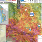
I have reviewed a small portion of the literature for the tectonics of the northern Eastern California shear zone, Owens Valley fault, Garlock fault, etc. I have a basic knowledge of this region and have attended several Pacific Cell Friends of the Pleistocene field trips in this area, but have not done extensive literature review for this area (though I did help Steve Bacon (DRI PhD. student defending soon) for his work on the Owens Valley fault for his M.S. thesis at Humboldt State University, Dept. of Geology, while I was a graduate student there with “early morning” Steve).
Below I present some key overview figures from some of the papers I reviewed today. See the reference list for additional papers. However, first I present a new map.

Global Strain Rate Map

  • Strain is basically the change in shape or volume of a material through time. The Earth deforms with space and time in relation to geospatial variations in plate tectonic motions.
  • Tectonic strain can be measured in a variety of methods. Most people are familiar with geodetic methods. Geodesy is the study of the motion of the Earth as measured at discrete locations (e.g. with GPS observations). One may use changes in position at GPS sites to measure how the Earth moves, so we can directly measure changes in shape this way.
  • Geodetic data can be combined with geologic and seismicity data to evaluate tectonic strain at global, regional, and local scales.
  • In 1998 the International Lithosphere Program started compiling a global dataset to support the construction of a Global Strain Rate Map (GSRM; Kreemer et al., 2000, 2002, 2003, 2014).
  • The GSRM has been incorporated into the Global Earthquake Model of Seismic Hazard, v 2.1 presented online here.
  • I present a map for the Ridgecrest Earthquake Sequence that uses an older version of the GSRM (v 1.2). The color ramp is based on the “second invariant” of strain. Warmer colors show regions of greater tectonic strain. Units are in 10 per year. I acquired these data here.

Geologic Map

  • There are some larger scale geology maps for this region, but they cost money (Dibblee Foundation/AAPG). Needless to say, I don’t have the $50 to buy them right now. They are geotiffs, so would overlay nicely.
  • The map below shows seismicity for the past month overlain upon the 1962 California Division of Mines and Geology 1:250,000 scale geologic map (Jennings et al., 1962). I prepared this on 21 July 2019 after georeferencing the map from the CGS website..


UNAVCO Response Page

  • UNAVCO has event response pages where people post visualizations of data. Here is the Ridgecrest Earhquake Response Page.

  • OTA-measured GNSS static displacements from the real-time GNSS system (blue) compared to the seismically derived static displacements (pink).


    Preliminary coseismic horizontal vector displacements for the July 4, 2019 M 6.4 earthquake. The 5-minute sample rate time series were obtained using rapid orbits from the Jet Propulsion Laboratory.


    Ultra rapid analysis coseismic offsets calculated by the Nevada Geodetic Laboratory (NGL) for a subset of continuous GPS stations in the region of the July 6, 2019 M 7.1 earthquake.


    Rapid analysis coseismic offset pattern for the July 6, 2019 M 7.1 Ridgecrest earthquake, from the Nevada Geodetic Laboratory (NGL)


    GPS derived coseismic displacements of Mw6.4 foreshock. Five days of GPS data spanning the foreshock and prior to the mainshock were processed to obtain the solution.


    GPS derived coseismic displacements of Mw7.1 mainshock. Four days of GPS data spanning the mainshock and after the foreshock were processed to obtain the solution.


    Preliminary slip results derived from geodetic and seismic data for the July 6, 2019 M 7.1 Ridgecrest earthquake, from the Pacfic Northwest Seismic Network. The slip model was run through G-FAST.

  • Here is a video showing real time GPS displacement from 1Hz GPS/GNSS NOTA data analyzed by Christine Puskas.

Background Literature – Tectonics

  • Here is a great overview map of the faults in the region from Oskin et al. (2008). Their paper is about their research to quantify the tectonic loading of faults in the Eastern California shear zone. Note that they use about 12 mm per year of Pacific-North America relative plate motion across this region.

  • A: Index map of southwest North America showing geodetic provinces from Bennett et al. (2003) and location of Mojave block. Velocities of geodetically stable regions are shown relative to Colorado Plateau. ECSZ—eastern California shear zone in Mojave block. Shear zone continues northward into western Great Basin province. GF—Garlock fault. B: Index map of the Mojave block with active faults and locations of recent earthquake ruptures. Circles show localities of slip-rate measurements that sum to ≤6.2 ± 1.9 mm/yr across the ECSZ. GPS—global positioning system.

  • Here is another good overview map, showing the faults for which Petersen and Wesnousky (1994) reviewed slip rates in that publication. They present an excellent review of all slip rate and paleoseismic investigations at the time that paper was published.

  • Map showing sites of slip rate studies in southern California for the San Andreas (SAI-14), San Jacinto (SJI-13), Elsinore-Whittier (El-8), Newport- Inglewood (N1-3), Palos Verdes (N4-6), Rose Canyon (N7), Transverse Ranges (T1-50), Mojave (MI-6), and Garlock (G1-9) faults.

  • Oskin and Iriondo studied the Blackwater fault, the right-lateral strike-slip fault system that extends from the south into the region of the Ridgecrest Earthquake Sequence. The Blackwater fault is connected to the south with the Calico fault (a fault between the 1992 and 1999 earthquakes). This appears to be the major Eastern California Shear zone fault that extends towards the Airport Valley and Little Lake faults (which ruptured during the Ridgecrest Earthquake Sequence).

  • A: Index map of Pacific–North America plate boundary through southwest North America. Principal faults are shown as thick black lines. Tectonically stable areas are outlined by dotted lines. Walker Lane and Eastern California shear zone, shown as dark gray band encompassing network of active faults, together absorb 9%–23% of total plate boundary shear (Dixon et al., 2000; Dokka and Travis, 1990a). JDF—Juan de Fuca; MTJ— Mendocino triple junction. B: Index map of Eastern California shear zone showing fault slip rates (in parentheses, mm/yr) determined by paleoseismic studies (Klinger and Piety, 2000; Lee et al., 2001; McGill and Sieh, 1993; Rockwell et al., 2000; Zhang et al., 1990). Heavy dark gray lines outline historic earthquake ruptures (Beanland and Clark, 1994; Sieh et al., 1993; Treiman et al., 2002). Heavy, medium gray band highlights Blackwater–Calico fault system. Light gray band surrounding Blackwater fault and passing north of Garlock fault is zone of localized 1.2 6 0.5 mm/yr strain accumulation documented by radar interferometry (Peltzer et al., 2001). C: Neotectonic map of Blackwater fault, showing type and orientation of fault line scarps with ticks on downthrown side. Dark patterned areas are lava flows cut by Blackwater fault (Dibblee, 1968, 1967; Smith, 1964)

  • Peltzer et al. (2001) evaluate the amount of tectonic strain that has accumulated over time (see geodesy section to learn more about strain). First I present their tectonic map.

  • Tectonic map of southern California. Solid lines are active faults (Jennings, 1975). Yellow dots are relocated earthquakes between 1981 and 2000 (Hauksson, 2000). Dashed-line box is area covered by Earth Resource Satellite (ERS) data used in this study. White dashed line shows location of concentrated shear observed in synthetic aperture radar (SAR) data. Black stars indicate epicenters of recent earthquakes: OV—1872 Owens Valley, JT—1992 Joshua Tree, L—1992 Landers, BB—1992 Big Bear, N—1994 Northridge, RC—1994 and 1995 Ridgecrest, HM—1999 Hector Mine. Heavy solid lines depict surface ruptures of Landers (Sieh et al., 1993), Hector Mine (U.S. Geological Survey and California Division of Mines and
    Geology, 2000; Peltzer et al., 2001), and Owens Valley (Beanland and Clark, 1994; only southern half of rupture is shown) earthquakes. Black dots and arrows show locations and observed velocities of 11 stations of Yucca GPS array (Gan et al., 2000).
    * Faults are listed in the paper

  • Guest et al. (2003) used geologic mapping and geochronologic data (ages of geologic units) to constrain a tectonic model. They suggest that some of the faults in the region developed as a result of tectonic blocks rotating about a vertical axis. First we see their geologic map.

  • Segment of Trona sheet geologic map showing Owlshead block, southern Death Valley, and Northeast Mojave block. WWFZ— Wingate Wash fault zone, BMF—Brown Mountain fault, OLF—Owl Lake fault, DVFZ—Death Valley fault zone, MSS—Mule Springs strand, LLS—Leach Lake strand, DWLF—Drink Water Lake fault, FIF—Fort Irwin fault, CCF—Coyote Canyon fault, TMF—Tiefort
    Mountain fault.

  • Here is the Guest et al. (2003) map showing their interpretation of how these faults developed over time.

  • In this model the Owlshead and southern Panamint blocks are hypothesized to have undergone sinistral transtension in response to a clockwise rotation of their southern confining boundary (Garlock fault zone).
    RTR—Radio Tower Range, SOM—Southern Owlshead Mountains, WWFZ—WingateWash fault zone, BMF—Brown Mountain fault, OLF—Owl Lake fault, GF—Garlock fault, MSS—Mule Springs strand, LLZ—Leach Lake fault zone, SDVFZ—Southern Death Valley fault zone.

Background Literature – Geodesy

  • Gan et al. (2003) present a summary of geodetic data where they show that the Owens Valley, Little Lake, and Helendale faults form the generalized western boundary of the Eastern California shear zone (there are additional right-lateral faults to the west however).

  • Map showing the location of the ECSZ, the GPS arrays, the station velocities (relative to the fixed North America), and the principal faults in southern California (from Jennings [1992]). The thick dashed lines directed N23°W show the boundaries of the assumed parallel-sided ECSZ. The thin dashed lines extended from the segments of the Garlock fault show the trends of the segments.

  • One of the challenges with interpreting geodetic data is comparing earthquake fault slip rates inferred from geodetic methods with rates calculated using geologic data (either from long term offsets of bedrock, or from more recent rates using fault trenches).
  • Chuang and Johnson (2011) present their comparisons of GPS slip rates with geologic rates.
    • Blue = geologic rate
    • Black = geodetic rate
    • Magenta = block model rate from their analyses


    Comparison of geologic fault slip rates (blue, mm/yr) used in model, range of estimates from elastic block models (black) of Becker et al. (2005) and Meade and Hager (2005), and estimates from our block model (magenta) along major faults. Negative is left lateral. Light red lines are surface fault traces, and white thick lines are model blocks. Blue arrows are Southern California Earthquake Center (SCEC) crustal motion map 3 (Shen et al., 2003) velocities with respect to stable North America.
    *See their paper for fault abbreviations.

  • Here is an interesting figure showing their (Chuang and Johnson, 2011) estimate of the relative position in the earthquake cycle for these faults. This is based on published recurrence intervals for these faults (the average time between earthquakes given paleoseismic investigation data).

  • Summary of assumed geologic rates, recurrence interval (T), and time since last earthquake (teq) in Southern California. (For further discussion of sources of T and teq, see footnote 1). Blue numbers are expert opinion slip rates from Working Group on California Earthquake Probabilities (2008) and red numbers are rates from other paleoseismology data.
    Color of rupture segment represents ratio of time since last earthquake and recurrence interval. Hot (red) colors show segments are in early earthquake cycle, and cold (blue) colors show late earthquake cycle.

  • This is the summary of the Chuang and Johnson (2011) slip rate comparison.

  • A: Geologic fault slip rates versus slip rates inferred from geodetic data. Geologic rates are summarized in Table DR1 (see footnote 1). Blue bars are slip rate comparisons from Meade and Hager (2005) and red bars are from this study. B: Normalized velocity across Garlock fault (blue), Mojave segment of San Andreas fault (red), and eastern California shear zone (ECSZ, green) from our cycle model. Black line is normalized velocity derived from elastic model.

  • Here is an earlier analysis comparing geodetic rates with geologic rates (Dixon et al., 2003). First we see a map showing the faults from which the fault comparisons are shown.

  • Sketch map of study area, modified from Dixon et al. (1995). Bar marks approximate location of Global Positioning System transect (Gan et al., 2000). GF— Garlock fault. Labeled faults of Eastern California shear zone: ALF— Airport Lake fault zone; OVF—Owens Valley fault zone; HMF—Hunter Mountain–Panamint Valley fault zone; DVF— Death Valley–Furnace
    Creek fault zone; FLV— Fish Lake Valley fault zone.

  • Here is the east west profile from Dixon et al. (2003). The horizontal axis is distance and the vertical axis is the rate that each site moves in mm per year. Their fault modeling is represented by the dark black line.

  • Global Positioning System velocity (triangles) and one standard error (bars) from Gan et al. (2000) compared to prediction of viscoelastic coupling model (heavy solid line), representing summed velocity contributions from four parallel faults (light dashed lines). SAF—San Andreas fault; DVF—Death Valley–Furnace Creek fault zone; HMF—Hunter Mountain–Panamint Valley fault zone; OVF—Owens Valley fault zone. Inset shows model rheology for Eastern California shear zone. SNB—Sierra Nevada block;B&R— Basin and Range Province; h is fault depth (depth of elastic layer) for three faults (a, b, or c), m is rigidity, h is viscosity. Arrows mark location of major shear-zone faults.

  • Peltzer et al. (2001) use synthetic aperture radar interferometry (see my second update report for more on InSAR anslysis) to measure tectonic deformation that accumulated between 1992-2000.
  • Alos, check out a more recent analysis using InSAR in CA here.
  • The Coso Geothermal Field is the rainbow area in the northernmost part of the map. Indian Wells Valley is the green area to the south of the Coso Field. This is an area of elevated strain. The Garlock fault is the ~east-west black line in the center of the white inset box.

  • Surface velocity map obtained by averaging 25 interferograms of Los Angeles–Mojave region. One color cycle depicts 10 mm/yr of surface displacement along radar line of sight (at lat N348; ERS [Earth Resource Satellite] descending track trends S13.68W, radar looking westward at 238 off vertical incidence angle in middle of imaged swath). Gray areas are zones of low phase coherence that have been masked in processing. Black lines are active faults (Jennings, 1975). White box indicates subset of synthetic aperture radar (SAR) data that was used for profile in Figure 4. Note conspicuous shear strain along San Andreas fault and shear zone parallel to Blackwater–Little Lake fault system. Large deformation signal in northwest corner of frame is ground subsidence related to Coso volcanic and geothermal field (Fig. 1). Surface displacement associated with 1994 and 1995 Ridgecrest earthquakes is visible south of Coso area. Other patterns of surface deformation include ground subsidence due to groundwater withdrawal in Los Angeles and Lancaster areas (Fig. 1) and to seasonal change of water table level around dry lakes.

  • Peltzer et al. (2001) plot observations from their radar data showing relative plate motion associated with dislocation along the Blackwater-Little Lake fault system.

  • Profiles of observed and modeled line-of-sight displacement projected on vertical plane perpendicular to shear zone. Gray dots are individual data points for all radar-image pixels included in box shown in Figure 3. Solid line shows 2 km running mean of observed displacement along profile length. Note that apparent standard deviation of projected data relative to average profile reflects in part displacement gradient parallel to fault strike and not only error in data. Groups of dots that deviate from dense part of profile are due to ground subsidence near lake shores and to surface displacement associated with Ridgecrest earthquakes (Figs. 1, 3). Short-dash line is profile predicted by long-term velocity model used to estimate interferometric baseline (Shen et al., 1996). Long-dash line is profile predicted by velocity model, including additional buried dislocation along Blackwater–Little Lake fault system. Parameters of added fault are given in text. Black dots and error bars (2s) are line-of-sight projections of horizontal velocities observed by GPS at stations of Yucca transect (Gan et al., 2000).

Background Literature – Little Lake fault

  • Amos et al. (2013) presented an analysis of “tectonic, geomorphic, and volcanic” features to derive a slip rate for the Little Lake fault near Little Lake, California. This is just northwest of the 2019 Ridgecrest Earthquake Sequence. Here is their tectonic map.

  • Overview of active faults and regional topography of the Eastern California shear zone (ECSZ) and southern Walker Lane belt. Labeled faults are abbreviated as follows: ALF—Airport Lake fault, BF—Blackwater fault, GF—Garlock fault, KCF—Kern Canyon fault, LLF—Little Lake fault, OVF—Owens Valley fault, SNFF—Sierra Nevada frontal fault. OL—Owens Lake, IWV—Indian Wells Valley. Major historical earthquake surface ruptures in the Eastern California shear zone and Walker Lane belt are outlined in white, with stars denoting epicentral locations: OV—1872 Owens Valley, L—Landers 1992, HM—1999 Hector Mine. Active fault traces are taken from the U.S. Geological Survey Quaternary fault and fold database, with the exception of the Kern Canyon fault, taken from Brossy et al. (2012).

  • Here is a geologic map from Amos et al. (2013) that shows the mapped faults and topographic controls of river drainage for the area.

  • Simplified geologic map of the Little Lake fault, highlighting Quaternary volcanic and alluvial deposits bearing on the Pleistocene drainage of Owens River through the Little Lake area. Map units are named and modified from Duffield and Bacon (1981). The 30 m elevation contours are taken from the National Elevation Database (NED). The 40Ar/39Ar dates are labeled as in Table 1. SNFF—Sierra Nevada frontal fault.

  • Here is a figure that shows the topography at the Amos et al. (2003) slip rate site along the Owens River. They measured topographic profiles of the ground surface across topographic landforms. These profiles were taken along the thin white lines on the map on the left.
  • On the right are the profiles from the western (B) and the eastern (C) profiles are shown on the right. They use these offset features, and the distance that they are offset, to calculate the slip rate here.

  • (A) 50 cm digital elevation model derived from terrestrial laser scanning (TLS) of displaced terrace risers in Little Lake narrows. (B–C) Stacked topographic profiles along the western and eastern edges of the Qt1 surface, respectively, used to reconstruct the total dextral offset of the Qt1-Qt2 terrace riser. Individual profiles were extracted perpendicular to the average riser orientation and were then projected onto a plane parallel to the local fault strike. Profile locations for each margin are shown in A. VE—vertical exaggeration.

  • This is one of the coolest figures I found during my literature review. Amos et al. (2013) back calculate what the ground surface would look like if back in time, before the fault started to offset the topography here.

  • Geometric reconstruction of (A) the modern geomorphic configuration of the upper Little Lake narrows indicates between ~140 and 250 m of dextral offset for the base (B) and upper edge (C) of the eastern canyon wall. Geologic units are labeled as in Figure 3. The base image includes a hillshade image from our terrestrial laser scanning (TLS) survey, as
    well as 10 m contours overlain on a National Elevation Database (NED) hillshade map. The map location is shown by the boxed area in Figure 3. Geologic units are labeled as in Figures 2 and 3.

  • This is a cool figure, but not as cool as the above map. Amos et al. (2013) plot their slip rate estimates compared to published rates. First they show their observations of displacement relative to the age of the offset topographic landform. Then they plot slip rate estimates in the same manner.

  • (A) Compiled dextral displacements and (B) corresponding fault-slip rates as a function of age for the Little Lake, Blackwater, and Garlock faults. Linear regressions in A indicate constant slip rates through time. Geologic slip rate estimates in B are for time intervals since the respective age measurements. Geodetic measurements represent
    interseismic deformation measured from interferometric synthetic aperture radar (InSAR) and global positioning system (GPS). […]

Background Literature – Garlock fault

  • Astiz and Allen (1983) studied the seismicity of southern California and looked specifically at earthquake mechanisms associated with the Garlock fault. First we see their seismicity map for the region, then we zoom into the Garlock fault.

  • Southern California seismiclty during 1981 from Caltech-USGS catalog. The outer border corresponds to the limits of the southern California array. The inner frame is the limit of Figures 2 and 6. Notice the cluster of earthquakes along the Garlock fault trace and the smaller activity w~th respect to many other faults in southern California.

  • Astiz and Allen (1983) plot the earthquake locations that they relocated for their analyses. This map shows a detailed map of the faults in the area..

  • Earthquake relocations from 1932 to 1981 in the Garlock fault zone. The light line corresponds to the 25-km-wide zone around the fault from which the earthquakes were taken from the catalog. The numbers m the figure corresponds to kilometers along the fault northeast from Gorman quarry (vertical axes in Figure 3). Sohd circles are quarries, and solid triangles are alignment array locations (from Keller et al., 1978). Faults are taken from Jennings and Strand (1969), Smith (1964), and Jennings et al. (1962).

  • This figure shows the earthquake mechanisms for some events that Astiz and Allen (1983) worked on to show how many faults have strike slip mechanisms, but that there are changes in earthquake type (some thrust (compression) and normal (extension) events).

  • Focal mechanisms for selected events that occurred m the Garlock fault zone between 1977 and 1981 Numbers correspond to those m Table 3 Event 5 is a composite mechanism of six nearby events.

  • McGill et al. (2009) late Pleistocene sediments (alluvial fan) and alluvial channels (with radiocarbon ages) to constrain an earthquake fault slip rate for the Garlock fault. First we see a tectonic map for the region.

  • Location of the Clark Wash site (large white circle) as well as other slip-rate and paleoseismic sites (small white circles) along the Garlock fault. AM—Avawatz Mountains; EPM—El Paso Mountains; GF—Garlock fault; PM—Providence Mountains; SAF—San Andreas fault; SLB—Soda Lake Basin; SM—Soda Mountains; SR—Slate Range; SSH—Salt Spring Hills; SV—Searles
    Valley.

  • These authors used a variety of observations to derive a statistical estimate (using probabilistic model) for a slip rate based on an estimate of offset and radiocarbon age (which both had a range of probabilities, plotted as a probability density function). This is really cool.

  • Probability density functions for left-lateral offset (A) and age (B) of Clark Wash that were assigned on the basis of quantitative constraints and subjective judgment (see text), and the resulting probability density function for the slip rate of the Garlock fault (C).

  • Here is a compilation of their slip rate estimates (McGill et al., 2009).

  • Comparison of slip-rate estimates for the Garlock fault. The three values in italics, associated with boxes that outline sections of the fault, are the slip rates and formal uncertainties from Meade and Hager’s (2005) best-fitting elastic block model of available geodetic data. They report, however, that experience with a range of models suggests that true uncertainties are ~3 mm/yr. White-filled circles mark the locations of Holocene and Late Quaternary geologic slip-rate estimates. The Holocene rates that are constrained by radiocarbon dates and are thus considered most reliable are shown in bold […].
    * more abbreviations and explanation in the paper

Background Literature – Owens Valley fault

  • Kylander-Clark et al. (2005) use the lateral offset of plutonic dikes (igneous rocks) to constrain a long term slip rate across the Owens Valley fault. This map shows one of the dike pairs used in their analysis. By knowing the age of these dieks, and the distance that they have been offset, we can obtain a slip rate.

  • Locations of the Golden Bear and Coso dikes, adjacent to Owens Valley. Main figure shows the Golden Bear and Coso dikes striking into the valley, where they intrude 102 Ma plutons. Both the dikes and the plutons provide distinctive markers that can be matched across the valley and are consistent with 65 km of dextral displacement since 84 Ma. Inset shows other markers across Owens Valley that earlier workers suggested indicate from 0 to 65 km of dextral offset across the valley. Also shown are the traces of the Tinemaha fault (Stevens et al., 1997; Stevens and Stone, 2002) and intrabatholithic break 3 (IBB3; Kistler, 1993), which are hypothesized to accommodate offset of these markers. Note that the section of IBB3 between 38°N and 36.5°N is correlative with the eastern intrabatholithic break (EIB) of Saleeby and Busby (1993). Not all known locations of Independence dikes are indicated. Instead, patterned areas show only the densest parts of the dike swarm as defi ned by Glazner et al. (2003). AR—Argus Range; CR—Coso Range; IR—Inyo Range; WM—White Mountains

  • Bacon and Pezzopane used trench excavations across earthquake faults to construct a prehistoric earthquake history for the Owens Valley fault. Below is their tectonic map for the region.

  • (A) Map of major Quaternary faults in the northern Eastern California shear zone and southern and central Walker Lane, as well as the locations of the Owens Valley fault. Faults are modified from Reheis and Dixon (1996) and Wesnousky (2005)
    (B) Generalized fault and geology map of south-central Owens Valley, showing the A.D. 1872 Owens Valley fault rupture and major fault zones in the valley (modified from Hollett et al. [1991] and Beanland and Clark [1994]).
    (For fault abbreviations, see their paper.)

  • This map shows a more detailed view of the Owens Valley fault and the Owens Lake topography (Bacon and Pezzopane, 2007).

  • Shaded relief map of southern Owens Valley showing fault zones and the ages of the most recent prominent highstands and recessional shorelines of Owens Lake during the latest Quaternary (modified from Bacon et al., 2006).

  • This map shows the Bacon and Pezzopane (2007) field sites.

  • Map of the field area and locations of paleoseismic study sites in relation to the A.D. 1872 Owens Valley earthquake fault trace near Lone Pine. Study sites are located on the Alabama Hills (AHS), Diaz Lake (DLS), and Manzanar (MZS) sections of the Owens Valley fault zone mapped by Bryant (1988) and Beanland and Clark (1994) from 1:12,000 aerial photographs.

  • An essential part of any earthquake fault investigation is knowledge about the geologic units that are offset by the fault. Bacon and Pezzopane (2007) also described and interpreted the sediment stratigraphy in southern Owens Valley as part of their research.

  • Schematic composite stratigraphic column. The generalized stratigraphic and geochronologic relations, developed from exposures at the Alabama Gates and Quaker paleoseismic sites and Owens River bluffs near Lone Pine (Bacon et al., 2006), show the positions of radiocarbon dates, sequence boundaries, and event chronologies as discussed in the text.

  • The geologic method (McCalpin, 1996) is based on the offset of geologic materials like sedimentary deposits or bedrock lithologic units. Below are trench logs showing the geologic units that Bacon and Pezzopane (2007) use to infer an earthquake history. Geologic evidence is “primary” evidence for earthquakes.

  • Here is a time series showing the sedimentary and earthquake history as interpreted by Bacon and Pezzopane (2007).

  • Schematic depiction of stratigraphy and structural relations at the Quaker paleoseismic site prior to the penultimate event and after the A.D. 1872 earthquake (depictions A–H). The stratigraphy and structure exposed in trench T5 (Fig. 7) was retrodeformed and reconstructed one event at a time (while also accounting for other stratigraphic and
    paleoseismic relations exposed in adjacent fault trenches and stratigraphic pits). The locations of sequence boundaries (SB0–SB4) are shown and can be referenced on Figure 5.

Background Literature – Earthquake History

  • Here are the results of the paleoseismic (prehistoric earthquake history) investigation for the Owens Valley fault (Bacon and Pezzopane, 2007).

  • Fault segmentation and section map of central and southern Owens Valley showing overlap and possible distributive faulting and linkage between the northern segment of the Owens Valley fault (OVF) and southern White Mountains fault (WMF) near Big Pine. The trace of the A.D. Owens Valley fault rupture and section boundaries of Beanland and Clark (1994) and segment boundaries of dePolo et al. (1991) are shown in relation to the central and southern White Mountains fault and the location of the Black Mountain rupture of dePolo (1989). RRF—Red Ridge fault; LP—Lone Pine; I—Independence; BP—Big Pine; OSL—optically stimulated luminescence; PE—Penultimate event; APE—antepenultimate event; MRE—most recent event.

  • McGill and Rockwell (1998) and Dawson et al. (2003) used fault trenching near El Paso Peaks, California to conduct a paleoseismic investigation along the Garlock fault. Below is a map that shows their trench site relative to tectonic features in the region.

  • Map showing the location of the trench site along the Garlock fault. Mountains are shaded, and valleys are shown open. Stippled areas are dry lake beds. SAF is San Andreas fault, DV is Death Valley, QM is Quail Mountains, LTC is Lone Tree Canyon, and SL is Searles (dry) Lake. Modified from McGill and Sieh [1993].

  • McGill and Rockwell (1998) present this figure that shows an aerial image and a geologic map showing topographic features labeled in the aerial image. Note how there is a stream channel that is left-laterally offset.

  • Geomorphic and geologic expression ofthe Garlock fault at the trench site. (top) An annotated aerial photograph (courtesy U.S. Geological Survey) showing the trench site and selected geomorphic features. Unlabeled arrows mark the locations of fault scarps and benches. (bottom) A geologic map of the same area. Scale and orientation of the air photo are the same as shown on the map.

  • Here is an annotated aerial image that was acquired when the light from the sun was at an angle that highlights the topographic features. This low-angle sun aerial photography method was pioneered by Bert Slemmons, one of the fathers of paleoseismology (who advised my HSU professor, Gary Carver when Gary was a student).
  • Note how some features on the north side of the fault are to the left of features on the south side of the fault. This is why we call these left-lateral strike-slip faults. If one turns the image upside down, they will notice that the stuff on the other side of the fault still moves to the left. So, it does not matter what side of the fault one is standing on. I rotated the image below so we can see this first hand (see how features on the top of the image are offset to the left compared to the bottom of the image.


  • Annotated aerial photograph showing local tectonic geomorphology of the trench site. Scale is approximate. Solid lines are mappable fault traces, and dashed lines are inferred fault traces.

  • This photo shows how huge and impressive the fault trenches were that Dawson et al. (2003) excavated for this study. Note the heavy equipment for scale. Read their paper to see the impressive amount of details that they used to unravel the earthquake history.

  • Annotated photograph illustrating some of the additional exposures that were created and documented. Note the location of trench 2, which had been backfilled at the time this photograph was taken. Trench 2 was later reexcavated to create the final and deepest exposure.

  • This is but one example of the complicated sediment stratigraphy and faulting evidence that Dawson et al. (2003) used as a basis for their observations and interpretations. I show both the trench log (artwork) and the annotated panchromatic photo mosaic.


  • Event Y logs and three-dimensional excavation. Figure 7a is a log of a portion of trench 1 with evidence for event Y taken from McGill and Rockwell [1998]. Units shown shaded were interpreted to have been deposited in a collapse pit and then subsequently faulted by event Y. Figure 7b shows the three-dimensional excavation of this feature that shows units 90 and 92 actually being tubular in shape and units 78–42 correlative with units outside of the interpreted collapse feature. Scale varies in this mosaic due to three-dimensionality of the exposure, but the total width of the area shown is about 2.5 m. Dashed lines represent corners of 3-D exposure.

  • These are complicated figures, yet elegant (McGill and Rockwell, 1998; Dawson et al., 2003). My favorite type of figure. The horizontal axis is time in calendar years (now is on the right and the past is on the left). The vertical axis is the thickness of the sedimentary deposits, with the ground surface at the top.
  • Each earthquake is named an event (e.g. Event W). The dots represent radiocarbon ages (and the horizontal lines are the uncertainty associated with these ages). In the Dawson figure, the gray region represents the envelope of possible ages for the sediments between the radiocarbon ages. They assume a linear sedimentation rate between ages. Often people call these radiocarbon dates, but they are ages (it is not possible to obtain a date from radiocarbon age determinations because a date is a single day and these analyses are not that precise).

  • Variation of calibrated radiocarbon dates with stratigraphic depth. Errors shown are 2-sigma. The thick, diagonal line connecting the best estimates of most of the radiocarbon ages illustrates the simplest sedimentation rate history. Thinner, diagonal lines on either side represent the 2-sigma error envelope on the sedimentation rate, assuming that the date of each sample closely approximates its time of deposition. The faulting events visible within the trench are labelled along the right side of the graph, according to their stratigraphic depth; implied, preferred ages are plotted explicitly. Uncertain events are shown in parentheses. Stratigraphic depths to the earthquake horizons and to each depositional unit containing a radiocarbon sample were taken from the composite stratigraphic section shown in Figure 4.


    Variation of calibrated radiocarbon dates with stratigraphic depth. Errors on the calibrated radiocarbon dates are 2-sigma. The curve connecting the solid circles connects the best estimates of the radiocarbon ages, providing the sedimentation rate. The dashed lines give the 2-sigma error envelope on the sedimentation rate.

  • Here is a table showing McGill and Rockwell (1998) earthquake event times and return interval for each prehistoric earthquake.

  • Here is the summary of prehistoric earthquake event times for this part of the Garlock fault (Dawson et al., 2003).

Social Media (UPDATE 2019.07.21


This is not about Ridgecrest, but about the time, 20 June.

UPDATE 2020.12.09

    References:

  • Amos, C.B., Bwonlee, S.J., Hood, D.H., Fisher, G.B., Bürgmann, R., Renne, P.R., and Jayko, A.S., 2013. Chronology of tectonic, geomorphic, and volcanic interactions and the tempo of fault slip near Little Lake, California in GSA Bulletin, v. 125, no. 7-8, https://doi.org/10.1130/B30803.1
  • Astiz, L. and Allen, C.R., 1983. Seismicity of the Garlock Fault, California in BSSA v. 73, no. 6, p. 1721-1734
  • Bacon, S.N. and Pezzopane, S.K., 2007. A 25,000-year record of earthquakes on the Owens Valley fault near Lone Pine, California: Implications for recurrence intervals, slip rates, and segmentation models in GSA Bulletin, v. 119, no. 7/8, p. 823-847, https://doi.org/10.1130/B25879.1
  • Bakun, W.H., Ralph A. Haugerud, Margaret G. Hopper, Ruth S. Ludwin, 2002. The December 1872 Washington State Earthquake in BSSA, v. 92, no. 8., https://doi.org/10.1785/0120010274
  • Brocher, T., Margaret G. Hopper, S.T. Ted Algermissen, David M. Perkins, Stanley R. Brockman, and Edouard P. Arnold, 2048. Aftershocks, Earthquake Effects, and the Location of the Large 14 December 1872 Earthquake near Entiat, Central Washington in BSSA, v. 108, no. 1., https://doi.org/10.1785/0120170224
  • Chuang, R.Y. and Johnson, K.M., 2011. Reconciling geologic and geodetic model fault slip-rate discrepancies in Southern California: Consideration of nonsteady mantle flow and lower crustal fault creep in Geology, v. 39, no. 7, p. 627630, https://doi.org/10.1130/G32120.1
  • Dawson, T. E., S. F. McGill, and T. K. Rockwell, Irregular recurrence of paleoearthquakes along the central Garlock fault near El Paso Peaks, California, J. Geophys. Res., 108(B7), 2356, https://doi.org/10.1029/2001JB001744, 2003.
  • Dixon, T.H., Norabuena, E., and Hotaling, L., 2003. Paleoseismology and Global Positioning System: Earthquake-cycle effects and geodetic versus geologic fault slip rates in the Eastern California shear zone in Geology, v. 31, no. 1., p. 55-58,
  • Frankel, K.L., Glazner, A.F., Kirby, E., Monastero, F.C., Strane, M.D., Oskin, M.E., Unruh, J.R., Walker, J.D., Anandakrishnan, S., Bartley, J.M., Coleman, D.S., Dolan, J.F., Finkel, R.C., Greene, D., Kylander-Clark, A., Morrero, S., Owen, L.A., and Phillips, F., 2008, Active tectonics of the eastern California shear zone, in Duebendorfer, E.M., and Smith, E.I., eds., Field Guide to Plutons, Volcanoes, Faults, Reefs, Dinosaurs, and Possible Glaciation in Selected Areas of Arizona, California, and Nevada: Geological Society of America Field Guide 11, p. 43–81, doi: 10.1130/2008.fl d011(03).
  • Frisch, W., Meschede, M., Blakey, R., 2011. Plate Tectonics, Springer-Verlag, London, 213 pp.
  • Gan, W., Zhang, P., Shen, Z-K., Prescott, W.H., and Svarc, J.L., 2003. Initiation of deformation of the Eastern California Shear Zone: Constraints from Garlock fault geometry and GPS observations in GRL, v. 30, no. 10, https://doi.org/10.1029/2003GL017090
  • Guest, B., Pavlis, T.L., Goldberg, H., and Serpa, L., 2003. Chasing the Garlock: A study of tectonic response to vertical axis rotation in Geology, v. 31, no. 6, p. 553-556
  • Hayes, G., 2018, Slab2 – A Comprehensive Subduction Zone Geometry Model: U.S. Geological Survey data release, https://doi.org/10.5066/F7PV6JNV.
  • Holt, W. E., C. Kreemer, A. J. Haines, L. Estey, C. Meertens, G. Blewitt, and D. Lavallee (2005), Project helps constrain continental dynamics and seismic hazards, Eos Trans. AGU, 86(41), 383–387, , https://doi.org/10.1029/2005EO410002. /li>
  • Kreemer, C., J. Haines, W. Holt, G. Blewitt, and D. Lavallee, 2000. On the determination of a global strain rate model, Geophys. J. Int., 52(10), 765–770.
  • Kreemer, C. , W.E. Holt, and A.J. Haines, 2002. The global moment rate distribution within plate boundary zones. In S. Stein and J.T. Freymueller (eds.): Plate Boundary Zones, Geodynamics Series, Vol. 30, https://doi.org/10/1029/030GD10
  • Kreemer, C., W. E. Holt, and A. J. Haines, 2003. An integrated global model of present-day plate motions and plate boundary deformation, Geophys. J. Int., 154(1), 8–34, , https://doi.org/10.1046/j.1365-246X.2003.01917.x.
  • Kreemer, C., G. Blewitt, E.C. Klein, 2014. A geodetic plate motion and Global Strain Rate Model in Geochemistry, Geophysics, Geosystems, v. 15, p. 3849-3889, https://doi.org/10.1002/2014GC005407.
  • Kylander-Clark, A.R.C., Coleman, D.S., Glazner, A.F., and Bartley, J.M., 2005. Evidence for 65 km of dextral slip across Owens Valley, California, since 83 Ma in GSA Bulletin, v. 117, no. 7/8, https://doi.org/10.1130/B25624.1
  • McAuliffe, L. J., Dolan, J. F., Kirby, E., Rollins, C., Haravitch, B., Alm, S., & Rittenour, T. M., 2013. Paleoseismology of the southern Panamint Valley fault: Implications for regional earthquake occurrence and seismic hazard in southern California. Journal of Geophysical Research: Solid Earth, 118, 5126-5146, https://doi.org/10.1029/jgrb.50359.
  • McGill, S.F. and Rockwell, T., 1998. Ages of late Holocene earthquakes on the central Garlock fault near El Paso Peaks, California in JGR, v. 103, no. B4, p. 7265-7279
  • McGill, S.F., Wells, S.G., Fortner, S.K., Kuzma, H.A., and McGill, J.D., 2009. Slip rate of the western Garlock fault, at Clark Wash, near Lone Tree Canyon, Mojave Desert, California in GSA Bulletin, v. 121, no. 3/4, https://doi.org/10.1130/B26123.1
  • Meyer, B., Saltus, R., Chulliat, a., 2017. EMAG2: Earth Magnetic Anomaly Grid (2-arc-minute resolution) Version 3. National Centers for Environmental Information, NOAA. Model. https://doi.org/10.7289/V5H70CVX
  • Müller, R.D., Sdrolias, M., Gaina, C. and Roest, W.R., 2008, Age spreading rates and spreading asymmetry of the world’s ocean crust in Geochemistry, Geophysics, Geosystems, 9, Q04006, https://doi.org/10.1029/2007GC001743
  • Oskin, M. and Iriondo, A., 2004. Large-magnitude transient strain accumulation on the Blackwater fault, Eastern California shear zone in Geology, v. 32, no. 4, https://doi.org/10.1130/G20223.1
  • Oskin, M., L. Perg, D. Blumentritt, S. Mukhopadhyay, and A. Iriondo, 2007. Slip rate of the Calico fault: Implications for geologic versus geodetic rate discrepancy in the Eastern California Shear Zone, J. Geophys. Res., v. 112, B03402, https://doi.org/10.1029/2006JB004451
  • Oskin, M., Perg, L., Shelef, E., Strane, M., Gurney, E., Singer, B., and Zhang, X., 2008. Elevated shear zone loading rate during an earthquake cluster in eastern California in Geology, v. 36, no. 6, https://doi.org/10.1130/G24814A.1
  • Peltzer, G., Crampe, F., Hensely, S., and Rosen, P., 2001. Transient strain accumulation and fault interaction in the Eastern California shear zone in geology, v. 29, no. 11
  • Petersen, M.D. and Wesnousky, S.G., 1994. Review Fault Slip Rates and Earthquake Histories for Active Faults in Southern California in BSSA, v. 84, no. 5, p. 1608-1649
  • Stein, R.S., Earthquake Conversations, Scientific American, vol. 288, 72-79, January issue, 2003. Republished in: Our Ever Changing Earth, Scientific American, Special Edition, v. 15 (2), 82-89, 2005.
  • Toda, S., Stein, R. S., Richards-Dinger, K. & Bozkurt, S. Forecasting the evolution of seismicity in southern California: Animations built on earthquake stress transfer. J. Geophys. Res. 110, B05S16 (2005) https://doi.org/10.1029/2004JB003415

Return to the Earthquake Reports page.


Earthquake Report: Ridgecrest Update #2

Well Well Well
Here is a commercial from Sony for Sony Discman following the 1995-96 Ridgecrest Earthquake (from which we have usurped this name for this July 2019 sequence).

The story continues to unfold.

  • Here is a graphic from the USGS that summarizes our observations as of 16 July.

Field Work Narrative

Last week I was lucky enough to spend a week in the field with my coworkers (California Geological Survey) and colleagues (U.S. Geological Survey) making observations of surface rupture from the Ridgecrest Earthquake Sequence (RES). It was initially termed the Searles Valley Earthquake Sequence, but we have since changed the name. Just check out #RidgecrestEarthquake on social media. Our work will be presented in several publications in the coming future. Stay tuned.
Many of us were granted rare access to the Naval Air Weapons Station China Lake. This emergency earthquake response effort was an unprecedented collaborative effort between the Navy, the CGS, and the USGS. We worked together as a team and accomplished our mission goals with due diligence. The CGS/USGS team is out in the field again this week, working off base. We plan to continue doing additional field work for weeks to come. (Though I need to get back to my tsunami stuff as we have deadlines to prepare new tsunami hazard products in the next few weeks to months.)
These collaborative efforts were based on a mutual respect between team agencies and team members. The field team members all appreciated the very special access we were granted. The commanding officer, Captain Paul Dale, is very supportive of scientific research and his support of our mission was evidence of this.
We were granted permission to take photos of the geologic evidence of the earthquake and ground shaking. We reviewed our images with the Public Affairs Officer to ensure that we did not take photos of any facilities or equipment that was on the base. This was important and we were very careful about this. We even double checked the images after we got back from the field.
I will add some photos to this page tomorrow.

Remote Sensing Narrative

There has also been a large number of Earth scientists using remote sensing data to evaluate the RES. These data are primarily from satellite images of different types (spectral imagery (another word for what we used to call air photos), RADAR, Global Positioning Systems (GPS), seismometer observations, etc.).
For most of these methods, pre-earthquake data are compared with post-earthquake data for a comparison. The methods used for these comparisons is advancing at a lightning pace. Every year, these models get better and better.
These remote sensing methods allow us to infer how the ground moved and slipped during and after the earthquake. We can get estimates of the slip on the fault from this type of analysis.
Combining different sources of remote sensing data also allows us to make estimates of the faults, where they moved, and how much they moved (in the subsurface).
I will present some of these observations below.

USGS Data Products

I prepared some interpretive posters for the M 7.1 earthquake shortly after it happened. The USGS earthquake pages are a source of great information as evidenced by how hard they are hit by web visitors following events as significant as the M 7.1. The website was unusable for periods of time. This demonstrates that the USGS is doing something right.
Last weekend, I spent Saturday preparing the same types of interpretive posters that I presented here, but as comparisons between the M 6.4 and M 7.1 temblors.

  • Here is an updated seismicity map. There are two main types of earthquakes on this map. I present this map both with aerial imagery and with a topographic (“hillshade”) basemap. I outline the general area of Ridgecrest in purple.
    1. First, there are an abundance of aftershocks aligned with the two main faults that ruptured during this sequence (the northwest trending M 7.1 fault and the northeast trending M 6.4 fault). Part of the northwest striking fault ruptured during the M 6.4 event.
    2. Second, there are several areas that show earthquakes that were triggered by this sequence. There are some triggered earthquakes along the Coso Range (where the Coso Geothermal Field is located), some events along the Garlock fault, and some temblors along the Ash Hill fault (in Panamint Valley, to the north of Searles Valley).


  • This is a seismicity comparison for the two earthquakes. on the left are earthquakes (USGS) from prior to the M 7.1 earthquake and on the right are quakes after and including the M 7.1 temblor. I plot the USGS Quaternary fault and fold database on the left as black lines.

  • Here is a map with landslide probability on it. Please head over to that report for more information about the USGS Ground Failure products (landslides and liquefaction). Basically, earthquakes shake the ground and this ground shaking can cause landslides. We can see that there is a low probability for landslides. However, we have already seen photographic evidence for landslides and the lower limit for earthquake triggered landslides is magnitude M 5.5 (from Keefer 1984-ish).

  • Here is a map showing liquefaction susceptibility. I explain more about this type of map in my original report for the M 6.4 earthquake. Scroll down a bit to find the landslide and liquefaction maps for that event.

  • Finally, here is a map that shows the shaking intensity for the M 6.4 and M 7.1 earthquakes. As I mention in my original report, this is based on a model that relates earthquake shaking intensity with earthquake magnitude and distance from the earthquake. Note that there was violent shaking from the M 7.1 event (MMI IX).

NASA JPL ARIA Data Products

  • NASA Jet Propulsion Laboratory (JPL) prepares Advanced Rapid Imaging and Analysis (ARIA) data products for major events worldwide. Their data are presented online here. I used the data from this event in a GIS computer program, but the data are prepared in Google Earth files too (so everyone can use them if they have a modern computer with an internet connection). This is a valuable government service.
  • This first map shows the results of modeling Synthetic Aperture Radar Interferometry data. Basically, Radar satellite imagery data from before and from after the earthquake are compared to model the amount of ground deformation that occurred between the satellite acquisitions. Each color band represents a certain amount of motion. This is referred to as the wrapped image.
  • Here are a series of sources of background information about InSAR analysis.

  • This map is made using the same basic data, though it has been processed in a way to show the overall ground motion with just two colors, instead of color bands. This is called the unwrapped image.

  • Below is the first in a series of videos that explains more about SAR and InSAR analyses.

Dr. Sotiris Valkaniotis

  • Dr. Valkaniotis is a Greek geologist who has a great set of remote sensing skills who studies earthquake geology and paleoseismology. I include lots of social media posts below where people share their analyses. However, I select two images from Dr. Valkaniotis for this earthquake. Contact him for more information about his processing. As embedded below in the social media section, here is the tweet that is the source of these two maps.
  • These images are similar to the NASA JPL ARIA unwrapped maps above. I include his description below in blockquote.

  • Gradient render from unwrapped LOS displacement map (higher quality 20m from SNAP). Surface ruptures (major & minor) are easily visible as dark linear features (high displacement gradient). Processing in @esa_gep. Descending pair from #Sentinel1, #Ridgecrestearthquake


    And the ascending pair from #Sentinel1, #Ridgecrestearthquake. Gradient render from unwrapped LOS displacement map (higher quality 20m from SNAP). Processing in @esa_gep.

  • Here is a map that Dr. Valkaniotis prepared showing fault lines he has interpreted from his model results.

  • Complex and detailed pattern of co-seismic ruptures for the #RidgecrestEarthquake sequence. Red lines are primary & secondary surface ruptures, together with small triggered ruptures away from main faults. Previously mapped Quaternary Faults with yellow, for comparison.

PBS News Hour: 2019.07.08

Death Valley at Devil’s Hole

The clip shows water violently sloshing around, rising and falling 10 to 15 feet, according to a park estimate. The video captures two angles, one looking into the cave and the other underwater inside it.
Devils Hole is a part of the desert uplands and spring-fed oases that make up the Ash Meadows complex, a national wildlife refuge.

Temblor Articles

Ross Stein (Ph.D.), Volkan Sevilgan (M.Sc.), Tiegan Hobbs (Ph.D.), Chris Rollins (Ph.D.), Geoffrey Ely, (Ph.D.), and Shinji Toda (Ph.D.) are coauthors to a suite of 5 articles presented on Temblor.net. Temblor is a National Science Foundation funded organization that promotes earthquake insurance and seismic retrofits for people in earthquake country. I wrote several articles for Temblor prior to starting work at the California Geological Survey. (My efforts at earthjay.com are purely volunteer and do not reflect endorsement nor review from or by CGS.)
These reports are excellent sources of interpretive information at the detail for non experts (sometimes my reports are at a detail more aimed towards undergraduate geology students, though I attempt to make them available to a broad audience as well). I include a few figures from their reports that I find most interesting, but please check out their articles for more information!

  • Dr. Stein begins by presenting an hypothesis that these earthquakes are in a region of increased tectonic stress following the 1872 Owens Valley Earthquake, estimated to have a magnitude of M 7.6 (though it happened prior to modern seismometer instrumentation, so magnitude estimates have considerable uncertainty).
  • When earthquake faults slip, the surrounding crust is squished and squashed. This deformation changes the tectonic stresses in the crust. In some places this change causes an increase in the amount of stress on earthquake faults and in some places it decreases the tectonic stress. In places where the stress increases, the fault is brought closer to having an earthquake, and vice versa for places where the stress is diminished.
  • These stress changes are very small, so for a fault to be triggered by these changes in “static coulomb stress,” the fault had to be almost ready to slip before these changes happened. More can be found in Stein (2003) and Toda et al. (2005) linked below in the references.
  • In the map below, warm colors represent areas with an increase in (static coulomb stress) and cool colors represent a decrease in stress. I include their figure caption in blockquote below the figure (as for all their figures).

  • he site of the July 4th shock was likely brought closer to failure in the 1872 M~7.6 shock. Notice that the (red) stress trigger zones of the this 148-year-old quake are all seismically active today, whereas the (blue) stress shadows are generally devoid of shocks.

  • The Owens Valley fault triggering is speculative of course, since that earthquake was so long ago. However, there are other cases where aftershocks or triggered earthquakes are happening a long time after the main event. For example, there are ongoing aftershocks following an 1872 earthquake near Lake Chelan (Bakun et al., 2002; Brocher et al., 2018).
  • Stein and his colleagues calculated “static coulomb” stress changes imparted by the Ridgecrest Earthquake Sequence onto a series of other faults in the area. Read more about their analyses here.

  • Here we calculate stress transferred to the principal mapped faults, using the USGS slip model for the 7.1 and a model based on University of Nevada Reno GPS displacements for the 6.4 (not shown here for simplicity, but included). Most of the stress change is from the 7.1: it was several times larger than the 6.4 and torqued the surrounding crust far more. This fault inventory might be woefully incomplete, of course: the 7.1 itself struck on an unmapped fault. Nevertheless, the most striking result is the >2-bar stress increase on a 30-km (20-mile) section of the Garlock Fault. An end-to-end rupture on the Garlock, if (still) possible, would be in the magnitude 7.6-7.8 range.

  • In my interpretive posters above, I mention the areas where there have been triggered earthquakes (e.g. the Coso Geothermal Field, the Garlock fault, the Ash Hill fault). Turns out, Stein and his colleagues were thinking the same thing.
  • They prepared a figure in their report here where they show changes in “static coulomb” stress. They label the same areas I mention (except the Ash Hill fault in Panamint Valley). Take a look at the areas of increased stress compared to these three regions (even the Ash Hill fault is in an area of increased stress).

  • Faults in the red lobes are calculated to be brought closer to failure; those in the blue ‘stress shadows’ are inhibited from failure. The calculation estimates what the dominant fault orientations are around the earthquakes by interpolating between major mapped faults (shown in red lines). So, we would expect strong stressing in the Coso Volcanic Field to the north (where the aftershocks lie), and along the Garlock Fault to the south (but not where most of them lie).

  • Hobbs and Rollins speculate that the San Andreas fault may also have changes in (static coulomb) stress imparted by the Garlock fault if that were to slip. Read more in their article here.

  • If the western and central Garlock were to rupture, it would load the section of the San Andreas just north of Los Angeles. The jog in the San Andreas under the S in “Source” is at Palmdale. Figure from McAuliffe et al. [2013].

Below are all the Temblor articles to read


2019.07.04 Southern California M 6.4 earthquake stressed by two large historic ruptures
2019.07.05 Earthquake early warning system challenged by the largest SoCal shock in 20 years
2019.07.06 Magnitude 7.1 earthquake rips northwest from the M6.4 just 34 hours later
2019.07.06 M 7.1 SoCal earthquake triggers aftershocks up to 100 mi away: What’s next?
2019.07.09 The Ridgecrest earthquakes: Torn ground, nested foreshocks, Garlock shocks, and Temblor’s forecast
  • Here are the references for these Temblor articles.
    • Stein, R. S., and Sevilgen, V., (2019), Southern California M 6.4 earthquake stressed by two large historic ruptures, Temblor, http://doi.org/10.32858/temblor.034
    • Hobbs, T.E. and Rollins, C., (2019), Earthquake early warning system challenged by the largest SoCal shock in 20 years, Temblor, http://doi.org/10.32858/temblor.035
    • Ross S. Stein, Tiegan Hobbs, Chris Rollins, Geoffrey Ely, Volkan Sevilgen, and Shinji Toda, (2019), Magnitude 7.1 earthquake rips northwest from the M6.4 just 34 hours later, Temblor, http://doi.org/10.32858/temblor.037
    • Ross S. Stein, Chris Rollins, Volkan Sevilgen, and Tiegan Hobbs, (2019), M 7.1 SoCal earthquake triggers aftershocks up to 100 mi away: What’s next?, Temblor, http://doi.org/10.32858/temblor.038
    • Chris Rollins, Ross S. Stein, Guoqing Lin, and Deborah Kilb (2019), The Ridgecrest earthquakes: Torn ground, nested foreshocks, Garlock shocks, and Temblor’s forecast, Temblor, http://doi.org/10.32858/temblor.039

Field Photos

  • Below are some field photos I took. I cannot tell anyone where they were taken (at least not yet) as we don’t have clearance. I may post more later, but wanted to post some to show people the type of observations we were making.
  • This is Dr. Chris DuRoss (USGS) as we walked across the scarp at our first site working together.

  • Here is a great one of Dr. Jessie T. Jobe (USGS, soon to be USBR) taking notes at that same scarp (DuRoss’ boots for scale).

  • This is a portion of a road where the fault crossed. There were several dm of lateral offset on either side of the road, but the road itself had an imperceptible amount of lateral offset (i.e. 1 ± 1 cm offset). There was some amount of compression here.

  • Here we were projecting the ground surface across the fault to estimate the amount of vertical displacement. Dr. Ryan Gold (USGS) is measuring while a Navy Base geologist is holding the profile stick along the ground surface.

  • Here is a photo very similar to Mr. Brian Olson’s tweeted photo, but I took this one instead. Dr. Belle Philibosian (USGS) is on the left and Kelly (NAWCL geologist) is on the right. This shows right-lateral strike-slip displacement of 420 cm. We thought nobody would believe us, so we made another measurement nearby to confirm.

  • I located some beautiful slickenlines (grooves in the fault surface created when the fault slips) and this is Dr. Beth Haddon (USGS) collecting strike, dip and rake data for these lines. We collected many photos of this site so that we can create a 3-D model (using structure from motion).

  • Here is Dr. Belle Philibosian looking spectacular as usual, providing scale to help us understand the amount of vertical separation across the fault in this location.

  • We located some evidence for liquefaction too. Here is a sand volcano, where lots of the sediment got washed away by the fluid that possibly shot up through this hole.

  • This was a great opportunity to show the compass orientation of these conjugate fault offsets in the road. The road material properties probably controlled the location of the faults here (there were pre-existing planes of weakness as evidenced by the tar patches, but some of the pavement faulting was new).

    References:

  • Amos, C.B., Bwonlee, S.J., Hood, D.H., Fisher, G.B., Bürgmann, R., Renne, P.R., and Jayko, A.S., 2013. Chronology of tectonic, geomorphic, and volcanic interactions and the tempo of fault slip near Little Lake, California in GSA Bulletin, v. 125, no. 7-8, https://doi.org/10.1130/B30803.1
  • Bakun, W.H., Ralph A. Haugerud, Margaret G. Hopper, Ruth S. Ludwin, 2002. The December 1872 Washington State Earthquake in BSSA, v. 92, no. 8., https://doi.org/10.1785/0120010274
  • Brocher, T., Margaret G. Hopper, S.T. Ted Algermissen, David M. Perkins, Stanley R. Brockman, and Edouard P. Arnold, 2048. Aftershocks, Earthquake Effects, and the Location of the Large 14 December 1872 Earthquake near Entiat, Central Washington in BSSA, v. 108, no. 1., https://doi.org/10.1785/0120170224
  • Frankel, K.L., Glazner, A.F., Kirby, E., Monastero, F.C., Strane, M.D., Oskin, M.E., Unruh, J.R., Walker, J.D., Anandakrishnan, S., Bartley, J.M., Coleman, D.S., Dolan, J.F., Finkel, R.C., Greene, D., Kylander-Clark, A., Morrero, S., Owen, L.A., and Phillips, F., 2008, Active tectonics of the eastern California shear zone, in Duebendorfer, E.M., and Smith, E.I., eds., Field Guide to Plutons, Volcanoes, Faults, Reefs, Dinosaurs, and Possible Glaciation in Selected Areas of Arizona, California, and Nevada: Geological Society of America Field Guide 11, p. 43–81, doi: 10.1130/2008.fl d011(03).
  • Frisch, W., Meschede, M., Blakey, R., 2011. Plate Tectonics, Springer-Verlag, London, 213 pp.
  • Hayes, G., 2018, Slab2 – A Comprehensive Subduction Zone Geometry Model: U.S. Geological Survey data release, https://doi.org/10.5066/F7PV6JNV.
  • Holt, W. E., C. Kreemer, A. J. Haines, L. Estey, C. Meertens, G. Blewitt, and D. Lavallee (2005), Project helps constrain continental dynamics and seismic hazards, Eos Trans. AGU, 86(41), 383–387, , https://doi.org/10.1029/2005EO410002. /li>
  • Kreemer, C., J. Haines, W. Holt, G. Blewitt, and D. Lavallee (2000), On the determination of a global strain rate model, Geophys. J. Int., 52(10), 765–770.
  • Kreemer, C., W. E. Holt, and A. J. Haines (2003), An integrated global model of present-day plate motions and plate boundary deformation, Geophys. J. Int., 154(1), 8–34, , https://doi.org/10.1046/j.1365-246X.2003.01917.x.
  • Kreemer, C., G. Blewitt, E.C. Klein, 2014. A geodetic plate motion and Global Strain Rate Model in Geochemistry, Geophysics, Geosystems, v. 15, p. 3849-3889, https://doi.org/10.1002/2014GC005407.
  • McAuliffe, L. J., Dolan, J. F., Kirby, E., Rollins, C., Haravitch, B., Alm, S., & Rittenour, T. M., 2013. Paleoseismology of the southern Panamint Valley fault: Implications for regional earthquake occurrence and seismic hazard in southern California. Journal of Geophysical Research: Solid Earth, 118, 5126-5146, https://doi.org/10.1029/jgrb.50359.
  • Meyer, B., Saltus, R., Chulliat, a., 2017. EMAG2: Earth Magnetic Anomaly Grid (2-arc-minute resolution) Version 3. National Centers for Environmental Information, NOAA. Model. https://doi.org/10.7289/V5H70CVX
  • Müller, R.D., Sdrolias, M., Gaina, C. and Roest, W.R., 2008, Age spreading rates and spreading asymmetry of the world’s ocean crust in Geochemistry, Geophysics, Geosystems, 9, Q04006, https://doi.org/10.1029/2007GC001743
  • Stein, R.S., Earthquake Conversations, Scientific American, vol. 288, 72-79, January issue, 2003. Republished in: Our Ever Changing Earth, Scientific American, Special Edition, v. 15 (2), 82-89, 2005.
  • Toda, S., Stein, R. S., Richards-Dinger, K. & Bozkurt, S. Forecasting the evolution of seismicity in southern California: Animations built on earthquake stress transfer. J. Geophys. Res. 110, B05S16 (2005) https://doi.org/10.1029/2004JB003415

Return to the Earthquake Reports page.


Earthquake Report: Halmahera, Indonesia

Well, yesterday I was preparing some updates to the Ridgecrest Earthquake following my field work with my colleagues at the California Geological Survey (where I work) and the U.S. Geological Survey. We spent the week documenting surface ruptures associated with the M 6.4 and M 7.1 Ridgecrest Earthquake Sequence. (it is currently named the Searles Valley Earthquake Sequence, but I am calling it the Ridgecrest Earthquake)
I was just about done with these new maps and getting ready to start writing them up in an updated earthquake report when I noticed that there was an interesting earthquake, with few historic analogues, along the Western Australia Shear Zone offshore of northwestern Australia. I probably won’t get to that earthquake, but I started downloading some material and reviewing my literature for the region. I considered doing both of these tasks on Sunday (today). That was not to be as I awakened to an email about this magnitude M 7.3 earthquake in Halmahera, Indonesia. I have several earthquake reports for the Molucca Strait, west of Halmahera. So, I have some background literature and knowledge about this region already.
There was an earthquake along Molucca Strait that I could not work on due to my field work. So I will briefly mention that quake here. There was also a recent earthquake to the south, in the Banda Sea (here is my earthquake report for that event). The June earthquake had the same magnitude as today’s shaker, M = 7.3. However, the earlier quake was too deep to cause a tsunami (unlike today’s temblor). Earthquakes along the Molucca Strait have generated tsunami with wave heights of over 9 meters (30 feet) according toe Harris and Major, 2016.
https://earthquake.usgs.gov/earthquakes/eventpage/us70004jyv/executive
The Molucca Strait is a north-south oriented seaway formed by opposing subduction zone / thrust faults (convergent plate boundaries). See the “Geologic Fundamentals” section below for an explanation of different fault types. On the west of the Molucca Strait is a thrust fault that dips downwards to the west. On the east, there is a thrust fault that dips down to the east (beneath the island of Halmahera).
There is a major east-west trending (striking) strike-slip fault that comes into the region from the east, called the Sorong fault. There are multiple strands of this system. A splay of this Sorong fault splays northwards through the island of Halmahera. There may be additional details about how this splay relates to the Sorong fault, but I was unable to locate any references (or read the details) today. According to BMKG, the fault that is associated with this earthquake is the Sorong-Bacan fault.
Today’s M 7.3 Halmahera earthquake is a strike-slip earthquake (the plates move side-by-side, like the San Andreas or North Anatolia faults). Often people don’t think of tsunami when a strike-slip earthquake happens because there is often little vertical ground motion. Many people are otherwise familiar with thrust or subduction zone earthquakes, which can produce significant uplift and subsidence (vertical land motion), that can lead to significant tsunami.
However, there is abundant evidence that strike-slip earthquakes do cause tsunami, though often of much smaller size than their thrust/subduction siblings. The main difference is that these strike-slip generated tsunami are much smaller in size.
For example, the 1999 Izmit and 2012 Wharton Basin earthquakes provided empirical evidence of strike-slip earthquake triggered tsunami. More recently, the 28 September 2018 magnitude M 7.5 Dongalla-Palu earthquake caused a tsunami in Palu Bay, Sulawesi, Indonesia that exceeded 10 meters (33 feet) in wave height (wave run up elevation)!!! I just got an email from Dr. Lori Dengler who is an a conference where people claim that the earthquake is possibly singlehandedly responsible for this large wave. Previously people thought that there may have been submarine landslides that contributed to the size.
Here is the tide gage record from a gage near today’s M 7.3 earthquake. The earthquake epicenter appears to be on land, so the tsunami is possibly smaller because of this. Indonesia operates a network of tide gages throughout the region here. The gage data below are from the island of Gebe, about 50 miles to the east of the M 7.3 epicenter.


Here is a quote from the Meteorology, Climatology and Geophysics Agency (BMKG) website:

Impact of Earthquake
Based on community reports, it was shown that shocks were felt in Bitung and Manado with the intensity of IV-V MMI (felt by almost all residents, many people built), and in Ternate III-IV MMI (felt by many people in the house). Until now there have been no reports of damage due to a strong earthquake shock in northern Maluku last night. The impact of the North Maluku earthquake only caused a tremendous panic among the people. In the city of Manado, some of the houses of the walls had cracks in the building walls of the building with very light categories.

Now I can get back to working on a Ridgecrest update… stay tuned. (the maps are already made)

Below is my interpretive poster for this earthquake

I plot the seismicity from the past month, with color representing depth and diameter representing magnitude (see legend).
I plot the USGS fault plane solutions (moment tensors in blue and focal mechanisms in orange). Due to the high rate of seismicity in this region, I do not have an historic seismicity poster for this event.

  • I placed a moment tensor / focal mechanism legend on the poster. There is more material from the USGS web sites about moment tensors and focal mechanisms (the beach ball symbols). Both moment tensors and focal mechanisms are solutions to seismologic data that reveal two possible interpretations for fault orientation and sense of motion. One must use other information, like the regional tectonics, to interpret which of the two possibilities is more likely.
  • I also include the shaking intensity contours transparently on the map. These use the Modified Mercalli Intensity Scale (MMI; see the legend on the map). This is based upon a computer model estimate of ground motions, different from the “Did You Feel It?” estimate of ground motions that is actually based on real observations. The MMI is a qualitative measure of shaking intensity. More on the MMI scale can be found here and here. This is based upon a computer model estimate of ground motions, different from the “Did You Feel It?” estimate of ground motions that is actually based on real observations.
  • I include the slab 2.0 contours plotted transparently (Hayes, 2018), which are contours that represent the depth to the subduction zone fault. These are mostly based upon seismicity. The depths of the earthquakes have considerable error and do not all occur along the subduction zone faults, so these slab contours are simply the best estimate for the location of the fault.

    Magnetic Anomalies

  • In the map below, I include a transparent overlay of the magnetic anomaly data from EMAG2 (Meyer et al., 2017). As oceanic crust is formed, it inherits the magnetic field at the time. At different points through time, the magnetic polarity (north vs. south) flips, the North Pole becomes the South Pole. These changes in polarity can be seen when measuring the magnetic field above oceanic plates. This is one of the fundamental evidences for plate spreading at oceanic spreading ridges (like the Gorda rise).
  • Regions with magnetic fields aligned like today’s magnetic polarity are colored red in the EMAG2 data, while reversed polarity regions are colored blue. Regions of intermediate magnetic field are colored light purple.

    I include some inset figures. Some of the same figures are located in different places on the larger scale map below.

  • In the upper left corner is a plate tectonic map showing major fault lines for the Molucca Strait and Halmahera region (Waltham et al., 2008). I place a blue star in the general location of today’s M 7.3 earthquake.
  • In the lower left corner is a low angle oblique view of the tectonic plates in this region (Hall, 2011). The view is from the southeast looking into the Earth towards the northwest.
  • In the lower right corner are the tide gage data from the tide gage at Pulau Gebe. These data were provided by the Indonesian Government here. These appear to be tsunami waves, they lasted over 5 hours and had a small wave height of 12 centimeters..
  • In the upper right corner is a part of the Global Earthquake Model (GEM) seismic hazard map that uses cool colors to represent a lower level of shaking intensity than warm colors (Silva et al., 2018). The units are in g (gravitational acceleration). 1 g = Earth’s gravity, so hypothetically, “rocks can get thrown in the air at 1g.” This map is prepared based on the chance an area will have earthquakes of a given size based on a combination of many different seismic hazard models. The region where today’s earthquake happened is colored yellow and has a 10% chance of shaking that 0.2g to 0.35 g (or stronger) over the next 50 years.
  • Below the hazard map is the GEM seismic risk map presents the geographic distribution of average annual loss (USD) due to ground shaking in the residential, commercial and industrial building stock, considering contents, structural and non-structural components. Warmer colors represent larger loss over time. Risk is the overlap of hazard and population. If there are no people, but there is seismic hazard, there is no seismic risk.
  • To the left of the GEM maps is a map of Halmahera and some surrounding islands. The color shows the level of seismic hazard for these islands (Zulkifli et al.,l 2017). The color shows the estimated Peak level of ground shaking for a period of 500 years (i.e. 10% probability of exceedance in 50 years). The units are the same (g). The M 7.3 earthquake generated up to ~.25 g, which is higher than the model would suggest (between 0.03 and 0.06 g).
  • Here is the map with a month’s seismicity plotted.

  • Here is the map with a century’s seismicity plotted. In the future I hope to get around to plotting earthquake mechanisms on this map. Yellow fault lines are from the Coordinating Committee Geoscience East-Southeast Asia consortium (CCOF). Red fault lines are from the Global Earthquake Model (GEM) Foundation.

Other Report Pages

Shaking Intensity and Potential for Ground Failure

  • Below are a series of maps that show the shaking intensity and potential for landslides and liquefaction. These are all USGS data products.
  • There are many different ways in which a landslide can be triggered. The first order relations behind slope failure (landslides) is that the “resisting” forces that are preventing slope failure (e.g. the strength of the bedrock or soil) are overcome by the “driving” forces that are pushing this land downwards (e.g. gravity). The ratio of resisting forces to driving forces is called the Factor of Safety (FOS). We can write this ratio like this:

    FOS = Resisting Force / Driving Force

    When FOS > 1, the slope is stable and when FOS < 1, the slope fails and we get a landslide. The illustration below shows these relations. Note how the slope angle α can take part in this ratio (the steeper the slope, the greater impact of the mass of the slope can contribute to driving forces). The real world is more complicated than the simplified illustration below.


    Landslide ground shaking can change the Factor of Safety in several ways that might increase the driving force or decrease the resisting force. Keefer (1984) studied a global data set of earthquake triggered landslides and found that larger earthquakes trigger larger and more numerous landslides across a larger area than do smaller earthquakes. Earthquakes can cause landslides because the seismic waves can cause the driving force to increase (the earthquake motions can “push” the land downwards), leading to a landslide. In addition, ground shaking can change the strength of these earth materials (a form of resisting force) with a process called liquefaction.
    Sediment or soil strength is based upon the ability for sediment particles to push against each other without moving. This is a combination of friction and the forces exerted between these particles. This is loosely what we call the “angle of internal friction.” Liquefaction is a process by which pore pressure increases cause water to push out against the sediment particles so that they are no longer touching.
    An analogy that some may be familiar with relates to a visit to the beach. When one is walking on the wet sand near the shoreline, the sand may hold the weight of our body generally pretty well. However, if we stop and vibrate our feet back and forth, this causes pore pressure to increase and we sink into the sand as the sand liquefies. Or, at least our feet sink into the sand.
    Below is a diagram showing how an increase in pore pressure can push against the sediment particles so that they are not touching any more. This allows the particles to move around and this is why our feet sink in the sand in the analogy above. This is also what changes the strength of earth materials such that a landslide can be triggered.


    Below is a diagram based upon a publication designed to educate the public about landslides and the processes that trigger them (USGS, 2004). Additional background information about landslide types can be found in Highland et al. (2008). There was a variety of landslide types that can be observed surrounding the earthquake region. So, this illustration can help people when they observing the landscape response to the earthquake whether they are using aerial imagery, photos in newspaper or website articles, or videos on social media. Will you be able to locate a landslide scarp or the toe of a landslide? This figure shows a rotational landslide, one where the land rotates along a curvilinear failure surface.


    Here is a map with landslide probability on it (Jessee et al., 2017). Please head over to that report for more information about the USGS Ground Failure products (landslides and liquefaction). Basically, earthquakes shake the ground and this ground shaking can cause landslides. We can see that there is a low probability for landslides. However, we have already seen photographic evidence for landslides and the lower limit for earthquake triggered landslides is magnitude M 5.5 (from Keefer 1984)

    Nowicki Jessee and others (2018) is the preferred model for earthquake-triggered landslide hazard. Our primary landslide model is the empirical model of Nowicki Jessee and others (2018). The model was developed by relating 23 inventories of landslides triggered by past earthquakes with different combinations of predictor variables using logistic regression. The output resolution is ~250 m. The model inputs are described below. More details about the model can be found in the original publication. We modify the published model by excluding areas with slopes <5° and changing the coefficient for the lithology layer "unconsolidated sediments" from -3.22 to -1.36, the coefficient for "mixed sedimentary rocks" to better reflect that this unit is expected to be weak (more negative coefficient indicates stronger rock).To exclude areas of insignificantly small probabilities in the computation of aggregate statistics for this model, we use a probability threshold of 0.002.

    Here is an excellent educational video from IRIS and a variety of organizations. The video helps us learn about how earthquake intensity gets smaller with distance from an earthquake. The concept of liquefaction is reviewed and we learn how different types of bedrock and underlying earth materials can affect the severity of ground shaking in a given location. The intensity map above is based on a model that relates intensity with distance to the earthquake, but does not incorporate changes in material properties as the video below mentions is an important factor that can increase intensity in places.

    Here is a map showing liquefaction susceptibility (Zhu et al., 2017).

    Zhu and others (2017) is the preferred model for liquefaction hazard. The model was developed by relating 27 inventories of liquefaction triggered by past earthquakes to globally-available geospatial proxies (summarized below) using logistic regression. We have implemented the global version of the model and have added additional modifications proposed by Baise and Rashidian (2017), including a peak ground acceleration (PGA) threshold of 0.1 g and linear interpolation of the input layers. We also exclude areas with slopes >5°. We linearly interpolate the original input layers of ~1 km resolution to 500 m resolution. The model inputs are described below. More details about the model can be found in the original publication.

Here is a map that shows a comparison of modeled shaking intensity for both the M 6.9 Molucca Strait (the left panel) and M 7.3 Halmahera (the right panel) earthquakes. The legend shows the MMI scale, which I discuss above.

Seismic Hazard and Seismic Risk

  • These are the two maps shown in the map above, the GEM Seismic Hazard and the GEM Seismic Risk maps from Pagani et al. (2018) and Silva et al. (2018).
    • The GEM Seismic Hazard Map:


    • The Global Earthquake Model (GEM) Global Seismic Hazard Map (version 2018.1) depicts the geographic distribution of the Peak Ground Acceleration (PGA) with a 10% probability of being exceeded in 50 years, computed for reference rock conditions (shear wave velocity, VS30, of 760-800 m/s). The map was created by collating maps computed using national and regional probabilistic seismic hazard models developed by various institutions and projects, and by GEM Foundation scientists. The OpenQuake engine, an open-source seismic hazard and risk calculation software developed principally by the GEM Foundation, was used to calculate the hazard values. A smoothing methodology was applied to homogenise hazard values along the model borders. The map is based on a database of hazard models described using the OpenQuake engine data format (NRML); those models originally implemented in other software formats were converted into NRML. While translating these models, various checks were performed to test the compatibility between the original results and the new results computed using the OpenQuake engine. Overall the differences between the original and translated model results are small, notwithstanding some diversity in modelling methodologies implemented in different hazard modelling software. The hashed areas in the map (e.g. Greenland) are currently not covered by a hazard model. The map and the underlying database of models are a dynamic framework, capable to incorporate newly released open models. Due to possible model limitations, regions portrayed with low hazard may still experience potentially damaging earthquakes.

    • The GEM Seismic Risk Map:


    • The Global Seismic Risk Map (v2018.1) presents the geographic distribution of average annual loss (USD) normalised by the average construction costs of the respective country (USD/m2) due to ground shaking in the residential, commercial and industrial building stock, considering contents, structural and non-structural components. The normalised metric allows a direct comparison of the risk between countries with widely different construction costs. It does not consider the effects of tsunamis, liquefaction, landslides, and fires following earthquakes. The loss estimates are from direct physical damage to buildings due to shaking, and thus damage to infrastructure or indirect losses due to business interruption are not included. The average annual losses are presented on a hexagonal grid, with a spacing of 0.30 x 0.34 decimal degrees (approximately 1,000 km2 at the equator). The average annual losses were computed using the event-based calculator of the OpenQuake engine, an open-source software for seismic hazard and risk analysis developed by the GEM Foundation. The seismic hazard, exposure and vulnerability models employed in these calculations were provided by national institutions, or developed within the scope of regional programs or bilateral collaborations. This global map and the underlying databases are based on best available and publicly accessible datasets and models. Due to possible model limitations, regions portrayed with low risk may still experience potentially damaging earthquakes.

Tsunami Hazard

  • Here are two maps that show the results of probabilistic tsunami modeling for the nation of Indonesia (Horspool et al., 2014). These results are similar to results from seismic hazards analysis and maps. The color represents the chance that a given area will experience a certain size tsunami (or larger).
  • The first map shows the annual chance of a tsunami with a height of at least 0.5 m (1.5 feet). The second map shows the chance that there will be a tsunami at least 3 meters (10 feet) high at the coast.

  • Annual probability of experiencing a tsunami with a height at the coast of (a) 0.5m (a tsunami warning) and (b) 3m (a major tsunami warning).

Some Relevant Discussion and Figures

  • Here is a tectonic map for this part of the world from Zahirovic et al., 2014. They show a fracture zone where the M 7.3 earthquake happened. I left out all the acronym definitions (you’re welcome), but they are listed in the paper.

  • Regional tectonic setting with plate boundaries (MORs/transforms = black, subduction zones = teethed red) from Bird (2003) and ophiolite belts representing sutures modified from Hutchison (1975) and Baldwin et al. (2012). West Sulawesi basalts are from Polvé et al. (1997), fracture zones are from Matthews et al. (2011) and basin outlines are from Hearn et al. (2003).

  • Here are maps showing the regional tectonics (Smoczyk et al., 2013).

  • Along its western margin, the Philippine Sea plate is associated with a zone of oblique convergence with the Sunda plate. This highly active convergent plate boundary extends along both sides the Philippine Islands, from Luzon in the north to Sulawesi in the south. The tectonic setting of the Philippines is unusual in several respects: it is characterized by opposite-facing subduction systems on its east and west sides; the archipelago is cut by a major transform fault, the Philippine Fault; and the arc complex itself is marked by volcanism, faulting, and high seismic activity. Subduction of the Philippine Sea plate occurs at the eastern margin of the archipelago along the Philippine Trench and its northern extension, the East Luzon Trough. The East Luzon Trough is thought to be an unusual example of a subduction zone in the process of formation, as the Philippine Trench system gradually extends northward (Hamburger and others, 1983).

  • This shows Global Positioning System (GPS) velocities at various locations. These plate motions are represented as vectors in mm/yr. (see legend) Here note how the vector labeled phil/eura (for the motion of the PSP relative to the Eurasia plate) is oblique to the plate margin along the Philippine trench (i.e. the PSP is not subducting perpendicular to the megathrust fault). The oblique relative motion seems to lead to strain partitioning, leading to a forearc sliver fault (the Philippine fault, shown in maps above). Below I include the text from the original figure caption in blockquote.

  • Topographic and tectonic map of the Indonesian archipelago and surrounding region. Labeled, shaded arrows show motion (NUVEL-1A model) of the first-named tectonic plate relative to the second. Solid arrows are velocity vectors derived from GPS surveys from 1991 through 2001, in ITRF2000. For clarity, only a few of the vectors for Sumatra are included. The detailed velocity field for Sumatra is shown in Figure 5. Velocity vector ellipses indicate 2-D 95% confidence levels based on the formal (white noise only) uncertainty estimates. NGT, ew Guinea Trench; NST, North Sulawesi Trench; SF, Sumatran Fault; TAF, Tarera-Aiduna Fault. Bathymetry [Smith and Sandwell, 1997] in this and all subsequent figures contoured at 2 km intervals

  • This is one of my favorite figures of all time (Hall, 2011). Read below for more details.

  • 3D cartoon of plate boundaries in the Molucca Sea region modified from Hall et al. (1995). Although seismicity identifies a number of plates there are no continuous boundaries, and the Cotobato, North Sulawesi and Philippine Trenches are all intraplate features. The apparent distinction between different crust types, such as Australian continental crust and oceanic crust of the Philippine and Molucca Sea, is partly a boundary inactive since the Early Miocene (east Sulawesi) and partly a younger but now probably inactive boundary of the Sorong Fault. The upper crust of this entire region is deforming in a much more continuous way than suggested by this cartoon.

  • Here is a map and cross section presented by Waltham et al. (2008). They use a variety of data sources as a basis for their interpretations (seismic reflection data, gravity data). Note how the Molucca Sea plate subducts both to the west and to the east. Below I include the text from the original figure caption in blockquote.

  • (A) Location and major tectonic features of the Molucca Sea region. Small, black-fi lled triangles are modern volcanoes. Bathymetric contours are at 200, 2000, 4000, and 6000 m. Large barbed lines are subduction zones, and small barbed lines are thrusts. (B) Cross section across the Halmahera and Sangihe Arcs on section line B. Thrusts on each side of the Molucca Sea are directed outward toward the adjacent arcs, although the subducting Molucca Sea plate dips east beneath Halmahera and west below the Sangihe Arc. (C) Inset is the restored cross section of the Miocene–Pliocene Weda Bay Basin of SW Halmahera on section line C, fl attened to the Pliocene unconformity, showing estimated thickness of the section

  • Early work done in the region was presented by McCaffrey et al. (1980). Here is a map showing seismic refraction lines that they used to constrain the structures in this region. Below I include the text from the original figure caption in blockquote.

  • Map of the Molucca Sea, eastern Indonesia, showing I~tions of seismic refraction lines (solid straight lines) and gravity traverses (duhed-dotted lines). Thrust faults are shown with teeth on hanging wall. Triangles represent active volcanoes defining the Sangihe and Halmahera magmatic arcs. Isobath interval is 1 km from Mammericks et al. [1976].

  • Here is a cross section that shows the gravity model they used to interpret this region.

  • Gravity model for the central Molucca Sea. (II) Crustal model with layers designated by their density contrasts and refraction control points by open circles and vertical bars. (b) Mantle structure used in modeling the gravity profiles in the central Molucca Sea. Figure 124 fits into the small box at the apex of the inverted-V-ehaped lithosphere. Slab dimensions are controlled by earthquake foci (dots) from Hlltherton 11M Dickinaon [1969J, and mantle densities are taken from Grow 11M Rowin [1975J. The column at the left shows assumed densities for the range of depths between the tick marks. The small v pattern represents oceanic crust, and island arc crust is designated by a short parallel line pattern. East is to the right of the figure.

  • Here is another tectonic map showing the Sorong fault and some splay faults (dashed lines running along Halmahera), one of which may be involved in today’s earthquake.

  • Location map and active faults of the Molucca Sea region. Fault colours: blue, convergence; red, transvergence; yellow, divergence; grey, uncertain motion. Fault abbreviations: CF, Catabato Fault; GF, Gorontalo Fault; NST, North Sulawesi Trench; PKF, Palu-Koro Fault; SF, Sorong Fault.

  • This is a geologic map for the islands in the region (Hall et al., 1988).

  • Sketch geological map of Halmahera based on Apandi & Sudana (1980), Silitonga et al. (1981), Supriatna (1980) & Yasin (1980) and modified after our own observations. Note in particular the absence of thrusting in the NE arm and the major NE-SW fault (the Subaim Fault) running parallel to the south side of Kau Bay.

Geologic Fundamentals

  • For more on the graphical representation of moment tensors and focal mechanisms, check this IRIS video out:
  • Here is a fantastic infographic from Frisch et al. (2011). This figure shows some examples of earthquakes in different plate tectonic settings, and what their fault plane solutions are. There is a cross section showing these focal mechanisms for a thrust or reverse earthquake. The upper right corner includes my favorite figure of all time. This shows the first motion (up or down) for each of the four quadrants. This figure also shows how the amplitude of the seismic waves are greatest (generally) in the middle of the quadrant and decrease to zero at the nodal planes (the boundary of each quadrant).

  • Here is another way to look at these beach balls.
  • There are three types of earthquakes, strike-slip, compressional (reverse or thrust, depending upon the dip of the fault), and extensional (normal). Here is are some animations of these three types of earthquake faults. The following three animations are from IRIS.
  • Strike Slip:

    Compressional:

    Extensional:

  • This is an image from the USGS that shows how, when an oceanic plate moves over a hotspot, the volcanoes formed over the hotspot form a series of volcanoes that increase in age in the direction of plate motion. The presumption is that the hotspot is stable and stays in one location. Torsvik et al. (2017) use various methods to evaluate why this is a false presumption for the Hawaii Hotspot.

  • A cutaway view along the Hawaiian island chain showing the inferred mantle plume that has fed the Hawaiian hot spot on the overriding Pacific Plate. The geologic ages of the oldest volcano on each island (Ma = millions of years ago) are progressively older to the northwest, consistent with the hot spot model for the origin of the Hawaiian Ridge-Emperor Seamount Chain. (Modified from image of Joel E. Robinson, USGS, in “This Dynamic Planet” map of Simkin and others, 2006.)

  • Here is a map from Torsvik et al. (2017) that shows the age of volcanic rocks at different locations along the Hawaii-Emperor Seamount Chain.

  • Hawaiian-Emperor Chain. White dots are the locations of radiometrically dated seamounts, atolls and islands, based on compilations of Doubrovine et al. and O’Connor et al. Features encircled with larger white circles are discussed in the text and Fig. 2. Marine gravity anomaly map is from Sandwell and Smith.

  • Here is a great tweet that discusses the different parts of a seismogram and how the internal structures of the Earth help control seismic waves as they propagate in the Earth.

    References:

  • Frisch, W., Meschede, M., Blakey, R., 2011. Plate Tectonics, Springer-Verlag, London, 213 pp.
  • Hall, R., 2011. Australia-SE Asia collision: plate tectonics and crustal flow in Geological Society, London, Special Publications 2011; v. 355; p. 75-109 doi: 10.1144/SP355.5
  • Hall., R., Audley-Charles, M.G., Banner, F.T., Hidayat, S., Tobing, S.L., 1988. Basement rocks of the Halmahera region, eastern Indonesia: a Late Cretaceous-early Tertiary arc and fore-arc in Journal of the Geological Society, v. 145, p. 65-84
  • Harris, R. and Major, J., 2016. Waves of destruction in the East Indies: the Wichmann catalogue of earthquakes and tsunami in the Indonesian region from 1538 to 1877 in Cummins, P. R. & Meilano, I. (eds) Geohazards in Indonesia: Earth Science for Disaster Risk Reduction. Geological Society, London, Special Publications, 441, http://doi.org/10.1144/SP441.2
  • Hayes, G., 2018, Slab2 – A Comprehensive Subduction Zone Geometry Model: U.S. Geological Survey data release, https://doi.org/10.5066/F7PV6JNV.
  • Highland, L.M., and Bobrowsky, P., 2008. The landslide handbook—A guide to understanding landslides, Reston, Virginia, U.S. Geological Survey Circular 1325, 129 p.
  • Holt, W. E., C. Kreemer, A. J. Haines, L. Estey, C. Meertens, G. Blewitt, and D. Lavallee (2005), Project helps constrain continental dynamics and seismic hazards, Eos Trans. AGU, 86(41), 383–387, , https://doi.org/10.1029/2005EO410002. /li>
  • Horspool, N., Pranantyo, I., Griffin, J., Latief, H., Natawidjaja, D. H., Kongko, W., Cipta, A., Bustaman, B., Anugrah, S. D., and Thio, H. K., 2014. A probabilistic tsunami hazard assessment for Indonesia, Nat. Hazards Earth Syst. Sci., 14, 3105-3122, https://doi.org/10.5194/nhess-14-3105-2014, 2014.
  • Jessee, M.A.N., Hamburger, M. W., Allstadt, K., Wald, D. J., Robeson, S. M., Tanyas, H., et al. (2018). A global empirical model for near-real-time assessment of seismically induced landslides. Journal of Geophysical Research: Earth Surface, 123, 1835–1859. https://doi.org/10.1029/2017JF004494
  • Keefer, D.K., 1984. Landslides Caused by Earthquakes in GSA Bulletin, v. 95, p. 406-421
  • Kreemer, C., J. Haines, W. Holt, G. Blewitt, and D. Lavallee (2000), On the determination of a global strain rate model, Geophys. J. Int., 52(10), 765–770.
  • Kreemer, C., W. E. Holt, and A. J. Haines (2003), An integrated global model of present-day plate motions and plate boundary deformation, Geophys. J. Int., 154(1), 8–34, , https://doi.org/10.1046/j.1365-246X.2003.01917.x.
  • Kreemer, C., G. Blewitt, E.C. Klein, 2014. A geodetic plate motion and Global Strain Rate Model in Geochemistry, Geophysics, Geosystems, v. 15, p. 3849-3889, https://doi.org/10.1002/2014GC005407.
  • McCaffrey, R., Silver, E.A., and Raitt, R.W., 1980. Crustal Structure of the Molucca Sea Collision Zone, Indonesia in The Tectonic and Geologic Evolution of Southeast Asian Seas and Islands-Geophysical Monograph 23, p. 161-177.
  • Meyer, B., Saltus, R., Chulliat, a., 2017. EMAG2: Earth Magnetic Anomaly Grid (2-arc-minute resolution) Version 3. National Centers for Environmental Information, NOAA. Model. https://doi.org/10.7289/V5H70CVX
  • Müller, R.D., Sdrolias, M., Gaina, C. and Roest, W.R., 2008, Age spreading rates and spreading asymmetry of the world’s ocean crust in Geochemistry, Geophysics, Geosystems, 9, Q04006, https://doi.org/10.1029/2007GC001743
  • Pagani,M. , J. Garcia-Pelaez, R. Gee, K. Johnson, V. Poggi, R. Styron, G. Weatherill, M. Simionato, D. Viganò, L. Danciu, D. Monelli (2018). Global Earthquake Model (GEM) Seismic Hazard Map (version 2018.1 – December 2018), DOI: 10.13117/GEM-GLOBAL-SEISMIC-HAZARD-MAP-2018.1
  • Silva, V ., D Amo-Oduro, A Calderon, J Dabbeek, V Despotaki, L Martins, A Rao, M Simionato, D Viganò, C Yepes, A Acevedo, N Horspool, H Crowley, K Jaiswal, M Journeay, M Pittore, 2018. Global Earthquake Model (GEM) Seismic Risk Map (version 2018.1). https://doi.org/10.13117/GEM-GLOBAL-SEISMIC-RISK-MAP-2018.1
  • Smoczyk, G.M., Hayes, G.P., Hamburger, M.W., Benz, H.M., Villaseñor, Antonio, and Furlong, K.P., 2013. Seismicity of the Earth 1900–2012 Philippine Sea plate and vicinity: U.S. Geological Survey Open-File Report 2010–1083-M, 1 sheet, scale 1:10,000,000.
  • Waltham et al., 2008. Basin formation by volcanic arc loading in GSA Special Papers 2008, v. 436, p. 11-26.
  • Zahirovic et al., 2014. The Cretaceous and Cenozoic tectonic evolution of Southeast Asia in Solid Earth, v. 5, p. 227-273, doi:10.5194/se-5-227-2014.
  • Zulkifli, M., Rudyanto, A., and Sakti, A.P., 2016. The View of Seismic Hazard in The Halmahera Region in proceedings from International Symposium on Earth Hazard and Disaster Mitigation (ISEDM) 2016 AIP Conf. Proc. 1857, 050004-1–050004-7; doi:10.1063/1.4987082

Return to the Earthquake Reports page.


Earthquake Report: Ridgecrest Update #1

There have been well over 1000 aftershocks with magnitudes M ≥ 0.5.
Last night there was the largest aftershock (so far) a magnitude M 5.4 earthquake.
It is clear that this sequence has involved at least 2 main faults. I interpret the mainshock (the M 6.4) to be on a northeast trending (striking) left-lateral strike-slip fault. This is largely because (1) the longer of the 2 aftershock trends is has this orientation and (2) the majority of field observations of surface rupture are along this orientation. The M 5.4 aftershock is located along the right-lateral northwest trending fault. The M 6.4 could be on the nw striking fault.
Lots of information about the regional tectonics is in my original report, so I won’t rehash that here.

  • I present two summaries below:
    1. A video showing seismicity for the past day or two.
    2. An updated seismicity map.

https://earthquake.usgs.gov/earthquakes/eventpage/ci38457511/executive

Seismicity Visualization

  • I use the USGS earthquake website to query for earthquakes for a given time range, spatial extent, and minimum magnitude. Using the query results, I export these data as a text file (for the GIS based maps) and as Google Earth kmz files.
  • I use the animated version of the kmz, use computer software to capture the animation, and then do some video editing with this software. The music is copyright free.

Updated Seismicity Map

  • I plot the seismicity from the past month, with color representing depth and diameter representing magnitude (see legend). I include earthquake epicenters from 1919-2019 with magnitudes M ≥ 5.0 in one version.
  • I plot the USGS fault plane solutions (moment tensors in blue and focal mechanisms in orange) for the earthquakes for which the USGS has prepared earthquake mechanism plots. Read more about these plots in my original report under “Geologic Fundamentals” at the bottom of the report.
  • I label these earthquakes relative to the date and time of their ocurrence. I also label them in red in order of appearance. There was a M 4.0 foreshock to the M 6.4 mainshock.
  • It is not clear, for some quakes, which fault they are on, so i include both nodal plane solutions (purple and green arrows). Obviously, these are just my interpretations based on a simple overlay with the faults. Upon more rigorous analysis, we will learn more about how these earthquakes relate to each other.
  • I place red dashed lines in the general location of the proposed faults involved in this sequence. They are not well constrained, though the northeast striking fault is somewhat located where the surface rupture is located crossing Highway 178 (the major road that traverses Ridgecrest).
  • Note that there are 3 normal faulting events (#5, 6, 7) and they happen at about the same time. As I mention in my original report, there are lots of normal faults mapped in this region.
  • The northeast striking fault is about 22 km long and the northwest striking fault is about 17 km long (if the most westerly eqs are not included as they appear to be on a separate fault based on the gap in seismicity). Using Wells and Coppersmith (1995), I calculate that a 22 km long fault could produce a M 6.6 earthquake. This is pretty close to M 6.4 given the uncertainty in those fault magnitude : fault lenth relations.


LATE BREAKING NEWS

USGS


Berkeley Seismology Lab

UPDATE

  • Here is a photo taken Dr. Mark Hemphill-Haley. This shows the Humboldt State University Baby Benioff seismograph for the M 7.1 earthquake. As Hemphill-Haley states, the gain is turned up so people can see smaller quakes. This is why the record maxes out. The beginning of the earthquake is on the bottom.

  • Here is an updated map. Please see previous maps and reports for more information about what is on this map.
  • I have plotted epicenters from the past few days for magnitudes M > 0.5 in green and earthquakes for the past century for magnitudes M > 5.0.
  • As I have discussed earlier and here, there are 2 major faults that are participating in this sequence. One fault is a northeast striking (oriented) left-lateral strike-slip fault (analog = Garlock fault). The other fault is a northwest striking (oriented) right-lateral strike-slip fault (analog = San Andreas, Owens Valley faults). There are also many other smaller faults too.
  • Earlier I interpreted the M 6.4 to have been on the northeast striking left-lateral strike-slip fault. This is still my favored interpretation as (1) using the empirical fault scaling relations from Wells and Coppersmith (1995), the 23 km length could produce a magnitude M 6.6 earthquake (close enough to > 6.4), (2) this is where the aftershocks were following the M 6.4, and (3) the surface rupture was identified along the northeast striking region. However, it may be on the northwest striking fault.
  • The M 7.1 earthquake is clearly on the nw striking right-lateral strike-slip fault. The aftershocks are filling in, showing us the spatial extent (the length) of this fault rupture. At first, there were several M 4+ aftershocks at the northwestern end of the aftershocks. As I was preparing the map below, some starting ripping off to the southeast of the ne striking fault. The nw fault appears to be about 60 km long. Using Wells and Coppersmith, a 56 km long rupture would produce a M 7.0 magnitude earthquake. Imagine that!

  • In the above map, there is an inset map showing the eastern California Shear Zone, the San Andreas fault, and the Garlock fault. I highlight several key historic earthquakes. The 1872 M 7.6+- Owens Valley, the 1992 M 7.4 Landers, and the 1999 M 7.1 Hector Mine earthquakes (the faults that ruptured are shown as red lines in the inset map).
  • In Dr. Ross Stein’s article on Temblor from late yesterday, Stein suggested that these Ridgecrest earthquakes are in a region of increased static coulomb stress from the 1872, 1992, and 1999 earthquakes. Below is one of his figures that shows regions that have an increased (in red) and decreased stress following the 1872 earthquake. Of particular interest is that there is a region of faults that lie between this ongoing Ridgecrest sequence and the 1872 rupture.

  • Here is their analysis that shows an expected increase in rates of seismicity follwing earthquakes from 1992-2005 (Toda et al., 2005). This is also from the Temblor report.

  • The reason I bring all this up is that there is a possibility that other faults in the region may rupture as a large earthquake. Of course, this could happen tomorrow or months or years from now. Recall that the last earthquake this size was in 1999 and the one prior to that was in 1992. Regardless, there is a stretch of the plate boundary faults (e.g. Owens Valley) that are between the 1872 and this 2019 slip.
  • My cousin (a famous blues guitarist, Barry Levenson) just asked me on social media about the “Big One.” (I am paraphrasing.). I wrote to him this: as far as the San Andreas fault (SAF), this Ridgecrest sequence probably does not affect the chance that the SAF might rupture. The SAF is getting ready to go every day, but this Ridgecrest sequence is probably not affecting that… the Ridgecrest sequence is just too far away from the SAF to affect it.
  • Here is the intensity map from the CISN/California Geological Survey. The color represents the shaking intensity from the M 7.1 earthquake.

  • The map above is based on an empirical relation between earthquake shaking intensity, earthquake magnitude, and distance to the earthquake. These relations depend also on other factors, like the type of earthquake and the type of Earth materials.
  • Here is a plot showing the empirical plot (blue lines) based on the attenuation relations of Boore and Atkinson (2008). The black dots represent observations from seismometers operated by the California Geological Survey. Note the limitation that there are few observations less than 100 km from the earthquake.

UPDATE: 2019.07.06 afternoon

  • Here are some updated maps. I am heading to the field tomorrow, so probably won’t be providing more updates, but we will see.
  • Here is an updated seismicity map. The aftershock zone is now extending all the way to the Garlock fault. Also, there are some triggered events far to the northwest of the aftershock zone. These are probably not part of the main northwest trending fault, which appears to end near where the aftershocks are. The pdf version of this map is 167 MB.
  • Stay Tuned

  • Here is a map with landslide probability on it. I prepared one like this for the M 6.4 earthquake. Please head over to that report for more information about the USGS Ground Failure products (landslides and liquefaction). Basically, earthquakes shake the ground and this ground shaking can cause landslides. We can see that there is a low probability for landslides. However, we have already seen photographic evidence for landslides and the lower limit for earthquake triggered landslides is magnitude M 5.5 (from Keefer 1984-ish).

  • Here is a map showing liquefaction susceptibility. I explain more about this type of map in my original report for the M 6.4 earthquake. Scroll down a bit to find the landslide and liquefaction maps for that event.

  • Finally, here is a map that shows the shaking intensity for the M 7.1 earthquake. As I mention in my original report, this is based on a model that relates earthquake shaking intensity with earthquake magnitude and distance from the earthquake. Note that there was violent shaking from the M 7.1 event (MMI IX).

    USGS Earthquake Forecast (UPDATED 5 July 2019)

  • The USGS has been increasing the list of products that are produced in association with their earthquake pages. One of these products is an earthquake forecast (not a prediction as nobody can predict earthquakes yet) that lists the chance of an earthquake with a given magnitude over a certain period of time. The forecast for the M 6.4 earthquake is found here. These forecasts are updated periodically, so the information will change with time. Below is a table where I present the forecast as it was when I checked the page this morning (would be nice if the USGS would produce an easy to read table).
  • Thanks to Dr. Harold Tobin for reviewing these tables (I reformat them) as he noticed a mistake. They are now fixed.
  • From the USGS:

    Be ready for more earthquakes

    • More earthquakes than usual (called aftershocks) will continue to occur near the mainshock.
    • When there are more earthquakes, the chance of a large earthquake is greater which means that the chance of damage is greater.
    • The USGS advises everyone to be aware of the possibility of aftershocks, especially when in or around vulnerable structures such as unreinforced masonry buildings.
    • This earthquake could be part of a sequence. An earthquake sequence may have larger and potentially damaging earthquakes in the future, so remember to: Drop, Cover, and Hold on.

    About this earthquake and related aftershocks

    • So far in this sequence there have been 97 magnitude 3 or higher earthquakes, which are strong enough to be felt, and 1 magnitude 5 or higher earthquakes, which are large enough to do damage.

    What we think will happen next

    • According to our forecast, over the next 1 Week there is a 3 % chance of one or more aftershocks that are larger than magnitude 6.4. It is likely that there will be smaller earthquakes over the next 1 Week, with 47 to 88 magnitude 3 or higher aftershocks. Magnitude 3 and above are large enough to be felt near the epicenter. The number of aftershocks will drop off over time, but a large aftershock can increase the numbers again, temporarily.

    About our earthquake forecasts

    • No one can predict the exact time or place of any earthquake, including aftershocks. Our earthquake forecasts give us an understanding of the chances of having more earthquakes within a given time period in the affected area. We calculate this earthquake forecast using a statistical analysis based on past earthquakes.
    • Our forecast changes as time passes due to decline in the frequency of aftershocks, larger aftershocks that may trigger further earthquakes, and changes in forecast modeling based on the data collected for this earthquake sequence.
    • The first table presents this forecast in terms of percent chance and the second table presents the forecast in terms of number of earthquakes.


    References:

  • Amos, C.B., Bwonlee, S.J., Hood, D.H., Fisher, G.B., Bürgmann, R., Renne, P.R., and Jayko, A.S., 2013. Chronology of tectonic, geomorphic, and volcanic interactions and the tempo of fault slip near Little Lake, California in GSA Bulletin, v. 125, no. 7-8, https://doi.org/10.1130/B30803.1
  • Frankel, K.L., Glazner, A.F., Kirby, E., Monastero, F.C., Strane, M.D., Oskin, M.E., Unruh, J.R., Walker, J.D., Anandakrishnan, S., Bartley, J.M., Coleman, D.S., Dolan, J.F., Finkel, R.C., Greene, D., Kylander-Clark, A., Morrero, S., Owen, L.A., and Phillips, F., 2008, Active tectonics of the eastern California shear zone, in Duebendorfer, E.M., and Smith, E.I., eds., Field Guide to Plutons, Volcanoes, Faults, Reefs, Dinosaurs, and Possible Glaciation in Selected Areas of Arizona, California, and Nevada: Geological Society of America Field Guide 11, p. 43–81, doi: 10.1130/2008.fl d011(03).
  • Frisch, W., Meschede, M., Blakey, R., 2011. Plate Tectonics, Springer-Verlag, London, 213 pp.
  • Hayes, G., 2018, Slab2 – A Comprehensive Subduction Zone Geometry Model: U.S. Geological Survey data release, https://doi.org/10.5066/F7PV6JNV.
  • Holt, W. E., C. Kreemer, A. J. Haines, L. Estey, C. Meertens, G. Blewitt, and D. Lavallee (2005), Project helps constrain continental dynamics and seismic hazards, Eos Trans. AGU, 86(41), 383–387, , https://doi.org/10.1029/2005EO410002. /li>
  • Kreemer, C., J. Haines, W. Holt, G. Blewitt, and D. Lavallee (2000), On the determination of a global strain rate model, Geophys. J. Int., 52(10), 765–770.
  • Kreemer, C., W. E. Holt, and A. J. Haines (2003), An integrated global model of present-day plate motions and plate boundary deformation, Geophys. J. Int., 154(1), 8–34, , https://doi.org/10.1046/j.1365-246X.2003.01917.x.
  • Kreemer, C., G. Blewitt, E.C. Klein, 2014. A geodetic plate motion and Global Strain Rate Model in Geochemistry, Geophysics, Geosystems, v. 15, p. 3849-3889, https://doi.org/10.1002/2014GC005407.
  • Meyer, B., Saltus, R., Chulliat, a., 2017. EMAG2: Earth Magnetic Anomaly Grid (2-arc-minute resolution) Version 3. National Centers for Environmental Information, NOAA. Model. https://doi.org/10.7289/V5H70CVX
  • Müller, R.D., Sdrolias, M., Gaina, C. and Roest, W.R., 2008, Age spreading rates and spreading asymmetry of the world’s ocean crust in Geochemistry, Geophysics, Geosystems, 9, Q04006, https://doi.org/10.1029/2007GC001743

Return to the Earthquake Reports page.


Earthquake Report: Ridgecrest, CA

Well, happy fourth of July!
There was a good sized earthquake in southern California today. The largest earthquake since the 1999 M 7.1 Hector Mine earthquake. (The 2003 San Simeon earthquake was larger, but much farther to the west, at about the same latitude.)
Today’s earthquake sequence has a mainshock (so far) with a magnitude M = 6.4. If you live in southern California or southern Nevada, please visit this website to describe your observations.
https://earthquake.usgs.gov/earthquakes/eventpage/ci38443183/executive
This region is at the intersection of several different fault systems. The Pacific-North America plate boundary, which most people associate with the San Andreas fault, includes the South Sierra Nevada fault zone and other right-lateral strike-slip faults that trend along the eastern side of the Sierra Nevada Mountains (including the Eastern California Shear Zone). There is also an interesting conjugate fault, the Garlock fault, which is a left-lateral strike-slip fault.
If we zoom into the area where this earthquake sequence is happening, we can locate some mapped faults. Some are parallel to the S. Sierra Nevada system and some are parallel to the Garlock fault. The faults parallel to the Sierra Nevada system are right-lateral and the faults parallel to the Garlock are left-lateral.
The sequence today appears to involve faults with both orientations. Looking at the aftershocks, it looks like the main shock is left-lateral (more aftershocks along the northeast trend).
These strike-slip faults also have normal motion on them (so they are both strike-slip and normal, i.e. “oblique”).
There are photographic reports of surface rupture (where the earthquake fault breaks the ground surface) across Highway 178.
This earthquake will be studied over the coming weeks, so I will be preparing updates in the near and far future.
The USGS earthquake products I review below include (1) the probability (“chance for”) landslides and liquefaction and (2) an earthquake forecast (the chance of future earthquakes for given time ranges).
Below, check out the social media links. There are field observations and a link to a Temblor report where they suggest this earthquake was possibly triggered by earthquakes in the 20th century.
Here is the Baby Benioff Seismograph from Humboldt State University, Department of Geology (photo credit Dr. Mark Hemphill-Haley).


This is in a tweet below, but the figure is so telling, I am placing it up here. Some may need to read more background material (below) to understand this figure.
This figure shows earthquake mechanisms (focal mechanisms) for seismicity associated with this ongoing sequence in Ridgecrest.


There are lots of great field photos in tweets below. Here is one of them. The reason I show this here is to mention one of the principles of geologic time. Relative time is based on several principles (e.g. law of superposition, principle of original horizontality). The principle demonstrated here is cross cutting relations.
The spectacular example spans different time scales. First the road was built, then the paint stripes were painted (superposed above the road, so are younger than the road). Then the driver of the Jeep felt the earthquake (inferred by the black rubber skid marks). The skid marks were then offset by the earthquake (the skid marks are cross-cut by the earthquake fault).
This objective information tells us several things about the earthquake. I already mentioned that the driver may have felt the earthquake, leading them to skid to a stop. The cool thing is that we can tell that the fault slipped in this area after the person skid across the fault. This is really cool… at this location, the shaking started prior to the fault slip.
UPDATE: Ian Pierce tells us that the black mark is not a skid mark, but road tar. So, I was incorrect.


UPDATE (2019.07.05): Here is my first Earthquake Report Update

Below is my interpretive poster for this earthquake

I plot the seismicity from the past month, with color representing depth and diameter representing magnitude (see legend). I include earthquake epicenters from 1919-2019 with magnitudes M ≥ 5.0 in one version.
I plot the USGS fault plane solutions (moment tensors in blue and focal mechanisms in orange), possibly in addition to some relevant historic earthquakes.

  • I placed a moment tensor / focal mechanism legend on the poster. There is more material from the USGS web sites about moment tensors and focal mechanisms (the beach ball symbols). Both moment tensors and focal mechanisms are solutions to seismologic data that reveal two possible interpretations for fault orientation and sense of motion. One must use other information, like the regional tectonics, to interpret which of the two possibilities is more likely.
  • I also include the shaking intensity contours on the map. These use the Modified Mercalli Intensity Scale (MMI; see the legend on the map). This is based upon a computer model estimate of ground motions, different from the “Did You Feel It?” estimate of ground motions that is actually based on real observations. The MMI is a qualitative measure of shaking intensity. More on the MMI scale can be found here and here. This is based upon a computer model estimate of ground motions, different from the “Did You Feel It?” estimate of ground motions that is actually based on real observations.
  • I include the slab 2.0 contours plotted (Hayes, 2018), which are contours that represent the depth to the subduction zone fault. These are mostly based upon seismicity. The depths of the earthquakes have considerable error and do not all occur along the subduction zone faults, so these slab contours are simply the best estimate for the location of the fault.

    Global Strain

  • In a map below, I include a transparent overlay of the Global Strain Rate Map (Kreemer et al., 2014).
  • The mission of the Global Strain Rate Map (GSRM) project is to determine a globally self-consistent strain rate and velocity field model, consistent with geodetic and geologic field observations. The overall mission also includes:
    1. contributions of global, regional, and local models by individual researchers
    2. archive existing data sets of geologic, geodetic, and seismic information that can contribute toward a greater understanding of strain phenomena
    3. archive existing methods for modeling strain rates and strain transients
  • The completed global strain rate map will provide a large amount of information that is vital for our understanding of continental dynamics and for the quantification of seismic hazards.
  • The version used in the poster(s) below is an update to the original 2004 map (Kreemer et al., 2000, 2003; Holt et al., 2005).

    I include some inset figures. Some of the same figures are located in different places on the larger scale map below.

  • In the upper right corner is a regional plate tectonic map (Amos et al., 2013). Earthquake faults are shown and labeled. I place a blue star in the location of today’s sequence. I label the Eastern California Shear zone. This map shows the locations of the historic major surface rupturing earthquakes (1872 Owen’s Valley, 1992 Landers, and 1999 Hector Mine).
  • In the lower left corner is a screen shot of the USGS website showing earthquakes from this sequence for M > 0.5.
  • In the upper left corner are two maps.
    • The one on the left shows the thickness of sedimentary deposits (Stevens et al., 2013). As these faults move, they create space for sediments to deposit. The faster the faults move (the slip rate) and the more time that passes, the thicker the sedimentary deposits can be. The thickest deposits are warmer in color. There is a cross section labeled (A-A’).
    • The one on the right shows how these authors interpret how the North America plate is broken up into “blocks.” These blocks are bounded by the different fault systems. The Indian Wells Valley is bisected by the Airport Lane/Little Lake fault.
  • In the lower right corner is cross section A-A’ through the Indian Wells Valley (Stevens et al., 2013). The gray areas represent the sedimentary deposits. The faults curring across and bounding this valley are shown (with arrows showing relative motion). The Little Lake fault is shown as a right-lateral strike-slip fault.
  • Here is the map with a month’s seismicity plotted. I include transparent colors that are based on the USGS “Did You Feel It?” (DYFI) felt reports database. This way we can compare the computer model based intensity data (the MMI contours) with the reports provided by real people. The comparison is decent.

  • This is a plot that allows us to take a closer look at the comparison between the modeled data relative to the reported data.
  • The vertical axis is shaking intensity (MMI). The horizontal axis is distance from the fault that slipped.
  • The orange line shows the result from the USGS application of a model from Atkinson and Wald (2007) called an “Attenuation Relation” model. This is an empirical model that relates shaking intensity with earthquake magnitude and distance.
  • These attenuation relations also take into account earthquake type, material properties, and other parameters that affect shaking intensity.
  • The blue dots are the actual reported values of intensity from people who used the USGS website to report their direct observations. As I write this, over 42,800 people reported what they experienced and observed. The bigger dots represent the meand and median intensity from the DYFI reports.

  • Here is the map with a century’s seismicity plotted, for quakes M ≥ 5.0.

  • Here is the map with a century’s seismicity plotted, for quakes M ≥ 5.0 with the Global Strain Map as an overlay.

    Landslide, Liquefaction, and Shaking Intensity

  • Here is a suite of maps that use USGS earthquake products to help us learn about how earthquakes may affect the landscape: landslide probability and liquefaction susceptibility (a.k.a. the Ground Failure data products)..
  • First I present the landslide probability model. This is a GIS data product that relates a variety of factors to the probability (the chance of) landslides as triggered by this earthquake. There are a number of assumptions that are made in order to be able to produce this model across such a large region, though this is still of great value (like other aspects from the USGS, e.g. the PAGER alert). Learn more about all of these Ground Failure products here.
  • There are many different ways in which a landslide can be triggered. The first order relations behind slope failure (landslides) is that the “resisting” forces that are preventing slope failure (e.g. the strength of the bedrock or soil) are overcome by the “driving” forces that are pushing this land downwards (e.g. gravity). I spend more time discussing landslides and liquefaction in this recent earthquake report.
  • This model, like all landslide computer models, uses similar inputs. I review these here:
    1. Some information about ground shaking. Often, people use Peak Ground Acceleration, though in the past decade+, it has been recognized that the parameter “Arias Intensity” is a better measure of the energy imparted by the earthquake across the land and seascape. Instead of simply accounting for the peak accelerations, AI integrates the entire energy (duration) during the earthquake. That being said, PGA is a more common parameter that is available for people to use. For example, when I was modeling slope stability for the 2004 Sumatra-Andaman subduction zone earthquake, the only model that was calibrated to observational data were in units of PGA. The first order control to shaking intensity (energy observed at any particular location) is distance to the earthquake fault that slipped.
    2. Some information about the strength of the materials (e.g. angle of internal friction (the strength) and cohesion (the resistance).
    3. Information about the slope. Steeper slopes, with all other things being equal, are more likely to fail than are shallower slopes. Think about skiing. Beginners (like me) often choose shallower slopes to ski because they will go down the slope slower, while experts choose steeper slopes.
  • I use the same color scheme that is presented by the USGS on their website. Note that the majority of areas that may have experienced earthquake triggered landslides are cream in color (0.3-1%). There are a few places with a slightly higher chance that there were triggered landslides. It is possible that there were no significant landslides from this earthquake. The lower bounds for earthquake triggered landslides on land is about M 5.5 and a M 6.4 releases much more energy than that.

  • Landslide ground shaking can change the Factor of Safety in several ways that might increase the driving force or decrease the resisting force. Keefer (1984) studied a global data set of earthquake triggered landslides and found that larger earthquakes trigger larger and more numerous landslides across a larger area than do smaller earthquakes. Earthquakes can cause landslides because the seismic waves can cause the driving force to increase (the earthquake motions can “push” the land downwards), leading to a landslide. In addition, ground shaking can change the strength of these earth materials (a form of resisting force) with a process called liquefaction.
  • Sediment or soil strength is based upon the ability for sediment particles to push against each other without moving. This is a combination of friction and the forces exerted between these particles. This is loosely what we call the “angle of internal friction.” Liquefaction is a process by which pore pressure increases cause water to push out against the sediment particles so that they are no longer touching.
  • An analogy that some may be familiar with relates to a visit to the beach. When one is walking on the wet sand near the shoreline, the sand may hold the weight of our body generally pretty well. However, if we stop and vibrate our feet back and forth, this causes pore pressure to increase and we sink into the sand as the sand liquefies. Or, at least our feet sink into the sand.
  • Below is the liquefaction susceptibility map. I discuss liquefaction more in my earthquake report on the 28 September 20018 Sulawesi, Indonesia earthquake, landslide, and tsunami here.
  • I use the same color scheme that the USGS uses on their website. Note how the areas that are more likely to have experienced earthquake induced liquefaction are in the valleys. The fact that this earthquake happened in the summer time suggests that there may not have been any liquefaction from this earthquake.

  • Finally, here is a map showing the earthquake shaking intensity. The scale is the Modified Mercalli Intensity scale (explained above).
  • I also include two inset maps (also in the landslide and liquefaction maps). These are seismic hazard and seismic risk maps. Read more about these maps here.
    • On the right is the Global Earthquake Model Seismic Hazard map. Color represents the amount of shaking that an area may experience over the next 50 years. The units are “g” (which stands for gravity, where g= 1 is the gravity at the Earth’s surface). If g > 1, objects can be thrown into the air.
    • On the left is the GEM Seismic Risk map. Risk is the combination of hazard and people. If there is seismic hazard where there are no people, then there is no seismic risk. If there are people where there is no seismic hazard, there is no seismic risk. Seismic risk happens when there are people exposed to seismic hazard. The color represents the financial expense due to seismic hazards.


    USGS Earthquake Forecast (UPDATED 5 July 2019)

  • The USGS has been increasing the list of products that are produced in association with their earthquake pages. One of these products is an earthquake forecast (not a prediction as nobody can predict earthquakes yet) that lists the chance of an earthquake with a given magnitude over a certain period of time. The forecast for the M 6.4 earthquake is found here. These forecasts are updated periodically, so the information will change with time. Below is a table where I present the forecast as it was when I checked the page this morning (would be nice if the USGS would produce an easy to read table).
  • Thanks to Dr. Harold Tobin for reviewing these tables (I reformat them) as he noticed a mistake. They are now fixed.
  • From the USGS:

    Be ready for more earthquakes

    • More earthquakes than usual (called aftershocks) will continue to occur near the mainshock.
    • When there are more earthquakes, the chance of a large earthquake is greater which means that the chance of damage is greater.
    • The USGS advises everyone to be aware of the possibility of aftershocks, especially when in or around vulnerable structures such as unreinforced masonry buildings.
    • This earthquake could be part of a sequence. An earthquake sequence may have larger and potentially damaging earthquakes in the future, so remember to: Drop, Cover, and Hold on.

    About this earthquake and related aftershocks

    • So far in this sequence there have been 97 magnitude 3 or higher earthquakes, which are strong enough to be felt, and 1 magnitude 5 or higher earthquakes, which are large enough to do damage.

    What we think will happen next

    • According to our forecast, over the next 1 Week there is a 3 % chance of one or more aftershocks that are larger than magnitude 6.4. It is likely that there will be smaller earthquakes over the next 1 Week, with 47 to 88 magnitude 3 or higher aftershocks. Magnitude 3 and above are large enough to be felt near the epicenter. The number of aftershocks will drop off over time, but a large aftershock can increase the numbers again, temporarily.

    About our earthquake forecasts

    • No one can predict the exact time or place of any earthquake, including aftershocks. Our earthquake forecasts give us an understanding of the chances of having more earthquakes within a given time period in the affected area. We calculate this earthquake forecast using a statistical analysis based on past earthquakes.
    • Our forecast changes as time passes due to decline in the frequency of aftershocks, larger aftershocks that may trigger further earthquakes, and changes in forecast modeling based on the data collected for this earthquake sequence.
    • The first table presents this forecast in terms of percent chance and the second table presents the forecast in terms of number of earthquakes.


Other Reports for this Earthquake

  • Temblor: Southern California M 6.4 earthquake stressed by two large historic ruptures
  • Some Relevant Discussion and Figures

    • Here is the Amos et al. (2013) plate tectonic map. Check out the location of the historic surface rupturing earthquakes. Their figure caption is below (as for other figures here).

    • Overview of active faults and regional topography of the Eastern California shear zone (ECSZ) and southern Walker Lane belt. Labeled faults are abbreviated as follows: ALF—Airport Lake fault, BF—Blackwater fault, GF—Garlock fault, KCF—Kern Canyon fault, LLF—Little Lake fault, OVF—Owens Valley fault, SNFF—Sierra Nevada frontal fault. OL—Owens Lake, IWV—Indian Wells Valley. Major historical earthquake surface ruptures in the Eastern California shear zone and Walker Lane belt are outlined in white, with stars denoting epicentral locations: OV—1872 Owens Valley, L—Landers 1992, HM—1999 Hector Mine. Active fault traces are taken from the U.S. Geological Survey Quaternary fault and fold database, with the exception of the Kern Canyon fault, taken from Brossy et al. (2012).

    • This map extends a little farther to the east (Frankel et al., 2008). This map shows nicely how the Sierra Nevada and Owens Valley faults (the Pacific-North America plate boundary) and Eastern California Shear Zone, aka ECSZ (the maps south of the Garlock fault, 35.5N°) interact with east-west trending left-lateral strike-slip faults like the Garlock fault. The ’92 Landers and ’99 Hector Mine Earthquakes are on faults in the ECSZ.

    • Shaded relief index map of Quaternary faults, roads, towns, and fi eld trip stops in the eastern California shear zone. Most faults are from the U.S. Geological Survey Quaternary fault and fold database (http://earthquake.usgs.gov/regional/qfaults). Arrows indicate relative fault motion for strike slip faults. Bar and circle indicates the hanging wall of normal faults. Field trip stop location numbers are tied to site descriptions in the fi eld guide section. AHF—Ash Hill fault; ALF—Airport Lake fault; B—Bishop; BF—Blackwater fault; BLF—Bicycle Lake fault; BM—Black Mountains; BP—Big Pine; Br—Baker; Bw—Barstow; By—Beatty; CA—California; CF—Cady fault; CLF—Coyote Lake fault; CoF—Calico fault; CRF—Camp Rock fault; DSF—Deep Springs fault; DV-FLVF—Death Valley–Fish Lake Valley fault; EPF—Emigrant Peak fault; EV— Eureka Valley; FIF—Fort Irwin fault; FM—Funeral Mountains; GF—Garlock fault; GFL—Goldstone Lake fault; GM—Grapevine Mountains; HF—Helendale fault; HLF—Harper Lake fault; HMSVF—Hunter Mountain–Saline Valley fault; I—Independence; LF—Lenwood fault; LLF— Lavic Lake fault; LoF—Lockhart fault; LP—Lone Pine; LuF—Ludlow fault; LV—Las Vegas; M—Mojave; MF—Manix fault; NV—Nevada; O—Olancha; OL—Owens Lake; OVF—Owens Valley fault; P—Pahrump; PF—Pisgah fault; PV—Panamint Valley; PVF—Panamint Valley fault; R—Ridgecrest; S—Shoshone; SAF—San Andreas fault; SDVF—southern Death Valley fault; SLF—Stateline fault; SPLM—Silver Peak–Lone Mountain extensional complex; SNF—Sierra Nevada frontal fault; SP—Silver Peak Range; T—Tonopah; TF—Tiefort Mountain fault; TMF—Tin Mountain fault; TPF—Towne Pass fault; WMF—White Mountains fault; YM—Yucca Mountain.

    • This is also from Amos et al. (2013) that shows how some northeast striking normal faults are related to the Little Lake fault, in the northern part of Indian Wells Valley. The Little Lake fault connects to the Sierra Nevada frontal fault.

    • Simplified geologic map of the Little Lake fault, highlighting Quaternary volcanic and alluvial deposits bearing on the Pleistocene drainage of Owens River through the Little Lake area. Map units are named and modified from Duffield and Bacon (1981). The 30 m elevation contours are taken from the National Elevation Database (NED). The 40Ar/39Ar dates are labeled as in Table 1. SNFF—Sierra Nevada frontal fault.

    • Here is the Frankel et al. (2008) larger scale fault map, also focusing on the northern Indian Wells Valley.

    • Northward branching of the Holocene-active Airport Lake fault zone in northern Indian Wells Valley, Rose Valley, the Coso Range, and Wild Horse Mesa. AL—Airport Lake playa; BR— basement ridge; CB—Central branch; CWF—Coso Wash fault; EB—Eastern branch; GF—geothermal field; HS— Haiwee Spring; LCF—Lower Cactus Flat; MF—McCloud Flat; UCF—Upper Centennial Flat; WB—Western branch; WHA—White Hills anticline; WHM—Wild Horse Mesa; WHMFZ— Wild Horse Mesa fault zone. Faults with especially prominent scarps in Wild Horse Mesa are highlighted in bold. Late Quaternary faults modified from Duffield and Bacon (1981) and Whitmarsh (1998), with additional original mapping. A and B indicate two faults that display evidence for late Quaternary dextral offset.

    • In 1995-1996 there was a sequence in Ridgecrest that had a mainshock of M 5.8. This sequence is also in the same forecast area suggested by Toda et al. (2005) to have a higher chance of earthquakes following the ECSZ temblors.
    • This figure from Dreger et al. (2008) show some earthquake mechanisms from the Ridgecrest sequence. Note that most of the quakes are strike slip, but there are some normal (extensional) earthquakes too. This matches the fault configuration, which represents longer term strain.

    • Map showing the locations of events from the SCSN Earthquake Catalog and seismic moment tensors obtained by inverting low-frequency waveforms recorded at BDSN stations CMB, PKD1, and SAO.

    • Speaking of earthquake triggering and aftershocks, this figure shows some triggered earthquakes following the 1992 Landers earthquake Rouqemore and Simila (1994). They extend to and beyond the Indian Wells Valley. One aftershock near the Little Lake fault zone has a strike-slip mechanism and is located nearby today’s M 6.4.

    • Seismicity (M 4 or greater) for 28 June 1992 to 1 June 1993. See Figure 1 legend for definitions of abbreviations. The 28 June 1992 Landers rupture is shown as shaded fault lines. Faults are from Jennings (1992).

    • Here is a figure that Dr. Ross Stein prepared in the Temblor article linked and tweeted below.
    • When earthquake faults slip, the surrounding crust deforms like jello. This deformation and the fault slip lead to changes in the forces within the Earth. These changes can increase or decrease the stress on faults in these areas.
    • The map below shows regions that have an increase in fault stress as red and areas that have a decrease in stress as blue.
    • Note that there are sections of faults that experience both increases and decreases in stress. Take note that these changes in stress are tiny compared to the amount of stress that it takes for a fault to create an earthquake. So, for this type of stress change to lead to an earthquake, the fault would need to already be highly stressed. If the fault is just about ready to slip before this M 6.4, it probably would not be triggered.
    • Read more in Dr. Stein’s article here.

    • Coulomb 3.3 calculation of stress transferred by the 4th July shock to the surrounding region and major faults. Here we use a simple source based on the moment tensor (geometry, sense of slip, and size) of the earthquake, as determined by the USGS.

    • Here is a low-angle oblique image from Roquemore (1980) that shows some normal faults (the Airport Lake fault). North is up in this case.

    • Aerial view of a 2 km wide tension graben located along the south end of the right slip Airport Lake fault.

    • Here is a map I put together showing the faulting in the area where the above aerial image was taken Guess which faults are more strike-slip in nature, compared to extensional (normal). North isn’t always up.

    • This is the Stevens et al. (2013) map that shows the sedimentary basins in the region.

    • Map showing interpreted thickness of Cenozoic deposits and major faults outlining the deep basins, based on inversion of gravity data [56]. Connection between West Inyo and Southwest Argus faults from Pluhar et al. [58]. ALFZ = Airport Lake Fault Zone; CWF = Coso Wash Fault; EIF = East Inyo Fault; LLF = Little Lake Fault. A-A’ to H-H’ indicate lines of cross sections and gravity profiles shown in Figure 10.

    • Here are the fault blocks presented by Stevens et al. (2013).

    • Map showing deep basins, relatively shallow down-dropped blocks, extended mountain blocks, and structural zones in the ESVS, which is bounded by largely unextended mountain blocks. CB = Chalfant Basin; NBB = North Bishop Block; RVB = Round Valley Basin

    • This is cross section A-A’ showing the normal and normal oblique faults that cross the Indian Wells Valley (Stevens et al., 2013).

    • Structural cross sections across the East Sierra Valley System (ESVS), with corresponding gravity profiles. Locations of sections are shown in Figure 5. No vertical exaggeration. Shading represents Quaternary sedimentary and volcanic deposits, with thicknesses based on inversion of gravity data [53].

    Geologic Fundamentals

    • For more on the graphical representation of moment tensors and focal mechanisms, check this IRIS video out:
    • Here is a fantastic infographic from Frisch et al. (2011). This figure shows some examples of earthquakes in different plate tectonic settings, and what their fault plane solutions are. There is a cross section showing these focal mechanisms for a thrust or reverse earthquake. The upper right corner includes my favorite figure of all time. This shows the first motion (up or down) for each of the four quadrants. This figure also shows how the amplitude of the seismic waves are greatest (generally) in the middle of the quadrant and decrease to zero at the nodal planes (the boundary of each quadrant).

    • Here is another way to look at these beach balls.
    • There are three types of earthquakes, strike-slip, compressional (reverse or thrust, depending upon the dip of the fault), and extensional (normal). Here is are some animations of these three types of earthquake faults. The following three animations are from IRIS.
    • Strike Slip:

      Compressional:

      Extensional:

    • This is an image from the USGS that shows how, when an oceanic plate moves over a hotspot, the volcanoes formed over the hotspot form a series of volcanoes that increase in age in the direction of plate motion. The presumption is that the hotspot is stable and stays in one location. Torsvik et al. (2017) use various methods to evaluate why this is a false presumption for the Hawaii Hotspot.

    • A cutaway view along the Hawaiian island chain showing the inferred mantle plume that has fed the Hawaiian hot spot on the overriding Pacific Plate. The geologic ages of the oldest volcano on each island (Ma = millions of years ago) are progressively older to the northwest, consistent with the hot spot model for the origin of the Hawaiian Ridge-Emperor Seamount Chain. (Modified from image of Joel E. Robinson, USGS, in “This Dynamic Planet” map of Simkin and others, 2006.)

    • Here is a map from Torsvik et al. (2017) that shows the age of volcanic rocks at different locations along the Hawaii-Emperor Seamount Chain.

    • Hawaiian-Emperor Chain. White dots are the locations of radiometrically dated seamounts, atolls and islands, based on compilations of Doubrovine et al. and O’Connor et al. Features encircled with larger white circles are discussed in the text and Fig. 2. Marine gravity anomaly map is from Sandwell and Smith.

    • Here is a great tweet that discusses the different parts of a seismogram and how the internal structures of the Earth help control seismic waves as they propagate in the Earth.

      References:

    • Amos, C.B., Bwonlee, S.J., Hood, D.H., Fisher, G.B., Bürgmann, R., Renne, P.R., and Jayko, A.S., 2013. Chronology of tectonic, geomorphic, and volcanic interactions and the tempo of fault slip near Little Lake, California in GSA Bulletin, v. 125, no. 7-8, https://doi.org/10.1130/B30803.1
    • Frankel, K.L., Glazner, A.F., Kirby, E., Monastero, F.C., Strane, M.D., Oskin, M.E., Unruh, J.R., Walker, J.D., Anandakrishnan, S., Bartley, J.M., Coleman, D.S., Dolan, J.F., Finkel, R.C., Greene, D., Kylander-Clark, A., Morrero, S., Owen, L.A., and Phillips, F., 2008, Active tectonics of the eastern California shear zone, in Duebendorfer, E.M., and Smith, E.I., eds., Field Guide to Plutons, Volcanoes, Faults, Reefs, Dinosaurs, and Possible Glaciation in Selected Areas of Arizona, California, and Nevada: Geological Society of America Field Guide 11, p. 43–81, doi: 10.1130/2008.fl d011(03).
    • Frisch, W., Meschede, M., Blakey, R., 2011. Plate Tectonics, Springer-Verlag, London, 213 pp.
    • Hayes, G., 2018, Slab2 – A Comprehensive Subduction Zone Geometry Model: U.S. Geological Survey data release, https://doi.org/10.5066/F7PV6JNV.
    • Holt, W. E., C. Kreemer, A. J. Haines, L. Estey, C. Meertens, G. Blewitt, and D. Lavallee (2005), Project helps constrain continental dynamics and seismic hazards, Eos Trans. AGU, 86(41), 383–387, , https://doi.org/10.1029/2005EO410002. /li>
    • Kreemer, C., J. Haines, W. Holt, G. Blewitt, and D. Lavallee (2000), On the determination of a global strain rate model, Geophys. J. Int., 52(10), 765–770.
    • Kreemer, C., W. E. Holt, and A. J. Haines (2003), An integrated global model of present-day plate motions and plate boundary deformation, Geophys. J. Int., 154(1), 8–34, , https://doi.org/10.1046/j.1365-246X.2003.01917.x.
    • Kreemer, C., G. Blewitt, E.C. Klein, 2014. A geodetic plate motion and Global Strain Rate Model in Geochemistry, Geophysics, Geosystems, v. 15, p. 3849-3889, https://doi.org/10.1002/2014GC005407.
    • Meyer, B., Saltus, R., Chulliat, a., 2017. EMAG2: Earth Magnetic Anomaly Grid (2-arc-minute resolution) Version 3. National Centers for Environmental Information, NOAA. Model. https://doi.org/10.7289/V5H70CVX
    • Müller, R.D., Sdrolias, M., Gaina, C. and Roest, W.R., 2008, Age spreading rates and spreading asymmetry of the world’s ocean crust in Geochemistry, Geophysics, Geosystems, 9, Q04006, https://doi.org/10.1029/2007GC001743

    Return to the Earthquake Reports page.