Earthquake Report: New Britain!

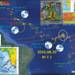
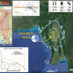
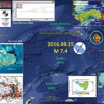
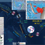
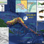
We just had an earthquake in the New Britain region of the equatorial Pacific. Here is the USGS website for this M 6.7 (now M 6.8) earthquake. This is a very interesting earthquake for this region because it is very deep.

Below is my interpretive poster for this earthquake. This map shows the slab contours (an estimate of the subduction zone plate interface). These contours are estimated by Hayes et al., (2012). The hypocentral depth is 499.1 km, which is deeper than the slab depth according to Hayes et al. (2012), which is about 220 km. This earthquake is clearly in one of the downgoing slabs of this region. I include several figures below that present various interpretations of the different oceanic slabs in this region.

I placed a moment tensor / focal mechanism legend on the poster. There is more material from the USGS web sites about moment tensors and focal mechanisms (the beach ball symbols). Both moment tensors and focal mechanisms are solutions to seismologic data that reveal two possible interpretations for fault orientation and sense of motion. One must use other information, like the regional tectonics, to interpret which of the two possibilities is more likely. The moment tensor shows northwest-southeast tension. If this is due to slab tension, then the slab would be dipping to the northwest, or the southeast. This tension may also be due to some form of bending in the slab, but it is difficult to tell given these limited data. Most of the recent seismicity in this region is associated with convergence along the New Britain trench or the South Solomon trench.

    I include some inset figures.

  • In the top of the poster are two figures from Oregon State University, which are based upon Hamilton (1979). “Tectonic microplates of the Melanesian region. Arrows show net plate motion relative to the Australian Plate.” To the right of the map is a cross section showing how the Solomon Sea plate is subducting beneath New Britain. This is from Johnson, 1976.
  • In the lower left corner is another generalized tectonic map of the region from Holm et al., 2015. This map shows the major plate boundary faults including the New Britain trench (NBT), one of the main culprits for recent seismicity of this region.
  • In the upper right corner are two figures from Holm and Richards (2013). The panel on the left shows (a) a plan view of the downgoing slab relative to islands in this region, (b) and (c) oblique views of the downgoing oceanic lithosphere of the Solomon Sea plate. Their paper discusses the back-arc spreading in the Bismarck Sea. They use hypocenter data to construct this 3-D model of the slab. On the right is a forecast of how the slab will be consumed along these subduction zones in the future.
  • In the lower right corner, I include a map that shows the Modified Mercalli Intensity Contours from this earthquake. I include this map further down on this page and have some explanations about what the Modified Mercalli Intensity (MMI) scale is.


  • Here is the localized map that shows the MMI contours. The MMI is a qualitative measure of shaking intensity. More on the MMI scale can be found here and here. This is based upon a computer model estimate of ground motions, different from the “Did You Feel It?” estimate of ground motions that is actually based on real observations.

    I have posted material about the recent and near recent (decadal) seismicity in the past:

  • Here is a post regarding the foreshocks. 2015.05.03
  • Here is a post summarizing the seismicity since 2000 AD. 2015.03.29
  • Here is a post comparing the New Britain region with the adjacent Bougainville region. 2015.03.30
  • This is a map showing the seismicity of this region since 2000 A.D.

  • Earlier, I discussed seismicity from 2000-2015 here. The seismicity on the west of this region appears aligned with north-south shortening along the New Britain trench, while seismicity on the east of this region appears aligned with more east-west shortening. Here is a map that I put together where I show these two tectonic domains with the seismicity from this time period (today’s earthquakes are not plotted on this map, but one may see where they might plot).

  • Here is the generalized tectonic map of the region from Holm et al., 2015. I include the figure caption below as a blockquote.

  • Tectonic setting and mineral deposits of eastern Papua New Guinea and Solomon Islands. The modern arc setting related to formation of the mineral deposits comprises, from west to east, the West Bismarck arc, the New Britain arc, the Tabar-Lihir-Tanga-Feni Chain and the Solomon arc, associated with north-dipping subduction/underthrusting at the Ramu-Markham fault zone, New Britain trench and San Cristobal trench respectively. Arrows denote plate motion direction of the Australian and Pacific plates. Filled triangles denote active subduction. Outlined triangles denote slow or extinct subduction. NBP: North Bismarck plate; SBP: South Bismarck plate; AT: Adelbert Terrane; FT: Finisterre Terrane; RMF: Ramu-Markham fault zone; NBT: New Britain trench.

  • Here is the slab interpretation for the New Britain region from Holm and Richards, 2013. I include the figure caption below as a blockquote.

  • 3-D model of the Solomon slab comprising the subducted Solomon Sea plate, and associated crust of the Woodlark Basin and Australian plate subducted at the New Britain and San Cristobal trenches. Depth is in kilometres; the top surface of the slab is contoured at 20 km intervals from the Earth’s surface (black) to termination of slabrelated seismicity at approximately 550 km depth (light brown). Red line indicates the locations of the Ramu-Markham Fault (RMF)–New Britain trench (NBT)–San Cristobal trench (SCT); other major structures are removed for clarity; NB, New Britain; NI, New Ireland; SI, Solomon Islands; SS, Solomon Sea; TLTF, Tabar–Lihir–Tanga–Feni arc. See text for details.

  • Here are the forward models for the slab in the New Britain region from Holm and Richards, 2013. I include the figure caption below as a blockquote.

  • Forward tectonic reconstruction of progressive arc collision and accretion of New Britain to the Papua New Guinea margin. (a) Schematic forward reconstruction of New Britain relative to Papua New Guinea assuming continued northward motion of the Australian plate and clockwise rotation of the South Bismarck plate. (b) Cross-sections illustrate a conceptual interpretation of collision between New Britain and Papua New Guinea.

  • This map shows plate velocities and euler poles for different blocks. Note the counterclockwise motion of the plate that underlies the Solomon Sea (Baldwin et al., 2012). I include the figure caption below as a blockquote.

  • Tectonic maps of the New Guinea region. (a) Seismicity, volcanoes, and plate motion vectors. Plate motion vectors relative to the Australian plate are surface velocity models based on GPS data, fault slip rates, and earthquake focal mechanisms (UNAVCO, http://jules.unavco.org/Voyager/Earth). Earthquake data are sourced from the International Seismological Center EHB Bulletin (http://www.isc.ac.uk); data represent events from January 1994 through January 2009 with constrained focal depths. Background image is generated from http://www.geomapapp.org. Abbreviations: AB, Arafura Basin; AT, Aure Trough; AyT, Ayu Trough; BA, Banda arc; BSSL, Bismarck Sea seismic lineation; BH, Bird’s Head; BT, Banda Trench; BTFZ, Bewani-Torricelli fault zone; DD, Dayman Dome; DEI, D’Entrecasteaux Islands; FP, Fly Platform; GOP, Gulf of Papua; HP, Huon peninsula; LA, Louisiade Archipelago; LFZ, Lowlands fault zone; MaT, Manus Trench; ML, Mt. Lamington; MT, Mt. Trafalgar; MuT, Mussau Trough; MV, Mt. Victory; MTB, Mamberamo thrust belt; MVF, Managalase Plateau volcanic field; NBT, New Britain Trench; NBA, New Britain arc; NF, Nubara fault; NGT, New Guinea Trench; OJP, Ontong Java Plateau; OSF, Owen Stanley fault zone; PFTB, Papuan fold-and-thrust belt; PP, Papuan peninsula; PRi, Pocklington Rise; PT, Pocklington Trough; RMF, Ramu-Markham fault; SST, South Solomons Trench; SA, Solomon arc; SFZ, Sorong fault zone; ST, Seram Trench; TFZ, Tarera-Aiduna fault zone; TJ, AUS-WDKPAC triple junction; TL, Tasman line; TT, Trobriand Trough;WD, Weber Deep;WB, Woodlark Basin;WFTB, Western (Irian) fold-and-thrust belt; WR,Woodlark Rift; WRi, Woodlark Rise; WTB, Weyland thrust; YFZ, Yapen fault zone.White box indicates the location shown in Figure 3. (b) Map of plates, microplates, and tectonic blocks and elements of the New Guinea region. Tectonic elements modified after Hill & Hall (2003). Abbreviations: ADB, Adelbert block; AOB, April ultramafics; AUS, Australian plate; BHB, Bird’s Head block; CM, Cyclops Mountains; CWB, Cendrawasih block; CAR, Caroline microplate; EMD, Ertsberg Mining District; FA, Finisterre arc; IOB, Irian ophiolite belt; KBB, Kubor & Bena blocks (including Bena Bena terrane); LFTB, Lengguru fold-and-thrust belt; MA, Mapenduma anticline; MB, Mamberamo Basin block; MO, Marum ophiolite belt; MHS, Manus hotspot; NBS, North Bismarck plate; NGH, New Guinea highlands block; NNG, Northern New Guinea block; OKT, Ok Tedi mining district; PAC, Pacific plate; PIC, Porgera intrusive complex; PSP, Philippine Sea plate; PUB, Papuan Ultramafic Belt ophiolite; SB, Sepik Basin block; SDB, Sunda block; SBS, South Bismarck plate; SIB, Solomon Islands block; WP, Wandamen peninsula; WDK, Woodlark microplate; YQ, Yeleme quarries.

  • This figure incorporates cross sections and map views of various parts of the regional tectonics (Baldwin et al., 2012). The New Britain region is in the map near the A and B sections. I include the figure caption below as a blockquote.

  • Oblique block diagram of New Guinea from the northeast with schematic cross sections showing the present-day plate tectonic setting. Digital elevation model was generated from http://www.geomapapp.org. Oceanic crust in tectonic cross sections is shown by thick black-and-white hatched lines, with arrows indicating active subduction; thick gray-and-white hatched lines indicate uncertain former subduction. Continental crust, transitional continental crust, and arc-related crust are shown without pattern. Representative geologic cross sections across parts of slices C and D are marked with transparent red ovals and within slices B and E are shown by dotted lines. (i ) Cross section of the Papuan peninsula and D’Entrecasteaux Islands modified from Little et al. (2011), showing the obducted ophiolite belt due to collision of the Australian (AUS) plate with an arc in the Paleogene, with later Pliocene extension and exhumation to form the D’Entrecasteaux Islands. (ii ) Cross section of the Papuan peninsula after Davies & Jaques (1984) shows the Papuan ophiolite thrust over metamorphic rocks of AUS margin affinity. (iii ) Across the Papuan mainland, the cross section after Crowhurst et al. (1996) shows the obducted Marum ophiolite and complex folding and thrusting due to collision of the Melanesian arc (the Adelbert, Finisterre, and Huon blocks) in the Late Miocene to recent. (iv) Across the Bird’s Head, the cross section after Bailly et al. (2009) illustrates deformation in the Lengguru fold-and-thrust belt as a result of Late Miocene–Early Pliocene northeast-southwest shortening, followed by Late Pliocene–Quaternary extension. Abbreviations as in Figure 2, in addition to NI, New Ireland; SI, Solomon Islands; SS, Solomon Sea; (U)HP, (ultra)high-pressure.

Earthquake Report: Equatorial Mid Atlantic Ridge

Between my trip to southern Oregon for a talk on Cascadia subduction zone earthquake and tsunami hazards and preparing for a talk on the tectonic contribution to sea-level rise, there were two earthquakes. The first one, which I will write about later, was a M 4.5 in northern California. The second earthquake was a M 7.1 along the Romanche fracture zone (RFZ), a transform plate boundary that offsets the Mid Atlantic Ridge (MAR). Here is the USGS webpage for this M 7.1 earthquake.

    There have been a number of M 7 earthquakes in this region in the past century and I have reported on some elsewhere along the MAR. Below are some Earthquake Reports for some of these earthquakes.

  • 2015.02.13 M 7.1
  • 2015.05.24 M 6.3
  • 2015.06.17 M 7.0

Below is my interpretive poster for this M 7.1 earthquake from yesterday morning (my time).

Below is my interpretive map that shows the epicenter, along with the shaking intensity contours. These contours use the Modified Mercalli Intensity (MMI) scale. The MMI is a qualitative measure of shaking intensity. More on the MMI scale can be found here and here. This is based upon a computer model estimate of ground motions, different from the “Did You Feel It?” estimate of ground motions that is actually based on real observations.

I placed a moment tensor / focal mechanism legend on the poster. There is more material from the USGS web sites about moment tensors and focal mechanisms (the beach ball symbols). Both moment tensors and focal mechanisms are solutions to seismologic data that reveal two possible interpretations for fault orientation and sense of motion. One must use other information, like the regional tectonics, to interpret which of the two possibilities is more likely. Based upon the location of this earthquake along the RFZ, I interpret this to have been a right lateral strike-slip earthquake.

    I have included some inset figures.

  • In the upper right corner, I include a map that shows the detailed bathymetry (the shape of the sea floor) for this region from Bonatti et al. (2001). In the lower panel (A) one may observe how the RFZ offsets the MAR. Ages of the oceanic lithosphere is plotted in red letters with 0 Ma (mega annum) at the MAR on the right and 60 Ma just to the west of the MAR on the left. We can calculate the slip-rate on the RFZ by using these age data and the distance that the MAR has been offset. Note the scale in the lower right corner.
  • To the left of the Bonatti et al. (2001) map is a map that shows the age of the oceanic crust in Million Years B.P. (before present). The MAR is highlighted because it is of about zero age, so is shown as red (Müller et al., 2008).
  • In the lower left corner is a map that shows a revised interpretation of the timing and orientations of the initial breakup and formation of the MAR and the Atlantic Ocean from Torsvik et al. (2009)


  • Here is the Bonatti et al. (2001) figure from the interpretive poster above. I include the figure caption as a blockquote below.

  • A: Multibeam topography of Romanche region, showing north-south profiles where sampling was carried out. Black dots and red numbers indicate estimated age (in million years) of lithosphere south of Romanche Transform, assuming spreading half-rate of 17 mm/yr within present-day ridge and transform geometry. White dots indicate epicenters of teleseismically recorded 1970–1995 events (magnitude . 4). FZ is fracture zone. B: Topography and petrology at eastern intersection of Romanche Fracture Zone with Mid-Atlantic Ridge. Data were obtained during expeditions S-16, S-19, and G-96 (Bonatti et al., 1994, 1996). C: Location of A along Mid-Atlantic Ridge.

  • Here is the Müller et al. (2008) figure from the interpretive poster above.

  • Here is the Torsvik et al. (2009) figure from the interpretive poster above. I include the figure caption as a blockquote below.

  • General structural map of the South Atlantic Ocean draped on topographic/bathymetric map from GTOPO 30. Boundaries between the four segments (Equatorial, Central, South and Falkland) are shown by dotted lines (RFZ, Romanche Fracture Zone; FFZ, Florianopolis Fracture Zone; AFFZ, Agulhas– Falkland Fracture Zone). Aptian salt basins (orange), LIPs (P, Parana; E, Etendeka; Karroo, Sierra Leone Rise and Agulhas), Seaward Dipping Reflectors (SDRs, white) and active hotspots (F, Fernando; C, Cameroon; Tr, Trinidade; Sh, St Helena; T, Tristan; V, Vema; B, Bouvet (Meteor) are also shown. Of these hotspots, only Tristan (responsible for the Parana-Etendeka LIP and Rio Grande Rise–Walvis Ridge) is classically considered as a deep plume in the literature (see Torsvik et al. 2006). However, Bouvet (Meteor) possibly responsible for Agulhas, and Maud Rise (East Antarctica) and Madagascar Ridge volcanism could possibly also have a deep plume origin (Section 6). PG, Ponta Grossa Dyke System; PA, Paraguay Dyke system; FI, Falkland Islands.

Here are a couple Earthquake Report interpretive posters for earthquakes from the past couple of years.

Here is a map that shows the 2015.06.17 Mw 7.0 earthquake, as well as the 2015.05.24 M = 6.3 earthquake (which has a compressional moment tensor). This occurred along an unnamed fracture zone.


Here is a map that shows the fracture zones and recent (2015) seismicity to the north of the M 6.3 earthquake.


Earthquake Report: Burma!

Well, there was an earthquake about 6 hours ago in Burma. This M 6.8 earthquake was rather deep, which is good for the residents of that area (the ground motions diminish with distance from the earthquake hypocenter). Here is the USGS website for this earthquake. This M 6.8 earthquake is possibly soled in the convergent plate boundary thrust fault at the base of the Indo-Burmese Wedge (see maps below). While this M 6.8 earthquake probably won’t result in a large number of casualties, there are reports of damage to buildings and temples. Some live updates on damage in this area are posted here.

Below is my interpretive map that shows the epicenter, along with the shaking intensity contours. These contours use the Modified Mercalli Intensity (MMI) scale. The MMI is a qualitative measure of shaking intensity. More on the MMI scale can be found here and here. This is based upon a computer model estimate of ground motions, different from the “Did You Feel It?” estimate of ground motions that is actually based on real observations.

I placed a moment tensor / focal mechanism legend on the poster. There is more material from the USGS web sites about moment tensors and focal mechanisms (the beach ball symbols). Both moment tensors and focal mechanisms are solutions to seismologic data that reveal two possible interpretations for fault orientation and sense of motion. One must use other information, like the regional tectonics, to interpret which of the two possibilities is more likely.


    I include some inset figures and maps. I also post some of these figures below, along with their original figure captions.

  • In the upper right corner I include the Rapid Assessment of an Earthquake’s Impact (PAGER) report. More on the PAGER program can be found here. An explanation of a PAGER report can be found here. PAGER reports are modeled estimates of damage. On the top is a histogram showing estimated casualties and on the right is an estimate of possible economic losses. This PAGER report suggests that there will be quite a bit of damage from this earthquake (and casualties).
  • In the lower right corner, is a map from Maurin and Rangin (2009) that shows the regional tectonics at a larger scale.
  • In the lower left corner is a map that shows an estimate of the ground motions from a hypothetical earthquake of this magnitude in this location. This shows the shaking intensity and uses the MMI scale mentioned above. The plot to the right shows the reported MMI intensity data as they relate to two plots of modeled estimates (the orange and green lines). These green dots are from the USGS “Did You Feel It?” reports compared to the estimates of ground shaking from Ground Motion Prediction Equation (GMPE) estimates. The relations between ground shaking and distance to an earthquake are also known as attenuation relations as the ground motions diminish (get attenuated) with distance from the earthquake.
  • In the upper left corner is a map from Wang et al. (2014) that shows even more details about the faulting in the Indo-Burmese Wedge (IBW) shown in the Maurin and Rangin (2009) map. To the right of this map is a cross section (c-c’ shown on the map) that shows an east-west transect of earthquake hypocenters (Wang et al., 2014).

Here is the Curray (2005) plate tectonic map.


Here is a map from Maurin and Rangin (2009) that shows the regional tectonics at a larger scale. They show how the Burma and Sunda plates are configured, along with the major plate boundary faults and tectonic features (ninetyeast ridge). The plate motion vectors for India vs Sunda (I/S) and India vs Burma (I/B) are shown in the middle of the map. Note the Sunda trench is a subduction zone, and the IBW is also a zone of convergence. There is still some debate about the sense of motion of the plate boundary between these two systems. This map shows it as strike slip, though there is evidence that this region slipped as a subduction zone (not strike-slip) during the 2004 Sumatra-Andaman subduction zone earthquake. I include their figure caption as a blockquote below.


Structural fabric of the Bay of Bengal with its present kinematic setting. Shaded background is the gravity map from Sandwell and Smith [1997]. Fractures and magnetic anomalies in black color are from Desa et al.[2006]. Dashed black lines are inferred oceanic fracture zones which directions are deduced from Desa et al. in the Bay of Bengal and from the gravity map east of the 90E Ridge. We have flagged particularly the 90E and the 85E ridges (thick black lines). Gray arrow shows the Indo-Burmese Wedge (indicated as a white and blue hatched area) growth direction discussed in this paper. For kinematics, black arrows show the motion of the India Plate with respect to the Burma Plate and to the Sunda Plate (I/B and I/S, respectively). The Eurasia, Burma, and Sunda plates are represented in green, blue, and red, respectively.

Wang et al. (2014) also have a very detailed map showing historic earthquakes along the major fault systems in this region. They also interpret the plate boundary into different sections, with different ratios of convergence:shear. I include their figure caption as a blockquote below.


Simplified neotectonic map of the Myanmar region. Black lines encompass the six neotectonic domains that we have defined. Green and Yellow dots show epicenters of the major twentieth century earthquakes (source: Engdahl and Villasenor [2002]). Green and yellow beach balls are focal mechanisms of significant modern earthquakes (source: GCMT database since 1976). Pink arrows show the relative plate motion between the Indian and Burma plates modified from several plate motion models [Kreemer et al., 2003a; Socquet et al., 2006; DeMets et al., 2010]. The major faults west of the eastern Himalayan syntax are adapted from Leloup et al. [1995] and Tapponnier et al. [2001]. Yellow triangle shows the uncertainty of Indian-Burma plate-motion direction.

Here is a map from Wang et al. (2014) that shows even more details about the faulting in the IBW. Today’s fault occurred nearby the CMf label. I include their figure caption as a blockquote below. Wang et al. (2014) found evidence for active faulting in the form of shutter ridges and an offset alluvial fan. Shutter ridges are mountain ridges that get offset during a strike-slip earthquake and look like window shutters. This geologic evidence is consistent with the moment tensor from today’s earthquake. There is a cross section (C-C’) that is plotted at about 22 degrees North (we can compare this with the Maurin and Rangin (2009) cross section if we like).


Figure 6. (a) Active faults and anticlines of the Dhaka domain superimposed on SRTM topography. Most of the active anticlines lie within 120 km of the deformation front. Red lines are structures that we interpret to be active. Black lines are structures that we consider to be inactive. CT = Comilla Tract. White boxes contain the dates and magnitudes of earthquakes mentioned in the text. CMf = Churachandpur-Mao fault; SM = St. Martin’s island antilcline; Da = Dakshin Nila anticline; M= Maheshkhali anticline; J = Jaldi anticline; P = Patiya anticline; Si = Sitakund anticline; SW= Sandwip anticline; L = Lalmai anticline; H = Habiganj anticline; R = Rashidpur anticline; F = Fenchunganj anticline; Ha = Hararganj anticline; Pa = Patharia anticline. (b) Profile from SRTM topography of Sandwip Island.

Here is the Wang et al. (2014) cross section. I include their figure caption as a blockquote below.


Schematic cross sections through two domains of the northern Sunda megathrust show the geometry of the megathrust and hanging wall structures. Symbols as in Figure 18. (a) The megathrust along the Dhaka domain dips very shallowly and has secondary active thrust faults within 120 km of the deformation front. See Figures 2 and 6 for profile location.

Here is a different cross section that shows how they interpret this plate boundary to have an oblique sense of motion (it is a subduction zone with some strike slip motion). Typically, these different senses of motion would be partitioned into different fault systems (read about forearc sliver faults, like the Sumatra fault. I mention this in my report about the earthquakes in the Andaman Sea from 2015.07.02). This cross section is further to the south than the one on the interpretation map above. I include their figure caption as a blockquote below.


Present cross section based on industrial multichannel seismics and field observations. The seismicity from USGS catalog and Engdahl [2002] is represented as black dots. Focal mechanisms from Global CMT (http://www.globalcmt.org/CMTsearch.html) catalog are also represented.

    For the January 2016 earthquake, Jascha Polet made these two figures:

  • Here is a cross section that shows seismicity for this region. The earthquakes are plotted as focal mechanisms. This comes from Jacha Polet, Professor of Geophysics at Cal Poly Pomona.

  • Here is a map showing the seismicity and focal mechanisms, also from Jacha Polet.

Earthquake Report: Italy

There was a M 6.2 earthquake in Italy tonight. Here is the USGS website for today’s earthquake. There is lots of information about the tectonics of this region. I can hardly do justice to all the people who have worked here. It seems like every route I take for more information, I get 10 more publications.
This earthquake is north of the region that had an M 6.3 earthquake in 2009 that led to an interesting (putting it nicely) interaction between scientists, public employees/politicians, and the legal system. Basically, several seismologists were sentenced to prison. More on this is found online, for example, here and here.
Below is my interpretive map that shows the epicenter, along with the shaking intensity contours. These contours use the Modified Mercalli Intensity (MMI) scale. The MMI is a qualitative measure of shaking intensity. More on the MMI scale can be found here and here. This is based upon a computer model estimate of ground motions, different from the “Did You Feel It?” estimate of ground motions that is actually based on real observations.
I placed a moment tensor / focal mechanism legend on the poster. There is more material from the USGS web sites about moment tensors and focal mechanisms (the beach ball symbols). Both moment tensors and focal mechanisms are solutions to seismologic data that reveal two possible interpretations for fault orientation and sense of motion. One must use other information, like the regional tectonics, to interpret which of the two possibilities is more likely. The tectonics of this region has many normal (extensional) faults, which explain the extensional moment tensor. However, I do not know enough of this region to interpret is this is an east or west dipping fault that ruptured (depends upon which side of which basin experience this earthquake; see below).

    I include some inset figures and maps.

  • In the upper right corner I include the Rapid Assessment of an Earthquake’s Impact (PAGER) report. More on the PAGER program can be found here. An explanation of a PAGER report can be found here. PAGER reports are modeled estimates of damage. On the top is a histogram showing estimated casualties and on the right is an estimate of possible economic losses. This PAGER report suggests that there will be quite a bit of damage from this earthquake (and casualties).
  • Below that I show the USGS plot of “Did You Feel It?” reports compared to the estimates of ground shaking from Ground Motion Prediction Equation (GMPE) estimates. The relations between ground shaking and distance to an earthquake are also known as attenuation relations as the ground motions diminish (get attenuated) with distance from the earthquake.
  • To the left of the PAGER report I include a basic tectonic map of this region. Maps with local (larger) scale have much more detailed views of the faulting.
  • In the lower left corner is a map showing a series of earthquake swarms that occurred between 1916 and 1920, rupturing across the Apennines in northern Italy. This is just to the north of tonight’s M 6.2 earthquake. It is interesting as Baize posted on twitter some accounts of this earthquake series on twitter yesterday. There is another map showing greater detail of the 1916 swarm.


I also plot a moment tensor from an earthquake in the western Mediterranean from 2016.01.24 in the above map. Here is my Earthquake Report for that seismicity and below is the map from that report.


In late 2015 (2015.11.17) there was a M 6.5 earthquake along a fault related to the terminus of the North Anatolian fault system in western Greece. Here is my earthquake report for that seismicity and below is my map from that report. Below this first map is another map that shows some aftershocks.


Here is an updated map that shows a couple more aftershocks, at a large (local) scale. I have included the moment tensors for the two largest aftershocks.


For more on the graphical representation of moment tensors and focal mechanisms, check this IRIS video out:

    Here are some observations made by others.

  • Susan Hough (USGS) asked people tonight what they thought about explaining why the “DYFI” reports seemed too small compared to the GMPE model predictions. So far, I am unsatisfied with the answers. Looking at the plot from the 2009 M 6.3 earthquake, the region’s low population density would not appear to explain this discrepancy. Perhaps it is because today’s earthquake happened at night time, so maybe people have not yet reported yet. Below I include these GMPE/DYFI plots for both 2016.08.24 M 6.2 and 2009.04.06 M 6.3 earthquakes. Interesting that the DYFI reports for the 2009 earthquake also have higher MMI values, in general, than the 2016 earthquake. The difference between a M 6.2 and > 6.3 earthquake is about 3 times (a M 6.3 releases about 3 times as much energy as a M 6.2 earthquake), but these maps seem much more different than that. I plot the DYFI maps below the attenuation plots.
  • 2016.08.24

  • 2009.04.06

  • 2016.08.24

  • 2009.04.06

  • David Schwartz (USGS) noted that tonight’s earthquake is “between the 1997 Assisi aftershock zone and the north end of the 2009 l’aquila rupture” and may be a “foreshock to a 1915-like Fucino rupture.” So we need to look at these two earthquakes to learn more about what Schwartz is talking about. Here is a web post about an INQUA workshop held in “Pescina, to commemorate the centenary of the 13/1/1915 M7 Fucino Earthquake.” This was posted by Stephanie Baize who is also on twitter. Follow him to learn more about tonight’s earthquake. There is a great paper that discusses the 1915 earthquake sequence that Schwartz was talking about here (Galadini and Galli, 1999). A more recent paper also discusses the faulting in this region (Palumbo et al., 2004).
    Here are some other maps that might help. (well, one so far)

  • This Billi et al. (2006) map shows some of these west dipping normal faults in central Italy, just south of the Apennines.

  • There are some excellent maps and figures from a study from 2004 (Boncio et al, 2004). This material was posted on twitter here.

Earthquake Report: Japan!

There continue to be earthquakes probably related to the 2011.03.11 Tohoku-Oki M 9.0 earthquake (the 4th largest earthquake recorded on modern seismologic instruments). Here are two excellent summary Earthquake Report pages associated with this region: The original Earthquake Report for the M 9.0 earthquake with some great animations!. A page where I present slip models, coulomb stress models, and aftershock location maps.

    Here are the USGS websites for the larger earthquakes plotted in my interpretive poster below.

  • 2016.08.20 09:01:26 UTC M 6.0
  • 2016.08.20 15:58:04 UTC M 6.0
  • 2016.08.20 16:10:34 UTC M 5.3
  • 2016.08.20 16:28:11 UTC M 5.3
    Here are some Earthquake Reports for seismicity associated with the M 9.0 Tohoku-Oki earthquake.

  • 2011.03.11 M 9.0 Japan (Tohoku-Oki)
  • 2013.10.25 M 7.1 Japan (Honshu)
  • 2015.02.16 M 6.7 Japan (Sanriku Coast)
  • 2015.02.16 M 6.7 Japan (Sanriku Coast Update #1)
  • 2015.02.16 M 6.7 Japan (Sanriku Coast Update #2)
  • 2015.02.20 M 6.7 Japan (Sanriku Coast Update #3)
  • 2015.02.21 M 6.7 Japan (Sanriku Coast Update #4)
  • 2015.02.25 M 6.3 Japan (Sanriku Coast Update #5)

Here is my interpretive map that shows the epicenter, along with the shaking intensity contours. These contours use the Modified Mercalli Intensity (MMI) scale. The MMI is a qualitative measure of shaking intensity. More on the MMI scale can be found here and here. This is based upon a computer model estimate of ground motions, different from the “Did You Feel It?” estimate of ground motions that is actually based on real observations.
I placed a moment tensor / focal mechanism legend on the poster. There is more material from the USGS web sites about moment tensors and focal mechanisms (the beach ball symbols). Both moment tensors and focal mechanisms are solutions to seismologic data that reveal two possible interpretations for fault orientation and sense of motion. One must use other information, like the regional tectonics, to interpret which of the two possibilities is more likely.

    I include some inset figures and maps.

  • In the upper right corner I include a map that shows seismicity before and after the M 9.0 Tohoku-Oki earthquake. Ammon et al. (2011) invert teleseismic P waves and broadband Raleigh waves with high-rate GPS data to constrain their slip model. Slip magnitude in meters is represented by shades of red. They also plot the source time function plot. Source time function plots show us the amount of energy that is released during an earthquake and how that energy release varies with time.
  • In the lower right corner I include a map that shows the seismicity in the region before and after the M 9.0 earthquake (Gusman et al., 2012).
  • In the lower left corner I include two figures from Ikuta et al. (2012). The upper panel shows how the 2011 slip region compares to slip from previous M 7 class earthquakes. The lower panel shows the slip deficit for this part of the subduction zone. Basically, this is a way of viewing how much plate convergence might be expected to contribute to earthquake slip over time.
  • In the upper left corner I include a figure from Lay et al. (2011) that shows the coulomb stress changes due to the 2011 earthquake. Basically, this shows which locations on the fault where we might expect higher likelihoods of future earthquake slip.


Here is a map (from this Earthquake Report page) showing the three largest magnitude earthquakes in this recent seismic swarm. Check out my previous post here to see other slip models, estimates of stress change due to the 2011 March 11 Tohoku-Oki earthquake, and how these relate to historic slip models.

    Below are some of the insets as individual figures. I include their original figure captions.

  • Here is a figure showing seismicity in the region of the Tohoku-Oki earthquake, the source time function of the M 9.0 earthquake, and their slip model (Ammon et al., 2011). There are dozens of slip models for the M 9.0 earthquake and they are all non unique. I include their figure caption below as a blockquote.

  • Map showing foreshocks, aftershocks, MORVEL model plate motions, rupture-model slip contours, and the locations of hrGPS stations (inverted triangles) used in to construct the model. Focal mechanisms are shown at the GCMT centroid.

  • Here is another map showing the seismicity associated with the Tohoku-Oki earthquake (Gusman et al., 2012). I include their figure caption below as a blockquote.

  • Map of the 2011 Tohoku earthquake. Red star represents the epicenter of the mainshock, rectangles represent the subfaults, gray circles represent fore-shocks and purple circles represent aftershocks and extensional faulting events in the outer-rise.

  • Here is a plot that shows how the 2011 slip region compares to slip from previous M 7 class earthquakes (Ikuta et al., 2012). Ikuta et al. (2012) discuss how regions surrounding the higher slip during the M 9.0 Tohoku-Oki earthquake had experienced smaller earthquakes that consumed some of the plate motion strain, thereby owing to the lower slip in those regions during the M 9.0 earthquake. These are also regions that have increased coulomb stress and increased seismicity following the 2011.03.11 earthquake. I include their figure caption below as a blockquote.

  • Co-seismic slip of the 2011 Tohoku-Oki earthquake and previous M 7-class earthquakes around the source region. (a) Co-seismic slip distribution of the 2011 Tohoku-Oki earthquake (blue intensity scale, as in Figure 2); the area with slip greater than 10 m is enclosed by a white line. The two stars show the locations of the main shock and the largest after-shock (March 11, 2011). The asperity distribution for M7-class earthquakes occurring in the past 80 years is shown by colored contours (after Murotani et al. [2004], Yamanaka and Kikuchi [2004], and Y. Yamanaka (NGY Seismology Notebook, http:// www.seis.nagoya-u.ac.jp/sanchu/Seismo_Note, last updated April 11, 2011)). The contour for each asperity encloses the areas in which the slip is greater than half of the maximum slip. (b) Cumulative seismic slip distribution along the trench for the earthquakes shown in Figure 10a. The total length of each arrow represents the maximum slip of the event, and the body length of each arrow represents the average slip. Modified after Figure 12b in Yamanaka and Kikuchi [2004], with the addition of the R4 region (data for the earthquakes in 1938 and 1982 are from Murotani et al. [2004] and Mochizuki et al. [2008], respectively) and new earthquakes (Y. Yamanaka, NGY Seismology Notebook, http://www.seis.nagoya-u.ac. jp/sanchu/Seismo_Note, last updated April 11, 2011). Slips on spatially overlapping asperities are accumulated. It is known that at least three more M7-class earthquakes have occurred since 1930 around the focal area of the southernmost 1982 earthquake (in 1943, 1961, and 1965). Vertical dotted line shows the slip expected with slip-deficit accumulation over 80 years.

  • Here is a plot showing how the low seismic coupling in the regions surrounding the high slip from the M 9.0 earthquake affect the slip deficit. Basically, this is a way of viewing how much plate convergence might be expected to contribute to earthquake slip over time. In this case, we see how the smaller earthquakes took up some of the slip adjacent to the 2011 slip patch (think about where today’s swarm took place compared to the region that slipped in 2011). I include their figure caption below as a blockquote.

  • Schematic illustration of apparent low seismic coupling and small effective slip deficit controlled by a persistent strong asperity that ruptured to produce a M9-class earthquake. The vertical axis represents the subduction rate and the horizontal axis represents the distance from the strong asperity. The accumulation rate of the slip deficit is shown by the solid curve. Apparent seismic coupling before the M9-class earthquake is represented by the ratio of the co-seismic slip (length of the gray arrows) to the subduction rate. The seismic coupling, as monitored by the occurrence of M7-class earthquakes, is low in areas close to the strong asperity. When the persistent strong asperity slips, the remaining slip deficit (gray area) is released. Note that this figure does not show the accumulated slip deficit; instead, it shows the relative contributions of strong and weak asperities to the accumulation rate of the slip deficit.

  • Here is a figure that shows the coulomb stress changes due to the 2011 earthquake. Basically, this shows which locations on the fault where we might expect higher likelihoods of future earthquake slip. Note how many of the aftershocks, including today’s earthquake, are in the region of increased coulomb stress. I include their figure caption below as a blockquote.

  • Maps of the Coulomb stress change predicted for the joint P wave, Rayleigh wave and continuous GPS inversion in Fig. 2. The margins of the latter fault model are indicated by the box. Two weeks of aftershock locations from the U.S. Geological Survey are superimposed, with symbol sizes scaled relative to seismic magnitude. (a) The Coulomb stress change averaged over depths of 10–15 km for normal faults with the same westward dipping fault plane geometry as the Mw 7.7 outer rise aftershock, for which the global centroid moment tensor mechanism is shown. (b) Similar stress changes for thrust faults with the same geometry as the mainshock, along with the Mw 7.9 thrusting aftershock to the south, for which the global centroid moment tensor is shown.

  • Here is a figure schematically showing how subduction zone earthquakes may increase coulomb stress along the outer rise. The outer rise is a region of the downgoing/subducting plate that is flexing upwards. There are commonly normal faults, sometimes reactivating fracture zone/strike-slip faults, caused by extension along the upper oceanic lithosphere. We call these bending moment normal faults. There was a M 7.1 earthquake on 2013.10.25 that appears to be along one of these faults. I include their figure caption below as a blockquote.

  • Schematic cross-sections of the A) Sanriku-oki, B) Kuril and C) Miyagi-oki subduction zones where great interplate thrust events have been followed by great trench slope or outer rise extensional events (in the first two cases) and concern about that happening in the case of the 2011 event.

    Here are some animations from the ARIA Project at Caltech/JPL. These document geodetic motion during the Tohoku-Oki Earthquake.

    Beginning with a description of the animations in blockquote.

    We show 2 videos on Japan’s movement over the 35 minutes following the initiation of the Tohoku-Oki (M 9.0). These images are made possible because of the density of GPS stations in Japan (about 1200 GPS stations, or a GPS station every ~30 km). The preliminary GPS displacement data that these animations are based on are provided by the ARIA team at JPL and Caltech. All Original GEONET RINEX data provided to Caltech by the Geospatial Information Authority (GSI) of Japan.

  • a) ARIA_GPSDisplacement:
  • This animation shows the cumulative displacements of the GPS stations relative to their position before the M9.0 Tohoku-Oki earthquake. The colors show the magnitude of displacement and the arrows indicate direction. We observe 2 kinds of motions, a permanent deformation in the vicinity of the earthquake (first red star) intermediately followed by a perturbation that travels about ~4 km/sec which are the surface waves generated by the earthquake.

  • Here is the file for direct download. (18 MB mp4)
  • b) ARIA_GPSvelocity:
  • This animation shows the estimated instantaneous velocities of the GPS stations. In this view, we only observe the transient motion caused by the earthquake. The first waves to propagate from the mainshock (red star) are the body waves (P and S) but they can be barely seen (look for a slight purple perturbation). These are followed by the surface waves (Love and Rayleigh) propagating as 2 orange-red stripes, as surface waves generate larger velocities at the surface than the body waves. At about 25 minutes there is a subtle signal from seismic waves generated by a small aftershock in northern Japan. At around 30 minutes we observe the seismic waves from a M7.9 aftershock (smaller red star), the largest aftershock to date. Since this event is about 30 times smaller than the mainshock, the P and S waves from this earthquake are too small to be detected with these rapid GPS solutions, but we can observe the surface waves. The small patches of color that appear randomly across Japan show the noise level of the measurements and are not related to any significant ground motion.

  • Here is the file for direct download. (6 MB mp4)
  • b) ARIA_GPSDisplacement_composite:
  • Here is the file for direct download. (6 MB mp4)
  • Here are some maps that are static results displayed in the above animations.
  • Coseismic Horizontal:

  • Coseismic Vertical:

Here is the usgs map for the region:

M7.3 Honshu

Earthquake Report: Scotia plate (S. Atlantic)

There was a large thrust earthquake along the Scotia plate today. Here is the USGS website for this M 7.4 earthquake. This is a very interesting region of the world with a very cool history.

There is an east verging (dips to the west) subduction zone where the South America plate subducts beneath the Sandwich plate (mmmmm, sandwiches). The USGS convergence rate shown on Google Earth is 7.8 cm/yr (for reference, this is about twice that of the Cascadia subduction zone). There is a volcanic arc associated with this subduction zone (the Islands west of the Scotia subduction zone). To the east, there is a spreading ridge that separates the Sandwich and Scotia plates. On the northern and southern boundaries of the Scotia plate are left-lateral strike-slip plate boundary transform faults. In the past several years, there have been earthquakes in most of these regions. I list some of these below.

Here is my interpretive map that shows the epicenter, along with the shaking intensity contours. These contours use the Modified Mercalli Intensity (MMI) scale. The MMI is a qualitative measure of shaking intensity. More on the MMI scale can be found here and here. This is based upon a computer model estimate of ground motions, different from the “Did You Feel It?” estimate of ground motions that is actually based on real observations.

I placed a moment tensor / focal mechanism legend on the poster. There is more material from the USGS web sites about moment tensors and focal mechanisms (the beach ball symbols). Both moment tensors and focal mechanisms are solutions to seismologic data that reveal two possible interpretations for fault orientation and sense of motion. One must use other information, like the regional tectonics, to interpret which of the two possibilities is more likely. This is an earthquake that occurred along a northwest striking thrust or reverse fault. The fault may be dipping in the northeast or southwest direction. My guess, based upon the orientation of the subduction zone, that this fault is dipping in the southwest direction. However, it could be antithetic to the megathrust (a back thrust), so we cannot be sure without more information or analyses.

    I include some inset figures and maps.

  • In the lower left corner, there are two figures from Civile et al. (2012). The upper panel is a map of the region that shows different geographical names and locations labeled upon a basemap that displays water depth (bathymetry) as different shades of blue (darker blue = deeper). The lower panel uses a basemap with generalized elevation as gray scale, but with historic seismicity plotted as dots with colors representing depth.
  • To the right of the moment tensor legend is a plot of water surface elevation observations from a tide gage as reported by NOAA (Stu Weinstein).
  • In the lower right corner there is a map that shows the tectonics of this region (Nerlich et al., 2013). There are colored lines with red in the middle that turns into yellow and then green. These colors represent the age of the lithospere (red = youngest). The red regions are generally associated with spreading ridges, where oceanic lithosphere is created (I love making statements about creation in an earthquake report).
  • To the left of that is the fault plane solution from the USGS (see link to the USGS site above to find out more about this solution). The USGS uses seismic wave data and estimates of the fault location to iteratively estimate the magnitude and spatial distribution of slip along the fault. Color represents the magnitude and there are vectors that represent the direction (also magnitude) of the slip during this earthquake. This is just an estimate.
  • In the upper right corner is a figure from Nerlich et al. (2013) that shows their interpretation of the tectonic evolution of this region. I show this figure below and include their figure caption as a blockquote.
  • To the left of that is a map that shows an estimate of plate age as calculated/modeled by Nerlich et al. (2013). Red colors represent the youngest lithosphere and green colors represent older lithosphere.


    Here are some of the figures included in my interpretive poster above.

  • Here is the physiographic map and the map that shows historic seismicity. Note how the earthquakes get deeper from east to west along the Scotia subduction zone (as the South America plate subducts westward beneath the Sandwich plate, the megathrust fault gets deeper. The Civile et al. (2012) paper is particularly relevant to the strike-slip faults on the southern boundary of the Scotia plate. I include their figure caption below as a blockquote.

  • (top panel) Physiographic map of the Scotia Arc, with the main geological provinces discussed in the text. Bathymetric contours from satellite-derived data (Smith and Sandwell, 1997). Box shows the present-day plate tectonic sketch for the Scotia Sea and surrounding regions. NSR, North Scotia Ridge; SSR, South Scotia Ridge; ESR, East Scotia Ridge; SFZ, Shackleton Fracture Zone; BD, Bruce Deep; SSP, South Shetland plate; sSP, South Sandwich plate. (bottom panel) Distribution of earthquakes in the Scotia Arc region. Epicenters and focal depths are obtained from EHB Bulletin (Engdahl et al., 1998). EHB shallow (red), intermediate (orange and yellow), and deep (blue), earthquakes are shown as circles. Smaller black circles represent earthquakes located by ISC (http://www.isc.ac.uk).

  • The tectonic setting for this region from Nerlich et al. (2013). I include their figure caption below as a blockquote.

  • View of Scotia Sea consisting of the Scotia and Sandwich plates, located in between the Antarctic Peninsula and South America (see also insert map, where the red dot indicates the center of the top view map). The region is framed by transform boundaries in the north (North Scotia Ridge (NSR)), south (South Scotia Ridge (SSR)), west (Shackelton Fracture Zone (SFZ)), and the South Sandwich subduction zone (SSSZ) in the east. Other features are Shag Rocks (SR), South Georgia (SG), and the South Orkney Microcontinent (SOM). Flowlines displaying motion paths of different continental fragments are shown in green. Active spreading (East Scotia Ridge (ESR)) exists in the East Scotia Sea. Extinct spreading ridges are found in theWest Scotia Sea (West Scotia Ridge (WSR)), Central Scotia Sea (Central Scotia Ridge (CSR) which remains controversial; see Subsection 2.2) and in the Protector (Pro), Dove (Dov), and Discovery Basins (Dis), respectively, which are bounded by presumably — as some discussion on their origin persists — South American continental fragments (Terror Rise (TR), Pirie Bank (PB), Discovery Bank (DB)). Extinct ridges are also found on the boundary between the Antarctic plate and former Phoenix plate as well as in the Powell Basin (Pow). Location of the dredge sample with Pacific mantle type signature (Pearce et al., 2001) [see discussion] is marked by a triangle.

  • Here is the kinematic tectonic reconstruction from Nerlich et al. (2013). The panel begins in the upper left at 50 million years ago. I include their figure caption below as a blockquote.

  • Tectonic reconstructions corresponding to 50 (a), 41 (b), 32 (c), 21 (d), 7 (e) and 0 Ma (f); labels as in Fig. 1; present-day bathymetry is shown (i.e. no age-masking). White/grey arrows indicate active/inactive spreading. 50 Ma ago, South America and Antarctica are connected by a coherent bridge of continental fragments. At 41 Ma, separation between South America and Antarctica and subduction behind Discovery Bank and South Georgia has started, as suggested by Barker (2001). Protector Basin has opened. 32 Ma ago, active spreading occurs along the West Scotia Ridge but has ceased in Dove Basin. At 21 Ma, further subduction behind Discovery Bank leads to opening of Discovery Basin. Moreover, subduction behind South Georgia is about to cause back-arc spreading in the Central Scotia Sea. Powell Basin is already fully open, placing the South Orkney Microcontinent to its present position relative to Antarctica. Seafloor spreading lasts along the West Scotia Ridge. 7 Ma ago spreading occurs along the West and East Scotia Ridges and ceases along the Central Scotia Ridge.

  • Nerlich et al. (2013) used asthenospheric flow estimates, their kinematic history model, and a dynamic topography deconvoloution method (using 4DPlates; Clark et al., 2012) to model the age of the oceanic lithosphere in this region. I include their figure caption below as a blockquote.

  • Synthetic age-grid based on the reconstruction model as shown in Fig. 2.

Earthquake Report: Australia!

Yesterday there was an earthquake in northeastern Australia. Here is the USGS website for this M 5.7 earthquake.

This earthquake occurred in a region that also experienced a similar magnitude earthquake in 2011. Here is the USGS website for that M 5.0 earthquake. More can be found about the larger earthquakes that have occurred in Australia here.

Here is my interpretive map that shows the epicenter, along with the shaking intensity contours. These contours use the Modified Mercalli Intensity (MMI) scale. The MMI is a qualitative measure of shaking intensity. More on the MMI scale can be found here and here. This is based upon a computer model estimate of ground motions, different from the “Did You Feel It?” estimate of ground motions that is actually based on real observations.

I placed a moment tensor / focal mechanism legend on the poster. There is more material from the USGS web sites about moment tensors and focal mechanisms (the beach ball symbols). Both moment tensors and focal mechanisms are solutions to seismologic data that reveal two possible interpretations for fault orientation and sense of motion. One must use other information, like the regional tectonics, to interpret which of the two possibilities is more likely. There are some faults in the region that are northeast striking, so this slightly favors an interpretation of a right-lateral (dextral) strike-slip earthquake.

    I include some inset figures and maps.

  • In the upper right corner is a figure from Matthews et al. (2011) showing the felt region from the 2011.04.16 earthquake near Bowen, AU.
  • To the left of that is a figure that shows the geology, faults, and seismicity in Australia. This map is from Australian Government Geoscience Australia (AGSO).
  • In the lower right corner is a map of the seismic hazard in Australia from 1991 (so it is dated). There is an updated version of this map here, with an online interface here. However, this region of AU still has a low seismic hazard.
  • In the lower left corner is the Rapid Assessment of an Earthquake’s Impact (PAGER) report. More on the PAGER program can be found here. An explanation of a PAGER report can be found here. PAGER reports are modeled estimates of damage. On the top is a histogram showing estimated casualties and on the right is an estimate of possible economic losses.
  • In the upper left corner is a plot of seismicity from the Queensland University Advanced Centre for Earthquake Studies (QUAKES).


Here is more on the 2011.04.16 M 5.0 Earthquake. First the figure and then below is a description from AGSO in blockquote.


On Saturday, 16 April 2011, a magnitude 5.3 earthquake occurred at 3:31pm local time, located 50km west of Bowen in central Queensland, near Mount Abbot. The event was widely felt along the Queensland coast, including Cairns about 400km from the epicentre, and further west in Hughenden about 370km away. Local residents experienced significant ground-shaking, with a maximum intensity of MMI V experienced in Ravenswood and Bowen with reports of slight damage in Guthalungra and Bowen. A focal mechanism produced for the main shock indicates that movement was predominantly strike slip. Four temporary seismic stations were installed around the epicentre, recording over 300 small aftershocks in the six weeks following the main shock. Five aftershocks ranging in magnitude from ML 3.2 to 4.1 were recorded on 16, 17 and 19 April. The Bowen earthquake was the largest recorded in the region since a magnitude 5.7 earthquake occurred north of Ravenswood (about 80km west of Mount Abbot) in December 1913

Earthquake Report: New Hebrides / Tonga Update #2

I put together another map that shows these two earthquakes. The M 7.2 earthquake appears to be along a west-northwest striking right lateral strike-slip fault and the M 6.1 appears to be either a steeply or shallowly dipping normal (extension) fault.

I placed a moment tensor / focal mechanism legend on the poster. There is more material from the USGS web sites about moment tensors and focal mechanisms (the beach ball symbols). Both moment tensors and focal mechanisms are solutions to seismologic data that reveal two possible interpretations for fault orientation and sense of motion. One must use other information, like the regional tectonics, to interpret which of the two possibilities is more likely.

    I include some inset figures and maps.

  • In the upper right corner is a figure from Richards et al. (2011). This is a tectonic map showing the plate boundaries with seismicity colored vs depth. Note how the New Hebrides earthquakes deepen to the east and the Tonga Trench earthquakes deepen to the west.
  • Below that is a cross section of the Kermadec trench that includes bathymetry of the region (topography of the sea floor). This graphic was created by scientists at Woods Hole.
  • In the lower right corner is a part of a map from the USGS tectonic map poster for this region of the Pacific Ocean. This is from the USGS Open File Report 2010-1083-I (Benz et al., 2011). Hypocenters are plotted as cross sections to show the geometry of the subducting slabs. This map is for the M 6.1 earthquake that appears to be in the downgoing Pacific plate. The earthquake is close to where cross section I-I’ is located (orange line on map).
  • In the lower left corner is a part of a map from the USGS tectonic map poster for this region of the Pacific Ocean. This is from the USGS Open File Report 2010-1083-I (Benz et al., 2011). Hypocenters are plotted as cross sections to show the geometry of the subducting slabs. This map is for the M 7.2 earthquake. Note the paucity of seismicity along the Hunter fracture zone.


There was some activity in September of 2015 south of the M 6.1. Here is my Earthquake Report for that M 6.4 earthquake. Below is my interpretive poster for that earthquake.


Here is another map of the bathymetry in this region of the Karmadec trench. This was produced by Jack Cook at the Woods Hole Oceanographic Institution. The Lousiville Seamount Chain is clearly visible in this graphic.


I put together an animation of seismicity from 1965 – 2015 Sept. 7. Here is a map that shows the entire seismicity for this period. I plot the slab contours for the subduction zone here. These were created by the USGS (Hayes et al., 2013).


Here is the animation. Download the mp4 file here. This animation includes earthquakes with magnitudes greater than M 6.5 and this is the kml file that I used to make this animation.


There was an earthquake to the north of the M 6.1 in November of 2014. Here is my Earthquake Report for that M 7.1 earthquake. Below is my interpretive map for that earthquake.


Here is another view of the slab, generated using P-wave tomography. Doug Weins discusses his work in this region. “Red and blue colors denote slow and fast velocities, respectively, and the velocity perturbation scale is shown at the bottom.”


Interestingly, deep focus earthquakes take up ~66% of the deep earthquakes globally. From this paper, we can see that the slab contour may change strike in the region of yesterday’s earthquake.


Richards et al., 2011 also show bends in the downgoing slab. There is some controversy about the configuration of the slab in this region. They show a detached slab just above the main port (more Star Wars), above the main slab.

Earthquake Report: New Hebrides Update #1

Well, as I was writing my initial report, some aftershocks hit. My initial report is(here, where I provide more information about the tectonics). At first I interpreted this M 7.2 earthquake as a northeast striking left-lateral strike-slip earthquake. However, these aftershocks appear to be aligned in a northwest striking orientation relative to each other. Because of this, there is some justification to interpret the M 7.2 earthquake to be aligned along a northwest striking fault. This would make this a right-lateral (dextral) strike-slip earthquake. I place a yellow-red line along strike of these
Below is a larger scale map with these aftershocks plotted.
I placed a moment tensor / focal mechanism legend on the poster. There is more material from the USGS web sites about moment tensors and focal mechanisms (the beach ball symbols). Both moment tensors and focal mechanisms are solutions to seismologic data that reveal two possible interpretations for fault orientation and sense of motion. One must use other information, like the regional tectonics, to interpret which of the two possibilities is more likely.

    I include some inset figures in the poster.

  • In the upper right corner is a figure from Richards et al. (2011). This is a tectonic map showing the plate boundaries with seismicity colored vs depth. Note how the New Hebrides earthquakes deepen to the east and the Tonga Trench earthquakes deepen to the west.


Interestingly, a M 6.1 earthquake occurred imperfectly along strike with this swarm. These earthquakes are generally far to distant to be related to each other. However, the spatial relations are coincident. Here is a map that shows this M 6.1 earthquake as a red circle. This earthquake has a hypocentral depth of 75 km. Here is the USGS website for this earthquake.


Here is the original Earthquake Report poster for this swarm, at a smaller scale than the one above.

Earthquake Report: New Hebrides

There was just a M 7.2 earthquake between New Caledonia and Fiji. There is a strike slip plate boundary fault in this region that connects the New Hebrides Trench with Fiji. Here is the USGS website for this earthquake.
Below is my interpretive map. I plot the earthquake epicenters from the last week as circles with diameters related to their magnitude and color representing time. I plot the moment tensor for this M 7.2 earthquake.
I placed a moment tensor / focal mechanism legend on the poster. There is more material from the USGS web sites about moment tensors and focal mechanisms (the beach ball symbols). Both moment tensors and focal mechanisms are solutions to seismologic data that reveal two possible interpretations for fault orientation and sense of motion. One must use other information, like the regional tectonics, to interpret which of the two possibilities is more likely.
I interpret this earthquake to be left-lateral (synistral) strike-slip. This is based upon its proximity to a transform plate boundary (HFZ – Hunter fracture zone). Without more information, I cannot rule out the alternative solution.

    I include some inset figures in the poster.

  • In the upper right corner, from left to right, are three figures from Richards et al. (2011). First is a tectonic map showing the plate boundaries with seismicity colored vs depth. Note how the New Hebrides earthquakes deepen to the east and the Tonga Trench earthquakes deepen to the west. Next is a map that shows the location of downgoing slabs (chunks of oceanic lithosphere), in red, that the authors have interpreted. Finally is a series of illustrations showing the Richards et al. (2011) interpretation of the evolution of the slabs related to the New Hebrides subduction zone.
  • On the left, above the moment tensor legend, I place a subset of the USGS tectonic map poster for this region of the Pacific Ocean. This is from the USGS Open File Report 2010-1083-I (Benz et al., 2011). Hypocenters are plotted as cross sections to show the geometry of the subducting slabs.


The New Hebrides subduction zone dips to the east and turns into a transform fault (Richards et al., 2011). I include the figure caption below as a blockquote.

Topography, bathymetry, and major tectonic element map of the study area. The Tonga and Vanuatu subduction systems are shown together with the locations of earthquake epicenters discussed herein. earthquakes between 0 and 70 km depth have been removed for clarity. Remaining earthquakes are color-coded according to depth. Earthquakes located at 500–650 km depth beneath the North Fiji Basin are also shown. Plate motions for Vanuatu are from the U.S. Geological Survey, and for Tonga from Beavan et al. (2002) (see text for details). Dashed line indicates location of cross section shown in Figure 3. NFB—North Fiji Basin; HFZ—Hunter Fracture Zone.

The New Hebrides subduction zone dips to the east and turns into a transform fault (Richards et al., 2011). I include the figure caption below as a blockquote.

Map showing distribution of slab segments beneath the Tonga-Vanuatu region. West-dipping Pacific slab is shown in gray; northeast-dipping Australian slab is shown in red. Three detached segments of Australian slab lie below the North Fiji Basin (NFB). HFZ—Hunter Fracture Zone. Contour interval is 100 km. Detached segments of Australian plate form sub-horizontal sheets located at ~600 km depth. White dashed line shows outline of the subducted slab fragments when reconstructed from 660 km depth to the surface. When all subducted components are brought to the surface, the geometry closely approximates that of the North Fiji Basin.

This figure shows Richards et al. (2011) Figure 4, that displays their interpretation of how the plates came to be configured here. They propose that the Australia plate detached and collided with the Pacific slab about 4 million years ago. I include the figure caption below as a blockquote.

Simplified plate tectonic reconstruction showing the progressive geometric evolution of the Vanuatu and Tonga subduction systems in plan view and in cross section. Initiation of the Vanuatu subduction system begins by 10 Ma. Initial detachment of the basal part of the Australian slab begins at ca. 5–4 Ma and then sinking and collision between the detached segment and the Pacific slab occur by 3–4 Ma. Initial opening of the Lau backarc also occurred at this time. Between 3 Ma and the present, both slabs have been sinking progressively to their current position. VT—Vitiaz trench;
dER—d’Entrecasteaux Ridge.

Here is a map from the USGS report linked above. Read more about this map on the USGS website. Earthquakes are plotted with color related to depth and circle diameter related to magnitude.

  • This is the legend.

  • Here are two cross sections showing the seismicity along swatch profiles F-F’ and G-G’.
    • F-F’

    • G-G’

An earthquake swarm happened on an analogous transform plate boundary to the north, along a strike-slip fault system in May, 2015. This is also a left lateral strike-slip system. Here is the Earthquake Report for this swarm of three earthquakes with magnitudes of 6.8, 6.8, and 6.9.

    Here are the USGS web pages for the three largest earthquakes in this series:

  • 2015.05.20 Mw 6.8
  • 2015.05.22 Mw 6.9
  • 2015.05.22 Mw 6.8


In April 2016, there was a swarm along the New Hebrides Trench to the north of today’s earthquake. The largest earthquakes were all in the upper M 5 to upper M 6 range. Here is my Earthquake Report for these earthquakes.

    Here are the USGS websites for the largest earthquakes plotted below.

  • 2016.04.03 M 6.9 08:23:53
  • 2016.04.06 M 6.7 06:58:48
  • 2016.04.06 M 5.9 07:57:38
  • 2016.04.06 M 5.3 06:54:54
  • 2016.04.07 M 6.7 03:32:53


    Here is an animation that shows the seismicity for this region from 1960 – 2016 for earthquakes with magnitudes greater than or equal to 7.0.

  • I include some figures mentioned in the posters above, in addition to a plot from Cleveland et al. (2014). In the upper right corner, Cleveland et al. (2014) on the left plot a map showing earthquake epicenters for the time period listed below the plot on the right. On the right is a plot of earthquakes (diameter = magnitude) of earthquakes with latitude on the vertical axis and time on the horizontal axis. Cleveland et al (2014) discuss these short periods of seismicity that span a certain range of fault length along the New Hebrides Trench in this area. Above is a screen shot image and below is the video.

  • Here is a link to the embedded video below (6 MB mp4)
    Here are the two figures from Cleveland et al. (2014).

  • Figure 1. I include the figure caption below as a blockquote.

  • (left) Seismicity of the northern Vanuatu subduction zone, displaying all USGS-NEIC earthquake hypocenters since 1973. The Australian plate subducts beneath the Pacific in nearly trench-orthogonal convergence along the Vanuatu subduction zone. The largest events are displayed with dotted outlines of the magnitude-scaled circle. Convergence rates are calculated using the MORVEL model for Australia Plate relative to Pacific Plate [DeMets et al., 2010]. (right) All GCMT moment tensor solutions and centroids for Mw ≥ 5 since 1976, scaled with moment. This region experiences abundant moderate and large earthquakes but lacks any events with Mw >8 since at least 1900.

  • Figure 17. I include the figure caption below as a blockquote.

  • One hundred day aftershock distributions of all earthquakes listed in the ISC catalog for the 1966 sequence and in the USGS-NEIC catalog for the 1980, 1997, 2009, and 2013 sequences in northern Vanuatu. The 1966 main shocks are plotted at locations listed by Tajima et al. [1990]. Events of the 1997 and 2009 sequences were relocated using the double difference method [Waldhauser and Ellsworth, 2000] for P wave first arrivals based on EDR picks. The event symbol areas are scaled relative to the earthquake magnitudes based on a method developed by Utsu and Seki [1954]. Hypocenters of most aftershock events occurred at <50 km depth.

  • Figure 17. I include the figure caption below as a blockquote.

  • (right) Space-time plot of shallow (≤ 70 km) seismicity M ≥ 5.0 in northern Vanuatu recorded in the NEIC catalog as a function of distance south of 10°N, 165.25°E. (left) The location of the seismicity on a map rotated to orient the trench vertically.