Earthquake Report: Indonesia

I had been making an update to an earthquake report on a regionally experienced M 5.6 earthquake from coastal northern California when I noticed that there was a M 7.3 earthquake in eastern Indonesia.

https://earthquake.usgs.gov/earthquakes/eventpage/us600044zz/executive

This earthquake is in a region of strike-slip faulting (if in downgoing plate for example) or subduction thrusting, so I thought it may or may not produce a tsunami. There are also intermediate depth quakes here (deeper than subduction zone megathrust events), like this earthquake (which reduces the chance of a tsunami). While we often don’t think of strike-slip earthquakes as those that could cause a tsunami, they can trigger tsunami, albeit smaller in size than those from subduction zone earthquakes or locally for landslides. But, I checked tsunami.gov just in case (result = no tsunami locally nor regionally). I also took a look at the tide gages in the region here and here (result = no observations).

South of this earthquake is a convergent plate boundary, where the Australia plate dives northwards beneath a part of the Sunda plate (Eurasia) forming the Java and Timor trenches (subduction zones). Far to the west, on 2 June 1994 there was a subduction zone megathrust earthquake along the Java Trench. Earlier, on 19 August 1977 there was an M 8.3 earthquake, but it was not a subduction zone thrust event, but an extensional earthquake in the downgoing Australia plate (Given and Kanamori, 19080). Both 1977 and 1994 events are shown on one of the maps below. The 1977 earthquake was tsunamigenic, creating a wave observed on tide gages at Damier, Hampton, and Port Hedland in Australia (Gusman et al., 2009).

To the north of the subduction zone, there is a parallel fault system that dips in the opposite direction as the subduction zone. This is referred to as a backthrust fault (it is a thrust fault and “backwards” to the main fault). The Wetar and Flores faults are both part of this backthrust system. In July and August of 2018 there was a series of earthquakes near the Island of Flores associated with this backthrust. Here is my final of 3 reports on those earthquakes.

The Timor trough wraps around to the north on its eastern end and eventually forms the Seram Trench, which dips to the south. The shape of these linked trenches forms a “U” shape with the open part of the U pointing to the west. Recently it has been published that the basin formed by these fault systems is the deepest forearc basin on Earth (Pownall et al., 2016). There was a subduction zone earthquake in 1938, called the Great Banda Sea Earthquake. Okal and Reymond (2003) prepared an earthquake mechanism for this M 8.5 earthquake.

To complicate matters, there is a large strike-slip system that comes into the area from the east (Papua New Guinea) and bisects the crest of the “U” shape. This strike slip system feeds into the backthrust so that the backthrust is both a thrust fault and a strike-slip fault. There are probably separate faults that accommodate these different senses of motion. There have been a series of strike-slip earthquakes in the 20th century associated with the strike-slip motion along this boundary. For example, Osada and Abe (1981) uses seismologic records (e.g. from seismometers) to prepare an earthquake mechanism for this M 8.1 earthquake. They found that it was an oblique strike-slip earthquake. The depth was pretty shallow compared to the M 7.3 earthquake I am reporting about today.

On 17 June 1987 there was another relatively shallow M 7.1 strike-slip earthquake on this strike-slip fault system.

However, there is also a deeper strike-slip fault within the Australia plate. This fault is probably what ruptured on 2 March 2005 (M 7.1) and 10 December 2012 (M 7.1). The M 7.3 earthquake from a day ago had a similar magnitude, depth, mechanism, and location as these earlier quakes. These may have all ruptured the same fault (or not).

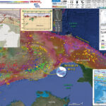
Below is my interpretive poster for this earthquake

I plot the seismicity from the past month, with color representing depth and diameter representing magnitude (see legend). I include earthquake epicenters from 1919-2019 with magnitudes M ≥ 7.0 in one version.
I plot the USGS fault plane solutions (moment tensors in blue and focal mechanisms in orange), possibly in addition to some relevant historic earthquakes. Some earthquakes have older focal mechanisms plotted in black and white.

  • I placed a moment tensor / focal mechanism legend on the poster. There is more material from the USGS web sites about moment tensors and focal mechanisms (the beach ball symbols). Both moment tensors and focal mechanisms are solutions to seismologic data that reveal two possible interpretations for fault orientation and sense of motion. One must use other information, like the regional tectonics, to interpret which of the two possibilities is more likely.
  • I also include the shaking intensity contours on the map. These use the Modified Mercalli Intensity Scale (MMI; see the legend on the map). This is based upon a computer model estimate of ground motions, different from the “Did You Feel It?” estimate of ground motions that is actually based on real observations. The MMI is a qualitative measure of shaking intensity. More on the MMI scale can be found here and here. This is based upon a computer model estimate of ground motions, different from the “Did You Feel It?” estimate of ground motions that is actually based on real observations.
  • I include the slab 2.0 contours plotted (Hayes, 2018), which are contours that represent the depth to the subduction zone fault. These are mostly based upon seismicity. The depths of the earthquakes have considerable error and do not all occur along the subduction zone faults, so these slab contours are simply the best estimate for the location of the fault.

    Magnetic Anomalies

  • In the map below, I include a transparent overlay of the magnetic anomaly data from EMAG2 (Meyer et al., 2017). As oceanic crust is formed, it inherits the magnetic field at the time. At different points through time, the magnetic polarity (north vs. south) flips, the North Pole becomes the South Pole. These changes in polarity can be seen when measuring the magnetic field above oceanic plates. This is one of the fundamental evidences for plate spreading at oceanic spreading ridges (like the Gorda rise).
  • Regions with magnetic fields aligned like today’s magnetic polarity are colored red in the EMAG2 data, while reversed polarity regions are colored blue. Regions of intermediate magnetic field are colored light purple.
  • We can see the roughly east-west trends of these red and blue stripes in the Caroline and Australia plates. These lines are parallel to the ocean spreading ridges from where they were formed. The stripes disappear at the subduction zone because the oceanic crust with these anomalies is diving deep beneath the Sunda plate (part of Eurasia), so the magnetic anomalies from the overlying Sunda plate mask the evidence for the Australia plate.

    Global Strain

  • In a map below, I include a transparent overlay of the Global Strain Rate Map (Kreemer et al., 2014).
  • The mission of the Global Strain Rate Map (GSRM) project is to determine a globally self-consistent strain rate and velocity field model, consistent with geodetic and geologic field observations. The overall mission also includes:
    1. contributions of global, regional, and local models by individual researchers
    2. archive existing data sets of geologic, geodetic, and seismic information that can contribute toward a greater understanding of strain phenomena
    3. archive existing methods for modeling strain rates and strain transients
  • The completed global strain rate map will provide a large amount of information that is vital for our understanding of continental dynamics and for the quantification of seismic hazards.
  • The version used in the poster(s) below is an update to the original 2004 map (Kreemer et al., 2000, 2003; Holt et al., 2005).

    I include some inset figures. Some of the same figures are located in different places on the larger scale map below.

  • In the upper left corner, I include a map from Benz et al. (2011) that shows historic earthquake locations (epicenters) along with some of the plate boundary faults. Note the strike slip fault (with the opposing black arrows) that cross the location of the 1938 earthquake (labeled in yellow on that map). I placed a blue star in the location of the M 7.3 quake. There is a cross section to the right of the map that shows how earthquakes dive down with a westward trend (following the plate down the subduction zone). The cross section location is shown on the map (B-B’).
  • In the upper right corner is a larger scale tectonic map from Audley (2011) showing the major thrust faults and the large forearc basin is labeled “Weber Deep.”
  • Hangesh and Whitney (2016) did lots of work on the faulting in the region to the south of the M 7.3. They show block boundaries and relative plate motion arrows in white. Note how they extend strike-slip motion along the Timor trough. This may be in addition to the strike-slip along the backthrust.
  • Here is the map with a month’s seismicity plotted. I included MMI contours from a recent M 6.3 earthquake in PNG, which led to a sequence of additional M~6 quakes to the southeast of that main shock. I won’t be writing a report for those quakes, even though it is interesting (check it out!). Sorry to have misspelled Hengesh as Hangesh.

  • Here is the map with a century’s seismicity (M ≥ 7.0) plotted.

  • Here is the map with a month’s seismicity (M ≥ 0.5) plotted with the Global Strain data plotted. We can see the 2018 Flores swarm show up here.

Other Report Pages

Some Relevant Discussion and Figures

  • Here is a tectonic map for this part of the world from Zahirovic et al., 2014. They show a fracture zone where the M 7.3 earthquake happened. I left out all the acronym definitions (you’re welcome), but they are listed in the paper.

  • Regional tectonic setting with plate boundaries (MORs/transforms = black, subduction zones = teethed red) from Bird (2003) and ophiolite belts representing sutures modified from Hutchison (1975) and Baldwin et al. (2012). West Sulawesi basalts are from Polvé et al. (1997), fracture zones are from Matthews et al. (2011) and basin outlines are from Hearn et al. (2003).

  • This is a great visualization showing the Australia plate and how it formed the largest forearc basin on Earth (Pownall et al., 2014).
  • The maps on the left show a time history of the tectonics. The low angle oblique view on the right shows the dipping crust (north is not always up, as in this figure).
  • In the lower right, they show how there is strike-slip faulting along the Seram trough also (I left out the figure caption for E).

  • Reconstructions of eastern Indonesia, adapted from Hall (2012), depict collision of Australia with Southeast Asia and slab rollback into Banda Embayment. Yellow star indicates Seram. Oceanic crust is shown in purple (older than 120 Ma) and blue (younger than 120 Ma); submarine arcs and oceanic plateaus are shown in cyan; volcanic island arcs, ophiolites, and material accreted along plate margins are shown in green. A: Reconstruction at 15 Ma. B: Reconstruction at 7 Ma. C: Reconstruction at 2 Ma. D: Visualization of present-day slab morphology of proto–Banda Sea based on earthquake hypocenter distribution and tomographic models

  • Here is a map and some cross sections showing seismic tomography (like C-T scans into the Earth using seismic waves instead of X-Rays). The map shows the location of the cross sections (Spakman et al., 2010).

  • The Banda arc and surrounding region. 200 m and 4,000 m bathymetric contours are indicated. The numbered black lines are Benioff zone contours in kilometres. The red triangles are Holocene volcanoes (http://www.volcano.si.edu/world/). Ar=Aru, Ar Tr=Aru trough, Ba=Banggai Islands, Bu=Buru, SBS=South Banda Sea, Se=Seram, Sm=Sumba, Su=Sula Islands, Ta=Tanimbar, Ta Tr=Tanimbar trough, Ti=Timor, W=Weber Deep.


    Tomographic images of the Banda slab. Vertical sections through the tomography model along the lines shown in Fig. 1. Colours: P-wave anomalies with reference to velocity model ak135 (ref. 30). Dots: earthquake hypocentres within 12 km of the section. The dashed lines are phase changes at ~410 km and ~660 km. The sections are plotted without vertical exaggeration; the horizontal axis is in degrees. The labelled positive anomalies are the Sunda (Su) and Banda (Ba) slabs: BuDdetached slab under Buru, FlDslab under Flores, SDslab under Seram, TDslab under Timor. a, The Sunda slab enters the lower mantle whereas the Banda embayment slab is entirely in the upper mantle with the change under Sulawesi. b–e, Banda slab morphology in sections parallel to Australia plate motion shows a transition from a steep slab with a flat section (fs) (b) to a spoon shape shallowing eastward (c–e).

  • Here is the tectonic map from Hengesh and Whitney (2016)

  • Illustration of major tectonic elements in triple junction geometry: tectonic features labeled per Figure 1; seismicity from ISC-GEM catalog [Storchak et al., 2013]; faults in Savu basin from Rigg and Hall [2011] and Harris et al. [2009]. Purple line is edge of Australian continental basement and fore arc [Rigg and Hall, 2011]. Abbreviations: AR = Ashmore Reef; SR = Scott Reef; RS = Rowley Shoals; TCZ = Timor Collision Zone; ST = Savu thrust; SB = Savu Basin; TT = Timor thrust; WT =Wetar thrust; WASZ = Western Australia Shear Zone. Open arrows indicate relative direction of motion; solid arrows direction of vergence.

  • Here is the Audley (2011) cross section showing how the backthrust relates to the subduction zone beneath Timor. I include their figure caption in blockquote below.

  • Cartoon cross section of Timor today, (cf. Richardson & Blundell 1996, their BIRPS figs 3b, 4b & 7; and their fig. 6 gravity model 2 after Woodside et al. 1989; and Snyder et al. 1996 their fig. 6a). Dimensions of the filled 40 km deep present-day Timor Tectonic Collision Zone are based on BIRPS seismic, earthquake seismicity and gravity data all re-interpreted here from Richardson & Blundell (1996) and from Snyder et al. (1996). NB. The Bobonaro Melange, its broken formation and other facies are not indicated, but they are included with the Gondwana mega-sequence. Note defunct Banda Trench, now the Timor TCZ, filled with Australian continental crust and Asian nappes that occupy all space between Wetar Suture and the 2–3 km deep deformation front north of the axis of the Timor Trough. Note the much younger decollement D5 used exactly the same part of the Jurassic lithology of the Gondwana mega-sequence in the older D1 decollement that produced what appears to be much stronger deformation.

  • Here is a figure showing the regional geodetic motions (Bock et al., 2003). I include their figure caption below as a blockquote.

  • Topographic and tectonic map of the Indonesian archipelago and surrounding region. Labeled, shaded arrows show motion (NUVEL-1A model) of the first-named tectonic plate relative to the second. Solid arrows are velocity vectors derived from GPS surveys from 1991 through 2001, in ITRF2000. For clarity, only a few of the vectors for Sumatra are included. The detailed velocity field for Sumatra is shown in Figure 5. Velocity vector ellipses indicate 2-D 95% confidence levels based on the formal (white noise only) uncertainty estimates. NGT, New Guinea Trench; NST, North Sulawesi Trench; SF, Sumatran Fault; TAF, Tarera-Aiduna Fault. Bathymetry [Smith and Sandwell, 1997] in this and all subsequent figures contoured at 2 km intervals.

  • Whitney and Hengesh (2015) used GPS modeling to suggest a model of plate blocks. Below are their model results.

  • Plate boundary segments in the Banda Arc region from Nugroho et al (2009). Numbers inside rectangles show possible micro-plate blocks near the Sumba Triple Junction (colored) based on GPS velocities (black arrows) with in a stable Eurasian reference frame.

  • Here is the conceptual model from Whitney and Hengesh (2015) that shows how left-lateral strike-slip faulting can come into the region.

  • Schematic map views of kinematic relations between major crustal elements in the Sumba Triple Junction region. CTZ= collisional tectonic zone. Red arrow size designates schematic plate motion relations based on geological data relative to a fixed Sunda shelf reference frame (pin).

Geologic Fundamentals

  • For more on the graphical representation of moment tensors and focal mechanisms, check this IRIS video out:
  • Here is a fantastic infographic from Frisch et al. (2011). This figure shows some examples of earthquakes in different plate tectonic settings, and what their fault plane solutions are. There is a cross section showing these focal mechanisms for a thrust or reverse earthquake. The upper right corner includes my favorite figure of all time. This shows the first motion (up or down) for each of the four quadrants. This figure also shows how the amplitude of the seismic waves are greatest (generally) in the middle of the quadrant and decrease to zero at the nodal planes (the boundary of each quadrant).

  • Here is another way to look at these beach balls.
  • There are three types of earthquakes, strike-slip, compressional (reverse or thrust, depending upon the dip of the fault), and extensional (normal). Here is are some animations of these three types of earthquake faults. The following three animations are from IRIS.
  • Strike Slip:

    Compressional:

    Extensional:

  • This is an image from the USGS that shows how, when an oceanic plate moves over a hotspot, the volcanoes formed over the hotspot form a series of volcanoes that increase in age in the direction of plate motion. The presumption is that the hotspot is stable and stays in one location. Torsvik et al. (2017) use various methods to evaluate why this is a false presumption for the Hawaii Hotspot.

  • A cutaway view along the Hawaiian island chain showing the inferred mantle plume that has fed the Hawaiian hot spot on the overriding Pacific Plate. The geologic ages of the oldest volcano on each island (Ma = millions of years ago) are progressively older to the northwest, consistent with the hot spot model for the origin of the Hawaiian Ridge-Emperor Seamount Chain. (Modified from image of Joel E. Robinson, USGS, in “This Dynamic Planet” map of Simkin and others, 2006.)

  • Here is a map from Torsvik et al. (2017) that shows the age of volcanic rocks at different locations along the Hawaii-Emperor Seamount Chain.

  • Hawaiian-Emperor Chain. White dots are the locations of radiometrically dated seamounts, atolls and islands, based on compilations of Doubrovine et al. and O’Connor et al. Features encircled with larger white circles are discussed in the text and Fig. 2. Marine gravity anomaly map is from Sandwell and Smith.

  • Here is a great tweet that discusses the different parts of a seismogram and how the internal structures of the Earth help control seismic waves as they propagate in the Earth.

    Social Media

    References:

  • Audley-Charles, M.G., 1986. Rates of Neogene and Quaternary tectonic movements in the Southern Banda Arc based on micropalaeontology in: Journal of fhe Geological Society, London, Vol. 143, 1986, pp. 161-175.
  • Audley-Charles, M.G., 2011. Tectonic post-collision processes in Timor, Hall, R., Cottam, M. A. &Wilson, M. E. J. (eds) The SE Asian Gateway: History and Tectonics of the Australia–Asia Collision. Geological Society, London, Special Publications, 355, 241–266.
  • Baldwin, S.L., Fitzgerald, P.G., and Webb, L.E., 2012. Tectonics of the New Guinea Region in Annu. Rev. Earth Planet. Sci., v. 41, p. 485-520.
  • Benz, H.M., Herman, Matthew, Tarr, A.C., Hayes, G.P., Furlong, K.P., Villaseñor, Antonio, Dart, R.L., and Rhea, Susan, 2011. Seismicity of the Earth 1900–2010 New Guinea and vicinity: U.S. Geological Survey Open-File Report 2010–1083-H, scale 1:8,000,000.
  • Given, J. W., and H. Kanamori (1980). The depth extent of the 1977 Sumbawa, Indonesia, earthquake, in EOS Trans. AGU., v. 61, p. 1044.
  • Gusnman, A.R., Tanioka, Y., Matsumoto, H., and Iwasakai, S.-I., 2009. Analysis of the Tsunami Generated by the Great 1977 Sumba Earthquake that Occurred in Indonesia in BSSA, v. 99, no. 4, p. 2169-2179, https://doi.org/10.1785/0120080324
  • Hall, R., 2011. Australia-SE Asia collision: plate tectonics and crustal flow in Geological Society, London, Special Publications 2011; v. 355; p. 75-109 doi: 10.1144/SP355.5
  • Hangesh, J. and Whitney, B., 2014. Quaternary Reactivation of Australia’s Western Passive Margin: Inception of a New Plate Boundary? in: 5th International INQUA Meeting on Paleoseismology, Active Tectonics and Archeoseismology (PATA), 21-27 September 2014, Busan, Korea, 4 pp.
  • Frisch, W., Meschede, M., Blakey, R., 2011. Plate Tectonics, Springer-Verlag, London, 213 pp.
  • Hayes, G., 2018, Slab2 – A Comprehensive Subduction Zone Geometry Model: U.S. Geological Survey data release, https://doi.org/10.5066/F7PV6JNV.
  • Holt, W. E., C. Kreemer, A. J. Haines, L. Estey, C. Meertens, G. Blewitt, and D. Lavallee (2005), Project helps constrain continental dynamics and seismic hazards, Eos Trans. AGU, 86(41), 383–387, , https://doi.org/10.1029/2005EO410002. /li>
  • Kreemer, C., J. Haines, W. Holt, G. Blewitt, and D. Lavallee (2000), On the determination of a global strain rate model, Geophys. J. Int., 52(10), 765–770.
  • Kreemer, C., W. E. Holt, and A. J. Haines (2003), An integrated global model of present-day plate motions and plate boundary deformation, Geophys. J. Int., 154(1), 8–34, , https://doi.org/10.1046/j.1365-246X.2003.01917.x.
  • Kreemer, C., G. Blewitt, E.C. Klein, 2014. A geodetic plate motion and Global Strain Rate Model in Geochemistry, Geophysics, Geosystems, v. 15, p. 3849-3889, https://doi.org/10.1002/2014GC005407.
  • Meyer, B., Saltus, R., Chulliat, a., 2017. EMAG2: Earth Magnetic Anomaly Grid (2-arc-minute resolution) Version 3. National Centers for Environmental Information, NOAA. Model. https://doi.org/10.7289/V5H70CVX
  • Müller, R.D., Sdrolias, M., Gaina, C. and Roest, W.R., 2008, Age spreading rates and spreading asymmetry of the world’s ocean crust in Geochemistry, Geophysics, Geosystems, 9, Q04006, https://doi.org/10.1029/2007GC001743
  • Okal, E. A., & Reymond, D., 2003. The mechanism of great Banda Sea earthquake of 1 February 1938: applying the method of preliminary determination of focal mechanism to a historical event in EPSL, v. 216, p. 1-15.
  • Osada, M. and Abe, K., 1981. Mechanism and tectonic implications of the great Banda Sea earthquake of November 4, 1963 in Physics of the Earth and Plentary Interiors, v. 25, p. 129-139
  • Pownall, J.M., Hall, R., Armstrong,, R.A., and Forster, M.A., 2014. Earth’s youngest known ultrahigh-temperature granulites discovered on Seram, eastern Indonesia in Geology, v. 42, no. 4, p. 379-282, https://doi.org/10.1130/G35230.1
  • Spakman, W. and Hall, R., 2010. Surface deformation and slab–mantle interaction during Banda arc subduction rollback in Nature Geosceince, v. 3, p. 562-566, https://doi.org/10.1038/NGEO917
  • Whitney, B.B. and Hengesh, J.V., 2015. A new model for active intraplate tectonics in western Australia in Proceedings of the Tenth Pacific Conference on Earthquake Engineering Building an Earthquake-Resilient Pacific 6-8 November 2015, Sydney, Australia, paper number 82
  • Zahirovic, S., Seton, M., and Müller, R.D., 2014. The Cretaceous and Cenozoic tectonic evolution of Southeast Asia in Solid Earth, v. 5, p. 227-273, doi:10.5194/se-5-227-2014

Return to the Earthquake Reports page.


Earthquake Report: Kermadec Trench

There was just an earthquake associated with the plate boundary that forms the Kermadec Trench, a deep oceanic trench that extends north from New Zealand, towards the Fiji Islands.
https://earthquake.usgs.gov/earthquakes/eventpage/us6000417i/executive
A minor tsunami (~25 cm in size) has been recorded at Raoul Island, due west of the earthquake, the closest gage to the temblor. Tide gages in New Zealand just began recording a small tsunami the moments I started writing this report (about an hour ± after the earthquake).
This tsunami is small enough that it probably won’t cause much damage. However, tidal inlets and harbors can have currents that are higher in response to even small tsunami, if the shape of the seafloor/harbor is optimal for this. However, further away from the earthquake, the tsunami will be even smaller; so small that it may not be observable in tide gage data.

  • These are the tide gage data from Raoul Island.
  • These are data from 15 Jun 22:30 UTC until 16 Jun 02:48 UTC.

In this part of the world, there is a convergent plate boundary where the Pacific plate dives westward beneath the Australia plate forming the Kermadec megathrust subduction zone fault. This fault has a history of earthquakes with magnitudes commonly exceeding M 7 and some exceeding M 8.
There was recently an M 6.9 earthquake in this same area and here is my earthquake report for that shaker.

While we cannot predict earthquakes, based on the historic record, this earthquake may be all that happens right now. But our historic record is incredibly short, so people must remain vigilant at all times.

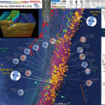
Below is my interpretive poster for this earthquake

I plot the seismicity from the past month, with color representing depth and diameter representing magnitude (see legend). I include earthquake epicenters from 1919-2019 with magnitudes M ≥ 6.0 and 7.0 in two versions.

I plot the USGS fault plane solutions (moment tensors in blue and focal mechanisms in orange), possibly in addition to some relevant historic earthquakes (including a M 6.1 earthquake that happened about an hour prior to the M 7.2. This is very close in time. The M 6.1 is too small of a magnitude to change the static coulomb stress significantly. It seems possible that there was dynamic triggering though (???). I will need to think about this a little more (check out the literature on dynamic triggering, to see what time window that may be a relevant trigger).

  • I placed a moment tensor / focal mechanism legend on the poster. There is more material from the USGS web sites about moment tensors and focal mechanisms (the beach ball symbols). Both moment tensors and focal mechanisms are solutions to seismologic data that reveal two possible interpretations for fault orientation and sense of motion. One must use other information, like the regional tectonics, to interpret which of the two possibilities is more likely.
  • I also include the shaking intensity contours on the map. These use the Modified Mercalli Intensity Scale (MMI; see the legend on the map). This is based upon a computer model estimate of ground motions, different from the “Did You Feel It?” estimate of ground motions that is actually based on real observations. The MMI is a qualitative measure of shaking intensity. More on the MMI scale can be found here and here. This is based upon a computer model estimate of ground motions, different from the “Did You Feel It?” estimate of ground motions that is actually based on real observations.
  • I include the slab 2.0 contours plotted (Hayes, 2018), which are contours that represent the depth to the subduction zone fault. These are mostly based upon seismicity. The depths of the earthquakes have considerable error and do not all occur along the subduction zone faults, so these slab contours are simply the best estimate for the location of the fault.

    Magnetic Anomalies

  • In the map below, I include a transparent overlay of the magnetic anomaly data from EMAG2 (Meyer et al., 2017). As oceanic crust is formed, it inherits the magnetic field at the time. At different points through time, the magnetic polarity (north vs. south) flips, the North Pole becomes the South Pole. These changes in polarity can be seen when measuring the magnetic field above oceanic plates. This is one of the fundamental evidences for plate spreading at oceanic spreading ridges (like the Gorda rise).
  • Regions with magnetic fields aligned like today’s magnetic polarity are colored red in the EMAG2 data, while reversed polarity regions are colored blue. Regions of intermediate magnetic field are colored light purple.
  • We can see the roughly east-west trends of these red and blue stripes. These lines are parallel to the ocean spreading ridges from where they were formed. The stripes disappear at the subduction zone because the oceanic crust with these anomalies is diving deep beneath the Sunda plate (part of Eurasia), so the magnetic anomalies from the overlying Sunda plate mask the evidence for the Australia plate.

    Global Strain

  • In a map below, I include a transparent overlay of the Global Strain Rate Map (Kreemer et al., 2014).
  • The mission of the Global Strain Rate Map (GSRM) project is to determine a globally self-consistent strain rate and velocity field model, consistent with geodetic and geologic field observations. The overall mission also includes:
    1. contributions of global, regional, and local models by individual researchers
    2. archive existing data sets of geologic, geodetic, and seismic information that can contribute toward a greater understanding of strain phenomena
    3. archive existing methods for modeling strain rates and strain transients
  • The completed global strain rate map will provide a large amount of information that is vital for our understanding of continental dynamics and for the quantification of seismic hazards.
  • The version used in the poster(s) below is an update to the original 2004 map (Kreemer et al., 2000, 2003; Holt et al., 2005).

    I include some inset figures. Some of the same figures are located in different places on the larger scale map below.

  • In the lower right corner is a map that shows the major islands, the major plate tectonic boundaries (the faults, the volcanoes), and the location of two profiles shown above (Ballance et al., 1999. I place a blue star in the general location of the earthquake.
  • In the upper right corner are these two profiles (17-1 & 17-2). These profiles show how the elevation changes (solid line) and how the geomagnetic properties intensity, declination, inclination (dashed) vary across the plate boundary.
  • In the lower left corner is a map from Benz et al. (2010) that shows earthquakes with circles that represent magnitude (diameter) and depth (color). Deeper = blue & shallower = red. There is a cross section (cut into the earth) profile through this seismicity that uses a source area as shown by a rectangle (the green line J-J’).
  • In the upper left corner is cross section J-J’ that shows earthquake hypocenters (3-D locations) in the region of the M 7.2 earthquake.
  • there is a cross section of the Kermadec trench that includes bathymetry of the region (topography of the sea floor). This graphic was created by scientists at Woods Hole. I label the Louisville Seamount Chain for reference to compare with the main map.
  • Here is the map with a month’s seismicity M ≥ 0.5 plotted (and magnetic anomalies).

  • Here is the map with a years’s seismicity M ≥ 2.0 plotted (and magnetic anomalies).

  • Here is the map with a century’s seismicity M ≥ 6.0 plotted (and strain).

  • Here is the map with a century’s seismicity M ≥ 7.0 plotted (and strain).

Other Report Pages

Tide Gage Data

  • First I present a tide gage summary map with the earthquakes from the past month shown transparently. Below are some of the tide gage data plots. These are all available from the International Oceanographic Commission.


  • here is a map that shows cross sections of seismicity, along with the tide gage data from the nearest station.

  • Here I have congregated all the tide gage data onto a single figure, each aligned relative to GMT time. Note which sites have up-first tsunami waves, relative to those that have down-first waves. Can you make sense of this?

Some Relevant Discussion and Figures

  • Here is the tectonic map from Ballance et al., 1999.

  • Map of the Southwest Pacific Ocean showing the regional tectonic setting and location of the two dredged profiles. Depth contours in kilometres. The presently active arcs comprise New Zealand–Kermadec Ridge–Tonga Ridge, linked with Vanuatu by transforms associated with the North Fiji Basin. Colville Ridge–Lau Ridge is the remnant arc. Havre Trough–Lau Basin is the active backarc basin. Kermadec–Tonga Trench marks the site of subduction of Pacific lithosphere westward beneath Australian plate lithosphere. North and South Fiji Basins are marginal basins of late Neogene and probable Oligocene age, respectively. 5.4sK–Ar date of dredged basalt sample (Adams et al., 1994).

  • Here is a great visualization of the Kermadec Trench from Woods Hole.

Kermadec Trench from Woods Hole Oceanographic Inst. on Vimeo.

  • Here is another map of the bathymetry in this region of the Kermadec trench. This was produced by Jack Cook at the Woods Hole Oceanographic Institution. The Lousiville Seamount Chain is clearly visible in this graphic.

  • I put together an animation of seismicity from 1965 – 2015 Sept. 7. Here is a map that shows the entire seismicity for this period. I plot the slab contours for the subduction zone here. These were created by the USGS (Hayes et al., 2012).

  • Here is the animation. Download the mp4 file here. This animation includes earthquakes with magnitudes greater than M 6.5 and this is the kml file that I used to make this animation.

Geologic Fundamentals

  • For more on the graphical representation of moment tensors and focal mechanisms, check this IRIS video out:
  • Here is a fantastic infographic from Frisch et al. (2011). This figure shows some examples of earthquakes in different plate tectonic settings, and what their fault plane solutions are. There is a cross section showing these focal mechanisms for a thrust or reverse earthquake. The upper right corner includes my favorite figure of all time. This shows the first motion (up or down) for each of the four quadrants. This figure also shows how the amplitude of the seismic waves are greatest (generally) in the middle of the quadrant and decrease to zero at the nodal planes (the boundary of each quadrant).

  • Here is another way to look at these beach balls.
  • There are three types of earthquakes, strike-slip, compressional (reverse or thrust, depending upon the dip of the fault), and extensional (normal). Here is are some animations of these three types of earthquake faults. The following three animations are from IRIS.
  • Strike Slip:

    Compressional:

    Extensional:

  • This is an image from the USGS that shows how, when an oceanic plate moves over a hotspot, the volcanoes formed over the hotspot form a series of volcanoes that increase in age in the direction of plate motion. The presumption is that the hotspot is stable and stays in one location. Torsvik et al. (2017) use various methods to evaluate why this is a false presumption for the Hawaii Hotspot.

  • A cutaway view along the Hawaiian island chain showing the inferred mantle plume that has fed the Hawaiian hot spot on the overriding Pacific Plate. The geologic ages of the oldest volcano on each island (Ma = millions of years ago) are progressively older to the northwest, consistent with the hot spot model for the origin of the Hawaiian Ridge-Emperor Seamount Chain. (Modified from image of Joel E. Robinson, USGS, in “This Dynamic Planet” map of Simkin and others, 2006.)

  • Here is a map from Torsvik et al. (2017) that shows the age of volcanic rocks at different locations along the Hawaii-Emperor Seamount Chain.

  • Hawaiian-Emperor Chain. White dots are the locations of radiometrically dated seamounts, atolls and islands, based on compilations of Doubrovine et al. and O’Connor et al. Features encircled with larger white circles are discussed in the text and Fig. 2. Marine gravity anomaly map is from Sandwell and Smith.

  • Here is a great tweet that discusses the different parts of a seismogram and how the internal structures of the Earth help control seismic waves as they propagate in the Earth.

Return to the Earthquake Reports page.


Earthquake Report: Kermadec

The earthquakes continue, every day. Today, there was a large earthquake associated with the subduction zone that forms the Kermadec Trench.

This earthquake was quite deep, so was not expected to generate a significant tsunami (if one at all).

There are several analogies to today’s earthquake. There was a M 7.4 earthquake in a similar location, but much deeper. These are an interesting comparison because the M 7.4 was compressional and the M 6.9 was extensional. There is some debate about what causes ultra deep earthquakes. The earthquakes that are deeper than about 40-50 km are not along subduction zone faults, but within the downgoing plate. This M 6.9 appears to be in a part of the plate that is bending (based on the Benz et al., 2011 cross section). As plates bend downwards, the upper part of the plate gets extended and the lower part of the plate experiences compression.

This is my first earthquake report to utilize the new slab contours (Slab 2.0) from Hayes (2018).

There has been a recent sequence of ultra deep earthquakes in the Fiji region, as well as subduction zone related earthquakes along the southern New Hebrides Trench. These links lead to my earthquake reports for those two regions: Fiji and New Hebrides.

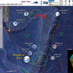
Below is my interpretive poster for this earthquake

I plot the seismicity from the past month, with color representing depth and diameter representing magnitude (see legend). I include earthquake epicenters from 1918-2018 with magnitudes M ≥ 6.5 in one version.
I plot the USGS fault plane solutions (moment tensors in blue and focal mechanisms in orange), possibly in addition to some relevant historic earthquakes.

  • I placed a moment tensor / focal mechanism legend on the poster. There is more material from the USGS web sites about moment tensors and focal mechanisms (the beach ball symbols). Both moment tensors and focal mechanisms are solutions to seismologic data that reveal two possible interpretations for fault orientation and sense of motion. One must use other information, like the regional tectonics, to interpret which of the two possibilities is more likely.
  • I also include the shaking intensity contours on the map. These use the Modified Mercalli Intensity Scale (MMI; see the legend on the map). This is based upon a computer model estimate of ground motions, different from the “Did You Feel It?” estimate of ground motions that is actually based on real observations. The MMI is a qualitative measure of shaking intensity. More on the MMI scale can be found here and here. This is based upon a computer model estimate of ground motions, different from the “Did You Feel It?” estimate of ground motions that is actually based on real observations.
  • I include the slab 2.0 contours plotted (Hayes, 2018), which are contours that represent the depth to the subduction zone fault. These are mostly based upon seismicity. The depths of the earthquakes have considerable error and do not all occur along the subduction zone faults, so these slab contours are simply the best estimate for the location of the fault.

    Magnetic Anomalies

  • In the map below, I include a transparent overlay of the magnetic anomaly data from EMAG2 (Meyer et al., 2017). As oceanic crust is formed, it inherits the magnetic field at the time. At different points through time, the magnetic polarity (north vs. south) flips, the north pole becomes the south pole. These changes in polarity can be seen when measuring the magnetic field above oceanic plates. This is one of the fundamental evidences for plate spreading at oceanic spreading ridges (like the Gorda rise).
  • Regions with magnetic fields aligned like today’s magnetic polarity are colored red in the EMAG2 data, while reversed polarity regions are colored blue. Regions of intermediate magnetic field are colored light purple.

    I include some inset figures. Some of the same figures are located in different places on the larger scale map below.

  • In the upper right corner is a plate tectonic map from Ballance et al. (1999) that shows the plate boundary faults in this region of the western Pacific. This shows that the Pacific plate subducts westward beneath the Australia plate. I placed a blue star in the general location of the M 6.9 earthquake (same for other inset figures).
  • In the upper left corner is a portion of the map from Benz et al. (2011) that shows earthquake epicenters with color representing depth and diameter representing magnitude. There are several cross sectional data prepared and the location for these cross sections is shown on the map.
  • In the lower left corner is cross section J-J’ that shows earthquake hypocenters (3-D locations) in the region of the M 6.9 earthquake.
  • In the lower right corner, there is a cross section of the Kermadec trench that includes bathymetry of the region (topography of the sea floor). This graphic was created by scientists at Woods Hole. I label the Louisville Seamount Chain for reference to compare with the main map.
  • Here is the map with a month’s seismicity plotted.

  • Here is the map with a centuries seismicity plotted.

Other Report Pages

Some Relevant Discussion and Figures

  • Here is the tectonic map from Ballance et al., 1999.

  • Map of the Southwest Pacific Ocean showing the regional tectonic setting and location of the two dredged profiles. Depth contours in kilometres. The presently active arcs comprise New Zealand–Kermadec Ridge–Tonga Ridge, linked with Vanuatu by transforms associated with the North Fiji Basin. Colville Ridge–Lau Ridge is the remnant arc. Havre Trough–Lau Basin is the active backarc basin. Kermadec–Tonga Trench marks the site of subduction of Pacific lithosphere westward beneath Australian plate lithosphere. North and South Fiji Basins are marginal basins of late Neogene and probable Oligocene age, respectively. 5.4sK–Ar date of dredged basalt sample (Adams et al., 1994).

  • Here is a great summary of the fault mechanisms for earthquakes along this plate boundary (Yu, 2013).

  • Large subduction-zone interplate earthquakes (large open gray stars) labeled with event date, Mw, GCMT focal mechanisms, and GPS velocity vectors (gray arrows and black triangles labeled with station name). GPS velocities are listed in Table 3. Black lines indicate the Tonga–Kermadec and Vanuatu trenches. Note that the 2009/09/29 Samoa–Tonga outer trench-slope event (Mw 8.1) triggered large interplate doublets (both of Mw 7.8; Lay et al., 2010). The Pacific plate subducts westward beneath the Australian plate along the Tonga–Kermadec trench, whereas the Australian plate subducts eastward beneath the Vanuatu arc and North Fiji basin. The opposite orientation between the Tonga–Kermadec and Vanuatu subduction systems is due to complex and broad back-arc extension in the Lau and North Fiji basins (Pelletier et al., 1998).


    Regional map of moderate-sized (mb > 4:7) shallow-focus repeating earthquakes and background seismicity along the (a) Tonga–Kermadec and (b) Vanuatu (former New Hebrides) subduction zones. Shallow repeating earthquakes (black stars) and their available Global Centroid Moment Tensor (GCMT; Dziewoński et al., 1981; Ekström et al., 2003) are labeled with event date and doublet/cluster id where applicable. Colors of GCMT are used to distinguish nearby different repeaters. Source parameters for the clusters and doublets are listed in Tables 1 and 2. Background seismicity is shown as gray dots and large interplate earthquakes (moment magnitude, Mw > 7:3) since 1976 are shown as large open gray stars. Black lines indicate the trench (Bird, 2003) and slab contour at 50-km depth (Gudmundsson and Sambridge, 1998). Repeating earthquake clusters in the (a) T1 and T2 plate-interface regions in Tonga and (b) V3 plate-interface region in Vanuatu are used to study the fault-slip rate ( _d). A regional map of the Tonga–Kermadec–Vanuatu subduction zones is
    shown in the inset figure, with the gray dotted box indicating the expanded region in the main figure.

  • Here is a 3-D view of the subducting slab along the Tonga Trench (Green, 2007). While this is to the north of where the M 6.9 happened, it helps us visualize the geometry of the subducting slab. Note how there is a different shape to the slab to the north than to the south. Take a look at the seismicity map in Benz et al., 2011 for comparison.

  • Earthquakes and subducted slabs beneath the Tonga–Fiji area. The subducting slab and detached slab are defined by the historic earthquakes in this region: the steeply dipping surface descending from the Tonga Trench marks the currently active subduction zone, and the surface lying mostly between 500 and 680 km, but rising to 300 km in the east, is a relict from an old subduction zone that descended from the fossil Vitiaz Trench. The locations of the mainshocks of the two Tongan earthquake sequences discussed by Tibi et al.2 are marked in yellow (2002 sequence) and orange (1986 series). Triggering mainshocks are denoted by stars; triggered mainshocks by circles. The 2002 sequence lies wholly in the currently subducting slab (and slightly extends the earthquake distribution in it),whereas the 1986 mainshock is in that slab but the triggered series is located in the detached slab,which apparently contains significant amounts of metastable olive.

  • This is a figure from de Paor et al. (2012) that shows cross sections along the Tonga/Kermadec system. These cross sections are based on “seismic tomographic” methods. Seismic tomography is similar to CT scans, which are “computed tomography” using X-Rays. Seismic tomography uses seismic waves to interrogate Earth’s interior and are calculated using the same general concepts that are used to resolve differences in density using CT scans (“cat scans”). The colors represent the relative seismic velocity of different parts of the lithosphere. Cool colors represent higher velocities, which are found in cold slabs (compared to warmer mantle, where seismic velocities are slower). These authors use the faster velocities to locate the subducting slab. The M 6.9 earthquake happened between cross sections B and C, but the geometry in that area looks more similar to cross section C.

  • This is a schematic illustration showing the interpretation from Chang et al. (2015) of the geometry of these subducting slabs. Compare with the Green (2007) figure above.

  • A schematic diagram illustrating the slab–plume interaction beneath the Tonga–Kermadec arc. Cyan lines on the surface show trenches, as shown in Fig. 1. HP, Hikurangi Plateau; KT, Kermadec Trench; NHT, New Hebrides Trench; TT, Tonga Trench; VT, Vitiaz Trench. The Samoan plume originates from a Mega ULVZ at the core–mantle boundary (CMB). The buoyancy caused by large stress from the plume at the bottom of the Tonga slab may contribute to the slab stagnation within the mantle transition zone, while the Kermadec slab is penetrating into the lower mantle directly. At the northern end of the Tonga slab, plume materials migrate into the mantle wedge, facilitated by strong toroidal flow around the slab edge induced by fast slab retreat

  • Here is a fantastic summary of the plate boundary in this region (Bird, 2003). There are so many earthquakes here that their symbols overlap each other.

  • Boundaries (heavy colored lines) of the New Hebrides (NH), Balmoral Reef (BR), Conway Reef (CR), and Futuna (FT) plates. All are included in the New Hebrides-Fiji orogen because of evidence that they may be deforming rapidly. Surrounding plates are Australia (AU), Tonga (TO), Niuafo’ou (NI), and Pacific (PA). Conventions as in Figure 2, except coastlines are blue. Oblique Mercator projection on great circle passing E-W through (17°S, 174°E).

  • Here is another map of the bathymetry in this region of the Kermadec trench. This was produced by Jack Cook at the Woods Hole Oceanographic Institution. The Lousiville Seamount Chain is clearly visible in this graphic.

  • I put together an animation of seismicity from 1965 – 2015 Sept. 7. Here is a map that shows the entire seismicity for this period. I plot the slab contours for the subduction zone here. These were created by the USGS (Hayes et al., 2012).

  • Here is the animation. Download the mp4 file here. This animation includes earthquakes with magnitudes greater than M 6.5 and this is the kml file that I used to make this animation.
  • Finally, I would like to show a figure prepared by Dr. Gavin Hayes (USGS) that shows the relations between the two ultra deep earthquakes near Fiji. I did not prepare a report for the M 7.9 earthquake on 2018.09.06, which is the main reason I included this information in this report. Dr. Hayes shows earthquake fault mechanisms (viewed from their side) relative to depth (along with earthquake hypocenters for smaller magnitude earthquakes). The geometry for the downgoing slab is shown as a purple dashed-dotted line. More can be found about this M 7.9 earthquake here.

Geologic Fundamentals

  • For more on the graphical representation of moment tensors and focal mechnisms, check this IRIS video out:
  • Here is a fantastic infographic from Frisch et al. (2011). This figure shows some examples of earthquakes in different plate tectonic settings, and what their fault plane solutions are. There is a cross section showing these focal mechanisms for a thrust or reverse earthquake. The upper right corner includes my favorite figure of all time. This shows the first motion (up or down) for each of the four quadrants. This figure also shows how the amplitude of the seismic waves are greatest (generally) in the middle of the quadrant and decrease to zero at the nodal planes (the boundary of each quadrant).

  • Here is another way to look at these beach balls.
  • There are three types of earthquakes, strike-slip, compressional (reverse or thrust, depending upon the dip of the fault), and extensional (normal). Here is are some animations of these three types of earthquake faults. The following three animations are from IRIS.
  • Strike Slip:

    Compressional:

    Extensional:

  • This is an image from the USGS that shows how, when an oceanic plate moves over a hotspot, the volcanoes formed over the hotspot form a series of volcanoes that increase in age in the direction of plate motion. The presumption is that the hotspot is stable and stays in one location. Torsvik et al. (2017) use various methods to evaluate why this is a false presumption for the Hawaii Hotspot.

  • A cutaway view along the Hawaiian island chain showing the inferred mantle plume that has fed the Hawaiian hot spot on the overriding Pacific Plate. The geologic ages of the oldest volcano on each island (Ma = millions of years ago) are progressively older to the northwest, consistent with the hot spot model for the origin of the Hawaiian Ridge-Emperor Seamount Chain. (Modified from image of Joel E. Robinson, USGS, in “This Dynamic Planet” map of Simkin and others, 2006.)

  • Here is a map from Torsvik et al. (2017) that shows the age of volcanic rocks at different locations along the Hawaii-Emperor Seamount Chain.

  • Hawaiian-Emperor Chain. White dots are the locations of radiometrically dated seamounts, atolls and islands, based on compilations of Doubrovine et al. and O’Connor et al. Features encircled with larger white circles are discussed in the text and Fig. 2. Marine gravity anomaly map is from Sandwell and Smith.

    Social Media

    References:

  • Ballance, P.F., ablaev, A.G., Pushchin, I.K., Pletnev, S.P., Birylina, M.G., Itaya, T., Follas, H.A., and Gibson, G.W., 1999. Morphology and history of the Kermadec trench–arc–backarc basin–remnant arc system at 30 to 32°S: geophysical profile, microfossil and K–Ar data in Marine Geology, v. 149, p. 35-62.
  • Bird, P., 2003. An updated digital model of plate boundaries in Geochemistry, Geophysics, Geosystems, v. 4, doi:10.1029/2001GC000252, 52 p.
  • Benz, H.M., Herman, Matthew, Tarr, A.C., Furlong, K.P., Hayes, G.P., Villaseñor, Antonio, Dart, R.L., and Rhea, Susan, 2011. Seismicity of the Earth 1900–2010 eastern margin of the Australia plate: U.S. Geological Survey Open-File Report 2010–1083-I, scale 1:8,000,000.
  • Chang, S-J., Ferreira, A.M.G., and Faccenda, M., 2016. Upper- and mid-mantle interaction between the Samoan plume and the Tonga–Kermadec slabs in Nature Communications, v. 7, DOI: 10.1038/ncomms10799
  • Green, H.W.II, 2007. Shearing instabilities accompanying high-pressure phase transformations and the mechanics of deep earthquakes in PNAS, v. 104, no. 22, p. 9133-9138, www.pnas.org/cgi/doi/10.1073/pnas.0608045104
  • Hayes, G., 2018, Slab2 – A Comprehensive Subduction Zone Geometry Model: U.S. Geological Survey data release, https://doi.org/10.5066/F7PV6JNV.

Return to the Earthquake Reports page.


°

ñ

Earthquake Report: New Zealand Post # 01

This is the first of several posts about a complex earthquake series that happened along the northern end of the South Island in New Zealand. I was at sea on the R/V Tangaroa collecting piston cores offshore along the Hikurangi subduction zone this month. While I was at sea, there was a large earthquake, probably along one of the upper plate faults in this region. I present a simple interpretive poster below and will follow up with several more posts as I find more time between my other responsibilities (I have been gone at sea for two weeks, so I have lots of catch up work to do). This earthquake series is in a complicated part of the Earth where a subduction plate boundary turns into a transform plate boundary. There was a tsunami warning for the nearby coasts, but not for a global tsunami.
Geonet is a website in New Zealand that is a collaboration between the Earthquake Commission and GNS Science. Here is the website at Geonet where one can find the most up to date observations and interpretations about this M 7.8 Kaikoura Earthquake series.

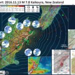
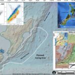
  • Below is a map that I prepared that shows the earthquakes (magnitude M ≥ 2.5) for the month of November as green circles (diameter represents earthquake magnitude). I also plot earthquakes with magnitudes M ≥ 5.5 from the period of 1950-2016. These are from the USGS NEIC, so the regional network run in New Zealand may have a larger number of earthquakes. I present two maps, one with a 250 m resolution bathymetric grid as a base and one with a Google Earth satellite based map as a base. This is not an official GNS nor NIWZ figure, but they were major supporters of the TAN163 cruise that I participated on, so we can attribute the core data to these organizations.
  • I placed the moment tensors for the larger earthquakes during this time period since the M 7.8 earthquake. The main earthquake is a compressional earthquake, probably on an upper plate fault. The M 7.8 earthquake triggered slip on other thrusts and some strike-slip faults in the region. Surface deformation measured using Interferometric Synthetic Aperture Radar (INSAR) is localized, supporting the upper plate rupture interpretation. Slip on the thrust during the 7.8 is estimated to be about 10 meters, which is also the maximum slip on some of the strike-slip fault systems. There have been some excellent photographs of the fault rupture (I will include these in a later post). Most of the large earthquakes are strike-slip, but there are some connecting faults that show thrust mechanisms. I also show the regions of different faults that have been observed to have surface ruptures.
  • After the earthquake, we changed our plans to conduct some post-earthquake response analyses. We collected additional cores to search for sedimentary evidence of the M 7.8 earthquake. We also collected sub-bottom profile and bathymetric data to search for seafloor exposed fault rupture. The cores we collected for our general study are shown as red cross-dots. The cores we collected as the earthquake are plotted as yellow cross-dots.
  • I also include the shaking intensity contours on the map. These use the Modified Mercalli Intensity Scale (MMI; see the legend on the map). This is based upon a computer model estimate of ground motions, different from the “Did You Feel It?” estimate of ground motions that is actually based on real observations. The MMI is a qualitative measure of shaking intensity. More on the MMI scale can be found here and here. This is based upon a computer model estimate of ground motions, different from the “Did You Feel It?” estimate of ground motions that is actually based on real observations.
  • I placed a moment tensor / focal mechanism legend on the poster. There is more material from the USGS web sites about moment tensors and focal mechanisms (the beach ball symbols). Both moment tensors and focal mechanisms are solutions to seismologic data that reveal two possible interpretations for fault orientation and sense of motion. One must use other information, like the regional tectonics, to interpret which of the two possibilities is more likely.
    • Inset Figures

      I include some inset figures. Here is some information about them. Below I include the original figures with the figure captions as blockquotes.

    • In the upper right corner is a map from NIWA (Phil Barnes). This map shows some of the major faults in this region. I placed the observed fault offsets on this map as orange lines. This map is on the NIWA website, but I will find the Barnes publication this came from and post that in a follow up web page.
    • In the lower right corner is a map from Geological and Nuclear Sciences (GNS) in Māori: Te Pū Ao. This map shows the regional faults and where there have been observations of surface rupture. The coseismic (during the earthquake) Global Positioning System (GPS) observations. Earthquakes are also plotted.
    • To the left of that is a figure from the Geospatial Information Authority of Japan (GSI). This is a summary figure showing modeled uplift as compared to InSAR analysis results. Note how localized the deformation is. I will present and discuss the analyses that went into this figure in a follow-up report.
    • To the left of that is a generalized tectonic map of the region.


    Here are the USGS websites for the large earthquakes plotted in the map above.

  • 20161113 M 7.8 11:02 USGS
  • 20161113 M 6.5 11:32 USGS
  • 20161113 M 6.1 11:52 USGS
  • 20161113 M 6.2 13:31 USGS
  • 20161113 M 5.7 19:28 USGS
  • 20161114 M 6.5 00:34 USGS
  • 20161114 M 5.4 01:30 USGS
  • 20161114 M 5.8 06:47 USGS
  • 20161115 M 5.4 01:34 USGS
  • 20161115 M 5.4 06:30 USGS
  • 20161118 M 5.1 14:22 USGS
  • 20161122 M 5.9 00:19 USGS
  • 20161122 M 5.3 00:19 USGS
  • 20161122 M 5.0 19:38 USGS
  • Here is an image of the seismograph as recorded by the Humboldt State University, Department of Geology, Baby Benioff seismometer. Here is a high resolution version as scanned by Dr. Stephen Tilinghast. (108 MB)

  • Here is the USGS Seismicity of the Earth map for this region (Benz et al., 2010). Click on the map for the pdf of this report (66 MB pdf). Here is 10 MB jpg file.

  • Initial recon overflights report that there have been over 100,000 landslides from this earthquake. Below is a map that shows a different analysis that people are conducting. There will be more.

  • Here is one of the early InSAR results from COMET. I will present more of these is a follow-up report.

  • Here is a cool comparison animated gif showing before and after the earthquake. This is an animated gif showing photos taken by Casey Miln and Andrew Spencer.

  • Casey Miln

  • Andrew Spencer

Getting ready for the cruise!

2016.11.09

Getting ready for the cruise!

My main research cruise blog page is here: http://humboldt-jay.blogspot.com.

  • We will be heading to sea to search for submarine landslide deposits called turbidites. There are several ways that these landslides can be triggered. Earthquakes are the most common landslide trigger on land and probably also in the submarine environment.
  • I have worked on turbidite Paleoseismology cruises offshore of Sumatra, Cascadia, and the Lesser Antilles. These are all places where there is an active subduction zone. I have documented these cruises on my research cruise blog humboldt-jay.blogspot.com. The research offshore of Sumatra was for my Ph.D. dissertation and is ongoing. The coring we conducted offshore of Cascadia was in support of Dr. Chris Goldfinger’s research on the spatiotemporal variation in earthquakes along the Cascadia subduction zone. Recently, we received the Kirk Bryan Award from the Geological Society of America for the USGS Professional Paper 1661-F. This past summer I participated on a French cruise aboard the NO Pourquoi Pas? The principal investigator for this Caribbean cruise was Nathalie Feuillet, from Institut de Physique du Globe de Paris (IPGP) in Paris.
  • We will be collecting sediment cores aboard the R/V Tangora, a National Institute of Water and Atmospheric Research Ltd (NIWA) research ship. R/V stands for “research vessel.” Here is the website that has information about the R/V Tangora. : www.niwa.co.nz/services/vessels/niwa-vessels/rv-tangaroa

Background

  • Below is a map that shows the general region where we plan on taking cores. The principal investigator for this cruise is Dr. Phillip Barnes, from NIWA. Dr. Barnes has done an incredible job planning for this cruise and I outline the general strategy below. As always, we will modify our plan as our experiences during the cruise inform us.
  • We will be collecting cores in sedimentary basins along the slope and in channel and other depositional settings along turbidite channel systems in the trench. We will be using classic methods (well, this is a new science, so it is funny to call these classic methods) used by many who look for seismoturbidites. We will be looking for sites that have sources of sediment that are isolated from each other. We are especially interested if these sites extend for distances larger than the length of faults that might be additional sources of ground motions that might trigger submarine landslides. We will also be looking for sites that permit us to apply the confluence test, which also requires sites that have isolated source distances that are sufficiently large.
    • I include some inset maps that have some other background material.

    • In the upper right corner is a map that shows the general plate tectonics of this region. This comes from Mike Norton via Creative Commons. The Pacific plate: Australia plate relative plate motions are shown in orange. Note how the plate motion is increasingly oblique as slip is transferred from the Kermadec-Hikurangi subduction zone systems in the north to the Alpine fault system (via Marlborough) in the south, then again to the subduction zone even further south.
    • In the upper left corner shows seismicity as plotted by Wallace, et al. (2009). These are earthquakes from 1990 through December 2007. The figure on the right shows the deeper events with their depth represented by color.
    • In the lower right corner is another figure from Wallace et al. (2009). This one shows more detailed fault mapping in the accretionary prism. These are offshore thrust faults that are additional sources of ground shaking for triggering turbidites. It will be important to be able to extend our correlations beyond any individual fault system to be able to link any given correlated turbidite to ground motions from the megathrust. There are also some strike-slip faults that may also confound our analysis, particularly in the southern Hikurangi margin. In this inset is a cross section showing that the accretionary prism is composed on imbricate thrust faults. These are the additional sources of ground shaking that are mapped in plan view on the map (labeled “Forearc domain” in the cross section).


    Here are some of the inset maps on their own, with their original figure captions as blockquotes.

  • Here is the plot from Wallace et al. (2009) that shows the seismicity from 1990-2007.

  • Selected seismicity between January 1990 and December 2007 (inclusive), from the GeoNet database (http://geonet.org.nz). Events shown are only those which were recorded by six or more stations, with nine or more observed phases, with unrestricted location depths, and RMS of arrival time residuals less than 1.0 s. Magnitude range of events shown is 0.29–6.99. (left) Events shallower than 33 km. (right) Events greater than 33-km depth.

  • Here is the map from Wallace et al. (2009) that shows the regional and local tectonics in the Hikurangi Trough.


    Tectonic setting of the Hikurangi margin. Modified from Barnes et al. [2009], copyright 2009, Elsevier. (a) Detailed bathymetry (NIWA), topography, and active faulting (black lines) of the onshore and offshore subduction margin. Dashed contours indicate sediment thickness on lower plate from Lewis et al. [1998]. Bold white dashed line shows the back of the accretionary wedge and the front of a deforming buttress of Cretaceous and Paleogene rocks covered by Miocene to Recent slope basins [from Lewis et al., 1997; Barnes et al., 1998b, 2009]. A–A0 line denotes cross-section location in Figure 1d. Dashed black lines show locations of seismic reflection lines from Figure 4, labeled by line number. White arrow shows Pacific/Australia relative plate motion in the region from Beavan et al. [2002]. Onshore active faults from GNS Science active faults database (http://maps.gns.cri.nz/website/af/). TVZ, Taupo Volcanic Zone; NIDFB, North Island Dextral Fault Belt; LR, approximate location of Lachlan Ridge; KR, approximate location of Kidnappers Ridge. (b) Broader-scale New Zealand tectonic setting. (c) Regional tectonic framework. RI, Raoul Island; NZ, New Zealand; HT, Hikurangi Trough. (d) Interpretive cross section across the strike of the subduction margin. Cross-section location denoted by A–A0 line in Figure 1a.

    Here are some figures that show the historic and prehistoric history of earthquakes in this region, with their original figure captions as blockquotes.

  • Here is a figure that shows our existing knowledge of the historic subduction zone earthquakes for this region (Wallace et al. (2014).


    Tectonic setting of the Hikurangi subduction zone at the boundary between the Pacific and Australian Plates. Black contours show the depth to the subduction interface (Williams et al., 2014). Red dots = historical subduction thrust events (all MW < 7.2). Gray dots = continuous GPS sites (http://www.geonet.org.nz). Arrows show convergence rates at the trench in mm yr–1 (Wallace et al., 2012a). PB = 1947 Poverty Bay earthquake. TB = 1947 Tolaga Bay earthquake. WF = Wairarapa Fault, the site of the 1855 earthquake. BL = Big Lagoon. MP = Mahia Peninsula. Black lines onshore are active faults (http://www.data.gns.cri.nz/af). In the forearc, most of these faults are either right lateral strike-slip or reverse. The strike-slip faults help to accommodate the margin-parallel component of relative plate motion.

  • Here is a figure that shows our existing knowledge of the prehistoric subduction zone earthquakes (Paleoseismology) for this region (Wallace et al. (2014).


    Map in upper panel shows locations of published Holocene records of coseismic vertical deformation along the Hikurangi Margin. Timeline in lower panel shows the approximate ages and types of impact found at different sites along the margin (note that this is an overview that does not show individual dates and their errors). We use black horizontal lines on the timeline to indicate times when vertical deformation occurs at multiple sites along the margin (summarized in the right panel of the timeline). These lines are also used on the map to indicate the approximate lateral extent of deformation and the strength of evidence for occurrence of a great subduction thrust earthquake. *Site 1: Clark et al. (2011) and Hayward et al. (2010). Site 2: McSaveney et al. (2006). Site 3: Berryman et al. (2011). Site 4: Hayward et al. (2006). Sites 5 and 6: Cochran et al. (2006). Site 7: Berryman (1993). Site 8: Wilson et al. (2006).

    References

  • Wallace et al., 2009. Characterizing the seismogenic zone of a major plate boundary subduction thrust: Hikurangi Margin, New Zealand, Geochem. Geophys. Geosyst., 10, Q10006, doi:10.1029/2009GC002610
  • Wallace, L.M., U.A. Cochran, W.L. Power, and K.J. Clark. 2014. Earthquake and tsunami potential of the Hikurangi subduction thrust, New Zealand: Insights from paleoseismology, GPS, and tsunami modeling. Oceanography 27(2):104–117, http://dx.doi.org/10.5670/oceanog.2014.46.

Earthquake Report: New Zealand!

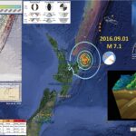
This was a very busy week for me, so I missed reporting on this series of earthquakes offshore the North Island of New Zealand. I did put together an interpretive Earthquake Report poster for these earthquakes for my general education earthquakes class, of which I present below. Initially there was a M 5.8 earthquake (USGS website for M 5.8), with a M 7.1 about 18 hours later (USGS website for M 7.1). Here is a kml that includes these, as well as the aftershocks to date. We have a great deal of information about the plate tectonics of this region. These earthquakes are along the northern Hikurangi margin, which is a convergent plate boundary formed by the subduction of the Pacific plate westward beneath the Australia plate.
The M 5.8 earthquake had an hypocentral depth of ~22 km, which (based upon the slab contours) places this earthquake in the downgoing Pacific plate. As plates subduct, they undergo extension as the deeper part of the plate pulls down on the shallower part of the plate. This “slab tension” can result in extensional (normal) earthquakes. Also, due to various reasons, the downgoing plate can be bent or flexed downwards. This can happen oceanward of the subduction zone or beneath the tip of the subduction zone fault, after the downgoing plate has subducted. If this downgoing plate flexes downward, the upper part of the lithosphere undergoes extension and extensional/normal earthquakes occur.
Initially, the M 7.1 earthquake was given an hypocentral depth of ~300 km. This was confusing as it did not seem to be anywhere near oceanic lithosphere as estimated by people who study this region. Within minutes, the USGS hypocentral depth was re-determined to be ~19 km. Comparing this depth with the slab contours (Hayes et al., 2012), this earthquake also occurred in the Pacific plate. The M 5.8 is probably a foreshock for the M 7.1, but we also might consider that the M 5.8 triggered the M 7.1 earthquake. Others will need to analyze these earthquake more before this detail can be worked out.
Below is my interpretive poster for this earthquake. This map shows the slab contours (an estimate of the subduction zone plate interface). These contours are estimated by Hayes et al., (2012). The hypocentral depth is 19.0 km, which is deeper than the slab depth according to Hayes et al. (2012), which is probably about 15 km. This earthquake is clearly in one of the downgoing slabs of the Pacific plate.
I placed a moment tensor / focal mechanism legend on the poster. There is more material from the USGS web sites about moment tensors and focal mechanisms (the beach ball symbols). Both moment tensors and focal mechanisms are solutions to seismologic data that reveal two possible interpretations for fault orientation and sense of motion. One must use other information, like the regional tectonics, to interpret which of the two possibilities is more likely. The moment tensor shows northwest-southeast tension. If this is due to slab tension, then the slab would be dipping to the northwest, or the southeast. This tension may also be due to some form of bending in the slab, but it is difficult to tell given these limited data. Most of the recent seismicity in this region is associated with convergence along the New Britain trench or the South Solomon trench.

    I include some inset figures.

  • In the upper right corner is a generalized tectonic map from Mike Norton (see poster for attribution).
  • In the lower right corner is a cross section of the southern Kermadec Trench. This was produced by Jack Cook at the Woods Hole Oceanographic Institution. The Lousiville Seamount Chain is clearly visible in this graphic.
  • In the upper left corner I include a map from the USGS Open File Report for this region of the world (Benz et al., 2011). The map shows seismicity colored vs. depth, some slab contours, and the location of the two cross sections that are also included in this poster (J-J’ and K-K’).


    Here are two figures from Jascha Polet, a seismologist at Cal Poly Pomona.

  • Here is a map showing seismicity and moment tensors for historic earthquakes, as well as the m 7.1 earthquake.

  • Here is a cross section showing the same seismicity and moment tensor data.

  • Here are some cross sections from Scherwath et al. (2010), located close to where the M 7.1 earthquake occurred. Note how the M 7.1 occurred at a location where the downgoing Pacific plate is indeed bending downward near the M 7.1 hypocenter.

For more on the graphical representation of moment tensors and focal mechanisms, check this IRIS video out:

Earthquake Report: Antarctic plate!

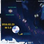
We just had an interesting mid-plate earthquake (not along a plate boundary). Hat Tip to Jascha Polet, who pointed out this is in the region of the 1998 M 8.1 earthquake, one of the largest strike-slip and mid-plate earthquakes ever recorded. I then learned that the seismicity in this region may be related to isostatic adjustments in the Antarctic plate! Here is the USGS website for this M 5.9 strike-slip earthquake.
Here is my interpretive map. I plot the USGS location as a yellow star. I also include some other figures as insets. I will discuss these below. I include a figure from Kreemer and Holt (2000) that shows focal mechanisms for earthquakes in the region plotted on a bathymetric map (seafloor topography). I also include a few maps from Das and Henry (2003). About a week ago, there was an earthquake along the Australia-Pacific plate boundary to the northeast of this earthquake (here is the Earthquake Report for that earthquake).
There is a legend that shows how moment tensors can be interpreted. Moment tensors are graphical solutions of seismic data that show two possible fault plane solutions. One must use local tectonics, along with other data, to be able to interpret which of the two possible solutions is correct. The legend shows how these two solutions are oriented for each example (Normal/Extensional, Thrust/Compressional, and Strike-Slip/Shear). There is more about moment tensors and focal mechanisms at the USGS.


Here is the earthquake report interpretive poster for the recent earthquake to the northeast.


Here is the Kreemer and Holt (2000) figure 1, showing the focal mechanisms for earthquakes along the regional plate boundary faults, as well as the focal mechanisms from the earthquakes in the region of the 1998 M 8.1 earthquake. I include their figure caption below in blockquote.

Focal mechanisms are from the Harvard CMT catalog (1/77-6/99). The black focal mechanisms indicate the 1998 Antarctic plate event with (some of) its aftershocks. Bathymetry is from Smith and Sandwell [1994]. Transform locations are derived from satellite altimetry by Spitzak and DeMets [1996]. MRC is the Macquarie Ridge Complex and TJ is the Australia-Pacific- Antarctica triple junction.

Here is the first figure from Das and Henry (2003). They plot the epicenters and focal mechanisms for earthquakes from the 1998 swarm overlain upon the gravity anomaly map. I include their figure caption below in blockquote.

The 25 March 1998 Antarctic plate earthquake (with a seismic moment of 1.3  1021 N m). (a) Relocated aftershocks [Henry et al., 2000] for the period 25 March 1998 to 25 March 1999 are shown as diamonds, with the main shock epicenter shown by a star. Only those earthquakes which are located with the semimajor axis of the 90% confidence ellipse 20 km are shown. International Seismological Centre epicenters for the period 1 January 1964 to 31 July 1997 are shown as circles. Marine gravity anomalies from an updated version of Sandwell and Smith [1997], illuminated from the east, with contours every 20 mGal, are shown in the background in the epicentral region. Selected linear gravity features are identified by white lines and are labeled F1–F6. F1, F2, and their southward continuation to join F1a compose the George V fracture zone. F4–F6 compose the Tasman fracture zone. (b) An expanded view of the region of the aftershocks. The relocated aftershocks in the first 24 hours are shown as diamonds; the rest are shown as circles. The 90% confidence ellipses are plotted for the locations; earthquakes without confidence ellipses were not successfully relocated and are plotted at the National Earthquake Information Center (NEIC) locations. The yellow star shows the NEIC epicenter for the main shock, with the CMT mechanism of solution 5 from Henry et al. [2000]. Available Harvard CMT solutions for the aftershocks are plotted, linked with lines to their centroid locations and then to their relocated epicenters, and are identified by their dates (mmddyy). The location of the linear features identified on Figure 6a are shown by black arrows. (c) Final distribution of moment release for preferred solution 8 of Henry et al. [2000]. There are the same gravity anomalies, same linear features, and same epicenters as Figure 6b except that now only earthquakes which are located with the semimajor axis of the 90% confidence ellipse 20 km are shown. Two isochrons from Mu¨ller et al. [1997] are plotted as white lines. Superimposed graph shows the final moment density, with a peak density of 1.25  1019 N m km 1. Regions of the fault with 15% of this maximum value are excluded in this plot. The baseline of the graph is the physical location of the fault. The spatial and temporal grid sizes used in the inversion for the slip were 5 km 5 km and 3 s, respectively.

This is the continuation of the above figure. This shows their interpretation of the faults that slipped during this 1998 earthquake series. In their paper, Das and Henry (2003) discuss the relations between main shocks and aftershocks. At the time, the 1998 earthquake “was the largest crustal submarine intraplate earthquake ever recorded, the largest strike-slip earthquake
since 1977, and at the time the fifth largest of any type worldwide since 1977” (Das and Henry, 2003). This M 8.1 earthquake was interesting because it crossed the fracture zones that trend N-S in the area. This is especially interesting because this is also what happened during the 2012 Sumatra Outer Rise earthquakes. Toda and Stein (2000) model the coulomb stress changes associated with different slip models from the M 8.1 earthquake to estimate if the aftershocks were triggered by the main earthquake. I include their figure caption below in blockquote.

(d) Principal features of the main shock rupture process [from Henry et al., 2000]. Arrows show location and directivity for the first and second subevents. Arrows are labeled with start and end times of rupture segments. Focal mechanisms are shown for the initiation, the first subevent plotted at the centroid obtained by Henry et al. [2000], and the second subevent. (The second subevent is not well located, and the centroid location is not indicated.) The cross shows the centroid location of moment tensor of the total earthquake obtained by Henry et al. [2000], and the triangle shows the Harvard CMT centroid. The same aftershock epicenters as Figure 6c are shown. Linear gravity features are shown as shaded lines, and probable locations of tectonic features T1a and T3a associated with the gravity features F1a and F3a are shown as shaded dashed lines. (See Henry et al. [2000] for further details.)

Here is the Kreemer and Holt (2000) figure that shows their interpretation of the stress field. The first figure below shows their determination of the strain rates as modeled from tectonic stresses at the plate boundaries. Note the low strain rate in the area near the M 8.1 earthquake (plotted as a focal mechanism). The second figure below shows the averaged minimum horiztonal deviatoric stress field caused by by flexure in the crust following the last ice age. Based upon their analyses, they attribute the earthquake to possibly be the result of stresses in the Antarctic plate following the last deglaciation. I include their figure caption below in blockquote.

a) Grid in which a strain rate field is determined associated with the accommodation of relative plate motions [DeMets et al., 1994]. These motions are applied as boundary velocity conditions,
illustrated by the grey arrows. b) Principal axes of the strain rate field for the region where the Antarctic event occurred (indicated by CMT focal mechanism). Model strain rates in this
region are one order of magnitude lower than along the surrounding ridges and transforms.


Principal axes of the vertically averaged minimum horizontal deviatoric stress field caused by gravitational potential energy differences within the lithosphere. CMT focal mechanism of Antarctic plate earthquake is shown. a) ‘ice-age’ simulation. b) change in stress tensor field from ‘ice-age’ to present day determined by taking the tensorial difference between the two solutions.

Earthquake Report: Macquarie – New Zealand

There was an earthquake along the plate boundary between the Australia plate to the west and the Pacific plate to the east, just south of New Zealand. Here is the USGS website for this M 6.2 earthquake. Yesterday on 2015/02/14 there was a widely felt earthquake with a smaller magnitude of M = 5.8 near Christchurch, on the northern end of the South Island, New Zealand. The M 5.8 was in the region that is still rebuilding following the Darfield-Canterbury earthquake series in 2010-2011. Here is my earthquake report for the M 5.8 earthquake.
Below is a map that has the USGS seismicity from 1900-2016, for earthquakes of magnitude M ≥ 6.0, plotted as orange circles. Here is the USGS query that I used to make this map. I include the USGS Modified Mercalli Intensity contours, made using this USGS kml file in Google Earth. The MMI is a qualitative measure of shaking intensity. More on the MMI scale can be found here and here.
I placed the moment tensors, that exist (post ~1970), for each of the earthquakes larger than M = 7.0. I include relative motion vectors for each moment tensor, based upon my interpretation from the mapped faults along this plate boundary. There is not a USGS moment tensor for the M 6.2 earthquake, so I place a generic strike-slip focal mechanism and place it in the orientation that aligns with the strike of the plate boundary near the epicenter.
There is a north-northeast striking ridge east of the Puysegur Trench, that trends southwest and turns into the Macquarie Ridge. At this latitude, the Trench to the west is mapped as a subduction zone. The plate convergence is oblique to the plate boundary. The earthquakes that are rupturing in the region of today’s earthquake, that have USGS moment tensors, all have orientations aligned with this ridge. Some earthquakes have strike-slip moment tensors and some have compressional moment tensors. The compressional earthquakes may be along subduction zone faults or simply thrust/reverse faults in the crust. There are no deep earthquakes in this region, so the subduction zone may not be active or existent in this region. The strike-slip earthquakes may be rupturing along forearc sliver faults, possibly there due to strain partitioning from the oblique convergence.
There is a legend that shows how moment tensors can be interpreted. Moment tensors are graphical solutions of seismic data that show two possible fault plane solutions. One must use local tectonics, along with other data, to be able to interpret which of the two possible solutions is correct. The legend shows how these two solutions are oriented for each example (Normal/Extensional, Thrust/Compressional, and Strike-Slip/Shear). There is more about moment tensors and focal mechanisms at the USGS.

    Here are two examples of earthquakes with similar moment tensors as today’s M 6.2 earthquake.

  • 1981.05.25 M 7.6 (NE-SW strike-slip
  • 1994.01.03 M 6.1 (NE-SW strike-slip
  • 2007.09.30 M 6.6 (E-W compressional moment tensor)
  • 2008.04.26 M 6.1 (E-W compressional moment tensor)


    Inset maps in the above interpretation poster include the following:

  • In the upper left corner I include the tectonic map from Benz et al. (2011) which shows how the East Vergent subduction zone at the Hikurangi Trench transforms (pun intended) via the Alpine fault (a right lateral strike-slip fault) to the West Vergent subduction zone at the Puysegur Trench. Fault vergence refers to the up-dip direction of the fault.

  • In the lower left corner I include the tectonic interpretation map from Daczko et al. (2004). Daczko et al. (2005) use volcaniclastic rocks on Macquarie Island to interpret the tectonic history of this region as it relates to the evolution of a spreading ridge as it converts into a transform plate boundary. I include the text from their figure below as a blockquote.

  • Location map of Macquarie Island and the Australian-Pacific transform plate boundary south of New Zealand. The thickest black line shows the extent of the Macquarie Ridge Complex (MRC). Crust formed by Australian-Pacific spreading along the (now extinct) Macquarie spreading ridge between ca. 40 and ca. 10 Ma is stippled. Filled triangles along the plate boundary are subduction zones; open triangles (in the Hjort region) represent incipient subduction (Meckel, 2003). Light gray illustrates regions ≤2000 m below sea level. Present plate boundaries are shown as black lines. Past plate boundaries are shown as dashed black lines. Fracture zones (FZ) are shown as thin black lines. Azimuthal equidistant projection centered at 60°S, 180°E (after Daczko et al., 2003).

  • In the upper right corner, I include the detailed tectonic map from Daczko et al. (2005) that shows how the spreading centers are now oritented in this region. Note that they query how the plate margin converts into the subduction zone to the north (question marks on their map). I include the text from their figure below as a blockquote.

  • Plate tectonic reconstruction for Chron 5 old – C5o (10.9 Ma). Stippled crust formed at the Macquarie spreading ridge (now a transform boundary), light gray crust formed at the Southeast Indian spreading ridge (still active), medium gray crust formed at the Pacific-Antarctic spreading ridge (still active), and dark gray crust formed at the Tasman spreading ridge (extinct). Magnetic anomaly picks are represented by open circles (C13o, 33.3 Ma); filled stars (C8o, 26.6 Ma); filled triangles (C6o, 20.1 Ma); filled hexagons (C5o, 10.9 Ma); plus symbols (all other ages). Thin black lines are lineaments (continental margins and fracture zones) interpreted from the satellite-derived free-air gravity field (Sandwell and Smith, 1997). Medium black lines are the plate boundaries active at 10.9 Ma (double line = spreading ridge; single line = transform). Thickest black lines are the Warna (Australian plate) and Matata (Pacifi c plate) fracture zones (FZ). These two fracture zones are linked by the only left lateral transform fault within the Macquarie crust as shown by the offset of C18o picks (open rectangles). The dashed lines show our interpreted position of the fracture zones allowing for a minor component of deformation of the fracture zones during Neogene and Quaternary transpression along the Australian-Pacific plate boundary. The arrow points to the inside corner of the ridge-transform intersection where we interpret the crust of Macquarie Island (MI) most likely formed.

    Something else of note is the M 8.2 earthquake, one of the largest strike-slip earthquakes ever recorded. This earthquake happened on 1989.05.23. Interestingly, this earthquake has some shared characteristics with the 2012 earthquake series offshore of Sumatra in 2012. More on this later as I need to get ready for X-Files. Here are a couple report pages for the 2012 earthquakes.

  • 2012.04.11 M 8.6
  • 2012.04.11 M 8.6 (update #1)