Earthquake Report: Papua New Guinea: Update #1

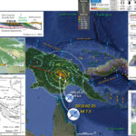
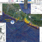
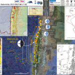
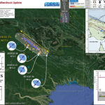
The aftershocks are still coming in! We can use these aftershocks to define where the fault may have slipped during this M 7.5 earthquake. As I mentioned yesterday in the original report, it turns out the fault dimension matches pretty well with empirical relations between fault length and magnitude from Wells and Coppersmith (1994).
The mapped faults in the region, as well as interpreted seismic lines, show an imbricate fold and thrust belt that dominates the geomorphology here (as well as some volcanoes, which are probably related to the slab gap produced by crust delamination; see Cloos et al., 2005 for more on this). I found a fault data set and include this in the aftershock update interpretive poster (from the Coordinating Committee for Geoscience Programmes in East and Southeast Asia, CCOP).
I initially thought that this M 7.5 earthquake was on a fault in the Papuan Fold and Thrust Belt (PFTB). Mark Allen pointed out on twitter that the ~35km hypocentral depth is probably too deep to be on one of these “thin skinned” faults (see Social Media below). Abers and McCaffrey (1988) used focal mechanism data to hypothesize that there are deeper crustal faults that are also capable of generating the earthquakes in this region. So, I now align myself with this hypothesis (that the M 7.5 slipped on a crustal fault, beneath the thin skin deformation associated with the PFTB. (thanks Mark! I had downloaded the Abers paper but had not digested it fully.)

Below is my interpretive poster for this earthquake

I plot the seismicity from the past month, with color representing depth and diameter representing magnitude (see legend).
I plot the USGS fault plane solutions (moment tensors in blue and focal mechanisms in orange) for the M 7.5 earthquake, in addition to some relevant historic earthquakes.

  • I placed a moment tensor / focal mechanism legend on the poster. There is more material from the USGS web sites about moment tensors and focal mechanisms (the beach ball symbols). Both moment tensors and focal mechanisms are solutions to seismologic data that reveal two possible interpretations for fault orientation and sense of motion. One must use other information, like the regional tectonics, to interpret which of the two possibilities is more likely.
  • I also include the shaking intensity contours on the map. These use the Modified Mercalli Intensity Scale (MMI; see the legend on the map). This is based upon a computer model estimate of ground motions, different from the “Did You Feel It?” estimate of ground motions that is actually based on real observations. The MMI is a qualitative measure of shaking intensity. More on the MMI scale can be found here and here. This is based upon a computer model estimate of ground motions, different from the “Did You Feel It?” estimate of ground motions that is actually based on real observations.
  • I include the slab contours plotted (Hayes et al., 2012), which are contours that represent the depth to the subduction zone fault. These are mostly based upon seismicity. The depths of the earthquakes have considerable error and do not all occur along the subduction zone faults, so these slab contours are simply the best estimate for the location of the fault.
  • I include some inset figures.

  • In the upper right corner is a general overview of the plate boundaries and mapped faults in the region. I place a blue star in the general location of the M 7.5 epicenter. The fault lines on this figure also come from CCOP.
  • In the lower right corner is a plot showing vertical land motion for GPS sites along a north-south profile. Basically, this shows that the sites north of the FTB are currently uplifting at about 5 mm.yr and the sites north of the Bewani fault zone are uplifting an additional 10 mm/yr. This means that the crustal shortening associated with the collision of Australia with the Pacific/Caroline plates is partly being accumulated as elastic strain in the crust and is localized on these fault systems. While this profile is several tens of kilometers to the west of the M 7.5, this process is likely also happening where the M 7.5 occurred.
  • On the left are three figures from Abers and McCaffrey (1988).
    • The upper panel shows the extent of a portion of their analysis that is cogent for the M 7.5 sequence. The extent of this box is also outlined in a dashed yellow rectangle on the main map. The blue star represents the general location of the M 7.5 earthquake. There are no backthrusts mapped on this figure (the hypothesis for the M 7.5 source fault promoted in my original report and on social media).
    • This is a north-south cross section showing the focal mechanisms for 3 of the earthquakes in the map. This shows a south vergent fault as a possible source for the M ~5.x earthquakes studied by Abers and McCaffrey (1988). I am starting to favor an interpretation that the M 7.5 fault is south vergent.
    • The lowest panel shows the interpretation from Abers that these deeper crustal faults are responsible for the seismicity they studied (and I thank mark again that I may posit that these faults are responsible for the current seismicity).


  • Here is the original interpretive poster from my initial report here.

  • The same map without historic seismicity.

Some Relevant Discussion and Figures

  • Here is the tectonic map from Loulali et al. (2015).

  • Tectonic setting of the Papua New Guinea region. Topography and bathymetry are from SRTM(http://topex.ucsd.edu/www_html/srtm30_plus.html). Faults are mostly from the East and Southeast Asia (CCOP) 1:2000000 geological map (downloaded from http://www.orrbodies.com/resources/item/orr0052). AFTB, Aure Fold-and-Thrust Belt; OSZF, Owen Stainly fault zone; GF, Gogol fault; BTFZ, Bewani-Torricelli fault zone; RMFZ, Ramu-Markham fault zone; BSSL, Bismarck Sea Seismic Lineation.

  • Here is a map from Abers and McCaffrey (1988) that shows all the earthquakes included in their study (and the focal mechanisms). Inset “a” is the region shown on the aftershock poster above.

  • Map of focal mechanisms determined here, locations of cross sections in Figure 11, and shallow seismicity. Focal mechanisms are shown as lower hemisphere projections with the compressional quadrants shaded, and the P and T axes shown as solid and open circles, respectively. The sizes of the focal spheres are scaled to log (MO), according to the scale in the upper right, and are labeled by the event numbers in Table 1. Seismicity is from the ISC catalog, 1964-1984, and includes all events listed as being shallower than 70 km recorded by 25 or more stations, with M b • 5.0, and with standard deviations in latitude, longitude, or depth each not exceeding 20 km. Inset in lower left shows all large (M • 7.0), shallow (! 70 km) earthquakes in the period 1900-1985, from the catalog compiled by Everingham [1974] for events before 1971 and from Ganse and Nelson [1981, with supplement] for more recent events. Faults are labelled on Figure 1.

  • Here are all the 3 cross sections from Abers and McCaffrey (1988). The upper section is a and the lower section is c (from the above map).

  • Cross sections of seismicity and topography: a, b, and c refer to the profile locations on Figure 2. Vertical exaggeration is 10x for topography and lx for seismicity, as indicated by the vertical scale bars on right. Horizontal scale, indicated on profile a, is the same for all profiles. Focal spheres are plotted as back hemisphere projections, and compressional quadrants are filled.

  • This is the money shot, showing their interpretation (Abers and McCaffrey, 1988).

  • Cartoon showing how thin-skinned faulting mapped in PNG might be related to faulting in the basement, inferred from the earthquakes and other evidence discussed in the text. See Figure 11a for comparison to actual topography and earthquake mechanisms.

Earthquake Report: Papua New Guinea

This morning (local time in California) there was an earthquake in Papua New Guinea with, unfortunately, a high likelihood of having a good number of casualties. I was working on a project, so could not immediately begin work on this report.
This M 7.5 earthquake (USGS website) occurred along the Papua Fold and Thrust Belt (PFTB), a (mostly) south vergent sequence of imbricate thrust faults and associated fold (anticlines). The history of this PFTB appears to be related to the collision of the Australia plate with the Caroline and Pacific plates, the delamination of the downgoing oceanic crust, and then associated magmatic effects (from decompression melting where the overriding slab (crust) was exposed to the mantle following the delamination). More about this can be found in Cloos et al. (2005).
The USGS prepared a fault slip model that shows this earthquake may have ruptured a north vergent (south dipping) thrust fault.
There was a M 6.5 earthquake north of today’s M 7.5 earthquake in November 2017. These earthquakes are along different fault systems and likely are too distant to be related.
On 2018.02.26 I prepared an updated report here.

Below is my interpretive poster for this earthquake

I plot the seismicity from the past month, with color representing depth and diameter representing magnitude (see legend). I include earthquake epicenters from 1918-2018 with magnitudes M ≥ 6.5 in one version.
I plot the USGS fault plane solutions (moment tensors in blue and focal mechanisms in orange) for the M 7.5 earthquake, in addition to some relevant historic earthquakes. There was a M 6.6 earthquake to the southeast along the PFTB in 2000 and I include the moment tensor for this earthquake.

  • I placed a moment tensor / focal mechanism legend on the poster. There is more material from the USGS web sites about moment tensors and focal mechanisms (the beach ball symbols). Both moment tensors and focal mechanisms are solutions to seismologic data that reveal two possible interpretations for fault orientation and sense of motion. One must use other information, like the regional tectonics, to interpret which of the two possibilities is more likely.
  • I also include the shaking intensity contours on the map. These use the Modified Mercalli Intensity Scale (MMI; see the legend on the map). This is based upon a computer model estimate of ground motions, different from the “Did You Feel It?” estimate of ground motions that is actually based on real observations. The MMI is a qualitative measure of shaking intensity. More on the MMI scale can be found here and here. This is based upon a computer model estimate of ground motions, different from the “Did You Feel It?” estimate of ground motions that is actually based on real observations.
  • I include the slab contours plotted (Hayes et al., 2012), which are contours that represent the depth to the subduction zone fault. These are mostly based upon seismicity. The depths of the earthquakes have considerable error and do not all occur along the subduction zone faults, so these slab contours are simply the best estimate for the location of the fault.
  • I include some inset figures.

  • In the lower right corner is a great figure showing the generalized plate tectonic boundaries in this region of the equatorial Pacific Ocean (Holm et al., 2016). I place a blue star in the general location of the M 6.5 earthquake (also plotted in other inset figures). This map shows the major plate boundary faults. Active subduction zones have shaded triangle fault symbols, while inactive subduction zones have un-shaded triangle fault line symbols.
  • In the lower left corner is a map showing the fault systems in the region (Cloos et al., 2005). The legend allows us to distinguish between active and inactive fault systems.
  • In the upper right corner is a figure from Baldwin et al. (2012). This figure shows a series of cross sections along this convergent plate boundary from the Solomon Islands in the east to Papua New Guinea in the west. Cross section ‘D’ is the most representative for the earthquakes today. I present the map and this figure again below, with their original captions.
  • In the upper left corner is cross section D-D’ that shows the PFTB. I placed the blue star along a north vergent fault that may be associated with today’s M 7.5. The faults are actually quite complex, so this schematic illustration may not be a perfect representation of the faults here.
  • In the center left is a plot showing the larger aftershocks (large enough to show up in USGS database, a global catalog). The rupture length of the fault that ruptured today may be ~160 km. Considering empirical relations developed by Wells and Coppersmith (1994), a 160 km fault length would generate a M 7.6-7.7 earthquake (close to M 7.5, given the empirical relations and the uncertainty with those relations).


  • The same map without historic seismicity.

  • Here is the interpretive poster from last November (this is the report).

  • Some Relevant Discussion and Figures

    • Here is the Holm et al. (2016) figure.

    • Topography, bathymetry and regional tectonic setting of New Guinea and Solomon Islands. Arrows indicate rate and direction of plate motion of the Australian and Pacific plates (MORVEL, DeMets et al., 2010); Mamberamo thrust belt, Indonesia (MTB); North Fiji Basin (NFB)

    • Koulali et al (2015) use GPS data to resolve the kinematics of the central-eastern Papua New Guinea region. The first figure below is a map that shows the GPS velocities in this region There are two cross section profiles labled on the map (the M 7.5 earthquake happened to the east of A-A’). Note the complicated and detaile dfault mapping (the balck lines). The convergence is generally perpendicular to the PFTB in the east and more oblique to the PFTB on the western portion of this map.

    • The GPS velocity field and 95 per cent confidence interval ellipses with respect to the Australian Plate. Red and blue vectors are the new calculated field and black vectors are from Wallace et al. (2004). The dashed rectangle shows the area of Fig. 3. The blue dashed lines correspond to the location of profiles shown in Fig. 4. Note that the velocity scales for the red and blue vectors are different (see the lower right corner for scales). The black velocities are plotted at the same scale as the red vectors.

    • Here are the two profiles. The red and blue lines plot vertical land motion (VLM) rates in mm/yr and show strain accumulates across the region. Today’s earthquake happened in the region labeled ‘Highland FTB.’ The plot shows that ~5 mm/yr of strain accumulates in this fault system.

    • Profiles A–A& and B–B& from Fig. 2 showing model fit to GPS observations. Red symbols and lines are the GPS observed and modelled velocities, respectively, for the profile-normal component. Blue symbols and lines correspond to the profile-parallel component. The green and pink lines corresponds to the model using the Ramu-Markham fault geometry from Wallace et al. (2004), south of Lae. Grey profiles show the projected topography. The seismicity is from the ISC catalogue for events > Mw 3.5 (1960–2011).

    • Here is a comparison of the proposed fault length shown on the poster with fault scaling relations from Wells and Coppersmith (1994). The upper panel is figure 9 and the lower panel is figure 17. I include figure captions for these figures below. Presuming a fault length of 160 km, the magnitude would be between 7.5 and 8.

    • Figure 9. (a) Regression of surface rupture length on magnitude (M). Regression line shown for all-slip-type relationship. Short dashed line indicates 95% confidence interval. (b) Regression lines for strike-slip, reverse, and normal-slip relationships. See Table 2 for regression coefficients. Length of regression lines shows the range of data for each relationship.

      Figure 17. Regression lines for stable continental region (SCR) earthquakes and non-SCR continental earthquakes. (a) Regression of surface rupture length on magnitude (M). (b) Regression of rupture area on magnitude (M).

    • Here is the USGS Pager Alert. More can be found about the PAGER alerts here.
    • PAGER provides shaking and loss estimates following significant earthquakes anywhere in the world. These estimates are generally available within 30 minutes and are updated as more information becomes available. Rapid estimates include the number of people and names of cities exposed to each shaking intensity level as well as the likely ranges of fatalities and economic losses. PAGER does not consider secondary effects such as landslides, liquefaction, and tsunami in loss estimates at this time.
    • This shows that there is a 42% chance that there will be between 100 and 1,000 casualties. We can only hope that there are fewer (which is possible).

    • Earlier, in other earthquake reports, I have discussed seismicity from 2000-2015 here. The seismicity on the west of this region appears aligned with north-south shortening along the New Britain trench, while seismicity on the east of this region appears aligned with more east-west shortening. Here is a map that I put together where I show these two tectonic domains with the seismicity from this time period (today’s earthquakes are not plotted on this map, but one may see where they might plot).

    • This map shows plate velocities and euler poles for different blocks. I include the figure caption below as a blockquote. The PFTB is shown as a kelly-green band of color.

    • Tectonic maps of the New Guinea region. (a) Seismicity, volcanoes, and plate motion vectors. Plate motion vectors relative to the Australian plate are surface velocity models based on GPS data, fault slip rates, and earthquake focal mechanisms (UNAVCO, http://jules.unavco.org/Voyager/Earth). Earthquake data are sourced from the International Seismological Center EHB Bulletin (http://www.isc.ac.uk); data represent events from January 1994 through January 2009 with constrained focal depths. Background image is generated from http://www.geomapapp.org. Abbreviations: AB, Arafura Basin; AT, Aure Trough; AyT, Ayu Trough; BA, Banda arc; BSSL, Bismarck Sea seismic lineation; BH, Bird’s Head; BT, Banda Trench; BTFZ, Bewani-Torricelli fault zone; DD, Dayman Dome; DEI, D’Entrecasteaux Islands; FP, Fly Platform; GOP, Gulf of Papua; HP, Huon peninsula; LA, Louisiade Archipelago; LFZ, Lowlands fault zone; MaT, Manus Trench; ML, Mt. Lamington; MT, Mt. Trafalgar; MuT, Mussau Trough; MV, Mt. Victory; MTB, Mamberamo thrust belt; MVF, Managalase Plateau volcanic field; NBT, New Britain Trench; NBA, New Britain arc; NF, Nubara fault; NGT, New Guinea Trench; OJP, Ontong Java Plateau; OSF, Owen Stanley fault zone; PFTB, Papuan fold-and-thrust belt; PP, Papuan peninsula; PRi, Pocklington Rise; PT, Pocklington Trough; RMF, Ramu-Markham fault; SST, South Solomons Trench; SA, Solomon arc; SFZ, Sorong fault zone; ST, Seram Trench; TFZ, Tarera-Aiduna fault zone; TJ, AUS-WDKPAC triple junction; TL, Tasman line; TT, Trobriand Trough;WD, Weber Deep;WB, Woodlark Basin;WFTB, Western (Irian) fold-and-thrust belt; WR,Woodlark Rift; WRi, Woodlark Rise; WTB, Weyland thrust; YFZ, Yapen fault zone.White box indicates the location shown in Figure 3. (b) Map of plates, microplates, and tectonic blocks and elements of the New Guinea region. Tectonic elements modified after Hill & Hall (2003). Abbreviations: ADB, Adelbert block; AOB, April ultramafics; AUS, Australian plate; BHB, Bird’s Head block; CM, Cyclops Mountains; CWB, Cendrawasih block; CAR, Caroline microplate; EMD, Ertsberg Mining District; FA, Finisterre arc; IOB, Irian ophiolite belt; KBB, Kubor & Bena blocks (including Bena Bena terrane); LFTB, Lengguru fold-and-thrust belt; MA, Mapenduma anticline; MB, Mamberamo Basin block; MO, Marum ophiolite belt; MHS, Manus hotspot; NBS, North Bismarck plate; NGH, New Guinea highlands block; NNG, Northern New Guinea block; OKT, Ok Tedi mining district; PAC, Pacific plate; PIC, Porgera intrusive complex; PSP, Philippine Sea plate; PUB, Papuan Ultramafic Belt ophiolite; SB, Sepik Basin block; SDB, Sunda block; SBS, South Bismarck plate; SIB, Solomon Islands block; WP, Wandamen peninsula; WDK, Woodlark microplate; YQ, Yeleme quarries.

    • This figure incorporates cross sections and map views of various parts of the regional tectonics (Baldwin et al., 2012). These deep earthquakes are nearest the cross section D (though are much deeper than these shallow cross sections). I include the figure caption below as a blockquote.

    • Oblique block diagram of New Guinea from the northeast with schematic cross sections showing the present-day plate tectonic setting. Digital elevation model was generated from http://www.geomapapp.org. Oceanic crust in tectonic cross sections is shown by thick black-and-white hatched lines, with arrows indicating active subduction; thick gray-and-white hatched lines indicate uncertain former subduction. Continental crust, transitional continental crust, and arc-related crust are shown without pattern. Representative geologic cross sections across parts of slices C and D are marked with transparent red ovals and within slices B and E are shown by dotted lines. (i ) Cross section of the Papuan peninsula and D’Entrecasteaux Islands modified from Little et al. (2011), showing the obducted ophiolite belt due to collision of the Australian (AUS) plate with an arc in the Paleogene, with later Pliocene extension and exhumation to form the D’Entrecasteaux Islands. (ii ) Cross section of the Papuan peninsula after Davies & Jaques (1984) shows the Papuan ophiolite thrust over metamorphic rocks of AUS margin affinity. (iii ) Across the Papuan mainland, the cross section after Crowhurst et al. (1996) shows the obducted Marum ophiolite and complex folding and thrusting due to collision of the Melanesian arc (the Adelbert, Finisterre, and Huon blocks) in the Late Miocene to recent. (iv) Across the Bird’s Head, the cross section after Bailly et al. (2009) illustrates deformation in the Lengguru fold-and-thrust belt as a result of Late Miocene–Early Pliocene northeast-southwest shortening, followed by Late Pliocene–Quaternary extension. Abbreviations as in Figure 2, in addition to NI, New Ireland; SI, Solomon Islands; SS, Solomon Sea; (U)HP, (ultra)high-pressure.

    • UPDATE (23:00 pacific time): This is one of the ground motion visualizations from IRIS. The red and blue colors represent the upward or downward motion recorded on seismometers. Note the background motions along the coast of WA, OR, and CA have high amplitudes (darker red and darker blue). This is probably due to the storm that is hitting the region (the wind blows trees, buildings, etc. and the waves pound the earth, both of which are recorded on seismometers). This is the first time that I noticed this phenomena on one of these visualizations. There are probably many other examples.
    • Another cool thing is that about half way through the animation, the seismic waves that were traveling west from the earthquake, travel around the globe, and then are seen here, traveling from teh east coast to the west coast. This is common to most all of these visualizations.

    Geologic Fundamentals

    • For more on the graphical representation of moment tensors and focal mechnisms, check this IRIS video out:
    • Here is a fantastic infographic from Frisch et al. (2011). This figure shows some examples of earthquakes in different plate tectonic settings, and what their fault plane solutions are. There is a cross section showing these focal mechanisms for a thrust or reverse earthquake. The upper right corner includes my favorite figure of all time. This shows the first motion (up or down) for each of the four quadrants. This figure also shows how the amplitude of the seismic waves are greatest (generally) in the middle of the quadrant and decrease to zero at the nodal planes (the boundary of each quadrant).

    • There are three types of earthquakes, strike-slip, compressional (reverse or thrust, depending upon the dip of the fault), and extensional (normal). Here is are some animations of these three types of earthquake faults. The following three animations are from IRIS.
    • Strike Slip:

      Compressional:

      Extensional:

    Social Media

      References:

    • Baldwin, S.L., Monteleone, B.D., Webb, L.E., Fitzgerald, P.G., Grove, M., and Hill, E.J., 2004. Pliocene eclogite exhumation at plate tectonic rates in eastern Papua New Guinea in Nature, v. 431, p/ 263-267, doi:10.1038/nature02846.
    • Baldwin, S.L., Fitzgerald, P.G., and Webb, L.E., 2012. Tectonics of the New Guinea Region, Annu. Rev. Earth Planet. Sci., v. 40, pp. 495-520.
    • Cloos, M., Sapiie, B., Quarles van Ufford, A., Weiland, R.J., Warren, P.Q., and McMahon, T.P., 2005, Collisional delamination in New Guinea: The geotectonics of subducting slab breakoff: Geological Society of America Special Paper 400, 51 p., doi: 10.1130/2005.2400.
    • Hamilton, W.B., 1979. Tectonics of the Indonesian Region, USGS Professional Paper 1078.
    • Hayes, G. P., D. J. Wald, and R. L. Johnson (2012), Slab1.0: A three-dimensional model of global subduction zone geometries, J. Geophys. Res., 117, B01302, doi:10.1029/2011JB008524.
    • Holm, R. and Richards, S.W., 2013. A re-evaluation of arc-continent collision and along-arc variation in the Bismarck Sea region, Papua New Guinea in Australian Journal of Earth Sciences, v. 60, p. 605-619.
    • Holm, R.J., Richards, S.W., Rosenbaum, G., and Spandler, C., 2015. Disparate Tectonic Settings for Mineralisation in an Active Arc, Eastern Papua New Guinea and the Solomon Islands in proceedings from PACRIM 2015 Congress, Hong Kong ,18-21 March, 2015, pp. 7.
    • Holm, R.J., Rosenbaum, G., Richards, S.W., 2016. Post 8 Ma reconstruction of Papua New Guinea and Solomon Islands: Microplate tectonics in a convergent plate boundary setting in Eartth Science Reviews, v. 156, p. 66-81.
    • Johnson, R.W., 1976, Late Cainozoic volcanism and plate tectonics at the southern margin of the Bismarck Sea, Papua New Guinea, in Johnson, R.W., ed., 1976, Volcanism in Australia: Amsterdam, Elsevier, p. 101-116
    • Koulali, A., tregoning, P., McClusky, S., Stanaway, R., Wallace, L., and Lister, G., 2015. New Insights into the present-day kinematics of the central and western Papua New Guinea from GPS in GJI, v. 202, p. 993-1004, doi: 10.1093/gji/ggv200
    • Sapiie, B., and Cloos, M., 2004. Strike-slip faulting in the core of the Central Range of west New Guinea: Ertsberg Mining District, Indonesia in GSA Bulletin, v. 116; no. 3/4; p. 277–293
    • Tregoning, P., McQueen, H., Lambeck, K., Jackson, R. Little, T., Saunders, S., and Rosa, R., 2000. Present-day crustal motion in Papua New Guinea, Earth Planets and Space, v. 52, pp. 727-730.
    • Wells, D., l., and Coppersmith, K.J., 1994. New Empirical Relationships among Magnitude, Rupture Length, Rupture Width, Rupture Area, and Surface Displacement in BSSA, vol. 84, no. 4, pp. 974-1002

    Earthquake Report: ¡Oaxaca, Mexico!

    There was just now an earthquake in Oaxaca, Mexico between the other large earthquakes from last 2017.09.08 (M 8.1) and 2017.09.08 (M 7.1). There has already been a M 5.8 aftershock.Here is the USGS website for today’s M 7.2 earthquake.
    This M 7.2 earthquake has a depth that is close to where we think the subduction zone fault is. Currently, the hypocentral depth is 24.7 km and the depth to the slab based upon the Hayes et al. (2012) Slab 1.0 model is about 40 km. So this earthquake may be in the upper North America plate and not on the subduction zone.
    UPDATE: The SSN has a reported depth of 12 km, further supporting evidence that this earthquake was in the North America plate.
    This region of the subduction zone dips at a very shallow angle (flat and almost horizontal).
    There was also a sequence of earthquakes offshore of Guatemala in June, which could possibly be related to the M 8.1 earthquake. Here is my earthquake report for the Guatemala earthquake.
    The poster also shows the seismicity associated with the M 7.6 earthquake along the Swan fault (southern boundary of the Cayman trough). Here is my earthquake report for the Guatemala earthquake.
    Today’s earthquake happened in a region that had a slightly elevated static coulomb stress following the 2017.09.08 M 8.1 earthquake as calculated by Shinji Toda from Temblor.
    UPDATE: I misinterpreted the stress change results as noticed by Eric Fielding:

    Below is my interpretive poster for this earthquake

    I plot the seismicity from the past year, with color representing depth and diameter representing magnitude (see legend). I include earthquake epicenters from 1918-2018 with magnitudes M ≥ 3.5.
    Note the difference in aftershock patterns between the shallower M 8.2 earthquake and the deeper M 7.1 earthquake. (hint: the deep M 8.1 did not have any aftershocks)
    I plot the USGS fault plane solutions (moment tensors in blue and focal mechanisms in orange) for the M 7.2 earthquake, in addition to some relevant recent earthquakes.

    • I placed a moment tensor / focal mechanism legend on the poster. There is more material from the USGS web sites about moment tensors and focal mechanisms (the beach ball symbols). Both moment tensors and focal mechanisms are solutions to seismologic data that reveal two possible interpretations for fault orientation and sense of motion. One must use other information, like the regional tectonics, to interpret which of the two possibilities is more likely.
    • I also include the shaking intensity contours on the map. These use the Modified Mercalli Intensity Scale (MMI; see the legend on the map). This is based upon a computer model estimate of ground motions, different from the “Did You Feel It?” estimate of ground motions that is actually based on real observations. The MMI is a qualitative measure of shaking intensity. More on the MMI scale can be found here and here. This is based upon a computer model estimate of ground motions, different from the “Did You Feel It?” estimate of ground motions that is actually based on real observations.
    • We can observe that Mexico City even shook more strongly due to the basin effects. Mexico City is locate on the map and there is a MMI IV.5 contour that surrounds the large valley. Mexico City was hit strongly by a M 8.0 earthquake in 1985 and again last September. See my report for more about the basin amplification.
    • I include the slab contours plotted (Hayes et al., 2012), which are contours that represent the depth to the subduction zone fault. These are mostly based upon seismicity. The depths of the earthquakes have considerable error and do not all occur along the subduction zone faults, so these slab contours are simply the best estimate for the location of the fault.
    • I include some inset figures.

    • In the lower left corner is a map from Mann (2007) that shows the regional tectonics. Plate boundary faults are in bold line, while lineations representing the spreading history are represented by thinner lines. I place a blue star in the general location of tonight’s M 7.2 earthquake (also in other inset maps) and green stars for the other 3 earthquakes discussed here.
    • In the upper right corner is a figure from Perez and Campos (2008; as presented here) which shows the interpreted geometry of the subducting slab in this region. The profile of the seismic array used as a basis for this interpretation (the MASE array) is denoted by the brown dashed line. This line is also shown on the figure in the lower right corner).
    • To the left of the cross section is a plot showing a 2 day solution for GPS positions in this region following the M 8.1 earthquake. Note how today’s M 7.2 earthquake (the blue star) is in an area that moved significantly during and following the M 8.1 earthquake.
    • In the lower right corner is a figure prepared by Temblor here, a company that helps people learn and prepare to be more resilient given a variety of natural hazards. This figure is the result of numerical modeling of static coulomb stress changes in the lithosphere following the 2017 M 8.1 earthquake. This basically means that regions that are red have an increased stress (an increased likelihood for an earthquake) following the earthquake, while blue represents a lower stress, or likelihood. The change in stress are very very small compared to the overall stress on any tectonic fault. This means that an earthquake may be triggered from this change in stress ONLY IF the fault is already highly strained (i.e. that the fault is about ready to generate an earthquake within a short time period, like a day, month, or year or so). The take away: the M 8.1 earthquake did not increase the stress on faults in the region of the M 7.1 (Temblor suggests the amount of increased stress near the M 7.1 is about the amount of force it takes to snap one’s fingers). However, today’s M 7.2 earthquake did have an increase in the stress on faults in the region of the M 7.1 earthquake.
    • In the upper left corner is a map that shows some historic earthquake patches along the Middle America Trench. Today’s earthquake happened near the and 1978 M 7.7 earthquake and a 1999 M 7.5 earthquake not shown on this map (but in region of the 1968 earthquake.


  • Here is the same poster but with the magnetic anomalies included (transparent).

  • Relevant Interpretive Posters

    Some Relevant Discussion and Figures

    • Here is the Franco et al. (2012) tectonic map.

    • Tectonic setting of the Caribbean Plate. Grey rectangle shows study area of Fig. 2. Faults are mostly from Feuillet et al. (2002). PMF, Polochic–Motagua faults; EF, Enriquillo Fault; TD, Trinidad Fault; GB, Guatemala Basin. Topography and bathymetry are from Shuttle Radar Topography Mission (Farr&Kobrick 2000) and Smith & Sandwell (1997), respectively. Plate velocities relative to Caribbean Plate are from Nuvel1 (DeMets et al. 1990) for Cocos Plate, DeMets et al. (2000) for North America Plate and Weber et al. (2001) for South America Plate.

    • Here is the figure from Gérault et al. (2015) that shows the slab contours.

    • (a) Geodynamic context of southwestern Mexico. Topography and bathymetry from ETOPO1 [Amante and Eakins, 2009]. A white curve outlines the Trans-Mexican Volcanic Belt (TMVB) [Ferrari et al., 2012]. The black lines show the isodepths of the Cocos slab at a 20 km interval, using seismicity up to ∼45 km depth and tomography below [Kim et al., 2012a]. These slab contours show that distinct topographic domains are associated with variations in slab geometry. The yellow vector shows the relative convergence velocity between the Cocos and North America Plate near Acapulco, holding North America fixed [DeMets et al., 2010]. The pink circles show the locations of the Meso-America Subduction Experiment (MASE) stations. (b) Moho depth (red) and upper slab limit (blue) from Kim et al. [2012a, 2013]. The dashed line shows the simplified Moho depth that we used in the numerical models. (c) Measured and smoothed topography along the MASE profile as a function of the distance from the southernmost seismic station, near Acapulco. The topography is smoothed using three passages of a rectangular sliding average of width 15 km.

    • Here are some figures from Pérez-Campos et al. (2008) that show results from the MASE seismic experiment. First is the map showing the seismic array in the tectonic context.

    • MASE seismic array. Slab isodepth contours from Pardo and Sua´rez [1995] are in blue dashed lines. The dots represent epicenters of M>4 earthquakes, reported by the Servicio Sismolo´gico Nacional (SSN; in pink) from December 2004 through June 2007 and those re-located by Pardo and Sua´rez [1995] (in green). The thick orange line represents the profile of Figures 2 and 3. The arrows indicate the beginning (dark blue) and end (light blue) of the flat segment, and the tip of the slab (red).

    • These authors used receiver functions to estimate the depth to the Cocos plate (the slab depth). Below is their figure showing their results. Receiver function analyses use an array (a linear network, or grid network, but a linear network in this case) of seismometers. “A receiver function technique is a way to model the structure of the Earth by using the information from teleseismic earthquakes recorded at a three component seismograph.” More can be found on this here and here.

    • Receiver function images. The black triangles denote the position of the stations along the profile with elevation exaggerated 10 times. The thick brown line denotes the extent of the TMVB. Seismicity (SSN: pink; Pardo and Sua´rez [1995]: green), within 50 km of the MASE profile, is shown as dots. The bottom left plot shows RFs for one teleseismic event along the flat slab portion of the slab; the bottom middle plot illustrates the corresponding model (LVM = low velocity mantle and OC = oceanic crust). Compressional-wave velocity models A, B, and C shown in the bottom right plot were determined from waveform modeling of RFs. They correspond to the structure at A, B, and C of the bottom left plot.

    • And finally, here is their model of the subducting slab. The authors also use seismic tomography to evaluate the geometry of the plates in this region. Seismic tomography is the same as a CT scan of the Earth. We can think of seismic tomography as a 3-D X-Ray of the Earth, just using seismic waves instead.

    • Composite model: tomographic and RF image showing the flat and descending segments of the slab. The key features are the flat under-plated subduction for 250 km, and the location and truncation of the slab at 500 km. The zone separating the ocean crust from the continental Moho is estimated to be less than 10 km in thickness. NA = North America, C = Cocos, LC = lower crust, LVM = low velocity mantle, OC = oceanic crust.

    Some Background Materials

    • For more on the graphical representation of moment tensors and focal mechnisms, check this IRIS video out:
    • Here is a fantastic infographic from Frisch et al. (2011). This figure shows some examples of earthquakes in different plate tectonic settings, and what their fault plane solutions are. There is a cross section showing these focal mechanisms for a thrust or reverse earthquake. The upper right corner includes my favorite figure of all time. This shows the first motion (up or down) for each of the four quadrants. This figure also shows how the amplitude of the seismic waves are greatest (generally) in the middle of the quadrant and decrease to zero at the nodal planes (the boundary of each quadrant).

    • There are three types of earthquakes, strike-slip, compressional (reverse or thrust, depending upon the dip of the fault), and extensional (normal). Here is are some animations of these three types of earthquake faults. Many of the earthquakes people are familiar with in the Mendocino triple junction region are either compressional or strike slip. The following three animations are from IRIS.
    • Strike Slip:

      Compressional:

      Extensional:

      • Below is a video that explains seismic tomography from IRIS.
      • Here is an educational animation from IRIS that helps us learn about how different earth materials can lead to different amounts of amplification of seismic waves. Recall that Mexico City is underlain by lake sediments with varying amounts of water (groundwater) in the sediments.
      • Here is an educational video from IRIS that helps us learn about resonant frequency and how buildings can be susceptible to ground motions with particular periodicity, relative to the building size.

      Social Media


        References:

      • Benz, H.M., Dart, R.L., Villaseñor, Antonio, Hayes, G.P., Tarr, A.C., Furlong, K.P., and Rhea, Susan, 2011 a. Seismicity of the Earth 1900–2010 Mexico and vicinity: U.S. Geological Survey Open-File Report 2010–1083-F, scale 1:8,000,000.
      • Benz, H.M., Tarr, A.C., Hayes, G.P., Villaseñor, Antonio, Furlong, K.P., Dart, R.L., and Rhea, Susan, 2011 b. Seismicity of the Earth 1900–2010 Caribbean plate and vicinity: U.S. Geological Survey Open-File Report 2010–1083-A, scale 1:8,000,000.
      • Cruz-Atienza et al., 2016. Long Duration of Ground Motion in the Paradigmatic Valley of Mexico in Scientific Reports, v. 6, DOI: 10.1038/srep38807
      • Franco, A., C. Lasserre H. Lyon-Caen V. Kostoglodov E. Molina M. Guzman-Speziale D. Monterosso V. Robles C. Figueroa W. Amaya E. Barrier L. Chiquin S. Moran O. Flores J. Romero J. A. Santiago M. Manea V. C. Manea, 2012. Fault kinematics in northern Central America and coupling along the subduction interface of the Cocos Plate, from GPS data in Chiapas (Mexico), Guatemala and El Salvador in Geophysical Journal International., v. 189, no. 3, p. 1223-1236. DOI: https://doi.org/10.1111/j.1365-246X.2012.05390.x
      • Franco, S.I., Kostoglodov, V., Larson, K.M., Manea, V.C>, Manea, M., and Santiago, J.A., 2005. Propagation of the 2001–2002 silent earthquake and interplate coupling in the Oaxaca subduction zone, Mexico in Earth Planets Space, v. 57., p. 973-985.
      • Frisch, W., Meschede, M., Blakey, R., 2011. Plate Tectonics, Springer-Verlag, London, 213 pp.
      • Garcia-Casco, A., Projenza, J.A., Iturralde-Vinent, M.A., 2011. Subduction Zones of the Caribbean: the sedimentary, magmatic, metamorphic and ore-deposit records UNESCO/iugs igcp Project 546 Subduction Zones of the Caribbean in Geologica Acta, v. 9, no., 3-4, p. 217-224
      • Gérault, M., Husson, L., Miller, M.S., and Humphreys, E.D., 2015. Flat-slab subduction, topography, and mantle dynamics in southwestern Mexico in Tectonics, v. 34, p. 1892-1909, doi:10.1002/2015TC003908.
      • Quzman-Speziale, M. and Zunia, F.R., 2015. Differences and similarities in the Cocos-North America and Cocos-Caribbean convergence, as revealed by seismic moment tensors in Journal of South American Earth Sciences, http://dx.doi.org/10.1016/j.jsames.2015.10.002
      • Hayes, G. P., D. J. Wald, and R. L. Johnson, 2012. Slab1.0: A three-dimensional model of global subduction zone geometries, J. Geophys. Res., 117, B01302, doi:10.1029/2011JB008524.
      • Lay et al., 2011. Outer trench-slope faulting and the 2011 Mw 9.0 off the Pacific coast of Tohoku Earthquake in Earth Planets Space, v. 63, p. 713-718.
      • Manea, M., and Manea, V.C., 2014. On the origin of El Chichón volcano and subduction of Tehuantepec Ridge: A geodynamical perspective in JGVR, v. 175, p. 459-471.
      • Mann, P., 2007, Overview of the tectonic history of northern Central America, in Mann, P., ed., Geologic and tectonic development of the Caribbean plate boundary in northern Central America: Geological Society of America Special Paper 428, p. 1–19, doi: 10.1130/2007.2428(01). For
      • McCann, W.R., Nishenko S.P., Sykes, L.R., and Krause, J., 1979. Seismic Gaps and Plate Tectonics” Seismic Potential for Major Boundaries in Pageoph, v. 117
      • Pérez-Campos, Z., Kim, Y., Husker, A., Davis, P.M. ,Clayton, R.W., Iglesias,k A., Pacheco, J.F., Singh, S.K., Manea, V.C., and Gurnis, M., 2008. Horizontal subduction and truncation of the Cocos Plate beneath central Mexico in GRL, v. 35, doi:10.1029/2008GL035127
      • Polltz, F.F., Stein, R.S., Sevigen, V., Burgmann, R., 2012. The 11 April 2012 east Indian Ocean earthquake triggered large aftershocks worldwide in Nature, v. 000, doi:10.1038/nature11504
      • Symithe, S., E. Calais, J. B. de Chabalier, R. Robertson, and M. Higgins, 2015. Current block motions and strain accumulation on active faults in the Caribbean in J. Geophys. Res. Solid Earth, v. 120, p. 3748–3774, doi:10.1002/2014JB011779.

    Earthquake Report: 1960 Valdivia, Chile M 9.5

    In commemoration of the #EarthquakeCup, I have put together a summary for the largest instrumentally recorded earthquake, the M 9.5 1960 Valdivia, Chile Earthquake.
    The Peru-Chile trench is quite active and generated Great earthquakes (M>8) in 1985, 2010, 2014, and 2015, with some large earthquakes sprinkled in for good measure (notably a M 7.6 in the region of the 1960 earthquake on 2016.12.15).

    Below is my interpretive poster for this earthquake

    I plot the seismicity from the past month, with color representing depth and diameter representing magnitude (see legend). I include earthquake epicenters from 1917-2017 with magnitudes M ≥ 7.0.
    I plot the USGS fault plane solutions (moment tensors in blue and focal mechanisms in orange) for the M 9.5 earthquake (Moreno et al., 2010), in addition to some relevant historic earthquakes.

    • I placed a moment tensor / focal mechanism legend on the poster. There is more material from the USGS web sites about moment tensors and focal mechanisms (the beach ball symbols). Both moment tensors and focal mechanisms are solutions to seismologic data that reveal two possible interpretations for fault orientation and sense of motion. One must use other information, like the regional tectonics, to interpret which of the two possibilities is more likely.
    • I also include the shaking intensity contours on the map. These use the Modified Mercalli Intensity Scale (MMI; see the legend on the map). This is based upon a computer model estimate of ground motions, different from the “Did You Feel It?” estimate of ground motions that is actually based on real observations. The MMI is a qualitative measure of shaking intensity. More on the MMI scale can be found here and here. This is based upon a computer model estimate of ground motions, different from the “Did You Feel It?” estimate of ground motions that is actually based on real observations.
    • I include the slab contours plotted (Hayes et al., 2012), which are contours that represent the depth to the subduction zone fault. These are mostly based upon seismicity. The depths of the earthquakes have considerable error and do not all occur along the subduction zone faults, so these slab contours are simply the best estimate for the location of the fault. Slab 2.0 is due out later this year!
    • I include some inset figures.

    • In the upper left corner is a plate tectonic map from Wikipedia.
    • To the right of this tectonic map I include an inset map from the USGS Seismicity History poster for this region (Rhea et al., 2010). There is one seismicity cross section with its locations plotted on the map (DD’). The USGS plot these hypocenters along this cross section and I include that below.
    • In the lower left corner, I include a time-space diagram from Moernaut et al. (2010).
    • In the lower right corner, I include a figure from Moreno et al. (2011) that shows the seismogenic coupling (the amount of the plate convergence rate that is accumulated as elastic strain, to be released during earthquakes). This shows how their model fits the GPS observations.
    • To the left of the plate locking figure is a map showing the fracture zones the form the plate boundary between the Nazca and Antarctic plates (Adriosola et al., 2005). This map also shows how the oblique convergence at the subduction zone is partitioned between the subduction zone and forearc sliver faults (strike slip faults that accommodate plate margin parallel strain).
    • In the upper right corner is a figure that shows the seismic moment (amount of energy, or force) released during the 1960 and 2010 earthquakes, along with the moment deficit (the amount of energy stored by the fault and crust) for the period following 1960 (Moreno et al., 2011).


    • Here is the same map, but showing the magnetic anomalies.


    • Here is a map that shows a comparison of the shaking intensity between the 1960 and 2010 earthquakes.


    Some Relevant Discussion and Figures

    • Below are some figures from Moreno et al. (2011) that show estimates of locking along the plate interface in this region. I include the figure captions as blockquote.
    • The first figure shows how the region of today’s earthquake is in an area of higher locking.

    • a) Optimal distribution of locking rate in the plate interface. Predicted interseismic velocities and GPS vectors corrected by the postseismic signals are shown by green and blue arrows, respectively. b) Tradeoff curve for a broad range of the smoothing parameter (β). The optimal value for β is 0.0095 located at the inflection of the curve.

    • This second figure shows the moment released during historic earthquakes and the moment accumulated due to seismogenic locking along the megathrust.

    • a) Latitudinal distribution of the coseismic moment (Mc) released by the 1960 Valdivia (Moreno et al., 2009) (red line) and 2010 Maule (Tong et al., 2010) (blue line) earthquakes, and of accumulated deficit of moment (Md) due to interseismic locking of the plate interface 50 (orange line) and 300 (gray line) years after the 1960 earthquake, respectively. The range of errors of the Md rate is depicted by dashed lines. High rate of Md was found in the earthquake rupture boundary, where slip deficit accumulated since 1835 seems to be not completely released by the 2010 Maule earthquake. b) Schematic map showing the deformation processes that control the observed deformation in the southern Andes and the similarity between coseismic and locking patches. Blue and red contours denote the coseismic slip for the 2010 Maule (Tong et al., 2010) and 1960 Valdivia (Moreno et al., 2009) earthquakes, respectively. Patches with locking degree over 0.75 are shown by brown shaded areas. The 1960 earthquake (red star) nucleated in the segment boundary, area that appears to be highly locked at present. The 2011 Mw 7.1 aftershock (gray) may indicate that stress has been transmitted to the southern limit of the Arauco peninsula.

    • Here is the space-time diagram from Moernaut et al., 2010. I include their figure caption below in blockquote.

    • Fig.: Setting and historical earthquakes in South-Central Chile. Data derived from Barrientos (2007); Campos et al. (2002); Melnick et al.(2009)

    • Here is the cross section of the subduction zone just to the south of this Sept/Nov 2015 swarm (Melnick et al., 2006). Below I include the text from the Melnick et al. (2006) figure caption as block text.

    • (A) Seismotectonic segments, rupture zones of historical subduction earthquakes, and main tectonic features of the south-central Andean convergent margin. Earthquakes were compiled from Lomnitz (1970, 2004), Kelleher (1972), Comte et al. (1986), Cifuentes (1989), Beck et al. (1998 ), and Campos et al. (2002). Nazca plate and trench are from Bangs and Cande (1997) and Tebbens and Cande (1997). Maximum extension of glaciers is from Rabassa and Clapperton (1990). F.Z.—fracture zone. (B) Regional morphotectonic units, Quaternary faults, and location of the study area. Trench and slope have been interpreted from multibeam bathymetry and seismic-reflection profiles (Reichert et al., 2002). (C) Profile of the offshore Chile margin at ~37°S, indicated by thick stippled line on the map and based on seismic-reflection profiles SO161-24 and ENAP-017. Integrated Seismological experiment in the Southern Andes (ISSA) local network seismicity (Bohm et al., 2002) is shown by dots; focal mechanism is from Bruhn (2003). Updip limit of seismogenic coupling zone from heat-fl ow measurements (Grevemeyer et al., 2003). Basal accretion of trench sediments from sandbox models (Lohrmann, 2002; Glodny et al., 2005). Convergence parameters from Somoza (1998 ).

    • In September through November of 2015, there was a M 8.3 earthquake further to the north. Below is my interpretive poster for that earthquake and here is my report, where I discuss the relations between the 2010, 2015, and other historic earthquakes in this region. Here is my report from September.

    • Here is a space time diagram from Beck et al. (1998 ). The 2015 earthquake occurs in the region of the 1943 and 1880 earthquakes. I updated this figure to show the latitudinal extent of the 2010 and 2015 earthquakes.

    Select Earthquake Reports for the Region

    • 2014.04.01 M 8.2 Chile
    • Here is an estimate of ground shaking intensity, with contours offshore and the fault slip region plotted at 21:00 PST:

    • 2015.09.16 M 8.3 Chile


    • This map shows the MMI contours for the 1960 and 2010 earthquakes in addition to this 2016 earthquake. This helps us visualize the spatial extent for these earthquakes with a large range of magnitudes. Recall that an M 9.5 earthquake releases about 32 times the energy that an M 8.5 earthquake releases. Note how the 1960 and 2010 earthquakes span a region between the Juan Fernandez fracture zone and where the Chile Rise intersects the trench, where the 4 fracture zones (Guamblin, Darwin, Taitao, and Tres Montes) intersect the trench.

    Earthquake Report: 1971 Sylmar, CA

    This earthquake was the second earthquake in the state of CA to lead to major changes in how people in the state handled earthquake hazards and risk and today is the 47th anniversary of this earthquake. The first important earthquake was the 1933 Long Beach Earthquake, which led to major changes in the building code (first in Long Beach, then later adopted by the entire state). These changes in the building code have continued to evolve and improve, eventually adopted globally. The 1971 M 6.7 Sylmar Earthquake (a little larger than the M 6.4 damaging earthquake sequence recently that happened in Taiwan) caused major damage to buildings and other infrastructure in southern CA (e.g a hospital was destroyed, which caused many casualties). The 1906 San Francisco Earthquake was important too, so I don’t want the SAF to feel left out. Though the 1933 Long Beach and 1971 Sylmar earthquakes seem to have led to more significant changes in how people approach earthquake hazards and risk.
    A major positive result from the Sylmar Earthquake was the Alquist Priolo Act. The AP Act created a requirement to characterize all the active faults in the state of CA and to regulate how to consider how structures could be built in relation to these active faults. More about the AP Act can be found here. After several years of no support from the state, the CA Geological Survey has recently supported work in this regard, resulting in an update of their guidelines in how to apply the AP Act in Special Publication 42.
    I put together a commemorative #EarthquakeReport interpretive poster to discuss the tectonics of the region. The San Andreas fault (SAF) system is the locus of ~75% of the Pacific-North America plate boundary motion. The SAF is in some places a mature fault with a single strand and in other places, there are multiple strands (e.g. the Elsinore, San Jacinto, and SAF in southern CA or the Maacama, Bartlett Springs, and SAF in northern CA). In southern CA, the SAF makes a bend (called the “Big Bend”) that forms a region of compression. This compression is realized in the form of thrust faults and folds, creating uplift forming the mountain ranges like the Santa Monica Mountains. Some of these thrust faults breach the ground surface and some are blind (they don’t reach the surface).
    In 1971 there was a large earthquake (M 6.7) that caused tremendous amounts of damage in southern CA. A hospital was built along one of the faults and this earthquake caused the hospital to collapse killing many people. The positive result of this earthquake is that the Alquist Priolo Act was written and passed in the state legislature. I plot the moment tensor for the 1971 earthquake (Carena and Suppe, 2002).
    Then, over 2 decades later, there was the M 6.7 Northridge Earthquake. This earthquake was very damaging. Here is a page that links to some photos of the damage. Here is the USGS website for this 1971 M 6.7 Sylmar Earthquake.

    Below is my interpretive poster for this earthquake

    I plot the seismicity from the past month, with color representing depth and diameter representing magnitude (see legend). I include earthquake epicenters from 1918-2018 with magnitudes M ≥ 4.5.
    I plot the USGS fault plane solutions (moment tensors in blue and focal mechanisms in orange) for the M 6.7 earthquake, in addition to some of the significant earthquakes in southern CA.

    • I placed a moment tensor / focal mechanism legend on the poster. There is more material from the USGS web sites about moment tensors and focal mechanisms (the beach ball symbols). Both moment tensors and focal mechanisms are solutions to seismologic data that reveal two possible interpretations for fault orientation and sense of motion. One must use other information, like the regional tectonics, to interpret which of the two possibilities is more likely.
    • I also include the shaking intensity on the map. These use the Modified Mercalli Intensity Scale (MMI; see the legend on the map). This is based upon a computer model estimate of ground motions, different from the “Did You Feel It?” estimate of ground motions that is actually based on real observations. The MMI is a qualitative measure of shaking intensity. More on the MMI scale can be found here and here. This is based upon a computer model estimate of ground motions, different from the “Did You Feel It?” estimate of ground motions that is actually based on real observations.
    • I include a legend showing the relative age of most recent activity for faults shown on the map. These faults are from the USGS Active Fault and Fold Database. More can be found about this database here.
    • I include some inset figures.

    • In the upper left corner is a map of the faults in southern CA (Tucker and Dolan, 2001). Strike-slip faults (like the SAF) have arrows on either side of the fault desginating the relative motion across the fault. Thrust faults have triangle barbs showing the convergence direction (the triangles are on the side of the fault that is dipping into the Earth).
    • Below this fault map is a low-angle oblique block diagram showing the configuration of thrust faults in the region of the Big Bend. These thrust faults are forming the topography in southern CA. The 1971 and 1994 earthquakes occurred along thrust faults similar to the ones shown in this block diagram.
    • In the upper right corner is a cross section of seismicity associated with the 1971 and 1994 earthquakes (Tsutsumi and Yeats, 1994). 1971 main and aftershocks are in blue and 1994 main and aftershocks are in red. Note how both earthquakes occurred along blind thrust faults. Also note that these faults were dipping in opposite directions (1971 dips to the north (south vergent) and 1994 dips to the south (north vergent).
    • In the lower right corner is another figure showing the aftershocks from the 1971 and 1994 earthquakes (Fuis et al., 2003). This shows their seismic velocity model (with fault interpretations). The 1971 and 1994 earthquake focal mechanisms are shown.
    • In the lower left corner is an illustration that shows the Likelihood of an earthquake with M ≥ 6.7 for the next 30 years. This is based upon the Uniform California Earthquake Rupture Forecast, Version 3 (UCERF3). More about UCERF3 can be found here. I placed a blue star in the general location of the 1971 Sylmar Earthquake.


    • Here is the same map, but the MMI is plotted as contours.


    Some Relevant Discussion and Figures

    • Here is the fault map from Tucker and Dolan (2001).

    • Regional neotectonic map for metropolitan southern California showing major active faults. The Sierra Madre fault is a 75-km-long active reverse fault that extends along the northern edge of the metropolitan region. Fault locations are from Ziony and Jones (1989), Vedder et al. (1986), Dolan and Sieh (1992), Sorlien (1994), and Dolan et al. (1997, 2000b). Closed teeth denote reverse fault surface trace; open teeth on dashed lines show upper edge of blind thrust fault ramps. Strike-slip fault surface traces shown by double arrows. Star denotes location of Oak Hill paleoseismologic trench site of Bonilla (1973). CSI, Clamshell-Sawpit fault; ELATB, East Los Angeles blind thrust system; EPT, Elysian park blind thrust fault; Hol Fl, Hollywood fault; PHT, Puente Hills blind thrust fault; RMF, Red Mountain fault; SCII, Santa Cruz Island fault; SSF, Santa Susana fault; SJcF, San Jacinto fault; SJF, San Jose fault; VF, Verdugo fault; A, Altadena study site of Rubin et al. (1998); LA, Los Angeles; LB, Long Beach; LC, La Crescenta; M, Malibu; NB, Newport Beach; Ox, Oxnard; P, Pasadena; PH, Port Hueneme; S, Horsethief Canyon study site in San Dimas; V, Ventura. Dark shading denotes mountains.

    • This is a figure that is based upon Fuis et al. (2001) as redrawn by UNAVCO that shows the orientation of thrust faults in this region of southern CA. Below the block diagram is a map showing the location of their seismic experiment (LARSE = Line 1; Fuis et al., 2003).

    • Schematic block diagram showing interpreted tectonics in vicinity of LARSE line 1. Active faults are shown in orange, and moderate and large earthquakes are shown with orange stars and attached dates, magnitudes, and names. Gray half-arrows show relative motions on faults. Small white arrows show block motions in vicinities of bright reflective zones A and B (see Fig. 2A). Large white arrows show relative convergence direction of Pacific and North American plates. We interpret a master decollement ascending from bright reflective zone A at San Andreas fault, above which brittle upper crust is imbricating along thrust and reverse faults and below which lower crust is flowing toward San Andreas fault (brown arrows) and depressing Moho. Fluid injection, indicated by small lenticular blue areas, is envisioned in bright reflective zones A and B.


      Shaded relief map of Los Angeles region, southern California, showing Quaternary faults (thin black lines, dotted where buried), shotpoints (gray and orange filled circles), seismographs (gray and orange lines), air-gun bursts (dashed yellow lines), and epicenters of earthquakes .M 5.8 since 1933 (focal mechanisms with attached magnitudes: 6.7a—Northridge [Hauksson et al., 1995], 6.7b—San Fernando [Heaton, 1982], 5.9—Whittier Narrows [Hauksson et al., 1988], 5.8—Sierra Madre [Hauksson, 1994], 6.3—Long Beach [Hauksson, 1987]). Faults are labeled in red; abbreviations: HF—Hollywood fault, MCF—Malibu Coast fault, MHF—Mission Hills fault, NHF—Northridge Hills fault, RF—Raymond fault, SF—San Fernando surface breaks, SSF—Santa Susana fault, SMoF—Santa Monica fault, SMFZ—Sierra Madre fault zone, VF—Verdugo fault. NH is Newhall.

    • Here are the figures from Hauksson et al. (1995) showing the regions effected by earthquakes in southern CA.

    • (A) Significant earthquakes of M >= 4.8 that have occurred in the greater Los Angeles basin area since 1920. Aftershock zones are shaded with cross hatching, including the 1994 Northridge earthquake. Dotted areas indicate surface rupture, including the rupture of the 1857 earthquake along the San Andreas fault. (B) Lower hemisphere focal mechanisms (shaded quadrants are compressional) for significant earthquakes that have occurred since 1933 in the greater Los Angeles area.

    • Here is the seismicity cross section plot from Tsutsumi and Yeats (1999).

    • Cross section down to 20 km depth across the central San Fernando Valley, including the 1971 Sylmar and 1994 Northridge earthquake zones. See Figure 2 for location of the section and Figure 3 for stratigraphic abbreviations. Wells are identified in the Appendix. Aftershock data for the 1971 (blue) and 1994 (red) earthquakes within a 10-km-wide strip including the line of this section are provided by Jim Mori at Kyoto University. Abbreviation for faults: MHF, Mission Hills fault; NHF, Northridge Hills fault; SSF, Santa Susana fault.

    • Here is the figure from Fuis et al. (2003) showing their interpretation of seismic data from the region. These data are from a seismic experiment also plotted in the map above. The panel on the left is A and the panel on the right is B. This is their figure 3.

    • Cross section along part of line 2 with superposition of various data layers. A: Tomographic velocity model plus line drawing extracted from reflection data (see text); heavier black lines represent better-correlated or higher-amplitude phases. B: Velocity model plus relocated aftershocks of 1971 San Fernando and 1994 Northridge earthquakes (brown and blue dots, respectively); main shock focal mechanisms (far hemispheres) are red (San Fernando; Heaton, 1982) and blue (Northridge; Hauksson et al., 1995). Aftershocks are projected onto line 2 from up to 10 km east.

    • This is a smaller scale cross section from Fuis et al. (2003) showing a broader view of the faults in this region. This shows the velocity model color legend that also applies to the above figure. This is their figure 4.

    • Similar to Fig. 3, with expanded depth and distance frame. See caption for Fig. 3 for definition of red, magneta, and blue lines; orange line—interpreted San Andreas fault (SAF); yellow lines—south-dipping reflectors of Mojave Desert and northern Transverse Ranges; “K” —reflection of Cheadle et al. (1986), which is out of plane of this section. SAF is not imaged directly; interpretation is based on approximate northward termination of upper reflections (best constrained) in San Fernando reflective zone (magenta lines). (See similar interpretation for SAF on line 1—Fig. 5.) Wells shown in Mojave Desert are (s) H&K Exploration Co., (t) Meridian Oil Co. (Dibblee, 1967). For well color key, see caption for Fig. 3. Thin, dashed yellow-orange line—estimated base of Cenozoic sedimentary rocks in Mojave Desert based on velocity. Darker, multicolored region (above region of light violet) represents part of velocity model where resolution ≥ 0.4 (see color bar).

    • Here is a fascinating figure from Carena and Suppe (2002) showing the 3-dimensional configuration of the faults involved in the 1971 and 1994 earthquakes.

    • Perspective view, looking from the SE, of the modeled Northridge and San Fernando thrusts. The Northridge thrust stops at a depth of about 6 km, and its upper tip east of the lateral ramp (Fig. 4) terminates almost against the San Fernando thrust, as was suggested by Morti et al. (1993). The San Fernando thrust loser tip is at a depth o 13 km, whereas the Northridge thrust lower tip is at 32 km.

    • Here is a map view of the Carena and Suppe (2002) interpretation of these fault planes.

    • Schematic geological map showing the position of the main faults and folds, as well as the depth contours (contour interval = 1 km) of the Northridge (solid) and San Fernando (dashed) thrusts.

    • Here is a structural cross section across this region (Carena and Suppe, 2002).

    • Cross-section through the San Fernando Valley with projected aftershocks of the 1994 Northridge earthquake and of the 1971 Sylmar earthquake. The Northridge aftershocks are projected from a distance of 1 km or less on each side of the cross-section (main shock projected from 2 km W), whereas those of the Sylmar earthquake are projected from 1.5 km or less (main shock projected from 5 km ESE). The sources that we used for near-surface geology and structure are Dibblee (1991) and a seismic line (Fig. 11). The large N-S changes in Upper Tertiary stratigraphic thicknesses in this region (Dibblee, 1991, 1992a), prevent detailed stratigraphic correlation across fault blocks (this figure and Fig. 12). This face suggests that the shallow faults and possible the deeper San Fernando thrust itself, are reactivating old normal faults of the southern margin of the Ventura Basin (Yeats, et al., 1994; Huftle and Yeats, 1996; Tsutsumi and Yeats, 1999). Location of cross-section is in Fig. 13.

    • Here is a comparison of the ground shaking intensity for these two earthquakes (1971 Sylmar vs. 1994 Northridge). These earthquakes had similar magnitudes, but the 1994 earthquake had a higher MMI. The upper panels are the USGS Shakemaps, which are model based estimates of shaking intensity, based on Ground Motion Predicti0on Equations (GMPE; attenuation relations). The lower panels plot two different sets of data. The orange lines are regression lines that represent how shaking intensity diminishes (attenuates) with distance from the earthquake. These are regressions based upon these GMPE relations. More about GMPE relations can be found here. The dots are data from real observations made by people who have reported this on the USGS Did You Feel It? website for each of these earthquakes. More about the DYFI program can be found here.

    Some Background Materials

    • For more on the graphical representation of moment tensors and focal mechnisms, check this IRIS video out:
    • Here is a fantastic infographic from Frisch et al. (2011). This figure shows some examples of earthquakes in different plate tectonic settings, and what their fault plane solutions are. There is a cross section showing these focal mechanisms for a thrust or reverse earthquake. The upper right corner includes my favorite figure of all time. This shows the first motion (up or down) for each of the four quadrants. This figure also shows how the amplitude of the seismic waves are greatest (generally) in the middle of the quadrant and decrease to zero at the nodal planes (the boundary of each quadrant).

    • There are three types of earthquakes, strike-slip, compressional (reverse or thrust, depending upon the dip of the fault), and extensional (normal). Here is are some animations of these three types of earthquake faults. Many of the earthquakes people are familiar with in the Mendocino triple junction region are either compressional or strike slip. The following three animations are from IRIS.
    • Strike Slip:

      Compressional:

      Extensional:

    Documentaries


    Social Media

    References

    • Carena, S. and Supper, J., 2002. Three-dimensional imaging of active structures using earthquake aftershocks: the Northridge thrust, California in Journal of Structural Geology, v. 24, p. 887-904.
    • Frisch, W., Meschede, M., Blakey, R., 2011. Plate Tectonics, Springer-Verlag, London, 213 pp.
    • Fuis, G.S>, Ryberg, T., Godfrey, N.J>, Okaya, D.A., and Murphy, J.M., 2001. Crustal structure and tectonics from the Los Angeles basin to the Mojave Desert, southern California in Geology, v. 29, no. 1. p. 15-18.
    • Fuis, G.S. et al., 2003. Fault systems of the 1971 San Fernando and 1994 Northridge earthquakes, southern California: Relocated aftershocks and seismic images from LARSE II in Geology, v. 31, no. 2, p. 171-174.
    • Hauksson, E., Jones, L.M., and Hutton, K., 1995. The 1994 Northridge earthquake sequence in California: Seismological and tectonic aspects in Journal of Geophysical Research, v., 100, no. B7, p. 12235-12355.
    • Tsutsumi, H. and Yeats, R.S., 1999. Tectonic Setting of the 1971 Sylmar and 1994 Northridge Earthquakes in the San Fernando Valley, California in BSSA, v. 89, p. 1232-1249.
    • Tucker, A.Z. and Dolan, J.F., 2001. Paleoseismologic Evidence for a ~8 Ka Age of the Most Recent Surface Rupture on the Eastern Sierra Madre Fault, Northern Los Angeles Metropolitan Region, California in BSSA, v. 91, no. 2, p. 232-249.