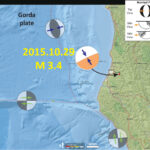
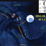
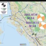
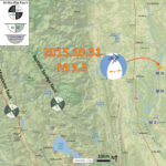
I hope not too many bottles of Sierra Nevada broke from this small earthquake. Based on the “Did You Feel It?” reports, I suspect that this did not happen. Here is the USGS website for this M = 3.5 earthquake.
Here is a map that shows the epicenter as a golden star (makes me think of Willy Wonka). I also include the shaking intensity contours on the map. These use the Modified Mercalli Intensity Scale (see the legend on the map). This is based upon a computer model estimate of ground motions, different from the “Did You Feel It?” estimate of ground motions that is actually based on real observations. The Modified Mercalli Intensity contours are plotted, with a max MMI = MIV. See the attenuation plot versus distance below to compare the difference between this model estimate and the real observations. The fit is pretty good.
I placed a moment tensor / focal mechanism legend in the upper left corner of the map. There is more material from the USGS web sites about moment tensors and focal mechanisms (the beach ball symbols). Both moment tensors and focal mechanisms are solutions to seismologic data that reveal two possible interpretations for fault orientation and sense of motion. One must use other information, like the regional tectonics, to interpret which of the two possibilities is more likely.
I plot the USGS moment tensor for this earthquake. This M = 3.5 earthquake shows an extensional earthquake, with oblique slip (partly strike-slip). I place orange arrows showing the extensional direction. It is difficult to know which is the correct nodal plane (which of the two possibilities are correct), so I plot both potential senses of strike-slip motion. Others may have stronger opinions about how to interpret this earthquake moment tensor.
Here is the plot showing how the shaking intensity attenuates with distance from the earthquake. The orange line is a model based estimate (Ground Motion Prediction Equation), which is based on empirical relations between earthquake magnitude and observations of ground motion recorded by seismometers (for hundreds of earthquakes in California). The blue dots are actual observations from the USGS “Did You Feel It?” web form.
The San Andreas fault is a right-lateral strike-slip transform plate boundary between the Pacific and North America plates. The plate boundary is composed of faults that are parallel to sub-parallel to the SAF and extend from the west coast of CA to the Wasatch fault (WF) system in central Utah (the WF runs through Salt Lake City and is expressed by the mountain range on the east side of the basin that Salt Lake City is built within). The map above shows the three major regional players along the transform plate boundary between the Pacific plate to the west and the North America plate to the east. The SAF, MF, and BSF are all right lateral strike-slip fault systems, which accommodate decreasing amounts of plate boundary motion from west to east.
The BSF is currently being investigated by Bob McPherson (Humboldt State University, Dept. of Geology). Please contact Bob (Robert.McPherson at humboldt.edu) for more information. Other work on the BSF has been presented in various USGS reports. James Lienkaemper published a report on the BSF as the USGS Data Series 541. Below is a map series from this report.
Also published in 2010 is a geologic map of the region (Ohlin et al., 2010). Here is the report. They also published the GIS data presented in their report.
There was recently an earthquake in the block separating the SAF and the MF. Below is a map from my report on that earthquake. I present more about the SAF plate boundary on that earthquake report page.
I place a map shows the configuration of faults in central (San Francisco) and northern (Point Delgada – Punta Gorda) CA (Wallace, 1990). Here is the caption for this map, that is on the lower left corner of my map. Below the citation is this map presented on its own.
Geologic sketch map of the northern Coast Ranges, central California, showing faults with Quaternary activity and basin deposits in northern section of the San Andreas fault system. Fault patterns are generalized, and only major faults are shown. Several Quaternary basins are fault bounded and aligned parallel to strike-slip faults, a relation most apparent along the Hayward-Rodgers Creek-Maacama fault trend.
Moving further west, there was an earthquake probably along the SAF near Point Arena in July of 2015. Here is my earthquake report for this M = 3.5 earthquake. Below is a map that I prepared for that earthquake. There is more about the SAF in this region on that earthquake report page.
Wallace, Robert E., ed., 1990. The San Andreas fault system, California: U.S. Geological Survey Professional Paper 1515, 283 p. [http://pubs.usgs.gov/pp/1988/1434/].
We just had a small earthquake in northern California. Here is the USGS website for the M = 3.4 earthquake. If you felt it, please go to the USGS “Did You Feel It?” website to fill out a report!
This small earthquake is due to deformation in the downgoing Gorda plate. The lower plate (which is the Juan de Fuca plate in your part of the world) deforms in various ways as it descends.
Today’s M 3.4 does nothing to affect the likelihood of a larger Cascadia subduction zone earthquake. It is simply interesting to those of us who felt it….
Here is a map showing the epicenter as a small red dot. I placed one of the focal mechanisms on the map. The earthquake strikes east-northeast, oblique to most of the other seismicity. The hypocentral depth plots deeper than the subduction zone fault (which is about 15-20 km in this region), so this earthquake is probably in the Gorda plate.
I placed a moment tensor / focal mechanism legend in the upper right corner of the map. There is more material from the USGS web sites about moment tensors and focal mechanisms (the beach ball symbols). Both moment tensors and focal mechanisms are solutions to seismologic data that reveal two possible interpretations for fault orientation and sense of motion. One must use other information, like the regional tectonics, to interpret which of the two possibilities is more likely.
Provided by Dr. Mark Hemphill-Haley, here is a plot from the new USGS broadband seismometer. From Mark:
Jacob Crummey (USGS) and Steve Tillinghast (HSU) had just completed installation of a new broadband seismometer in Founders Hall. We got the 3 component waveform and it looks great! Top is vertical, middle is horizontal north and bottom is horizontal east.
There are several sources of seismicity in northern California, The Cascadia subduction zone, the Gorda plate, the Mendocino fault, the San Andreas fault, the Blanco fracture zone, and within the North America plate. Below are some pages that discuss earthquakes with these different sources.
The larger earthquakes plotted in the map below probably do more to load strain along the Cascadia subduction zone fault (than the M 3.4). The map below shows some of these larger magnitude earthquakes. Here is a post about this earthquake from May 2015.
This shows how broadly this M = 3.4 earthquake was felt.
This is a plot showing how the ground motions attenuate (lessen) with distance from the earthquake. The orange line is an estimate of the intensity of ground motions based on a numerical model. This numerical model is based on a regression of hundreds of earthquakes (distance vs. magnitude/intensity). These regressions form the basis for Ground Motion Prediction Equations (GMPEs). The blue dots are the actual observations made by real people (using the DYFI form that I posted above). These model based estimates of ground shaking intensity are used, especially for larger earthquakes, to determine what damage might be expected. See my post about the recent post about the M 7.5 earthquake in Afghanistan, where I show a PAGER report adjacent to the DYFI map. The PAGER report is the report that lists the probable extent of damage to people and their belongings. Aid organizations and governments can estimate what scope disaster efforts might need to be based upon these PAGER reports (note the USAID logo).
Here is a map of the Cascadia subduction zone, modified from Nelson et al. (2004). The Juan de Fuca and Gorda plates subduct norteastwardly beneath the North America plate at rates ranging from 29- to 45-mm/yr. Sites where evidence of past earthquakes (paleoseismology) are denoted by white dots. Where there is also evidence for past CSZ tsunami, there are black dots. These paleoseismology sites are labeled (e.g. Humboldt Bay). Some submarine paleoseismology core sites are also shown as grey dots. The two main spreading ridges are not labeled, but the northern one is the Juan de Fuca ridge (where oceanic crust is formed for the Juan de Fuca plate) and the southern one is the Gorda rise (where the oceanic crust is formed for the Gorda plate).
Here is a version of the CSZ cross section alone (Plafker, 1972). This shows two parts of the earthquake cycle: the interseismic part (between earthquakes) and the coseismic part (during earthquakes). Regions that experience uplift during the interseismic period tend to experience subsidence during the coseismic period.
This map (McCrory et al., 2006) shows the secular (ongoing modern) rates of motion for the Juan de Fuca and Gorda plates relative to the North America plate (Wilson, 1998; McCrory, 2000). Red triangles denote active arc volcanoes.
Here is a view of the subduction zone showing the landscape and the plate configuration within the Earth. The cross section is located near the southern Willamette Valley. This is schematic and does not completely match the real geography. Note how the downgoing plate melts and the rising magma leads to volcanism of the Cascade volcanoes (a volcanic arc).
This figure shows how a subduction zone deforms between (interseismic) and during (coseismic) earthquakes. We also can see how a subduction zone generates a tsunami. Atwater et al., 2005.
Here is an animation produced by the folks at Cal Tech following the 2004 Sumatra-Andaman subduction zone earthquake. I have several posts about that earthquake here and here. One may learn more about this animation, as well as download this animation here.
This figure shows the regions that participate in this interseismic and coseismic deformation at Cascadia. Atwater et al., 2005. Black dots on the map show sites where evidence for coseismic subsidence has been found in coastal marshes, lakes, and estuaries.
Here is a map showing a number of data sets. Seismicity is plotted versus depth (NCEDC). Tremor is plotted (Pacific Northwest Seismic Network). Vertical Deformation rates are plotted (unpublished). Slab depth contours (km) are plotted (McCrory et al., 2006). Fault locking zones are plotted (Wang et al., 2003; Burgette et al., 2009). Bob McPherson (Humboldt State University, Department of Geology) is currently working on a research paper where he will discuss how the seismicity reveals the location of the seismogenically locked fault zone.
This map shows the various possible prehistoric earthquake rupture regions (patches) for the past 10,000 years. Goldfinger et al., 2012. These rupture scenarios have been adopted by the USGS hazards team that determines the seismic hazards for the USA.
References:
Atwater, B.F., Musumi-Rokkaku, S., Satake, K., Tsuju, Y., Eueda, K., and Yamaguchi, D.K., 2005. The Orphan Tsunami of 1700—Japanese Clues to a Parent Earthquake in North America, USGS Professional Paper 1707, USGS, Reston, VA, 144 pp.
Burgette, R. et al., 2009. Interseismic uplift rates for western Oregon and along-strike variation in locking on the Cascadia subduction zone in Journal of Geophysical Research, v. 114, B01408, doi:10.1029/2008JB005679
Chaytor, J.D., Goldfinger, C., Dziak, R.P., and Fox, C.G., 2004. Active deformation of the Gorda plate: Constraining deformation models with new geophysical data: Geology v. 32, p. 353-356
Nelson, A.R., Kelsey, H.M., and Witter, R.C., 2006. Great earthquakes of variable magnitude at the Cascadia subduction zone: Quaternary Research, doi:10.1016/j.yqres.2006.02.009, p. 354-365.
Wang, K., Wells, R., Mazzotti, S., Hyndman, R. D., and Sagiya, T., 2003. A revised dislocation model of interseismic deformation of the Cascadia subduction zone Journal of Geophysical Research, B, Solid Earth and Planets v. 108, no. 1.
There have been several data updates following the earthquake yesterday. I presented my first summary about this M = 7.5 earthquake here. There are a number of sources of information regarding the casualties from this devastating earthquake posted on this Earthquake Engineering Research Institute page..
Here is a map that shows the earthquakes with magnitudes greater than or equal to M = 7.0. I plotted the USGS moment tensors for earthquakes that have them. I include a USGS Open File Report 1103 map of the tectonic domains of Afghanistan. Note that there have been 8 earthquakes in this magnitude range in the past ~20 years, so these happen about every 12 years or so.
Here are links to the USGS web pages for each of the earthquakes labeled in the below map:
IRIS has put together a teachable moment here. In addition, there are a number of visualizations and sources of data on their “spud” page here. I embed some of the videos below.
These first two animations show how seismic waves propagate through the USArray, a network of seismometers. The first animation shows the vertical motion in color (red = up & blue = down) and the horizontal motion as a vector. Above each animation is a screenshot.
Here is a link to the embedded video below.
Here is a visualization of the sesimic waves propagating from the source area. This animation comes from Princeton. Above the animation is a screenshot.
Here is a link to the embedded video below.
This animation shows the epicenters for various earthquakes related to this M 7.5 earthquake.
This animation shows the slip along the fault through time.
IRIS also has an earthquake browser. Here is a map for this region from that browser. Check out the browser here. Pavlis and Das (2000) proposed an hypothsis to explain the pattern if intermediate-depth earthquakes in the Pamir-Hindu-Kush region. They suggest that there is a slab of oceanic crust that has separated from the downgoing India plate. This slab is neutrally bouyant and “hangs out” in the mantle. They suggest this slab is acting as a strain marker. I provide a link to their paper below.
Here is their figure showing the slab at different time intervals. I include their figure caption as a blockquote.
Tectonic models that have been proposed for the Pamir-Hindu Kush region. (a) A cartoon of the double-facing subduction zone. (b) The comparable diagram showing the geometry of a bent, overturned slab. Figure la and lb illustrate this three-dimensional geometry using a map view projection that can be thought of as being sliced off at two depths:( 1) the shaded region marks a slice at the approximate depth of the top of the mantle earthquake zone around 70 km depth, and (2) the mixed solid and dashed lines (showing hidden surfaces) illustrate the piercing points of a slab at the approximate base of the activity around 200 km in depth. The double-facing model in Figure la implies downdip motion as illustrated by the arrows. In our model the slab has relatively small vertical motion emphasized by the lack of arrows in Figure lb. Patterned zone in Figure la illustrates the major shear zone required in this model within which we estimate high shear strain rates of the order of 10^-13 s^-1.
Sippl et al. (2013) have worked out some hypotheses about the tectonics of the region to explain the intermediate to deep seismicity. They used a two year period when they deployed seismometers in the region. They recorded and located 9,532 earthquakes. They found that seismicity forms an upper and a lower domain. The upper domain includes earthquakes that plot along a plane that dips sub-vertically. The lower domain is more complex, with several sub-parallel planes.
They propose two models
Two-Sided subduction of Eurasian and Indian continental lithosphere
A purely Eurasian source of lithosphere
Here is a map with seismicity plotted in plan view, in E-W cross sectional view, and in N-S cross sectional view. I include their figure caption below in a blockquote.
Overall distribution of seismicity in the study area from August 2008 to June 2010 in map view (plotted onto a topographic map) and as projection of all events onto a longitudinal and latitudinal plane. Dot sizes denote different earthquake magnitudes, and colors denote different depth levels (in the map view plot) and distance from the projection plane, respectively, as indicated in the color legends. Deeper events were plotted on top of shallower ones in the map view subplot, nearer events on top of farther ones in the projections. Boxes indicate the location and extent of the profiles shown in Figure 7; colors reflect a subdivision in western Hindu Kush (red), eastern Hindu Kush (blue), and Pamir (black), which is reflected in the colors in Figure 7. Lower right sub-figure shows the distribution of local magnitudes in our data set. A total of 9105 of the total number of 9532 earthquakes are shown here; the missing events are located north of the region shown in this plot.
Here are cross-sectional plots of sesimicity for the different swaths shown in the above map. I include their figure caption below in a blockquote.
Series of profile projections perpendicular to the strike of the structure outlined by intermediate-depth earthquakes in Pamir and Hindu Kush. Locations of the profiles are indicated in Figure 5. Average topography across the swath widths is shown on top of the profiles. Circles denote earthquakes relocated with the double-difference method; crosses are events where this relocation was not performed. Colors of earthquake markers refer to different structural units (red: western Hindu Kush, blue: eastern Hindu Kush, and black: Pamir) and are likewise indicated in Figure 5 [the above map].
Here is a conceptual model showing the Sippl et al. (2013) interpretation of plate configuration in this region. I include their figure caption below in a blockquote.
Schematic representation of the geometry outlined by the earthquake locations presented in this study. The Pamir seismic zone defines an arc which incrementally changes its dip direction from southward to eastward and its strike direction from east-west to north-south from east to west. Dashed line corresponds to the upper limit of intermediate-depth seismicity along strike. The Pamir’s dip angle stays constant along strike at depths shallower than 150 km. Southwest of the Pamir arc, clearly separated from it in terms of dip direction, is the Hindu Kush seismic zone, which strikes roughly east-west and generally dips nearly vertically northwards. A tendency toward a strike alignment with the western Pamir is discernible in its eastern part. Although significantly smaller in width, the Hindu Kush exhibits considerably more structural complexity than the Pamir, shown by its fragmentation in several (curvi)planar fragments.
Here is a video that shows the shaking and some damage…
Here are some additional visualizations of the seismic waves propagating through the USARRAY.
As above, there is a figure showing the preview above each embedded video. These are products of IRIS.
This is the mp4 link to the embedded video below (8 MB mp4). This video shows the 3-dimensional visualization. The vector direction and length shows the magnitude and direction in the horizontal dimension. The color represents the magnitude and direction in the vertical dimension.
This is the mp4 link to the embedded video below (8 MB mp4). This video shows the Z-dimensional visualization (vertical). The color represents the magnitude and direction in the vertical dimension.
Here is a map showing the region and today’s earthquake epicenters. I placed the moment tensor for the M = 7.5 earthquake on the map. The moment tensor shows a pure thrust/reverse mechanism. I placed a general tectonic map from the USGS Open File Report 1103.
I placed a moment tensor / focal mechanism legend in the upper right corner of the map. There is more material from the USGS web sites about moment tensors and focal mechanisms (the beach ball symbols). Both moment tensors and focal mechanisms are solutions to seismologic data that reveal two possible interpretations for fault orientation and sense of motion. One must use other information, like the regional tectonics, to interpret which of the two possibilities is more likely.
This is a local map, the three small orange circles are the earthquakes with a M = 4 range listed above. From left to right, M = 4.8, 4.4, 4.7. The large orange circle is the M = 7.5
Here is a more detailed tectonic map of the region from Molnar (2001).
This map, from the USGS OFR 1103 shows the tectonic domains of Afghanistan. Todays seismicity occurred in the Hindu Kush.
This map shows historic earthquakes in the region, with magnitudes greater than or equal to M = 7.0, from 1900 until today. These are the queries that I used to make this map (kml) (csv). I also include the MMI contours. Here is the USGS event kmz file.
The PAGER report, which is a model based estimate of casualties and damage, suggest that there is a 32% probability that between 1,000 and 10,000 people will suffer death.
This is the “Did You Feel It?” map, showing observations of felt shaking intensity, using the Modified Mercalli Shaking Intensity Scale.
This is another version of the DYFI data, showing how it compares to the MMI estimates that are based on a computer model.
Here is an interesting plot that shows how the shaking intensity and ground motions decay (attenuate) with distance. The orange and green lines are the modeled data (using regressions from the eastern US and California, respectively). Interestingly, the observational data (green dots) match more closely the eastern US regressions, but also generally lie between the two models. The PAGER alert is based upon these models, while the “DYFI” map is based on real observations.
The USGS finite fault plane solution shows that there were two major slip patches in this earthquake.
The moment rate plot (shows the energy released during the earthquake with time) shows a bimodal release. This matches the slip model above.
Jascha Polet has produced some excellent seismicity plots, including moment tensors. Below are two maps and a cross section prepared in GMT. Dr. Polet is a Seismologist and Professor of Geophysics at Cal Poly Pomona.
Over the past day or so, there has been a swarm of seismicity in the La Pine area. La Pine is on the east side of the Cascade mountain range, a magmatic arc related to the Cascadia subduction zone. As the downgoing Juan de Fuca plate extends into the upper mantle, the sea water stored in the oceanic crust (which formed under water) combines with the increased heat to melt. This melt is less dense than the crust and surrounding mantle material, so it rises. This rising magma gives rise to the volcanoes in the Cascade range. There exist every type of volcano in the Cascades due to the wide range of magma composition along the arc.
Today’s largest magnitude earthquake has a magnitude M = 3.0. This is too small to get a moment tensor or focal mechanism calculated, so we do not know what type of earthquake this is. However, we can surmise that it is either compressional or extensional, probably not shear (strike-slip). The swarm may be related to back arc extension, or may be related to some magmatic processes. I favor the former since these earthquakes plot between a series of mapped Quaternary active faults. To the west is Hamner Butte and the the north is Davis Mountain. To the north, there does appear to be some north-northeast lineaments that suggest some fault related volcanism. To the south there also are mapped faults called the Chemult graben fault system (see Personius references below). These are normal faults, so the likely mechanism for earthquakes in this swarm is extensional. The last activity on these faults predate the Mazama ash since they are overlain by a pyroclastic flow from that eruption. The latest age estimate for the eruption of Mt. Mazama is based on Bayesian modeling of many radiocarbon age determinations by Egan et al. (2015) and set at 7682–7584 cal. yr BP (95.4% probability range). However, Pezzopane (1993) classify this fault system as late Pleistocene.
Here is the USGS web page for this M = 3.0 earthquake. In addition to the compilation from Personius (see below), work has been done on the faulting in this region by Pezzopane (1993) and Pezzopane and Weldon (1993). Weldon et al. (2003) map most of the faults in this region as late Quaternary (<780 ka) in age.
This is a map that shows the locality for this mini swarm.
This is a map that shows the region, that extends across the Cascades.
This is a map of the Cascdia subduction zone and Cascade magmatic arc.
Here is a view of the subduction zone showing the landscape and the plate configuration within the Earth. The cross section is located near the southern Willamette Valley. This is schematic and does not completely match the real geography. Note how the downgoing plate melts and the rising magma leads to volcanism of the Cascade volcanoes (a volcanic arc). Dr. John Vidale, from the Pacific Northwest Seismic Network posted this today showing the seismic record of these earthquakes. Dr. Vidale also plotted the cumulative number of earthquakes in this region for the past 12 years.
This area is at the western boundary of the High Lava Plains, where they meet the Cascades. Newberry Crater, which is where the 2000 Pacific Northwest Cell Friends of the Pleistocene field trip met, is to the northeast of this swarm. Here is a map that shows the volcanism of the region from Meigs et al. (2009). Below is the caption from Meigs et al. (2009).
Volcanic and tectonic elements of the western United States: (A) Distribution of volcanic rocks younger than 17 Ma, by age and composition (Luedke and Smith, 1984), illustrates the tremendous volcanic activity east of the Cascade Range in the northern extent of the Basin and Range province. (B) Some tectonic elements (after Jordan et al., 2004) superimposed on the map of Luedke and Smith (1984). Solid brown line outlines the Basin and Range province. Volcanic fields younger than 5 Ma illustrate the continuing activity in the Cascade Range and along the High Lava Plains (HLP; brown field) and the eastern Snake River Plain (ESRP). Short curves along the HLP and ESRP are isochrons (ages in Ma) for the migrating silicic volcanism along each volcanic trace. Flood basalt activity was fed from dike systems in the northern Nevada rift (NNR), Steens Mountain (SM), the western Snake River Plain (WSRP) and the Chief Joseph (CJ) and Cornucopia (C) dike swarms of the Columbia River Basalt Group. These dikes occur near the western border of Precambrian North America as defined by the 87Sr/86Sr 0.706 line (large dot-dash line). Northwest-trending fault systems—Olympic-Wallowa lineament (OWL), Vale (V), Brothers (B), Eugene-Denio (ED) and McLoughlin (Mc)—are shown by the short-dashed lines. Additional features include Newberry Volcano (NB), Owyhee Plateau (OP), Juan de Fuca Plate, San Andreas fault zone (SAFZ), and Mendocino triple junction (MTJ).CA—California; ID—Idaho; OR—Oregon; NV—Nevada; UT— Utah; WA—Washington; WY—Wyoming.
Here is the Weldon et al. (2002) map of faults in this region.
Meigs, A., Scarberry, K., Grunder, A., Carlson, R., Ford, M.T., Fouch, M., Grove, T., Hart, W.K., Iademarco, M., Jordan, B., Milliard, J., Streck, M.J., Trench, D., and Weldon, R., 2009. Geological and geophysical perspectives on the magmatic and tectonic development, High Lava Plains and northwest Basin and Range, in O’Connor, J.E., Dorsey, R.J., and Madin, I.P., eds., Volcanoes to Vineyards: Geologic Field Trips through the Dynamic Landscape of the Pacific Northwest: Geological Society of America Field Guide 15, p. 435–470, doi: 10.1130/2009.fl d015(21).
Nelson, A.R., Kelsey, H.M., Witter, R.C., 2006. Great earthquakes of variable magnitude at the Cascadia subduction zone in Quaternary Research 65, 354-365.
Personius, S.F., compiler, 2002. Fault number 839a, Chemult graben fault system, western section, in Quaternary fault and fold database of the United States: U.S. Geological Survey website, http://earthquakes.usgs.gov/hazards/qfaults, accessed 10/22/2015 10:08 PM.
Personius, S.F., compiler, 2002. Fault number 839b, Chemult graben fault system, Walker Rim section, in Quaternary fault and fold database of the United States: U.S. Geological Survey website, http://earthquakes.usgs.gov/hazards/qfaults, accessed 10/22/2015 10:09 PM.
Pezzopane, S.K., 1993, Active faults and earthquake ground motions in Oregon: Eugene, Oregon, University of Oregon, unpublished Ph.D. dissertation, 208 p.
Pezzopane, S.K. and Weldon, R.J.III., 1993. Tectonic Role of Active Faulting in Central Oregon in Tectonics, v. 12, no. 5, p. 1140-1169.
We just had an earthquake in the Vanuatu region, along the New Hebrides subduction zone. This earthquake is at great depth and will most likely not produce a tsunami. The USGS magnitude is currently set at M = 7.3. UPDATE: revised magnitude M = 7.1.
Here is the USGS website for this earthquake. Here is a USGS poster that presents the historic seismicity of this region.
Here is a map that shows the earthquake (depth ~117 km) plotted east of the New Hebrides subduction zone. Since this subduction zone fault dips to the right (east), the location of this earthquake makes sense.
I placed a moment tensor / focal mechanism legend in the upper right corner of the map. There is more material from the USGS web sites about moment tensors and focal mechanisms (the beach ball symbols). Both moment tensors and focal mechanisms are solutions to seismologic data that reveal two possible interpretations for fault orientation and sense of motion. One must use other information, like the regional tectonics, to interpret which of the two possibilities is more likely.
The moment tensor shows an oblique compressional mechanism.
Here is a map from the USGS report linked above. Read more about this map on the USGS website. Earthquakes are plotted with color related to depth and circle diameter related to magnitude. Today’s M 7.1 earthquake occurred midway between these two cross sections F-F’ and G-G’.
This is the legend.
Here are two cross sections showing the seismicity along swatch profiles F-F’ and G-G’.
F-F’
G-G’
This is the shaking intensity map for this earthquake, so it was probably felt across a broad region (all the islands in this map). This map uses the Modified Mercalli Intensity Scale, a shaking intensity scale that is based upon observations made by people, not instruments. More can be found about the MMI scale of shaking intensity here and here.
This is a photo of the Baby Benioff seismograph from Humboldt State University. Photo credit Michelle Robinson.
This region has been very active in the past few years. I will add more posts about this later, but here is a map that I made following a May 2015 earthquake to the north. This shows the regional tectonics.
There was an earthquake series that followed the May earthquake, in August 2015.
Here is a map that shows the regional tectonics of this convergent plate boundary from the northern New Hebrides trench northwards.
Here is the “PAGER” report (version 3). This is an estimate of the potential damage to people and their belongings. There is a 30% probability that there are between 1 and 10 casualties.
Here is another map showing the regional tectonics. I put this together following an M = 6.4 earthquake along the Kermadec trench in September of 2015.
Following the Kermadec trench earthquake, I put together an animation showing historic seismicity for this region leading up to 9/2015. I put together an animation of seismicity from 1965 – 2015 Sept. 7. Here is a map that shows the entire seismicity for this period. I plot the slab contours for the subduction zone here. These were created by the USGS (Hayes et al., 2013).
Here is the animation. Download the mp4 file here. This animation includes earthquakes with magnitudes greater than M 6.5 and this is the kml file that I used to make this animation.
Those of you in the region of the San Francisco Bay are probably wondering what the likelihood that this recent and ongoing swarm of earthquakes in the San Ramon area may lead to a larger earthquake. I do not know, but I will lay out some things for you to chew on.
Two possibilities exist. The prior has a slightly higher likelihood in my opinion. Others may have a stronger opinion and when they chime in, I will add more commentary here.
These are foreshocks to an earthquake on the Pleasanton fault zone.
These earthquakes are loading the Calaveras fault and we can expect an earthquake on that fault system.
Here is a map that shows the regional fault lines and the focal mechanisms for the two largest (M = 3.4 & 3.4) earthquakes from this swarm. Given the presence of the dominantly right-lateral strike-slip faulting in the region, I interpret these two earthquakes to be right-lateral (dextral) strike-slip earthquakes. It appears that these earthquakes are shallow and are associated with deformation along the Pleasanton fault or nearby faults. It appears that these earthquakes are near the northward termination of this fault zone.
I placed a moment tensor / focal mechanism legend in the upper left corner of the map. There is more material from the USGS web sites about moment tensors and focal mechanisms (the beach ball symbols). Both moment tensors and focal mechanisms are solutions to seismologic data that reveal two possible interpretations for fault orientation and sense of motion. One must use other information, like the regional tectonics, to interpret which of the two possibilities is more likely.
Here are the USGS web pages for these two earthquakes:
Here is a locally zoomed map showing these earthquakes as they relate to the cities of San Ramon and Danville. Notice how the Pleasanton fault ends in the region of the swarm. This swarm may have loaded the fault segments to the south, along the Pleasanton fault. However, it probably did not load significantly the Calaveras fault system to the west. The faults at depth may be complicated, so this 2-D plan view interpretation of the stresses is probably an oversimplification.
The USGS, have made estimates of the probabilities of earthquake ruptures on the major fault zones in the San Francisco Bay area. Here is a link to their web site. Below is a map showing the probabilities that they have assigned to each of these major fault zones. Note the low probability assigned to the Calaveras fault zone. Click on the map for a higher resolution (10 MB) pdf map. Keith I. Kelson and Sean T. Sundermann published a report based on their USGS National Earthquake Hazards Reduction Program funded study of the Calaveras fault. They report a couple swarms possibly associated with the Pleasanton fault zone. In 1976 there was a swarm with a M 4.0 largest earthquake and in 1970 there was a swarm with a M 4.3 as a largest earthquake. Then in 2002 there was a swarm with a M 3.9 as a largest earthquake.
Based on all these different sources of information, it would appear that this swarm is similar to swarms in 1970, 1976, and 2002. I do not expect either of the two possibilities, that I list at the top of this page, to occur. We cannot predict the future, but can only look for patterns based upon the past. This is sort of inverse uniformitarianism.
You’re invited to come network with old friends and colleagues, meet new ones, enjoy a locally-made beverage, maybe learn something and share your local knowledge with others. Cascadia GeoSciences presents:
A Research Presentation by Todd B. Williams and Dr. Jason R. Patton
Unraveling tectonic and eustatic factors of sea level rise in northern California, Humboldt Bay.
WHEN: Friday October 23rd 5:30-8 pm
WHERE: Arcata D Street Neighborhood Center
1301 D St, Arcata, CA 95521
(see map below)
Hope to see you there!
Future Presents will be posted online here.
IRIS and the US Geological Survey have recently produced an educational video about tectonic earthquakes in the region of the US Pacific Northwest. The project was funded by the National Science Foundation.
The Video
YT link for the embedded video below. mp4 link for the embedded video below.
mp4 embedded video:
YT embedded video:
I recently collected a core with a thick sandy deposit that is hypothesized to be the sedimentary deposit that was the result of tsunami deposition following the 1700 A.D. Cascadia subduction zone earthquake. Here is my post about that core.
Here is a composite of the two cores that I collected. The top of the core is on the left. Some interpret this to be the 1700 AD tsunami deposit.
I have compiled some literature about the CSZ earthquake and tsunami. Here is a short list that might help us learn about what is contained within the core that I collected.
Earlier this year was the 315th anniversary of the 1700 AD Cascadia subduction zone earthquake and tsunami. I compiled some information about that earthquake and tsunami. I included some information about the plate tectonics of the region. Here is the post for that anniversary.
Here is a map of the Cascadia subduction zone, modified from Nelson et al. (2006). The Juan de Fuca and Gorda plates subduct norteastwardly beneath the North America plate at rates ranging from 29- to 45-mm/yr. Sites where evidence of past earthquakes (paleoseismology) are denoted by white dots. Where there is also evidence for past CSZ tsunami, there are black dots. These paleoseismology sites are labeled (e.g. Humboldt Bay). Some submarine paleoseismology core sites are also shown as grey dots. The two main spreading ridges are not labeled, but the northern one is the Juan de Fuca ridge (where oceanic crust is formed for the Juan de Fuca plate) and the southern one is the Gorda rise (where the oceanic crust is formed for the Gorda plate).
This map (McCrory et al., 2006) shows the secular (ongoing modern) rates of motion for the Juan de Fuca and Gorda plates relative to the North America plate (Wilson, 1998; McCrory, 2000). Red triangles denote active arc volcanoes.
Here is a view of the subduction zone showing the landscape and the plate configuration within the Earth. The cross section is located near the southern Willamette Valley. This is schematic and does not completely match the real geography. Note how the downgoing plate melts and the rising magma leads to volcanism of the Cascade volcanoes (a volcanic arc).
Here is a version of the CSZ cross section alone (Plafker, 1972).
This figure shows how a subduction zone deforms between (interseismic) and during (coseismic) earthquakes. We also can see how a subduction zone generates a tsunami. Atwater et al., 2005.
Here is an animation produced by the folks at Cal Tech following the 2004 Sumatra-Andaman subduction zone earthquake. I have several posts about that earthquake here and here. One may learn more about this animation, as well as download this animation here.
This figure shows the regions that participate in this interseismic and coseismic deformation at Cascadia. Atwater et al., 2005. Black dots on the map show sites where evidence for coseismic subsidence has been found in coastal marshes, lakes, and estuaries.
This shows how the CSZ is deforming vertically today (Wang et al., 2003). The panel on the right shows the vertical motion in mm/yr.
This figure, also from Wang et al. (2003), shows their estimate of how the coseismic vertical motion may happen. Contours are in meters.
Here is a graphic showing the sediment-stratigraphic evidence of earthquakes in Cascadia. Atwater et al., 2005. There are 3 panels on the left, showing times of (1) prior to earthquake, (2) several years following the earthquake, and (3) centuries after the earthquake. Before the earthquake, the ground is sufficiently above sea level that trees can grow without fear of being inundated with salt water. During the earthquake, the ground subsides (lowers) so that the area is now inundated during high tides. The salt water kills the trees and other plants. Tidal sediment (like mud) starts to be deposited above the pre-earthquake ground surface. This sediment has organisms within it that reflect the tidal environment. Eventually, the sediment builds up and the crust deforms interseismically until the ground surface is again above sea level. Now plants that can survive in this environment start growing again. There are stumps and tree snags that were rooted in the pre-earthquake soil that can be used to estimate the age of the earthquake using radiocarbon age determinations. The tree snags form “ghost forests.
Here is a photo of the ghost forest, created from coseismic subsidence during the Jan. 26, 1700 Cascadia subduction zone earthquake. Atwater et al., 2005.
Here is a photo I took in Alaska, where there was a subduction zone earthquake in 1964. These tree snags were living trees prior to the earthquake and remain to remind us of the earthquake hazards along subduction zones.
This shows how a tsunami deposit may be preserved in the sediment stratigraphy following a subduction zone earthquake, like in Cascadia. Atwater et al., 2005. If there is a source of sediment to be transported by a tsunami, it will come along for the ride and possibly be deposited upon the pre-earthquake ground surface. Following the earthquake, tidal sediment is deposited above the tsunami transported sediment. Sometimes plants that were growing prior to the earthquake get entombed within the tsunami deposit.
Here is a new animation of the tsunami that was triggered during the 1700 AD CSZ earthquake. This is just a model and has considerable uncertainty associated with it. From the US NWS Pacific Tsunami Warning Center (PTWC).
This is the timeline of prehistoric earthquakes as preserved in sediment stratigraphy in Grays Harbor and Willapa Bay, Washington. Atwater et al., 2005. This timeline is based upon numerous radiocarbon age determinations for materials that died close to the time of the prehistoric earthquakes inferred from the sediment stratigraphy at locations along the Grays Harbor, Willapa Bay, and Columbia River estuary paleoseismic sites.
Offshore, Goldfinger and others (from the 1960’s into the 21st Century, see references in Goldfinger et al., 2012) collected cores in the deep sea. These cores contain submarine landslide deposits (called turbidites). These turbidites are thought to have been deposited as a result of strong ground shaking from large magnitude earthquakes. Goldfinger et al. (2012) compile their research in the USGS professional paper. This map shows where the cores are located.
Here is an example of how these “seismoturbidites” have been correlated. The correlations are the basis for the interpretation that these submarine landslides were triggered by Cascadia subduction zone earthquakes. This correlation figure demonstrates how well these turbidites have been correlated. Goldfinger et al., 2012
This map shows the various possible prehistoric earthquake rupture regions (patches) for the past 10,000 years. Goldfinger et al., 2012. These rupture scenarios have been adopted by the USGS hazards team that determines the seismic hazards for the USA.
I have a paper that also discusses the paleoseismology and sedimentary settings in Cascadia (and Sumatra). Patton et al., 2013.
Here is my abstract:
Turbidite deposition along slope and trench settings is evaluated for the Cascadia and Sumatra–Andaman subduction zones. Source proximity, basin effects, turbidity current flow path, temporal and spatial earthquake rupture, hydrodynamics, and topography all likely play roles in the deposition of the turbidites as evidenced by the vertical structure of the final deposits. Channel systems tend to promote low-frequency components of the content of the current over longer distances, while more proximal slope basins and base-of-slope apron fan settings result in a turbidite structure that is likely influenced by local physiography and other factors. Cascadia’s margin is dominated by glacial cycle constructed pathways which promote turbidity current flows for large distances. Sumatra margin pathways do not inherit these antecedent sedimentary systems, so turbidity currents are more localized.
The Gorda plate is deforming due to north-south compression between the Pacific and Juan de Fuca plates. There have been many papers written about this. The most recent and comprehensive review is from Jason Chaytor (Chaytor et al., 2004). Here is a map of the Cascadia subduction zone, as modified from Nelson et al. (2006) and Chaytor et al. (2004). I have updated the figure to be good for projections in a dark room (green) and to have the correct sense of motion on the two transform plate boundaries at either end of the CSZ (Queen Charlotte and San Andreas faults).
Here is the Chaytor et al. (2004) map that shows their interpretation of the structural relations in the Gorda plate.
Here is a map from Rollins and Stein, showing their interpretations of different historic earthquakes in the region. This was published in response to the Januray 2010 Gorda plate earthquake. The faults are from Chaytor et al. (2004).
The Blanco fracture zone is also an active transform plate boundary. The BFZ is a strike slip fault system that connects two spreading ridges, the Gorda Rise and the Juan de Fuca Ridge. Here is a map that shows the tectonic setting and some earthquakes related to the BFZ from April 2015. There are some animations on this web page showing seismicity with time along the BFZ, over the past 15
years.
References:
McCrory, P.A., 2000. Upper plate contraction north of the migrating Mendocino triple junction, northern California: Implications for partitioning of strain: Tectonics, v. 19, p. 11441160.
Nelson, A.R., Kelsey, H.M., Witter, R.C., 2006. Great earthquakes of variable magnitude at the Cascadia subduction zone. Quaternary Research 65, 354-365.
Wang, K., Wells, R., Mazzotti, S., Hyndman, R. D., and Sagiya, T., 2003. A revised dislocation model of interseismic deformation of the Cascadia subduction zone Journal of Geophysical Research, B, Solid Earth and Planets v. 108, no. 1.
Gibbons and others (2015) have put together a suite of geologic data (e.g. ages of geologic units, fossils), plate motion data (geometry of plates and ocean ridge spreading rates), and plate tectonic data (initiation and cessation of subduction or collision, obduction of ophiolites) to create a global plate tectonic map that spans the past 200 million years (Ma). Here is the facebook post that I first saw to include this video.
Here is a view of their tectonic map at a specific time. Gibbons et al. (2015) created several animations using their plate tectonic model. I have embedded both of these videos below. Other versions of these files are placed on the NOAA Science on a Sphere Program website.
They also compare their model with P-wave tomographic analytical results. P-Wave tomography works similar to CT-scans. CT-scans are the the result of integrating X-Ray data, from many 3-D orientations, to model the 3-D spatial variations in density. “CT” is an acronym for “computed tomography.” Both are kinds of tomography. Here is a book about seismic tomography. Here is a paper from Goes et al. (2002) that discusses their model of the thermal structure of the uppermost mantle in North America as inferred from seismic tomography.
Here is an illustration from the wiki page that that attempts to help us visualize what tomography is.
P-Wave tomography uses Seismic P-Waves to model the 3-D spatial variation of Earth’s internal structure. P-Wave tomography is similar to Computed-Tomography of X-Rays because the P-wave sources are also in different spatial locations. For CT-scans, the variation in density is inferred with the model. For P-Wave tomography, the variation in seismic velocity. Typically, when seismic waves travel faster, they are travelling through old, cold, and more dense crust/lithosphere/mantle. Likewise, when seismic waves travel slower, they are travelling through relatively young, hot, and less dense crust/lithosphere/mantle.
Regions of Earth’s interior that have faster seismic velocities are often plotted in blue. Regions that have slower velocities are often plotted in red.
Here are their plots showing the velocity perturbation (faster or slower). I include the figure caption below the image.
Plate reconstructions superimposed on age-coded depth slices from P-wave seismic tomography (Li et al., 2008) using first-order assumptions of near-vertical slab sinking, with a) 3.0 and 1.2 cm/yr constant sinking rates in the upper and lower mantle, respectively, following Zahirovic et al. (2012), and b) 5.0 and 2.0 cm/yr upper and lower mantle sinking rates, respectively, following Replumaz et al. (2004). Both end-member sinking rates indicate bands of slab material (blue, S1–S2) offset southward from the Andean-style subduction zone along southern Lhasa, consistentwith the interpretations of Tethyan subducted slabs by Hafkenscheid et al. (2006). However, although the P-wave tomography provides higher resolution than S-wave tomography, the amplitude of the velocity perturbation is significantly lower in oceanic regions (e.g., S2) and the southern hemisphere due to continental sampling biases. Orthographic projection centered on 0°N, 90°E.