2015.09.16 Chile Update #3

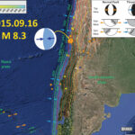
The aftershocks continue and will do so for weeks. Aftershocks from the 2011.03.27 Tohoku-Oki M 9.0 earthquake continue today. The decay rate for seismicity relates to characteristics of the fault called the b-value. The b-value can be determined/modeled in several ways, the rate of decay of earthquake magnitude with time is one way to estimate the b-value without using a model. In the map below, I plot the earthquakes in this region with time on the horizontal axis and magnitude on the horizontal axis.
I also present Figure 2 from Beck et al. (1998 ) on the map, the space-time plot of historic and prehistoric earthquakes associated with the Chile subduction zone. I add a green line showing my interpretation for the strike length of this M 8.3 earthquake. Originally it appeared to match the 1943 and 1880 earthquakes, though it appears to extend further along strike. The 1922 and 1880 strike lengths are not well constrained, so this 2015 earthquake may indeed be slipping the same patch of this part of the subduction zone. Indeed, Juan Fernandez Ridge may be a structural boundary that may cause segmentation in this part of the subduction zone. If it does, it does not do so every time, as evidenced by the strike-length of the 1730 AD and 1647 AD earthquakes.

Here is a map with updated epicenters from this morning. I have also included more moment tensors. To date, these are all compressional earthquakes. However, there are a few earthquakes to the west of the the subduction zone fault. I suspect that these might be extensional or strike-slip. In many cases, as the downgoing plate in a subduction zone reaches the trench, it flexes downwards. This causes tension in the upper part of the plate, so extensional (normal) faults form, sometimes reactivating existing faults. These reactivated faults could also rupture as a strike slip fault, depending upon the fault orientation and strain field. So far, these earthquakes to the west of the subduction zone fault are too small for the USGS to generate a moment tensor. Note the location of the Juan Fernandez Ridge.

    Here is a list of the earthquakes for which I have plotted the moment tensors. I provide the link to the USGS website for each earthquake.

  • 2015/09/16 M 8.3
  • 2015/09/16 M 6.4
  • 2015/09/16 M 7.0
  • 2015/09/17 M 6.4
  • 2015/09/17 M 6.5
  • 2015/09/17 M 6.7
  • 2015/09/18 M 6.3
  • 2015/09/19 M 6.1
  • 2015/09/19 M 6.2

This map shows the epicenters from the past week and the strike length of some historic and prehistoric earthquakes. I also include here the space-time diagram from Beck et al. (1998 ). The slab contours are also plotted (the depth, in km, to the subduction zone fault; Hayes et al., 2012).


This is the magnitude-time plot that is embedded in the map above.


Here is a table of the earthquakes with M > 5 that are in the plot on the map. This spreadsheet includes all of the earthquakes for the past week.


Here is the updated Beck et al. (1998 ) space-time figure.


References:


Chile Historic Tsunami Comparisons

Here are three tsunami wave amplitude models from NOAA for three Great (magnitude > 8.0) earthquakes in Chile.

    Here are the USGS websites for the three earthquakes that generated these earthquakes, plus the one from 2015.09.16 not shown on the map below. The USGS magnitudes are listed.

  • 1960.05.22 M 9.6 Bio-Bio, Chile 25 km (the USGS lists the M as 9.6, while most everyone else states M = 9.5
  • 2010.02.27 M 8.8 Bio-Bio, Chile 22.9 km
  • 2014.04.01 M 8.2 Iquique, Chile 25 km
  • 2015.09.16 M 8.3 Illapel, Chile 25 km
    Here are the NOAA Center for Tsunami Research websites for the three tsunamis plotted in the map below, plus the one from 2015.09.16 not shown on the map below.

  • 1960.05.22 M 9.5 (There is no page for the 1960 earthquake, so this map is located on the 2010 page.)/li>
  • 2010.02.27 M 8.8
  • 2014.04.01 M 8.2
  • 2015.09.16 M 8.3

Here is the map. These three maps use the same color scale. There is not yet a map with this scale for the 2015 tsunami, so we cannot yet make the comparison.


Here is an animation of these three tsunami from the US NWS Pacific Tsunami Warning Center (PTWC). This is the YouTube link.

Here are all the earthquakes of magnitude greater than M 8.0 in Chile from between 1900 and today (2015.09.18 ).


Here is a space time diagram from Beck et al. (1998 ). The 2015 earthquake occurs in the region of the 1943 and 1880 earthquakes.


Here is the latest map that shows the 2015 earthquake and aftershocks in relation to some of the historic maps shown on the Beck et al. (1998 ) space time diagram. I describe this map and its contents more on this page (Hayes et al., 2012).

2015.09.16 Chile Update #2

Here I post some updates about the M 8.3 Great Earthquake in Chile and the associated tsunami observations and models.

Here is an updated map, that shows the aftershocks are extending further north and south, out of the 1943 strike length region. The 1922 earthquake to the north was much larger, with a magnitude of M 8.5.


Here are some observations from tide gages along the west coast of the US. These all come from here.
Crescent City


North Spit (Humboldt Bay)


Here are some tsunami simulations from NOAA here.
Here is the wave height map, based on numerical simulations of wave propagation throughout the Pacific Ocean. These simulations are recurrently compared with tide gage and buoy data.


This plot shows their model results as compared to tide gages in Chile.


This plot shows their model results as compared to tide gages in California.


This is an animation of their wave propagation model. Here is the link to the embedded mp4 video below.


Here is some drone footage of the tsunami damage in Chile.
RT:

emol TV:

The Guardian:

Here is a large scale map showing an update of the epicenter plots.

Chile M 8.3 Earthquake: Tsunami Observations!

Here are a couple of videos that document the arrival of tsunami waves in the “mouth of Genio river at Wafer Bay, Cocos Island, Costa Rica.
Cocos Island is a National Park located between Galapagos Islands and the continental coast of Costa Rica, at a distance of about 500km of the later.” (quote from Dr. Silvia Chacón-Barrantes Coordinator RONMAC Program (Costa Rica Sea Level Observation Network); Coordinator SINAMOT (National Tsunami Monitoring System); National University (UNA); Heredia, Costa Rica; silviachaconb at gmail.com )

Here is the video link to youtube of the embedded video below.
Here is an mp4 file to download.

Here is an example of the 2011 tsunami in the same location. The youtube link of the embedded video below.

Here are some observations of the tsunami on the west coast of the USA. These are from NOAA.
Crescent City:
(updated 2015.09.17 20:20 PST)


The North Spit (Humboldt Bay):


Ventura, California:


Santa Barbara, California:
(updated 2015.09.17 20:20 PST)


Here are some observations as reported by NOAA.


And, here are some hourly GPS observations of this earthquake, processed at the Nevada Geodetic Laboratory. This was posted by Dr. John Vidale of the Pacific Northwest Seismic Network. Here is John’s quote of Geoff,
“From Geoff Blewitt, UNR, realtime GPS of the Chile earthquake:
“a figure showing our 5-minute GPS solutions for station SANT, Santiago, Chile. The earthquake displaced the station over approximately 10 mm northward, and 15 mm westward. It will be interesting to see retrospectively how real time GPS performed.”
Slightly non-realtime – automatically updated every hour, but I don’t think that matters.”

2015.09.16 Chile Update #1

Here are some updates to this earthquake and tsunami.
First, here is an updated map. I have included an illustration from Atwater et al. (2005) that shows the earthquake cycle at a subduction zone. A subduction zone is a convergent plate boundary where the oceanic crust of one plate subducts beneath the continental crust of another plate. In Chile, these are the Nazca and South America plates, respectively. The earthquake cycle causes the continental crust to deform elastically. When the fault slips (the earthquake), the seafloor deforms, elevating the water column. When the water column converts this newly stored potential energy into kinetic energy, it falls down and then oscillates up and down. This oscillation creates waves that spread out across the ocean. These waves are the tsunami waves.


I include tsunami travel time information on the above map. The travel time map comes from NOAA here. The tsunami height observations come from here.
Here is the latest estimate for when the first tsunami may reach the west coast of the USA. This came from the National Tsunami Warning Center from Palmer, AK.


Here is the tsunami travel time map from NOAA.


Here is a modeled estimate of tsunami wave height from the NTWC in Alaska.


The largest aftershock, so far, is a M = 7.0 earthquake. I include the moment tensor for that earthquake. Check out my first post about the M 8.3 earthquake to learn more about moment tensors.

    Here are the USGS web pages for these two earthquakes:

  • 2015.09.16 M 8.3
  • 2015.09.16 M 7.0
  • There are a number of M ~ 6 earthquakes and here is a link that will take one to the USGS web pages for those earthquakes. Just click on the circles and a little window shows up with a link to that earthquake page.

Here is an update to the observation of the HSU “Baby Benioff” in Van Matre Hall (photo credit Dr. Mark Hemphill-Haley, chair of the Humboldt State University, Department of Geology. Here is the HSU Dept. of Geology facebook page. Mark’s photo shows the P-wave. The video below shows the secondary waves.


This is a video of the seismometer as secondary waves (please help here) propagate through the Earth. Here is a link to the 17 MB mp4 file if the embedded video below does not work. h/t to Hector Flores, a Geology student at Humboldt State University for providing this video. Here is his email: hef49 at humboldt.edu


There was also a video from youtube that shows a seiche in a swimming pool. (h/t/ Hillary on facebook).

The PAGER alert has also been updated and now has a slightly higher estimate for potential casualties. Below I post two PAGER alert versions (V3 and V6). These PAGER alerts are generated by numerical models. As seismologists further analyze the seismic data, they improve their models and generate new PAGER loss estimates. These loss estimates allow governments to estimate how much aid that they might need to prepare.


Also, the USGS has prepared their first fault plane solution. This is one of the updates to the numerical models that led to changes in the PAGER alerts (and other derivative, like intensity and PGA maps). This is posted on the USGS web page for the M 8.3 earthquake.


Here are some other examples of updates to the seismic data and models.
PGA V 1:


PGA V 2:


Attenuation V 1:


Attenuation V 2 (note that one of the major changes occurs at observations with short hypocentral distance, also, note the difference in horizontal scale):


Here are some seismicity plots from Centro Sismologico Nacional Universidad de Chile. There is a map and two cross sections.


P 14


P 15


Here are two animations from IRIS. These animations allow us to visualize seismic waves propagate through the Earth. I present screenshots of each animation above each embedded animation.
This shows motions in three directions.

Here is a link to the mp4 file if you want to download it.

This shows motion in the vertical direction.

Here is a link to the mp4 file if you want to download it.

Great Tsunamigenic Earthquake offshore Chile!

[Additional information is posted in a supplementary post here.]
Well, I was in the middle of a Quaternary Stratigraphy lab when this hit, so it took a while to get home. My delay pales in comparison to the probably large number of casualties from this earthquake. The mainshock was a M = 8.3 Great Earthquake and here is the USGS web page for this earthquake. “Great” earthquakes are earthquakes of magnitude larger than M = 8. This earthquake is in a seismic gap north of a 2010 earthquake. There was a swarm of earthquakes in this region in March of 2015.

Below is a map that shows the seismicity from the last few hours, along with the slab contours (Hayes et al., 2012). I placed the moment tensor from the M 8.3 Great Earthquake. I placed the general along-strike distance for older historic earthquakes in green (and labeled their years). The largest earthquake ever recorded, the Mw = 9.5 Chile earthquake, had a slip patch that extends from the south of the map to just south of the 2010 earthquake swarm. The 2014 earthquake swarm epicenters are plotted with a green arrow.
I placed a moment tensor / focal mechanism legend in the upper right corner of the map. There is more material from the USGS web sites about moment tensors and focal mechanisms (the beach ball symbols). Both moment tensors and focal mechanisms are solutions to seismologic data that reveal two possible interpretations for fault orientation and sense of motion. One must use other information, like the regional tectonics, to interpret which of the two possibilities is more likely.


Hundreds of people died as a result of the 1922 earthquake. The USGS has more news reports about the 1922 earthquake here. There were also reports of a tsunami over 9 meters. So we know that this segment of the fault can produce large earthquakes and tsunami. However, it has been about a century since the last Great subduction zone earthquake in this region of the fault.
Here is a map that shows the Modified Mercalli Intensity shaking contours. These contours are based on empirical relations between the attenuation of seismic energy with distance from the hypocenter (also known as Ground Motion Prediction Equation models, GMPE). This is in contrast to the “Did You Feel It?” maps, that use the same intensity scale, but are based on real observations.


Here is the pager report for this M 8.3 earthquake. This is an estimate of the probability of damage to people and their infrastructure. This is based upon the model that also generated the MMI contours in the above map.


Here is a similarly computer generated estimate of shaking intensity for this M 8.3 earthquake.


Here is the DYFI map for this earthquake, showing the data points from places where observations were reported from.


This shows how the shaking intensity attenuates (decays) with distance from the earthquake. The dots are the data and the binned data (average), while the orange and green lines are the estimates based upon the GMPE model mentioned above. Note how the empirical relations based upon earthquakes in California (green) fit the observations more well than the empirical relations based upon earthquakes in the eastern and central US. Think about what the implications of this might be. Well, it might mean that the geology in this part of Chile are more like California that it is like central/eastern US.


This is the record of the M 8.3 on “Baby Benioff” in Van Matre Hall (photo credit Dr. Mark Hemphill-Haley, chair of the Humboldt State University, Department of Geology. Here is the HSU Dept. of Geology facebook page.


This Great Earthquake also generated a tsunami. Here is the tsunami record from the Coquimbo tide gage.


Here is the tsunami record from the Valparaiso tide gage.


There have been measured tsunamis in Chile. This is from the National Tsunami Warning Center from Palmer, AK.


Here is a map showing the seismicity for the March 2015. Below I list the USGS web pages for each of the earthquakes plotted on this map. I placed the location of the surface trace of the subduction zone fault in purple. This is based on the USGS location, which is approximate as it is based on the coarse resolution global topography data set. I have also placed the historic earthquake rupture limits in green. Note how the 3/9 M 5.1 earthquake plots west of the SZ fault, so it must be in the down going plate. This earthquake has an extensional moment tensor, consistent with either bending moment stresses, or slab pull extension stresses. Without more analyses, it would be difficult to distinguish between the two.

Here is the map that I put together for some earthquakes in the seismic gap that I placed with an orange line in the above map. Here is my previous post about this series of M~5 earthquakes.


Here are some forecasts of tsunami activity on the west coast of North America. This is from the National Tsunami Warning Center from Palmer, AK.


Here are the estimated arrival times for tsunami waves in the Pacific Basin. This is from the National Tsunami Warning Center from Palmer, AK.


Here is the tsunami threat forecaset. This is from the National Tsunami Warning Center from Palmer, AK.


This is what they suggest one does in these threatened areas. This is from the National Tsunami Warning Center from Palmer, AK.

[Additional information is posted in a supplementary post here.]

Gulf of California Earthquakes! (first update)

Here is an update to the early morning post… I have prepared an updated map that shows the fracture zones, spreading ridges, transform faults, and basins in the region of seismicity from the past 24 hours.
Here is the map. I include more explanation (e.g. about moment tensors) on the first post here. As David Bazard points out, the oblique slip during this earthquake could be interpreted as transtensional (extension due to the orientation of strike-slip faults, i.e. “step overs”).


This is a nice simple figure, from the University of Sydney here, showing the terminology of strike slip faulting. It may help with the following figures.

Here is a fault block diagram showing how strike-slip step overs can create localized compression (positive flower) or extension (negative flower). More on strike-slip tectonics (and the source of this image) here.


Here is another great figure showing how sedimentary basins can be developed as a result of step overs in strike slip fault systems (source: Becky Dorsey, University of Oregon, Dept. of Geological Sciences).


I also put together an animation of seismicity from 1065 – 2015. First, here is a map that shows the spatial extent of this animation.


Here is the animation link (2 MB mp4 file) if you cannot view the embedded video below. Note how the animation begins in 1965, but has the recent seismicity plotted for reference.

    There have been two large magnitude earthquakes in this region over the past 50 years.

  • 2007.09.01 M 6.1
  • 2010.10.21 M 6.7

Gulf of California Earthquakes! (first post)

We just had a few earthquakes in the Gulf of California (GOC). The results are early, so there is not a moment tensor plotted yet (updated map shows it now). The epicenters plot in the Farallon Baisn. The Gulf of California is caused by rifting at oceanic spreading centers. These spreading centers are connected to the southern San Andreas transform plate boundary to the north and the East Pacific Rise Oceanic to the south, with en-echelon strike slip faults and spreading centers. There is probably no tsunami hazard from these earthquakes, but I would not be sleeping on the beach tonight.

    Here are some earthquakes so far:

  • 2015.09.13 M 6.6
  • 2015.09.13 M 5.3
  • 2015.09.13 M 4.9
  • 2015.09.13 M 5.2

Here is a quick map showing the location. I also plot the Shaking Intensity (Modified Mercalli Shaking Intensity) contours, as well as the age of the crust, in the inset map in the lower left corner of this map. I placed a moment tensor / focal mechanism legend in the upper right corner of the map. There is more material from the USGS web sites about moment tensors and focal mechanisms (the beach ball symbols). Both moment tensors and focal mechanisms are solutions to seismologic data that reveal two possible interpretations for fault orientation and sense of motion. One must use other information, like the regional tectonics, to interpret which of the two possibilities is more likely.
Based on the moment tensor, it appears that this swarm may be aligned along the unnamed fracture zone to the north east, that runs sub-parallel to, the Alt fracture zone. I interpret the M 6.6 earthquake to be a right-lateral strike-slip-oblique earthquake.


Here are some maps that I found that show various aspects of the southern part of the Gulf of Mexico.
This map shows the broad scale transform/spreading ridge system responsible for the opening up of the GOC over time.


This map shows the basins formed between the transform faults in the GOC.


This map shows the transform faults in the region of today’s earthquakes.


This map shows the magnetic anomalies and the geologic map for the land and the youngest oceanic crust.


This map shows a more broad view of the magnetic anomalies through time.


This is an animation from Tanya Atwater. Click on this link to take you to yt (if the embedded video below does not work).

Here is an animation from IRIS. This link takes you to yt (if you cannot view the embedded version below). Here is a link to download the 21 MB mp4 vile file.


This is a link to a tectonic summary map from the USGS. Click on the map below to download the 20 MB pdf file.

Earthquake in Papua New Guinea!

In the last ~24 hours, we have had a few earthquakes in northeastern Papua New Guinea, all in the M 5 range.

    Here are the USGS web sites for these earthquakes:

  • 2015.09.11 M 5.5
  • 2015.09.11 M 5.3
  • 2015.09.12 M 5.0

Here is a map that shows these three earthquakes. I have plotted the USGS moment tensors for the M 5.3 and M 5.5 earthquakes. I placed a moment tensor / focal mechanism legend in the upper right corner of the map. There is more material from the USGS web sites about moment tensors and focal mechanisms (the beach ball symbols). Both moment tensors and focal mechanisms are solutions to seismologic data that reveal two possible interpretations for fault orientation and sense of motion. One must use other information, like the regional tectonics, to interpret which of the two possibilities is more likely.
These moment tensors show compression in the ~northeast direction. This is consistent with the northwest striking plate boundary fault to the southwest of these earthquakes.


Here is a generalized tectonic map from Hamilton (1979), posted on the Oregon State University website.


Here is a more detailed geologic and seismicity map from Baldwin et al. (2012). These M ~5 earthquakes are plotted near the Ramu-Markham fault which is an onland extension of the New Britain trench (south verging subduction zone plate boundary), a plate boundary fault system separating volcanic arc / ophiolite rocks on the north from the New Guinea Mobile Belt rocks to the south.


This map has some cross sections to help us interpret the complicated geology of the region (Baldwin et al., 2012). We can note that the different maps of this region all plot the plate boundaries in different places, probably because they are all using different sources of information (e.g. the GPS geodetic map below, which only uses motions of points).


The Baldwin et al. (2012) map above uses geology and GPS geodesy, but this map only has plate motions plotted (from Paul Tregoning at The Australian National University). The map plots, “linear velocities of GPS sites in PNG, showing absolute motions of the numerous tectonic plates.” Go to his website where he presents some related papers.


This is an interesting map from a Baldwin et al. (2004). This shows how the Woodlark Basin is formed by the spreading center there. This map shows the Trobriand trough meet the New Britain trench and note how they verge in opposite directions. Compare this with the oblique map and cross section above.


Here is another map (from a GSA Bulletin article) that also shows how the NBT transitions into the RMFZ.


There was a M = 7.0 earthquake in northwest Papua New Guinea in late July 2015. I report about that earthquake and it also is compressional and related to the east-west striking north-south convergence along the north side of Papua New Guinea. Below is a map showing my interpretations of that earthquake.


The New Britain trench is a very seismically active region. Below are a couple reports on the seismic activity from the past year or two.

Here is a summary map showing some of the seismicity in the New Britain trench region. The first one shows the seismicity and moment tensors plotted with the slab contours from Hayes et al. (2012). The second map shows how the NBT transitions eastward to the South Solomon Sea trench. Note how the moment tensors show that the slip partitioning rotates with the strike of the subduction zone faults.


Kermadec trench earthquake!

Last night there were a few earthquakes along the Kermadec trench, which is a convergent plate boundary (subduction zone) where the Pacific plate subducts westward beneath the Australia plate. Here is the USGS website for this M 6.4 earthquake. Recent seismicity in nearby regions include July / August and August 2015 along the Solomon trench and the transform plate boundary that connects the South Solomon trench with the New Hebrides trench.
Here is a map that shows the epicenters of the seismic swarm from the past day. I plot the moment tensor, which shows west-northwest compression. I placed a moment tensor / focal mechanism legend in the upper right corner of the map. There is more material from the USGS web sites about moment tensors and focal mechanisms (the beach ball symbols). Both moment tensors and focal mechanisms are solutions to seismologic data that reveal two possible interpretations for fault orientation and sense of motion. One must use other information, like the regional tectonics, to interpret which of the two possibilities is more likely.
There is also a cross section of the Kermadec trench that includes bathymetry of the region (topography of the sea floor). This graphic was created by scientists at Woods Hole.
The map also shows the seismic activity along the New Britain trench. This region has been very active recently, with a M 7.5 in May 2015.


Here is another map of the bathymetry in this region of the Karmadec trench. This was produced by Jack Cook at the Woods Hole Oceanographic Institution. The Lousiville Seamount Chain is clearly visible in this graphic.


I put together an animation of seismicity from 1965 – 2015 Sept. 7. Here is a map that shows the entire seismicity for this period. I plot the slab contours for the subduction zone here. These were created by the USGS (Hayes et al., 2013).


Here is the animation. Download the mp4 file here. This animation includes earthquakes with magnitudes greater than M 6.5 and this is the kml file that I used to make this animation.


Here is a map that shows the aforementioned August 2015 seismicity along the transform plate boundary.


This map shows some seismicity along this transform system that happened in May of 2015.


This map shows the seismicity in the region of New Britain, Papua New Guinea, and Bougainville. I discuss the earthquakes plotted in this map here.