Earthquake Report: 2018 Summary

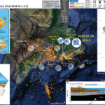
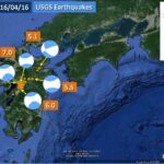
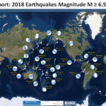
Here I summarize Earth’s significant seismicity for 2018. I limit this summary to earthquakes with magnitude greater than or equal to M 6.5. I am sure that there is a possibility that your favorite earthquake is not included in this review. Happy New Year.
However, our historic record is very short, so any thoughts about whether this year (or last, or next) has smaller (or larger) magnitude earthquakes than “normal” are limited by this small data set.
Here is a table of the earthquakes M ≥ 6.5.


Here is a plot showing the cumulative release of seismic energy. This summary is imperfect in several ways, but shows how only the largest earthquakes have a significant impact on the tally of energy release from earthquakes. I only include earthquakes M ≥ 6.5. Note how the M 7.5 Sulawesi earthquake and how little energy was released relative to the two M = 7.9 earthquakes.

Below is my summary poster for this earthquake year

  • I include moment tensors for the earthquakes included in the reports below.
  • Click on the map to see a larger version.


This is a video that shuffles through the earthquake report posters of the year


2018 Earthquake Report Pages

Other Annual Summaries

2018 Earthquake Reports

    General Overview of how to interact with these summaries

    • Click on the earthquake “magnitude and location” label (e.g. “M 6.9 Fiji”) to go to the Earthquake Report website for any given earthquake. Click on the map to open a high resolution pdf version of the interpretive poster. More information about the poster is found on the Earthquake Report website.
    • I plot the seismicity from the past month, with color representing depth and diameter representing magnitude (see legend). I include earthquake epicenters from 1918-2018 with magnitudes M ≥ 7.5 in one version.
    • I plot the USGS fault plane solutions (moment tensors in blue and focal mechanisms in orange), possibly in addition to some relevant historic earthquakes.

    Background on the Earthquake Report posters

    • I placed a moment tensor / focal mechanism legend on the posters. There is more material from the USGS web sites about moment tensors and focal mechanisms (the beach ball symbols). Both moment tensors and focal mechanisms are solutions to seismologic data that reveal two possible interpretations for fault orientation and sense of motion. One must use other information, like the regional tectonics, to interpret which of the two possibilities is more likely.
    • I also include the shaking intensity contours on the maps. These use the Modified Mercalli Intensity Scale (MMI; see the legend on the map). This is based upon a computer model estimate of ground motions, different from the “Did You Feel It?” estimate of ground motions that is actually based on real observations. The MMI is a qualitative measure of shaking intensity. More on the MMI scale can be found here and here. This is based upon a computer model estimate of ground motions, different from the “Did You Feel It?” estimate of ground motions that is actually based on real observations.
    • I include the slab 2.0 contours plotted (Hayes, 2018), which are contours that represent the depth to the subduction zone fault. These are mostly based upon seismicity. The depths of the earthquakes have considerable error and do not all occur along the subduction zone faults, so these slab contours are simply the best estimate for the location of the fault.li>

    Magnetic Anomalies

    • In the maps below, I include a transparent overlay of the magnetic anomaly data from EMAG2 (Meyer et al., 2017). As oceanic crust is formed, it inherits the magnetic field at the time. At different points through time, the magnetic polarity (north vs. south) flips, the north pole becomes the south pole. These changes in polarity can be seen when measuring the magnetic field above oceanic plates. This is one of the fundamental evidences for plate spreading at oceanic spreading ridges (like the Gorda rise).
    • Regions with magnetic fields aligned like today’s magnetic polarity are colored red in the EMAG2 data, while reversed polarity regions are colored blue. Regions of intermediate magnetic field are colored light purple.

2018.01.10 M 7.6 Cayman Trough

Just a couple hours ago there was an earthquake along the Swan fault, which is the transform plate boundary between the North America and Caribbean plates. The Cayman trough (CT) is a region of oceanic crust, formed at the Mid-Cayman Rise (MCR) oceanic spreading center. To the west of the MCR the CT is bound by the left-lateral strike-slip Swan fault. To the east of the MCR, the CT is bound on the north by the Oriente fault.
Based upon our knowledge of the plate tectonics of this region, I can interpret the fault plane solution for this earthquake. The M 7.6 earthquake was most likely a left-lateral strike-slip earthquake associated with the Swan fault.

  • Plotted with a century’s earthquakes with magnitudes M ≥ 6.5

  • Plotted with a century’s earthquakes with magnitudes M ≥ 3.5

  • There were two observations of a small amplitude (small wave height) tsunami recorded on tide gages in the region. Below are those observations.

2018.01.14 M 7.1 Peru

We had a damaging and (sadly) deadly earthquake in southern Peru in the last 24 hours. This is an earthquake, with magnitude M 7.1, that is associated with the subduction zone forming the Peru-Chile trench (PCT). The Nazca plate (NP) is subducting beneath the South America plate (SAP). There are lots of geologic structures on the Nazca plate that tend to affect how the subduction zone responds during earthquakes (e.g. segmentation).
In the region of this M 7.1 earthquake, two large structures in the NP are the Nazca Ridge and the Nazca fracture zone. The Nazca fracture zone is a (probably inactive) strike-slip fault system. The Nazca Ridge is an over-thickened region of the NP, thickened as the NP moved over a hotspot located near Salas y Gomez in the Pacific Ocean east of Easter Island (Ray et al., 2012).
There are many papers that discuss how the ridge affects the shape of the megathrust fault here. The main take-away is that the NR is bull dozing into South America and the dip of the subduction zone is flat here. There is a figure below that shows the deviation of the subducting slab contours at the NR.


Well, I missed looking further into a key update paper and used figures from an older paper on my interpretive poster yesterday. Thanks to Stéphane Baize for pointing this out! Turns out, after their new analyses, the M 7.1 earthquake was in a region of higher seismogenic coupling, rather than low coupling (as was presented in my first poster).
Also, Dr. Robin Lacassin noticed (as did I) the paucity of aftershocks from yesterday’s M 7.1. This was also the case for the carbon copy 2013 M 7.1 earthquake (there was 1 M 4.6 aftershock in the weeks following the M 7.1 earthquake on 2013.09.25; there were a dozen M 1-2 earthquakes in Nov. and Dec. of 2013, but I am not sure how related they are to the M 7.1 then). I present a poster below with this in mind. I also include below a comparison of the MMI modeled estimates. The 2013 seems to have possibly generated more widespread intensities, even though that was a deeper earthquake.

2018.01.23 M 7.9 Gulf of Alaska

  • 2018.01.23 M 7.9 Gulf of Alaska UPDATE #1
  • 2018.01.24 M 7.9 Gulf of Alaska UPDATE #2
  • This earthquake appears to be located along a reactivated fracture zone in the GA. There have only been a couple earthquakes in this region in the past century, one an M 6.0 to the east (though this M 6.0 was a thrust earthquake). The Gulf of Alaska shear zone is even further to the east and has a more active historic fault history (a pair of earthquakes in 1987-1988). The magnetic anomalies (formed when the Earth’s magnetic polarity flips) reflect a ~north-south oriented spreading ridge (the anomalies are oriented north-south in the region of today’s earthquake). There is a right-lateral offset of these magnetic anomalies located near the M 7.9 epicenter. Interesting that this right-lateral strike-slip fault (?) is also located at the intersection of the Gulf of Alaska shear zone and the 1988 M 7.8 earthquake (probably just a coincidence?). However, the 1988 M 7.8 earthquake fault plane solution can be interpreted for both fault planes (it is probably on the GA shear zone, but I don’t think that we can really tell).
    This is strange because the USGS fault plane is oriented east-west, leading us to interpret the fault plane solution (moment tensor or focal mechanism) as a left-lateral strike-slip earthquake. So, maybe this earthquake is a little more complicated than first presumed. The USGS fault model is constrained by seismic waves, so this is probably the correct fault (east-west).
    I prepared an Earthquake Report for the 1964 Good Friday Earthquake here.

    • The USGS updated their MMI contours to reflect their fault model. Below is my updated poster. I also added green dashed lines for the fracture zones related to today’s M 7.9 earthquake (on the magnetic anomaly inset map).

    • These are the observations as reported by the NTWC this morning (at 4:15 AM my local time).

    • Large Scale Interpretive Map (from update report)

    As a reminder, if the M 7.9 earthquake fault is E-W oriented, it would be left-lateral. The offset magnetic anomalies show right-lateral offset across these fracture zones. This was perhaps the main reason why I thought that the main fault was not E-W, but N-S. After a day’s worth of aftershocks, the seismicity may reveal some north-south trends. But, as a drama student in 7th grade (1977), my drama teacher (Ms. Naichbor, rest in peace) asked our class to go stand up on stage. We all stood in a line and she mentioned that this is social behavior, that people tend to stand in lines (and to avoid doing this while on stage). Later, when in college, professors often commented about how people tend to seek linear trends in data (lines). I actually see 3-4 N-S trends and ~2 E-W trends in the seismicity data.
    So, that being said, here is the animation I put together. I used the USGS query tool to get earthquakes from 1/22 until now, M ≥ 1.5. I include a couple inset maps presented in my interpretive posters. The music is copyright free. The animations run through twice.
    Here is a screenshot of the 14 MB video embedded below. I encourage you to view it in full screen mode (or download it).


    2018.02.16 M 7.2 Oaxaca, Mexico

    There was just now an earthquake in Oaxaca, Mexico between the other large earthquakes from last 2017.09.08 (M 8.1) and 2017.09.08 (M 7.1). There has already been a M 5.8 aftershock.Here is the USGS website for today’s M 7.2 earthquake.
    The SSN has a reported depth of 12 km, further supporting evidence that this earthquake was in the North America plate.
    This region of the subduction zone dips at a very shallow angle (flat and almost horizontal).
    There was also a sequence of earthquakes offshore of Guatemala in June, which could possibly be related to the M 8.1 earthquake. Here is my earthquake report for the Guatemala earthquake.
    The poster also shows the seismicity associated with the M 7.6 earthquake along the Swan fault (southern boundary of the Cayman trough). Here is my earthquake report for the Guatemala earthquake.

    • Here is the same poster but with the magnetic anomalies included (transparent).

    2018.02.25 M 7.5 Papua New Guinea

  • 2018.02.26 M 7.5 Papua New Guinea Update #1
  • This morning (local time in California) there was an earthquake in Papua New Guinea with, unfortunately, a high likelihood of having a good number of casualties. I was working on a project, so could not immediately begin work on this report.
    This M 7.5 earthquake (USGS website) occurred along the Papua Fold and Thrust Belt (PFTB), a (mostly) south vergent sequence of imbricate thrust faults and associated fold (anticlines). The history of this PFTB appears to be related to the collision of the Australia plate with the Caroline and Pacific plates, the delamination of the downgoing oceanic crust, and then associated magmatic effects (from decompression melting where the overriding slab (crust) was exposed to the mantle following the delamination). More about this can be found in Cloos et al. (2005).

  • The same map without historic seismicity.


  • The aftershocks are still coming in! We can use these aftershocks to define where the fault may have slipped during this M 7.5 earthquake. As I mentioned yesterday in the original report, it turns out the fault dimension matches pretty well with empirical relations between fault length and magnitude from Wells and Coppersmith (1994).
    The mapped faults in the region, as well as interpreted seismic lines, show an imbricate fold and thrust belt that dominates the geomorphology here (as well as some volcanoes, which are probably related to the slab gap produced by crust delamination; see Cloos et al., 2005 for more on this). I found a fault data set and include this in the aftershock update interpretive poster (from the Coordinating Committee for Geoscience Programmes in East and Southeast Asia, CCOP).
    I initially thought that this M 7.5 earthquake was on a fault in the Papuan Fold and Thrust Belt (PFTB). Mark Allen pointed out on twitter that the ~35km hypocentral depth is probably too deep to be on one of these “thin skinned” faults (see Social Media below). Abers and McCaffrey (1988) used focal mechanism data to hypothesize that there are deeper crustal faults that are also capable of generating the earthquakes in this region. So, I now align myself with this hypothesis (that the M 7.5 slipped on a crustal fault, beneath the thin skin deformation associated with the PFTB. (thanks Mark! I had downloaded the Abers paper but had not digested it fully.

    • Here is the “update” map with aftershocks

    2018.03.08 M 6.8 New Ireland

    We had an M 6.8 earthquake near a transform micro-plate boundary fault system north of New Ireland, Papua New Guinea today. Here is the USGS website for this earthquake.
    The main transform fault (Weitin fault) is ~40 km to the west of the USGS epicenter. There was a very similar earthquake on 1982.08.12 (USGS website).
    This earthquake is unrelated to the sequence occurring on the island of New Guinea.
    Something that I rediscovered is that there were two M 8 earthquakes in 1971 in this region. This testifies that it is possible to have a Great earthquake (M ≥ 8) close in space and time relative to another Great earthquake. These earthquakes do not have USGS fault plane solutions, but I suspect that these are subduction zone earthquakes (based upon their depth).
    This transform system is capable of producing Great earthquakes too, as evidenced by the 2000.11.16 M 8.0 earthquake (USGS website). This is another example of two Great earthquakes (or almost 2 Great earthquakes, as the M 7.8 is not quite a Great earthquake) are related. It appears that the M 8.0 earthquake may have triggered teh M 7.8 earthquake about 3 months later (however at first glance, it seemed to me like the strike-slip earthquake might not increase the static coulomb stress on the subduction zone, but I have not spent more than half a minute thinking about this).

    Main Interpretive Poster with emag2


    Earthquakes M≥ 6.5 with emag2


    2018.03.26 M 6.6 New Britain

    The New Britain region is one of the more active regions in the world. See a list of earthquake reports for this region at the bottom of this page, above the reference list.
    Today’s M 6.6 earthquake happened close in proximity to a M 6.3 from 2 days ago and a M 5.6 from a couple weeks ago. The M 5.6 may be related (may have triggered these other earthquakes), but this region is so active, it might be difficult to distinguish the effects from different earthquakes. The M 5.6 is much deeper and looks like it was in the downgoing Solomon Sea plate. It is much more likely that the M 6.3 and M 6.6 are related (I interpret that the M 6.3 probably triggered the M 6.6, or that M 6.3 was a foreshock to the M 6.6, given they are close in depth). Both M 6.3 and M 6.6 are at depths close to the depth of the subducting slab (the megathrust fault depth) at this location. So, I interpret these to be subduction zone earthquakes.

    2018.03.26 M 6.9 New Britain

    Well, those earthquakes from earlier, one a foreshock to a later one, were foreshocks to an earthquake today! Here is my report from a couple days ago. The M 6.6 and M 6.3 straddle today’s earthquake and all have similar hypocentral depths.

    2018.04.02 M 6.8 Bolivia

    A couple days ago there was a deep focus earthquake in the downgoing Nazca plate deep beneath Bolivia. This earthquake has an hypocentral depth of 562 km (~350 miles).
    We are still unsure what causes an earthquake at such great a depth. The majority of earthquakes happen at shallower depths, caused largely by the frictional between differently moving plates or crustal blocks (where earth materials like the crust behave with brittle behavior and not elastic behavior). Some of these shallow earthquakes are also due to internal deformation within plates or crustal blocks.
    As plates dive into the Earth at subduction zones, they undergo a variety of changes (temperature, pressure, stress). However, because people cannot directly observe what is happening at these depths, we must rely on inferences, laboratory analogs, and other indirect methods to estimate what is going on.
    So, we don’t really know what causes earthquakes at the depth of this Bolivia M 6.8 earthquake. Below is a review of possible explanations as provided by Thorne Lay (UC Santa Cruz) in an interview in response to the 2013 M 8.3 Okhotsk Earthquake.

    2018.05.04 M 6.9 Hawai’i

    There has been a swarm of earthquakes on the southeastern part of the big island, with USGS volcanologists hypothesizing about magma movement and suggesting that an eruption may be imminent. Here is a great place to find official USGS updates on the volcanism in Hawaii (including maps).
    Hawaii is an active volcanic island formed by hotspot volcanism. The Hawaii-Emperor Seamount Chain is a series of active and inactive volcanoes formed by this process and are in a line because the Pacific plate has been moving over the hotspot for many millions of years.
    Southeast of the main Kilauea vent, the Pu‘u ‘Ö‘ö crater saw an elevation of lava into the crater, leading to overtopping of the crater (on 4/30/2018). Seismicity migrated eastward along the ERZ. This morning, there was a M 5.0 earthquake in the region of the Hilina fault zone (HFZ). I was getting ready to write something up, but I had other work that I needed to complete. Then, this evening, there was a M 6.9 earthquake between the ERZ and the HFZ.
    There have been earthquakes this large in this region in the past (e.g. the 1975.1.29 M 7.1 earthquake along the HFZ). This earthquake was also most likely related to magma injection (Ando, 1979). The 1975 M 7.1 earthquake generated a small tsunami (Ando, 1979). These earthquakes are generally compressional in nature (including the earthquakes from today).
    Today’s earthquake also generated a tsunami as recorded on tide gages throughout Hawaii. There is probably no chance that a tsunami will travel across the Pacific to have a significant impact elsewhere.

    This version includes earthquakes M ≥ 3.5 (note the seismicity offshore to the south, this is where the youngest Hawaii volcano is).

    Below are a series of plots from tide gages installed at several sites in the Hawaii Island Chain. These data are all posted online here and here.

    • Hilo, Hawaii

    • Kawaihae, Hawaii

    Temblor Reports:

    • Click on the graphic to see a pdf version of the article.
    • Click on the html link (date) to visit the Temblor site.
    2018.05.05 Pele, the Hawai’i Goddess of Fire, Lightning, Wind, and Volcanoes
    2018.05.06 Pele, la Diosa Hawaiana del Fuego, los Relámpagos, el Viento y los Volcanes de Hawái

    2018.08.05 M 6.9 Lombok, Indonesia

    Yesterday morning, as I was recovering from working on stage crew for the 34th Reggae on the River (fundraiser for the non profit, the Mateel Community Center), I noticed on social media that there was an M 6.9 earthquake in Lombok, Indonesia. This is sad because of the likelihood for casualties and economic damage in this region.
    However, it is interesting because the earthquake sequence from last week (with a largest earthquake with a magnitude of M 6.4) were all foreshocks to this M 6.9. Now, technically, these were not really foreshocks. The M 6.4 has an hypocentral (3-D location) depth of ~6 km and the M 6.9 has an hypocentral depth of ~31 km. These earthquakes are not on the same fault, so I would interpret that the M 6.9 was triggered by the sequence from last week due to static coulomb changes in stress on the fault that ruptured. Given the large difference in depths, the uncertainty for these depths is probably not sufficient to state that they may be on the same fault (i.e. these depths are sufficiently different that this difference is larger than the uncertainty of their locations).
    I present a more comprehensive analysis of the tectonics of this region in my earthquake report for the M 6.4 earthquake here. I especially address the historic seismicity of the region there. This M 6.9 may have been on the Flores thrust system, while the earthquakes from last week were on the imbricate thrust faults overlying the Flores Thrust. See the map from Silver et al. (1986) below. I include the same maps as in my original report, but after those, I include the figures from Koulani et al. (2016) (the paper is available on researchgate).

    • Here is the map with a month’s seismicity plotted.

    2018.08.15 M 6.6 Aleutians

    Well, yesterday while I was installing the final window in a reconstruction project, there was an earthquake along the Aleutian Island Arc (a subduction zone) in the region of the Andreanof Islands. Here is the USGS website for the M 6.6 earthquake. This earthquake is close to the depth of the megathrust fault, but maybe not close enough. So, this may be on the subduction zone, but may also be on an upper plate fault (I interpret this due to the compressive earthquake fault mechanism). The earthquake has a hypocentral depth of 20 km and the slab model (see Hayes et al., 2013 below and in the poster) is at 40 km at this location. There is uncertainty in both the slab model and the hypocentral depth.
    The Andreanof Islands is one of the most active parts of the Aleutian Arc. There have been many historic earthquakes here, some of which have been tsunamigenic (in fact, the email that notified me of this earthquake was from the ITIC Tsunami Bulletin Board).
    Possibly the most significant earthquake was the 1957 Andreanof Islands M 8.6 Great (M ≥ 8.0) earthquake, though the 1986 M 8.0 Great earthquake is also quite significant. As was the 1996 M 7.9 and 2003 M 7.8 earthquakes. Lest we forget smaller earthquakes, like the 2007 M 7.2. So many earthquakes, so little time.

    • Here is the map with a month’s seismicity plotted.

    • Here is the map with a centuries seismicity plotted for earthquakes M ≥ 6.6.

    2018.08.18 M 8.2 Fiji

    We just had a Great Earthquake in the region of the Fiji Islands, in the central-western Pacific. Great Earthquakes are earthquakes with magnitudes M ≥ 8.0.
    This earthquake is one of the largest earthquakes recorded historically in this region. I include the other Large and Great Earthquakes in the posters below for some comparisons.
    Today’s earthquake has a Moment Magnitude of M = 8.2. The depth is over 550 km, so is very very deep. This region has an historic record of having deep earthquakes here. Here is the USGS website for this M 8.2 earthquake. While I was writing this, there was an M 6.8 deep earthquake to the northeast of the M 8.2. The M 6.8 is much shallower (about 420 km deep) and also a compressional earthquake, in contrast to the extensional M 8.2.
    This M 8.2 earthquake occurred along the Tonga subduction zone, which is a convergent plate boundary where the Pacific plate on the east subducts to the west, beneath the Australia plate. This subduction zone forms the Tonga trench.

    • Here is the map with a centuries seismicity plotted with M ≥ 7.5.

    2018.08.19 M 6.9 Lombok, Indonesia

    This ongoing sequence began in late July with a Mw 6.4 earthquake. Followed less than 2 weeks later with a Mw 6.9 earthquake.
    Today there was an M 6.3 soon followed by an M 6.9 earthquake (and a couple M 5.X quakes).
    These earthquakes have been occurring along a thrust fault system along the northern portion of Lombok, Indonesia, an island in the magamatic arc related to the Sunda subduction zone. The Flores thrust fault is a backthrust to the subduction zone. The tectonics are complicated in this region of the world and there are lots of varying views on the tectonic history. However, there has been several decades of work on the Flores thrust (e.g. Silver et al., 1986). The Flores thrust is an east-west striking (oriented) north vergent (dipping to the south) thrust fault that extends from eastern Java towards the Islands of Flores and Timor. Above the main thrust fault are a series of imbricate (overlapping) thrust faults. These imbricate thrust faults are shallower in depth than the main Flores thrust.
    The earthquakes that have been happening appear to be on these shallower thrust faults, but there is a possibility that they are activating the Flores thrust itself. Perhaps further research will illuminate the relations between these shallower faults and the main player, the Flores thrust.

    • Here is the map with a month’s seismicity plotted.

    • Here is an updated local scale (large scale) map showing the earthquake fault mechanisms for the current sequence. I label them with yellow numbers according to the sequence timing. I outlined the general areas that have had earthquakes into two zones (phases). Phase I includes the earthquakes up until today and Phase II includes the earthquakes from today. There is some overlap, but only for a few earthquakes. In general, it appears that the earthquakes have slipped in two areas of the Flores fault (or maybe two shallower thrust faults).

    • Here is the interpretive posted from the M 6.4 7/28 earthquake, with historic seismicity and earthquake mechanisms.

    2018.08.21 M 7.3 Venezuela

    We just had a M 7.3 earthquake in northern Venezuela. Sadly, this large earthquake has the potential to be quite damaging to people and their belongings (buildings, infrastructure).
    The northeastern part of Venezuela lies a large strike-slip plate boundary fault, the El Pilar fault. This fault is rather complicated as it strikes through the region. There are thrust faults and normal faults forming ocean basins and mountains along strike.
    Many of the earthquakes along this fault system are strike-slip earthquakes (e.g. the 1997.07.09 M 7.0 earthquake which is just to the southwest of today’s temblor. However, today’s earthquake broke my immediate expectations for strike-slip tectonics. There is a south vergent (dipping to the north) thrust fault system that strikes (is oriented) east-west along the Península de Paria, just north of highway 9, east of Carupano, Venezuela. Audenard et al. (2000, 2006) compiled a Quaternary Fault database for Venezuela, which helps us interpret today’s earthquake. I suspect that this earthquake occurred on this thrust fault system. I bet those that work in this area even know the name of this fault. However, looking at the epicenter and the location of the thrust fault, this is probably not on this thrust fault. When I initially wrote this report, the depth was much shallower. Currently, the hypocentral (3-D location) depth is 123 km, so cannot be on that thrust fault.
    The best alternative might be the subduction zone associated with the Lesser Antilles.

    • Here is the map with a month’s seismicity plotted, along with USGS earthquakes M ≥ 6.0.

    2018.08.24 M 7.1 Peru

    Well, this earthquake, while having a large magnitude, was quite deep. Because earthquake intensity decreases with distance from the earthquake source, the shaking intensity from this earthquake was so low that nobody submitted a single report to the USGS “Did You Feel It?” website for this earthquake.
    While doing my lit review, I found the Okal and Bina (1994) paper where they use various methods to determine focal mechanisms for the some deep earthquakes in northern Peru. More about focal mechanisms below. These authors created focal mechanisms for the 1921 and 1922 deep earthquakes so they could lean more about the 1970 deep earthquake. Their seminal work here forms an important record of deep earthquakes globally. These three earthquakes are all extensional earthquakes, similar to the other deep earthquakes in this region. I label the 1921 and 1922 earthquakes a couplet on the poster.
    There was also a pair of earthquakes that happened in November, 2015. These two earthquakes happened about 5 minutes apart. They have many similar characteristics, suggest that they slipped similar faults, if not the same fault. I label these as doublets also.
    So, there may be a doublet companion to today’s M 7.1 earthquake. However, there may be not. There are examples of both (single and doublet) and it might not really matter for 99.99% of the people on Earth since the seismic hazard from these deep earthquakes is very low.
    Other examples of doublets include the 2006 | 2007 Kuril Doublets (Ammon et al., 2008) and the 2011 Kermadec Doublets (Todd and Lay, 2013).

    • Here is the map with a century’s seismicity plotted, along with USGS earthquakes M ≥ 7.0.

    2018.09.05 M 6.6 Hokkaido, Japan

    Following the largest typhoon to strike Japan in a very long time, there was an earthquake on the island of Hokkaido, Japan today. There is lots on social media, including some spectacular views of disastrous and deadly landslides triggered by this earthquake (earthquakes are the number 1 source for triggering of landslides). These landslides may have been precipitated (sorry for the pun) by the saturation of hillslopes from the typhoon. Based upon the USGS PAGER estimate, this earthquake has the potential to cause significant economic damages, but hopefully a small number of casualties. As far as I know, this does not incorporate potential losses from earthquake triggered landslides [yet].
    This earthquake is in an interesting location. to the east of Hokkaido, there is a subduction zone trench formed by the subduction of the Pacific plate beneath the Okhotsk plate (on the north) and the Eurasia plate (to the south). This trench is called the Kuril Trench offshore and north of Hokkaido and the Japan Trench offshore of Honshu.
    One of the interesting things about this region is that there is a collision zone (a convergent plate boundary where two continental plates are colliding) that exists along the southern part of the island of Hokkaido. The Hidaka collision zone is oriented (strikes) in a northwest orientation as a result of northeast-southwest compression. Some suggest that this collision zone is no longer very active, however, there are an abundance of active crustal faults that are spatially coincident with the collision zone.
    Today’s M 6.6 earthquake is a thrust or reverse earthquake that responded to northeast-southwest compression, just like the Hidaka collision zone. However, the hypocentral (3-D) depth was about 33 km. This would place this earthquake deeper than what most of the active crustal faults might reach. The depth is also much shallower than where we think that the subduction zone megathrust fault is located at this location (the fault formed between the Pacific and the Okhotsk or Eurasia plates). Based upon the USGS Slab 1.0 model (Hayes et al., 2012), the slab (roughly the top of the Pacific plate) is between 80 and 100 km. So, the depth is too shallow for this hypothesis (Kuril Trench earthquake) and the orientation seems incorrect. Subduction zone earthquakes along the trench are oriented from northwest-southweast compression, a different orientation than today’s M 6.6.
    So today’s M 6.6 earthquake appears to have been on a fault deeper than the crustal faults, possibly along a deep fault associated with the collision zone. Though I am not really certain. This region is complicated (e.g. Kita et al., 2010), but there are some interpretations of the crust at this depth range (Iwasaki et al., 2004) shown in an interpreted cross section below.

    • Here is the map with a centuries seismicity plotted.

    Temblor Reports:

    • Click on the graphic to see a pdf version of the article.
    • Click on the html link (date) to visit the Temblor site.
    2018.09.06 Violent shaking triggers massive landslides in Sapporo Japan earthquake

    2018.09.09 M 6.9 Kermadec

    Today, there was a large earthquake associated with the subduction zone that forms the Kermadec Trench.
    This earthquake was quite deep, so was not expected to generate a significant tsunami (if one at all).
    There are several analogies to today’s earthquake. There was a M 7.4 earthquake in a similar location, but much deeper. These are an interesting comparison because the M 7.4 was compressional and the M 6.9 was extensional. There is some debate about what causes ultra deep earthquakes. The earthquakes that are deeper than about 40-50 km are not along subduction zone faults, but within the downgoing plate. This M 6.9 appears to be in a part of the plate that is bending (based on the Benz et al., 2011 cross section). As plates bend downwards, the upper part of the plate gets extended and the lower part of the plate experiences compression.

    • Here is the map with a month’s seismicity plotted.

    • Here is the map with a centuries seismicity plotted.

    2018.09.28 M 7.5 Sulawesi

  • 2018.10.16 M 7.5 Sulawesi UPDATE #1
  • Well, around 3 AM my time (northeastern Pacific, northern CA) there was a sequence of earthquakes including a mainshock with a magnitude M = 7.5. This earthquake happened in a highly populated region of Indonesia.
    This area of Indonesia is dominated by a left-lateral (sinistral) strike-slip plate boundary fault system. Sulawesi is bisected by the Palu-Kola / Matano fault system. These faults appear to be an extension of the Sorong fault, the sinistral strike-slip fault that cuts across the northern part of New Guinea.
    There have been a few earthquakes along the Palu-Kola fault system that help inform us about the sense of motion across this fault, but most have maximum magnitudes mid M 6.
    GPS and block modeling data suggest that the fault in this area has a slip rate of about 40 mm/yr (Socquet et al., 2006). However, analysis of offset stream channels provides evidence of a lower slip rate for the Holocene (last 12,000 years), a rate of about 35 mm/yr (Bellier et al., 2001). Given the short time period for GPS observations, the GPS rate may include postseismic motion earlier earthquakes, though these numbers are very close.
    Using empirical relations for historic earthquakes compiled by Wells and Coppersmith (1994), Socquet et al. (2016) suggest that the Palu-Koro fault system could produce a magnitude M 7 earthquake once per century. However, studies of prehistoric earthquakes along this fault system suggest that, over the past 2000 years, this fault produces a magnitude M 7-8 earthquake every 700 years (Bellier et al., 2006). So, it appears that this is the characteristic earthquake we might expect along this fault.
    Most commonly, we associate tsunamigenic earthquakes with subduction zones and thrust faults because these are the types of earthquakes most likely to deform the seafloor, causing the entire water column to be lifted up. Strike-slip earthquakes can generate tsunami if there is sufficient submarine topography that gets offset during the earthquake. Also, if a strike-slip earthquake triggers a landslide, this could cause a tsunami. We will need to wait until people take a deeper look into this before we can make any conclusions about the tsunami and what may have caused it.

    • There have been tsunami waves recorded on a tide gage over 300 km to the south of the epicenter, at a site called Mumuju. Below is a map and a plot of water surface elevations from this source.


    • Here is the map with a month’s seismicity plotted.

    • Here is the map with a centuries worth of seismicity plotted.

    Here is a map that shows the updated USGS model of ground shaking. The USGS prepared an updated earthquake fault slip model that was additionally informed by post-earthquake analysis of ground deformation. The original fault model extended from north of the epicenter to the northernmost extent of Palu City. Soon after the earthquake, Dr. Sotiris Valkaniotis prepared a map that showed large horizontal offsets across the ruptured fault along the entire length of the western margin on Palu Valley. This horizontal offset had an estimated ~8 meters of relative displacement. InSAR analyses confirmed that the coseismic ground deformation extended through Palu Valley and into the mountains to the south of the valley.

    My 2018.10.01 BC Newshour Interview

    InSAR Analysis

    Synthetic Aperture Radar (SAR) is a remote sensing method that uses Radar to make observations of Earth. These observations include the position of the ground surface, along with other information about the material properties of the Earth’s surface.
    Interferometric SAR (InSAR) utilizes two separate SAR data sets to determine if the ground surface has changed over time, the time between when these 2 data sets were collected. More about InSAR can be found here and here. Explaining the details about how these data are analyzed is beyond the scope of this report. I rely heavily on the expertise of those who do this type of analysis, for example Dr. Eric Fielding.

    • I prepared a map using the NASA-JPL InSAR data. They post all their data online here. I used the tiff image as it is georeferenced. However, some may prefer to use the kmz file in Google Earth.
    • I include the faults mapped by Wilkinson and Hall (2017), the PGA contours from the USGS model results. More on Peak Ground Acceleration (PGA) can be found here. I also include the spatial extent of the largest landslides that I mapped using post-earthquake satellite imagery provided by Digital Globe using their open source imagery program.


    M 7.5 Landslide Model vs. Observation Comparison

    Landslides during and following the M=7.5 earthquake in central Sulawesi, Indonesia possibly caused the majority of casualties from this catastrophic natural disaster. Volunteers (citizen scientists) have used satellite aerial imagery collected after the earthquake to document the spatial extent and magnitude of damage caused by the earthquake, landslides, and tsunami.
    Until these landslides are analyzed and compared with regions that did not fail in slope failure, we will not be able to reconstruct what happened… why some areas failed and some did not.
    There are landslide slope stability and liquefaction susceptibility models based on empirical data from past earthquakes. The USGS has recently incorporated these types of analyses into their earthquake event pages. More about these USGS models can be found on this page.
    I prepared some maps that compare the USGS landslide and liquefaction probability maps. Below I present these results along with the MMI contours. I also include the faults mapped by Wilkinson and Hall (2017). Shown are the cities of Donggala and Palu. Also shown are the 2 tide gage locations (Pantoloan Port – PP and Mumuju – M). I also used post-earthquake satellite imagery to outline the largest landslides in Palu Valley, ones that appear to be lateral spreads.

    • Here is the landslide probability map (Jessee et al., 2018). Below the poster I include the text from the USGS website that describes how this model is prepared.


    Nowicki Jessee and others (2018) is the preferred model for earthquake-triggered landslide hazard. Our primary landslide model is the empirical model of Nowicki Jessee and others (2018). The model was developed by relating 23 inventories of landslides triggered by past earthquakes with different combinations of predictor variables using logistic regression. The output resolution is ~250 m. The model inputs are described below. More details about the model can be found in the original publication. We modify the published model by excluding areas with slopes <5° and changing the coefficient for the lithology layer "unconsolidated sediments" from -3.22 to -1.36, the coefficient for "mixed sedimentary rocks" to better reflect that this unit is expected to be weak (more negative coefficient indicates stronger rock).To exclude areas of insignificantly small probabilities in the computation of aggregate statistics for this model, we use a probability threshold of 0.002.

    • Here is the liquefaction probability (susceptibility) map (Zhu et al., 2017). Note that the regions of low slopes in the valleys and coastal plains are the areas with a high chance of experiencing liquefaction. Areas of slopes >5° are excluded from this analysis.
    • Note that the large landslides (yellow polygons) are not in regions of high probability for liquefaction.


    Zhu and others (2017) is the preferred model for liquefaction hazard. The model was developed by relating 27 inventories of liquefaction triggered by past earthquakes to globally-available geospatial proxies (summarized below) using logistic regression. We have implemented the global version of the model and have added additional modifications proposed by Baise and Rashidian (2017), including a peak ground acceleration (PGA) threshold of 0.1 g and linear interpolation of the input layers. We also exclude areas with slopes >5°. We linearly interpolate the original input layers of ~1 km resolution to 500 m resolution. The model inputs are described below. More details about the model can be found in the original publication.

    Temblor Reports:

    • Click on the graphic to see a pdf version of the article.
    • Click on the html link (date) to visit the Temblor site.
    2018.09.28 The Palu-Koro fault ruptures in a M=7.5 quake in Sulawesi, Indonesia, triggering a tsunami and likely more shocks
    2018.10.03 Tsunami in Sulawesi, Indonesia, triggered by earthquake, landslide, or both
    2018.10.16 Coseismic Landslides in Sulawesi, Indonesia

    2018.10.10 M 7.0 New Britain, PNG

    In this region of the world, the Solomon Sea plate and the South Bismarck plate converge to form a subduction zone, where the Solomon Sea plate is the oceanic crust diving beneath the S.Bismarck plate.
    The subduction zone forms the New Britain Trench with an axis that trends east-northeast. To the east of New Britain, the subduction zone bends to the southeast to form the San Cristobal and South Solomon trenches. Between these two subduction zones is a series of oceanic spreading ridges sequentially offset by transform (strike slip) faults.
    Earthquakes along the megathrust at the New Britain trench are oriented with the maximum compressive stress oriented north-northwest (perpendicular to the trench). Likewise, the subduction zone megathrust earthquakes along the S. Solomon trench compress in a northeasterly direction (perpendicular to that trench).
    There is also a great strike slip earthquake that shows that the transform faults are active.
    This earthquake was too small and too deep to generate a tsunami.

    • Here is the map with a century’s seismicity plotted.

    Temblor Reports:

    • Click on the graphic to see a pdf version of the article.
    • Click on the html link (date) to visit the Temblor site.
    2018.10.10 M 7.5 Earthquake in New Britain, Papua New Guinea

    2018.10.22 M 6.8 Explorer plate

    This region of the Pacific-North America plate boundary is at the northern end of the Cascadia subduction zone (CSZ). To the east, the Explorer and Juan de Fuca plates subduct beneath the North America plate to form the megathrust subduction zone fault capable of producing earthquakes in the magnitude M = 9 range. The last CSZ earthquake was in January of 1700, just almost 319 years ago.
    The Juan de Fuca plate is created at an oceanic spreading center called the Juan de Fuca Ridge. This spreading ridge is offset by several transform (strike-slip) faults. At the southern terminus of the JDF Ridge is the Blanco fault, a transtensional transform fault connecting the JDF and Gorda ridges.
    At the northern terminus of the JDF Ridge is the Sovanco transform fault that strikes to the northwest of the JDF Ridge. There are additional fracture zones parallel and south of the Sovanco fault, called the Heck, Heckle, and Springfield fracture zones.
    The first earthquake (M = 6.6) appears to have slipped along the Sovanco fault as a right-lateral strike-slip earthquake. Then the M 6.8 earthquake happened and, given the uncertainty of the location for this event, occurred on a fault sub-parallel to the Sovanco fault. Then the M 6.5 earthquake hit, back on the Sovanco fault.

    • Here is the map with a century’s seismicity plotted.

    2018.10.25 M 6.8 Greece

    Before I looked more closely, I thought this sequence might be related to the Kefallonia fault. I prepared some earthquake reports for earthquakes here in the past, in 2015 and in 2016.
    Both of those earthquakes were right-lateral strike-slip earthquakes associated with the Kefallonia fault.
    However, today’s earthquake sequence was further to the south and east of the strike-slip fault, in a region experiencing compression from the Ionian Trench subduction zone. But there is some overlap of these different plate boundaries, so the M 6.8 mainshock is an oblique earthquake (compressional and strike-slip). Based upon the sequence, I interpret this earthquake to be right-lateral oblique. I could be wrong.

    • Here is the map with a century’s seismicity plotted.

    • Here is the tide gage data from Katakolo, which is only 65 km from the M 6.8 epicenter.

    Temblor Reports:

    • Click on the graphic to see a pdf version of the article.
    • Click on the html link (date) to visit the Temblor site.
    2018.10.26 Greek earthquake in a region of high seismic hazard

    2018.11.08 M 6.8 Mid Atlantic Ridge (Jan Mayen fracture zone)

    There was a M = 6.8 earthquake along a transform fault connecting segments of the Mid Atlantic Ridge recently.
    North of Iceland, the MAR is offset by many small and several large transform faults. The largest transform fault north of Iceland is called the Jan Mayen fracture zone, which is the location for the 2018.11.08 M = 6.8 earthquake.

    • Here is the map with a century’s seismicity plotted.

    • Here is the large scale map showing earthquake mechanisms for historic earthquakes in the region. Note how they mostly behave well (are almost perfectly aligned with the Jan Mayen fracture zone). There are a few exceptions, including an extensional earthquake possibly associated with extension on the MAR (2010.06.03 M = 5.6). Also, 2 earthquakes (2003.06.19 and 2005.07.25) are show oblique slip (not pure strike-slip as they have an amount of compressional motion) near the intersection of the fracture zone and the MAR.

    2018.11.30 M 7.0 Alaska

    Today’s earthquake occurred along the convergent plate boundary in southern Alaska. This subduction zone fault is famous for the 1964 March 27 M = 9.2 megathrust earthquake. I describe this earthquake in more detail here.
    During the 1964 earthquake, the downgoing Pacific plate slipped past the North America plate, including slip on “splay faults” (like the Patton fault, no relation, heheh). There was deformation along the seafloor that caused a transoceanic tsunami.
    The Pacific plate has pre-existing zones of weakness related to fracture zones and spreading ridges where the plate formed and are offset. There was an earthquake in January 2016 that may have reactivated one of these fracture zones. This earthquake (M = 7.1) was very deep (~130 km), but still caused widespread damage.
    The earthquake appears to have a depth of ~40 km and the USGS model for the megathrust fault (slab 2.0) shows the megathrust to be shallower than this earthquake. There are generally 2 ways that may explain the extensional earthquake: slab tension (the downgoing plate is pulling down on the slab, causing extension) or “bending moment” extension (as the plate bends downward, the top of the plate stretches out.

  • Temblor Report
    • Here is the map with a century’s seismicity plotted.

    Temblor Reports:

    • Click on the graphic to see a pdf version of the article.
    • Click on the html link (date) to visit the Temblor site.
    2018.11.30 Exotic M=7.0 earthquake strikes beneath Anchorage, Alaska
    2018.12.11 What the Anchorage earthquake means for the Bay Area, Southern California, Seattle, and Salt Lake City

    2018.12.05 M 7.5 New Caledonia

    There was a sequence of earthquakes along the subduction zone near New Caledonia and the Loyalty Islands.
    This part of the plate boundary is quite active and I have a number of earthquake reports from the past few years (see below, a list of earthquake reports for this region).
    But the cool thing from a plate tectonics perspective is that there was a series of different types of earthquakes. At first view, it appears that there was a mainshock with a magnitude of M = 7.5. There was a preceding M 6.0 earthquake which may have been a foreshock.
    The M 7.5 earthquake was an extensional earthquake. This may be due to either extension from slab pull or due to extension from bending of the plate. More on this later.
    Following the M 7.5, there was an M 6.6 earthquake, however, this was a thrust or reverse (compressional) earthquake. The M 6.6 may have been in the upper plate or along the subduction zone megathrust fault, but we won’t know until the earthquake locations are better determined.
    A similar sequence happened in October/November 2017. I prepared two reports for this sequence here and here. Albeit, in 2017, the thrust earthquake was first (2017.10.31 vs. 2017.11.19).
    There have been some observations of tsunami. Below is from the Pacific Tsunami Warning Center.

    • Here is the map with a month’s seismicity plotted.

    • Here is the map with a century’s seismicity plotted.

    2018.12.20 M 7.4 Bering Kresla

  • 2018.12.20 M 7.3 Bering Kresla UPDATE #1
  • A large earthquake in the region of the Bering Kresla fracture zone, a strike-slip fault system that coincides with the westernmost portion of the Aleutian trench (which is a subduction zone further to the east).
    This earthquake happened in an interesting region of the world where there is a junction between two plate boundaries, the Kamchatka subduction zone with the Aleutian subduction zone / Bering-Kresla Shear Zone. The Kamchatka Trench (KT) is formed by the subduction (a convergent plate boundary) beneath the Okhotsk plate (part of North America). The Aleutian Trench (AT) and Bering-Kresla Shear Zone (BKSZ) are formed by the oblique subduction of the Pacific plate beneath the Pacific plate. There is a deflection in the Kamchatka subduction zone north of the BKSZ, where the subduction trench is offset to the west. Some papers suggest the subduction zone to the north is a fossil (inactive) plate boundary fault system. There are also several strike-slip faults subparallel to the BKSZ to the north of the BKSZ.

    • Here is the map with a month’s seismicity plotted, including the age of the crust.

    • Here is the map with a century’s seismicity plotted, with earthquakes M ≥ 6.0, including the age of the crust.

    UPDATE #1

    • Here is the map with a month’s seismicity plotted.

    • Here is the map with a century’s seismicity plotted, with earthquakes M ≥ 6.0.

    2018.12.29 M 7.0 Philippines

    This magnitude M = 7.0 earthquake is related to the subduction zone that forms the Philippine trench (where the Philippine Sea plate subducts beneath the Sunda plate). Here is the USGS website for this earthquake.
    The earthquake was quite deep, which makes it less likely to cause damage to people and their belongings (e.g. houses and roads) and also less likely that the earthquake will trigger a trans-oceanic tsunami.
    Here are the tidal data:

    • Here is the map with a century’s seismicity plotted.

    Geologic Fundamentals

    • For more on the graphical representation of moment tensors and focal mechnisms, check this IRIS video out:
    • Here is a fantastic infographic from Frisch et al. (2011). This figure shows some examples of earthquakes in different plate tectonic settings, and what their fault plane solutions are. There is a cross section showing these focal mechanisms for a thrust or reverse earthquake. The upper right corner includes my favorite figure of all time. This shows the first motion (up or down) for each of the four quadrants. This figure also shows how the amplitude of the seismic waves are greatest (generally) in the middle of the quadrant and decrease to zero at the nodal planes (the boundary of each quadrant).

    • Here is another way to look at these beach balls.
    • There are three types of earthquakes, strike-slip, compressional (reverse or thrust, depending upon the dip of the fault), and extensional (normal). Here is are some animations of these three types of earthquake faults. The following three animations are from IRIS.
    • Strike Slip:

      Compressional:

      Extensional:

    • This is an image from the USGS that shows how, when an oceanic plate moves over a hotspot, the volcanoes formed over the hotspot form a series of volcanoes that increase in age in the direction of plate motion. The presumption is that the hotspot is stable and stays in one location. Torsvik et al. (2017) use various methods to evaluate why this is a false presumption for the Hawaii Hotspot.

    • A cutaway view along the Hawaiian island chain showing the inferred mantle plume that has fed the Hawaiian hot spot on the overriding Pacific Plate. The geologic ages of the oldest volcano on each island (Ma = millions of years ago) are progressively older to the northwest, consistent with the hot spot model for the origin of the Hawaiian Ridge-Emperor Seamount Chain. (Modified from image of Joel E. Robinson, USGS, in “This Dynamic Planet” map of Simkin and others, 2006.)

    • Here is a map from Torsvik et al. (2017) that shows the age of volcanic rocks at different locations along the Hawaii-Emperor Seamount Chain.

    • Hawaiian-Emperor Chain. White dots are the locations of radiometrically dated seamounts, atolls and islands, based on compilations of Doubrovine et al. and O’Connor et al. Features encircled with larger white circles are discussed in the text and Fig. 2. Marine gravity anomaly map is from Sandwell and Smith.

    Return to the Earthquake Reports page.

    Earthquake-Volcanic Eruption Report: Hawai’i

    My USGS Earthquake Notification Service email inbox has been going on overtime.
    There has been a swarm of earthquakes on the southeastern part of the big island, with USGS volcanologists hypothesizing about magma movement and suggesting that an eruption may be imminent. Here is a great place to find official USGS updates on the volcanism in Hawaii (including maps). I had been following this on social media.
    Here is a temblor blogpost that I wrote. Here is a Spanish version.
    Hawaii is an active volcanic island formed by hotspot volcanism. The Hawaii-Emperor Seamount Chain is a series of active and inactive volcanoes formed by this process and are in a line because the Pacific plate has been moving over the hotspot for many millions of years.
    As these volcanoes grow with time, the flanks of the volcanoes become covered in new volcanic rock. The flanks become unstable and collapse as landslides. There is evidence that some of these landslides trigger some of the largest tsunami ever found.
    The seismicity started in the central part of the “East Rift Zone” (ERZ), a region of extension probably caused by flank collapse. This extension lowers pressure in the magma chamber, leading to eruptions. Magma migrates around for various reasons, including changes in pressure in the magma chamber. These motions of magma and fluids can cause earthquakes.
    This part of Hawaii is the locus of the most recent volcanism, with the newest volcanic center formed to the southeast of the island.
    Southeast of the main Kilauea vent, the Pu‘u ‘Ö‘ö crater saw an elevation of lava into the crater, leading to overtopping of the crater (on 4/30/2018). Seismicity migrated eastward along the ERZ. This morning, there was a M 5.0 earthquake in the region of the Hilina fault zone (HFZ). I was getting ready to write something up, but I had other work that I needed to complete. Then, this evening, there was a M 6.9 earthquake between the ERZ and the HFZ.
    There have been earthquakes this large in this region in the past (e.g. the 1975.1.29 M 7.1 earthquake along the HFZ). This earthquake was also most likely related to magma injection (Ando, 1979). The 1975 M 7.1 earthquake generated a small tsunami (Ando, 1979). These earthquakes are generally compressional in nature (including the earthquakes from today).
    Today’s earthquake also generated a tsunami as recorded on tide gages throughout Hawaii. There is probably no chance that a tsunami will travel across the Pacific to have a significant impact elsewhere.
    So. This M 6.9 may be the largest earthquake. There may be a larger one in store (the USGS suggests that these fault systems could produce a M 8 earthquake). The eruptions may be done for now. There may be more.

    Below is my interpretive poster for this earthquake

    I plot the seismicity from the past month, with color representing depth and diameter representing magnitude (see legend). I include earthquake epicenters from 1918-2018 with magnitudes M ≥ 4.5 in a second poster (and down to M ≥ 3.5 in a third poster).
    I plot the USGS fault plane solutions (moment tensors in blue and focal mechanisms in orange) for the M 6.9 earthquake, in addition to some relevant historic earthquakes.
    I placed green circles in the locations of the (a) 4/30 lava lake filling event and (b) 5/3-4 fissure eruption.

    • I placed a moment tensor / focal mechanism legend on the poster. There is more material from the USGS web sites about moment tensors and focal mechanisms (the beach ball symbols). Both moment tensors and focal mechanisms are solutions to seismologic data that reveal two possible interpretations for fault orientation and sense of motion. One must use other information, like the regional tectonics, to interpret which of the two possibilities is more likely.
    • I include some inset figures.

    • In the upper right corner is a geologic map with color representing the relative age of volcanic deposits (Sherrod et al., 2007). (red = youngest, orange next youngest) I placed a blue circle in the location of the vents that erupted on 5/3-4.
    • In the upper left corner is a map that shows the rift zones (active extensional volcanism) and the region is divided by the major sources for the volcanic rocks (e.g. Mauna Kea, Mauna Loa, and Kilauea; Tilling et al., 2010). I placed a blue circle in the location of the vents that erupted on 5/3-4.
    • In the lower left corner is a visualization showing the magma reservoir hypothesized to be the source of lava along the Southwest and East Rift zones, as well as for Kilauea (Tilling et al., 2010).
    • In the lower right corner is a map that shows the relative severity of volcanic hazard for the island of Hawaii (Tilling, et al., 2010).
    • To the left of the hazard map is a geological cross section showing the subsurface structures in the region (USGS).


    • This version includes earthquakes M ≥ 4.5


    • This version includes earthquakes M ≥ 3.5 (note the seismicity offshore to the south, this is where the youngest Hawaii volcano is).


    USGS Earthquake Pages

    Some Relevant Discussion and Figures

    • Here is the map showing the rifts (Tilling et al., 2010)

    • Shaded relief map of the southeastern part of the Island of Hawai‘i, showing the principal features and localities of Mauna Loa, Kïlauea, and Lö‘ihi Volcanoes discussed in the text.

    • This is the figure that shows an hypothetical configuration of the magma reservoir beneath Kilauea (Tilling et al., 2010).

    • Cut-away view looking deep beneath Kïlauea Volcano, showing the shallow magma reservoir and the principal magma passageways. Areas in yellow are the most favorable zones for magma movement (arrows show direction) and storage. Though greatly generalized, this depiction of Kïlauea’s “plumbing system” is compatible with all known scientific information. (Simplified from technical illustration of Michael P. Ryan, USGS.)

    • Below are a series of plots from tide gages installed at several sites in the Hawaii Island Chain. These data are all posted online here and here.
    • Hilo, Hawaii

    • Kawaihae, Hawaii

    • Here is a plot showing the tsunami from the 1975 M 7.1 earthquake (Ando, 1979). On the left are modeled tsunami wave height based on two different fault models (each with fault dips of 20 degrees, but widths of 20km and 30km).

    • This is a timeline of historic volcanism on Hawaii (Tilling et al., 2010).

    • Graph summarizing the eruptions of Mauna Loa and Kïlauea Volcanoes during the past 200 years. The Pu‘u ‘Ö‘ö- Kupaianaha eruption has continued into the 21st century. Information is sketchy for eruptions before 1823, when the first missionaries arrived on the Island of Hawai‘i. The total duration of eruptive activity in a given year, shown by the length of the vertical bar, may be for a single eruption or a combination of several separate eruptions.

    • Here is the volcanic hazard severity map from Tilling et al. (2010).

    • Map of Island of Hawai‘i showing the volcanic hazards from lava flows. Severity of the hazard increases from zone 9 to zone 1. Shaded areas show land covered by flows erupted in the past two centuries from three of Hawai‘i’s five volcanoes (Hualälai, Mauna Loa, and Kïlauea).

    • Below is a series of maps that shows the recent volcanism in the region (Orr et al., 2012).

    • The first 3½ years of the Pu‘u ‘Öÿö eruption of Kïlauea Volcano (January 1983–June 1986) were dominated by episodic lava fountains that constructed the Pu‘u ‘Öÿö cone and fed ‘a‘ä flows (the less fluid of the two types of Hawaiian lava flows) (USGS photo by J.D. Griggs, June 1984). The map shows lava flows erupted from Kïlauea Volcano in the 19th and 20th centuries (gray). These flows originated from the summit caldera, the East Rift Zone, or the Southwest Rift Zone (not shown). Flows erupted during the first 3½ years of the Pu‘u ‘Öÿö eruption are shown in red. The Island of Hawai‘i (see inset map) is composed of five volcanoes—Kohala, Mauna Kea, Hualälai, Mauna Loa, and Kïlauea


      In 1986, the Pu‘u ‘Öÿö eruption shifted to the Kupaianaha vent. This photo shows lava flows erupted from Kupaianaha entering the community of Kalapana on the Island of Hawai‘i’s southeast coast in May 1990 (USGS photo by J.D. Griggs). Over the following months, Kalapana was almost completely destroyed, and lava filled beautiful nearby Kaimü Bay. The map shows lava flows erupted from Kupaianaha and nearby fissures during 1986–1992 in red. Older flows from the Pu‘u ‘Öÿö eruption are shown in orange.


      Lava flows erupt from new vents on the south flank of the Pu‘u ‘Öÿö cone (right side of photo) that opened after Pu‘u ‘Öÿö Crater filled to overflowing in early 2004 (USGS photo by Richard Hoblitt, January 2004). Collapse of the southwest side of the cone formed a scallop-shaped scar, revealing red layers of welded spatter (deposited as clots of molten lava) that under-lie loose tan-colored pyroclastic deposits (hot debris ejected during an eruption). The map shows flows erupted from Pu‘u ‘Öÿö and from fissures in Näpau Crater during 1992–2007 in red. Older flows from the Pu‘u ‘Öÿö eruption are shown in orange.


      A lava channel, elevated as much as 150 feet (45 meters) above the adjacent terrain, transports lava away from the Fissure D vent, which opened in July 2007 (USGS photo by James Kauahikaua, October 2007). The “perched” (elevated) lava channel was the main path for lava until November 2007, when lava was diverted from the vent to the southeast. Pu‘u ‘Öÿö is at upper right. The map shows lava flows erupted in Pu‘u ‘Öÿö and from the Fissure D vent between Pu‘u ‘Öÿö and Kupaianaha during 2007–2011 in red. Older flows from the Pu‘u ‘Öÿö eruption are shown in orange.


      In March 2011, lava broke to the surface between Pu‘u ‘Öÿö and Näpau Crater marking the start of the Kamoamoa fissure eruption. In this photo lava erupts from the fissure shortly after the beginning of the eruption and pours into a deep, older crack (USGS photo by Tim Orr). The map shows flows erupted during the Kamoamoa eruption and from Pu‘u ‘Öÿö during 2011–2012 in red. The Kamoamoa flows are to the left, flows from the August 2011 Pu‘u ‘Öÿö flank breakout are at center, flows from a fissure high on Pu‘u ‘Öÿö’s northeast flank are to the right. Older flows from the Pu‘u ‘Öÿö eruption are shown in orange.

    • This map highlights the seismicity associated with volcanism related to the youngest volcano in the Hawaii Islands (Tilling et al., 2010).

    • Map showing the locations of earthquakes that occurred during the 1970s and in the July–August 1996 period in the vicinity of Lö‘ihi. These earthquake swarms, plus similar occurrences in 1984–85 and the early 1990s, provide seismic evidence that Lö‘ihi is an active submarine volcano.

    • The ERZ and HFZ are also actively deforming between earthquakes. Below are two maps that show (a) regional vertical land motion and (b) results from block modeling to resolve the differential motion across this area (Shirzaei et al., 2013).

    • The linear velocity field in the line of sight of the descending-orbit Envisat satellite (track 200) over the Kilauea south flank from 2003 till 2010. Area of the study, Hilina Fault System (HFS), is outlined by dashed box. Location of GPS stations used is marked by their names next to filled squares colored by the mean rate of motion in the LOS direction. Station PGF1 is the reference for both GPS and InSAR datasets. WHP = western Hilina Pali, HP = Holei Pali.


      Colored panels represent relatively coherently moving blocks based on the InSAR deformation over the HFS according to Figs. 2–4 and traces of mapped faults, which are used to compare with GPS data. Each block is labeled by its average LOS velocity.

    Geologic Fundamentals

    • This is an image from the USGS that shows how, when an oceanic plate moves over a hotspot, the volcanoes formed over the hotspot form a series of volcanoes that increase in age in the direction of plate motion. The presumption is that the hotspot is stable and stays in one location. Torsvik et al. (2017) use various methods to evaluate why this is a false presumption for the Hawaii Hotspot.

    • A cutaway view along the Hawaiian island chain showing the inferred mantle plume that has fed the Hawaiian hot spot on the overriding Pacific Plate. The geologic ages of the oldest volcano on each island (Ma = millions of years ago) are progressively older to the northwest, consistent with the hot spot model for the origin of the Hawaiian Ridge-Emperor Seamount Chain. (Modified from image of Joel E. Robinson, USGS, in “This Dynamic Planet” map of Simkin and others, 2006.)

    • Here is a map from Torsvik et al. (2017) that shows the age of volcanic rocks at different locations along the Hawaii-Emperor Seamount Chain.

    • Hawaiian-Emperor Chain. White dots are the locations of radiometrically dated seamounts, atolls and islands, based on compilations of Doubrovine et al. and O’Connor et al. Features encircled with larger white circles are discussed in the text and Fig. 2. Marine gravity anomaly map is from Sandwell and Smith.

    • For more on the graphical representation of moment tensors and focal mechanisms, check this IRIS video out:
    • Here is a fantastic infographic from Frisch et al. (2011). This figure shows some examples of earthquakes in different plate tectonic settings, and what their fault plane solutions are. There is a cross section showing these focal mechanisms for a thrust or reverse earthquake. The upper right corner includes my favorite figure of all time. This shows the first motion (up or down) for each of the four quadrants. This figure also shows how the amplitude of the seismic waves are greatest (generally) in the middle of the quadrant and decrease to zero at the nodal planes (the boundary of each quadrant).

    • There are three types of earthquakes, strike-slip, compressional (reverse or thrust, depending upon the dip of the fault), and extensional (normal). Here is are some animations of these three types of earthquake faults. The following three animations are from IRIS.
    • Strike Slip:

      Compressional:

      Extensional:

    Social Media


    UPDATE 5/5


      References:

    • Ando, M., 1979. The Hawaii Earthquake of November 29, 1975: Low Dip Angle Faulting Due to Forceful Injection of Magma in JGR, v. 84, no. B13
    • Orr, T.R., et a., 2012. The Ongoing Pu‘u ‘Ö‘ö Eruption of Kïlauea Volcano, Hawai‘i—30 Years of Eruptive Activity in USGS Fact Sheet 2012-3127, 2013.
    • Sherrod, D.R., Sinton, J.M., Watkins, S.E., and Brunt, K.M., 2007, Geologic Map of the State of Hawaii: U.S. Geological Survey Open-File Report 2007-1089, 83 p., 8 plates, scales 1:100,000 and 1:250,000, with GIS database
    • Tilling, R.I., Keliker, C., and Swanson, D.A., 2010. Eruptions of Hawaiian Volcanoes—Past, Present, and Future, U.S. Geological Survey, General Information Product 117, 72 pp.
    • Torsvik, T.H., et al., 2017. Pacific plate motion change caused the Hawaiian-Emperor Bend in Nature Communications, DOI: 10.1038/ncomms15660

    #EarthquakeReport Mariana Trench!

    Earlier this year, there was an intermediate depth earthquake along the Mariana Trench with a magnitude of M 7.7. I was traveling and did not have the opportunity to prepare a report at the time. While getting together my annual summary I noticed this omission and prepared this report to compliment the remaining reports. Here is the USGS website for this earthquake. Intermediate depth earthquakes happen at hypocentral depths between 70 and 300 km and represent deformation within the downgoing lithosphere. The earthquake has an hypocentral depth of almost 200 km, so is unlikely to generate major ground motions at the surface (see the #EarthquakeReport interpretive poster below). After publishing (on 2016.12.28), I will change the publication date to 2016.07.29.

    Below is my interpretive poster for this earthquake.

    I plot the seismicity from the past year, with color representing depth and diameter representing magnitude (see legend). I also include a blue line (labeled E-E’) that aligns with the cross section shown on one of the inset figures below.

    • I placed a moment tensor / focal mechanism legend on the poster. There is more material from the USGS web sites about moment tensors and focal mechanisms (the beach ball symbols). Both moment tensors and focal mechanisms are solutions to seismologic data that reveal two possible interpretations for fault orientation and sense of motion. One must use other information, like the regional tectonics, to interpret which of the two possibilities is more likely. The moment tensor shows northeast-southwest compression, perpendicular to the convergence at this plate boundary. Most of the recent seismicity in this region is associated with convergence along the New Britain trench or the South Solomon trench.
    • I also include the shaking intensity contours on the map. These use the Modified Mercalli Intensity Scale (MMI; see the legend on the map). This is based upon a computer model estimate of ground motions, different from the “Did You Feel It?” estimate of ground motions that is actually based on real observations. The MMI is a qualitative measure of shaking intensity. More on the MMI scale can be found here and here. This is based upon a computer model estimate of ground motions, different from the “Did You Feel It?” estimate of ground motions that is actually based on real observations.
    • I did not include the slab contours (Hayes et al., 2012), which are contours that represent the depth to the subduction zone fault. These are mostly based upon seismicity. The depths of the earthquakes have considerable error and do not all occur along the subduction zone faults, so these slab contours are simply the best estimate for the location of the fault. The hypocentral depth plots this close to the location of the fault as mapped by Hayes et al. (2012). These slab contours would have been difficult to see in the second map below, so I decided to leave them off of both maps. Instead, there is sufficient seismicity at sufficient depths with which to visualize the dipping megathrust faults (colors from shallow to deep: orange, yellow, green, blue, purple, and red).

      I include some inset figures in the poster.

    • In the upper left corner I include a general plate tectonic map showing the plate boundary faults, oceanic ridges, and oceanic plateaus (Seno and Maruyama, 1984).
    • In the center on the top I include a figure presented by Uyeda and Kanamori (1979) where they propose two end members for subduction zone geometry: (1) shallow dipping megathrusts, the “Chile type” and (2) deeply dipping megathrusts, the “Marianas type.”
    • In the lower left corner I include two figures. On the left is a regional tectonic map that shows how back arc spreading and arc volcanism have interacted to create the region. On the right is a cross-section at about 20 degrees North latitude. The cross-section shows how these elements interacted through time to result in the current configuration/geometry.
    • In the lower right corner is a low-angle oblique view of the bathymetry of the Mariana Trench, volcanic arc, and back arc (Susan Merle).
    • Above that is a cross section showing some specific components of the Mariana Trench region (Hussong et al., 1982).
    • In the upper right corner is a plot of seismicity from Matt Fouch (using data from Engdahl et al., 1998 ). On the left is a map showing the epicenters colored for depth. On the right are hypocenters plotted along cross-sections for different locations as designated on the map. Cross section E-E; is just north of the M 7.7 earthquake. I show the M 7.7 earthquake on the map and the cross-section as a large blue dot. Note how the M 7.7 earthquake happened along a very steeply dipping part of the megathrust. I include this figure with more a detailed description below.


    • This map shows earthquakes from 1900-2016 with magnitudes M ≥ 5.5.


    • Here is the tectonic map of the region. Seno and Maruyama (1984) muse paleomagnetic data from sediment cores to reconstruct the plate tectonic geometry since the Eocene. I include their figure captions as a blockquote.

    • Tectonic elements in the Philippine Sea, Deep Sea Drilling Project sites are indicated by solid squares with site numbers. I, B and G denote Izu Peninsula, Benin Islands and Guam, respectively. Volcanic ridges are spotted and remnant arcs are hatchured. Arrows indicate declination of paleomagnetism of two seamounts in the Sbikoku Basin (Vaccquier and Uyeda. 1957).

    • This is an updated cross-section of the Uyeda and Maruyama (1984) end member types of subduction zones from Stern et al. (2002). There are many variables that might control earthquakes along subduction zones that are also not represented by this model. These other variables might include at least: thickness of sediment on incoming oceanic crust, roughness of incoming oceanic crust (possibly affected by the overlying sediment), convergence rate, hydrogeologic processes (in crust or sediment), etc.

    • End-member types of subduction zones, based on the age of lithosphere being subducted (modified after Uyeda and Kanamori [1979]).

    • This shows the arc and backarc tectonic elements in this region (Stern et al., 2003).

    • Generalized locality map for the Izu-Bonin-Mariana Arc system. Dashed line labeled STL = Sofugan Tectonic Line.

    • This shows, in cross-section form, the magmatic evolution of the Back-Arc along the Mariana Trench (Stern et al., 2003).

    • Simplified history of the IBM arc system. Shaded areas are magmatically inactive, cross-hatched areas are magmatically active.

    • This is the cross section from Hussong and Fryer (1982) showing the crustal structure in the region of Deep Sea Drilling Project Site 60. More about this site is available online here. The upper panel is the original figure (showing the drill sites) and the lower panel is an updated version. These figures also show the velocity model in km/second (this shows how the seismic velocity varies through different materials). Note the rough incoming oceanic crust (see the Magellan Seamounts on the Pacific plate). The rough plate is also visible in the main poster above.

    • Physiographic diagram and crustal structure across the Mariana Trench and arc and the Mariana Trough, with Leg 60 site location shown. Crustal structure generalized from IODP site survey data by D. Hussong. Physiography drawn from IPOD site survey data by W. Coulbourn. This diagram summarizes the data and structural interpretations available prior to drilling.


    • Here Stern (2010) updates the cross section of Uyeda and Kanamori (1979) even further.

    • Comparison of Andean-type arc (a) and intra-oceanic arc system (b), greatly simplified.

      • Here is the seismicity cross section prepared by Fouch also an inset in the poster above.

      • Map view of bathymetry and seismicity in the IBM subduction zone using the earthquake catalog of Engdahl, van der Hilst & Buland 1998. Circles denote epicentral locations; lighter circles represent shallower events, darker circles represent deeper events. Black lines denote cross sectional areas depicted in 6 profiles on right, organized from N to S. Black circles represent hypocentral locations in volume ~60 km to each side of the lines shown on the map at left. Large variations in slab dip and maximum depth of seismicity are apparent. Distance along each section is measured from the magmatic arc. A) Northern Izu-Bonin region. Slab dip is ~45°; seismicity tapers off from ~175 km to ~300 km depth but increases around 400 km, and terminates at ~475 km. B) Central Izu Bonin region. Slab dip is nearly vertical; seismicity tapers off from ~100 km to ~325 km but increases in rate and extends horizontally around 500 km, and terminates at ~550 km. C) Southern Izu Bonin region. Slab dip is ~50°; seismicity is continuous to ~200 km, but a very few anomalous events are evident down to ~600 km. D) Northern Mariana region. Slab dip is ~60°; seismicity is continuous to ~375 km and terminates at ~400 km, but a very few anomalous events are evident down to ~600 km. E) Central Mariana region. Slab dip is vertical; seismicity tapers off slightly between ~275 km and ~575 km, but is essentially continuous. A pocket of deep events around 600 km exists, as well as 1 deep event at 680 km. F) Southern Mariana region. Slab dip is ~55°; seismicity is continuous to ~225 km, with an anomalous event at 375 km.

    • This is a great synthesis figure showing the tectonics of the central Mariana Trench (Oakley et al., 2008 ). This shows the bathymetry of the central Mariana Trench, along with Multi Channel Seismic lines used to characterize the lithospheric structure and seismic velocity profiles.

    • Regional location map. PSP, Philippine Sea Plate; PP, Pacific Plate; IBM, Izu-Bonin-Mariana Trenches; MT, Mariana Trough; WMR, West Mariana Ridge; PVB, Parece Vela Basin; PKR, Palau-Kushu Ridge; WPB, West Philippine Basin. Bathymetry of the central Mariana arc-trench system from combined surveys, sunlit from the east, showing EW0202 seismic lines. Interpreted lines are shown in red. Pacific Plate magnetic lineations from Nakanishi et al. [1992a] are drawn in white.

    • This is a larger scale map showing the active bending moment normal faults in the subducting Pacific plate (mapped as black lines in the map on the left). Cross-section profiles are shown in the center. Note how the roughness of the Pacific plate may impart some topography to the upper plate (Oakley et al., 2008 ).

    • Bathymetry along MCS tracks and generated profiles across the central Mariana Trench plotted from west to east. Flexure-related faults are outlined in black. The dashed line on the bathymetric map outlines the lower slope terrace in Region D. VE = 14x. Depth versus latitude along the Central Mariana Trench axis (orange) and outer fore
      arc (pink).

    • This is a cross section showing the plate and mantle geometry, the sediment thickness, and the structures in this region. There is a comparison between what is on the incoming (subducting) plate with what is found along the outer Mariana Forearc. This figure brings together many of the details that may control both intraplate (crustal) and interplate (megathrust) seismicity (Oakey et al., 2008 ).

    • Enlarged cross section along MCS Line 53–54 of the outer fore arc and subducting plate with numerically annotated features. To illustrate the deeper morphology in Region D, dotted lines show the bathymetry and subducted plate along MCS Line 79–80.

    • This map shows some moment tensors as calculated by Emry et al. (2014). The authors evaluate the cause for the faulting in this region and associate seismicity plotted in this map as due to the extension in the outer rise.

    • Relocated GCMT earthquakes in map view. Lower hemisphere stereographic projections for earthquakes are shown with compressional P wave quadrants (containing the T axis in black) and dilatational P wave quadrants (containing the P axis in white). The event numbers next to each focal mechanism correspond to Tables 2 and 4. The red arrow shows the angle of convergence of the Pacific plate relative to the Mariana fore arc as determined by Kato et al. [2003]. High-resolution bathymetry data in Northern and Central Mariana are from 2010 Mariana Law of the Sea Cruise [Gardner, 2010] and high-resolution bathymetry data in Southern Mariana are courtesy of F.Martinez. The color scale for bathymetry is positioned below and is the same for all bathymetric maps in the paper. (inset) Tectonic setting of the Philippine Sea. Bathymetry contours are shown by thin black lines. Subduction trenches are shown in blue; spreading centers are shown in red; transforms are shown in green.

    • Here is a larger scale view of the bathymetry and moment tensors (Emry et al., 2014). The normal faults are easy to see in the bathymetry (e.g. the white lines on the right side of the map). Note how the moment tensors are aligned subparallel to the faults.

    • (top) Relocated GCMT earthquake locations in map view. Lower hemisphere stereographic projections for earthquakes are shown with compressional quadrants (in black) and dilatational quadrants (in white). The red arrow shows the angle and rate of Pacific plate convergence relative to the fore arc as determined by Kato et al. [2003]. High-resolution bathymetry data are from Gardner [2010]. The bathymetry scale is the same as in [the figure above]. Inset shows the tectonic setting of the Mariana Islands. Bathymetry contours are shown by thin black lines. The trench axis is shown in blue; back-arc spreading center is in red; transform is in green.
    • (bottom) Trench perpendicular cross section with the location of the subduction trench at 0 km; negative distances indicate the distance landward (or west of the trench) and positive distances indicate seaward distances (or east of the trench). Thick black lines show the bathymetry along (17.25°N, 147.3577°E) to (17.2752°N, 148.9311°E). Thick red lines show depth to the Moho used in our waveform inversion. Black squares show the depth to the plate interface at ~17°N from Oakley et al. [2008]; red squares indicate the continuation of the Moho landward from the trench. Focal mechanisms for the region are rotated 90° into cross section. Dilatational quadrants are indicated by white while compressional quadrants are indicated by red. Vertical exaggeration (VE) is 1.5.
    • These are model results that show an estimate for the changes in stresses in the crust due to flexure of the outer rise along the Mariana Trench (Emry et al., 2014). Seismicity is plotted along these cross sections. Note how the shallow region that experiences flexure also experiences extension up to more than 100 MPa. Note how the earthquakes in Central Mariana all occur in this region (in contrast to Southern Mariana).

    • (top) The best fit flexure model for the Central Mariana outer rise using bathymetry seaward (east) of the trench axis. (bottom) The best fit flexure model for the Southern Mariana outer rise using bathymetry seaward (southeast) of the trench axis. Tensional deviatoric stresses correspond to blue regions and positive values (MPa); compression corresponds to red regions and negative values, and black regions indicate highly compressional stresses where the color scale has saturated. Extensional earthquakes plotted as white diamonds; strike-slip earthquakes are black crosses; compressional earthquakes are gray circles.

    References:

    Earthquake Report: Japan Update #2

    Here is an update to the seismicity from the past couple of days in Kyushu Japan. On 2016/04/14 there was an earthquake with magnitude M 6.2 that initiated this series of earthquakes. The largest aftershock was a magnitude M 6.0. The following day, there was a M 7.0 earthquake. These earthquakes have ruptured a series of faults in the region of Kumamoto, Kyushu, Japan.
    Here is a page that helps people connect and help those in Japan.

      Here are the USGS websites for the larger earthquakes in this region for today and yesterday.

    • 2016.04.14 12:26 UTC M 6.2
    • 2016.04.14 15:03 UTC M 6.0
    • 2016.04.14 15:06 UTC M 5.3
    • 2016.04.15 16:25 UTC M 7.0
    • 2016.04.15 18:55 UTC M 5.5
    • 2016.04.15 22:11 UTC M 5.1
      Here are my initial reports.

    • 2016.04.14 M 6.2
    • 2016.04.15 M 7.0
    • Here is a fantastic animated gif of the seismicity in this region. The gif has a large file size and one may download it here. Below I include a figure caption as a blockquote.

    • [ For the officials ] we made this kind of animation . In terms of image for this time of seismic activity I hope to reference . (Temporal movement of the epicenters of Kumamoto Earthquakes)
      Time series epicenter plot GIF
      https://drive.google.com/file/d/0B8MRNE4IXrmSZW5fV3k0M3RfeVU/view?pref=2&pli=1
      Credit: JMA hypocenter · Hinet automatic processing epicenter · ALOS World 3D DSM ( land terrain ) · J-EGG500 ( bathymetry ) AIST seamless geological map ( fault ) · GSHHS ( coastline )

      Here are the two maps from the first two Earthquake Reports. Please visit those pages for an explanation.

    • Initial Report 2016.04.14 M 6.2

    • Update # 1 Report 2016.04.15 M 7.0

    This area is near the southern terminus of the Median Tectonic Line (MTL), a large dextral strike-slip fault system. Below is a map that shows the major faults in Japan.

    • Here is the figure showing the tectonic setting (Kurikami et al., 2009). I include their figure caption as a blockquote.

    • Current tectonic situation of Japan and key tectonic features.

    Jascha Polet, Seismologist at Cal Poly Pomona, posted this map that shows the aftershocks from the past 24 hours. She prepared this map from the Hi-Net Hypocenter Map tool. They clearly align with the mapped faults in the region, that are also align with the MTL.

      Ross Stein and Volkan Sevilgen hypothesize that the M 6.1 earthquake loaded stress upon the fault that ruptured as the M 7.0 earthquake. This short lived increased stress caused the M 7.0 and other earthquakes. They post the figure from below on their website for this earthquake series. They run a website called Tremblor. Below is a figure that shows how slip from the M 6.2 (labeled M 6.1, with the epicenter located by a yellow star) increased stress upon faults to the northeast and to the southwest of the epicenter.

      Changes

    • The USGS constructed an earthquake slip model. Below is a plot of this slip model in relation to the region.

    • Shakemap: Once the USGS constructed a slip model for this earthquake, they ran a new ground motion model with this fault slip model as a source of ground motions. Below is a comparison between these two shakemaps.

    • PAGER Report: With these new estimates of ground shaking, the USGS then makes a new estimate of damage to people and their belongings. Below is a comparison of these two PAGER alert pages.

    • These plots show two things, both relating how ground motions (shaking intensity) attenuate with distance (energy gets absorbed by the Earth). The two colored lines represent the empirical model outputs that drive the shakemap and PAGER models. These empirical models are called Ground Motion Prediction Equations (GMPE). The green line assumes an Earth like that in California (accreted terranes, low seismic Q). The orange line assumes an earth line the central and eastern USA (craton/stable continent, higher seismic Q). The green dots are data from reported observations and the blue dots show the mean and standard deviation of the ground motions for a series of binned distances. The models than produce the green and orange lines are based on seismological measurements from thousands of earthquakes. Note how the observations match the California GMPE plot.

    Volcano Report: Pavlof

    Pavlof Volcano (PV) is erupting. PV is located near Sand Point Alaska, along the eastern Aleutian Magmatic Arc. The Alaska Volcano Observatory placed the PV into alert level “warning” and aviation color code red. Below is the description of the current conditions in blockquote:

    Pavlof Volcano began erupting abruptly this afternoon, sending an ash cloud to 20,000 ft ASL as reported by a pilot. As of 4:18 pm AKDT (00:18 UTC), ash was reportedly moving northward from the volcano. Seismicity began to increase from background levels at about 3:53 pm (23:53 UTC) with quick onset of continuous tremor, which remains at high levels. AVO is raising the Aviation Color Code to RED and the Volcano Alert Level to WARNING.

    Here is the AVO page for Pavlof.
    This is a map that shows the Volcanoes in this region (Schaefer et al., 2014). Here is a link to a larger sized, higher resolution version of the map (34 MB pdf).


    This is a screen shot showing the alert status and the definition of “red.” This page is dynamic, so if you click on the above link to the AVO page, it will have different content. I include images from the Forecast parts of the page below.

    Pavlof Volcano Description

    From the AVO:

    Pavlof Volcano is a snow- and ice-covered stratovolcano located on the southwestern end of the Alaska Peninsula about 953 km (592 mi) southwest of Anchorage. The volcano is about 7 km (4.4 mi) in diameter and has active vents on the north and east sides close to the summit. With over 40 historic eruptions, it is one of the most consistently active volcanoes in the Aleutian arc. Eruptive activity is generally characterized by sporadic Strombolian lava fountaining continuing for a several-month period. Ash plumes as high as 49,000 ft ASL have been generated by past eruptions of Pavlof, and during the 2013 eruption, ash plumes as high as 27,000 feet above sea level extending as much as 500 km (310 mi) beyond the volcano were generated. The nearest community, Cold Bay, is located 60 km (37 miles) to the southwest of Pavlof.

      Forecasts

    • Ashfall Forecast
      • This and all following ashfall graphics is the output of a mathematical model of volcanic ash transport and deposition on the ground (Ash3D, USGS).
      • This model shows expected ashfall accumulation (deposit thickness) for actual or hypothetical eruptions.
      • AVO produces this graphic when a volcano is restless by assuming a reasonable hypothetical eruption, in order to provide a pre-eruptive forecast of areas likely to be affected. During an eruption, AVO updates the forecast with actual observations (eruption start time and duration, plume height) as they become available.
      • Colored contour lines represent points of equal ash thickness on the ground. Small accumulations of ash may occur beyond the “Trace” contour. Actual deposit thickness may vary from the forecast as the modelled points are based on our best estimates. Thickness terms are explained here.
      • This graphic does not show ash cloud movement in the atmosphere; please refer to the other graphics for ash cloud forecasts. Click here to return to other models output.


    • Ash Cloud Height Forecast
      • This model shows expected movement of an ash cloud in the atmosphere for actual or hypothetical eruptions.
      • AVO produces this graphic when a volcano is restless by assuming a reasonable hypothetical eruption, in order to provide a pre-eruptive forecast of airspace likely to be affected. During an eruption, AVO updates the forecast with actual observations (eruption start time and duration, plume height) as they become available.
      • Colors represent the height of the top of the ash cloud, in feet above sea level, as it drifts downwind.
      • This graphic does not show ashfall deposition on the ground; go here for ashfall graphic. Note that it is possible for ash clouds to move overhead with little or no fallout on the ground.
      • For more information about ASH3D, see USGS Open-File Report 2013-1122.


    • Ash Cloud Load Forecast
      • This model shows expected load (amount) of ash in the atmosphere for actual or hypothetical eruptions.
      • AVO produces this graphic when a volcano is restless by assuming a reasonable hypothetical eruption, in order to provide a pre-eruptive forecast of airspace likely to be affected. During an eruption, AVO updates the forecast with actual observations (eruption start time and duration, plume height) as they become available.
      • Colors represent amounts of ash in the atmosphere, summed from the bottom to the top of the cloud. Warmer colors represent areas of greater ash; colder colors mean less ash.
        This graphic does not show ashfall deposition on the ground; go here for ashfall graphic. Note that it is possible for ash clouds to move overhead with little or no fallout on the ground.


    • Puff Cloud Height Forecast
      • This model shows expected movement of an ash cloud in the atmosphere for actual or hypothetical eruptions.
      • AVO produces this graphic when a volcano is restless by assuming a reasonable hypothetical eruption, in order to provide a pre-eruptive forecast of airspace likely to be affected. During an eruption, AVO will update the forecast with actual observations (eruption start time and duration, plume height) as they become available.
      • Colored dots represent the estimated height of the top of the ash cloud, in feet above sea level, as it drifts downwind. [Change the color bar legend to “Height of top of ash cloud”]
      • This graphic does not show ashfall deposition on the ground; go here for ashfall graphic. Note that it is possible for ash clouds to move overhead with little or no fallout on the ground.
      • For more information about Puff, see http://pafc.arh.noaa.gov/puff/index.html.


    • Trajectory Forecast
      • This trajectory graphic is the output of a mathematical model showing wind direction and speed at different altitudes above sea level (HYSPLIT, NOAA). It does not contain information about ash emissions from the volcano.
      • Colored lines show the direction an ash cloud emanating from a point source (the volcano) would travel at different altitudes in feet above ground level. A given eruption cloud may not reach all altitudes shown.
      • Symbols are spaced one hour apart and reflect the forecast speed of the ash cloud.
      • This model is updated every 6 hours.
        • UTC to AKDT conversion (Alaska Daylight Time):

        • 0000 UTC = 4:00 PM AKDT on the previous day as UTC
        • 0600 UTC = 10:00 PM AKDT on the previous day as UTC
        • 1200 UTC = 4:00 AM AKDT on the same day as UTC
        • 1800 UTC= 10:00 AM AKDT on the same day as UTC
      • For more information about HYSPLIT see: http://www.arl.noaa.gov/ready/traj_alaska.html.


      Earthquakes Also

    • Interesting that to the west there have been a few earthquakes recently. Here is a map that shows those regions, along with the volcano locations. Note Pavlof is along the eastern part of this map, approximately 900 km east of the Amlia fracture zone (which is just east of the largest cluster of earthquakes.


      Images from the 2014/11/12-16 eruption

    • In 2014/11/12 Pavlof Volcano began erupting. The report from the Global Volcanism Project for that eruption is here.
      • 2014/11/16 07:02 AM UTC – NASA EO-1 Advanced Land Imager image high temperature flowage deposit on the northwest flank of Pavlof Volcano. This shortwave infrared image is sensitive to very high temperatures. This flowage deposit likely contains both new lava and hot rock debris, but the distribution has not yet been determined. The deposit extends for about 3.3 miles (5.4 km) from the vent.

      • 2016/11/15 21:46 PM UTC – Satellite image from the USGS/NASA Landsat-8 satellite showing the eruption cloud at Pavlof Volcano on November 15 at 12:46 pm AKST (21:46 UTC). This is just a portion of the eruption cloud, which extended for more than 250 miles to the northwest at the time this image was collected. In this image, the distance from the erupting vent to the upper left corner of the image is 45 miles (70 km). The shadow of the eruption cloud on the underlying meteorological clouds can be seen in this image. Pilots reported the height of the cloud at 35,000 ft (10.7 km) above sea level.

      References:

    • Global Volcanism Program, 2015. Report on Pavlof (United States). In: wunderman, R (ed.), Bulletin of the Global Volcanism Network, 40:4. Smithsonian Institution. http://dx.doi.org/10.5479/si.GVP.BGVN201504-312030.
    • Schaefer, J.R., Cameron, C.E., and Nye, C.J., 2014, Historically active volcanoes of Alaska, in Schaefer, J.R., Cameron, C.E., and Nye, C.J., Historically active volcanoes of Alaska: Alaska Division of Geological & Geophysical Surveys Miscellaneous Publication 133 v. 1.2, 1 sheet, scale 1:3,000,000. doi:10.14509/20181