Earthquake Report: M 6.8 Morocco

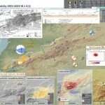
This evening (my time) there was an earthquake in Morocco. Magnitude 6.8, rather shallow, reverse or thrust (compressional) mechanism.

https://earthquake.usgs.gov/earthquakes/eventpage/us7000kufc/executive

This M 6.8 earthquake happened in the Atlas Mountains, a compressional system with south dipping reverse faults on the north and north dipping reverse faults on the south.

It is possible, if not probable, that this earthquake is related to one of these reverse faults. Based on the location, it seems possible that this earthquake is on a south dipping thrust fault (associated with the North Atlas fault system).

I used the USGS earthquake catalog and it appears that this is the largest magnitude earthquake to happen in Morocco (since we started recording earthquakes on seismometers).

Here is the sobering part of this earthquake. The USGS PAGER Alert provides an estimate for the number of casualties and economic impact. Read more about how these estimates are produced (and how to read this report) here.

UPDATE: (2023.09.10 Version 7)

UPDATE: (2023.09.11)

Fault Scaling Relations

Empirical fault scaling relations are ways that we can compare fault rupture sizes with earthquake magnitudes. One of the most used and well cited empirical fault scaling relations paper is Wells and Coppersmith, 1994.

  • Wells and Coppersmith developed relations between earthquake magnitude/moment magnitude and surface rupture length, subsurface rupture length, and rupture area. They also consider the difference between mean and maximum displacement measures.
  • The length of fault rupture is the distance that the fault slipped measured parallel to Earth’s surface. When we see fault lines mapped on a map, these lines are representative of the fault length.
  • The width of fault rupture is the distance that the fault slipped measured down into the Earth. For a fault that dips straight down into the Earth (perpendicular to the Earth’s surface), the width of the fault rupture is the distance between the Earth’s surface and the depth where the fault slipped. For faults that dip at an angle (like along a subduction zone, or a reverse/thrust fault like the fault that caused this M 6.8 earthquake), the distance measured is measured along this non-perpendicular distance.
  • The area of fault slip is basically the fault length times the fault width.
  • Here is the USGS fault slip model for the M 6.8 earthquake. The length of the fault slip figure is about 40 kilometers (km) and the width of the fault is about 45 km. The color represents the amount that the fault slipped (in meters) during the earthquake. So, the slip area does not fill this entire area. Most of the slip length is within ~30 km and width is within ~35km. The maximum slip is ~1.7 meters.


  • There have been some updates to these scaling relations that attempt to improve these relations. However, Wells and Coppersmith still work pretty well (the updates are not really that much different).
  • There remain certain types of earthquakes where we have small amounts of information to constrain these relations for those types of earthquakes (particularly large magnitude earthquakes, which are more rare than small and medium sized earthquakes). So, there is room for improvement.
  • Here is a plot from Wells and Coppersmith that shows the data relating magnitude with subsurface rupture length. We can see that there is a positive relation between magnitude and length (as the length is larger, so is the magnitude).


    (a) Regression of subsurface rupture length on magnitude (M). Regression line shown for all-slip-type relationship. Short dashed line indicates 95% confidence interval. (b) Regression lines for strike-slip relationships. See
    Table 2 for regression coefficients. Length of regression lines shows the range of data for each relation.

  • Note that there is lots of variation, so these empirical relations (represented by the lines that are drawn to “fit” these data) have lots of range. So, these empirical relations are not perfect predictors (i.e., fault length does not perfectly predict magnitude).
  • For example, a fault with subsurface rupture length of 10 km could have a magnitude that ranges between 5.25 and 6.25+. Remember, a M 6.25 releases about 32 times as much energy as a M 5.25. A M 6.25 earthquake is much larger than a M 5.25.
  • So, I used these scaling relations to calculate the magnitude for earthquakes of varying subsurface fault length. Here is a table from those calculations.


  • The M 6.8 USGS earthquake slip model suggests that this earthquake fits well with these subsurface fault scaling relations from Wells and Coppersmith (1994).
  • Well, as I was wrapping up for the day, I refreshed the USGS website for the earthquake and they had updated a bunch of the data (intensity, GIS data, and the slip data). So, the slip model shows a much smaller slip area. Though, if we look at the EMSC aftershock region, we may think that their first slip model was better. The aftershock region has a better fit for the scaling relations.

Below is my interpretive poster for this earthquake

  • I plot the seismicity from the past month, with diameter representing magnitude (see legend). I include earthquake epicenters from 1922-2022 with magnitudes M ≥ 3.0 in one version.
  • I plot the USGS fault plane solutions (moment tensors in blue and focal mechanisms in orange), possibly in addition to some relevant historic earthquakes.
  • A review of the basic base map variations and data that I use for the interpretive posters can be found on the Earthquake Reports page. I have improved these posters over time and some of this background information applies to the older posters.
  • Some basic fundamentals of earthquake geology and plate tectonics can be found on the Earthquake Plate Tectonic Fundamentals page.

    I include some inset figures. Some of the same figures are located in different places on the larger scale map below.

  • In the upper left corner is a map that shows the tectonic plates and seismicity for northwestern Africa.
  • In the upper right corner is a map that shows the earthquake intensity using the modified Mercalli intensity scale. Earthquake intensity is a measure of how strongly the Earth shakes during an earthquake, so gets smaller the further away one is from the earthquake epicenter. The map colors represent a model of what the intensity may be.
  • Below the intensity map is a plot that shows the same intensity (both modeled and reported) data as displayed on the map. Note how the intensity gets smaller with distance from the earthquake.
  • In the lower left center are two maps showing the probability of earthquake triggered landslides and possibility of earthquake induced liquefaction. I will describe these phenomena below.
  • In the lower right corner is a larger scale map showing the Atlas Mountains and the North and South Atlas faults.
  • To the left of this large scale map is a map from Beauchamp et al., 1999. This map is for the Atlas Mtns to the east of where this earthquake happened. Note the tectonic folds associated with the underlying reverse faults.
  • In the upper left is a map from TEixel et al. (1999) that includes cross section locations. Cross section C is displayed to the right. The location of this cross section is also shown on the main map with the green line.
  • To the left of the intensity map is a map from Banault et al. (2023) that includes a yellow star where the M 6.8 earthquake occurred.
  • Here is the map with a month’s seismicity plotted.

  • This is an updated poster with COMET InSAR analytical results. I also figured out how to download the EMSC seismicity data (they changed their website, so had to learn something new. Here is where one may download data from their catalog.
  • The USGS earthquake catalog (aka ComCat) is a global network, so a global catalog. The EMSC catalog relies, in places, on a more local network, so has more events in the catalog than in ComCat.
  • However, ComCat usually has all the major events and spans a longer time period.
  • SO, the 3 month seismicity I use here is from EMSC and the century dataset is based on the ComCat catalog.

Other Report Pages

Discussion about aftershocks

    the following is a series of statements that i wrote to respond to someone who is in Morocco. i thought that perhaps others might find this useful.

    aftershocks may last for weeks, possibly months. aftershocks typically decay at a rate that is dependent on the fault system. each fault system is slightly different.

    Here is a short story about aftershocks in Northern California but this story is relevant to earthquakes elsewhere.

    we don’t know the specific rate of decay for a fault system until we observe the aftershocks decay for that fault. some faults have few aftershocks and others have robust aftershock sequences (many events).

    it is not satisfying to not know how long they will last, i understand.

    e.g., there was an earthquake in central Washington USA in 1872 and some argue that this continues to have aftershocks.

    so, they will last a while and nobody will know when they will stop.

    but for people to feel safe to start living in their homes again, they need to get an expert, like an engineer, to evaluate the stability of their houses. only an expert, who is trained to inspect structures, can make these evaluations.

    will there be other large earthquakes? this is something nobody can know.

    follow advice for getting an engineer to check out one’s building(s) so that they can feel safe living in them; if the engineer decides that the structure is safe to withstand earthquakes, that is the best we can do.

    the M6.8 changed the stresses in the crust adjacent to the earthquake. in some places, these stresses increased the chance for earthquakes on different (or the same) faults. in other places, they decreased the stress.

    these changes in stress are modest but can trigger a new earthquake. but this depends on the state of stress of the other earthquake fault, something that we cannot yet know. so, we cannot know if the places where stress is increased will have a triggered/new earthquake.

    the best we can do is to make sure that buildings are resistant to earthquake forces. this capability is reliant on engineers, building inspectors, competent building contractors, building codes, etc. AND that these people follow the rules (building codes).

    the Feb 2023 Türkiye earthquakes destroyed buildings that were constructed under well designed building codes. but they were destroyed because people did not follow the code. lots of buildings were built before the codes existed and those did not perform well either.

    so, when living in earthquake country, one simply needs to ensure that they are living/working in earthquake resistant buildings. they may find comfort to live outside these structures until they are inspected. this is the smart thing to do.

    i don’t have the expertise to know if a building is designed to withstand earthquakes. i am not a structural engineer, an earthquake engineer. i know some and can follow the local building codes here where i live. and i sure could not offer advice remotely. one simply needs to seek local expertise. i wish i could offer more advice.

    finally, people who have been traumatized by this earthquake and continue to be traumatized by these aftershocks are going through what everyone does when faced with these conditions. this is typical. maybe finding comfort with friends and family and neighbors will help (?).

    i hope i have provided some constructive feedback to your questions/concerns.

    hopefully this information can help those in Morocco cope with this extremely challenging natural hazard.

    if nothing else, the survivors will be able to build back stronger and more earthquake resistant.

Shaking Intensity

  • Here is a figure that shows a more detailed comparison between the modeled intensity and the reported intensity. Both data use the same color scale, the Modified Mercalli Intensity Scale (MMI). More about this can be found here. The colors and contours on the map are results from the USGS modeled intensity. The DYFI data are plotted as colored dots (color = MMI, diameter = number of reports).
  • In the upper panel is the USGS Did You Feel It reports map, showing reports as colored dots using the MMI color scale. Underlain on this map are colored areas showing the USGS modeled estimate for shaking intensity (MMI scale).
  • In the lower panel is a plot showing MMI intensity (vertical axis) relative to distance from the earthquake (horizontal axis). The models are represented by the green and orange lines. The DYFI data are plotted as light blue dots. The mean and median (different types of “average”) are plotted as orange and purple dots. Note how well the reports fit the green line (the model that represents how MMI works based on quakes in California).
  • Below the lower plot is the USGS MMI Intensity scale, which lists the level of damage for each level of intensity, along with approximate measures of how strongly the ground shakes at these intensities, showing levels in acceleration (Peak Ground Acceleration, PGA) and velocity (Peak Ground Velocity, PGV).

Potential for Ground Failure

Luckily I updated this page because I noticed that the interpretive figure below was incorrect (it was for a different earthquake).

  • Below are a series of maps that show the potential for landslides and liquefaction. These are all USGS data products.
    There are many different ways in which a landslide can be triggered. The first order relations behind slope failure (landslides) is that the “resisting” forces that are preventing slope failure (e.g. the strength of the bedrock or soil) are overcome by the “driving” forces that are pushing this land downwards (e.g. gravity). The ratio of resisting forces to driving forces is called the Factor of Safety (FOS). We can write this ratio like this:

    FOS = Resisting Force / Driving Force

  • When FOS > 1, the slope is stable and when FOS < 1, the slope fails and we get a landslide. The illustration below shows these relations. Note how the slope angle α can take part in this ratio (the steeper the slope, the greater impact of the mass of the slope can contribute to driving forces). The real world is more complicated than the simplified illustration below.

  • Landslide ground shaking can change the Factor of Safety in several ways that might increase the driving force or decrease the resisting force. Keefer (1984) studied a global data set of earthquake triggered landslides and found that larger earthquakes trigger larger and more numerous landslides across a larger area than do smaller earthquakes. Earthquakes can cause landslides because the seismic waves can cause the driving force to increase (the earthquake motions can “push” the land downwards), leading to a landslide. In addition, ground shaking can change the strength of these earth materials (a form of resisting force) with a process called liquefaction.
  • Sediment or soil strength is based upon the ability for sediment particles to push against each other without moving. This is a combination of friction and the forces exerted between these particles. This is loosely what we call the “angle of internal friction.” Liquefaction is a process by which pore pressure increases cause water to push out against the sediment particles so that they are no longer touching.
  • An analogy that some may be familiar with relates to a visit to the beach. When one is walking on the wet sand near the shoreline, the sand may hold the weight of our body generally pretty well. However, if we stop and vibrate our feet back and forth, this causes pore pressure to increase and we sink into the sand as the sand liquefies. Or, at least our feet sink into the sand.
  • Below is a diagram showing how an increase in pore pressure can push against the sediment particles so that they are not touching any more. This allows the particles to move around and this is why our feet sink in the sand in the analogy above. This is also what changes the strength of earth materials such that a landslide can be triggered.

  • Below is a diagram based upon a publication designed to educate the public about landslides and the processes that trigger them (USGS, 2004). Additional background information about landslide types can be found in Highland et al. (2008). There was a variety of landslide types that can be observed surrounding the earthquake region. So, this illustration can help people when they observing the landscape response to the earthquake whether they are using aerial imagery, photos in newspaper or website articles, or videos on social media. Will you be able to locate a landslide scarp or the toe of a landslide? This figure shows a rotational landslide, one where the land rotates along a curvilinear failure surface.

  • Below is the liquefaction susceptibility and landslide probability map (Jessee et al., 2017; Zhu et al., 2017). Please head over to that report for more information about the USGS Ground Failure products (landslides and liquefaction). Basically, earthquakes shake the ground and this ground shaking can cause landslides.
  • I use the same color scheme that the USGS uses on their website. Note how the areas that are more likely to have experienced earthquake induced liquefaction are in the valleys. Learn more about how the USGS prepares these model results here.

Remote Sensing of Surface Deformation

  • One way to learn about the processes that happen during an earthquake is to evaluate the “coseismic” (during earthquake) surface deformation from that earthquake.
  • There are many ways to do this type of analysis. One may use classic surveys (using levels and tape measures) to measure the changes. One may use digital observations from satellites or airplanes, called remote sensing.
  • One of the ways to do this remote sensing is with a method called interferometric synthetic aperture radar (InSAR).
  • The techniques to apply InSAR methods are advanced and take years to master. I will not attempt to explain the full description of what InSAR is but below is a list of online resources where others do a great job at explaining InSAR:
  • Basically, there are satellites that pass over Earth over a regular schedule. These satellites have sensors (called platforms) that acquire a variety of data that span different parts of the electromagnetic spectrum.
  • Many are familiar with the visible light part of the electromagnetic spectrum (recall the Pink Floyd album, The Dark Side of the Moon, which has an image of light going through a prism, showing the different colors of the visible spectrum.
  • The different parts of the electromagnetic spectrum are described by the wavelength of the waves that these different types of radiation use to travel. The wavelength span for blue light is between 400 and 500 nanometers (nm). Green is 500 to 600 nm and red is 600 to 700 nm.
  • Other bands have longer or shorter wavelengths. X-Rays have much shorter wavelengths and infrared radiation has longer wavelengths.
  • Radar operates at long wavelengths (1-100 cm or 10,000,000-1,000,000,000 nm)
  • InSAR analysis, generally, uses radar data collected at two different times to determine how the Earth’s surface moved between the radar acquisitions.
  • There are some organizations that have programs that staff people to work on these InSAR analyses for events like earthquakes. NASA Jet Propulsion Laboratory (JPL) and the Centre for Observation and Modeling of Earthquakes, Volcanoes, and Tectonics (COMET) are two of these programs. They provide the results from their analyses online for anyone to download for free.
  • Here is the COMET event page for this M6.8 Morocco Earthquake.
  • This is a plot of the “unwrapped” InSAR results from the first Sentinel 1 (one of the radar satellites used for InSAR analysis) post-earthquake radar acquisition.
  • Color represents how the surface moved towards or away from the Satellite between 30 August and 11 September 2023. This is an ascending track and once we get a descending track acquisition, we will be able to get a better idea of the coseismic deformation.
  • This result helps us learn that the area in red generally went up and that the fault is dipping to the north (looking at the unwrapped data in the lower panel help with this interpretation).

  • Here is the source of data that I used to plot the above figures.

    Some Relevant Discussion and Figures

    • Here is the tectonic map from the poster (Teizel et al., 2002).

    • (a) Location sketch map of the Atlas Mountains in the North African foreland. (b) Geological map of the central High Atlas, indicating the section lines of Figure 2. ATC, Ait Tamlil basement culmination; SC, Skoura basement culmination; MC, Mougueur basement culmination; FZ, Foum Zabel thrust.

    • Here is the cross section from the poster (Teizel et al., 2002).

    • Serial geological cross sections through the High Atlas of Morocco (location in Figure 1b): (a) Midelt-Errachidia section, (b) Imilchil section, and (c) Demnat section. Segment x–x0 in 2c is adapted from Errarhaoui [1997].

    • This part of the world was once a mid ocean spreading ridge (aka a rifted margin). This figure shows the tectonic plate boundary configurations from this time of Earth’s past.
    • We will revisit this paper further down in the report where we see a geologic map and cross section in the region of this M 6.8 earthquake.

    • Plate reconstruction of the Central Atlantic to the Triassic-Jurassic boundary (200 Ma) (modified from Schettino and Turco, 2009). Rift zones are shown in dark grey. The square indicates the reconstructed position of the Marrakech High Atlas pf Morocco (MHA).

    (Domènech et al., 2015)

    • Here is the Babault et al. (2013) tectonic map.

    • Tectonic sketch map of the Moroccan High Atlas Mountains, indicating the lines of section of Figure 4a, b.

    • Here are the Babault et al. (2013) cross sections.

    • Structural cross-sections across the High Atlas and the Eastern Cordillera of Colombia. (a, b) Sections across the eastern and central High Atlas (from Teixell et al. 2003). These sections are based on field data and were modified from the original according to gravity modelling by Ayarza et al. 2005 (see location in Fig. 1). Although largely eroded, the Cretaceous sediments probably formed a tabular body that covered the entire Atlas domain, representing post-rift conditions. (c) Simplified structural cross-section of the Eastern Cordillera of Colombia, approximately through the latitude of Bogota´ (see location in Fig. 2). This section was constructed on the basis of maps, seismic profiles and structural data provided by ICP-Ecopetrol. The deep structure of the Sabana de Bogota´ region is conjectural as it is poorly imaged in the seismic profiles. The lower–upper Cretaceous boundary is taken for the sake of convenience at the top of the Une and Hilo´ formations. MMVB, Middle Magdalena Valley basin; LLB, Llanos basin.

    • The following are some maps from Lanari et al. (2020).
    • This is the main tectonic map.

    • Location of the study area and simplified geological map of the High Atlas and Anti‐Atlas Mountains. Africa Plate motion considering Eurasia fixed by Serpelloni et al. (2007). FWHA = far western High Atlas; WHA = western High Atlas; CHA = central High Atlas, AA = Anti‐Atlas; MA = Middle Atlas; SAF = South Atlas fault; JTF = Jebilet thrust front.

    • This is a map that shows how complicated the faulting is in this region.

    • Simplified geological map of the study area with schematic logs. See Figure 1 for location. The black lines are the cross‐section traces. Data from Baudon et al. (2009), Domènech et al. (2016, 2015), and El Arabi et al. (2003).

    • Here is a study about the geodetics of the western Mediterranean (Vernant et al., 2010). This study just barely reaches into the western Atlas Mountains, where the M 6.8 earthquake happened.
    • Geodesy is the study of the deformation of the Earth’s surface. Geodesists may study interseismic (between earthquakes) deformation or coseismic (during earthquakes) deformation.
    • These researchers used Global Positioning System (GPS, like in your smartphone) to measure the motion of locations in this area of study.
    • This map shows the two profiles plotted in the next figure. Profile 1 is of interest.

    • (a) GPS site velocities with respect to Nubia and 95% confidence ellipses. Heavy dashed lines show locations of profiles shown in Fig. 3 with the widths of the profiles indicated by lighter dashed lines. Focal mechanism indicates the location of the February 2004 Al Hoceima earthquake. Base map as in Fig. 1. (b) GPS site velocities with respect to Eurasia and 95% confidence ellipses. Format as in (a).

    • Profile 1 makes it into the western Atlas Mountains.
    • On the left, note sites MARO and AZIL. Look at the profile normal plot (the vertical axis represents how much the sites are moving relative to the direction perpendicular to the profile, which is sort of the direction of convergence in the Atlas Mountains).
    • The difference in convergence along the western part of profile 1 shows that there is very little interseismic deformation here. This supports the hypothesis that these faults are low slip rate faults.
    • There does appear to be some amount of interseismic deformation parallel to the profile. This suggests that there is some amount of lateral strain accumulating on these faults. However, these profiles are not oriented in an optimal direction to study the faults in the Atlas Mountains (so my crude interpretations are moderately inaccurate; what do you think about these geodetic data?).

    • Profiles 1 and 2 (see Fig. 2a). (a and d) Component of velocities and 1-sigma uncertainties along the direction of plate motion (normal to profile). (b and e) Component of velocities and 1-sigma uncertainties normal to the direction of plate motion (i.e., parallel to profiles). The interseismic deformation predicted by elastic block models is shown for the three main hypothesized plate boundaries (Red = Klitgord and Schouten, 1986; Green = Bird, 2003; Blue = Gutscher, 2004, see Fig. 1 for geometry). The pink line is for a model with a central Rif block (see the figure for geometry). (c and f) Topography and interpretative cross-section along Profiles 1 and 2. CC = Continental crust, LM= lithospheric mantle, OC= ocean crust, LVA = low velocity, high attenuation seismic anomaly (Calvert et al., 2000a,b).

    UPDATE: 11 Sept 2023

    • Albert Griera tweeted a figure that is included in a reference (Domènech et al., 2015). I used a couple figures from that journal article in an interpretive illustration below.
    • This Domènech et al. (2015) paper includes a cross section very close to the M 6.8 earthquake. At the top of this illustration is the map that shows the geology, faults, and the location for the cross section. Below is this cross section at two different time periods.
    • I include the figure captions for the map and cross section in block quote below the illustration.

    • (a) Geologic map of the western and Marrakech High Atlas (modified from Hollard, 1985), showing location of the study area detailed in (b). (b) Geologic map of the Marrakech High Atlas showing the main structural elements. Squares correspond to areas described in detail in this paper.

      Present-day cross section of the Marrakech High Atlas (see location in Fig. 2) and restoration to a state previous to the orogenic inversion in the Late Cretaceous.

Seismic Hazard and Seismic Risk

  • These are the two maps that show seismic and seismic risk for the western Mediterranean, the GEM Seismic Hazard and the GEM Seismic Risk maps from Pagani et al. (2018) and Silva et al. (2018).
    • The GEM Seismic Hazard Map:


    • The Global Earthquake Model (GEM) Global Seismic Hazard Map (version 2018.1) depicts the geographic distribution of the Peak Ground Acceleration (PGA) with a 10% probability of being exceeded in 50 years, computed for reference rock conditions (shear wave velocity, VS30, of 760-800 m/s). The map was created by collating maps computed using national and regional probabilistic seismic hazard models developed by various institutions and projects, and by GEM Foundation scientists. The OpenQuake engine, an open-source seismic hazard and risk calculation software developed principally by the GEM Foundation, was used to calculate the hazard values. A smoothing methodology was applied to homogenise hazard values along the model borders. The map is based on a database of hazard models described using the OpenQuake engine data format (NRML). Due to possible model limitations, regions portrayed with low hazard may still experience potentially damaging earthquakes.
    • Here is a view of the GEM seismic hazard map for the western Mediterranean.

    • The GEM Seismic Risk Map:


    • The Global Seismic Risk Map (v2018.1) presents the geographic distribution of average annual loss (USD) normalised by the average construction costs of the respective country (USD/m2) due to ground shaking in the residential, commercial and industrial building stock, considering contents, structural and non-structural components. The normalised metric allows a direct comparison of the risk between countries with widely different construction costs. It does not consider the effects of tsunamis, liquefaction, landslides, and fires following earthquakes. The loss estimates are from direct physical damage to buildings due to shaking, and thus damage to infrastructure or indirect losses due to business interruption are not included. The average annual losses are presented on a hexagonal grid, with a spacing of 0.30 x 0.34 decimal degrees (approximately 1,000 km2 at the equator). The average annual losses were computed using the event-based calculator of the OpenQuake engine, an open-source software for seismic hazard and risk analysis developed by the GEM Foundation. The seismic hazard, exposure and vulnerability models employed in these calculations were provided by national institutions, or developed within the scope of regional programs or bilateral collaborations.
    • Here is a view of the GEM seismic risk map for the western Mediterranean.

      References:

      Basic & General References

    • Frisch, W., Meschede, M., Blakey, R., 2011. Plate Tectonics, Springer-Verlag, London, 213 pp.
    • Hayes, G., 2018, Slab2 – A Comprehensive Subduction Zone Geometry Model: U.S. Geological Survey data release, https://doi.org/10.5066/F7PV6JNV.
    • Holt, W. E., C. Kreemer, A. J. Haines, L. Estey, C. Meertens, G. Blewitt, and D. Lavallee (2005), Project helps constrain continental dynamics and seismic hazards, Eos Trans. AGU, 86(41), 383–387, , https://doi.org/10.1029/2005EO410002. /li>
    • Jessee, M.A.N., Hamburger, M. W., Allstadt, K., Wald, D. J., Robeson, S. M., Tanyas, H., et al. (2018). A global empirical model for near-real-time assessment of seismically induced landslides. Journal of Geophysical Research: Earth Surface, 123, 1835–1859. https://doi.org/10.1029/2017JF004494
    • Kreemer, C., J. Haines, W. Holt, G. Blewitt, and D. Lavallee (2000), On the determination of a global strain rate model, Geophys. J. Int., 52(10), 765–770.
    • Kreemer, C., W. E. Holt, and A. J. Haines (2003), An integrated global model of present-day plate motions and plate boundary deformation, Geophys. J. Int., 154(1), 8–34, , https://doi.org/10.1046/j.1365-246X.2003.01917.x.
    • Kreemer, C., G. Blewitt, E.C. Klein, 2014. A geodetic plate motion and Global Strain Rate Model in Geochemistry, Geophysics, Geosystems, v. 15, p. 3849-3889, https://doi.org/10.1002/2014GC005407.
    • Meyer, B., Saltus, R., Chulliat, a., 2017. EMAG2: Earth Magnetic Anomaly Grid (2-arc-minute resolution) Version 3. National Centers for Environmental Information, NOAA. Model. https://doi.org/10.7289/V5H70CVX
    • Müller, R.D., Sdrolias, M., Gaina, C. and Roest, W.R., 2008, Age spreading rates and spreading asymmetry of the world’s ocean crust in Geochemistry, Geophysics, Geosystems, 9, Q04006, https://doi.org/10.1029/2007GC001743
    • Pagani,M. , J. Garcia-Pelaez, R. Gee, K. Johnson, V. Poggi, R. Styron, G. Weatherill, M. Simionato, D. Viganò, L. Danciu, D. Monelli (2018). Global Earthquake Model (GEM) Seismic Hazard Map (version 2018.1 – December 2018), DOI: 10.13117/GEM-GLOBAL-SEISMIC-HAZARD-MAP-2018.1
    • Silva, V ., D Amo-Oduro, A Calderon, J Dabbeek, V Despotaki, L Martins, A Rao, M Simionato, D Viganò, C Yepes, A Acevedo, N Horspool, H Crowley, K Jaiswal, M Journeay, M Pittore, 2018. Global Earthquake Model (GEM) Seismic Risk Map (version 2018.1). https://doi.org/10.13117/GEM-GLOBAL-SEISMIC-RISK-MAP-2018.1
    • Storchak, D. A., D. Di Giacomo, I. Bondár, E. R. Engdahl, J. Harris, W. H. K. Lee, A. Villaseñor, and P. Bormann (2013), Public release of the ISC-GEM global instrumental earthquake catalogue (1900–2009), Seismol. Res. Lett., 84(5), 810–815, doi:10.1785/0220130034.
    • Zhu, J., Baise, L. G., Thompson, E. M., 2017, An Updated Geospatial Liquefaction Model for Global Application, Bulletin of the Seismological Society of America, 107, p 1365-1385, https://doi.org/0.1785/0120160198
    • Specific References

    • Arboleya, M.L., Teoxe;. A., Charroud, M., Julivert, M., 2004. A structural transect through the High and Middle Atlas of Morocco in Journal of African Earth Sciences, v. 39, p. 319-327, https://doi.org/10.1016/j.jafrearsci.2004.07.036
    • Beauchamp, W., Allmendinger, R.W., Barazangi, M., Demnati, A., El Alji, M., and Dahmani, M., 1999. Inversion tectonics and the evolution of the High Atlas Mountains, Morocco, based on a geological-geophysical transect in Tectonics, v. 18, no. 2, p. 163-184, https://doi.org/10.1029/1998TC900015
    • Domènech, M., Teixell, A., Babault, J., and Arbolya, M-L., 2015. The inverted Triassic rift of the Marrakech High Atlas: A reappraisal of basin geometries and faulting histories in Tectonophysics, v. 663, p. 177-191, https://doi.org/10.1016/j.tecto.2015.03.017
    • Domènech, M., Teixell, A., and Stockli, D.F., 2016. Magnitude of rift-related burial and orogenic contraction in the Marrakech High Atlas revealed by zircon(U-Th)/He thermochronology and thermal modeling in Tectonics, v. 35, p. 2609–2635, https://doi.org/10.1002/2016TC004283
    • Jiménez‐Munt, I., M. Fernàndez, J. Vergés, D. Garcia‐Castellanos, J. Fullea, M. Pérez‐Gussinyé, and J. C. Afonso(2011), Decoupled crust‐mantle accommodation of Africa‐Eurasia convergence in the NW Moroccan margin,J. Geophys. Res.,116, B08403, https://doi.org/10.1029/2010JB008105
    • Babault, J., Teixell, A., Struth, L., Van Den Driessche, J., Arboleya, ML., Tesón, and E., 2013. “Shortening, structural relief and drainage evolution in inverted rifts: insights from the Atlas Mountains, the Eastern Cordillera of Colombia and the Pyrenees”, Thick-Skin-Dominated Orogens: From Initial Inversion to Full Accretion, in Nemcˇok, M., Mora, A. & Cosgrove, J. W. (eds) Thick-Skin-Dominated Orogens: From Initial Inversion to Full Accretion. Geological Society, London, Special Publications, 377, http://dx.doi.org/10.1144/SP377.14
    • Lanari, R., Faccenna, C., Fellin, M. G., Essaifi, A., Nahid, A., Medina, F., & Youbi, N. (2020). Tectonic evolution of the western High Atlas of Morocco: Oblique convergence, reactivation, and transpression. Tectonics, 39, e2019TC005563. https://doi.org/10.1029/2019TC005563
    • Teixell, A., Arboleya, M., Julivert, M., and Charroud, M., 2003. Tectonic shortening and topography in the central High Atlas (Morocco) in Tectonics, v. 22, no. 5, 1051, https://doi.org/10.1029/2002TC001460
    • Vernant et al., 2010. Geodetic constraints on active tectonics of the Western Mediterranean: Implications for the kinematics and dynamics of the Nubia-Eurasia plate boundary zone in Journal of Geodynamics, v. 49, no 3-4, p. 123-129, https://doi.org/10.1016/j.jog.2009.10.007

    Return to the Earthquake Reports page.

Earthquake Report: Kantō, Japan

Today marks 100 years since the 1923 Great Kantō Earthquake.

https://earthquake.usgs.gov/earthquakes/eventpage/iscgem911526/executive

I am putting together the basics and will update over the next few months.

This earthquake generated strong ground shaking, triggered landslides, induced liquefaction, generated tsunami, and (sadly) caused a large number of casualties and deaths.

There was also a large typhoon that hit this area around the time of the earthquake. The fires from the earthquake were spread by the winds from this typhoon.

There are estimates that as many as 142,800 people died from this earthquake.

Here is a short video that mentions the 1923 earthquake.

This part of Japan is tectonically dominated by convergent plate boundaries called subduction zones.

For example, the Tokyo region was in the southern extent of the 2011 Tohoku-oki Earthquake. Here is an Earthquake Report for the 2011 earthquake.

There is a subduction zone that forms the Sagami trough. This is where the Philippine Sea plate subducts northwards beneath the Okhotsk plate (part of North America).

The 1923 earthquake appears to have slipped along this fault (maybe several sub-faults of this fault).

Below is my interpretive poster for this earthquake

  • I plot the seismicity from the past month, with diameter representing magnitude (see legend). I include earthquake epicenters from 1922-2022 with magnitudes M ≥ 3.0 in one version.
  • I plot the USGS fault plane solutions (moment tensors in blue and focal mechanisms in orange), possibly in addition to some relevant historic earthquakes.
  • A review of the basic base map variations and data that I use for the interpretive posters can be found on the Earthquake Reports page. I have improved these posters over time and some of this background information applies to the older posters.
  • Some basic fundamentals of earthquake geology and plate tectonics can be found on the Earthquake Plate Tectonic Fundamentals page.

    I include some inset figures. Some of the same figures are located in different places on the larger scale map below.

  • In the upper left corner is a map showing the tectonic plates and their boundaries. There is an inset figure from Lin et al. (2016) that shows a low angle oblique view of the tectonic plates and how the different subduction zones dive beneath each other.
  • To the right of this map is another plate tectonic map from Nyst et al. (2006). I describe this figure lower down in the report.
  • In the lower right corner is a map that shows the earthquake intensity using the modified Mercalli intensity scale. Earthquake intensity is a measure of how strongly the Earth shakes during an earthquake, so gets smaller the further away one is from the earthquake epicenter. The map colors represent a model of what the intensity may be.
  • Above this intensity map is a figure from Stein et al. (2006) that shows what the intensity observations were from the 1923 earthquake. The JMA intensity scale is similar to the MMI scale but just spans a range from 1-7, while the MMI scale spans a range of 1-10.
  • In the upper right corner are two maps showing the probability of earthquake triggered landslides and possibility of earthquake induced liquefaction. I will describe these phenomena below.
  • To the left of the modeled intensity map is a figure that shows an earthquake slip model result from Kobayashi and Koketsu (2006). I discuss this figure later in the report.
  • In the lower left is a map showing inundation heights (rup-up elevations) from the 1923 earthquake generated tsunami (Matsuda et al., 1978).
  • Here is the map with a month’s seismicity plotted.

    Some Relevant Discussion and Figures

    • Matsuda et al. (1978) prepared a summary of major earthquakes in the southern Kanto district in Japan.
    • This summary included earthquake mechanisms and recurrence times for these earthquakes.
    • They used uplifted marine terraces as a basis for their interpretations.
    • This map shows the spatial extent for the earthquakes in their summary.

    • Great earthquakes during past 400 years off central Honshu. Encircled areas are earthquake source areas inferred from tsunami refraction diagram (Hatori, 1974, 1975a, 1975b, 1976a). Encircled area with a broken line is an area of the future earthquake of Oiso type. Ages of sudden uplift for the respective terrace were inferred from the thickness of marine sediments overlying the collected 14C samples and the width of the terrace.

    • This map shows the inundation height for tsunami generated by the 1923 and 1703 tsunami.

    • Inundation height of tsunamis at the 1923 earthquake (top) and at the 1703 earthquake (bottom) (data from Hatori and others, 1973; Hatori, 1976b).

    • The tsunami was devastating and had a run-up elevation that was at least 12 meters in some locations.
    • Here is a map showing some run-up elevations around Sagami Bay, south of the epicenter (Hatori, 1984).
    • The authors directly interviewed survivors of the earthquake and tsunami and their report is based on these interviews.

    • Distribution of inundation heights (above sea level. unti: m) of the 1923 Kanto tsunami in the Atami region.

    • This is a photo showing damaged houses and a dashed line representing the inundation level of 12 meters above sea level(flow depth; Hatori, 1984).

    • Damage to houses caused by the 1023 Kanto tsunami at Atami (from T. Ikeda). The dotted line shows the inundation level (3.0 m above sea level).

    • Here is a map showing the topography and inundation extent along the coast at Atami (Hatori, 1984).

    • Topography of Atami (ground elevations above M.S.L.) and inundation area of the 1923 Kanto tsunami.

    • Nyst et al. (2006) used updated geodetic analyses to reevaluate the 1923 Great Kanto Earthquake.
    • Geodesy is the study of the deformation of the Earth, how the plates and crust move with time.
    • This can be for times between earthquakes (interseismic) or during earthquakes (coseismic).
    • They used geodetic observations (tide gage data, benchmark survey data) to constrain tectonic models of the earthquake.
    • Their analyses included the application of different fault slip models and how those different models may have generated deformation of Earth’s surface.
    • Here is a great tectonic map from their paper, showing the major tectonic boundaries, the shape of the megathrust subduction zone faults (slabs), and their proposed earthquake fault planes (the areas of the faults that slipped during the earthquake) for the 1923 temblor.

    • (a) Plate tectonic setting of Japan, where four major plates converge: the Eurasian (EU) or Amurian according to Heki et al. [1999] and Heki and Miyazaki [2001], North American (NA) or Okhotsk according to Seno et al. [1993, 1996], Pacific (PA), and Philippine Sea (PH) plates. Northern Honshu is located on the North American or Okhotsk plate. ISTL, Itoigawa-Shizuoka Tectonic Line. The arrows indicate motion of different plates relative to northern Honshu, and the numbers are averages of the rate predictions in millimeters per year, based on Global Positioning System (GPS) observations [Heki et al., 1999; Seno et al., 1996]. The dashed square outlines the area shown in Figure 1b. (b) Isodepth contours of the surfaces of the PH plate based on seismic reflection data [from Sato et al., 2005] and the PA plate based on seismicity data [from Noguchi, 2002]. (c) Active fault map of the coastal region around Sagami Bay with 1923 coseismic fault model planes (model III) of Matsu’ura et al. [1980] and isodepth contours of the PH plate [Sato et al., 2005]. The star indicates the epicenter of the 1923 Kanto earthquake according to the seismic study of Kanamori and Miyamura [1970]. The boldface lines indicate the Sagami trough.

    • Here is a map that shows their calculation of vertical land motion generated by the earthquake (Nyst et al., 2006).
    • The height of the colored bars represents the uplift (or subsidence) at each location. The arrowheads show the direction of motion.

    • Leveling routes in Kanto and the vertical displacement derived from surveys before and shortly after 1923. The oval indicates tide gauge station Aburatsubo, which provides the data for the absolute vertical reference frame. The roman enumeration and color coding of the arrows correspond to the profiles shown in Figure 10. The direction in which the profiles in Figure 10 display displacement along the routes is here indicated by a black arrow. For closed loops I and IV the white arrow indicates the start of the profile.

    • This map shows the different fault slip models that they considered in their study (Nyst et al., 2006).

    • Surface projection of a selection of fault plane models that are based on historical geodetic observations (triangulation and leveling data). The arrows indicate the slip direction, and the numbers indicate the magnitude of the slip for the uniform slip models.

    • These plots show a comparison of their model results with the observations (Nyst et al., 2006).

    • Fit of our uniform source model to the leveling observations that are adjusted for interseismic deformation and indicated by the colored lines. The dashed lines represent the absolute vertical displacement of our model. The color coding and roman numerals correspond to the level routes shown in Figure 5. The vertical component of the interseismic deformation field, plotted for routes I through IV, is omitted for routes V through IX, because there its signal is indistinguishable from zero displacement. Route X (Figure 5) is not displayed here, because the observations do not show any deformation and our model predicts zero vertical displacement along this route.

    • Kobayashi and Koketsu (2005) also used geodetic data to develop a slip model for this 1923 Great Kanto Earthquake.
    • Kobayashi and Koketsu (2005) “inverted” these geodetic data to estimate where the slip was on their fault models. They considered a range of parameters and included geodetic data, teleseismic data (seismic waves transmitted far distances), and strong ground motion data (seismic waves recorded on seismometers near the earthquake) for their inversions. The result of their inversion is a slip distribution for the earthquake fault slip. A slip distribution is a plot of an earthquake fault that shows how much the fault slipped in different parts of the fault. In most cases, faults do not slip in a homogeneous manner (the fault slips more in some places and less in other places).
    • Here is another figure that shows coseismic (during the earthquake) geodetic observations from this earthquake (Kobayashi and Koketsu, 2005)
    • Dark arrows show horizontal motion, black bars show subsidence (vertical motion downwards), and the white bars show uplift (vertical motion upwards).

    • Observed geodetic data. The arrows denote horizontal displacements from triangulation. The bars denote vertical displacements from leveling (up: white, down: black). The rectangular area bounded by dashed lines indicates the horizontal projection of the fault plane. The star symbol denotes the epicenter.

    • This is a figure that shows the prefered results from their study (Kobayashi and Koketsu, 2005)
    • The figure shows the slip model (color = slip amount, arrows = slip direction), the vertical motion from their model, and the horizontal motion from their model (compared to the observations).

    • Results from inversions of the geodetic data using the Green’s functions for a 1-D layered structure. (a) Slip distribution. (b) Observed (up: red, down: blue) and calculated (black) vertical displacements. (c) Observed (green) and calculated (black) horizontal displacements. The variance reduction for geodetic data is 0.96.

    • Nakadai et al. (2023) recently published a new source model for the 1923 Great Kantō Earthquake.
    • These authors used (inverted) coseismic geodetic observations to calculate the slip distribution from the earthquake (as Kobayashi and Koketsu (2005) did above ^^^).
    • First we see a map showing the region of these earthquakes, the locations of tide gages that recorded the tsunami, and a plot showing the tsunami size in places along the coast.

    • Tectonic setting near the source area of the 1923 Kanto earthquake. (a) The source areas of the 1923 Kanto earthquake (orange) and the 1703 Genroku Kanto earthquake (green). Red triangles show location of tide gauges in which tsunamis generated by the 1923 Kanto earthquake were observed. (b) Maximum tsunami surveyed heights (Aida, 1993) along the east coast of the Izu Peninsula shown in a red rectangle in panel (a).

    • Here is a map that shows the hypothetical fault geometry that Nakadai et a.l. (2023) used for their inversions.
    • The blue dashed lines show the shape of the megathrust subduction zone fault, the fault that forms the Sagami trough, and how it dips to the north.
    • The orange lines show the fault elements (subfaults) used in this study.

    • Locations of subfaults along the plate interface along the Sagami trough where the Philippine Sea plate subducts. Blue dashed contours show the depth of the plate interface with a 2 km interval. Red triangles show locations of tide gauges where tsunami waveforms were observed.

    • This figure shows the results of their inversion.
    • The map on the left shows the fault slip distribution (colored yellow to red to brown, 1- to 12-m of slip). There were two regions of high slip, circled in blue.
    • The plots on the right show the tide gage data (these are called marigrams) from the tsunami, in blue. The orange lines are plots showing tsunami waves calculated from their tsunami model that used the slip distribution along the fault shown on the left.
    • The comparison between their modeled data and the observed data is really good, except that Chiba misses one of the large waves and misses the timing of the 2nd or 3rd waves.

    • Results of the joint inversion of tsunami waveforms and crustal deformation data. (a) The estimated slip distribution of the 1923 Kanto earthquake. Red triangles show locations of tide gauges where tsunami waveforms were observed. Two blue dashed ellipsoids, I and II, show large slip areas. A blue star shows the epicenter of the Kanto earthquake. Black
      contours show the slip distribution estimated by Matsu’ura et al. (2007) with a contour interval of 2 m. Two blue dashed ellipsoids, I and II, show large slip areas. (b) Comparison of observed (blue) and computed (orange) tsunami waveforms. Yellow hatched areas show parts of tsunami waveforms used in the joint inversion.

    • This map shows a comparison between their modeled coseismic vertical land motion (using orange (up) and yellow (down) arrows) with the observed vertical land motion (dark blue (up) and light blue (down) arrows).

    • Comparison of observed and computed vertical crustal deformation caused by the 1923 Kanto earthquake. Dark and light blue arrows show observed uplifts and subsidence, respectively. Red and orange arrows show computed uplifts and subsidence, respectively.

    • These are their slip distributions for a variety of how much they weight the crustal deformation data relative to the tsunami ddata.

    • Slip distributions estimated from the joint inversion of tsunami waveforms and crustal deformation data using different weighting factors (λ), the weight of the crustal deformation data against the tsunami data, 0.25, 0.5, 0,75, 1.0, and 2.0. Blue arrows show subfault 4C for which a large slip was estimated in this study but not in the previous studies.

    • This figure shows a comparison between the tsunami observations and their calculated tsunami sizes.

    • (a) Comparison of surveyed tsunami heights (red dots), computed maximum tsunami heights from the estimated slip distribution (blue dots), and those from the slip distribution without subfault 4C (green dots), along the east coast of the Izu Peninsula. (b) Maximum tsunami height distribution near the east coast of the Izu peninsula computed from the estimated slip distribution.

    • Stein et al. (2006) prepared an updated seismic hazard assessment for the Tokyo region of southern Japan.
    • Their model was based on observations from historical earthquakes.

    • (a) Simplified tectonic map of the Kanto triple junction (Toda et al. submitted), showing the Japan Group and Kashima-Daiichi seamount chains. (b) The Philippine Sea plate is shaded pink, where it descends beneath the Eurasian plate. The proposed Kanto fragment (green) lies between the Philippine Sea plate and the underlying Pacific plate. Sites of
      large historical earthquakes are identified with their tectonic plate element. Two cross-sections through greater Tokyo are shown with 1979–2003 microseismicity in the lower panels.

    • This shows the peak intensities that they used for their hazard model. The intensities from the 1923 Great Kanto Earthquake are in the upper right panel (Stein et al., 2006).

    • (a) Peak intensities observed during the past 400 years. Observed intensity distribution for (b) 1923 MZ7.9 Kanto (c) 1855 Mw7.4 Ansei-Edo and (d) 1703 Mw8.2 Genroku shocks (Bozkurt et al. submitted), together with our inferred seismic sources for these three earthquakes.

    • These are the seismic slip rates for the sources used in their model (Stein et al., 2006).

    • The inferred seismic slip rate (often called the ‘slip deficit rate’) for the major sources, and their association with larger historic events and historical seismicity, modified from Nishimura & Sagiya (submitted). Red sources slip at high rate and are presently locked, and thus are accumulating tectonic strain to be released in future large earthquakes; white sources have a low slip rate or creep, and so are unlikely to be sites of future large shocks.

    • These maps show the 30 year probability percent (%) of ground shaking exceeding JMA 6 (about 0.93 pga) and places that may experience earthquake induced liquefaction (Stein et al., 2006).
    • Compare the lower map with the USGS earthquake induced liquefaction susceptibility map in the poster or below in the ground failure interpretation figure.

    • (a) Spatial distribution of the time-averaged 30 year probability of severe shaking (PGAw0.93g), which is consistent with our independent estimate (Bozkurt et al. submitted). (b) The probability of shaking is correlated with proximity to the plate-boundary faults and to sites of unconsolidated sediments. ISTL, Itoigawa-Shizuoka Tectonic Line.

    • Kimura et al. (2010) used seismic reflection and microseismicity data to investigate the fault geometry in the region of the 1923 Great Kanto Earthquake.
    • They found evidence for the subducting plate (and more).
    • Here is a figure showing the earthquakes they studied, the plate tectonic configuration, and the seismicity they used for their study.

    • (A) Plate geometry of the PHS, which subducts below Kanto from the Sagami trough. The arrow represents the plate convergence direction relative to Kanto (25).(B) Map of Kanto. Blue lines denote deep seismic survey lines. Small triangles denote the nearest points between P1 and P2. Small red circles denote repeating earthquakeson the PHS, with the representative focal mechanism (13, 18). Green lines represent isodepth contours of the PHS; numbers denote depths in kilometers (18). The epicenter, focal mechanism, and source fault are shown for the 1923 Kanto earthquake (12, 26), its largest aftershock (13), and the SSE (16, 17), respectively. Small squares represent seismographic stations. (C) The cross section along a line a-b-c-d. The plate boundary of the PHS revealed by P1 (13) is shown as a thick line. Small blue circles denote background earthquakes.

    • Here is a figure showing the seismic reflection data they used for their study (Kimura et al., 2010).

    • Deep seismic reflection profiles. Horizontal distance from the Sagami trough is shown on top. P2 is projected onto the N30°E direction. Red arrows show the plate boundary. Numbers denote P-wave velocities (km/s). Small triangles denote the nearest point between P1 and P2. In P2, the final hypocenters of the Off-Kanto cluster for which depths were adjusted by the P-S wave are projected (red, RQs; black, background microearthquakes). The original sections are shown in fig. S1. The velocity profile at the location indicated by an open arrow is displayed to the right, with enlargements of waveforms at major deep reflectors (R1 and R2) at locations shown by black arrows (III, IV) that are convolved by reflectors at the basement of the surface sedimentary layer just above each region (I, II). P1 data are from (13).

    • Here is a figure showing their interpretations (Kimura et al., 2010).

    • Schematic illustration of subsurface structure, the plate boundary (red line), and underplating off the Kanto region of the Philippine Sea plate. The depth uncertainty of the RQs is also shown.

    Shaking Intensity

    • Here is a figure that shows a more detailed comparison between the modeled intensity and the reported intensity. Both data use the same color scale, the Modified Mercalli Intensity Scale (MMI). More about this can be found here. The colors and contours on the map are results from the USGS modeled intensity. The DYFI data are plotted as colored dots (color = MMI, diameter = number of reports).
    • In the upper panel is the USGS Did You Feel It reports map, showing reports as colored dots using the MMI color scale. Underlain on this map are colored areas showing the USGS modeled estimate for shaking intensity (MMI scale).
    • In the lower panel is a plot showing MMI intensity (vertical axis) relative to distance from the earthquake (horizontal axis). The models are represented by the green and orange lines. The DYFI data are plotted as light blue dots. The mean and median (different types of “average”) are plotted as orange and purple dots. Note how well the reports fit the green line (the model that represents how MMI works based on quakes in California).
    • Below the lower plot is the USGS MMI Intensity scale, which lists the level of damage for each level of intensity, along with approximate measures of how strongly the ground shakes at these intensities, showing levels in acceleration (Peak Ground Acceleration, PGA) and velocity (Peak Ground Velocity, PGV).

    • Here is the observed intensity map from Stein et al. (2006)

    • Observed intensity distribution for (b) 1923 MZ7.9 Kanto earthquake.

    Potential for Ground Failure

    Luckily I updated this page because I noticed that the interpretive figure below was incorrect (it was for a different earthquake).

    • Below are a series of maps that show the potential for landslides and liquefaction. These are all USGS data products.
      There are many different ways in which a landslide can be triggered. The first order relations behind slope failure (landslides) is that the “resisting” forces that are preventing slope failure (e.g. the strength of the bedrock or soil) are overcome by the “driving” forces that are pushing this land downwards (e.g. gravity). The ratio of resisting forces to driving forces is called the Factor of Safety (FOS). We can write this ratio like this:

      FOS = Resisting Force / Driving Force

    • When FOS > 1, the slope is stable and when FOS < 1, the slope fails and we get a landslide. The illustration below shows these relations. Note how the slope angle α can take part in this ratio (the steeper the slope, the greater impact of the mass of the slope can contribute to driving forces). The real world is more complicated than the simplified illustration below.

    • Landslide ground shaking can change the Factor of Safety in several ways that might increase the driving force or decrease the resisting force. Keefer (1984) studied a global data set of earthquake triggered landslides and found that larger earthquakes trigger larger and more numerous landslides across a larger area than do smaller earthquakes. Earthquakes can cause landslides because the seismic waves can cause the driving force to increase (the earthquake motions can “push” the land downwards), leading to a landslide. In addition, ground shaking can change the strength of these earth materials (a form of resisting force) with a process called liquefaction.
    • Sediment or soil strength is based upon the ability for sediment particles to push against each other without moving. This is a combination of friction and the forces exerted between these particles. This is loosely what we call the “angle of internal friction.” Liquefaction is a process by which pore pressure increases cause water to push out against the sediment particles so that they are no longer touching.
    • An analogy that some may be familiar with relates to a visit to the beach. When one is walking on the wet sand near the shoreline, the sand may hold the weight of our body generally pretty well. However, if we stop and vibrate our feet back and forth, this causes pore pressure to increase and we sink into the sand as the sand liquefies. Or, at least our feet sink into the sand.
    • Below is a diagram showing how an increase in pore pressure can push against the sediment particles so that they are not touching any more. This allows the particles to move around and this is why our feet sink in the sand in the analogy above. This is also what changes the strength of earth materials such that a landslide can be triggered.

    • Below is a diagram based upon a publication designed to educate the public about landslides and the processes that trigger them (USGS, 2004). Additional background information about landslide types can be found in Highland et al. (2008). There was a variety of landslide types that can be observed surrounding the earthquake region. So, this illustration can help people when they observing the landscape response to the earthquake whether they are using aerial imagery, photos in newspaper or website articles, or videos on social media. Will you be able to locate a landslide scarp or the toe of a landslide? This figure shows a rotational landslide, one where the land rotates along a curvilinear failure surface.

    • Below is the liquefaction susceptibility and landslide probability map (Jessee et al., 2017; Zhu et al., 2017). Please head over to that report for more information about the USGS Ground Failure products (landslides and liquefaction). Basically, earthquakes shake the ground and this ground shaking can cause landslides.
    • I use the same color scheme that the USGS uses on their website. Note how the areas that are more likely to have experienced earthquake induced liquefaction are in the valleys. Learn more about how the USGS prepares these model results here.

      References:

      Basic & General References

    • Frisch, W., Meschede, M., Blakey, R., 2011. Plate Tectonics, Springer-Verlag, London, 213 pp.
    • Hayes, G., 2018, Slab2 – A Comprehensive Subduction Zone Geometry Model: U.S. Geological Survey data release, https://doi.org/10.5066/F7PV6JNV.
    • Holt, W. E., C. Kreemer, A. J. Haines, L. Estey, C. Meertens, G. Blewitt, and D. Lavallee (2005), Project helps constrain continental dynamics and seismic hazards, Eos Trans. AGU, 86(41), 383–387, , https://doi.org/10.1029/2005EO410002. /li>
    • Jessee, M.A.N., Hamburger, M. W., Allstadt, K., Wald, D. J., Robeson, S. M., Tanyas, H., et al. (2018). A global empirical model for near-real-time assessment of seismically induced landslides. Journal of Geophysical Research: Earth Surface, 123, 1835–1859. https://doi.org/10.1029/2017JF004494
    • Kreemer, C., J. Haines, W. Holt, G. Blewitt, and D. Lavallee (2000), On the determination of a global strain rate model, Geophys. J. Int., 52(10), 765–770.
    • Kreemer, C., W. E. Holt, and A. J. Haines (2003), An integrated global model of present-day plate motions and plate boundary deformation, Geophys. J. Int., 154(1), 8–34, , https://doi.org/10.1046/j.1365-246X.2003.01917.x.
    • Kreemer, C., G. Blewitt, E.C. Klein, 2014. A geodetic plate motion and Global Strain Rate Model in Geochemistry, Geophysics, Geosystems, v. 15, p. 3849-3889, https://doi.org/10.1002/2014GC005407.
    • Meyer, B., Saltus, R., Chulliat, a., 2017. EMAG2: Earth Magnetic Anomaly Grid (2-arc-minute resolution) Version 3. National Centers for Environmental Information, NOAA. Model. https://doi.org/10.7289/V5H70CVX
    • Müller, R.D., Sdrolias, M., Gaina, C. and Roest, W.R., 2008, Age spreading rates and spreading asymmetry of the world’s ocean crust in Geochemistry, Geophysics, Geosystems, 9, Q04006, https://doi.org/10.1029/2007GC001743
    • Pagani,M. , J. Garcia-Pelaez, R. Gee, K. Johnson, V. Poggi, R. Styron, G. Weatherill, M. Simionato, D. Viganò, L. Danciu, D. Monelli (2018). Global Earthquake Model (GEM) Seismic Hazard Map (version 2018.1 – December 2018), DOI: 10.13117/GEM-GLOBAL-SEISMIC-HAZARD-MAP-2018.1
    • Silva, V ., D Amo-Oduro, A Calderon, J Dabbeek, V Despotaki, L Martins, A Rao, M Simionato, D Viganò, C Yepes, A Acevedo, N Horspool, H Crowley, K Jaiswal, M Journeay, M Pittore, 2018. Global Earthquake Model (GEM) Seismic Risk Map (version 2018.1). https://doi.org/10.13117/GEM-GLOBAL-SEISMIC-RISK-MAP-2018.1
    • Storchak, D. A., D. Di Giacomo, I. Bondár, E. R. Engdahl, J. Harris, W. H. K. Lee, A. Villaseñor, and P. Bormann (2013), Public release of the ISC-GEM global instrumental earthquake catalogue (1900–2009), Seismol. Res. Lett., 84(5), 810–815, doi:10.1785/0220130034.
    • Zhu, J., Baise, L. G., Thompson, E. M., 2017, An Updated Geospatial Liquefaction Model for Global Application, Bulletin of the Seismological Society of America, 107, p 1365-1385, https://doi.org/0.1785/0120160198
    • Specific References

    • Davison, C., 1925. The Japanese Earthquake of 1 September 1923. The Geographical Journal, 65(1), 41. https://doi.org/10.2307/1782347
    • Hatori, Tokutaro, 1984. Tsunami Behavior of the 1923 Kanto Earthquake at Atami and Hatsushima Island in Sagami Bay in Bull. Earthquake Research Institute, v. 58, p. 683-689
    • Jones, M., 2016. The Great Kantō Earthquake and the Chimera of National Reconstruction in Japan. By J. Charles Schencking . New York: Columbia University Press, 2013. xxii, 374 pp. ISBN: 9780231162180 (cloth; also available as e-book). – Imaging Disaster: Tokyo and the Visual Culture of Japan’s Great Earthquake of 1923. By Gennifer Weisenfeld . Berkeley: University of California Press, 2012. xv, 393 pp. ISBN: 9780520271951 (cloth; also available as e-book). The Journal of Asian Studies, 75(3), 836–839. https://doi.org/10.1017/s0021911816000851
    • Kimura, H., Takeda, T., Obara, K., & Kasahara, K., 2010. Seismic Evidence for Active Underplating Below the Megathrust Earthquake Zone in Japan. Science, 329(5988), 210–212. https://doi.org/10.1126/science.1187115 
    • Kobayashi, R., Koketsu, K. Source process of the 1923 Kanto earthquake inferred from historical geodetic, teleseismic, and strong motion data. Earth Planet Sp 57, 261–270 (2005). https://doi.org/10.1186/BF03352562
    • Matsuda, T., Ota, Y., Ando, M., & Yonekura, N., 1978. Fault mechanism and recurrence time of major earthquakes in southern Kanto district, Japan, as deduced from coastal terrace data. Geological Society of America Bulletin, 89(11), 1610. https://doi.org/10.1785/0120230050
    • Nyst, M., Nishimura, T., Pollitz, F. F., and Thatcher, W., 2006. The 1923 Kanto earthquake reevaluated using a newly augmented geodetic data set, J. Geophys. Res., 111, B11306, https://doi.org/10.1029/2005JB003628.
    • Pollitz, F. F., Pichon, X., & Lallemant, S. J. (1996). Shear partitioning near the central Japan triple junction: the 1923 great Kanto earthquake revisited-II. Geophysical Journal International, 126(3), 882–892. https://doi.org/10.1111/j.1365-246x.1996.tb04710.x
    • Stein, R.S., Toda, S., Parsons, T., amnd Grunewald, E., 2006. A new probabilistic seismic hazard assessment for greater Tokyo in Philos Trans A Math Phys Eng Sci.v. 364, p. 1965-1988. doi: 10.1098/rsta.2006.1808.
    • https://www.jstage.jst.go.jp/article/jamstecr/23/0/23_12/_html/-char/en
    • https://www.sciencedirect.com/science/article/abs/pii/0040195189903880
    • https://www.researchgate.net/publication/282052144_Geological_and_historical_evidence_of_irregular_recurrent_earthquakes_in_Japan
    • https://www.researchgate.net/publication/352413188_Time-Dependent_Probabilistic_Tsunami_Inundation_Assessment_Using_Mode_Decomposition_to_Assess_Uncertainty_for_an_Earthquake_Scenario
    • Audio version of the wikipedia page:

    Return to the Earthquake Reports page.