Earthquake Report: 1700 Cascadia subduction zone 317 year commemoration

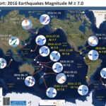
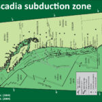
Today (possibly tonight at about 9 PM) is the birthday of the last known Cascadia subduction zone (CSZ) earthquake. There is some evidence that there have been more recent CSZ earthquakes (e.g. late 19th century in southern OR / northern CA), but they were not near full margin ruptures (where the entire fault, or most of it, slipped during the earthquake).
I have been posting material about the CSZ for the past couple of years here and below are some prior Anniversary posts, as well as Earthquake Reports sorted according to their region along the CSZ. Below I present some of the material included in those prior reports (to help bring it all together), but I have prepared a new map for today’s report as well.


On this evening, 317 years ago, the Cascadia subduction zone fault ruptured as a margin wide earthquake. I here commemorate this birthday with some figures that are in two USGS open source professional papers. The Atwater et al. (2005) paper discusses how we came to the conclusion that this last full margin earthquake happened on January 26, 1700 at about 9 PM (there may have been other large magnitude earthquakes in Cascadia in the 19th century). The Goldfinger et al. (2012) paper discusses how we have concluded that the records from terrestrial paleoseismology are correlable and how we think that the margin may have ruptured in the past (rupture patch sizes and timing). The reference list is extensive and this is but a tiny snapshot of what we have learned about Cascadia subduction zone earthquakes. Brian Atwater and his colleagues have updated the Orphan Tsunami and produced a second edition available here for download and here for hard copy purchase (I have a hard copy).

Here is a map of the Cascadia subduction zone, modified from Nelson et al. (2006). The Juan de Fuca and Gorda plates subduct northeastwardly beneath the North America plate at rates ranging from 29- to 45-mm/yr. Sites where evidence of past earthquakes (paleoseismology) are denoted by white dots. Where there is also evidence for past CSZ tsunami, there are black dots. These paleoseismology sites are labeled (e.g. Humboldt Bay). Some submarine paleoseismology core sites are also shown as grey dots. The two main spreading ridges are not labeled, but the northern one is the Juan de Fuca ridge (where oceanic crust is formed for the Juan de Fuca plate) and the southern one is the Gorda rise (where the oceanic crust is formed for the Gorda plate).


Today I prepared this new map showing the results of shakemap scenario model prepared by the USGS. I prepared this map using data that can be downloaded from the USGS website here. Shakemaps show what we think might happen during an earthquake, specifically showing how strongly the ground might shake. There are different measures of this, which include Peak Ground Acceleration (PGA), Peak Ground Velocity (PGV), and Modified Mercalli Intensity (MMI). More background information about the shakemap program at the USGS can be found here. One thing that all of these measures share is that they show that there is a diminishing of ground shaking with distance from the earthquake. This means that the further from the earthquake, the less strongly the shaking will be felt. This can be seen on the maps below. The USGS prepares shakemaps for all earthquakes with sufficiently large magnitudes (i.e. we don’t need shakemaps for earthquakes of magnitude M = 1.5). An archive of these USGS shakemaps can be found here. All the scenario USGS shakemaps can be found here.
I chose to use the MMI representation of ground shaking because it is most easily comparable for people to understand. This is because MMI scale is designed based upon relations between ground shaking intensity and observations that people are able to make (e.g. how strongly they felt the earthquake, how much objects in their residences or places of business responded, how much buildings were damaged, etc.).
The MMI ground motion model is based upon a computer model estimate of ground motions, different from the “Did You Feel It?” estimate of ground motions that is actually based on real observations. More on the MMI scale can be found here and here.


Here is the USGS version of this map. The outline of the fault that was used to generate the ground motions that these maps are based upon is outlined in black.


I prepared an end of the year summary for earthquakes along the CSZ. Below is my map from this Earthquake Report.

  • Here is the map where I show the epicenters as circles with colors designating the age. I also plot the USGS moment tensors for each earthquake, with arrows showing the sense of motion for each earthquake.
  • I placed a moment tensor / focal mechanism legend in the lower left corner of the map. There is more material from the USGS web sites about moment tensors and focal mechanisms (the beach ball symbols). Both moment tensors and focal mechanisms are solutions to seismologic data that reveal two possible interpretations for fault orientation and sense of motion. One must use other information, like the regional tectonics, to interpret which of the two possibilities is more likely.
  • In some cases, I am able to interpret the sense of motion for strike-slip earthquakes. In other cases, I do not know enough to be able to make this interpretation (so I plot both solutions).

    I include some inset figures in the poster.

  • In the upper left corner is a map of the Cascadia subduction zone (CSZ) and regional tectonic plate boundary faults. This is modified from several sources (Chaytor et al., 2004; Nelson et al., 2004)
  • Below the CSZ map is an illustration modified from Plafker (1972). This figure shows how a subduction zone deforms between (interseismic) and during (coseismic) earthquakes. Today’s earthquake did not occur along the CSZ, so did not produce crustal deformation like this. However, it is useful to know this when studying the CSZ.
  • To the lower right of the Cascadia map and cross section is a map showing the latest version of the Uniform California Earthquake Rupture Forecast (UCERF). Let it be known that this is not really a forecast, and this name was poorly chosen. People cannot forecast earthquakes. However, it is still useful. The faults are colored vs. their likelihood of rupturing. More can be found about UCERF here. Note that the San Andreas fault, and her two sister faults (Maacama and Bartlett Springs), are orange-red.
  • To the upper right of the Cascadia map and cross section is a map showing the shaking intensities based upon the USGS Shakemap model. Earthquake Scenarios describe the expected ground motions and effects of specific hypothetical large earthquakes. The color scale is the same as found on many of my #EarthquakeReport interpretive posters, the Modified Mercalli Intensity Scale (MMI). The latest version of this map is here.
  • In the upper right corner I include generalized fault map of northern California from Wallace (1990).
  • To the left of the Wallace (1990) map is a figure that shows the evolution of the San Andreas fault system since 30 million years ago (Ma). This is a figure from the USGS here.
  • In the lower right corner I include the Earthquake Shaking Potential map from the state of California. This is a probabilistic seismic hazard map, basically a map that shows the likelihood that there will be shaking of a given amount over a period of time. More can be found from the California Geological Survey here. I place a yellow star in the approximate location of today’s earthquake.


This figure shows how a subduction zone deforms between (interseismic) and during (coseismic) earthquakes. We also can see how a subduction zone generates a tsunami. Atwater et al., 2005.


Here is a version of the CSZ cross section alone (Plafker, 1972).


Here is an animation produced by the folks at Cal Tech following the 2004 Sumatra-Andaman subduction zone earthquake. I have several posts about that earthquake here and here. One may learn more about this animation, as well as download this animation here.

Here is a graphic showing the sediment-stratigraphic evidence of earthquakes in Cascadia. Atwater et al., 2005. There are 3 panels on the left, showing times of (1) prior to earthquake, (2) several years following the earthquake, and (3) centuries after the earthquake. Before the earthquake, the ground is sufficiently above sea level that trees can grow without fear of being inundated with salt water. During the earthquake, the ground subsides (lowers) so that the area is now inundated during high tides. The salt water kills the trees and other plants. Tidal sediment (like mud) starts to be deposited above the pre-earthquake ground surface. This sediment has organisms within it that reflect the tidal environment. Eventually, the sediment builds up and the crust deforms interseismically until the ground surface is again above sea level. Now plants that can survive in this environment start growing again. There are stumps and tree snags that were rooted in the pre-earthquake soil that can be used to estimate the age of the earthquake using radiocarbon age determinations. The tree snags form “ghost forests.


Here is a photo of the ghost forest, created from coseismic subsidence during the Jan. 26, 1700 Cascadia subduction zone earthquake. Atwater et al., 2005.


Here is a photo I took in Alaska, where there was a subduction zone earthquake in 1964. These tree snags were living trees prior to the earthquake and remain to remind us of the earthquake hazards along subduction zones.


This shows how a tsunami deposit may be preserved in the sediment stratigraphy following a subduction zone earthquake, like in Cascadia. Atwater et al., 2005. If there is a source of sediment to be transported by a tsunami, it will come along for the ride and possibly be deposited upon the pre-earthquake ground surface. Following the earthquake, tidal sediment is deposited above the tsunami transported sediment. Sometimes plants that were growing prior to the earthquake get entombed within the tsunami deposit.


The NOAA/NWS/Pacific Tsunami Warning Center has updated their animation of the simulation of the 1700 “Orphan Tsunami.”
Source: Nathan C. Becker, Ph.D. nathan.becker at noaa.gov

Below are some links and embedded videos.

  • Here is the yt link for the embedded video below.
  • Here is the mp4 link for the embedded video below. (2160p 145 mb mp4)
  • Here is the mp4 link for the embedded video below. (1080p 145 mb mp4)

  • Here is the text associated with this animation:

    Just before midnight on January 27, 1700 a tsunami struck the coasts of Japan without warning since no one in Japan felt the earthquake that must have caused it. Nearly 300 years later scientists and historians in Japan and the United States solved the mystery of what caused this “orphan tsunami” through careful analysis of historical records in Japan as well as oral histories of Native Americans, sediment deposits, and ghost forests of drowned trees in the Pacific Northwest of North America, a region also known as Cascadia. They learned that this geologically active region, the Cascadia Subduction Zone, not only hosts erupting volcanoes but also produces megathrust earthquakes capable of generating devastating, ocean-crossing tsunamis. By comparing the tree rings of dead trees with those still living they could tell when the last of these great earthquakes struck the region. The trees all died in the winter of 1699-1700 when the coasts of northern California, Oregon, and Washington suddenly dropped 1-2 m (3-6 ft.), flooding them with seawater. That much motion over such a large area requires a very large earthquake to explain it—perhaps as large as 9.2 magnitude, comparable to the Great Alaska Earthquake of 1964. Such an earthquake would have ruptured the earth along the entire length of the 1000 km (600 mi) -long fault of the Cascadia Subduction Zone and severe shaking could have lasted for 5 minutes or longer. Its tsunami would cross the Pacific Ocean and reach Japan in about 9 hours, so the earthquake must have occurred around 9 o’clock at night in Cascadia on January 26, 1700 (05:00 January 27 UTC).

    The Pacific Tsunami Warning Center (PTWC) can create an animation of a historical tsunami like this one using the same too that they use for determining tsunami hazard in real time for any tsunami today: the Real-Time Forecasting of Tsunamis (RIFT) forecast model. The RIFT model takes earthquake information as input and calculates how the waves move through the world’s oceans, predicting their speed, wavelength, and amplitude. This animation shows these values through the simulated motion of the waves and as they race around the globe one can also see the distance between successive wave crests (wavelength) as well as their height (half-amplitude) indicated by their color. More importantly, the model also shows what happens when these tsunami waves strike land, the very information that PTWC needs to issue tsunami hazard guidance for impacted coastlines. From the beginning the animation shows all coastlines covered by colored points. These are initially a blue color like the undisturbed ocean to indicate normal sea level, but as the tsunami waves reach them they will change color to represent the height of the waves coming ashore, and often these values are higher than they were in the deeper waters offshore. The color scheme is based on PTWC’s warning criteria, with blue-to-green representing no hazard (less than 30 cm or ~1 ft.), yellow-to-orange indicating low hazard with a stay-off-the-beach recommendation (30 to 100 cm or ~1 to 3 ft.), light red-to-bright red indicating significant hazard requiring evacuation (1 to 3 m or ~3 to 10 ft.), and dark red indicating a severe hazard possibly requiring a second-tier evacuation (greater than 3 m or ~10 ft.).

    Toward the end of this simulated 24-hours of activity the wave animation will transition to the “energy map” of a mathematical surface representing the maximum rise in sea-level on the open ocean caused by the tsunami, a pattern that indicates that the kinetic energy of the tsunami was not distributed evenly across the oceans but instead forms a highly directional “beam” such that the tsunami was far more severe in the middle of the “beam” of energy than on its sides. This pattern also generally correlates to the coastal impacts; note how those coastlines directly in the “beam” have a much higher impact than those to either side of it.

    Offshore, Goldfinger and others (from the 1960’s into the 21st Century, see references in Goldfinger et al., 2012) collected cores in the deep sea. These cores contain submarine landslide deposits (called turbidites). These turbidites are thought to have been deposited as a result of strong ground shaking from large magnitude earthquakes. Goldfinger et al. (2012) compile their research in the USGS professional paper. This map shows where the cores are located.


    Here is an example of how these “seismoturbidites” have been correlated. The correlations are the basis for the interpretation that these submarine landslides were triggered by Cascadia subduction zone earthquakes. This correlation figure demonstrates how well these turbidites have been correlated. Goldfinger et al., 2012.


    This map shows the various possible prehistoric earthquake rupture regions (patches) for the past 10,000 years. Goldfinger et al., 2012. These rupture scenarios have been adopted by the USGS hazards team that determines the seismic hazards for the USA.


    Here is an update of this plot given new correlations from recent work (Goldfinger et al., 2016).


    Here is a plot showing the earthquakes in a linear timescale.


    I combined the plot above into another figure that includes all the recurrence intervals and segment lengths in a single figure. This is modified from Goldfinger et al. (2012).

    http://earthquake.usgs.gov/earthquakes/shakemap/global/shake/casc9.0_expanded_peak_se/

Earthquake Report: Bougainville! (western equatorial Pacific)

Last night (my time) we had a large earthquake along a plate boundary that is one of the most tectonically active regions in the world. There was an earthquake with a magntude of M 7.9 along the San Cristobal Trench (north of the South Solomon Trench). Here is the USGS website for this M 7.9 earthquake. This earthquake seems to be related to a series of earthquakes that started (at least) in December of 2016. This M 7.9 has a similar depth as the 12/17 M 7.9 further to the north. However, today’s earthquake is about 40+- km deeper than the subduction zone fault as suggested by Hayes et al. (2012).

Below is my interpretive poster for this earthquake.

I plot the seismicity from the past year, with color representing depth and diameter representing magnitude (see legend).

  • I placed a moment tensor / focal mechanism legend on the poster. There is more material from the USGS web sites about moment tensors and focal mechanisms (the beach ball symbols). Both moment tensors and focal mechanisms are solutions to seismologic data that reveal two possible interpretations for fault orientation and sense of motion. One must use other information, like the regional tectonics, to interpret which of the two possibilities is more likely. The moment tensor shows northeast-southwest compression, perpendicular to the convergence at this plate boundary. Most of the recent seismicity in this region is associated with convergence along the San Cristobal trench or the South Solomon trench.
  • I also include the shaking intensity contours on the map. These use the Modified Mercalli Intensity Scale (MMI; see the legend on the map). This is based upon a computer model estimate of ground motions, different from the “Did You Feel It?” estimate of ground motions that is actually based on real observations. The MMI is a qualitative measure of shaking intensity. More on the MMI scale can be found here and here. This is based upon a computer model estimate of ground motions, different from the “Did You Feel It?” estimate of ground motions that is actually based on real observations.
  • I include the slab contours plotted (Hayes et al., 2012), which are contours that represent the depth to the subduction zone fault. These are mostly based upon seismicity. The depths of the earthquakes have considerable error and do not all occur along the subduction zone faults, so these slab contours are simply the best estimate for the location of the fault. The hypocentral depth plots this deeper that the fault as mapped by Hayes et al. (2012).
  • I include some inset figures.

  • In the lower left corner is a generalized tectonic map of the region from Holm et al., 2015. This map shows the major plate boundary faults including the New Britain trench (NBT), one of the main culprits for recent seismicity of this region.
  • In the upper left corner a figure from Oregon State University, which are based upon Hamilton (1979). “Tectonic microplates of the Melanesian region. Arrows show net plate motion relative to the Australian Plate.” This is from Johnson, 1976. There is a plate tectonic map and a cross section showing the subduction of the Solomon Sea plate.
  • In the upper right corner is a figure from Baldwin et al. (2012). This figure shows a series of cross sections along this convergent plate boundary from the Solomon Islands in the east to Papua New Guinea in the west. Cross section ‘C’ is the most representative for the earthquake today. I present the map and this figure again below, with their original captions.
  • In the lower right corner is the USGS fault plane solution plotted in place on a map. This figure shows their model results with color representing the spatial variation in earthquake fault slip for this M 7.8 earthquake. This model is calibrated using seismologic observations. I include the fault plane solution from the 12/17 M 7.9 earthquake to the north for comparison.


  • There have been several observations of tsunami in the region. This table comes from the Pacific Tsunami Warning Center. There was no likelihood for a tsunami to hit the west coast of the continental USA.

  • In earlier earthquake reports, I discussed seismicity from 2000-2015 here. The seismicity on the west of this region appears aligned with north-south shortening along the New Britain trench, while seismicity on the east of this region appears aligned with more east-west shortening. Here is a map that I put together where I show these two tectonic domains with the seismicity from this time period (today’s earthquakes are not plotted on this map, but one may see where they might plot).


Background Figures

  • Here is the generalized tectonic map of the region from Holm et al., 2015. I include the figure caption below as a blockquote. Compare this figure with the map above where I present the tectonic domains associated with the New Britain and San Cristobal trenches.

  • Tectonic setting and mineral deposits of eastern Papua New Guinea and Solomon Islands. The modern arc setting related to formation of the mineral deposits comprises, from west to east, the West Bismarck arc, the New Britain arc, the Tabar-Lihir-Tanga-Feni Chain and the Solomon arc, associated with north-dipping subduction/underthrusting at the Ramu-Markham fault zone, New Britain trench and San Cristobal trench respectively. Arrows denote plate motion direction of the Australian and Pacific plates. Filled triangles denote active subduction. Outlined triangles denote slow or extinct subduction. NBP: North Bismarck plate; SBP: South Bismarck plate; AT: Adelbert Terrane; FT: Finisterre Terrane; RMF: Ramu-Markham fault zone; NBT: New Britain trench.

  • Here is the slab interpretation for the New Britain region from Holm and Richards, 2013. Note the tear in the slab where the New Britain and South Solomon trenches intersect. This feeds into the tectonic domains discussed in my map above and also here. I include the figure caption below as a blockquote.

  • 3-D model of the Solomon slab comprising the subducted Solomon Sea plate, and associated crust of the Woodlark Basin and Australian plate subducted at the New Britain and San Cristobal trenches. Depth is in kilometres; the top surface of the slab is contoured at 20 km intervals from the Earth’s surface (black) to termination of slabrelated seismicity at approximately 550 km depth (light brown). Red line indicates the locations of the Ramu-Markham Fault (RMF)–New Britain trench (NBT)–San Cristobal trench (SCT); other major structures are removed for clarity; NB, New Britain; NI, New Ireland; SI, Solomon Islands; SS, Solomon Sea; TLTF, Tabar–Lihir–Tanga–Feni arc. See text for details.

  • This map shows plate velocities and euler poles for different blocks. Note the counterclockwise motion of the plate that underlies the Solomon Sea (Baldwin et al., 2012). I include the figure caption below as a blockquote.

  • Tectonic maps of the New Guinea region. (a) Seismicity, volcanoes, and plate motion vectors. Plate motion vectors relative to the Australian plate are surface velocity models based on GPS data, fault slip rates, and earthquake focal mechanisms (UNAVCO, http://jules.unavco.org/Voyager/Earth). Earthquake data are sourced from the International Seismological Center EHB Bulletin (http://www.isc.ac.uk); data represent events from January 1994 through January 2009 with constrained focal depths. Background image is generated from http://www.geomapapp.org. Abbreviations: AB, Arafura Basin; AT, Aure Trough; AyT, Ayu Trough; BA, Banda arc; BSSL, Bismarck Sea seismic lineation; BH, Bird’s Head; BT, Banda Trench; BTFZ, Bewani-Torricelli fault zone; DD, Dayman Dome; DEI, D’Entrecasteaux Islands; FP, Fly Platform; GOP, Gulf of Papua; HP, Huon peninsula; LA, Louisiade Archipelago; LFZ, Lowlands fault zone; MaT, Manus Trench; ML, Mt. Lamington; MT, Mt. Trafalgar; MuT, Mussau Trough; MV, Mt. Victory; MTB, Mamberamo thrust belt; MVF, Managalase Plateau volcanic field; NBT, New Britain Trench; NBA, New Britain arc; NF, Nubara fault; NGT, New Guinea Trench; OJP, Ontong Java Plateau; OSF, Owen Stanley fault zone; PFTB, Papuan fold-and-thrust belt; PP, Papuan peninsula; PRi, Pocklington Rise; PT, Pocklington Trough; RMF, Ramu-Markham fault; SST, South Solomons Trench; SA, Solomon arc; SFZ, Sorong fault zone; ST, Seram Trench; TFZ, Tarera-Aiduna fault zone; TJ, AUS-WDKPAC triple junction; TL, Tasman line; TT, Trobriand Trough;WD, Weber Deep;WB, Woodlark Basin;WFTB, Western (Irian) fold-and-thrust belt; WR,Woodlark Rift; WRi, Woodlark Rise; WTB, Weyland thrust; YFZ, Yapen fault zone.White box indicates the location shown in Figure 3. (b) Map of plates, microplates, and tectonic blocks and elements of the New Guinea region. Tectonic elements modified after Hill & Hall (2003). Abbreviations: ADB, Adelbert block; AOB, April ultramafics; AUS, Australian plate; BHB, Bird’s Head block; CM, Cyclops Mountains; CWB, Cendrawasih block; CAR, Caroline microplate; EMD, Ertsberg Mining District; FA, Finisterre arc; IOB, Irian ophiolite belt; KBB, Kubor & Bena blocks (including Bena Bena terrane); LFTB, Lengguru fold-and-thrust belt; MA, Mapenduma anticline; MB, Mamberamo Basin block; MO, Marum ophiolite belt; MHS, Manus hotspot; NBS, North Bismarck plate; NGH, New Guinea highlands block; NNG, Northern New Guinea block; OKT, Ok Tedi mining district; PAC, Pacific plate; PIC, Porgera intrusive complex; PSP, Philippine Sea plate; PUB, Papuan Ultramafic Belt ophiolite; SB, Sepik Basin block; SDB, Sunda block; SBS, South Bismarck plate; SIB, Solomon Islands block; WP, Wandamen peninsula; WDK, Woodlark microplate; YQ, Yeleme quarries.

  • This figure incorporates cross sections and map views of various parts of the regional tectonics (Baldwin et al., 2012). The New Britain region is in the map near the A and B sections. I include the figure caption below as a blockquote.

  • Oblique block diagram of New Guinea from the northeast with schematic cross sections showing the present-day plate tectonic setting. Digital elevation model was generated from http://www.geomapapp.org. Oceanic crust in tectonic cross sections is shown by thick black-and-white hatched lines, with arrows indicating active subduction; thick gray-and-white hatched lines indicate uncertain former subduction. Continental crust, transitional continental crust, and arc-related crust are shown without pattern. Representative geologic cross sections across parts of slices C and D are marked with transparent red ovals and within slices B and E are shown by dotted lines. (i ) Cross section of the Papuan peninsula and D’Entrecasteaux Islands modified from Little et al. (2011), showing the obducted ophiolite belt due to collision of the Australian (AUS) plate with an arc in the Paleogene, with later Pliocene extension and exhumation to form the D’Entrecasteaux Islands. (ii ) Cross section of the Papuan peninsula after Davies & Jaques (1984) shows the Papuan ophiolite thrust over metamorphic rocks of AUS margin affinity. (iii ) Across the Papuan mainland, the cross section after Crowhurst et al. (1996) shows the obducted Marum ophiolite and complex folding and thrusting due to collision of the Melanesian arc (the Adelbert, Finisterre, and Huon blocks) in the Late Miocene to recent. (iv) Across the Bird’s Head, the cross section after Bailly et al. (2009) illustrates deformation in the Lengguru fold-and-thrust belt as a result of Late Miocene–Early Pliocene northeast-southwest shortening, followed by Late Pliocene–Quaternary extension. Abbreviations as in Figure 2, in addition to NI, New Ireland; SI, Solomon Islands; SS, Solomon Sea; (U)HP, (ultra)high-pressure.


Background Videos

  • I put together an animation that shows the seismicity for this region from 1900-2016 for earthquakes with magnitude of M ≥ 6.5. Here is the USGS query I used to search for these data used in this animation. I show the location of the Benz et al. (2011) cross section E-E’ as a yellow line on the main map.
  • In this animation, I include some figures from the interpretive poster above. I also include a tectonic map based upon Hamilton (1979). Music is from copyright free music online and is entitled “Sub Strut.” Above the video I present a map showing all the earthquakes presented in the video.
  • Here is a link to the embedded video below (5 MB mp4)


Earthquake Report: Celebes Sea!

Catching up on some earthquake reports on a Friday night. This earthquake happened on 2017.01.10 in a region to the west of the Molluca Strait. I have reported on Molucca Strait earthquakes several times before as this is a very seismically active region. To the north and east of the Molucca Strait is a subduction zone, where the Philippine Sea plate (PSP) subducts westward beneath the Sunda plate (SP), forming the Philippine Trench. This M 7.3 earthquake is within the PSP at a depth of about 600 km. Here is the USGS web page for this earthquake.

The PSP subducts westward and has earthquakes deeper than 600 km. These are not subduction zone earthquakes (deeper than 40-50 km max), but are related to deformation within the downgoing plate. (my fingers typed plage instead of plate, which leads me to remember the disease “the plage” in Star Trek Voyager. digression aside.). This M 7.3 earthquake appears to be an earthquake like this, within the PSP that is internally deforming.

  • I placed a moment tensor / focal mechanism legend on the poster. There is more material from the USGS web sites about moment tensors and focal mechanisms (the beach ball symbols). Both moment tensors and focal mechanisms are solutions to seismologic data that reveal two possible interpretations for fault orientation and sense of motion. One must use other information, like the regional tectonics, to interpret which of the two possibilities is more likely. The moment tensor shows east-west extension, perpendicular to the convergence at this plate boundary. This earthquake is the result of extension in the PSP.
  • I also include the shaking intensity contours on the map. These use the Modified Mercalli Intensity Scale (MMI; see the legend on the map). This is based upon a computer model estimate of ground motions, different from the “Did You Feel It?” estimate of ground motions that is actually based on real observations. The MMI is a qualitative measure of shaking intensity. More on the MMI scale can be found here and here. This is based upon a computer model estimate of ground motions, different from the “Did You Feel It?” estimate of ground motions that is actually based on real observations.
  • I include the slab contours plotted (Hayes et al., 2012), which are contours that represent the depth to the subduction zone fault. These are mostly based upon seismicity. The depths of the earthquakes have considerable error and do not all occur along the subduction zone faults, so these slab contours are simply the best estimate for the location of the fault. Today’s M 7.2 earthquake is not directly related to the subduction zones in this region (it is genetically related to a spreading ridge), but they do play an important role in the region.

    I include some inset figures in the poster below.

  • In the upper right corner I include a map showing the seismicity and tectonic plate boundary faults for this region (Smoczyk et al., 2013). Earthquakes are plotted with color representing depth and diameter representing magnitude (see legend). Below the map are two cross-sections (with a legend), C-C’ and D-D.’ Cross section D-D’ is aligned close to where this M 7.3 earthquake occurred. I place a blue star on the map and cross section in the general location of this earthquake epicenter (map) and hypocenter (cross section).
  • On the left side of the poster I include a small scale (upper panel) and a large scale (bottom panel) view of the regional tectonics (Zahirovic et al., 2014). Plate boundary fault symbology (and other features, like fracture zones) is shown in the legend. I place a blue star on the map in the general location of this earthquake epicenter.


  • This is the same poster, but includes earthquakes since 1900 with magnitudes M ≥ 6.5.

  • Here are maps showing the regional tectonics (Zahirovic et al., 2014). Below I include the text from the original figure caption in blockquote.

  • Regional tectonic setting with plate boundaries (MORs/transforms = black, subduction zones = teethed red) from Bird (2003) and ophiolite belts representing sutures modified from Hutchison (1975) and Baldwin et al. (2012). West Sulawesi basalts are from Polvé et al. (1997), fracture zones are from Matthews et al. (2011) and basin outlines are from Hearn et al. (2003). ANI – Andaman and Nicobar Islands, BD– Billiton Depression, Ba – Bangka Island, BI – Belitung (Billiton) Island, BiS – Bismarck Sea, BP – Benham Plateau, CaR – Caroline Ridge, CS – Celebes Sea, DG– Dangerous Grounds, EauR – Eauripik Ridge, FIN – Finisterre Terrane, GoT – Gulf of Thailand, GR– Gagua Ridge, HAL– Halmahera, HBa – Huatung Basin, KB–Ketungau Basin, KP – Khorat Platform, KT – Kiilsgaard Trough, LS – Luconia Shoals, MacB – Macclesfield Bank, ManTr – Manus Trench, MaTr – Mariana Trench, MB– Melawi Basin, MDB– Minami Daito Basin, MG– Mangkalihat, MIN – Mindoro, MN– Mawgyi Nappe, MoS – Molucca Sea, MS– Makassar Straits, MTr – Mussau Trench, NGTr – New Guinea Trench, NI – Natuna Islands, ODR– Oki Daito Ridge, OJP –Ontong Java Plateau, OSF – Owen Stanley Fault, PAL – Palawan, PhF – Philippine Fault, PT – Paternoster Platform, PTr – Palau Trench, PVB – Parece Vela Basin, RB – Reed Bank, RMF– Ramu-Markham Fault, RRF – Red River fault, SEM– Semitau, ShB – Shikoku Basin, Sol. Sea – Solomon Sea, SPK – Sepik, SPT – Sabah–Palawan Trough, STr – Sorol Trough, Sul – Sulawesi, SuS – Sulu Sea, TPAA– Torricelli–Prince Alexander Arc, WB–West Burma, WCT–W Caroline Trough, YTr –Yap Trough


    Regional tectonic setting of the Philippine Sea plate, Papua New Guinea and the Caroline Plate, following symbology of Fig. 1. The crystallization ages of ophiolites were used to infer oceanic crust age, while the metamorphic age was used to infer collision and obduction. A– Lagonoy Ophiolite, B – Calaguas Ophiolite, C – Dibut Bay Ophiolite, D– Casiguran Ophiolite, E – Montalban Ophiolite, F – Zambales– Angat Ophiolite, G– Itogon Ophiolite, H– Marinduque Basin/Sibuyan Ophiolite, I – Mindoro/Amnay ophiolites, J – Palawan Ophiolite, K– Pujada Ophiolite, PUB – Papuan Ultramafic Belt, COPB – central ophiolite belt.

  • Here are plots showing the seismic tomographic results from Zahirovic et al. (2014). Basically, the authors use seismic waves in a 3-D geospatial model of the Earth to construct a 3-D model of the spatial variations in seismic velocity throughout the Earth. The concept is the same as that for 3-D Computed Tomography of X-Rays (aka CT-Scans). Their paper discusses a great many more details and they incorporate a broad range of methods in their analyses (including geologic history, topographic/bathymetric analyses, kinematic reconstructions (reconstructing plate motions over time), paleogeography, gravimetric analyses, and seismic tomography. The 2017.01.10 M 7.3 earthquake happened close to the cross section labeled G-G.’ Below I include the text from the original figure caption in blockquote.
  • Here these authors present some seismic velocity contoured surfaces (isosurfaces). Basically, each of these blebs represents a 3-dimensional suface that is the same seismic velocity. These surfaces are imaginary (like elevation or topographic contours) because the seismic velocity actually varies in a more continuous manner (like elevation or topography). The color of the blebs is based on depth (see legend).

  • 3-D visualization of +0.2% seismic velocity anomaly isosurfaces in MIT-P (top) and +0.9% seismic velocity perturbation in GyPSuM-S (bottom) models. Profiles A to G represent the vertical profiles (see Fig. 10) that capture the convergence and subduction histories of the region since the Cretaceous. Present-day coastlines are translucent grey shades, and present-day plate boundaries are translucent black lines. Slab volumes are colored by their depth, while the light blue color represents the interior surface of these slabs. PSCS – proto-South China Sea slab.

  • Here the PSP is labelled as the blue slab “PSP” (colder blue slab = higher seismic velocity; warmer red mantle = lower seismic velocity).

  • Vertical sections from MIT-P (Li et al., 2008) and GyPSuM-S (Simmons et al., 2009) seismic tomography models along profiles A to E (magenta lines). The first-order differences between the P- and S-wave models is that the amplitude of the positive seismic velocity anomalies significantly diminishes away from continental coverage (e.g., dashed lines in profiles A and B). A depth slice at 746 km from MIT-P is provided for reference with super-imposed present-day coastlines and plate boundaries. Interpreted slab sources are labeled: GI-BA= Greater India–Neo-Tethyan back-arc slab, M/N-T – Meso- and Neo-Tethyan slabs, W-S –Woyla–Sunda slabs, S – Sunda slab, PSCS – proto-South China Sea slab, PAC – Pacific slab, PMOL– proto-Molucca slab, PSOL – proto-Solomon slab, CS – Caroline slab, PSP – Philippine Sea Plate slab, S-C = Sulu–Celebes slab.

  • Finally the authors present two models that incorporate the changes in plate boundary types and vergence through time (see panel with 2 maps an d2 cross-sections).

  • End-member pre-rift scenarios along northern Gondwana during the latest Jurassic (155 Ma) rift timing with a triple junction detaching the East Java, West Sulawesi, East Borneo and Mangkalihat from New Guinea driven by north-dipping subduction along the Woyla intra-oceanic arc representing the model implemented in this study (left). Alternatively, these blocks may have originated in the Argo Abyssal Plain (AAP), and a back-arc scenario may have existed along New Guinea (right), similar to the Incertus Arc proposed by Hall (2012). However, if this back-arc spreading did not detach continental blocks, then it may be the source for the proto-Philippine Arc. It is beyond the scope of this study to resolve whether the Mawgyi Nappes on West Burma or the Woyla Terranes on Sumatra contain microcontinental blocks, as it remains a continued source of controversy.We prefer the accretion of buoyant microcontinents in this region in order to account for the closure mechanism of theWoyla back arc in the Late Cretaceous. GAP – Gascoyne Abyssal Plain, PBE – proto-Banda Embayment, SNL– Sikuleh, Natal, Lolotoi and Bengkulu microcontinents. Schematic cross sections approximately follow dashed green line and are modified from Bouilhol et al. (2013). Not to scale.

  • Here are maps showing the regional tectonics (Smoczyk et al., 2013).

  • Along its western margin, the Philippine Sea plate is associated with a zone of oblique convergence with the Sunda plate. This highly active convergent plate boundary extends along both sides the Philippine Islands, from Luzon in the north to Sulawesi in the south. The tectonic setting of the Philippines is unusual in several respects: it is characterized by opposite-facing subduction systems on its east and west sides; the archipelago is cut by a major transform fault, the Philippine Fault; and the arc complex itself is marked by volcanism, faulting, and high seismic activity. Subduction of the Philippine Sea plate occurs at the eastern margin of the archipelago along the Philippine Trench and its northern extension, the East Luzon Trough. The East Luzon Trough is thought to be an unusual example of a subduction zone in the process of formation, as the Philippine Trench system gradually extends northward (Hamburger and others, 1983).

  • This shows Global Positioning System (GPS) velocities at various locations. These plate motions are represented as vectors in mm/yr. (see legend) Here note how the vector labeled phil/eura (for the motion of the PSP relative to the Eurasia plate) is oblique to the plate margin along the Philippine trench (i.e. the PSP is not subducting perpendicular to the megathrust fault). The oblique relative motion seems to lead to strain partitioning, leading to a forearc sliver fault (the Philippine fault, shown in maps above). Below I include the text from the original figure caption in blockquote.

  • Topographic and tectonic map of the Indonesian archipelago and surrounding region. Labeled, shaded arrows show motion (NUVEL-1A model) of the first-named tectonic plate relative to the second. Solid arrows are velocity vectors derived from GPS surveys from 1991 through 2001, in ITRF2000. For clarity, only a few of the vectors for Sumatra are included. The detailed velocity field for Sumatra is shown in Figure 5. Velocity vector ellipses indicate 2-D 95% confidence levels based on the formal (white noise only) uncertainty estimates. NGT, ew Guinea Trench; NST, North Sulawesi Trench; SF, Sumatran Fault; TAF, Tarera-Aiduna Fault. Bathymetry [Smith and Sandwell, 1997] in this and all subsequent figures contoured at 2 km intervals

  • Here is a map and cross section presented by Waltham et al. (2008). They use a variety of data sources as a basis for their interpretations (seismic reflection data, gravity data). Note how the Molucca Sea plate subducts both to the west and to the east. Below I include the text from the original figure caption in blockquote.

  • (A) Location and major tectonic features of the Molucca Sea region. Small, black-fi lled triangles are modern volcanoes. Bathymetric contours are at 200, 2000, 4000, and 6000 m. Large barbed lines are subduction zones, and small barbed lines are thrusts. (B) Cross section across the Halmahera and Sangihe Arcs on section line B. Thrusts on each side of the Molucca Sea are directed outward toward the adjacent arcs, although the subducting Molucca Sea plate dips east beneath Halmahera and west below the Sangihe Arc. (C) Inset is the restored cross section of the Miocene–Pliocene Weda Bay Basin of SW Halmahera on section line C, fl attened to the Pliocene unconformity, showing estimated thickness of the section

  • Early work done in the region was presented by McCaffrey et al. (1980). Here is a map showing seismic refraction lines that they used to constrain the structures in this region. Below I include the text from the original figure caption in blockquote.

  • Map of the Molucca Sea, eastern Indonesia, showing I~tions of seismic refraction lines (solid straight lines) and gravity traverses (duhed-dotted lines). Thrust faults are shown with teeth on hanging wall. Triangles represent active volcanoes defining the Sangihe and Halmahera magmatic arcs. Isobath interval is 1 km from Mammericks et al. [1976].

  • Here is a cross section that shows the gravity model they used to interpret this region.

  • Gravity model for the central Molucca Sea. (II) Crustal model with layers designated by their density contrasts and refraction control points by open circles and vertical bars. (b) Mantle structure used in modeling the gravity profiles in the central Molucca Sea. Figure 124 fits into the small box at the apex of the inverted-V-ehaped lithosphere. Slab dimensions are controlled by earthquake foci (dots) from Hlltherton 11M Dickinaon [1969J, and mantle densities are taken from Grow 11M Rowin [1975J. The column at the left shows assumed densities for the range of depths between the tick marks. The small v pattern represents oceanic crust, and island arc crust is designated by a short parallel line pattern. East is to the right of the figure.

  • Here is a map with moment tensors plotted for four earthquakes that happened in the Molucca Strait in 2014. Note how they are east-west compressional. This earthquake happened really close to the M 7.1 from earlier (2014/11/15). Here is my page that has more information about the regional tectonic interpretations. Here is the USGS page for this M 6.8 earthquake.

References:

Earthquake Report: Arctic!

Well, I put this and my next earthquake report together shortly after these earthquakes happened, but I was otherwise busy before I could present them online.
There was an earthquake in the Arctic on 2017.01.08, along the channel of one of the major northwest passages. At first, I thought: “intraplate!” This earthquake is not along a plate boundary (though there are many examples of intraplate earthquakes). What led to this seismicity? Perhaps it is due to intraplate deformation along pre-existing fault systems. Perhaps it is related to internal deformation of the crust due to stressed from post-glacial rebound. I am still not sure. There is sparce historic seismicity here and I only spent a few hours looking through the literature. If anyone has an explanation, I would love to hear their ideas. One confounding factor is that this region is covered in ice at least most of the year, so there is probably a limitation to the subsurface geophysical exploration data (e.g. seismic reflection/refraction, seismic tomography, etc.).

Below is my interpretive poster for this earthquake.

I plot the seismicity from the 1900 until today, with color representing depth and diameter representing magnitude (see legend). Here is my html query for the USGS NEIC database. I present USGS moment tensors for some of the larger magnitude earthquakes. There was an earthquake with a magnitude of M = 7.7 in 1933. There has been some work on that earthquake, so I plot the focal mechanism for that earthquake from Bent (2002).
There have been earthquakes in this region, notably a M 5.8 earthquake in 1987, which has a focal mechanism (plotted) almost identical to this 2017 M 5.8 earthquake (can we say “characteristic?” heheh). There was another earthquake after the 2016 M 5.8, a M = 85.2 on 2016.01.09. Below are some of the earthquakes plotted on this interpretive poster below. The earthquakes with moment tensors or focal mechanisms have their magnitude in bold.
Anthony Lomax prepared a first motion mechanism for this 2017.01.08 M 5.8 earthquake that suggest a more strike-slip earthquake. Lomax states they interpret these data to be of poor quality (probably due to the azimuthal seismologic coverage). I present the Lomax focal mechanism below. The USGS moment tensor suggests that this is compressional and slightly oblique (largely consistent with the Lomax focal mechanism).
This earthquake may be along faults related to the Devon fault or others that may be responsible for the formation of Barrow Strait. It is difficult to tell without more data.

  • I place a moment tensor / focal mechanism legend on the poster. There is more material from the USGS web sites about moment tensors and focal mechanisms (the beach ball symbols). Both moment tensors and focal mechanisms are solutions to seismologic data that reveal two possible interpretations for fault orientation and sense of motion. One must use other information, like the regional tectonics, to interpret which of the two possibilities is more likely. The moment tensor shows northeast-southwest compression, perpendicular to the compression at the “Big Bend.”
  • I also include the shaking intensity on the map (as a raster, not as contours, due to the small scale of this map). These use the Modified Mercalli Intensity Scale (MMI; see the legend on the map). This is based upon a computer model estimate of ground motions, different from the “Did You Feel It?” estimate of ground motions that is actually based on real observations. The MMI is a qualitative measure of shaking intensity. More on the MMI scale can be found here and here. This is based upon a computer model estimate of ground motions, different from the “Did You Feel It?” estimate of ground motions that is actually based on real observations.
  • I include some additional information like the possible location of the Devon fault, as published by Indigenous and Northern Affairs Canada (green line). I include the approximate location of the cross section from this publication (with some insets described below) as a dashed yellow line.

    I include some inset figures in the poster (there is not much literature about the tectonics of this region, in my very brief review: please let me know of any additional sources!).

  • In the lower left corner is a map that shows the estimated thickness of sediment overlying Cretaceous oceanic crust. The location of the cross section (on the right) is demarcated as a dashed yellow line on this map and on the main map. The general region mapped in this inset map is outlined as a gray rectangle on the main map.
  • To the right of the map is a cross section from the same publication. Note the sub-vertical faults, with the basin forming Devon fault on the northern boundary of the Lancaster Basin (labeled “Lancaster Sound” on the map.


  • Here is a map showing seismicity in the region of the 1933 earthquake (Bent, 2002). I include the original figure caption below in blockquote.

  • Seismicity in and near Baffin Bay. Circles (scaled to magnitude) indicate epicentres of earthquakes of magnitude less than 6.0. Larger earthquakes are represented by stars and date. Earthquakes of magnitude 5.0 and greater are plotted for the period 1900–1996, magnitudes 4.0–4.9 for 1960–1996, 3.0–3.9 for 1970–1996 and 2.0–2.9 for 1980–1996. See the text for completeness periods for various magnitudes. Epicentres are from the Canadian Earthquake Epicentre File (CEEF). The 2000 m bathymetry contour is indicated by the dashed line. Black triangles indicate communities in which the London Times reported that the 1933 earthquake had been felt; white triangles are communities in which the earthquake had been reported not felt; grey triangles are communities shown for geographic reference only.

  • Here is the map of the Cenezoic/Mesozoic sedimentary basins (INAC). The major basin bounding faults are labeled (e.g. Devon fault)

  • lsopach (thousands of metres) of Mesozoic-Cenozoic strata, Lancaster Sound and adjacent areas.

  • Here is the cross section designated by the dashed yellow lines in the interpretive poster. Note that the Devon fault is the big player on the northern boundary of the basin. With this single cross section, it is difficult to understand the structural relations between these different faults.

  • Schematic cross-section, Lancaster Sound Basin to Bylot Basin.

References:

Earthquake Report: 1994 Northridge!

Today is the commemoration of the 1994 M 6.7 Northridge Earthquake. I was living in Arcata at the time (actually in my school bus in a driveway to save money). I remember calling my mom from a pay phone to talk about the earthquake (I did not have a phone at the time; turns out Pac Bell did not want to install a phone in my bus and I probably could not afford it anyways). She lived in Long Beach, but the damage affected the entirety of southern California.
https://earthquake.usgs.gov/earthquakes/eventpage/ci3144585/executive
I put together a commemorative #EarthquakeReport interpretive poster to discuss the tectonics of the region. The San Andreas fault (SAF) system is the locus of ~75% of the Pacific-North America plate boundary motion. The SAF is in some places a mature fault with a single strand and in other places, there are multiple strands (e.g. the Elsinore, San Jacinto, and SAF in southern CA or the Maacama, Bartlett Springs, and SAF in northern CA). In southern CA, the SAF makes a bend (called the “Big Bend”) that forms a region of compression. This compression is realized in the form of thrust faults and folds, creating uplift forming the mountain ranges like the Santa Monica Mountains. Some of these thrust faults breach the ground surface and some are blind (they don’t reach the surface).
In 1971 there was a large earthquake (M 6.7) that caused tremendous amounts of damage in southern CA. A hospital was built along one of the faults and this earthquake caused the hospital to collapse killing many people. The positive result of this earthquake is that the Alquist Priolo Act was written and passed in the state legislature. I plot the moment tensor for the 1971 earthquake (Carena and Suppe, 2002).
Then, over 2 decades later, there was the M 6.7 Northridge Earthquake. This earthquake was very damaging. Here is a page that links to some photos of the damage. I plot the moment tensor for this earthquake in my interpretive poster below.

Below the 2017 report, see the UPDATE from 2019, the 25 Year Commemoraion

Below is my interpretive poster for this earthquake.

I plot the seismicity from the past month, with color representing depth and diameter representing magnitude (see legend).

  • I placed a moment tensor / focal mechanism legend on the poster. There is more material from the USGS web sites about moment tensors and focal mechanisms (the beach ball symbols). Both moment tensors and focal mechanisms are solutions to seismologic data that reveal two possible interpretations for fault orientation and sense of motion. One must use other information, like the regional tectonics, to interpret which of the two possibilities is more likely. The moment tensor shows northeast-southwest compression, perpendicular to the compression at the “Big Bend.”
  • I also include the shaking intensity contours on the map. These use the Modified Mercalli Intensity Scale (MMI; see the legend on the map). This is based upon a computer model estimate of ground motions, different from the “Did You Feel It?” estimate of ground motions that is actually based on real observations. The MMI is a qualitative measure of shaking intensity. More on the MMI scale can be found here and here. This is based upon a computer model estimate of ground motions, different from the “Did You Feel It?” estimate of ground motions that is actually based on real observations.
  • I plot the fault lines from the USGS Quaternary Fault and Fold Database. I include a legend showing how colors represent the USGS estimates for the most recent activity along each of these faults. More can be found about this database here.

    I include some inset figures in the poster.

  • In the upper right corner is a map of the faults in southern CA (Tucker and Dolan, 2001). Strike-slip faults (like the SAF) have arrows on either side of the fault desginating the relative motion across the fault. Thrust faults have triangle barbs showing the convergence direction (the triangles are on the side of the fault that is dipping into the Earth).
  • To the left of this fault map is a low-angle oblique block diagram showing the configuration of thrust faults in the region of the Big Bend. These thrust faults are forming the topography in southern CA. The 1971 and 1994 earthquakes occurred along thrust faults similar to the ones shown in this block diagram.
  • In the lower right corner is a figure that shows some historic earthquakes in this region (Hauksson et al., 1995). The upper panel shows the affected areas from these earthquakes in hatchured polygons. The lower panel shows the focal mechanisms for these earthquakes.
  • In the upper left corner I include the USGS “Did You Feel It?” shakemap. This map uses the MMI scale mentioned above. These are results from the USGS DYFI reporting website. So, these are real observations, compared to the MMI contours in the main map, which is based upon ground motion modeling of the earthquake.
  • Below the DYFI map is a cross section of seismicity associated with the 1971 and 1994 earthquakes (Tsutsumi and Yeats, 1994). 1971 main and aftershocks are in blue and 1994 main and aftershocks are in red. Note how both earthquakes occurred along blind thrust faults. Also note that these faults were dipping in opposite directions (1971 dips to the north (south vergent) and 1994 dips to the south (north vergent).
  • In the lower left corner is another figure showing the aftershocks from the 1971 and 1994 earthquakes (Fuis et al., 2003). On the left panel is their seismic velocity model (with fault interpretations) and on the right panel shows the seismicity plotted on the velocity model. I present this figure below.


Some Relevant Discussion and Figures

  • Here is the fault map from Tucker and Dolan (2001).

  • Regional neotectonic map for metropolitan southern California showing major active faults. The Sierra Madre fault is a 75-km-long active reverse fault that extends along the northern edge of the metropolitan region. Fault locations are from Ziony and Jones (1989), Vedder et al. (1986), Dolan and Sieh (1992), Sorlien (1994), and Dolan et al. (1997, 2000b). Closed teeth denote reverse fault surface trace; open teeth on dashed lines show upper edge of blind thrust fault ramps. Strike-slip fault surface traces shown by double arrows. Star denotes location of Oak Hill paleoseismologic trench site of Bonilla (1973). CSI, Clamshell-Sawpit fault; ELATB, East Los Angeles blind thrust system; EPT, Elysian park blind thrust fault; Hol Fl, Hollywood fault; PHT, Puente Hills blind thrust fault; RMF, Red Mountain fault; SCII, Santa Cruz Island fault; SSF, Santa Susana fault; SJcF, San Jacinto fault; SJF, San Jose fault; VF, Verdugo fault; A, Altadena study site of Rubin et al. (1998); LA, Los Angeles; LB, Long Beach; LC, La Crescenta; M, Malibu; NB, Newport Beach; Ox, Oxnard; P, Pasadena; PH, Port Hueneme; S, Horsethief Canyon study site in San Dimas; V, Ventura. Dark shading denotes mountains.

  • This is a figure that is based upon Fuis et al. (2001) as redrawn by UNAVCO that shows the orientation of thrust faults in this region of southern CA. Below the block diagram is a map showing the location of their seismic experiment (LARSE = Line 1; Fuis et al., 2003).

  • Schematic block diagram showing interpreted tectonics in vicinity of LARSE line 1. Active faults are shown in orange, and moderate and large earthquakes are shown with orange stars and attached dates, magnitudes, and names. Gray half-arrows show relative motions on faults. Small white arrows show block motions in vicinities of bright reflective zones A and B (see Fig. 2A). Large white arrows show relative convergence direction of Pacific and North American plates. We interpret a master decollement ascending from bright reflective zone A at San Andreas fault, above which brittle upper crust is imbricating along thrust and reverse faults and below which lower crust is flowing toward San Andreas fault (brown arrows) and depressing Moho. Fluid injection, indicated by small lenticular blue areas, is envisioned in bright reflective zones A and B.


    Shaded relief map of Los Angeles region, southern California, showing Quaternary faults (thin black lines, dotted where buried), shotpoints (gray and orange filled circles), seismographs (gray and orange lines), air-gun bursts (dashed yellow lines), and epicenters of earthquakes .M 5.8 since 1933 (focal mechanisms with attached magnitudes: 6.7a—Northridge [Hauksson et al., 1995], 6.7b—San Fernando [Heaton, 1982], 5.9—Whittier Narrows [Hauksson et al., 1988], 5.8—Sierra Madre [Hauksson, 1994], 6.3—Long Beach [Hauksson, 1987]). Faults are labeled in red; abbreviations: HF—Hollywood fault, MCF—Malibu Coast fault, MHF—Mission Hills fault, NHF—Northridge Hills fault, RF—Raymond fault, SF—San Fernando surface breaks, SSF—Santa Susana fault, SMoF—Santa Monica fault, SMFZ—Sierra Madre fault zone, VF—Verdugo fault. NH is Newhall.

  • Here are the figures from Hauksson et al. (1995) showing the regions effected by earthquakes in southern CA.

  • (A) Significant earthquakes of M >= 4.8 that have occurred in the greater Los Angeles basin area since 1920. Aftershock zones are shaded with cross hatching, including the 1994 Northridge earthquake. Dotted areas indicate surface rupture, including the rupture of the 1857 earthquake along the San Andreas fault. (B) Lower hemisphere focal mechanisms (shaded quadrants are compressional) for significant earthquakes that have occurred since 1933 in the greater Los Angeles area.

  • Here is the seismicity cross section plot from Tsutsumi and Yeats (1999).

  • Cross section down to 20 km depth across the central San Fernando Valley, including the 1971 Sylmar and 1994 Northridge earthquake zones. See Figure 2 for location of the section and Figure 3 for stratigraphic abbreviations. Wells are identified in the Appendix. Aftershock data for the 1971 (blue) and 1994 (red) earthquakes within a 10-km-wide strip including the line of this section are provided by Jim Mori at Kyoto University. Abbreviation for faults: MHF, Mission Hills fault; NHF, Northridge Hills fault; SSF, Santa Susana fault.

  • Here is the figure from Fuis et al. (2003) showing their interpretation of seismic data from the region. These data are from a seismic experiment also plotted in the map above. The panel on the left is A and the panel on the right is B. This is their figure 3.

  • Cross section along part of line 2 with superposition of various data layers. A: Tomographic velocity model plus line drawing extracted from reflection data (see text); heavier black lines represent better-correlated or higher-amplitude phases. B: Velocity model plus relocated aftershocks of 1971 San Fernando and 1994 Northridge earthquakes (brown and blue dots, respectively); main shock focal mechanisms (far hemispheres) are red (San Fernando; Heaton, 1982) and blue (Northridge; Hauksson et al., 1995). Aftershocks are projected onto line 2 from up to 10 km east.

  • This is a smaller scale cross section from Fuis et al. (2003) showing a broader view of the faults in this region. This shows the velocity model color legend that also applies to the above figure. This is their figure 4.

  • Similar to Fig. 3, with expanded depth and distance frame. See caption for Fig. 3 for definition of red, magneta, and blue lines; orange line—interpreted San Andreas fault (SAF); yellow lines—south-dipping reflectors of Mojave Desert and northern Transverse Ranges; “K” —reflection of Cheadle et al. (1986), which is out of plane of this section. SAF is not imaged directly; interpretation is based on approximate northward termination of upper reflections (best constrained) in San Fernando reflective zone (magenta lines). (See similar interpretation for SAF on line 1—Fig. 5.) Wells shown in Mojave Desert are (s) H&K Exploration Co., (t) Meridian Oil Co. (Dibblee, 1967). For well color key, see caption for Fig. 3. Thin, dashed yellow-orange line—estimated base of Cenozoic sedimentary rocks in Mojave Desert based on velocity. Darker, multicolored region (above region of light violet) represents part of velocity model where resolution ≥ 0.4 (see color bar).

  • Here is a fascinating figure from Carena and Suppe (2002) showing the 3-dimensional configuration of the faults involved in the 1971 and 1994 earthquakes.

  • Perspective view, looking from the SE, of the modeled Northridge and San Fernando thrusts. The Northridge thrust stops at a depth of about 6 km, and its upper tip east of the lateral ramp (Fig. 4) terminates almost against the San Fernando thrust, as was suggested by Morti et al. (1993). The San Fernando thrust loser tip is at a depth o 13 km, whereas the Northridge thrust lower tip is at 32 km.

  • Here is a map view of the Carena and Suppe (2002) interpretation of these fault planes.

  • Schematic geological map showing the position of the main faults and folds, as well as the depth contours (contour interval = 1 km) of the Northridge (solid) and San Fernando (dashed) thrusts.

  • Here is a structural cross section across this region (Carena and Suppe, 2002).

  • Cross-section through the San Fernando Valley with projected aftershocks of the 1994 Northridge earthquake and of the 1971 Sylmar earthquake. The Northridge aftershocks are projected from a distance of 1 km or less on each side of the cross-section (main shock projected from 2 km W), whereas those of the Sylmar earthquake are projected from 1.5 km or less (main shock projected from 5 km ESE). The sources that we used for near-surface geology and structure are Dibblee (1991) and a seismic line (Fig. 11). The large N-S changes in Upper Tertiary stratigraphic thicknesses in this region (Dibblee, 1991, 1992a), prevent detailed stratigraphic correlation across fault blocks (this figure and Fig. 12). This face suggests that the shallow faults and possible the deeper San Fernando thrust itself, are reactivating old normal faults of the southern margin of the Ventura Basin (Yeats, et al., 1994; Huftle and Yeats, 1996; Tsutsumi and Yeats, 1999). Location of cross-section is in Fig. 13.

UPDATE 2019.01.17 25 Year Commemoration

I present some updates to this earthquake report for the 17 January 1994 M 6.7 Northridge Earthquake. First I present a new poster with some updated figures, then I review some of the new knowledge that we have gained over the years since 1994.
I presented a Temblor post about what would happen if there were a repeat of the Northridge earthquake today, during the partial federal government shutdown. Here is that article.
Below are two interpretive posters that allow one to compare the shaking intensities from the 1994 Northridge earthquake and an hypothetical earthquake on several segments of the southern San Andreas fault.
I won’t review the background for this poster as it includes the same background information as the poster I made 2 years ago (read above).
I include some of the major earthquakes in the region, including a mechanism for the 1993 M = 6.4 Long Beach earthquake (Hauksson and Gross, 1991).

    I include some inset figures in the poster.

  • In the upper left corner is a figure that shows (A) GPS velocities and remote sensing (InSAR) based surface velocities, (B) a cross section showing how these plate motions result in compression, and (C) a low angle oblique block model view of the tectonic blocks configured to accommodate the plate motions (Daout et al., 2016).
  • In the lower left corner is a low angle oblique view of the San Andreas fault and other faults that are underlying much of the LA basin and its millions of inhabitants (Daout et al., 2016).
  • In the upper right corner is a figure from Rollins et al. (2018) that shwos the fault geometry, GPS plate motion rates, and historic earthquake mechanisms for the LA basin.
  • In the lower right corner shows how much plate motion is proportioned onto the different major blind thrust faults in the southland.

I present the poster in 2 formats. First we see the USGS shakemap from the 1994 quake. Then we see a shakemap from a “scenario” earthquake, an earthquake of size that we speculate to occur on several segments of the San Andreas fault.
The USGS prepares scenario earthquakes so that we have an estimate of the potential for damage to people and their belongings from an earthquake of a given size in a given location. Here is an interface that allows one to browse all of the USGS scenario earthquakes.

  • This is the map showing shaking intensities from the 1994 earthquake.


  • Here is the Daout et al. (2016) introduction figure. Note the large remote sensing velocities (LOS) in the LA basin.

  • Seismotectonic setting of the Southern California fault system. (a) GPS data in the ITRF08 reference frame highlighting a uniform velocity field despite the complex three-dimensional geometry of the faults systems. InSAR velocitiy map is derived from Envisat descending track 170 [from Liu et al., 2014]. Black rectangle defines the profile perpendicular to the SAF. Major strikes-slip faults including the San Andreas Fault (SAF), Whittier Fault (WF), San Jacinto Fault (SJF), and the Elsinore Fault (EF) are in black. Major thrust faults including the Sierra Madre Thrust fault (SMT), the Elysian Park Thrust (EPT), the Puente Hills Thrusts (PHT), San Gorgonio Pass (SGP), and the North Frontal Thrusts (NFT) are in red. (b) Simplified kinematic sketch illustrating how the obliquity of the SAF creates a local shortening (red vector) between the Mojave Block (MB) and Los Angeles (LA). (c) Simplified three-dimensional model across the profile PP′ illustrating how the geometry of the ramp-décollement system partitions the uniform velocity field and controls the amount of shortening and uplift along the various blocks.

  • This figure shows how they modeled the subsurface faults and how their model results fit the remote sensing (InSAR) and GPS data. They used a Bayesian statistical technique, which is why there are so many possible fault geometries in panel B.

  • Comparison between the prior and posterior models. (a) Two-dimensional prior model based on the tectonic review along the profile PP′ defined in Figure 1. Black lines (red dashed lines, respectively) represent slipping (locked, respectively) sections of the faults; arrows indicate relative direction of the movement on faults. The SAF is associated with two thick black dashed lines and a question mark as we have no constraints of its deep geometry. We use this configuration and the conservation of motion along each junction to explore the various parameters defined in this figure. Insert is a simplified two-dimensional block model illustrating the relation between the block geometries and longitudinal velocities along the structures. (b) Posterior geometries in agreement with the data (blue lines) and average geometry (black lines). (c) InSAR LOS velocities (grey points) and GPS projected in the LOS direction (black squares) and average model obtained. (d) Profile-perpendicular (blue markers), profile-parallel (green markers), and vertical (red markers) GPS velocities with their associated uncertainties. Average model obtained (blue, green, and red lines) along profiles.

  • Here is the block model from Daout et al. (2016) that shows their modeled fault slip rates for each of these faults.

  • Three-dimensional schematic block model across the SGM [after Fuis et al., 2001b] superimposed to the digital elevation model, the seismicity (yellow dots), the Moho model (red line), and interpreted active faults summarizing the average interseismic strike-slip (back arrows) and dip-slip (red arrows) rates extracted from the Bayesian exploration. Shallow faults (dashed lines) that formed a complex three-dimensional system at the surface [Plesch et al., 2007] are locked during the interseismic period, while the ramp-décollement system (solid lines) decouples the upper crust from the lower crust and partitioned the observed uniform velocity field (blue vector) at the downdip end of the
    structures.

  • Here are the GPS observations used by Rollins et al. (2018) to conduct their study evaluating the seismogenic locking on the blind thrust faults (like the Puente Hills Thrust) beneath Los Angeles. These faults may pose a greater hazard to Angelinos than the San Andreas fault. Take another look at the two interpretive posters above. Chekc out the shaking in the LA basin from both the 1994 Northridge quake and the Scenario San Sandreas fault earthquake. You may notice a slight increase in shaking intensity from the 1994 earthquake. Note: the Puente Hills Thrust is even closer to the LA Basin than the Northridge quake. The Compton fault, similar to the Puente Hills, is hypothesized to generate a M = 7.45 earthquake, which would release a substantially larger earthquake than in 1994.

  • (a) Tectonics and shortening in the Los Angeles region. Dark blue arrows are shortening-related GPS velocities relative to the San Gabriel Mountains (Argus et al., 2005). Contours are uniaxial strain rate (rate of change of εxx) in the N ~5° E direction estimated from the GPS using the method of Tape et al. (2009). Background shading is the shear modulus at 100-m depth in the CVM*, a heterogeneous elastic model based on the Community Velocity Model (Süss & Shaw, 2003; Shaw et al., 2015) that we create and use in this study (section 4). Black lines are upper edges of faults, dashed for blind faults. Epicenters of the 1971, 1987, and 1994 earthquakes are from Southern California Earthquake Data Center; focal mechanisms are from Heaton (1982) for 1971 and Global CMT Catalog for 1987 and 1994. Profile A-A0 follows LARSE line 1 (Fuis et al., 2001) onshore and line M-M0 of Sorlien et al. (2013) offshore. SGF = San Gabriel Fault; SSF = Santa Susana Fault. VF = Verdugo Fault. SAF = San Andreas Fault. CuF = Cucamonga Fault. A-DF = Anacapa-Dume Fault. SMoF = Santa Monica Fault. HF = Hollywood Fault. RF = Raymond Fault. UEPF = Upper Elysian Park Fault. ChF = Chino Fault. WF = Whittier Fault. N-IF = Newport-Inglewood Fault. PVF = Palos Verdes Fault. (b) GPS velocities on islands. (c) Tectonic setting. Black lines and pairs of half-arrows, respectively, are major faults and their slip senses. Black arrow is Pacific Plate velocity relative to North American plate from Kreemer et al. (2014). GF = Garlock Fault. SJF = San Jacinto Fault. EF = Elsinore Fault. SB = Santa Barbara. LA = Los Angeles. SD = San Diego.

  • Here is a cross section showing the fault geometry used by Rollins et al. (2018).

  • (a) Cross sections of faults, structure, north-south contraction, and seismicity along profile A-A0 . Red lines are fault surfaces as meshed here (Figure 3), dashed where uncertain (Shaw & Suppe, 1996; Shaw & Shearer, 1999; Fuis et al., 2012). Geometries of basin, basement, and mantle are from Shaw et al. (2015); geometry of base of Fernando Formation (boundary between beige and tan units of the basin) is interpolated from Sorlien et al. (2013; offshore), Wright (1991; coastline to Whittier Fault), and Yeats (2004; Whittier Fault to Sierra Madre Fault); topography is from Fuis et al. (2012). (b) Projections of Argus et al. (2005) GPS velocities (relative to San Gabriel Mountains) onto the direction N 5° E and 1σ uncertainties. Note that stations on Palos Verdes are plotted left of the coastline as the offshore section of profile A-A0 passes alongside Palos Verdes (Figure 1a). (c) Seismotectonic features. Distribution of shear modulus is from the CVM*, the heterogeneous elastic model used in this study (section 4). Translucent white circles are relocated 1981–2016 M ≥ 2 earthquakes whose epicenters lie within the mesh area of the three thrust faults and decollement (Hauksson et al., 2012 and updated). PVF = Palos Verdes Fault; N-IF = Newport-Inglewood Fault; WF = Whittier
    Fault.

  • This is a great map showing the depth of the faults in the region from Rollins et al. (2018).

  • Meshed geometries of the three main thrust faults beneath the Los Angeles basin (section 4), colored by depth, and 1981–2016 M ≥ 2.5 earthquakes within the mesh area from Hauksson et al. (2012 and updated), scaled by magnitude (white-filled circles). Gray-filled circles are 1981–2016 M ≥ 4.5 earthquakes outside the mesh area. Inferred paleoearthquakes are from Rubin et al. (1998) and Leon et al. (2007, 2009). SAF = San Andreas Fault.

  • There are a great many more fantastic details about the Rollins et al. (2018) analysis in their paper, so please read it (search for the preprint that is lurking around online). This map is the main summary figure, showing the amount of seismic energy (moment deficit) that each fault accumulates each year. Warmer colors mean that the fault is accumulating more strain each year. The more strain that is accumulated, the more energy could potentially be released during an earthquake. Some suggest that larger strain accumulation rates may also lead to more frequent earthquakes, but this is a complicated issue and we don’t know yet what the real answer is… so exciting.

  • Estimates of moment deficit accumulation rate from combining the four interseismic strain accumulation models. (a) Spatial distribution of moment deficit accumulation rate per area. (Values are on the order of ~108 N m -1 yr -1 as the moment deficit accumulation rate per patch is on the order of 1015 N m -1 yr -11 [Figure S11] and the patches are a few kilometers (a few thousand meters) on a side.) (b) Unified PDF of moment deficit accumulation rate (dark blue object) formed by combining the PDFs from the four strain accumulation models. The PDF would follow the red curve if strain accumulation updip of the tips of the Puente Hills and Compton faults (PHF and CF) were counted.

Geologic Fundamentals

  • For more on the graphical representation of moment tensors and focal mechnisms, check this IRIS video out:
  • Here is a fantastic infographic from Frisch et al. (2011). This figure shows some examples of earthquakes in different plate tectonic settings, and what their fault plane solutions are. There is a cross section showing these focal mechanisms for a thrust or reverse earthquake. The upper right corner includes my favorite figure of all time. This shows the first motion (up or down) for each of the four quadrants. This figure also shows how the amplitude of the seismic waves are greatest (generally) in the middle of the quadrant and decrease to zero at the nodal planes (the boundary of each quadrant).

  • Here is another way to look at these beach balls.
  • There are three types of earthquakes, strike-slip, compressional (reverse or thrust, depending upon the dip of the fault), and extensional (normal). Here is are some animations of these three types of earthquake faults. The following three animations are from IRIS.
  • Strike Slip:

    Compressional:

    Extensional:

  • This is an image from the USGS that shows how, when an oceanic plate moves over a hotspot, the volcanoes formed over the hotspot form a series of volcanoes that increase in age in the direction of plate motion. The presumption is that the hotspot is stable and stays in one location. Torsvik et al. (2017) use various methods to evaluate why this is a false presumption for the Hawaii Hotspot.

  • A cutaway view along the Hawaiian island chain showing the inferred mantle plume that has fed the Hawaiian hot spot on the overriding Pacific Plate. The geologic ages of the oldest volcano on each island (Ma = millions of years ago) are progressively older to the northwest, consistent with the hot spot model for the origin of the Hawaiian Ridge-Emperor Seamount Chain. (Modified from image of Joel E. Robinson, USGS, in “This Dynamic Planet” map of Simkin and others, 2006.)

  • Here is a map from Torsvik et al. (2017) that shows the age of volcanic rocks at different locations along the Hawaii-Emperor Seamount Chain.

  • Hawaiian-Emperor Chain. White dots are the locations of radiometrically dated seamounts, atolls and islands, based on compilations of Doubrovine et al. and O’Connor et al. Features encircled with larger white circles are discussed in the text and Fig. 2. Marine gravity anomaly map is from Sandwell and Smith.

References

  • Carena, S. and Supper, J., 2002. Three-dimensional imaging of active structures using earthquake aftershocks: the Northridge thrust, California in Journal of Structural Geology, v. 24, p. 887-904.
  • Daout, S., S. Barbot, G. Peltzer, M.-P. Doin, Z. Liu, and R. Jolivet, 2016. Constraining the kinematics of metropolitan Los Angeles faults with a slip-partitioning model in Geophys. Res. Lett., v. 43, p. 11,192–11,201 doi:10.1002/2016GL071061.
  • Fuis, G.S>, Ryberg, T., Godfrey, N.J>, Okaya, D.A., and Murphy, J.M., 2001. Crustal structure and tectonics from the Los Angeles basin to the Mojave Desert, southern California in Geology, v. 29, no. 1. p. 15-18.
  • Fuis, G.S. et al., 2003. Fault systems of the 1971 San Fernando and 1994 Northridge earthquakes, southern California: Relocated aftershocks and seismic images from LARSE II in Geology, v. 31, no. 2, p. 171-174.
  • Hauksson, E. and Gross, S., 1991, Source Parameters of the 1933 Long Beach Earthquake in BSSA, v. 81, no. 1., p. 81-98
  • Hauksson, E., Jones, L.M., and Hutton, K., 1995. The 1994 Northridge earthquake sequence in California: Seismological and tectonic aspects in Journal of Geophysical Research, v., 100, no. B7, p. 12235-12355.
  • Rollins, C., Avouac, J.-P., Landry, W., Argus, D. F., & Barbot, S. (2018). Interseismic strain accumulation on faults beneath Los Angeles, California. Journal of Geophysical Research: Solid Earth, 123. https://doi.org/10.1029/2017JB015387
  • Tsutsumi, H. and Yeats, R.S., 1999. Tectonic Setting of the 1971 Sylmar and 1994 Northridge Earthquakes in the San Fernando Valley, California in BSSA, v. 89, p. 1232-1249.
  • Tucker, A.Z. and Dolan, J.F., 2001. Paleoseismologic Evidence for a 8 Ka Age of the Most Recent Surface Rupture on the Eastern Sierra Madre Fault, Northern Los Angeles Metropolitan Region, California in BSSA, v. 91, no. 2, p. 232-249.

Earthquake Report: Explorer plate!

In the past 2 days there have been a few earthquakes in the Explorer plate region along the Pacific-North America plate boundary. On March 19 of this year there was a series of earthquakes in this same region (to the southeast of today’s earthquakes). Here is my report for the March 2016 earthquakes.
The Cascadia subduction zone (CSZ) is an approximately 1,200-kilometer convergent plate boundary that extends from northern California to Vancouver Island, Canada (inset figure). The Explorer, Juan de Fuca, and Gorda plates are subducting eastwardly below the North American plate. Seismicity, crustal deformation, and geodesy provide evidence that the Cascadia subduction zone is locked and is capable of producing a great (magnitude greater than or equal to 8.5) earthquake (Heaton and Kanamori, 1984; McPherson, 1989; Clarke and Carver, 1992; Hyndman and Wang, 1995; Flück and others, 1997).
The Queen Charlotte fault (QCF) is a dextral (right-lateral) transform plate boundary (strike-slip) fault that forms the Pacific-North America plate boundary north of Vancouver Island. There have been a series of earthquakes along this fault system in the last 100 years, including earthquakes in the 1920s, 1940s, and 2010s. At its southern terminus it meets the CSZ and Explorer ridge (a spreading ridge system that forms oceanic lithosphere of the Explorer plate) to form the Queen Charlotte triple junction (QCTJ labeled on the interpretive poster below). I also include a map below showing the earthquakes with magnitudes M ≥ 7.0 for this time period. The southernmost part of the QCF also has a subduction zone beneath the strike-slip fault. This part of the boundary had a subduction zone earthquake in 2012.

Below is my interpretive poster for this earthquake.

I plot the seismicity from the past month, with color representing depth and diameter representing magnitude (see legend).

  • I placed a moment tensor / focal mechanism legend on the poster. There is more material from the USGS web sites about moment tensors and focal mechanisms (the beach ball symbols). Both moment tensors and focal mechanisms are solutions to seismologic data that reveal two possible interpretations for fault orientation and sense of motion. One must use other information, like the regional tectonics, to interpret which of the two possibilities is more likely. The moment tensor shows northeast-southwest compression, perpendicular to the convergence at this plate boundary. Most of the recent seismicity in this region is associated with convergence along the New Britain trench or the South Solomon trench.
  • I also include the shaking intensity contours on the map. These use the Modified Mercalli Intensity Scale (MMI; see the legend on the map). This is based upon a computer model estimate of ground motions, different from the “Did You Feel It?” estimate of ground motions that is actually based on real observations. The MMI is a qualitative measure of shaking intensity. More on the MMI scale can be found here and here. This is based upon a computer model estimate of ground motions, different from the “Did You Feel It?” estimate of ground motions that is actually based on real observations.
    • Here are the USGS websites for the earthquakes plotted in the interpretive poster below.

    • 2017-01-06 15:49 M 5.1
    • 2017-01-06 16:42 M 4.3
    • 2017-01-06 16:52 M 4.6
    • 2017-01-06 21:05 M 4.1
    • 2017-01-07 03:13 M 5.7

    I include some inset figures in the poster.

  • In the upper right corner is a map of the Cascadia subduction zone (CSZ) and regional tectonic plate boundary faults. This is modified from several sources (Chaytor et al., 2004; Nelson et al., 2004). I place a red star in the general location of today’s seismicity.
  • Below the CSZ map is an illustration modified from Plafker (1972). This figure shows how a subduction zone deforms between (interseismic) and during (coseismic) earthquakes. Today’s earthquake did not occur along the CSZ, so did not produce crustal deformation like this. However, it is useful to know this when studying the CSZ.
  • To the left of the CSZ map is a map showing the plate boundary faults associated with the northern CSZ and to the north (including the Queen Charlotte fault; Braunmiller and Nabalek, 2002). I place a red star in the general location of today’s seismicity. These earthquakes occurred in the region east of the Explorer rift. This region of the world still contains some major tectonic mysteries and this is quite exciting. This shows the Winona Block as a microplate between the Pacific and North America plates, north of the Explorer plate. The Winona Block is labeled “WIN BLOCK” on the map. Note that there are two spreading ridges on the western and central part of this block. It is possible that the Explorer ridge-rift system extends into the Winona Block to form a third spreading ridge in the Winona Block.
  • In the upper left corner is a map from Braunmiller and Nabalek (2002) that shows focal mechanisms and bathymetry for the Pacific-Explorer plate boundary region. I place a red star in the general location of today’s seismicity.
  • In the lower left corner is a figure that shows an interpretation of how this plate boundary developed over the past 3 million years (Braunmiller and Nabalek, 2002). I place a red star in the general location of today’s seismicity.


  • Here is the same map, but with the seismicity from 1900-2017 plotted. These are USGS earthquakes with magnitudes M ≥ 5.0 for this time period. These are the same earthquakes plotted in the video below.


  • Here is a larger scale map showing these earthquakes from the last couple of days. Note how these earthquakes align along a north-northeast striking orientation. This orientation matches the lineations that are co-parallel to the spreading ridges in this area. These could be strike-slip fault earthquakes, but the orientation of the moment tensor solutions do not align with the strike-slip faults in this region. This is why I interpret these to be extensional (normal) earthquakes.


  • Here is the map with the seismicity from 1900-2017 plotted. These are USGS earthquakes with magnitudes M ≥ 7.0 for this time period. I include the moment tensors from the 2012 and 2013 earthquakes (the only earthquakes for this time period that have USGS moment tensors). The 2012 earthquake generated a tsunami. I discuss the 2012 “Haida Gwai” earthquake here.


  • Here is the general tectonic map of the region (Braunmiller and Nabalek, 2002). Today’s earthquakes happened in a place that suggest the Explorer ridge extends further to the north into the Winona Block. Below I include the text from the original figure caption in blockquote.

  • Map of Explorer region and surroundings. Plate boundaries are based on Riddihough’s [1984] and Davis and Riddihough’s [1982] tectonic models. Solid lines are active plate boundaries (single lines are transform faults, double lines are spreading centers, barbed lines are subduction zones with barbs in downgoing plate direction). The wide double line outlines the width of the Sovanco fracture zone, and the dots sketch the Explorer-Winona boundary. Plate motion vectors (solid arrows) are from NUVEL-1A [DeMets et al., 1994] for Pacific-North America motion and from Wilson [1993] for Pacific-Juan de Fuca and Juan de Fuca-North America motion. Open arrows are Explorer relative plate motions averaged over last 1 Myr [Riddihough, 1984] (in text, we refer to these most recent magnetically determined plate motions as the ‘‘Riddihough model’’). Winona block motions (thin arrows), described only qualitatively by Davis and Riddihough [1982], are not to scale. Abbreviations are RDW for Revere-Dellwood- Wilson, Win for Winona, FZ for fault zone, I for island, S for seamount, Pen for peninsula.

  • Here is the larger scale figure that shows the details of the plate boundary in this region (Braunmiller and Nabalek, 2002). Below I include the text from the original figure caption in blockquote.

  • Close-up of the Pacific-Explorer boundary. Plotted are fault plane solutions (gray scheme as in Figure 3) and well-relocated earthquake epicenters. The SeaBeam data are from the RIDGE Multibeam Synthesis Project (http://imager.ldeo.columbia.edu) at the Lamont-Doherty Earth observatory. Epicenters labeled by solid triangles are pre-1964, historical earthquakes (see Appendix B). Solid lines mark plate boundaries inferred from bathymetry and side-scan data [Davis and Currie, 1993]; dashed were inactive. QCF is Queen Charlotte fault, TW are Tuzo Wilson seamounts, RDW is Revere-Dellwood-Wilson fault, DK are Dellwood Knolls, PRR is Paul Revere ridge, ER is Explorer Rift, ED is Explorer Deep, SERg is Southern Explorer ridge, ESM is Explorer seamount, SETB is Southwest Explorer Transform Boundary, SAT is Southwestern Assimilated Territory, ESDZ is Eastern Sovanco Deformation Zone, HSC is Heck seamount chain, WV is active west valley of Juan de Fuca ridge, MV is inactive middle valley.

  • This is the figure that shows an interpretation of how this plate boundary formed over the past 3 Ma (Braunmiller and Nabalek, 2002). Below I include the text from the original figure caption in blockquote.

  • Schematic plate tectonic reconstruction of Explorer region during the last 3 Myr. Note the transfer of crustal blocks (hatched) from the Explorer to the Pacific plate; horizontal hatch indicates transfer before 1.5 Ma and vertical hatch transfer since then. Active boundaries are shown in bold and inactive boundaries are thin dashes. Single lines are transform faults, double lines are spreading centers; barbed lines are subduction zones with barbs in downgoing plate direction. QCF is Queen Charlotte fault, TW are the Tuzo Wilson seamounts, RDW is Revere-Dellwood-Wilson fault, DK are the Dellwood Knolls, ED is Explorer Deep, ER is Explorer Rift, ERg is Explorer Ridge, ESM is Explorer Seamount, SOV is Sovanco fracture zone, ESDZ is Eastern Sovanco Deformation Zone, JRg is Juan de Fuca ridge, and NF is Nootka fault. The question mark indicates ambiguity whether spreading offshore Brooks peninsula ceased when the Dellwood Knolls became active (requiring only one independently moving plate) or if both spreading centers, for a short time span, where active simultaneously (requiring Winona block motion independent from Explorer plate during that time).

  • Below I include some inset maps from Audet et al. (2008 ) and Dziak (2006). Each of these authors have published papers about the Explorer plate. Dziak (2006) used bathymetric and seismologic data to evaluate the faulting in the region and discussed how the Explorer plate is accommodating a reorganization of the plate boundary. Audet et al. (2008 ) use terrestrial seismic data to evaluate the crust along northern Vancouver Island and present their tectonic map as part of this research (though they do not focus on the offshore part of the Explorer plate). I include these figures below along with their figure captions. Today’s earthquakes happened at the northwestern portion of these maps from Dziak (2006).
  • Dziak, 2006

  • Bathymetric map of northern Juan de Fuca and Explorer Ridges. Map is composite of multibeam bathymetry and satellite altimetry (Sandwell and Smith, 1997). Principal structures are labeled: ERB—Explorer Ridge Basin, SSL—strike-slip lineation. Inset map shows conventional tectonic interpretation of region. Dashed box shows location of main figure. Solid lines are active plate boundaries, dashed line shows Winona-Explorer boundary, gray ovals represent seamount chains. Solid arrows show plate motion vectors from NUVEL-1A (DeMets et al., 1994) for Pacific–North America and from Wilson (1993) for Pacific–Juan de Fuca and Juan de Fuca–North America. Open arrows are Explorer relative motion averaged over past 1 m.y. (Riddihough, 1984). Abbreviations: RDW—Revere-Dellwood-Wilson,Win—Winona block, C.O.—Cobb offset, F.Z.—fracture zone. Endeavour segment is northernmost section of Juan de Fuca Ridge.

  • Dziak, 2006

  • Structural interpretation map of Explorer–Juan de Fuca plate region based on composite multibeam bathymetry and satellite altimetry data (Fig. 1). Heavy lines are structural (fault) lineations, gray circles and ovals indicate volcanic cones and seamounts, dashed lines are turbidite channels. Location of magnetic anomaly 2A is shown; boundaries are angled to show regional strike of anomaly pattern.

  • Dziak, 2006

  • Earthquake locations estimated using U.S. Navy hydrophone arrays that occurred between August 1991 and January 2002. Focal mechanisms are of large (Mw>4.5) earthquakes that occurred during same time period, taken from Pacific Geoscience Center, National Earthquake Information Center, and Harvard moment-tensor catalogs. Red mechanism shows location of 1992 Heck Seamount main shock.

  • Dziak, 2006

  • Tectonic model of Explorer plate boundaries. Evidence presented here is consistent with zone of shear extending through Explorer plate well south of Sovanco Fracture Zone (SFZ) to include Heck, Heckle, and Springfield seamounts, and possibly Cobb offset (gray polygon roughly outlines shear zone). Moreover, Pacific– Juan de Fuca–North American triple junction may be reorganizing southward to establish at Cobb offset. QCF—Queen Charlotte fault.

  • Audet et al., 2008

  • Identification of major tectonic features in western Canada. BP—Brooks Peninsula, BPfz—Brooks Peninsula fault zone, NI— Nootka Island, QCTJ—Queen Charlotte triple junction. Dotted lines delineate extinct boundaries or shear zones. Seismic stations are displayed as inverted black triangles. Station projections along line 1 and line 2 are plotted as thick white lines. White triangles represent Alert Bay volcanic field centers. Center of array locates town of Woss. Plates: N-A—North America; EXP—Explorer; JdF—Juan de Fuca; PAC—Pacific.

  • Here is another map that shows the tectonics of this region. Hyndman (2015) shows the region where the 2012 Haida Gwaii earthquake ruptured. I include two more figures below. This figure Below I include the text from the original figure caption in blockquote.

  • The Queen Charlotte fault (QCF) zone, the islands of Haida Gwaii and adjacent area, and the locations of the 2012 Mw 7.8 (ellipse), 2013 Mw 7.5 (solid line), and 1949 Ms 8.1 (dashed) earthquakes. The along margin extent of the 1949 event is not well constrained.

  • This map shows the main and aftershocks from the 2012 Haida Gwaii earthquake sequence (Hyndman, 2015). This 2012 sequence is interesting because, prior to these earthquakes, it was unclear whether the fault along Haida Gwaii was a strike-slip or a thrust fault. For example, Riddihough (1984) suggests that there is no subduction going on along the Explorer plate at all. Turns out it is probably both. When this 2012 earthquake happened, I took a look at the bathymetry in Google Earth and noticed the Queen Charlotte Terrace, which looks suspiciously like an accretionary prism. This was convincing evidence for the thrust fault earthquakes. Below I include the text from the original figure caption in blockquote.

  • Aftershocks of the 2012 Mw 7.8 Haida Gwaii thrust 13 earthquake (after Cassidy et al., 2013). They approximately define the rupture area. The normal-faulting mechanisms for two of the larger aftershocks are also shown. Many of the aftershocks are within the incoming oceanic plate and within the overriding continental plate rather than on the thrust rupture plane.

  • This is a great version of this figure that shows how there are overlapping subduction (thrust) and transform (strike-slip) faults along the Haida Gwaii region (Hyndman, 2015). Below I include the text from the original figure caption in blockquote.

  • Model for the 2012 Mw 7.8 earthquake rupture and the partitioning of oblique convergence into margin parallel motion on the Queen Charlotte transcurrent fault and nearly orthogonal thrust convergence on the Haida Gwaii thrust fault.

  • Here is a figure that shows two ways of interpreting the Queen Charlotte triple junction region (Kreemer et al., 1998). Note the 1900-2017 seismicity map above, which supports the interpretation in the right panel (B). Something of trivial nature is that this article is from the pre-computer illustration era (see the squiggly hand drawn arrow in the right panel B). Below I include the text from the original figure caption in blockquote.

  • (A) Major tectonic features describing the micro-plate model for the Explorer region. The Explorer plate (EXP) is an independent plate and is in convergent motion towards the North American plate (NAM). V.I. D Vancouver Island; PAC D the Pacific plate; JdF D the Juan the Fuca plate. The accentuated zone between the Explorer and JdF ridges is the Sovanco transform zone and the two boundary lines do not indicate the presence of faults but define the boundaries of this zone of complex deformation. (B) The key features of the pseudo-plate model for the region are a major plate boundary transform fault zone between the North American and Pacific plates and the Nootka Transform, a left-lateral transform fault north of the Juan the Fuca plate.

References:

  • Atwater, B.F., Musumi-Rokkaku, S., Satake, K., Tsuju, Y., Eueda, K., and Yamaguchi, D.K., 2005. The Orphan Tsunami of 1700—Japanese Clues to a Parent Earthquake in North America, USGS Professional Paper 1707, USGS, Reston, VA, 144 pp.
  • Braunmiller, J. and Nabelek, J., 2002. Seismotectonics of the Explorer region in JGR, v. 107, NO. B10, 2208, doi:10.1029/2001JB000220, 2002
  • Chaytor, J.D., Goldfinger, C., Dziak, R.P., and Fox, C.G., 2004. Active deformation of the Gorda plate: Constraining deformation models with new geophysical data: Geology v. 32, p. 353-356.
  • Audet, P., Bostock, M.G., Mercier, J.-P., and Cassidy, J.F., 2008., Morphology of the Explorer–Juan de Fuca slab edge in northern Cascadia: Imaging plate capture at a ridge-trench-transform triple junction in Geology, v. 36, p. 895-898.
  • Clarke, S. H., and Carver, G. C., 1992. Late Holocene Tectonics and Paleoseismicity, Southern Cascadia Subduction Zone, Science, vol. 255:188-192.
  • Dziak, R.P., 2006. Explorer deformation zone: Evidence of a large shear zone and reorganization of the Pacific–Juan de Fuca–North American triple junction in Geology, v. 34, p. 213-216.
  • Flück, P., Hyndman, R. D., Rogers, G. C., and Wang, K., 1997. Three-Dimensional Dislocation Model for Great Earthquakes of the Cascadia Subduction Zone, Journal of Geophysical Research, vol. 102: 20,539-20,550.
  • Heaton, f f., Kanamori, F. F., 1984. Seismic Potential Associated with Subduction in the Northwest United States, Bulletin of the Seismological Society of America, vol. 74: 933-941.
  • Hyndman, R. D., and Wang, K., 1995. The rupture zone of Cascadia great earthquakes from current deformation and the thermal regime, Journal of Geophysical Research, vol. 100: 22,133-22,154.
  • Keemer, C., Govers, R., Furlong, K.P., and Holt, W.E., 1998. Plate boundary deformation between the Pacific and North America in the Explorer region in Tectonophysics, v. 293, p. 225-238.
  • McPherson, R. M., 1989. Seismicity and Focal Mechanisms Near Cape Mendocino, Northern California: 1974-1984: M. S. thesis, Arcata, California, Humboldt State University, 75 p
  • Nelson, A.R., Asquith, A.C., and Grant, W.C., 2004. Great Earthquakes and Tsunamis of the Past 2000 Years at the Salmon River Estuary, Central Oregon Coast, USA: Bulletin of the Seismological Society of America, Vol. 94, No. 4, pp. 1276–1292
  • Plafker, G., 1972. Alaskan earthquake of 1964 and Chilean earthquake of 1960: Implications for arc tectonics in Journal of Geophysical Research, v. 77, p. 901-925.
  • Riddihough, R., 1984. Recent Movements of the Juan de Fuca Plate System in JGR, v. 89, no. B8, p. 6980-6994.
  • Wang, K., Wells, R., Mazzotti, S., Hyndman, R. D., and Sagiya, T., 2003. A revised dislocation model of interseismic deformation of the Cascadia subduction zone Journal of Geophysical Research, B, Solid Earth and Planets v. 108, no. 1.

Earthquake Report: North Fiji Basin!

We just had a large earthquake along the West Fiji Ridge, one of the spreading ridges that forms the North Fiji Basin. Here is the USGS website for this M 7.2 earthquake.
This earthquake was relatively shallow and, probably since it was an extensional earthquake with a relatively low magnitude, did not pose a tsunami hazard or risk. There was a tsunami with a height of ~10 cm recorded in Fiji. Here is the final tsunami threat message from the Pacific Tsunami Warning Center in Hawaii.

Below is my interpretive poster for this earthquake.

I plot the seismicity from the past month, with color representing depth and diameter representing magnitude (see legend).

  • I placed a moment tensor / focal mechanism legend on the poster. There is more material from the USGS web sites about moment tensors and focal mechanisms (the beach ball symbols). Both moment tensors and focal mechanisms are solutions to seismologic data that reveal two possible interpretations for fault orientation and sense of motion. One must use other information, like the regional tectonics, to interpret which of the two possibilities is more likely.
  • I also include the shaking intensity contours on the map. These use the Modified Mercalli Intensity Scale (MMI; see the legend on the map). This is based upon a computer model estimate of ground motions, different from the “Did You Feel It?” estimate of ground motions that is actually based on real observations. The MMI is a qualitative measure of shaking intensity. More on the MMI scale can be found here and here. This is based upon a computer model estimate of ground motions, different from the “Did You Feel It?” estimate of ground motions that is actually based on real observations.
  • I include the slab contours plotted (Hayes et al., 2012), which are contours that represent the depth to the subduction zone fault. These are mostly based upon seismicity. The depths of the earthquakes have considerable error and do not all occur along the subduction zone faults, so these slab contours are simply the best estimate for the location of the fault. Today’s M 7.2 earthquake is not directly related to the subduction zones in this region (it is genetically related to a spreading ridge), but they do play an important role in the region.
  • I also include moment tensors for several recent earthquakes in the region. Below are links to the USGS websites and the Earthquake Report pages for these earthquakes. I had not prepared a report for the M 6.3, but will briefly discuss this earthquake in this report. The M 7.8 and M 7.9 subduction zone earthquake slip patches are outlined as dashed white lines.

    I include some inset figures in the poster.

  • In the lower left corner I include map that shows the historic seismicity for this region (Martin, 2014). The color shows well how the earthquakes that happen along the Tonga Trench get deeper along with the subducting slab. Shallow earthquakes are generally subduction zone earthquakes and deeper earthquakes are related (generally) to processes happening withing the downgoing slab. The 2017.01.02 M 6.3 earthquake is one of these deep earthquakes. I will briefly compare this M 6.3 earthquake with an earthquake from the region that occurred in 1932 (Okal, 1997).
  • In the center top I include a figure that shows a small scale map of the southwestern Pacific (a) and a large scale map of the North Fiji Basin (b) from Martin, 2013. The various spreading ridges are indicated as double lines. I present this figure below.
  • In the upper right corner I include a figure from Schellart et al. (2002) that shows a conceptual model for the development of the North Fiji Basin formed by extension in the plate as the Basin rotated clockwise towards the New Hebrides Trench. I present this below.
  • In the lower right corner I include a figure from Richards et al. (2011) that shows their model of how the subducting slabs have interacted through time. These authors think that there is a stalled out and torn slab at depth below the North Fiji Basin. The M 7.2 earthquake occurred near the cross section c-c’.


Below is additional background material about the tectonics in this region.

  • Here is the seismicity map from Martin (2014). Below I include the text from the original figure caption in blockquote.

  • Earthquake hypocentres from the USGS catalogue (earthquakes from 0 to 70 km depth excluded for clarity), overlain on shaded relief bathymetry showing tectonic elements of the Vanuatu/Tonga area. FP= Fiji Platform. HFZ= Hunter Fracture Zone. NC = New Caledonia. S = Samoa.

  • Here is the general tectonic map for the western Pacific and the North Fiji Basin (Martin, 2013). Below I include the text from the original figure caption in blockquote.

  • (a) The North Fiji Basin in its regional setting in the southwest Pacific Ocean (after Hall and Spakman, 2002; Mann and Taira, 2004; Schellart et al., 2006; Whattam et al., 2008). Light grey¼oceanic crust. Dark grey = oceanic plateaus or island-arc crust. NZ = New Zealand; PNG = Papua New Guinea. CR = Colville Ridge; FP = Fiji Platform; KR = Kermadec Ridge; LHR = Lord Howe Rise; LR = Lau Ridge; MBP = Melanesian Border Plateau; NFB = North Fiji Basin; NC = New Caledonia; NR = Norfolk Ridge; OJP = Ontong Java Plateau; S = Samoa; SCT = San Cristobal Trench; SI = Solomon Islands; TR = Tonga Ridge; VA = Vanuatu Arc; VT = Vitiaz Trench. Black arrows show direction and rate in cm/yr of motion of the Pacific Plate relative to the Australian Plate (DeMets et al., 1994; Mann and Taira, 2004). (b) Main tectonic elements of the North Fiji Basin (NFB) (after Auzende et al., 1995a; Lagabrielle et al., 1996; Pelletier et al., 2001; Ruellan and Lagabrielle, 2005). White areas outlined in black = island arc crust. Black = Islands: A = Aneityum; Ef = Efate; Es = Espirito Santo; M = Malekula; Ta = Tanna. Ridges: Ba, Bl and Br¼Balmoral, Bligh and Braemar (after Jarvis et al., 1994); D = D’Entrecasteaux; WT = West Torres Platform. Spreading Ridges: CSR = Central; FSR = Futuna; HH = Hazel Holmes; SP = South Pandora; Tr = Tripartite; WFR = West Fiji; Fracture Zones: EFZ = Epi (after Greene and Collot, 1994; Raos and Crawford, 2004); HFZ = Hunter; NFFZ = North Fiji. Thin arrows show representative GPS convergence rates between the Vanuatu Arc and the Australian Plate (Calmant et al., 1995, 2003; Taylor et al., 1995; Wallace et al., 2005, 2009). In the Aneityum Tanna area rates are 116–124 mm/yr, in Efate 86–94 mm/yr, while in Espirito Santo and Malekula they are 17–43 mm/yr. Small dashed square shows the location of Fig. 10.

  • Here is the figure from Schellart et al. (2002) that shows their model of tectonic development of the North Fiji Basin. Schellart et al. (2002) include a long list of references for the tectonics in this region here. Below I include the text from the original figure caption in blockquote.

  • Tectonic reconstruction of the New Hebrides – Tonga region (modified and interpreted from Auzende et al. [1988], Pelletier et al. [1993], Hathway [1993] and Schellart et al.(2002a)) at (a) ~ 13 Ma, (b) ~ 9 Ma, (c) 5 Ma and (d) Present. The Indo-Australian plate is fixed. DER = d’Entrcasteaux Ridge, HFZ = Hunter Fracture Zone, NHT = New Hebrides Trench, TT = Tonga Trench, WTP = West Torres Plateau. Arrows indicate direction of arc migration. During opening of the North Fiji Basin, the New Hebrides block has rotated some 40-50° clockwise [Musgrave and Firth 1999], while the Fiji Plateau has rotated some 70-115° anticlockwise [Malahoff et al. 1982]. During opening of the Lau Basin, the Tonga Ridge has rotated ~ 20° clockwise [Sager et al. 1994]. (Click for enlargement)

  • Here is a great illustration from Martin (2013) that shows the “Double Saloon Door” model of backarc spreading that may have led to the development of the North Fiji Basin. Below I include the text from the original figure caption in blockquote.

  • Double-saloon-door rifting and seafloor spreading model (after Martin, 2006, 2007). Double wavy lines¼island arc crust created at a pre-existing accretionary wedge/magmatic arc. Motifs on the rotating terranes = island arc volcanoes. Dotted area¼extended island arc crust. Thin lines within light shaded area = isochrons within oceanic crust. Thick line with black triangles¼subduction zone. Plate West 2 rotates clockwise about pole P1, whereas plate East 2 rotates counter clockwise about pole P2. (a) 201 of Rotation: arc-parallel rifts have developed, and an arc-perpendicular rift has initiated as West 2 separates from East 2 in an east west direction. (b) 401 of Rotation: oceanic crust has extended both to the east and west (compare Fig. 3b with a), and the oceanic rift tips propagate both east and west, shown by isochrons abutting rifted island arc crust. Relative to the southwesterly motion of the east end of plate West 2, and the southeasterly motion of the west end of plate East 2, the arc-perpendicular oceanic rift tip propagates north. Simultaneously, the arc-perpendicular oceanic rift also extends south (compare the NS extent of oceanic crust in Fig. 3b and c). The arc-perpendicular rift therefore propagates both north and south. (c) 601 of Rotation: similar to the development of the North Fiji Basin (NFB), where the situation described in Fig. 3b above has evolved further. (d) For comparison to the model, a compilation of identified magnetic anomalies and lineations in the NFB (after Malahoff et al., 1982a; Auzende et al., 1988a, 1988b,1990, 1994a, 1995a, 1995b; Charvis and Pelletier, 1989; Maillet et al., 1989; Tanahashi et al., 1991; Pelletier et al., 1993; Huchon et al., 1994; Jarvis et al., 1994; Joshima et al., 1994; Tanahashi et al., 1994; Lagabrielle et al., 1996; Pelletier et al., 2000, 2001; Ruellan and Lagabrielle, 2005). Numbers and letter J¼identified magnetic anomalies. Fracture zones: HFZ¼Hunter, FFZ¼Futuna. Note that Fig. 3a–c is symmetrical, whereas the NFB is asymmetrical: Vanuatu Arc is 1163 km long, whereas Fiji Platform extends 510 km.

  • Here is a time series of maps and cross sections from Martin (2014) that shows the development of these plate margins for the past 12 Ma. Below I include the text from the original figure caption in blockquote.

  • Evolution of slabs underlying the NFB in plan and two cross-sections, based on reconstructions of Martin (2013). Red = combined Vanuatu Fiji Platform slab. Grey=Tonga slab. Toroidal flows around the Vanuatu Arc rotation pole shown in brown arrows, around the Fiji platform rotation pole in green and around the northern end of Tonga slab in blue (lighter colours indicate flows below the slab). Cross-sections are intended to show upwelling and downwelling components of toroidal as opposed to poloidal flows. See Funiciello et al. (2006), Stegman et al. (2006), Schellart (2008) and Faccenna et al. (2010) for the full complexity of flows generated in analogue and numeric models.

  • a) Vitiaz-parallel reconstruction when NEdirected subduction of the Australian Plate started 12/10 Ma ago. Toroidal flow radii shown as 500 km except around the Fiji Platform pole which is shown as 270 km because it may have been restricted by the northern end of the reconstructed Tonga slab (cf Fig. 2), whose hingeline was essentially stationary from 12/10Ma to 6 Ma. F=Fiji Platform. L=Lau Ridge. T=Tonga Ridge. V=Vanuatu Arc.
  • b) 7.5Ma reconstruction. Thick black arrows showclockwise rollback of Vanuatu Arc and counterclockwise rollback of Fiji Platform, creating a concave slab (cf Fig. 3).
  • c) 5Ma reconstruction. Rollback of Tonga slab beginning 6Ma ago (indicated inwhite,marking initial opening of overlying Lau Basin) initiates toroidal flowaround northern end of Tonga slab (blue arrows). Separate flow cell around Fiji Platform rotation pole is omitted for clarity. Flow likely entered both NFB and Lau Basin mantle wedges.
  • d) 1.5 Ma reconstruction when Fiji Platformstopped rotating (Martin, 2013), as it collided with Lau Ridge.
  • e) Present day. Extent of the combined Vanuatu/Fiji Platformslab based on seismicity outboard of the Tonga slab in zones I and II of Bonnardot et al. (2009). Where Richards et al. (2011) show extensive slab tears, limited tears are shown based on tomography (Hall and Spakman, 2002; Schellart and Spakman, 2012), with gaps indicating possible tears under the Hunter and Epi Fracture Zones. The modelled slab (using rotations of Martin, 2013) extends SE to the Hunter Fracture Zone. Note that Chen and Brudzinski (2001) and Richards et al. (2011) include more hypocentres to the southeast, but these have alternatively been interpreted as extensional or compressional earthquakes related to the upper surface of a Tonga slab double seismic zone (Bonnardot et al., 2009). Lau Basin has expanded, northern Tonga slab is further east and flow into the NFB is reduced or curtailed.
  • Here is an animated gif that I made from martin (2013) that shows their tectonic reconstruction from 12 Ma to ~1.5 Ma. I also prepared this as a short video clip here (4 MB mp4). I include the figure captions from the individual panels below as blockquotes.


  • >12 Ma (Fig. 4)

  • Pre-12 Ma pre-rift reconstruction. Fiji Platform is rotated 126.4° (after Taylor et al., 2000) about a rotation pole at 15°37S 179°W (PFP), thereby positioning it NS and aligned with the Lau Ridge. The Vanuatu Arc is rotated 631 about a pole at 10°22S 166°E (PVA). Stars with OJP and MBP mark Ontong Java Plateau and Melanesian Border Plateau collisions which choke the SW-directed subduction zone (thick line with triangles). Dotted lines: VT = Vitiaz Trench; NDZ = northern deformation zone (after Pelletier and Auzende, 1996). Tonga Ridge, outlined in red, is rotated against the Lau Ridge to its position prior to opening of the Lau Basin.

  • 10-12 Ma (Fig. 5)

  • Vitiaz-parallel reconstruction. Vanuatu Arc rotated 52°, and Fiji platform 58.4° from their present-day positions. This is similar to the pre-rift reconstruction of Auzende et al. (1988b, 1995a) which they date as 10 and 12 Ma respectively. Dotted line¼ = Vitiaz Trench. Black line with triangles = NE-directed subduction zone. Thin arrows indicate initial movements of the Vanuatu Arc and the Fiji Platform. Depending on their relative rate of motion (Martin, 2006), initial movement between the east end of the Vanuatu Arc and the west end of the Fiji Platform is strike–slip, implying an R–R–F triple junction. Dashed line¼first magnetic lineation southwest of Fiji Platform, which in its rotated position is sub-parallel to a magnetic lineation off the tip of the Vanuatu Arc. Inset shows subdivision of magnetic lineations into three regions (after Auzende et al., 1988b, 1990). Double dashed line¼axial anomaly. Note that region 2 is divided into two sub-regions, separated by region 3.

  • 7.5 Ma (Fig. 6)

  • Figs. 6–9 are drawn taking the Vitiaz-parallel reconstruction (Fig. 5) to be 12Ma (Auzende et al., 1995a), and assuming 521 rotation of the Vanuatu Arc pro-rata over 12 Ma, and 58.41 of the Fiji Platform pro-rata from 12 Ma to 1.56 Ma (see Sections 2 and 4). 7.5 Ma reconstruction. Vanuatu Arc rotated 32.51 and Fiji Platform rotated 33.21 from their present-day positions. Thin lines are rotated magnetic lineations northeast and southeast of the Vanuatu Arc (Fig. 3d), whereas dashed thin lines are rotated lineations north and southwest of Fiji Platform. Paired thin lines represent a cartoon of the R–R–R triple junction which develops as a result of the WNW–ESE separation of the east end of the Vanuatu Arc and the west end of the Fiji Platform (compare Fig. 3). Note that the first lineation to the southwest of Fiji, which was oriented slightly east of due north in Fig. 5, has been rotated and is slightly west of due north.

  • 5 Ma (Fig. 7)

  • 5.0 Ma reconstruction. Vanuatu Arc rotated 21.7°, Fiji Platform rotated 19.3°. Dotted lines = EW-oriented anomalies (after Pelletier et al., 1993). Other lineations as in Fig. 6. With initial movement having started at 6 Ma, Tonga Ridge and Lau Ridge have begun to separate (after Parson and Hawkins, 1994; Parson and Wright, 1996; Taylor et al., 1996).

  • 2.5 Ma (Fig. 8)

  • 2.5 Ma reconstruction. Vanuatu Arc rotated 10.91, Fiji Platform rotated 5.31. 2A = anomaly 2A (3.6–2.6 Ma). Note that anomalies 2A are superimposed at 17°S, but are overlapped at 17°30′–19°30′S.

  • 1.5 Ma (Fig. 9)

  • 1.5 Ma reconstruction. Vanuatu Arc rotated 6.51, Fiji Platform present-day position. 2 = anomaly 2 (1.95–1.78 Ma).

  • Martin (2014) suggests that mantle flow at the edges of the subducting slabs play a part in the “Double Saloon Door” tectonic model. Here is an illustration that shows how these flows (toroidal in shape) may be configured. Below I include the text from the original figure caption in blockquote.

  • Proposed geodynamic mechanism for concave slab under the NFB. Rollback induces slab curvature and opposite toroidal flows with upwelling and downwelling components (Faccenna et al., 2010; Funiciello et al., 2006; Schellart, 2008), the latter influenced by slab curvature (Kneller and Van Keken, 2008). Mantle flow is concentrated towards the slab in a central location (curved solid lines with arrows, shown dashed when seaward of the slab). Gravitational forces on either flank of curved subduction slab shown by open white arrows. Rifted island arc crust in overlying plate shown in white with fault block pattern. Oceanic crust lightly shaded.

  • Auzende et al. (1994) posit that the Central Spreading Ridge and the West Fiji Ridge have been spreading and “functioning synchronously” for the past 1-1.5 Ma. Here is a figure where they present their estimates of spreading rates for these ridges. These spreading rates are based upon the distances between magnetic anomalies and the ridges. Below I include the text from the original figure caption in blockquote.

  • Kinematic sketch of twin ridges. NFFZ = north Fiji fracture zone; CFZ = central Fiji fracture zone; SFFZ = south Fiji fracture zone; CSR = central spreading ridge; WFR = west Fiji ridge; 5-6 = spreading rate (in cm/yr) calculated from magnetic data; 0-2? = inferred spreading rate (in cm/yr). Arrows at tips of ridge segments indicate direction of propagation. Contour interval = 1 km. A = western North Fiji Basin plate; B = intermediate microplate; C = north Fiji (Pacific?) plate; D = southeast Fiji (Australian?) plate.

  • Okal (1997) conducted an analysis of seismological records from a deep earthquake that happened in the region of the M 6.3 earthquake. This earthquake occurred on 26 May 1932, long before modern seismometers made it to the scene. Okal estimated the magnitude to be similar in size to earthquakes in the mid M 7 range. Here is a figure from Okal (1997) that shows some focal mechanisms for the earthquakes from 1932. Compare the mainshock (the largest focal mechanism) with the moment tensor for the 2016.01.02 M 6.3 earthquake. Below I include the text from the original figure caption in blockquote.
  • 1932.05.26 M 7.6 (USGS)

  • Focal mechanism of the 1932 earthquake, as determined in this study. We also show CMT solutions in the immediate vicinity of the event, as available from Dziewonski et al. (1983, and subsequent quarterly updates) and Huang et al. (1997). Their spatial distribution is shown in map view. The background map at the upper right sets the study area (shaded) into the familiar bathymetry of the Fiji-Tonga-Kermadec region. The separation of isobaths is 1000 m.

  • Interestingly, deep focus earthquakes take up ~66% of the deep earthquakes globally. From Yu and Wen (2012), we can see some moment tensors for deep earthquakes in this region. The 1994.07.30 earthquake is just west of the 2017 M 6.3 earthquake and also has a similar moment tensor to the 2017 M 6.3 earthquake.

  • Regional map of deep-focus similar earthquake pairs and seismicity near the Tonga–Fiji subduction zone. Deep similar earthquake pairs (black stars) and their available Global Centroid Moment Tensor (CMT) (Dziewonski et al., 1981; Ekstrom et al., 2003) are labeled with event date and doublet/cluster ID where applicable. Source parameters of the doublets/clusters are listed in Tables 1, 2. Background deep seismicity is shown as gray dots. Black lines indicate the slab contours below 300 km depth (Gudmundsson and Sambridge, 1998), with an interval of 100 km. Regional map of the Tonga–Fiji–Kermadec subduction zone is shown in the inset, with gray dotted box indicating the region blow-up in the main figure. Black lines are the slab contours below 300 km depth and the Tonga–Kermadec trench (Bird, 2003). The color version of this figure is available only in the electronic edition.

UPDATE: 2017.01.03 20:15 PST:

References:

  • Auzende, J-M., Pelletier, B., Lafoy, Y., 1994. Twin active spreading ridges in the North Fiji Basin (southwest Pacific) in Geology, v. 22, p. 63-66.
  • Benz, H.M., Herman, Matthew, Tarr, A.C., Furlong, K.P., Hayes, G.P., Villaseñor, Antonio, Dart, R.L., and Rhea, Susan, 2011. Seismicity of the Earth 1900–2010 eastern margin of the Australia plate: U.S. Geological Survey Open-File Report 2010–1083-I, scale 1:8,000,000.
  • Hayes, G.P., Wald, D.J., and Johnson, R.L., 2012. Slab1.0: A three-dimensional model of global subduction zone geometries in, J. Geophys. Res., 117, B01302, doi:10.1029/2011JB008524
  • Martin, A.K., 2013. Double-saloon-door tectonics in the North Fiji Basin in EPSL, v. 374, p. 191-203.
  • Martin, A.K., 2014. Concave slab out board of the Tonga subduction zone caused by opposite toroidal flows under the North Fiji Basin in Tectonophysics, v. 622, p. 56-61.
  • Okal, 1997. A reassessment of the deep Fiji earthquake of 26 May 1932 in Tectonophysics v., 275, p. 313-329.
  • Richards, S., Holm., R., Barber, G., 2011. When slabs collide: A tectonic assessment of deep earthquakes in the Tonga-Vanuatu region, Geology, v. 39, pp. 787-790.
  • Schellart, W., Lister, G. and Jessell, M. 2002. Analogue modelling of asymmetrical back-arc extension. In: (Ed.) Wouter Schellart, and Cees W. Passchier, Analogue modelling of large-scale tectonic processes, Journal of the Virtual Explorer, Electronic Edition, ISSN 1441-8142, volume 7, paper 3, doi:10.3809/jvirtex.2002.00046
  • Yu, W. and Wen, L., 2012. Deep-Focus Repeating Earthquakes in the Tonga–Fiji Subduction Zone, BSSA, v. 102, no. 4, pp. 1829-1849

Earthquake Report: 2016 Summary Cascadia

Here I summarize the seismicity for Cascadia in 2016. I limit this summary to earthquakes with magnitude greater than or equal to M 4.0. I reported on all but five of these earthquakes. I put this together a couple weeks ago, but wanted to wait to post until the new year (just in case that there was another earthquake to include).
I prepared a 2016 annual summary for Earth here.

    I include summaries of my earthquake reports in sorted into three categories. One may also search for earthquakes that may not have made it into these summary pages (use the search tool).

  • Magnitude
  • Region
  • Year

Earthquake Summary Poster (2016)

  • Here is the map where I show the epicenters as circles with colors designating the age. I also plot the USGS moment tensors for each earthquake, with arrows showing the sense of motion for each earthquake.
  • I placed a moment tensor / focal mechanism legend in the lower left corner of the map. There is more material from the USGS web sites about moment tensors and focal mechanisms (the beach ball symbols). Both moment tensors and focal mechanisms are solutions to seismologic data that reveal two possible interpretations for fault orientation and sense of motion. One must use other information, like the regional tectonics, to interpret which of the two possibilities is more likely.
  • In some cases, I am able to interpret the sense of motion for strike-slip earthquakes. In other cases, I do not know enough to be able to make this interpretation (so I plot both solutions).

    I include some inset figures in the poster.

  • In the upper left corner is a map of the Cascadia subduction zone (CSZ) and regional tectonic plate boundary faults. This is modified from several sources (Chaytor et al., 2004; Nelson et al., 2004)
  • Below the CSZ map is an illustration modified from Plafker (1972). This figure shows how a subduction zone deforms between (interseismic) and during (coseismic) earthquakes. Today’s earthquake did not occur along the CSZ, so did not produce crustal deformation like this. However, it is useful to know this when studying the CSZ.
  • To the lower right of the Cascadia map and cross section is a map showing the latest version of the Uniform California Earthquake Rupture Forecast (UCERF). Let it be known that this is not really a forecast, and this name was poorly chosen. People cannot forecast earthquakes. However, it is still useful. The faults are colored vs. their likelihood of rupturing. More can be found about UCERF here. Note that the San Andreas fault, and her two sister faults (Maacama and Bartlett Springs), are orange-red.
  • To the upper right of the Cascadia map and cross section is a map showing the shaking intensities based upon the USGS Shakemap model. Earthquake Scenarios describe the expected ground motions and effects of specific hypothetical large earthquakes. The color scale is the same as found on many of my #EarthquakeReport interpretive posters, the Modified Mercalli Intensity Scale (MMI). The latest version of this map is here.
  • In the upper right corner I include generalized fault map of northern California from Wallace (1990).
  • To the left of the Wallace (1990) map is a figure that shows the evolution of the San Andreas fault system since 30 million years ago (Ma). This is a figure from the USGS here.
  • In the lower right corner I include the Earthquake Shaking Potential map from the state of California. This is a probabilistic seismic hazard map, basically a map that shows the likelihood that there will be shaking of a given amount over a period of time. More can be found from the California Geological Survey here. I place a yellow star in the approximate location of today’s earthquake.


    Cascadia subduction zone: General Overview

  • Cascadia’s 315th Anniversary 2015.01.26
  • Cascadia’s 316th Anniversary 2016.01.26
  • Earthquake Information about the CSZ 2015.10.08

The big player this year was an M 6.5 along the Mendocino fault on 2016.12.08. Here I present an inventory of 8 earthquakes with M ≥ 5.0. There are a few additional earthquakes with smaller magnitudes that are of particular interest.

Please visit the #EarthquakeReport pages for more information about the figures that I include in the Earthquake Report interpretive posters below.


    References

  • Atwater, B.F., Musumi-Rokkaku, S., Satake, K., Tsuju, Y., Eueda, K., and Yamaguchi, D.K., 2005. The Orphan Tsunami of 1700—Japanese Clues to a Parent Earthquake in North America, USGS Professional Paper 1707, USGS, Reston, VA, 144 pp.
  • Chaytor, J.D., Goldfinger, C., Dziak, R.P., and Fox, C.G., 2004. Active deformation of the Gorda plate: Constraining deformation models with new geophysical data: Geology v. 32, p. 353-356.
  • Dengler, L.A., Moley, K.M., McPherson, R.C., Pasyanos, M., Dewey, J.W., and Murray, M., 1995. The September 1, 1994 Mendocino Fault Earthquake, California Geology, Marc/April 1995, p. 43-53.
  • Geist, E.L. and Andrews D.J., 2000. Slip rates on San Francisco Bay area faults from anelastic deformation of the continental lithosphere, Journal of Geophysical Research, v. 105, no. B11, p. 25,543-25,552.
  • Irwin, W.P., 1990. Quaternary deformation, in Wallace, R.E. (ed.), 1990, The San Andreas Fault system, California: U.S. Geological Survey Professional Paper 1515, online at: http://pubs.usgs.gov/pp/1990/1515/
  • McLaughlin, R.J., Sarna-Wojcicki, A.M., Wagner, D.L., Fleck, R.J., Langenheim, V.E., Jachens, R.C., Clahan, K., and Allen, J.R., 2012. Evolution of the Rodgers Creek–Maacama right-lateral fault system and associated basins east of the northward-migrating Mendocino Triple Junction, northern California in Geosphere, v. 8, no. 2., p. 342-373.
  • Nelson, A.R., Asquith, A.C., and Grant, W.C., 2004. Great Earthquakes and Tsunamis of the Past 2000 Years at the Salmon River Estuary, Central Oregon Coast, USA: Bulletin of the Seismological Society of America, Vol. 94, No. 4, pp. 1276–1292
  • Rollins, J.C. and Stein, R.S., 2010. Coulomb stress interactions among M ≥ 5.9 earthquakes in the Gorda deformation zone and on the Mendocino Fault Zone, Cascadia subduction zone, and northern San Andreas Fault: Journal of Geophysical Research, v. 115, B12306, doi:10.1029/2009JB007117, 2010.
  • Stoffer, P.W., 2006, Where’s the San Andreas Fault? A guidebook to tracing the fault on public lands in the San Francisco Bay region: U.S. Geological Survey General Interest Publication 16, 123 p., online at http://pubs.usgs.gov/gip/2006/16/
  • Wallace, Robert E., ed., 1990, The San Andreas fault system, California: U.S. Geological Survey Professional Paper 1515, 283 p. [http://pubs.usgs.gov/pp/1988/1434/].

Earthquake Report: 2016 Summary

Here I summarize the global seismicity for 2016. I limit this summary to earthquakes with magnitude greater than or equal to M 7.0. I reported on all but two of these earthquakes. There were no earthquakes as large as an M 8.0 for the entire year of 2016. However, we had an inventory of 17 earthquakes with M ≥ 7.0. Here is the 2015 Earthquake Summary Page. I initially prepared this a couple weeks ago, but wanted to wait until January 1 before I presented it. Good thing I waited as there was an earthquake in Chile on 12/25 and a swarm in Nevada on 12/28. Happy New Year! Waiting to post this was challenging, sort of like waiting to open wrapped holiday gifts.

    I include summaries of my earthquake reports in sorted into three categories. One may also search for earthquakes that may not have made it into these summary pages (use the search tool).

  • Magnitude
  • Region
  • Year

Annual Summary Poster

  • Here is the map where I show the epicenters as circles with colors designating the age. I also plot the USGS moment tensors for each earthquake, with arrows showing the sense of motion for each earthquake.
  • I placed a moment tensor / focal mechanism legend in the lower left corner of the map. There is more material from the USGS web sites about moment tensors and focal mechanisms (the beach ball symbols). Both moment tensors and focal mechanisms are solutions to seismologic data that reveal two possible interpretations for fault orientation and sense of motion. One must use other information, like the regional tectonics, to interpret which of the two possibilities is more likely.
  • In some cases, I am able to interpret the sense of motion for strike-slip earthquakes. In other cases, I do not know enough to be able to make this interpretation (so I plot both solutions).

  • Compare with last year’s summary poster. Here is the 2015 Earthquake Summary Page. Note how the subduction zones in the southwestern Pacific are highly active in both 2015 and 2016.

    2016 Highlights from others

  • Here is a summary showing a running total and mean of earthquakes for different magnitude ranges. This came from Chris Rowan @Allochthonous. Here is an update to the graphic below, coming with an explanation.

  • Here is a summary showing the epicenters from earthquakes in 2016 with symbol sorted vs. magnitude. This came from Susan Hough @SeismoSue.


ALL Earthquake Reports – 2016