New Britain and Bougainville: tectonic domains?

I was taking a looksie at the different moment tensors for the years of 2000, 2010, 2014, and March 2015. I noticed that the transform plate boundary on the eastern side of the South Bismarck plate may separate segments of the subduction fault formed by the downgoing Solomon Sea plate (as it subducts beneath the South Bismarck plate to the north and the Pacific plate to the east). Earthquakes to the west of this transform fault (fault segment colored green) show northwest-southeast oriented compression. The earthquakes to the east of this transform fault (colored orange)show northeast-southwest compression. The transform fault appears to have ruptured in 2000 with a Mw 8.0 earthquake. I outlined the March 2015 swarm with a polygon that has dots as fill, within the region of NW-NE Compression. I placed the fault boundaries onto the Google Earth imagery (bathy is a combination of coarse SRTM data from Smith and Sandwell and some fine bathy in some locations). These fault boundaries are very imprecisely located. Here is a post that has some of the geography/plates/etc. labeled. Here is my initial post regarding the Mw 7.5 earthquake.

New Britain trench swarm

There have been a few aftershocks. I have outlines the region of the subduction zone that appears to have slipped in this March 2015 swarm. Here was my first post about the main shock and the tsunami notifications. I have also outlined the regions that slipped in 2010 and 2014. As I stated earlier, this 2015 swarm is in the same region as a swarm from 2000. Here is my post where I place the moment tensors from these three periods (2000, 2010, and 2014) in relation to this 2015 swarm. I also list the USGS web pages for all these earthquakes on that page.


In the above map, notice the Mw 5.9 earthquake. This earthquake (here is the USGS web page for this earthquake) is at a depth of ~196 km. This earthquake is at a depth that places it at or near the plate interface, the subduction zone fault. However, we may note that it has an extensional moment tensor. Thuse it is probably in the downgoing Solomon Sea plate (either from extension in the plate due to slab pull of due to bending of the plate). The map below shows the slab contours (based on seismicity, Hayes et al., 2012). Click on the map to see it at higher resolution.


As a review from my earlier posts, here is a map modified from Hamilton (1979). This shows the relative motion between the Solomon Sea plate and the South Bismarck plate. There are some right-lateral transform faults in the South Bismarck plate (the upper plate), but today’s moment tensor and hypocentral depth support the hypothesis that this was on the megathrust.


This is a cross section that goes along with the above map. This shows the configuration of the megathrust. I got both of the graphics from Oregon State University, CEOAS here.


Here is a primer for those who would like to understand focal mechanisms better (from the USGS). Normal earthquakes are extensional, reverse earthquakes are compressional, and strike-slip earthquakes are the result of shear.

New Britain trench seismicity: 2000 through March 2015

I have here placed the moment tensors for the large magnitude earthquakes along the New Britain trench for the time period from 2000 through March 2015. Note that the Mw 8.0 has a strike-slip moment tensor. There is a transform plate boundary in that region. It is interesting that the Mw 7.8 subduction zone earthquake followed hours afterwards. I would interpret this to have been a triggered earthquake (not an aftershock, since it is on a different fault). Today’s Mw 7.5 earthquake is down-dip from the 2000 Mw 7.8 earthquake.

New Britain Earthquake Tsunami Update

The tsunami threat has now passed. There has been a single record of this tsunami so far. This is from the Pacific Tsunami Warning Center here. If one is ever interested in looking up information about tsunami warnings, watches, or advisory, here is the place to go.


I have posted other material about the tectonics of this region and the earthquakes along the New Britain trench here.

Earthquake in the New Britain trench

We just had a large magnitude earthquake in the New Britain region, probably on the megathrust (subduction zone fault). There was a swarm of seismic activity in this region in July and August of 2010. Further to the southeast, there was a flurry of seismic activity in 2014. Here is a page I put together about that 2014 swarm. There were some other earthquakes even further to the south that I discuss here. Here is the USGS website for today’s earthquake of magnitude Mw = 7.5. The USGS put together an educational poster for the tectonics of this region here.
This is a map showing the region. I have plotted the suspect subduction zone fault in Orange (with triangles on the hanging wall side of the fault). The moment tensor for today’s earthquake is on the right and the moment tensors from two of the 2010 earthquakes are on the left. Depth contours for an estimate of the depth of the subduction zone fault (aka the slab depth) are plotted in colored lines (Hayes et al., 2012). These contours are based on seismicity, so have considerable uncertainty.


This is an earthquake that may generate deformation of the seafloor that may lead to a tsunami. The magnitude is small and the hypocentral depth is about 64 km, so if there were a tsunami, it would probably be very small. The Pacific Tsunami Warning Center in Hawaii issued a threat to the southwest Pacific. Here is their Tsunami Threat Forecast:


Here is their estimated time of arrival for a couple locations:


Here is a map modified from Hamilton (1979). This shows the relative motion between the Solomon Sea plate and the South Bismarck plate. There are some right-lateral transform faults in the South Bismarck plate (the upper plate), but today’s moment tensor and hypocentral depth support the hypothesis that this was on the megathrust.


This is a cross section that goes along with the above map. This shows the configuration of the megathrust. I got both of the graphics from Oregon State University, CEOAS here.


The USGS put together a poster for the 2010 earthquake swarm here.

    Here is a series of links to the USGS web sites for the earthquakes in 2010.

  • 2010-07-18 13:04:09 (UTC) M 6.9
  • 2010-07-18 13:34:59 (UTC) M 7.3
  • 2010-07-20 19:18:20 (UTC) M 6.3
  • 2010-08-04 22:01:43 (UTC) M 7.0

Here is an update of the threat from the PTWC.


This shows a model estimate of ground motions (shaking intensity) using the Modified Mercalli Intensity scale. This is just a model and has many assumptions that may be, at least partially, incorrect. The MMI scale is shown on the “Pager” graphic below.


This shows the estimated threat to people and their belongings. This is based on the modeling of ground motions as represented in the map above.


For example, this is a map that shows the shaking intensity from real data (peoples’ observations using the USGS “Did You Feel It?” website).


Here is a primer for those who would like to understand focal mechanisms better (from the USGS). Normal earthquakes are extensional, reverse earthquakes are compressional, and strike-slip earthquakes are the result of shear.

Earthquake in the New Britain trench

We just had a large magnitude earthquake in the New Britain region, probably on the megathrust (subduction zone fault). There was a swarm of seismic activity in this region in July and August of 2010. Further to the southeast, there was a flurry of seismic activity in 2014. Here is a page I put together about that swarm. There were some other earthquakes even further to the south that I discuss here. Here is the USGS website for today’s earthquake of magnitude Mw = 7.5.
This is an earthquake that may generate deformation of the seafloor that may lead to a tsunami. The magnitude is small and the hypocentral depth is about 64 km, so if there were a tsunami, it would probably be very small. The Pacific Tsunami Warning Center in Hawaii issued a threat to the southwest Pacific. Here is their Tsunami Threat Forecast:


Here is their estimated time of arrival for a couple locations:


This is a map showing the region. I have plotted the suspect subduction zone fault in Orange (with triangles on the hanging wall side of the fault). The moment tensor for today’s earthquake is on the right and the moment tensors from two of the 2010 earthquakes are on the left. Depth contours for an estimate of the depth of the subduction zone fault (aka the slab depth) are plotted in colored lines (Hayes et al., 2012). These contours are based on seismicity, so have considerable uncertainty.


Here is a map modified from Hamilton (1979). This shows the relative motion between the Solomon Sea plate and the South Bismarck plate. There are some right-lateral transform faults in the South Bismarck plate (the upper plate), but today’s moment tensor and hypocentral depth support the hypothesis that this was on the megathrust.


This is a cross section that goes along with the above map. This shows the configuration of the megathrust. I got both of the graphics from Oregon State University, CEOAS here.


The USGS put together a poster for the 2010 earthquake swarm here.

    Here is a series of links to the USGS web sites for the earthquakes in 2010.

  • 2010-07-18 13:04:09 (UTC) M 6.9
  • 2010-07-18 13:34:59 (UTC) M 7.3
  • 2010-07-20 19:18:20 (UTC) M 6.3
  • 2010-08-04 22:01:43 (UTC) M 7.0

Here is an update of the threat from the PTWC.


Here is a primer for those who would like to understand focal mechanisms better (from the USGS). Normal earthquakes are extensional, reverse earthquakes are compressional, and strike-slip earthquakes are the result of shear.

Chile earthquakes in the 2010 slip region

We had a small flurry of earthquake activity in Chile today, along the subduction zone there. Today’s activity is in the the region of the 2010 earthquake sequence. The largest magnitude earthquake in today’s sequence is a M = 6.2. Here is the USGS page for that earthquake.
Here is a map showing the seismicity for the past month or so. Below I list the USGS web pages for each of the earthquakes plotted on this map. I placed the location of the surface trace of the subduction zone fault in purple. This is based on the USGS location, which is approximate as it is based on the coarse resolution global topography data set. I have also placed the historic earthquake rupture limits in green. Note how the 3/9 M 5.1 earthquake plots west of the SZ fault, so it must be in the down going plate. This earthquake has an extensional moment tensor, consistent with either bending moment stresses, or slab pull extension stresses. Without more analyses, it would be difficult to distinguish between the two.

    Here are the USGS web pages for the earthquakes plotted in the above map.

  • 2/17 M 5.4
  • 3/2 M 5.3
  • 3/5 M 5.0
  • 3/9 M 5.1
  • 3/14 M 5.1
  • 3/18 M 6.2

Here is the map that I put together for some earthquakes in the seismic gap that I placed with an orange line in the above map. Here is my previous post about this series of M~5 earthquakes.


Here is a primer for the different types of earthquake faults and moment tensor/focal mechanisms. This comes from the USGS. This explains focal mechanisms. Moment tensors (which I use on my figures above) are determined differently, but their graphical solution/representation is the same as for focal mechanisms (for all practical purposes). Here is the USGS page on moment tensors if you want to learn more about them.

Molucca Earthquake

This region is a seismically active region. Today we had a M 6.2 earthquake. Here is the USGS web page for this earthquake.

    Last November, there were a series of large magnitude compression aearthquakes. Here are some posts about these earthquakes.

  • 11/15/14 M 7.1
  • 11/21/14 M 6.5
  • 11/26/14 M 6.8

Here is a map showing the earthquakes for the past month in the same region as the above earthquakes.


Here is a more detailed tectonic map with a cross section showing how these two opposing subduction zones are configured. This is from a Geological Society of America Special paper here.

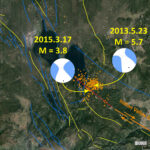
Lake Almanor: Indian Valley fault activity

There was an earthquake swarm in this region in 2013. The largest magnitude earthquake had a magnitude of M = 5.7. Here is the USGS page for that earthquake. “Today” we got a M = 3.8 earthquake in this same region. Here is the USGS web page for today’s earthquake. The Indian Valley fault is at the northern end of the Mohawk Valley fault system. We will be taking a look at this fault system (and the sedimentary/stratigraphic history) for this year’s Pacific Cell Friends of the Pleistocene field trip. The Mohawk Valley fault system is probably the northern extension of the Walker Lane. The Walker Lane is the northernmost extension of the east-of-the-Sierra-Nevada-mtns part of the plate boundary between the North America and Pacific plates (the most well known part of this plate boundary is the San Andreas fault). We looked at the Walker Lane for the 2010 Pacific Cell Friends of the Pleistocene field trip. We looked at faulting in the Lake Tahoe region for the 2012 Pacific Cell Friends of the Pleistocene field trip.
Here is a map showing the swarm from 2013, as well as the location of today’s M 3.8 earthquake. All orange dots represent earthquake epicenters from the year of 2013. On the map I have placed the moment tensors for the M 5.7 and M 3.8 earthquakes. The Indian Valley fault is shown in orange. I extended this fault (as a red dashed line) to where it may exist, based upon the recent seismicity. All the other lines are from the USGS fault and fold database. Anyone can use these fault data and they are downloadable here.


Here is the map that I made in 2013. Note the yellow fault lines that are near the town of Sierra. These represent the Mohwk Valley fault zone.


There was a swarm near Mt. Lassen in November 2014. I posted about this swarm at the time here. Here is a map showing that swarm.


Here is a primer for the different types of earthquake faults and moment tensor/focal mechanisms. This comes from the USGS. This explains focal mechanisms. Moment tensors (which I use on my figures above) are determined differently, but their graphical solution/representation is the same as for focal mechanisms (for all practical purposes). Here is the USGS page on moment tensors if you want to learn more about them.

    Here are three maps that have moment tensor data plotted. The first one shows the moment tensor for the M 3.8 earthquake. I have plotted the two moment tensor strike lines as light orange, each labeled. The mean strike line (geometrical construction) is plotted in red.


    This second one shows the moment tensor for the M 5.7 earthquake.


    This final one shows a pure strike slip focal mechanism for an earthquake with the same strike as the mapped Indian Valley fault, immediately to the south east of Lake Almanor.

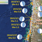
Earthquakes in Chile: Between the 2010 and 2014 Slip Patches

There have been a few earthquakes in the region between the 2010 and 2014 Chile subduction zone earthquakes. This is a seismic gap that has not had a Great earthquake since 1977, a ~M = 8.5 earthquake that spanned the distance between the ’10 and ’14 earthquakes.

Here is a map that shows the recent swarm of ~M = 5 earthquakes. There are moment tensors for the earthquakes listed below, some recent historic subduction zone earthquakes. I placed the general along-strike distance for older historic earthquakes in green (and labeled their years). The largest earthquake ever recorded, the Mw = 9.5 Chile earthquake, had a slip patch that extends from the south of the map to just south of the 2010 earthquake swarm. The 2010 and 2014 earthquake swarm epicenters are plotted as colored circles, while most other historic earthquake epicenters are plotted as gray circles. Note how this March 2015 swarm is at the northern end of the 1922/11/11 M 8.3 earthquake. At the bottom of this page, I put a USGS graphic about what these moment tensor plots (beach balls) tell us about the earthquakes.


Hundreds of people died as a result of the 1922 earthquake. The USGS has more news reports about the 1922 earthquake here. There were also reports of a tsunami over 9 meters. So we know that this segment of the fault can produce large earthquakes and tsunami. However, it has been about a century since the last Great subduction zone earthquake in this region of the fault.

Here is a map that shows the 2014 EQ swarm as it relates to historic slip patches in the region (Hayes et al., 2014). Note how there are large portions of the 1877 segment that have not gone off since 1877. This swarm of M~5 earthquakes is to the south of the 1995 earthquake that is plotted on the southern portion of this figure.


I remember discussing the 2014 earthquake at the 2014 SSA meeting. It was just after the swarm and it was fresh in my mind. Especially since I put together that animation of the time series. I mentioned to someone whose name I wont mention how interesting it was that there appeared to be two distinct slaong-strike slip patches to the swarm. They claimed that it could not be the case. He looked at the deformation data (inSAR) and claimed that it was clearly a single patch. Later I realized that inSAR could not distinguish these patches due to the time limitations of the overflight. Basically, there would need to be an acquisition before the swarm, in the middle of the swarm (between the two large slips), and one after the swarm was over. Since this is not possible (due to the short time of the swarm), it would be impossible to say there could not be two distinct patches. I wish I had this in my mind at the time. Here is a figure showing how these two patches have resolvable slip. Ironically, the person I spoke with about this at the meeting reviewed the Hayes manuscript. From Hayes et al. (2014).


Here is the figure I was looking for (Hayes et al., 2014). This shows the moment/slip deficit based on seismicity since 1900. The slip deficit is an estimate of the amount of “slip” or moment that has been accumulated as strain upon the fault over a given amount of time. This is determined with several assumptions:

  1. The geometry of the fault, plate configuration, and convergence rates
  2. The coupling ratio, or how much of the plate convergence is actually contributing to accumulated strain and how much is aseismic, or not contributing to accumulated strain.

The region between 300 and 550 km is the region of the 1877 slip that has not ruptured since then, except for the 1995 and 2007 earthquakes (which contribute to the moment/slip deficit estimate in this figure). This is the region immediately to the north of this March 2015 swarm. This region (300-550 km) is the same region in the seismic gap in the next map (Fig. 1 Hayes et al., 2014).


Here is figure 1 from Hayes et al. (2014). This shows this seismic gap for the region of the subduction zone that ruptured in 1977. The southern boundary of this figure stops north of the 2015 EQ swarm.

Going to the north, we can see this slip deficit map modeled by Chlieh et al. (2011). They also placed the historic and prehistoric along-strike slip extents as part of this plot. The 2001 M 8.4 earthquake in Peru is shown in this figure, as well as the Hayes et al. (2014) figure above. The southernmost part of this figure (red slip deficit) is the region that slipped in 2014. There remains a patch with a large slip deficit offshore of Tacna, Peru.


Going to the south we can take a look at the 1835, 1960, and 2010 slip patches and how they might relate to each other. Here is a map from Melnick et al. (2014). Below I paste the figure caption from this Melnick et al. (2014) figure.


Here is the figure text from their article (you will need to read their article to get the references they list in this caption): FIG. 1. Modeled plate-boundary slip during the 2010 Maule earthquake and slip deficit of Darwin seismic gap. a. Slip from Lorito et al. (2011) with computed (grey arrows) and GPS (orange arrows) displacements (Vigny et al., 2011; Moreno et al., 2012). White squares show GPS sites used by Lorito et al. (2011). Inset shows histogram of residuals between measured and modeled displacements. SE-standard error. Note that Lorito et al. ‘s model underestimates GPS displacements between 36-37.5°S where they forecasted a Mw 7.5-8 earthquake; b. Alternative slip distribution (Moreno et al., 2012) with modeled and GPS displacements. Inset shows histogram of residuals; c. Slip deficit after the 2010 earthquake including plate coupling over 175 years at an heterogeneous rate (Moreno et al., 2010; Moreno et al., 2011), slip release by the 1960, 1928, and 1985 events (Moreno et al., 2009; Moreno et al., 2012), and the slip distribution of Moreno et al. (2012). Note that the deficit is negative or null over most of the rupture zone, suggesting the 2010 earthquake closed the gap opened in 1835. Extent of 1835 rupture inferred from a compilation of historical sources (see text). The Santa María splay fault system, which slipped during the Maule earthquake (Melnick et al., 2012b), may be associated with the positive slip deficit near Concepción; d. Slip deficit using the same constraints as in (c) but with the slip model of Lorito et al. Note the large positive region northwest of Concepción. The extent of the 1835 rupture assumed by Lorito et al. (2011) is shown.
Here is a primer for the different types of earthquake faults and moment tensor/focal mechanisms. This comes from the USGS. This explains focal mechanisms. Moment tensors (which I use on my figures above) are determined differently, but their graphical solution/representation is the same as for focal mechanisms (for all practical purposes). Here is the USGS page on moment tensors if you want to learn more about them.

    References:

  • Chlieh et al., 2011. Interseismic coupling and seismic potential along the Central Andes subduction zone, Journal of Geophysical Research, v. 116, B12405, 21 p.
  • Hayes, G.P., Herman, M.W., Barnhart, W.D., Furlong, K.P., Riquelme, S., Benz., H.M., Bergman, E., Barrientos, S., Earle, P.S., and Samsonov, S., 2014. Continuing megathrust earthquake potential in Chile after the 2014 Iquique earthquake: Nature, v. 512, p. 295-299.