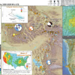
This year we look back and remember what happened ten years ago in Japan and across the entire Pacific Basin.
There are numerous web experiences focused on this type of reflection. Here is a short list, some of which I have been involved in.
The California Geological Survey (CGS) prepared several websites devoted to the Tōhoku-oki Earthquake and Tsunami, focusing on how the tsunami impacted California and what has changed in the state since 2011. The entire tsunami program contributed to these expoeriences. Learn more about this program at the CGS Tsunami Program website.
Here is a fantastic web page that Nick Graehl put together using an ArcGIS Story Map system. Don’t miss the two multimedia tours, one for observations in Japan and one for observations in California.
Here are all the pages for this earthquake and tsunami:
I focus mostly on new material I prepared for the following report.
Updated Interpretive Poster
I plot the seismicity from the year after the M 9.1, as well as large events from the past century, with diameter representing magnitude (see legend).
I plot the USGS fault plane solutions (moment tensors in blue and focal mechanisms in orange), possibly in addition to some relevant historic earthquakes.
A review of the basic base map variations and data that I use for the interpretive posters can be found on the Earthquake Reports page. I have improved these posters over time and some of this background information applies to the older posters.
In the upper left corner is a small scale plate tectonic map showing the plate boundary faults with the magnetic anomalies overlain in transparency. There is an inset low angle oblique illustrative map showing how these plates interact in the subsurface (Lin et al., 2016).
In the lower right corner is a map that shows a comparison between the USGS modeled earthquake intensity and the USGS Did You Feel It? observations. These data are also included in a web map lower down in this update.
To the left of the intensity map are two tide gage plots that show a tsunami record. The upper plot is from Crescent City, California. The lower plot is from Naha, a location southwest of the earthquake, labeled on tectonic map. These and other tide gage records are viewable in the tide gage web map below.
In the upper right corner are two maps displaying the results from ground failure models from the USGS. The map on the left shows the potential for landslides triggered by the M 9.1 earthquake. The map on the right shows the chance that an area may have experienced liquefaction. These are included in a web map below.
Here is the map with a year’s and century’s seismicity plotted.
Seismicity
Web Map
Use this map to see the magnitudes of different earthquakes experienced in Japan. The map shows earthquake epicenters for large-magnitude historic events of the past century. It also includes epicenters for all aftershocks and triggered earthquakes for a year after the M 9.1 earthquake, and an outline of the aftershocks, which illustrates the area of the fault that slipped during the M 9.1 earthquake.
If you want to see this map in a larger window, click here.
Earthquake Intensity
Earthquake intensity is a measure of how strongly earthquake shaking is felt by people and objects. The further away from the epicenter, the lower the earthquake intensity. Seismologists use computer models to estimate what the intensity will be from an earthquake. The U.S. Geological Survey uses its “Did You Feel It?” (DYFI) system to collect observations about how strongly people in different places felt an earthquake.
Here is a figure that shows a more comparison between the modeled intensity and the reported intensity. Both data use the same color scale, the Modified Mercalli Intensity Scale (MMI). More about this can be found here. The colors and contours on the map are results from the USGS modeled intensity. The DYFI data are plotted as colored dots (color = MMI, diameter = number of reports).
The 3 panels, from left to right, show the USGS Shakemap (the model estimate), the DYFI reports, and an overlay comparing both of these data.
Web Map
Use this map to see the level of intensity people felt in different parts of Japan. The map displays the USGS intensity model for the M 9.1 earthquake as transparent colors. The map also shows, as colored circles, the “Did You Feel It?” report results from people who experienced shaking from this earthquake.
If you want to see this map in a larger window, click here.
Tsunami
Tsunami can be caused by a variety of processes, including earthquakes, volcanic eruptions, landslides, and meteorological phenomena. Earthquakes, eruptions, and landslides cause tsunami when these processes displace water in some way. We may typically associate tsunami with subduction zone earthquakes because these earthquakes are the type that generate vertical land motion along the sea floor.
Here is a great illustration of how a subduction zone earthquake can generate a tsunami (Atwater et al., 2005).
We think that the earthquake slipped at least 50 meters (165 feet) during several minutes. This is the largest coseismic measurement of any subduction zone earthquake (so far).
When the fault slipped, it caused the seafloor to deform and move. This motion also displaced the overlying water column.
As the water column is elevated, it gains potential energy. As this uplifted water expends this energy by oscillating up and down, it radiates energy in the form of tsunami waves.
Tsunami were observed across the entire Pacific Basin, causing extensive damage and casualties in Japan, but also in other places too. There was about $100 million damage to coastal infrastructure in California alone.
This is an animated model of the Great East Japan tsunami of ten years ago. The warmer the colors, the larger the wave. The first surges reached the closest Japan coasts in about 25 minutes. The first surges reached Crescent City in 9.5 hours. (modified text from Dr. Lori Dengler)
This is the same map used as an overlay in the web map below.
Here is the tide gage record from Crescent City, California, USA.
Time is represented by the horizontal axis and elevation is represented on the vertical axis. The darker blue line in this image represents NOAA’s tidal forecast. The data recorded by the tide gage are represented by the light blue colored lines. Wave height is the distance measured between the wave crest and trough. Wave amplitude is the level of water above sea level.
Some of these data came from the IOC sea level monitoring website.
Web Map
Use this map to see tsunami wave data as recorded by tide gages across the entire Pacific Basin. Click on a white triangle and there is a link to open the tide gage data as a graphic.
There is an overlay of color that represents the size of the tsunami as it travelled across the ocean. Learn more about these data here.
If you want to see this map in a larger window, click here.
Ground Failure
Below are a series of maps that show the shaking intensity and potential for landslides and liquefaction. These are all USGS data products.
There are many different ways in which a landslide can be triggered. The first order relations behind slope failure (landslides) is that the “resisting” forces that are preventing slope failure (e.g. the strength of the bedrock or soil) are overcome by the “driving” forces that are pushing this land downwards (e.g. gravity). The ratio of resisting forces to driving forces is called the Factor of Safety (FOS). We can write this ratio like this:
FOS = Resisting Force / Driving Force
When FOS > 1, the slope is stable and when FOS < 1, the slope fails and we get a landslide. The illustration below shows these relations. Note how the slope angle α can take part in this ratio (the steeper the slope, the greater impact of the mass of the slope can contribute to driving forces). The real world is more complicated than the simplified illustration below.
Landslide ground shaking can change the Factor of Safety in several ways that might increase the driving force or decrease the resisting force. Keefer (1984) studied a global data set of earthquake triggered landslides and found that larger earthquakes trigger larger and more numerous landslides across a larger area than do smaller earthquakes. Earthquakes can cause landslides because the seismic waves can cause the driving force to increase (the earthquake motions can “push” the land downwards), leading to a landslide. In addition, ground shaking can change the strength of these earth materials (a form of resisting force) with a process called liquefaction.
Sediment or soil strength is based upon the ability for sediment particles to push against each other without moving. This is a combination of friction and the forces exerted between these particles. This is loosely what we call the “angle of internal friction.” Liquefaction is a process by which pore pressure increases cause water to push out against the sediment particles so that they are no longer touching.
An analogy that some may be familiar with relates to a visit to the beach. When one is walking on the wet sand near the shoreline, the sand may hold the weight of our body generally pretty well. However, if we stop and vibrate our feet back and forth, this causes pore pressure to increase and we sink into the sand as the sand liquefies. Or, at least our feet sink into the sand.
Below is a diagram showing how an increase in pore pressure can push against the sediment particles so that they are not touching any more. This allows the particles to move around and this is why our feet sink in the sand in the analogy above. This is also what changes the strength of earth materials such that a landslide can be triggered.
Below is a diagram based upon a publication designed to educate the public about landslides and the processes that trigger them (USGS, 2004). Additional background information about landslide types can be found in Highland et al. (2008). There was a variety of landslide types that can be observed surrounding the earthquake region. So, this illustration can help people when they observing the landscape response to the earthquake whether they are using aerial imagery, photos in newspaper or website articles, or videos on social media. Will you be able to locate a landslide scarp or the toe of a landslide? This figure shows a rotational landslide, one where the land rotates along a curvilinear failure surface.
Below is the liquefaction susceptibility and landslide probability map (Jessee et al., 2017; Zhu et al., 2017). Please head over to that report for more information about the USGS Ground Failure products (landslides and liquefaction). Basically, earthquakes shake the ground and this ground shaking can cause landslides. We can see that there is a low probability for landslides. However, we have already seen photographic evidence for landslides and the lower limit for earthquake triggered landslides is magnitude M 5.5 (from Keefer 1984)
Use this map to see the magnitudes of different earthquakes experienced in Japan. The map shows earthquake epicenters for large-magnitude historic events of the past century. It also includes epicenters for all aftershocks and triggered earthquakes for a year after the M 9.1 earthquake, and an outline of the aftershocks, which illustrates the area of the fault that slipped during the M9.1 earthquake.
Web Map
If you want to see this map in a larger window, click here.
— Jason "Jay" R. Patton (@patton_cascadia) March 11, 2018
References:
Basic & General References
Frisch, W., Meschede, M., Blakey, R., 2011. Plate Tectonics, Springer-Verlag, London, 213 pp.
Hayes, G., 2018, Slab2 – A Comprehensive Subduction Zone Geometry Model: U.S. Geological Survey data release, https://doi.org/10.5066/F7PV6JNV.
Holt, W. E., C. Kreemer, A. J. Haines, L. Estey, C. Meertens, G. Blewitt, and D. Lavallee (2005), Project helps constrain continental dynamics and seismic hazards, Eos Trans. AGU, 86(41), 383–387, , https://doi.org/10.1029/2005EO410002. /li>
Jessee, M.A.N., Hamburger, M. W., Allstadt, K., Wald, D. J., Robeson, S. M., Tanyas, H., et al. (2018). A global empirical model for near-real-time assessment of seismically induced landslides. Journal of Geophysical Research: Earth Surface, 123, 1835–1859. https://doi.org/10.1029/2017JF004494
Kreemer, C., J. Haines, W. Holt, G. Blewitt, and D. Lavallee (2000), On the determination of a global strain rate model, Geophys. J. Int., 52(10), 765–770.
Kreemer, C., W. E. Holt, and A. J. Haines (2003), An integrated global model of present-day plate motions and plate boundary deformation, Geophys. J. Int., 154(1), 8–34, , https://doi.org/10.1046/j.1365-246X.2003.01917.x.
Kreemer, C., G. Blewitt, E.C. Klein, 2014. A geodetic plate motion and Global Strain Rate Model in Geochemistry, Geophysics, Geosystems, v. 15, p. 3849-3889, https://doi.org/10.1002/2014GC005407.
Pagani,M. , J. Garcia-Pelaez, R. Gee, K. Johnson, V. Poggi, R. Styron, G. Weatherill, M. Simionato, D. Viganò, L. Danciu, D. Monelli (2018). Global Earthquake Model (GEM) Seismic Hazard Map (version 2018.1 – December 2018), DOI: 10.13117/GEM-GLOBAL-SEISMIC-HAZARD-MAP-2018.1
Silva, V ., D Amo-Oduro, A Calderon, J Dabbeek, V Despotaki, L Martins, A Rao, M Simionato, D Viganò, C Yepes, A Acevedo, N Horspool, H Crowley, K Jaiswal, M Journeay, M Pittore, 2018. Global Earthquake Model (GEM) Seismic Risk Map (version 2018.1). https://doi.org/10.13117/GEM-GLOBAL-SEISMIC-RISK-MAP-2018.1
Zhu, J., Baise, L. G., Thompson, E. M., 2017, An Updated Geospatial Liquefaction Model for Global Application, Bulletin of the Seismological Society of America, 107, p 1365-1385, https://doi.org/0.1785/0120160198
Hirose et al., 2011. Outline of the 2011 off the Pacific coast of Tohoku Earthquake (Mw 9.0) Seismicity: foreshocks, mainshock, aftershocks, and induced activity in Earth Planets Space, v. 63, p. 655-658
Ikuta et al., 2012. A small persistent locked area associated with the 2011 Mw9.0 Tohoku-Oki earthquake, deduced from GPS data in Journal of Geophysical Research, v. 117, DOI: 10.1029/2012JB009335
Ito et al., 2011. Slip distribution of the 2011 off the Pacific coast of Tohoku Earthquake inferred from geodetic data in Earth Planets Space, v. 63, p. 627-630
Koper et al., 2011. Frequency-dependent rupture process of the 2011 Mw 9.0 Tohoku Earthquake: Comparison of short-period P wave back projection images and broadband seismic rupture models in Earth Planets Space, v. 63, p. 599-602.
Kosuga et al, 2011. Seismic activity around the northern neighbor of the 2011 off the Pacific coast of Tohoku Earthquake with emphasis on a potentially large aftershock in the area in Earth Planets Space, v. 63, p. 719-723.
Lay et al., 2011 a. The 2011 Mw 9.0 off the Pacific coast of Tohoku Earthquake: Comparison of deep-water tsunami signals with finite-fault rupture model predictions in Earth Planets Space, v. 63, p. 797-801.
Lay et al., 2011 b. Possible large near-trench slip during the 2011 Mw 9.0 off the Pacific coast of Tohoku Earthquake in Earth Planets Space, v. 63, p. 687-692.
Lay et al., 2011 c. Outer trench-slope faulting and the 2011 Mw 9.0 off the Pacific coast of Tohoku Earthquake in Earth Planets Space, v. 63, p. 713-718.
Lee et al., 2011. Evidence of large scale repeating slip during the 2011 Tohoku‐Oki earthquake in Geophysical Research Letters, v. 38, DOI: 10.1029/2011GL049580.
Newman et al., 2011. Hidden depths in Nature, v. 474, p. 441-443.
Nishimura et al., 2011. The 2011 off the Pacific coast of Tohoku Earthquake and its aftershocks observed by GEONET in Earth Planets Space, v. 63, p. 631-636.
Orzawa et al., 2011. Coseismic and postseismic slip of the 2011 magnitude-9 Tohoku-Oki earthquake in Nature, v. 000, p. 1-4.
Satake et al., 2013. Time and Space Distribution of Coseismic Slip of the 2011 Tohoku Earthquake as Inferred from Tsunami Waveform Data in Bulletin of the Seismological Society of America, v. 1032, p. 1473-1492.
Simons et al., 2011. The 2011 Magnitude 9.0 Tohoku-Oki Earthquake: Mosaicking the Megathrust from Seconds to Centuries in Science, v. 332, p. 1421-1425.
Terakawa et al., 2013. Changes in seismic activity following the 2011 Tohoku-oki earthquake: Effects of pore fluid pressure in Earth and Planetary Science Letters, v. 365, p. 17-24.
Toda et al., 2011. Using the 2011 Mw 9.0 off the Pacific coast of Tohoku Earthquake to test the Coulomb stress triggering hypothesis and to calculate faults brought closer to failure in Earth Planets Space, v. 63, p. 725-730.
Uchida and Matsuzawa, 2011. Coupling coefficient, hierarchical structure, and earthquake cycle for the source area of the 2011 off the Pacific coast of Tohoku earthquake inferred from small repeating earthquake data in Earth Planets Space, v. 63, p. 675-679.
Wang et al., 2013. The 2011 Mw 9.0 Tohoku Earthquake: Comparison of GPS and Strong-Motion Data in Bulletin of the Seismological Society of America, v. 103, p. 1336-1347.
Yagi and Fukahata, 2011. Rupture process of the 2011 Tohoku‐oki earthquake and absolute elastic strain release in Geophysical Research Letters, v. 38, DOI: 10.1029/2011GL048701
Yamazaki et al., 2011. Modeling near‐field tsunami observations to improve finite‐fault slip models for the 11 March 2011 Tohoku earthquake in Geophysical Research Letter,s v. 38, DOI: 10.1029/2011GL049130
Yomogida et al., 2011. Along-dip segmentation of the 2011 off the Pacific coast of Tohoku Earthquake and comparison with other megathrust earthquakes in Earth Planets Space, v. 63, p. 697-701.
Yue and Lay, 2013. Source Rupture Models for the Mw 9.0 2011 Tohoku Earthquake from Joint Inversions of High-Rate Geodetic and Seismic Data in Bulletin of the Seismological Society of America, v. 103, p. 1242-1255.
Idaho lies in the intersection of several different physiographic provinces. Physiographic provinces are areas of Earth that have landforms of similar shape. These landforms are largely caused by tectonics and climate (of course, the climate is controlled largely by tectonics, but there are other factors like the rotation of the planet, convection cells in the atmosphere, etc. well, those convection cells are also controlled by tectonics (i.e. where continents are) too. so, yes, tectonics controls everything (even though it does not).
The two main physiographic provinces (also called geomorphic provinces, after the word “geomorphology” – the shape of the landscape) at play in central Idaho are the Basin and Range and the Rocky Mountains.
The Rocky Mountains were formed long ago (between 80 and 55 million years ago) and are the result of compressional tectonics that uplifted the continent, forming these mountains. While the compression that formed the Rocky Mtns ceased millions of years ago, the topography remains (e.g. Denver, the mile high city).
The Basin and Range is a region of the western US and northwestern Mexico that has undergone East-West directed extension since the Miocene (~17 million years ago). This extension forms normal fault bounded basins (valleys), separated by ranges (mountains). These faults generally trend north-south, but there have been several phases of extension in slightly different directions. So, the faults preserve a complicated history of these changes in tectonic regime. Though, the landforms left behind are persistent (the basins and the ranges).
Here is a view of the physiographic provinces in the USA.
There are many different phases of tectonic deformation that formed the geomorphic provinces of North America, so take an historical geology course to learn more!
In northern Idaho, there is additional period of tectonic deformation that left behind geologic structures that appear to be playing a part in the M 6.5 temblor. During the Eocene, there was a period of east-west extension that caused lots of faults to form. These faults have been inactive for a very long time.
However, sometimes there are older inactive faults that are oriented optimally to be reactivated under newer and possibly different tectonic forces. One example of this is in the Gorda plate offshore of northern California. Faults formed along the spreading ridge (the Gorda Rise), initially formed as normal faults, are exposed to north-south oriented compression and reactivate as strike-slip faults.
Here we are, in central Idaho, where there are some Basin and Range faults (generally northwest trending here) that have been responsible for very large historic earthquakes.
The 1959 Hebgen Lake M 7.3 earthquake in Montana was felt widely, caused surface rupture (where the fault breaks through the ground surface, forming a topographic escarpment called a fault scarp), and triggered many landslides. One of these landslides slipped into a river, blocking the flow of the river, forming a lake. After I defended my Ph.D. I went on a drive about. Beginning at a Geological Society of America meeting in Bozeman (yes, this is what geologists do for their vacation), I drove through Yellowstone and crossed the continental divide to visit friends in Colorado. As I was camping near Yellowstone, I drove to see the scarp from this large earthquake and stopped at the “Earthquake Lake.” Lucky me, it was the opening day of the Earthquake Lake Visitor’s Center (though it turns out it was just a new building, lol). I grabbed an Earthquake Lake coffee mug and went on my way.
The 1983 magnitude M 6.9 Borah Peak Earthquake ruptured a normal fault about 70 km to the east of yesterday’s M 6.5. That earthquake also caused surface rupture and geologists like Dr. Chris Duross (from the USGS) have been studying that fault to learn about the prehistoric earthquake history.
A recent example of a Basin and Range fault earthquake happened in 2017 in southeastern Idaho, just south of the Snake River Plain (another geomorphic province, formed by the passage of the Yellowstone Hotspot). Here is my report for that earthquake.
The M 6.5 earthquake yesterday happened in an area where a Basin & Range (B&R) fault ends near one of these older Eocene aged faults. Most of us saw the earthquake notification and probably thought that the quake would have been a B&R normal (extensional) fault. However, when the mechanism was posted online, the earthquake mechanism was instead a strike-slip earthquake. This was really interesting. I love when things happen that are unexpected. This is what makes life exciting.
Over the past few years, there has been an increase in the amount of people making observations, looking at the academic and govt literature, and forming hypotheses about these events.It used to be just a few of us, but now the bug has spread and lots of people are part of this educational process. This all is expressed via social media (mostly on twitter), where peoples’ hypotheses are discussed, shot down, or synchronistically further developed to learn something new we were not expecting. I am a coauthor of a forthcoming paper where we discussed some of these events. This is where it happens, online and in real time.
The same was true for this M 6.5 earthquake in Idaho. People started using existing data, using visualizations in Google Earth, and using all the tools we have at our desktop fingertips, to figure out what the heck happened in a remote region of Idaho.
Thanks to the Idaho Geological Survey, I learned of some of the faults in the region. I downloaded their geologic maps and GIS data and started to work.
The main B&R normal fault that may be somehow related to the M 6.5 earthquake is the Sawtooth fault, a northwest trending (striking) fault that Dr. Glenn Thackray (2013) suggested was “Holocene Active.” (This means the last time it had a large earthquake was sometime during the Holocene, or during the last 12,000 years or so.)
Dr. Thackray used newly collected high resolution LiDAR topographic data to identify fault scarps that offset geomorphic features that during Holocene time. If the landforms were created less than 12,000 years ago and the fault cut through these landforms, then the earthquake that cut the landforms happened after the landforms were created (and also less than 12,000 years ago).
Here is a figure from Thackray et al. (2013) that shows the fault they observed (in the inset B, look at the shadow formed by the fault; the arrows are pointing at the fault scarp). This fault is listed as a high priority to be studied, yet there are no published records yet (Crone et al., 2009).
One of the major older faults (Eocene age) that cuts through the center of Idaho is the Trans-Challis fault zones (TCFZ; Bennet, 1986). Based on the work of others (like Kiilsgaard et al., 1986), this fault is thought to be related to the extension from Eocene time and is possibly related to the volcanism and detatchemnt faulting associated with metamorphic core complexes.
Most of the faults in the TCFZ are also normal faults (makes sense since they were formed from extension). However, there are lots of faults of different types as they can form is they are oriented in ways different than the normal faults.
So, at second glance, the M 6.5 event may have been on one of these older faults associated with the TCFZ. Perhaps the pre-existing older fault, which was inactive, was oriented in the correct position to respond to the modern tectonic forces. Thus, this fault would be considered to be reactivated.
At third glance, it is possible that the M 6.5 event happened on a fault not observed at Earth’s surface and could be related to the Sawtooth fault (or some other fault).
The mechanism is not a purely strike-slip earthquake as it is not a 100% double-couple earthquake (a double couple is the type of force that is associated with the crust moving in one direction on one side of the fault and in the other direction on the other side of the fault). Someone has hypothesized that the M 6.5 earthquake may have been complicated and involved both normal and strike-slip faulting. I like this hypothesis as it fits my idea of an older fault being reactivated under a newer (modern = today) tectonic regime.
Something else to note. I took a look at Wells and Coppersmith (1994). These authors use earthquake event data to prepare some empirical relations between earthquakes of various sizes, types,e tc. and the magnitude of those earthquakes. So we can take one parameter and estimate what another parameter may be.
OK, lets look at some eye candy. (sorry for the long introduction)
Below is my interpretive poster for this earthquake
I plot the seismicity from the past 3 months, with diameter representing magnitude (see legend). I include earthquake epicenters from 1920-2020 with magnitudes M ≥ 6.5.
I plot the USGS fault plane solutions (moment tensors in blue and focal mechanisms in orange), possibly in addition to some relevant historic earthquakes.
A review of the basic base map variations and data that I use for the interpretive posters can be found on the Earthquake Reports page.
I include some inset figures. Some of the same figures are located in different places on the larger scale map below.
In the lower left corner is a map of the western USA showing the topography and seismicity for the past 3 months. Note the M 6.5 event in yellow and the recent earthquake in Utah near the Great Salt Lake.
In the upper left corner I include a map from Bennett (1986) that shows some of the major faults in Idaho. I placed a blue star in the location of the M 6.5 and labeled the Trans-Challis fault zone.
In the upper right corner I include a map showing the region impacted by this earthquake. The Earthquake Intensity uses the MMI scale (the colors), read more about this here. This map represents an estimate of ground shaking from the M 6.5 based on a statistical model using the results of tens of thousands of earthquakes.
To the right of the Bennet map is a plot showing how these USGS models “predict” the ground shaking intensity will be relative to distance from the earthquake. These models are represented by the broan and green lines. People can fill out an online form to enter their observations and these “Did You Feel It?” observations are converted into an intensity number and these are plotted as dots in this figure.
In the lower center is a map from the U.S. Geological Survey National Seismic Hazard Map (Petersen et al., 2019). This map shows the chance that any region may experience strong ground shaking from an earthquake in the next 100 years. The M 6.5 happened in an area thought to have a 36-74% chance of shaking at least MMI VI. Looking at the other plots on this poster, we can see that this map held true. What is the highest MMI in the upper right inset map? What is the highest ground shaking intensity in the plot in the upper center? Most of the observed intensities are less than MMI 6, but there were some.
Here is the map with 3 month’s seismicity plotted.
After I worked for the day, I thought to put together an updated map with aftershocks plotted, at a larger scale. I had downloaded the 10m digital elevation model data for Idaho about a year ago, so it was easy to load it up as a base map.
I annotated the Bennet (1986) tectonic map to highlight the different faults (older faults in light orange, younger B&R faults in darker orange). I encircled the area of the M 6.5 sequence.
These seismicity data are sourced from IRIS’ earthquake browser. The USGS earthquakes website was not working, so I needed to go elsewhere to obtain seismicity data. This has become a problem in the past few years as more and more people find the excellent services from he USGS to be useful to them. This is good and bad. It makes it difficult to get data. Another problem is that the “Did You Feel It” website does not work (the M 7.1 Ridgecrest Earthquake has many fewer DYFI observations due to this problem).
One thing we might do is estimate what the surface rupture length might it take to generate a M 6.5 earthquake. According to the Wells and Coppersmith (1994) empirical relations, there may be a surface rupture length of about 20 km. If we look at the aftershock sequence in the poster below, we might observe that the fault length may be about 24 km. So, while these are not the same thing, they are of about the same scale. (I used the relations in their figure 9)
Earthquake Triggered Landslides
There are many different ways in which a landslide can be triggered. The first order relations behind slope failure (landslides) is that the “resisting” forces that are preventing slope failure (e.g. the strength of the bedrock or soil) are overcome by the “driving” forces that are pushing this land downwards (e.g. gravity). The ratio of resisting forces to driving forces is called the Factor of Safety (FOS). We can write this ratio like this:
FOS = Resisting Force / Driving Force
When FOS > 1, the slope is stable and when FOS < 1, the slope fails and we get a landslide. The illustration below shows these relations. Note how the slope angle α can take part in this ratio (the steeper the slope, the greater impact of the mass of the slope can contribute to driving forces). The real world is more complicated than the simplified illustration below.
Landslide ground shaking can change the Factor of Safety in several ways that might increase the driving force or decrease the resisting force. Keefer (1984) studied a global data set of earthquake triggered landslides and found that larger earthquakes trigger larger and more numerous landslides across a larger area than do smaller earthquakes. Earthquakes can cause landslides because the seismic waves can cause the driving force to increase (the earthquake motions can “push” the land downwards), leading to a landslide. In addition, ground shaking can change the strength of these earth materials (a form of resisting force) with a process called liquefaction.
Sediment or soil strength is based upon the ability for sediment particles to push against each other without moving. This is a combination of friction and the forces exerted between these particles. This is loosely what we call the “angle of internal friction.” Liquefaction is a process by which pore pressure increases cause water to push out against the sediment particles so that they are no longer touching.
An analogy that some may be familiar with relates to a visit to the beach. When one is walking on the wet sand near the shoreline, the sand may hold the weight of our body generally pretty well. However, if we stop and vibrate our feet back and forth, this causes pore pressure to increase and we sink into the sand as the sand liquefies. Or, at least our feet sink into the sand.
Below is a diagram showing how an increase in pore pressure can push against the sediment particles so that they are not touching any more. This allows the particles to move around and this is why our feet sink in the sand in the analogy above. This is also what changes the strength of earth materials such that a landslide can be triggered.
Below is a diagram based upon a publication designed to educate the public about landslides and the processes that trigger them (USGS, 2004). Additional background information about landslide types can be found in Highland et al. (2008). There was a variety of landslide types that can be observed surrounding the earthquake region. So, this illustration can help people when they observing the landscape response to the earthquake whether they are using aerial imagery, photos in newspaper or website articles, or videos on social media. Will you be able to locate a landslide scarp or the toe of a landslide? This figure shows a rotational landslide, one where the land rotates along a curvilinear failure surface.
Here is an excellent educational video from IRIS and a variety of organizations. The video helps us learn about how earthquake intensity gets smaller with distance from an earthquake. The concept of liquefaction is reviewed and we learn how different types of bedrock and underlying earth materials can affect the severity of ground shaking in a given location. The intensity map above is based on a model that relates intensity with distance to the earthquake, but does not incorporate changes in material properties as the video below mentions is an important factor that can increase intensity in places.
If we look at the map at the top of this report, we might imagine that because the areas close to the fault shake more strongly, there may be more landslides in those areas. This is probably true at first order, but the variation in material properties and water content also control where landslides might occur.
There are landslide slope stability and liquefaction susceptibility models based on empirical data from past earthquakes. The USGS has recently incorporated these types of analyses into their earthquake event pages. More about these USGS models can be found on this page.
I prepared some maps that compare the USGS landslide probability maps for the 2020 M 6.5 and 1959 M 7.3 Hebgen Lake earthquakes.
Here is the landslide probability map (Jessee et al., 2018). Below the poster I include the text from the USGS website that describes how this model is prepared.
Note that they are at different scales.
Nowicki Jessee and others (2018) is the preferred model for earthquake-triggered landslide hazard. Our primary landslide model is the empirical model of Nowicki Jessee and others (2018). The model was developed by relating 23 inventories of landslides triggered by past earthquakes with different combinations of predictor variables using logistic regression. The output resolution is ~250 m. The model inputs are described below. More details about the model can be found in the original publication. We modify the published model by excluding areas with slopes <5° and changing the coefficient for the lithology layer "unconsolidated sediments" from -3.22 to -1.36, the coefficient for "mixed sedimentary rocks" to better reflect that this unit is expected to be weak (more negative coefficient indicates stronger rock).To exclude areas of insignificantly small probabilities in the computation of aggregate statistics for this model, we use a probability threshold of 0.002.
Other Report Pages
Some Relevant Discussion and Figures
Here is the tectonic map from Bennett (1986). The Challis Volcanics are the stippled areas near the Trans-Challis fault zone.
Trans-Challis fault system and other selected geologic features in Pacific Northwest and southern British Columbia, Canada. Modified from Tipper et al. (1981); strontium data from Armstrong (1979) and Armstrong et al. (1977). Volcanics: 1—McAbee Basin; 2—Tranquille Basin; 3—Monte Lake Volcanics; 4—Torada graben; 5—Republic graben; 6—Kettle graben; 7—Clarno Volcanics; 8—Challis Volcanics; 9—Challis Volcanics in Owyhee County. Core complexes: A—Shuswap Complex; B—Valhalla gneiss dome and Passmore gneiss dome; C— Kcitie yueiss dome; D—Okanogan gneiss dome; E—Selkirk igneous complex (Kaniksu batholith); F—Spokane dome; 6—Boehls Butte Formation; H—Pioneer Mountain core complex; I—House Mountain metamorphic complex. X—Chilly Buttes; Borah Peak earthquake, October 28,1983. Dashdot line = boundary of Basin and Range province in Oregon.
This is a larger scale map showing some of the detailed fault mapping (Bennett, 1986). The Trans-Challis fault system is the northeast trending faults. Normal (extensional) faults are shown with symbols that look like small balls at the end of tiny sticks. The balls are on the side of the fault that goes down.
Note the location of Stanley, Idaho. I labeled the location of Stanley in the updated poster above, as well as the landslide probability map.
The M 6.5 earthquake is to the northwest of Stanley, just to the east of the Knapp Creek graben.
Major geologic features of trans-Challis fault system in central Idaho. Modified from Kiilsgaard et al. (1986).
This map shows the geologic structures formed at different times since the Jurassic (150-200 million years ago), through the Eocene (56-34 million years ago).
Tectonic map of the western United States, showing the major components of the Cordilleran orogenic belt. The initial Sr ratio line is taken to represent the approximate western edge of North American cratonic basement (Armstrong and others, 1977; Kistler and Peterman, 1978). Abbreviations as follows: CRO, Coast Range ophiolite; LFTB, Luning-Fencemaker thrust belt; CNTB, Central Nevada thrust belt; WH, Wasatch hinge line; UU, Uinta Mountains uplift; CMB, Crazy Mountains basin; PRB, Powder River basin; DB, Denver basin; RB, Raton basin. Precambrian shear zones after Karlstrom and Williams (1998).
Here is another version of that map. The Idaho Batholith is the plus “+” symbolized ares in central western Idaho, a magmatic arc formed adjacent to an ancient convergent plate boundary.
Simplified version of figure 2, showing some of the major tectonic features in the Cordilleran thrust belt discussed in the text. Abbreviations as follows: LCL, Lewis and Clark line; SWMT, Southwest Montana transverse zone; CC, Cabin culmination; WC, Wasatch culmination; SAC, Santaquin culmination; SC, Sevier culmination; CNTB, Central Nevada thrust belt; LFTB, Luning-Fencemaker thrust belt; WH, Wasatch hinge line. Stippled region represents Cordilleran foreland basin system.
If one looks at the updated aftershock poster above, or the Bennet (1986) map that shows the B&R faults in dark orange. These are some of the faults in the figure below, from Janecke (1992).
The fault (thick black line) the is southwest of the Lost River Range and extends southeast of Challis is the Lost River fault zone.
Location map of central Idaho showings elected Cenozoic normal faults. Solid triangles hows location of tilted Tertiary conglomerates in the footwall of the Pass Creek fault system. Widely-spaced diagonal rule shows Trans-Challis zone. Selected Tertiary plutons are cross-hatched. Small dots outline late Cenozoic basin fill. Numerous NE striking normal faults in the central Lost River Range are omitted for clarity. BPH is Borah Peak horst; WKH is White Knob horst; PCWC is Pass Creek-Wet Creek reentrant.
This is a great cross section to check out the proposed geometry of some of these normal faults (Janecke, 1992),
Northwest-southeast cross section of three NE striking normal faults. Volcanic rocks are stippled. Location of cross section is in above map. Restoration indicates 30% extension during synvolcanic faulting int he area. The Long Lost fault may have been reactivated.
This is a map that shows the geologic regions of Idaho (Kuntz et al., 1982). The Idaho Batholith is the mapped geologic unit where the M 6.5 earthquake happened.
Generalized map of southern Idaho showing major geologic and physiographic features and locations referred to in the text.
A recent study of the Lost River fault by DuRoss et al. (2019) has given us an idea about how much that fault slips during earthquakes. This is the fault that ruptured during the Borah Peak earthquake in 1983.
This is a map showing the part of the fault that they studied.
Surface-rupture extent of the 1983 Mw 6.9 Borah Peak earthquake (red), which ruptured the Thousand Springs and southernmost Warm Springs sections of the Lost River fault zone (LRFZ). The Willow Creek Hills are an area of hanging-wall bedrock and complex surface faulting that form a normal-fault structural barrier between the two sections. Yellow polygons show the extent of digital surface models generated in this study using low-altitude aerial imagery derived from unmanned aircraft systems. Fault traces and time of most recent faulting modified from U.S. Geological Survey (2018). Focal mechanism from Doser and Smith (1985); approximate location is 10 km south of figure extent (Richins et al., 1987). Triangles indicate paleoseismic sites: RC—Rattlesnake Creek; SC—Sheep Creek; PS—Poison Spring; DP—Doublespring Pass; EC—Elkhorn Creek; MC—McGowen Creek. Inset map shows regional context. LFZ—Lemhi fault zone; BFZ—Beaverhead fault zone; ESRP—Eastern Snake River Plain; INL—Idaho National Laboratory. Base maps are National Elevation Data set 10 m and 30 m (inset map) digital elevation models.
Dr. DuRoss and his colleagues made a series of measurements of the displacement across the fault for for past earthquakes, including a surface measurement from the most recent 1983 earthquake (using a high resolution topographic model they created using aerial images they collected and “structure from motion” computer processing they applied. Using these different measurements, along with radiocarbon ages of the timing of these past earthquakes, we can get an idea about what type of size of an earthquake happens here and how often.
This is the type of information that is used to create seismic hazard maps. The first figure shows two estimates of slip for the 1983 earthquake along the Warm Springs section of the Lost River fault.. The lower panel shows the slip distribution for the penultimate (PE1) and the ante-penultimate (PE2) earthquakes.
Vertical separation (VS) along the southern 8 km of Warm Springs section. (A) 1983 VS measured in this study (red) compared to those of Crone et al. (1987) (blue) for the 1983 surface rupture. RC shows displacement measured at the Rattlesnake Canyon trench (Schwartz, written communication, 2016). (B) Cumulative VS for prehistoric scarps along the Warm Springs section, showing scarps having VS of ≤2 m (PE1; blue line and shading) and >2 m (PE2; magenta line and shading). Plus signs (1983 rupture) and circles (prehistoric) indicate preferred VS values; vertical lines show min-max VS range based on multiple VS measurement iterations.
This second figure shows something similar for the Arentson Gulch fault, a system that crosses the valley in the middle of the valley to the west of the Lost River Mtns.Knowing about how much this fault slips during earthquakes allows us to consider different earthquake models and how these faults interact with each other during earthquakes.
Vertical separation (VS) along the 8-km-long Arentson Gulch fault near the northernmost Thousand Springs section. (A) 1983 VS measured in this study (red) compared to those of Crone et al. (1987) (blue) for the 1983 surface rupture. (B) Cumulative VS for prehistoric scarps (squares), including VS for compound (including 1983 and prehistoric displacement) and single-event (prehistoric displacement only) scarps.
Here is a compilation of all their data for slip along the different faults in their study.
Summary of vertical separation (VS) along the Warm Springs and Thousand Springs sections. (A) Cumulative VS, showing Warm Springs section scarps (magenta and blue) and the 1983 rupture (red). Prehistoric scarps along the northern Thousand Springs section (gray circles; this study) show a pattern of VS decreasing toward the Willow Creek Hills that is similar to the 1983 (red) and prehistoric (green) VS curves for the Arentson Gulch fault. The VS curve for the 1983 rupture of the Thousand Springs section (kilometers 13–34) is fit to data reported in Crone et al. (1987). (B) Per-event vertical displacement based on mean displacement difference curves (see text for discussion). Along the Warm
Springs section, prehistoric ruptures PE2 (magenta) and PE1 (blue) show significantly more displacement than the 1983 rupture (red). Green line shows prehistoric VS along the Arentson Gulch fault. Gray box shows extent of the Willow Creek Hills structure along the Lost River fault zone. Triangles show paleoseismic sites. SC—Sheep Creek; DP—Doublespring Pass.
— Jason "Jay" R. Patton (@patton_cascadia) April 2, 2020
Epicenter of today's #idahoearthquake placed on our Miocene and Younger Fault map (M-8)-ZOOMED IN. It falls close to the trans-Challis faults system and northern end of the Basin and Range. Thanks @cmcfeeney for quick turn around. pic.twitter.com/egOkiwnj3F
See those waves on Lake Okanagan? It's a perfectly still day and no boats are out. That's from the earthquake in Idaho 10 min ago pic.twitter.com/ztFWWBErb8
Exactly! There are many miocene-Quaternary faults documented by the Idaho Geologic Survey with similar north-northeast orientations pic.twitter.com/8DmoJmmosG
Today's quake struck off the end of the Sawtooth Fault, which accommodates E-W stretching of the northern Basin and Range. Could the Sawtooth Fault now unzip? It happened before, in 1983, when the nearby Lost River Fault ruptured in an M 7.3 earthquake. pic.twitter.com/msbHRqg0Px
The USGS ShakeMap of ground motion intensity has been updated since y'day, as new constraints have come in. Main new constraints appear to be the DYFI community responses, as new pockets of MMI V emerged in Snake River Plain towns with clusters of respondents but few seismometers https://t.co/ZPBcCugUBJpic.twitter.com/iYNuuVpoGD
… "These earthquakes are caused by tectonic extension of the region and are not related to Yellowstone, nor will they have a significant impact on the Yellowstone system." Full report in the link below: https://t.co/30Jpx70s0g
— Dr Janine Krippner (@janinekrippner) April 1, 2020
Trying to decompose the moment tensor of M6.5 Idaho earthquake into two double couple mechanisms. It can be decomposed into an Mw6.5 strike-slip event plus an Mw6.1 normal event, which seems consistent with the local tectonics. A first-motion mechanism might offer additional info pic.twitter.com/xP8s5R0waV
Latest #Sentinel1 interferogram for M6.5 Idaho #earthquake; still low coherence from snow/forests but fringes & aftershocks hint at a NNW main fault plane, continuation of Sawtooth FZ? Rupture prob. more complex. Processed with DIAPASON at @esa_gep _gep #idahoearthquakepic.twitter.com/7Lfk0VFCCs
Frisch, W., Meschede, M., Blakey, R., 2011. Plate Tectonics, Springer-Verlag, London, 213 pp.
Hayes, G., 2018, Slab2 – A Comprehensive Subduction Zone Geometry Model: U.S. Geological Survey data release, https://doi.org/10.5066/F7PV6JNV.
Holt, W. E., C. Kreemer, A. J. Haines, L. Estey, C. Meertens, G. Blewitt, and D. Lavallee (2005), Project helps constrain continental dynamics and seismic hazards, Eos Trans. AGU, 86(41), 383–387, , https://doi.org/10.1029/2005EO410002. /li>
Jessee, M.A.N., Hamburger, M. W., Allstadt, K., Wald, D. J., Robeson, S. M., Tanyas, H., et al. (2018). A global empirical model for near-real-time assessment of seismically induced landslides. Journal of Geophysical Research: Earth Surface, 123, 1835–1859. https://doi.org/10.1029/2017JF004494
Kreemer, C., J. Haines, W. Holt, G. Blewitt, and D. Lavallee (2000), On the determination of a global strain rate model, Geophys. J. Int., 52(10), 765–770.
Kreemer, C., W. E. Holt, and A. J. Haines (2003), An integrated global model of present-day plate motions and plate boundary deformation, Geophys. J. Int., 154(1), 8–34, , https://doi.org/10.1046/j.1365-246X.2003.01917.x.
Kreemer, C., G. Blewitt, E.C. Klein, 2014. A geodetic plate motion and Global Strain Rate Model in Geochemistry, Geophysics, Geosystems, v. 15, p. 3849-3889, https://doi.org/10.1002/2014GC005407.
Pagani,M. , J. Garcia-Pelaez, R. Gee, K. Johnson, V. Poggi, R. Styron, G. Weatherill, M. Simionato, D. Viganò, L. Danciu, D. Monelli (2018). Global Earthquake Model (GEM) Seismic Hazard Map (version 2018.1 – December 2018), DOI: 10.13117/GEM-GLOBAL-SEISMIC-HAZARD-MAP-2018.1
Silva, V ., D Amo-Oduro, A Calderon, J Dabbeek, V Despotaki, L Martins, A Rao, M Simionato, D Viganò, C Yepes, A Acevedo, N Horspool, H Crowley, K Jaiswal, M Journeay, M Pittore, 2018. Global Earthquake Model (GEM) Seismic Risk Map (version 2018.1). https://doi.org/10.13117/GEM-GLOBAL-SEISMIC-RISK-MAP-2018.1
Zhu, J., Baise, L. G., Thompson, E. M., 2017, An Updated Geospatial Liquefaction Model for Global Application, Bulletin of the Seismological Society of America, 107, p 1365-1385, https://doi.org/0.1785/0120160198
Specific References
Crone, A.J., Haller, K.M., and Maharrey, J.Z., 2009, Evaluation of hazardous faults in the Intermountain West region—Summary and recommendations of a workshop: U.S. Geological Survey Open-File Report 2009-1140, 71 p. Available at: http://pubs.usgs.gov/of/2009/1140/
DeCelles, P/G/, 2004. Late Jurassic to Eocene Evolution of the Cordilleran Thrust Belt and Foreland Basin System, Western U.S.A. in American Journal of Science, v. 304., p. 105-168
DuRoss, C.B., Bunds, M.P., Gold, R.D., Briggs, R.W., Reitman, N.G., Personius, S.F., and Toké, N.A., 2019, Variable normal-fault rupture behavior, northern Lost River fault zone, Idaho, USA: Geosphere, v. 15, no. 6, p. 1869–1892, https://doi.org/10.1130/GES02096.1.
Janecke, S.U., 1992. Kinematics and Timing of Three Superposed Extensional Systems, East Central Idaho: Evidence for an Eocene Tectonic Transition in Tectonics, v. 11, no. 6, p. 1121-1138
Kiilsgaard, T.H., and Lewis, R.S., 1986, Plutonic rocks of Cretaceous age and faults, Atlanta lobe, Idaho batholith, in McIntyre, D.H., ed., Symposium on the geology and mineral deposits of the Challis 1 by 2 degree quadrangle, Idaho: U.S. Geological Survey Bulletin 1658
Kuntz, M.A., Champion, D.E., Spiker, E.C., LeFebvre, R.H., and McBroome, L.A., 1982. The Great Rift and the Evolution of the Craters of the Moon Lava Field, Idaho in Bill Bonnichsen and R.M. Breckenridge, ed., Cenozoic geology of Idaho: Idaho Bureau of Mines and Geology Bulletin, v. 26., p. 423-437
Thackray, G.D., Rodgers, D.W., and Streutker, D., 2013., Holocene scarp on the Sawtooth fault, central Idaho, USA, documented through lidar topographic analysis
This is the ten year commemoration of the 2010 magnitude 7 earthquake in Haiti that caused widespread damage and casualties, triggered thousands of landslides, caused tsunami, triggered a turbidity current, and caused thousands to be internally displaced. https://earthquake.usgs.gov/earthquakes/eventpage/usp000h60h/executive
Here I review some of the earthquake related materials from this temblor.
The M 7 earthquake happened on a strike-slip fault system that accommodates relative plate motion between the North America and Caribbean plates. There is a history and prehistory of earthquakes on this fault system.
This event was quite deadly. Here is a comparison of this earthquake relative to other earthquakes (Billham, 2010).
Deaths from earthquakes since 1900. The toll of the Haiti quake is more than twice that of any previous magnitude-7.0 event, and the fourth worst since 1900.
Below is my interpretive poster for this earthquake
I plot the seismicity from the past month, with color representing depth and diameter representing magnitude (see legend). I include earthquake epicenters from 1920-2020 with magnitudes M ≥ 6.0.
I plot the USGS fault plane solutions (moment tensors in blue and focal mechanisms in orange), possibly in addition to some relevant historic earthquakes.
A review of the basic base map variations and data that I use for the interpretive posters can be found on the Earthquake Reports page.
I include some inset figures. Some of the same figures are located in different places on the larger scale map below.
In the lower right corner is an inset map showing the major plate boundary faults from the Global Earthquake Model (GEM). The M 7.0 is shown as a yellow circle (as the same for the other insets).
In the upper left corner is a tectonic overview figure from Symithe et al. (2015) showing earthquakes colored relative to depth.
To the right of the Symithe et al. (2015) map is a plot showing horizontal motion based on GPS sites. The north-south profile (A-A’ in green) shows how horizontal GPS motions change as the profile crosses the two main faults. Because of these offsets, we can infer these faults are seismogenically locked and storing tectonic strain. The Enriquillo fault is accumulating about 8 mm/year of strain and the Septentrional fault is accumulating about 8 mm/year of tectonic strain. In general, if these faults rupture every 100 years, they might slip 80 mm. This is a rough approximation and there are lots of complications for such an estimate. But what is true, these faults cannot slip more than they can accumulate over time due to plate motions.
In the upper right corner is a map that shows the tectonic strain (deformation of the crust) due to earthquakes and interseismic ground motion (Kreemer et al., 2014).
To the left of the strain map are two figures from Frankel et al. (2011) that show the chance of shaking of a certain magnitude (percent gravity, or “g”) for a 50 year period (the life of a building).
In the lower center are 2 figures from Hayes et al. (2010) that show the USGS fault slip models.
Here is the map with a month’s and century’s seismicity plotted.
Here is a great tectonic overview for the entire Caribbean region from Symithe et al. (2015).
Seismotectonic setting of the Caribbean region. Black lines show the major active plate boundary faults. Colored circles are precisely relocated seismicity [1960–2008, Engdahl et al., 1998] color coded as a function of depth. Earthquake focal mechanism are from the Global CMT Catalog (1976–2014) [Ekstrom et al., 2012], thrust focal mechanisms are shown in blue, others in red. H = Haiti, DR = Dominican Republic, MCS = mid-Cayman spreading center, WP = Windward Passage, EPGF = Enriquillo Plaintain Garden fault.
Here is a video from IRIS that reviews the 2010 Haiti Earthquake.
These figures show the chance of the region will experience ground shaking over a period of 50 years (the life of a building) from Frankel et al. (2011). These maps are based on a model that uses the seismic velocity of materials in the upper 30 meters using the topographic slope as a proxy for Earth materials. Some consider this a better estimate of shaking likelihood compared to models that consider a fixed parameter for Earth materials (e.g. bedrock of a specific range in seismic velocities).
Hazard maps using grid of VS30 values shown in Figure 7: (top) PGA (%g) with 10% probability of exceedance, (bottom) PGA (%g) with 2% probability of exceedance in 50 years.
This is an excellent tectonic overview figure from Calais et al. (2010). The upper panel shows the main tectonic faults and historic seismicity. The lower panel shows the location of some of the known historic earthquake slip patches (where the faults slipped during the earthquakes).
Tectonic setting of the northeastern Caribbean and Hispaniola. a, Major active plate-boundary faults (black lines), instrumental seismicity (National Earthquake Information Center database, 1974–present) and Caribbean–North America relative motion (arrow). P.R. Puerto Rico; D.R. Dominican Republic. b, Summary of the present-day tectonic setting of Hispaniola. Estimated historical rupture areas are derived from archives. 1860, 1953 and 1701 are the dates of smaller magnitude, poorly located events. Vertical strike-slip events are shown as lines; dip-slip events are shown as projected surface areas. The red arrows show geodetically inferred long-term slip rates (labelled in mmyr-1) of active faults in the region from the block model discussed here (the arrows show motion of the southern with respect to the northern block).
Here is a more localized view of the tectonics of Hispaniola (Fleur et al., 2015). Because the relative motion between the North America and Caribbean plates (and all the other complicated blocks, fault orientations, etc.) is oblique to the plate boundary, there are both strike-slip and thrust faults (the result of strain partitioning).
Tectonic setting and active faulting in Haiti. (a) Major anticlines (lines with arrows, dashed white: growing and grey: older), active thrusts (black), and strike-slip faults (EPGF and SF: in red) from this study [Mann et al., 1995; Pubellier et al., 2000; Mauffret and Leroy, 1997; Granja Bruña et al., 2014]. Blue (1): rigid Beata oceanic crust block. Dark purples: toleitic complex oceanic crust outcrops. Orange: Cul-de-Sac and Enriquillo (CSE) ramp basins; brown (2): Hispaniola volcanic arc. Black crosses: metamorphic Cretaceous basement; yellow: rigid Bahamas bank. Haiti FTB: Haiti fold and thrust belt. Grey line: trench. Double black arrows: regional compression deduced from mean orientations of folds and thrusts. (b) Active faulting in southern Haiti. Topography and bathymetry (contours each 200 m) from Global Multi-Resolution Topography (GMRT) synthesis (http://www.geomapapp.org). Faults, folds, and symbols as in Figure 1a. Simple red and black arrows: strike-slip motion. In orange: push-down troughs of Port-au-Prince Bay and Azuei and Enriquillo Lakes in the CSE ramp basin. Inset (bottom left): fault geometry and kinematics. Grey ellipse: zone with en echelon troughs in N100°E direction. Inset (top right): simplified strain ellipse in southern Haiti.
This shows a fantastic visualization of the tectonics of southern Hispaniola (Fleur et al., 2015). Most of the faults are thrust faults and the Equillon fault system bisects them.
(a) Active faulting and seismicity in the southeastern part of Haiti. Topography and bathymetry (contours each 100 m), from Advanced Spaceborne Thermal Emission and Reflection (http://asterweb.jpl.nasa.gov/) and Shuttle Radar Topography Mission 30+ (http://www2.jpl.nasa.gov/srtm/), respectively, and the 1:25000 bathymetric chart of the Hydrographic and Oceanographic Department of the French Navy (contours at 2, 5, 10, 20, 30, 50, 100, and 130m) in the Port-au-Prince Bay. Faults, folds, and symbols as in Figure 1. Red star: 2010 main shock epicenter from Mercier de Lépinay et al. [2011] with the centroid moment tensor from Harvard University (http://www.globalcmt.org); seismicity from Douilly et al. [2013], and focal mechanisms from Nettles and Hjörleifsdóttir [2010]. Location of Figure 3a is indicated. PAP, Port-au-Prince. Folds in CSE ramp basin with locations of Figures 4a and 4b are indicated: PaPT: Port-au-Prince thrust; DT: Dumay thrust; NaC: Nan Cadastre thrust (see Figure 4b); Jac: Jacquet thrust; Gan: Ganthier thrust (see figure 4a). Red and white star near DT: location of Figure 4d. (b) NNE-SSW geological cross section across the Cul-de-Sac-Enriquillo plain. Geology from www.bme.gouv.ht and Mann et al. [1991b] (supporting information Figure S5) with colors of units as in Figure 2c. Profile location shown in Figure 2a; topography as in Figure 1. No vertical exaggeration. (c) Three-dimensional block diagram showing the geology, the aftershocks [from Douilly et al., 2013], and the fault system along a N-S cross section (location in Figure 2a). The block highlighted in red is uplifting in between the LT and the EPGF.
These figures show the tectonic geomorphology of the area near Port-au-Prince (Fleur et al., 2015).
(a) Active faulting in the 2010 earthquake epicentral area. Active faults, symbols, topography, and bathymetry as in Figure 2a. Location of Figure 3b is indicated. SSW-NNE topographic profiles are shown in the inset. ΔR: fault throw at the seafloor. Vertical exaggeration (VE): 20X; α: slope of the Léogâne delta fan. (b) The Lamentin thrust in Carrefour. Topography from lidar data (contours at 5m vertical interval). Rivers in blue, with thicker traces for larger ones. Inset in the lower left corner: topographic profile BB′ along of the Lamentin fold crest (VE: 5X). Inset in the upper right corner: topographic profile AA′ perpendicular to the Lamentin thrust system (VE: 2.5X) and the most plausible geometry of the thrusts (with no vertical exaggeration). In yellow: upper Miocene limestone; in grey: Quaternary conglomerates. MT:main thrust. The width of the fold and the slope of the fan surface constrain the rooting depth of the emergent ramp to the décollement [e.g.,Meyer et al., 1998].
Here are some maps and photos of field evidence for active faulting in the area (Fleur et al., 2015).
Active folding in the Cul-de-Sac-Enriquillo ramp basin. (a) Aerial photograph of the 8 km long Ganthier Quaternary fold. (b) Lidar topography of the Nan Cadastre Quaternary thrust folding. Inset: topographic profile AA′ and possible interpretation at depth. (c) Field photograph along the eastern flank of the Bois Galette River (location in Figure 4a) showing the folded alluvial sediments of the Ganthier fold dipping ~30°N. (d) Field photograph and interpretation of the 50 ± 15° southward dipping Dumay thrusts (in red) exposed in cross section on the eastern bank of the Rivière Grise (location in Figure 2a). The fault offsets by several tens of centimeters Quaternary sediments (lacustrine and conglomerates) incised by the river.
This figure shows the interseismic (between earthquakes) GPS plate motion vectors (Calais et al., 2011). Each red arrow represents the direction and velocity (speed) that a GPS site is moving over the past decade or two.
The panel on the right shows a north-south transect of velocities relative to strike-slip (blue) and thrust (red) motion. There is clear evidence for decadal scale (“active”) strike-slip tectonic strain (deformation) across both Enriquillo and Septentrional faults. There is also compressional deformation across these fault zones, though much more compression across the Enriquillo fault (there is considerable noise in the compressional plot).
Interseismic GPS velocities. The GPS velocity field is determined from GPS campaigns before the 12 January 2010 earthquake. The ellipses and error bars are 95% confidence. a, Velocities with respect to the North American plate. b, Velocities with respect to the Caribbean plate. c, Velocity profile perpendicular to the plate boundary (coloured circles and one-sigma error bars) and best-fit elastic block model (solid lines). Blue D profile-perpendicular (‘strike-slip’) velocity components; orange D profile-parallel (‘shortening’) velocity components. The profile trace and width are indicated by dashed lines in a and b.
Here is an updated geodetic figure from Symithe and Calais (2016) showing strike-slip and thrust strain.
GPS velocities shown with respect to the North American plate (A) and to the Caribbean plate (B). Error ellipses are 95% confidence. (C) North–south profile including GPS sites shown with the dashed box shown on panels A and B. Velocities are projected onto directions parallel (blue) and normal (red) to the EPGF direction. MS = Massif de la Selle, CdS = Cul-de-Sac basin, MN= Matheux-Neiba range, PC= Plateau Central, PN= Plaine du Nord, EF= Enriquillo fault, SF= Septentrional fault.
Here is their interpretation about how this interseismic motion relates to the geologic structures (Symithe and Calais, 2016)..
Top and middle: comparison between the best-fit model (solid lines) and GPS observations for the strike-slip (blue) and shortening (red) components for the one– fault model, i.e. with oblique slip on the south-dipping fault. Bottom: interpretative geological cross-section using information from Saint Fleur et al. (2015). The red line indicates the model fault with its locked portion shown as solid. The surface trace of the fault in the best-fit model coincides with the northern limb of the Ganthier fold, indicated by the letter G. The gradient of GPS velocities coincides with the southern edge of the Cul-de-Sac basin, while the Matheux range appears devoid from present-day strain accumulation. D = Dumay locale where Terrier et al. (2014) report reverse faulting affecting Quaternary sediments. G = Ganthier fold (Mann et al., 1995).
This figure shows the coseismic displacements in the region (Calais et al., 2010). The map shows horizontal motion. The plot on the right shows these displacements in 3 directions (north-south in black; east-west in blue; up-down in red)
Coseismic displacements from GPS measurements. a, Map of horizontal coseismic displacements. Note the significant component of shortening, similar to the interseismic velocity field (Fig. 2). The orange arrows have been shortened by 50% to fit within the map. Displacements at stations TROU and DFRT, cited in the text, are labelled. NR Can Natural
Resources Canada. b, Position time series at station DFRT (orange arrow labelled on a) showing four pre-earthquake measurement epochs and the post-earthquake epoch. Note the steady interseismic strain accumulation rate and the sudden coseismic displacement.
This figure shows the earthquake surface deformation as measured using satellite data (interferrometric RADAR). The figure also shows a slip model showing the relative amount of slip. Finally, a cross section showing the orientation of the fault that slipped. This is also from Calais et al. (2010).
Deformation observations and rupture model. a, Interferogram (descending track, constructed from images acquired on 9 March 2009 and 25 January 2010), GPS observed (black) and model (red) coseismic displacements. The yellow circles show aftershocks. G D Greissier, L D Léogâne, PaP D Port-au-Prince. EF D Enriquillo–Plantain Garden fault. The black rectangle shows the surface projection of the modelled rupture; the black–white dashed line is the intersection with the surface. LOS displ:D line-of-sight displacement. b, Total slip distribution from a joint inversion of InSAR and GPS data, viewed from the northwest. c, Interpretative cross-section between points A and B indicated on a. The red line shows coseismic rupture.
Here is a figure showing the aftershocks for the Haiti Earthquake sequence (Douilly et al., 2013). They sampled the seismicity in various transects (A, B, C, D, E, and F) and plotted these seismicity in cross sections below the map. These authors use these plots to evaluate hypothetical fault models.
Cross sections perpendicular to the Enriquillo fault illustrating possible fault structures. Hypocenters within the rectangular boxes are included in the corresponding cross section. The open triangles in the cross sections indicate the surface trace of the Enriquillo fault. The red line shows the main earthquake rupture on the Léogâne fault; blue lines show the Trois Baies thrust fault; green lines show south-dipping antithetic structures delineated by aftershocks possibly triggered by Coulomb stress changes following the mainshock. The black lines in the cross sections show the hypothesized location of the Enriquillo fault, which is believed to dip from 65° north (Prentice et al., 2010) to vertical.
Earthquake Stress Triggering
When an earthquake fault slips, the crust surrounding the fault squishes and expands, deforming elastically (like in one’s underwear). These changes in shape of the crust cause earthquake fault stresses to change. These changes in stress can either increase or decrease the chance of another earthquake.
Lin et al. (2010) conducted this type of analysis for the 2010 M 7.0 Haiti Earthquake. They found that some of the faults in the region experienced an increase in fault stress (the red areas on the figure below). These changes in stress are very small, so require a fault to be at the “tipping point” for these changes in stress to cause an earthquake.
There has not yet been a triggered earthquake in this region. However, we don’t know much about how long these stress changes really can affect an earthquake fault (it is thought to last only a few years at most, but some suggest it may last centuries).
This first figure from Lin et al. (2010) shows the changes in stress on some nearby faults.
Coulomb stress changes imparted by the January 12, 2010, Mw=7.0 rupture resolved on surrounding faults inferred from Mann and others (2002). Thrust faults dip 45°.
This second figure from Lin et al. (2010) shows the regional changes in stress.
Coulomb stress changes imparted by the January 12, 2010, Mw=7.0 rupture to the Septentrional Fault, assuming a friction of 0.4 (a friction of 0.0 yields a similar result, with the peak stress shifted 25 km to the west). Stress changes are positive but very small. The two 1/26/10 aftershocks are the only events thus far to locate well off the source model; if they are left-lateral events on roughly E-W planes, then they would have been promoted by stress imparted by the January 12 mainshock rupture.
This figure shows a slip model for the earthquake (compared with coastal uplift observations) and the results of a static coulomb stress modeling.
In the upper panel, color represents the amount the fault slipped in centimeters.
In the lower panel, red areas are areas that experienced an increase in stress on a fault and blue areas experienced a stress decrease. The left map shows these stress changes imparted on south vergent (north dipping) thrust faults. The panel on the right shows north vergent (south dipping) receiver thrust faults.
Newstatic slipmodel for the 2010 Haiti earthquake and induced Coulomb stress changes. (a) Axonometric view from SE showing the slip distribution on two faults (EPGF and LT) determined by modeling geodetic data (GPS and interferometry) and coastal uplift values recorded by coral (see supporting information). Arrows (white for EPGF and black for LT) indicate the motion of the hanging wall with respect to the footwall. Land surfaces in grey. Red lines: active faults. Blue bars: coastal uplift measured by using corals from Hayes et al. [2010]. Red bars: uplift predicted by our model. Focal mechanisms indicated the EPGF (dark yellow) and Lamentin fault (green) geometry. (b) Coulomb stress changes induced by the slip model we determined, in map view at 7.5 km depth. Black rectangles: modeled faults. Epicentral locations of aftershocks from Douilly et al. [2013]. Insets in the upper left corners: parameters of the receiver faults used for the Coulomb stress calculation. Calculated for receiver faults having the same geometry as the strike-slip EPGF (dark yellow lines) and as the Lamentin thrust (dark green lines), respectively (Figure 5b, left and right).
Here is another static coulomb stress transfer model from Symithe et al. (2013). The difference between the upper and lower panels reflects the different fault friction parameter used in these two models.
Calculated coseismic Coulomb stress change on the regional faults of southern Haiti based on coseismic slip associated with our preferred model (Fig. 5c) and two assumptions of apparent friction. The Enriquillo fault is assumed to dip 65° to the south with a rake of 20°. The Trois Baies fault is assumed to dip 55° to the north with a rake of 70°. All other faults are assumed to dip at 60° and a rake of 90° (pure
thrust). Major cities are noted by green circles.
Earthquake Humanitarian Impact
Here is a summary figure from USAID that shows the humanitarian impact from the earthquake and other related factors. The gray arrows show the location and quantity of internally displaced persons (people who moved within Haiti following the earthquake).
Here is a figure that is the result of some analyses of the rate at which people displaced themselves internally (Lu et al., 2012).
Overview of population movements. (A) Shows the geography of Haiti, with distances from PaP marked. The epicenter of the earthquake is marked by a cross. (B) Gives the proportion of individuals who traveled more than d km between day t − 1 and t. Distances are calculated by comparing the person’s current location with his or her latest observed location. In (C), we graph the change in the number of individuals in the various provinces in Haiti. (D) Gives a cumulative probability distribution of the daily travel distances d for people in PaP at the time of the earthquake. (E) Shows the cumulative probability distribution of d for people outside PaP at the time of the earthquake. Finally, (F) gives the exponent α of the power-law dependence of d—the probability of d is proportional to d−α. These are obtained by a maximum-likelihood method (33), and differ from the slopes of the lines in (D) and (E) by unity since these are the cumulative distributions.
Earthquake Shaking Intensity
Here is a figure that shows a more detailed comparison between the modeled intensity and the reported intensity. Both data use the same color scale, the Modified Mercalli Intensity Scale (MMI). More about this can be found here. The colors and contours on the map are results from the USGS modeled intensity. The DYFI data are plotted as colored dots (color = MMI, diameter = number of reports).
In the upper right corner is a plot showing MMI intensity (vertical axis) relative to distance from the earthquake (horizontal axis). The models are represented by the green and orange lines. The DYFI data are plotted as light blue dots.
Earthquake Triggered Landslides
There are many different ways in which a landslide can be triggered. The first order relations behind slope failure (landslides) is that the “resisting” forces that are preventing slope failure (e.g. the strength of the bedrock or soil) are overcome by the “driving” forces that are pushing this land downwards (e.g. gravity). The ratio of resisting forces to driving forces is called the Factor of Safety (FOS). We can write this ratio like this:
FOS = Resisting Force / Driving Force
When FOS > 1, the slope is stable and when FOS < 1, the slope fails and we get a landslide. The illustration below shows these relations. Note how the slope angle α can take part in this ratio (the steeper the slope, the greater impact of the mass of the slope can contribute to driving forces). The real world is more complicated than the simplified illustration below.
Landslide ground shaking can change the Factor of Safety in several ways that might increase the driving force or decrease the resisting force. Keefer (1984) studied a global data set of earthquake triggered landslides and found that larger earthquakes trigger larger and more numerous landslides across a larger area than do smaller earthquakes. Earthquakes can cause landslides because the seismic waves can cause the driving force to increase (the earthquake motions can “push” the land downwards), leading to a landslide. In addition, ground shaking can change the strength of these earth materials (a form of resisting force) with a process called liquefaction.
Sediment or soil strength is based upon the ability for sediment particles to push against each other without moving. This is a combination of friction and the forces exerted between these particles. This is loosely what we call the “angle of internal friction.” Liquefaction is a process by which pore pressure increases cause water to push out against the sediment particles so that they are no longer touching.
An analogy that some may be familiar with relates to a visit to the beach. When one is walking on the wet sand near the shoreline, the sand may hold the weight of our body generally pretty well. However, if we stop and vibrate our feet back and forth, this causes pore pressure to increase and we sink into the sand as the sand liquefies. Or, at least our feet sink into the sand.
Below is a diagram showing how an increase in pore pressure can push against the sediment particles so that they are not touching any more. This allows the particles to move around and this is why our feet sink in the sand in the analogy above. This is also what changes the strength of earth materials such that a landslide can be triggered.
Below is a diagram based upon a publication designed to educate the public about landslides and the processes that trigger them (USGS, 2004). Additional background information about landslide types can be found in Highland et al. (2008). There was a variety of landslide types that can be observed surrounding the earthquake region. So, this illustration can help people when they observing the landscape response to the earthquake whether they are using aerial imagery, photos in newspaper or website articles, or videos on social media. Will you be able to locate a landslide scarp or the toe of a landslide? This figure shows a rotational landslide, one where the land rotates along a curvilinear failure surface.
Here is a map that I put together using the GIS data available from Harp et al. (2016).
Here is a map from Gorum et al. (2023) that also shows the landslide distribution across the landscape.
Tectonic setting and landslide distribution map of the study area. (a) Area surrounding the Mw 7.0 January 2010 Haiti earthquake epicenter; beach ball shows focal mechanism (earthquake.usgs.gov). (b) Tectonic setting of the Caribbean plate boundaries. Red star and the points are locations of main shock and major aftershock distributions, respectively. (c) Topographic setting and mean local relief (white circles with±1σ whiskers) of pre- and post-earthquake landslides: alluvial plains and fans (APF), coastal cliff (CSC), deeply incised valley (DIV), dissected hilly and mountainous terrain (HDHM), round crested slopes and hills (RLH), moderately steep slopes (MR), plateau escarpments (PE), and steep faulted hills (SFH).
This shows a large scale comparison of landslides with different temporal origins (Gorum et al., 2013).
Distribution of (a) coseismic and (b) aseismic landslides along a reach of the Momance River, Haiti; black star is location of 2010 earthquake epicenter; white arrow is flow direction. Old landslides may likely be of prehistoric origin.
These authors considered topographic relief as a control for landslide triggering.
Regional distribution of co- and aseismic landslides, and re-activated slope failures. (a) Normalized spatial density of pre-earthquake aseismic landslides within 1-km radius (see text). (b) Spatial density of coseismic landslides. (c) Spatial density of re-activated landslides. (d and e) Fraction of area affected by (d) aseismic and (e) coseismic
landslides per 0.01° latitude; circles are individual landslide locations scaled by area (see legend in panel g). Thin black dashed lines are areas affected by the landslides; thick black dashed lines are mean local relief of coseismically uplifted and subsided areas. (f and g) Histograms of (f) point density [km−2] and (g) rate [%] of re-activated landslides for 0.01° latitude bins; PaP: Port-au-Prince; PG: Petit Goave.
Here these authors compare uplift and subsidence measured from satellites (Gorum et al., 2013).
Distribution of coseismic deformation, slip, and landslide density. (a) Vertical-deformation signal from InSAR (after Hayes et al., 2010); black circles are mapped coseismic landslides; the black star is the epicenter. (b) Normalized landslide density map (cf. Fig. 4). (c) Rupture model and coseismic slip amplitudes from inversion of InSAR data, field based off-set measurements, and broadband teleseismic body-waveform data (after Hayes et al., 2010). (d) Block diagram of the Léogâne thrust and Enriquillo–Plantain Garden Fault blind rupture. Normalized landslide density superimposed on data by Mercier de Lépinay et al. (2011). Inset block diagram shows proposed fault geometry by Hayes et al., (2010) for Haiti earthquake ruptures. Thick solid lines are surface projections of each fault; PaP: Port-au-Prince.
Here is the conclusion figure from Gorum et al. (2013) that shows some of the controlling factors for earthquake triggered landslides.
Along-strike (W–E) distribution of (a) mean coseismic deformation (Hayes et al., 2010), (b) coseismic and re-activated normalized landslide density, (c) mean local relief, and (d)mean hillslope gradient in the uplifted section.N–S distribution of (e) mean coseismic deformation (Hayes et al., 2010), (f) coseismic and re-activated landslide density, (g)mean local relief, and (h) mean hillslope gradient in both uplifted and subsided parts. Inset maps show locations of the swaths. Black lines (c, d, g and h) and shadings are means and±1 σ in 60-m bins. Light and dark grey boxes delimit peaks in normalized landslide density (b), and sub-sections of differing dominant fault geometries in (e). Dashed grey lines are regional means; scale differs between panels (b and f) in coseismic and re-activated landslide density.
This is a take away figure putting the Haiti earthquake triggered landslides in context with other earthquakes.
Summary of coseismic landslide inventory data from documented reverse or thrust-fault earthquakes. Left panel shows extent of faulting recorded in historical (grey bars) and recent earthquakes (black bars; modified after McCalpin, 2009). Thick and thin black bars are lengths of surface and blind fault ruptures; estimates of surface rupture lengths (grey bars) and maximum coseismic uplift (light grey arrows) from Wells and Coppersmith (1994); lower limits from Bonilla (1988). Maximum coseismic uplift (MCU, dark grey arrows) and surface/blind ruptures: (1)Wenchuan, China, Mw 7.9 (Liu-Zeng et al., 2009); (2) Chi-Chi, Taiwan, Mw 7.6 (Chen et al., 2003); (3) Haiti Mw 7.0 (Hayes et al., 2010); (4) Iwate-Miyagi, Japan, Mw 6.9 (Ohta et al., 2008); (5) Northridge, USA, Mw 6.7 (Shen et al., 1996); and (6) Lorca, Spain, Mw 5.2 (Martinez-Diaz et al., 2012). Right panel shows hanging wall and foot-wall areas affected by coseismic landsliding, and box-and-whisker plots of local relief. Box delimits lower and upper quartiles and median; whiskers are 5th and 95th percentiles; open circles are outliers. Landslide inventory data from Gorum et al. (2011), Liao and Lee (2000), Yagi et al. (2009), Harp and Jibson (1995), and Alfaro et al. (2012); landslide lower limits are from Keefer (1984).
Earthquake Triggered Turbidity Currents
Cecilia McHugh used NSF rapid response funding to collect geophysical (e.g. bathymetry, subsurface seismic profiles) and sedimentary core data in the epicentral region of the M 7.0 Haiti Earthquake. McHugh et al. (2011) discovered that the earthquake triggered turbidity currents (submarine landslides) that (A) caused suspended sediment to be found in the water column after the earthquake and (B) led to the deposition of a turbidite.
McHugh et al. (2011) found evidence for prior earthquake triggered turbidites in the form of sedimentary deposits. These deposits were found in sedimentary cores and in subsurface imaging (seismic reflection data).
Here is a sediment core that includes the 2010 seismoturbidite, as well as several previous likely seismoturbidites.
A: Bulk density, magnetic suscep- GC-2 tibility, 234Th (dpm/g), and photo of GC2 recovered from Canal du Sud at 1753 m. The 12 January turbidite contains 5-cm-thick basal bed of black sand and 50 cm of mud above, forming turbidite-homogenite unit. Bulk density decreases upward to nearly seawater values, and magnetic susceptibility signal is higher near base, corresponding to sand rich in magnetic minerals analyzed at 55, 113, and 143 cm (plag—plagioclase; qtz—quartz). Boxes delineate 12 January and older events.
Here is a seismic reflection profile from McHugh et al. (2011). The dark layers are muddy layers between the turbidites. The plot on the right shows evidence for the suspended sediment.
A: Semitransparent lens on Chirp profile is 12 January earthquake-generated turbidite. B: CTD (conductivity, temperature, depth) transmissometer measurements of water column obtained at 1750 m. Anomaly in beam attenuation in lower 600 m is interpreted as sediment plume that has remained in suspension since 12 January.
Earthquake Triggered Tsunami
Here is a plot from Fritz et al. (2012) that shows field observations from the tsunami.
Tsunami flow depths and runup heights measured along coastlines in the Gulf of Gonaˆve and along Hispaniola’s south coast.
Frisch, W., Meschede, M., Blakey, R., 2011. Plate Tectonics, Springer-Verlag, London, 213 pp.
Hayes, G., 2018, Slab2 – A Comprehensive Subduction Zone Geometry Model: U.S. Geological Survey data release, https://doi.org/10.5066/F7PV6JNV.
Holt, W. E., C. Kreemer, A. J. Haines, L. Estey, C. Meertens, G. Blewitt, and D. Lavallee (2005), Project helps constrain continental dynamics and seismic hazards, Eos Trans. AGU, 86(41), 383–387, , https://doi.org/10.1029/2005EO410002. /li>
Jessee, M.A.N., Hamburger, M. W., Allstadt, K., Wald, D. J., Robeson, S. M., Tanyas, H., et al. (2018). A global empirical model for near-real-time assessment of seismically induced landslides. Journal of Geophysical Research: Earth Surface, 123, 1835–1859. https://doi.org/10.1029/2017JF004494
Kreemer, C., J. Haines, W. Holt, G. Blewitt, and D. Lavallee (2000), On the determination of a global strain rate model, Geophys. J. Int., 52(10), 765–770.
Kreemer, C., W. E. Holt, and A. J. Haines (2003), An integrated global model of present-day plate motions and plate boundary deformation, Geophys. J. Int., 154(1), 8–34, , https://doi.org/10.1046/j.1365-246X.2003.01917.x.
Kreemer, C., G. Blewitt, E.C. Klein, 2014. A geodetic plate motion and Global Strain Rate Model in Geochemistry, Geophysics, Geosystems, v. 15, p. 3849-3889, https://doi.org/10.1002/2014GC005407.
Pagani,M. , J. Garcia-Pelaez, R. Gee, K. Johnson, V. Poggi, R. Styron, G. Weatherill, M. Simionato, D. Viganò, L. Danciu, D. Monelli (2018). Global Earthquake Model (GEM) Seismic Hazard Map (version 2018.1 – December 2018), DOI: 10.13117/GEM-GLOBAL-SEISMIC-HAZARD-MAP-2018.1
Silva, V ., D Amo-Oduro, A Calderon, J Dabbeek, V Despotaki, L Martins, A Rao, M Simionato, D Viganò, C Yepes, A Acevedo, N Horspool, H Crowley, K Jaiswal, M Journeay, M Pittore, 2018. Global Earthquake Model (GEM) Seismic Risk Map (version 2018.1). https://doi.org/10.13117/GEM-GLOBAL-SEISMIC-RISK-MAP-2018.1
Zhu, J., Baise, L. G., Thompson, E. M., 2017, An Updated Geospatial Liquefaction Model for Global Application, Bulletin of the Seismological Society of America, 107, p 1365-1385, https://doi.org/0.1785/0120160198
Specific References
Billham, R., 2010. Lessons from the Haiti Earthquake in Nature, v. 463, doi:10.1038/463878a
Calais, E., Mazabraud, Y., de Lepinay, B.M., Mann, P., Mattioli, G., and Jansma, P., 2002. Strain partitioning and fault slip rates in the northeastern Caribbean from GPS measurements in GRL, v. 29, no. 18, doi:10.1029/2002GL015397
Calais, E., Freed, A., Mattioli, G., Amerlung, F., Jonsson, S., Jansma, P., Hong, S-H., Dixon, T., Prepetit, C., and Momplaisir, R., 2010. Transpressional rupture of an unmapped fault
during the 2010 Haiti earthquake in Nature Geoscience, http://www.nature.com/doifinder/10.1038/ngeo992
Douilly, R., Haase, J.S., Ellsworth, W.L., Bouin, M-P., Calais, E., Symithe, S.J., Aerbruster, J.G., de Lepinay, B.M., Deschamps, A., Mildor, S-L., Meremonte, M.E., and Hough, S.E., 2013. Crustal Structure and Fault Geometry of the 2010 Haiti Earthquake from Temporary Seismometer Deployments in BSSA, v. 103, no. 4, p. 2305-2325, doi: 10.1785/0120120303
Douilly, R., H. Aochi, E. Calais, and A. M. Freed, 2015. Three-dimensional dynamic rupture simulations across interacting faults: The Mw7.0, 2010, Haiti earthquake, J. Geophys. Res. Solid Earth, 120, 1108–1128, doi:10.1002/2014JB011595.
Frankel, A., Harmsen, S., Mueller, C., Calais, E., and Haase, J., 2011. Seismic Hazard Maps for Haiti in Earthquake Spectra, v. 27, no. 1, p. S23-S41
Fritz, H.M., Hillaire, J.V., Moliere, E., Wei, Y., and Mohammed, F., 2012. Twin Tsunamis Triggered by the 12 January 2010 Haiti Earthquake in Pure and Applied Geophysics, doi:10.1007/s00024-012-0479-3
Gorum, T., van Westen, C.J., Korup, O., van der Meijde, M., Fan, X., and van der Meer, F.D., 2013. Complex rupture mechanism and topography control symmetry of mass-wasting pattern, 2010 Haiti earthquake in Geomorphology, v. 184, p. 127-138, http://dx.doi.org/10.1016/j.geomorph.2012.11.027
Harp, E.L., Jibson, R.W., and Schmitt, R.G., 2016, Map of landslides triggered by the January 12, 2010, Haiti earthquake: U.S. Geological Survey Scientific Investigations Map 3353, 15 p., 1 sheet, scale 1:150,000, http://dx.doi.org/10.3133/sim3353.
Lin, Jian, Stein, Ross S., Sevilgen, Volkan, and Toda, Shinji, 2010. USGS-WHOI-DPRI Coulomb stress-transfer model for the January 12, 2010, MW=7.0 Haiti earthquake: U.S. Geological Survey Open-File Report 2010-1019, 7 p. http://pubs.usgs.gov/of/2010/1019/.
Liu, J. Y., H. Le, Y. I. Chen, C. H. Chen, L. Liu, W. Wan, Y. Z. Su, Y. Y. Sun, C. H. Lin, and M. Q. Chen, 2011. Observations and simulations of seismoionospheric GPS total electron content anomalies before the 12 January 2010 M7 Haiti earthquake, J. Geophys. Res., 116, A04302, doi:10.1029/2010JA015704.
Lu, X., Bengtsson, L., and olme, P., 2012. Predictability of population displacement after the 2010 Haiti earthquake in PNAS, v. 109, no. 29, https://doi.org/10.1073/pnas.1203882109
McHugh, C.M., Seeber, L., Braudy, N., Cormier, M-H., Davis, M.B., Diebold, J.B., Dieudonne, N., Douilly, R., R., Guilick, S.P.S., Hornbach, M.J., Johnson III,, H.E., Mishkin, K.R., Sorlien, C.C., Steckler, M.S., Symithe, S.J., and Templeton, J., 2011. Offshore sedimentary effects of the 12 January 2010 Haiti earthquake in Geology, v. 39, no. 8, p. 723-726, doi:10.1130/G31815.1
Saint Fleur, N., N. Feuillet, R. Grandin, E. Jacques, J. Weil-Accardo, and Y. Klinger, 2015. Seismotectonics of southern Haiti: A new faulting model for the 12 January 2010M7.0 earthquake, Geophys. Res. Lett., 42, 10,273–10,281, doi:10.1002/2015GL065505.
Symithe, S., E. Calais, Haase, J.S., Freed, A.M., and Douilly, R., 2013. Coseismic Slip Distribution of the 2010 M 7.0 Haiti Earthquake and Resulting Stress Changes on Regional Faults in BSSA, v. 103, np. 4, p. 2326-2343, doi: 10.1785/0120120306
Symithe, S., E. Calais, J. B. de Chabalier, R. Robertson, and M. Higgins, 2015. Current block motions and strain accumulation on active faults in the Caribbean, J. Geophys. Res. Solid Earth, 120, 3748–3774, doi:10.1002/2014JB011779.
Symithe, S. and E. Calais, 2016. Present-day Shortening in Southern Haiti from GPS measurements and implications for seismic hazard in Tectonophysics, v. 689, p. 117-124, http://dx.doi.org/10.1016/j.tecto.2016.04.034
This region of Earth is one of the most seismically active in the past decade plus. This morning, as I was preparing for work, I got an email notifying me of an earthquake with a magnitude M = 7.5 located near New Ireland, Papua New Guinea. https://earthquake.usgs.gov/earthquakes/eventpage/us70003kyy/executive
There are every type of plate boundary fault in this region. There are subduction zones, such as that forms the New Britain and San Cristobal trenches. There are transform faults, such as that responsible for the M 7.5 temblor. There are also spreading ridges, such as the one that forms the Manus Basin to the northwest of today’s quake.
I interpret this M 7.5 earthquake to be a left-lateral strike slip earthquake based on (1) the USGS mechanism (moment tensor), (2) our knowledge of the faulting in the region, and (3) historic analogue earthquake examples. There was an earthquake on a subparallel strike-slip fault on 8 March 2018 (here is the earthquake report for that event). Also in that report, I discuss an earthquake from November 2000 that had a magnitude M = 8.0.
After my work on the 28 September 2018 Donggala-Palu earthquake, landslides, and tsunami, I am open minded about the possibility of strike-slip earthquakes as having tsunamigenic potential. There are actually many examples of strike-slip earthquakes causing tsunami, including the 1999 Izmit, 2012 Wharton Basin, and the 2000 New Ireland earthquake too! (see Geist and Parsons, 2005 for more about the small 2000 tsunami.) There was initially a tsunami notification from tsunami.gov about the possibility of a tsunami. Here is a great website where I usually visit when I am looking for tsunami records on tide gage data. This is the closest gage to the quake, but it is not located optimally to record a small tsunami as might have been generated today (I checked).
The Weitin fault is a very active fault, with a slip rate of about 130 mm/yr (Tregoning et al, 1999, 2005). For a comparison, the San Andreas fault has a slip rate of about 25-35 mm/year. Here is a great treatise on the SAF.
There are also examples of earthquake triggering in this region. For example, the 2000.11.16 M 8.0 strike-slip earthquake triggered the 2000.11.16 M 7.8 thrust fault earthquake. It is not unreasonable to consider it possible that there may be triggered earthquakes from this M 7.5 earthquake. Of course, we won’t know until it happens because nobody has the capability to predict earthquakes (regardless of what the charlatans may claim).
The USGS has a variety of products associated with their earthquake pages. I use many of these products in these earthquake reports, so I especially appreciate them. One of the recently added products is a landslide and a liquefaction probability model output. Based on our knowledge of how earthquake release energy, and our knowledge of how earth materials respond to this energy release, people have developed models that allow us to estimate the possibility any given region may experience landslides or liquefaction. I spent some time discussing this in the 28 Sept. 2018 Donggala-Palu earthquake report here.
Below is my interpretive poster for this earthquake
I plot the seismicity from the past month, with color representing depth and diameter representing magnitude (see legend). I include earthquake epicenters from 1918-2018 with magnitudes M ≥ 3.0 in one version.
I plot the USGS fault plane solutions (moment tensors in blue and focal mechanisms in orange), possibly in addition to some relevant historic earthquakes.
I placed a moment tensor / focal mechanism legend on the poster. There is more material from the USGS web sites about moment tensors and focal mechanisms (the beach ball symbols). Both moment tensors and focal mechanisms are solutions to seismologic data that reveal two possible interpretations for fault orientation and sense of motion. One must use other information, like the regional tectonics, to interpret which of the two possibilities is more likely.
I also include the shaking intensity contours on the map. These use the Modified Mercalli Intensity Scale (MMI; see the legend on the map). This is based upon a computer model estimate of ground motions, different from the “Did You Feel It?” estimate of ground motions that is actually based on real observations. The MMI is a qualitative measure of shaking intensity. More on the MMI scale can be found here and here. This is based upon a computer model estimate of ground motions, different from the “Did You Feel It?” estimate of ground motions that is actually based on real observations.
I include the slab 2.0 contours plotted (Hayes, 2018), which are contours that represent the depth to the subduction zone fault. These are mostly based upon seismicity. The depths of the earthquakes have considerable error and do not all occur along the subduction zone faults, so these slab contours are simply the best estimate for the location of the fault.
Magnetic Anomalies
In the map below, I include a transparent overlay of the magnetic anomaly data from EMAG2 (Meyer et al., 2017). As oceanic crust is formed, it inherits the magnetic field at the time. At different points through time, the magnetic polarity (north vs. south) flips, the North Pole becomes the South Pole. These changes in polarity can be seen when measuring the magnetic field above oceanic plates. This is one of the fundamental evidences for plate spreading at oceanic spreading ridges (like the Gorda rise).
Regions with magnetic fields aligned like today’s magnetic polarity are colored red in the EMAG2 data, while reversed polarity regions are colored blue. Regions of intermediate magnetic field are colored light purple.
We can see the roughly east-west trends of these red and blue stripes in the Woodlark Basin. These lines are parallel to the ocean spreading ridges from where they were formed. The stripes disappear at the subduction zone because the oceanic crust with these anomalies is diving deep beneath the upper plate, so the magnetic anomalies from the overlying plate mask the evidence for the lower plate.
I include some inset figures. Some of the same figures are located in different places on the larger scale map below.
In the lower left corner is a figure from Oregon State University (Geology). This shows a cartoon view of the tectonic plates in the region. Note the subduction zone where the Solomon Sea late dives beneath the South Bismarck and Pacific plates. Of particular interest today is the transform (strike-slip) plate boundary between the North and South Bismarck plates.
In the upper left corner are two more detailed tectonic maps from Holm et al. (2019). The upper panel shows the plate boundary faults (active subduction zones are symbolized with dark triangles, fossil subd. zones are shown as open triangles). I plate a blue star int eh location of today’s earthquake (as for all inset figures). The lower panel shows the source of volcanic rocks as they have been derived from different subducted oceanic crust and overlying mantle. The geochemistry of these volcanic rocks helps us learn about the tectonic history of this complicated region.
The figure in the lower right corner (Holm et al., 2019) shows the current configuration of the different plate boundary faults. Note the left lateral strike-slip relative motion on the (labeled here) Bismarck Sea fault. When this fault crosses New Ireland, it splays into a series of different faults. The most active fault is the Weitin fault.
The figure in the upper right corner has lots of information, including cross sections showing the subduction zones (Holm et al., 2016). The oceanic crust created by spreading centers is highlighted for the Woodlark Basin, as well as the Manus Basin northwest of today’s M 7.5 earthquake. The cross section A-B shows these spreading centers.
Here is the map with a month’s seismicity plotted. This map includes magnetic anomaly data.
Here is the map with a century’s seismicity plotted for magnitudes M ≥ 7.5. Because of the complexity of this figure, the magnetic anomaly data are not included.
M 7.5 Landslide and Liquefaction Models
There are many different ways in which a landslide can be triggered. The first order relations behind slope failure (landslides) is that the “resisting” forces that are preventing slope failure (e.g. the strength of the bedrock or soil) are overcome by the “driving” forces that are pushing this land downwards (e.g. gravity). The ratio of resisting forces to driving forces is called the Factor of Safety (FOS). We can write this ratio like this:
FOS = Resisting Force / Driving Force
When FOS > 1, the slope is stable and when FOS < 1, the slope fails and we get a landslide. The illustration below shows these relations. Note how the slope angle α can take part in this ratio (the steeper the slope, the greater impact of the mass of the slope can contribute to driving forces). The real world is more complicated than the simplified illustration below.
Landslide ground shaking can change the Factor of Safety in several ways that might increase the driving force or decrease the resisting force. Keefer (1984) studied a global data set of earthquake triggered landslides and found that larger earthquakes trigger larger and more numerous landslides across a larger area than do smaller earthquakes. Earthquakes can cause landslides because the seismic waves can cause the driving force to increase (the earthquake motions can “push” the land downwards), leading to a landslide. In addition, ground shaking can change the strength of these earth materials (a form of resisting force) with a process called liquefaction.
Sediment or soil strength is based upon the ability for sediment particles to push against each other without moving. This is a combination of friction and the forces exerted between these particles. This is loosely what we call the “angle of internal friction.” Liquefaction is a process by which pore pressure increases cause water to push out against the sediment particles so that they are no longer touching.
An analogy that some may be familiar with relates to a visit to the beach. When one is walking on the wet sand near the shoreline, the sand may hold the weight of our body generally pretty well. However, if we stop and vibrate our feet back and forth, this causes pore pressure to increase and we sink into the sand as the sand liquefies. Or, at least our feet sink into the sand.
Below is a diagram showing how an increase in pore pressure can push against the sediment particles so that they are not touching any more. This allows the particles to move around and this is why our feet sink in the sand in the analogy above. This is also what changes the strength of earth materials such that a landslide can be triggered.
Below is a diagram based upon a publication designed to educate the public about landslides and the processes that trigger them (USGS, 2004). Additional background information about landslide types can be found in Highland et al. (2008). There was a variety of landslide types that can be observed surrounding the earthquake region. So, this illustration can help people when they observing the landscape response to the earthquake whether they are using aerial imagery, photos in newspaper or website articles, or videos on social media. Will you be able to locate a landslide scarp or the toe of a landslide? This figure shows a rotational landslide, one where the land rotates along a curvilinear failure surface.
Here is an excellent educational video from IRIS and a variety of organizations. The video helps us learn about how earthquake intensity gets smaller with distance from an earthquake. The concept of liquefaction is reviewed and we learn how different types of bedrock and underlying earth materials can affect the severity of ground shaking in a given location. The intensity map above is based on a model that relates intensity with distance to the earthquake, but does not incorporate changes in material properties as the video below mentions is an important factor that can increase intensity in places.
If we look at the map at the top of this report, we might imagine that because the areas close to the fault shake more strongly, there may be more landslides in those areas. This is probably true at first order, but the variation in material properties and water content also control where landslides might occur.
There are landslide slope stability and liquefaction susceptibility models based on empirical data from past earthquakes. The USGS has recently incorporated these types of analyses into their earthquake event pages. More about these USGS models can be found on this page.
I prepared some maps that compare the USGS landslide and liquefaction probability maps.
Here is the landslide probability map (Jessee et al., 2018). Below the poster I include the text from the USGS website that describes how this model is prepared. The topography and bathymetry come from the National Science Foundation funded GeoMapApp.
Nowicki Jessee and others (2018) is the preferred model for earthquake-triggered landslide hazard. Our primary landslide model is the empirical model of Nowicki Jessee and others (2018). The model was developed by relating 23 inventories of landslides triggered by past earthquakes with different combinations of predictor variables using logistic regression. The output resolution is ~250 m. The model inputs are described below. More details about the model can be found in the original publication. We modify the published model by excluding areas with slopes <5° and changing the coefficient for the lithology layer "unconsolidated sediments" from -3.22 to -1.36, the coefficient for "mixed sedimentary rocks" to better reflect that this unit is expected to be weak (more negative coefficient indicates stronger rock).To exclude areas of insignificantly small probabilities in the computation of aggregate statistics for this model, we use a probability threshold of 0.002.
Here is the liquefaction probability (susceptibility) map (Zhu et al., 2017). Note that the regions of low slopes in the valleys and coastal plains are the areas with a high chance of experiencing liquefaction.
Zhu and others (2017) is the preferred model for liquefaction hazard. The model was developed by relating 27 inventories of liquefaction triggered by past earthquakes to globally-available geospatial proxies (summarized below) using logistic regression. We have implemented the global version of the model and have added additional modifications proposed by Baise and Rashidian (2017), including a peak ground acceleration (PGA) threshold of 0.1 g and linear interpolation of the input layers. We also exclude areas with slopes >5°. We linearly interpolate the original input layers of ~1 km resolution to 500 m resolution. The model inputs are described below. More details about the model can be found in the original publication.
Other Report Pages
Some Relevant Discussion and Figures
Here is the generalized tectonic map of the region from Holm et al., 2015. I include the figure caption below as a blockquote.
Tectonic setting and mineral deposits of eastern Papua New Guinea and Solomon Islands. The modern arc setting related to formation of the mineral deposits comprises, from west to east, the West Bismarck arc, the New Britain arc, the Tabar-Lihir-Tanga-Feni Chain and the Solomon arc, associated with north-dipping subduction/underthrusting at the Ramu-Markham fault zone, New Britain trench and San Cristobal trench respectively. Arrows denote plate motion direction of the Australian and Pacific plates. Filled triangles denote active subduction. Outlined triangles denote slow or extinct subduction. NBP: North Bismarck plate; SBP: South Bismarck plate; AT: Adelbert Terrane; FT: Finisterre Terrane; RMF: Ramu-Markham fault zone; NBT: New Britain trench.
In earlier earthquake reports, I discussed seismicity from 2000-2015 here. The seismicity on the west of this region appears aligned with north-south shortening along the New Britain trench, while seismicity on the east of this region appears aligned with more east-west shortening. Here is a map that I put together where I show these two tectonic domains with the seismicity from this time period (today’s earthquakes are not plotted on this map, but one may see where they might plot).
Here is the slab interpretation for the New Britain region from Holm and Richards, 2013. I include the figure caption below as a blockquote.
3-D model of the Solomon slab comprising the subducted Solomon Sea plate, and associated crust of the Woodlark Basin and Australian plate subducted at the New Britain and San Cristobal trenches. Depth is in kilometres; the top surface of the slab is contoured at 20 km intervals from the Earth’s surface (black) to termination of slabrelated seismicity at approximately 550 km depth (light brown). Red line indicates the locations of the Ramu-Markham Fault (RMF)–New Britain trench (NBT)–San Cristobal trench (SCT); other major structures are removed for clarity; NB, New Britain; NI, New Ireland; SI, Solomon Islands; SS, Solomon Sea; TLTF, Tabar–Lihir–Tanga–Feni arc. See text for details.
Here are the forward models for the slab in the New Britain region from Holm and Richards, 2013. I include the figure caption below as a blockquote.
Forward tectonic reconstruction of progressive arc collision and accretion of New Britain to the Papua New Guinea margin. (a) Schematic forward reconstruction of New Britain relative to Papua New Guinea assuming continued northward motion of the Australian plate and clockwise rotation of the South Bismarck plate. (b) Cross-sections illustrate a conceptual interpretation of collision between New Britain and Papua New Guinea.
Here is a map showing some detailed mapping of the Weitin fault (Lindley, 2006).
Weitin Fault, Southern New Ireland, showing trace of fault, topography and evidence used by Hohnen (1978) to tentatively suggest sinistral fault movement (after Hohnen, 1978).
This figure shows details of the regional tectonics (Holm et al., 2016). I include the figure caption below as a blockquote.
a) Present day tectonic features of the Papua New Guinea and Solomon Islands region as shown in plate reconstructions. Sea floor magnetic anomalies are shown for the Caroline plate (Gaina and Müller, 2007), Solomon Sea plate (Gaina and Müller, 2007) and Coral Sea (Weissel and Watts, 1979). Outline of the reconstructed Solomon Sea slab (SSP) and Vanuatu slab (VS)models are as indicated. b) Cross-sections related to the present day tectonic setting. Section locations are as indicated. Bismarck Sea fault (BSF); Feni Deep (FD); Louisiade Plateau
(LP); Manus Basin (MB); New Britain trench (NBT); North Bismarck microplate (NBP); North Solomon trench (NST); Ontong Java Plateau (OJP); Ramu-Markham fault (RMF); San Cristobal trench (SCT); Solomon Sea plate (SSP); South Bismarck microplate (SBP); Trobriand trough (TT); projected Vanuatu slab (VS); West Bismarck fault (WBF); West Torres Plateau (WTP); Woodlark Basin (WB).
Here is a larger scale map showing lineaments (thin black lines) which represent structures formed at the spreading ridges (Lindley, 2006). These spreading ridges are perpendicular to the Weitin and sister transform faults (like the Sapom fault).
Map showing onshore structures of the Gazelle Peninsula and New Ireland and those interpreted from SeaMARC II sidescan backscatter data in the Eastern Bismarck Sea. BSSL, Bismarck Sea Seismic Lineation (BSSL). SeaMARC II backscatter data from which lineations have been picked are from Taylor et al. (1991 a-c). Modified after Madsen and Lindley (1994).
The interpretive poster above shows the 2007 M 8.1 tsunamigenic subduction zone earthquake. I presented information about this earthquake in a report from 22 Jan. 2017 here. Below are some of the interpretive posters from that report that show excellent examples of subduction zone earthquakes along the San Cristobal trench.
Here is my interpretive poster from the 12/17 M 7.9 Bougainville Earthquake, possibly (probably) related to today’s M 7.9 earthquake. This is my Earthquake Report for the 12/17 earthquake.
Here is the map with a century’s seismicity plotted.
Here is a visualization of the seismicity as presented by Dr. Steve Hicks.
Here are the maps from Holm et al. (2019) that show the sources of volcanic rocks in the region.
Tectonic setting of Papua New Guinea and Solomon Islands. A) Regional plate boundaries and tectonic elements. Light grey shading illustrates bathymetry <2000m below sea level indicative of continental or arc crust, and oceanic plateaus. The New Guinea Orogen comprises rocks of the New Guinea Mobile Belt and the Papuan Fold and Thrust Belt; Adelbert Terrane (AT); Aure-Moresby trough (AMT); Bougainville Island (B); Bismarck Sea fault (BSF); Bundi fault zone (BFZ); Choiseul Island (C); Feni Deep (FD); Finisterre Terrane (FT); Guadalcanal Island (G); Gazelle Peninsula (GP); Kia-Kaipito-Korigole fault zone (KKKF); Lagaip fault zone (LFZ); Malaita Island (M); Manus Island (MI); New Britain (NB); New Georgia Islands (NG); New Guinea Mobile Belt (NGMB); New Ireland (NI); Papuan Fold and Thrust Belt (PFTB); Ramu-Markham fault (RMF); Santa Isabel Island (SI); Sepik arc (SA); Weitin Fault (WF); West Bismarck fault (WBF); Willaumez-Manus Rise (WMR). Arrows indicate rate and direction of plate motion of the Australian and Pacific plates (MORVEL, DeMets et al., 2010); B) Pliocene-Quaternary volcanic centres and magmatic arcs related to this study. Figure modified from Holm et al. (2016). Subduction zone symbols with filled pattern denote active subduction; empty symbols denote extinct subduction zone or negligible convergence.
This is a series of plate reconstructions from Holm et al. (2019), the final panel is in the interpretive poster above.
Selected tectonic reconstructions and mineral deposit formation for key areas and times within the eastern Papua New Guinea and Solomon Islands region. A) Formation of the Panguna and Fauro Island Deposits above the interpreted subducted margin of the Solomon Sea plate-Woodlark Basin, and Mase deposit above the subducting Woodlark spreading center; B) Formation of the New Georgia deposits above the subducting Woodlark spreading center, and Guadalcanal deposits above the subducting margin of the Woodlark Basin; C) Formation of the Solwara deposits related to transtension along the Bismarck Sea fault above the subducting Solomon Sea plate, and deposits of the Tabar- Lihir-Tanga-Feni island arc chain related to upper plate extension (normal faulting indicated by hatched linework between New Ireland and Bougainville), while the Ladolam deposit forms above a tear in the subducting slab. Interpreted Solomon Sea slab (light blue shaded area for present-day) is from Holm and Richards (2013); the reconstructed surface extent or indicative trend of slab structure is indicated by the dashed red lines. Green regions denote the present-day landmass using modern coastlines; grey regions are indicative of crustal extent using the 2000m bathymetric contour. The reconstruction is presented here relative to the global moving hotspot reference frame, please see the reconstruction files in the supplementary material for specific reference frames.
Geologic Fundamentals
For more on the graphical representation of moment tensors and focal mechanisms, check this IRIS video out:
Here is a fantastic infographic from Frisch et al. (2011). This figure shows some examples of earthquakes in different plate tectonic settings, and what their fault plane solutions are. There is a cross section showing these focal mechanisms for a thrust or reverse earthquake. The upper right corner includes my favorite figure of all time. This shows the first motion (up or down) for each of the four quadrants. This figure also shows how the amplitude of the seismic waves are greatest (generally) in the middle of the quadrant and decrease to zero at the nodal planes (the boundary of each quadrant).
Here is another way to look at these beach balls.
The two beach balls show the stike-slip fault motions for the M6.4 (left) and M6.0 (right) earthquakes. Helena Buurman's primer on reading those symbols is here. pic.twitter.com/aWrrb8I9tj
There are three types of earthquakes, strike-slip, compressional (reverse or thrust, depending upon the dip of the fault), and extensional (normal). Here is are some animations of these three types of earthquake faults. The following three animations are from IRIS.
Strike Slip:
Compressional:
Extensional:
This is an image from the USGS that shows how, when an oceanic plate moves over a hotspot, the volcanoes formed over the hotspot form a series of volcanoes that increase in age in the direction of plate motion. The presumption is that the hotspot is stable and stays in one location. Torsvik et al. (2017) use various methods to evaluate why this is a false presumption for the Hawaii Hotspot.
A cutaway view along the Hawaiian island chain showing the inferred mantle plume that has fed the Hawaiian hot spot on the overriding Pacific Plate. The geologic ages of the oldest volcano on each island (Ma = millions of years ago) are progressively older to the northwest, consistent with the hot spot model for the origin of the Hawaiian Ridge-Emperor Seamount Chain. (Modified from image of Joel E. Robinson, USGS, in “This Dynamic Planet” map of Simkin and others, 2006.)
Here is a map from Torsvik et al. (2017) that shows the age of volcanic rocks at different locations along the Hawaii-Emperor Seamount Chain.
Hawaiian-Emperor Chain. White dots are the locations of radiometrically dated seamounts, atolls and islands, based on compilations of Doubrovine et al. and O’Connor et al. Features encircled with larger white circles are discussed in the text and Fig. 2. Marine gravity anomaly map is from Sandwell and Smith.
Here is a great tweet that discusses the different parts of a seismogram and how the internal structures of the Earth help control seismic waves as they propagate in the Earth.
Today, on #SeismogramSaturday: what are all those strangely-named seismic phases described in seismograms from distant earthquakes? And what do they tell us about Earth’s interior? pic.twitter.com/VJ9pXJFdCy
Baldwin, S.L., Fitzgerald, P.G., and Webb, L.E., 2012. Tectonics of the New Guinea Region, Annu. Rev. Earth Planet. Sci., v. 40, pp. 495-520.
Cloos, M., Sapiie, B., Quarles van Ufford, A., Weiland, R.J., Warren, P.Q., and McMahon, T.P., 2005, Collisional delamination in New Guinea: The geotectonics of subducting slab breakoff: Geological Society of America Special Paper 400, 51 p., doi: 10.1130/2005.2400.
Frisch, W., Meschede, M., Blakey, R., 2011. Plate Tectonics, Springer-Verlag, London, 213 pp.
Geist, E. L., and T. Parsons (2005), Triggering of tsunamigenic aftershocks from large strike-slip earthquakes: Analysis of the November 2000 New Ireland earthquake sequence, Geochem. Geophys. Geosyst., 6, Q10005, https://doi.org/10.1029/2005GC000935.
Hayes, G., 2018, Slab2 – A Comprehensive Subduction Zone Geometry Model: U.S. Geological Survey data release, https://doi.org/10.5066/F7PV6JNV.
Highland, L.M., and Bobrowsky, P., 2008. The landslide handbook—A guide to understanding landslides, Reston, Virginia, U.S. Geological Survey Circular 1325, 129 p.
Holm, R.J., Rosenbaum, G., Richards, S.W., 2016. Post 8 Ma reconstruction of Papua New Guinea and Solomon Islands: Microplate tectonics in a convergent plate boundary setting in Eartth Science Reviews, v. 156, p. 66-81.
Holm, R.J., Tapster, S., Jelsma, H.A., Rosenbaum, G., and Mark, D.F., 2019. Tectonic evolution and copper-gold metallogenesis of the Papua New Guinea and Solomon Islands region in Ore Geology Reviews, v. 104, p. 208-226, https://doi.org/10.1016/j.oregeorev.2018.11.007
Jessee, M.A.N., Hamburger, M. W., Allstadt, K., Wald, D. J., Robeson, S. M., Tanyas, H., et al. (2018). A global empirical model for near-real-time assessment of seismically induced landslides. Journal of Geophysical Research: Earth Surface, 123, 1835–1859. https://doi.org/10.1029/2017JF004494
Johnson, R.W., 1976, Late Cainozoic volcanism and plate tectonics at the southern margin of the Bismarck Sea, Papua New Guinea, in Johnson, R.W., ed., 1976, Volcanism in Australia: Amsterdam, Elsevier, p. 101-116
Keefer, D.K., 1984. Landslides Caused by Earthquakes in GSA Bulletin, v. 95, p. 406-421
Kreemer, C., G. Blewitt, E.C. Klein, 2014. A geodetic plate motion and Global Strain Rate Model in Geochemistry, Geophysics, Geosystems, v. 15, p. 3849-3889, https://doi.org/10.1002/2014GC005407.
Lindley, I.D., 2006. Extensional and vertical tectonics in the New Guinea islands: implications for island arc evolution in Annals of Geophysics, suppl to v. 49, no. 1, p. 403-426
Tregoning, P., Jackong, R.J., McQueen, H., Lambeck, K., Stevens, C., Little, R.P., Curley, R., and Rosa, R., 1999. Motion of the South Bismarck Plate, Papua New Guinea in GRL, v. 26, no. 23, p. 3517-3520
Tregoning, P., McQueen, H., Lambeck, K., Jackson, R. Little, T., Saunders, S., and Rosa, R., 2000. Present-day crustal motion in Papua New Guinea, Earth Planets and Space, v. 52, pp. 727-730.
Tregoning, P., Sambridge, M., McQueen, H., Toulin, S., and Nicholson, T., 2005. Motion of the South Bismarck Plate, Papua New Guinea in GJI, v. 160, p. 1103-111, https://doi.org/10.111/j.1365-246X.2005.02567.x
USGS, 2004. Landslide Types and Processes, U.S. Geological Survey Fact Sheet 2004-3072
Zhu, J., Baise, L. G., Thompson, E. M., 2017, An Updated Geospatial Liquefaction Model for Global Application, Bulletin of the Seismological Society of America, 107, p 1365-1385, doi: 0.1785/0120160198
Here I summarize Earth’s significant seismicity for 2018. I limit this summary to earthquakes with magnitude greater than or equal to M 6.5. I am sure that there is a possibility that your favorite earthquake is not included in this review. Happy New Year.
However, our historic record is very short, so any thoughts about whether this year (or last, or next) has smaller (or larger) magnitude earthquakes than “normal” are limited by this small data set.
Here is a table of the earthquakes M ≥ 6.5.
Here is a plot showing the cumulative release of seismic energy. This summary is imperfect in several ways, but shows how only the largest earthquakes have a significant impact on the tally of energy release from earthquakes. I only include earthquakes M ≥ 6.5. Note how the M 7.5 Sulawesi earthquake and how little energy was released relative to the two M = 7.9 earthquakes.
Global #earthquakes by Magnitude (M5+) by year (2000-18), showing remarkable consistency from geologic forcing. Whereas patterns are understood, they do not permit short-term, local predictions; instead, be informed and be prepared. #geohazards@IRIS_EPO@USGSpic.twitter.com/BmtXhhUvWF
The pattern of shallow earthquakes (depth < 33 km) is typical, with much of the country susceptible to regular shallow seismicity, with lower rates in Northland/Auckland and southeast Otago. pic.twitter.com/3jip8Lyje9
General Overview of how to interact with these summaries
Click on the earthquake “magnitude and location” label (e.g. “M 6.9 Fiji”) to go to the Earthquake Report website for any given earthquake. Click on the map to open a high resolution pdf version of the interpretive poster. More information about the poster is found on the Earthquake Report website.
I plot the seismicity from the past month, with color representing depth and diameter representing magnitude (see legend). I include earthquake epicenters from 1918-2018 with magnitudes M ≥ 7.5 in one version.
I plot the USGS fault plane solutions (moment tensors in blue and focal mechanisms in orange), possibly in addition to some relevant historic earthquakes.
Background on the Earthquake Report posters
I placed a moment tensor / focal mechanism legend on the posters. There is more material from the USGS web sites about moment tensors and focal mechanisms (the beach ball symbols). Both moment tensors and focal mechanisms are solutions to seismologic data that reveal two possible interpretations for fault orientation and sense of motion. One must use other information, like the regional tectonics, to interpret which of the two possibilities is more likely.
I also include the shaking intensity contours on the maps. These use the Modified Mercalli Intensity Scale (MMI; see the legend on the map). This is based upon a computer model estimate of ground motions, different from the “Did You Feel It?” estimate of ground motions that is actually based on real observations. The MMI is a qualitative measure of shaking intensity. More on the MMI scale can be found here and here. This is based upon a computer model estimate of ground motions, different from the “Did You Feel It?” estimate of ground motions that is actually based on real observations.
I include the slab 2.0 contours plotted (Hayes, 2018), which are contours that represent the depth to the subduction zone fault. These are mostly based upon seismicity. The depths of the earthquakes have considerable error and do not all occur along the subduction zone faults, so these slab contours are simply the best estimate for the location of the fault.li>
Magnetic Anomalies
In the maps below, I include a transparent overlay of the magnetic anomaly data from EMAG2 (Meyer et al., 2017). As oceanic crust is formed, it inherits the magnetic field at the time. At different points through time, the magnetic polarity (north vs. south) flips, the north pole becomes the south pole. These changes in polarity can be seen when measuring the magnetic field above oceanic plates. This is one of the fundamental evidences for plate spreading at oceanic spreading ridges (like the Gorda rise).
Regions with magnetic fields aligned like today’s magnetic polarity are colored red in the EMAG2 data, while reversed polarity regions are colored blue. Regions of intermediate magnetic field are colored light purple.
Just a couple hours ago there was an earthquake along the Swan fault, which is the transform plate boundary between the North America and Caribbean plates. The Cayman trough (CT) is a region of oceanic crust, formed at the Mid-Cayman Rise (MCR) oceanic spreading center. To the west of the MCR the CT is bound by the left-lateral strike-slip Swan fault. To the east of the MCR, the CT is bound on the north by the Oriente fault.
Based upon our knowledge of the plate tectonics of this region, I can interpret the fault plane solution for this earthquake. The M 7.6 earthquake was most likely a left-lateral strike-slip earthquake associated with the Swan fault.
Plotted with a century’s earthquakes with magnitudes M ≥ 6.5
Plotted with a century’s earthquakes with magnitudes M ≥ 3.5
There were two observations of a small amplitude (small wave height) tsunami recorded on tide gages in the region. Below are those observations.
We had a damaging and (sadly) deadly earthquake in southern Peru in the last 24 hours. This is an earthquake, with magnitude M 7.1, that is associated with the subduction zone forming the Peru-Chile trench (PCT). The Nazca plate (NP) is subducting beneath the South America plate (SAP). There are lots of geologic structures on the Nazca plate that tend to affect how the subduction zone responds during earthquakes (e.g. segmentation).
In the region of this M 7.1 earthquake, two large structures in the NP are the Nazca Ridge and the Nazca fracture zone. The Nazca fracture zone is a (probably inactive) strike-slip fault system. The Nazca Ridge is an over-thickened region of the NP, thickened as the NP moved over a hotspot located near Salas y Gomez in the Pacific Ocean east of Easter Island (Ray et al., 2012).
There are many papers that discuss how the ridge affects the shape of the megathrust fault here. The main take-away is that the NR is bull dozing into South America and the dip of the subduction zone is flat here. There is a figure below that shows the deviation of the subducting slab contours at the NR.
Well, I missed looking further into a key update paper and used figures from an older paper on my interpretive poster yesterday. Thanks to Stéphane Baize for pointing this out! Turns out, after their new analyses, the M 7.1 earthquake was in a region of higher seismogenic coupling, rather than low coupling (as was presented in my first poster).
Also, Dr. Robin Lacassin noticed (as did I) the paucity of aftershocks from yesterday’s M 7.1. This was also the case for the carbon copy 2013 M 7.1 earthquake (there was 1 M 4.6 aftershock in the weeks following the M 7.1 earthquake on 2013.09.25; there were a dozen M 1-2 earthquakes in Nov. and Dec. of 2013, but I am not sure how related they are to the M 7.1 then). I present a poster below with this in mind. I also include below a comparison of the MMI modeled estimates. The 2013 seems to have possibly generated more widespread intensities, even though that was a deeper earthquake.
This earthquake appears to be located along a reactivated fracture zone in the GA. There have only been a couple earthquakes in this region in the past century, one an M 6.0 to the east (though this M 6.0 was a thrust earthquake). The Gulf of Alaska shear zone is even further to the east and has a more active historic fault history (a pair of earthquakes in 1987-1988). The magnetic anomalies (formed when the Earth’s magnetic polarity flips) reflect a ~north-south oriented spreading ridge (the anomalies are oriented north-south in the region of today’s earthquake). There is a right-lateral offset of these magnetic anomalies located near the M 7.9 epicenter. Interesting that this right-lateral strike-slip fault (?) is also located at the intersection of the Gulf of Alaska shear zone and the 1988 M 7.8 earthquake (probably just a coincidence?). However, the 1988 M 7.8 earthquake fault plane solution can be interpreted for both fault planes (it is probably on the GA shear zone, but I don’t think that we can really tell).
This is strange because the USGS fault plane is oriented east-west, leading us to interpret the fault plane solution (moment tensor or focal mechanism) as a left-lateral strike-slip earthquake. So, maybe this earthquake is a little more complicated than first presumed. The USGS fault model is constrained by seismic waves, so this is probably the correct fault (east-west).
I prepared an Earthquake Report for the 1964 Good Friday Earthquake here.
The USGS updated their MMI contours to reflect their fault model. Below is my updated poster. I also added green dashed lines for the fracture zones related to today’s M 7.9 earthquake (on the magnetic anomaly inset map).
These are the observations as reported by the NTWC this morning (at 4:15 AM my local time).
Large Scale Interpretive Map (from update report)
As a reminder, if the M 7.9 earthquake fault is E-W oriented, it would be left-lateral. The offset magnetic anomalies show right-lateral offset across these fracture zones. This was perhaps the main reason why I thought that the main fault was not E-W, but N-S. After a day’s worth of aftershocks, the seismicity may reveal some north-south trends. But, as a drama student in 7th grade (1977), my drama teacher (Ms. Naichbor, rest in peace) asked our class to go stand up on stage. We all stood in a line and she mentioned that this is social behavior, that people tend to stand in lines (and to avoid doing this while on stage). Later, when in college, professors often commented about how people tend to seek linear trends in data (lines). I actually see 3-4 N-S trends and ~2 E-W trends in the seismicity data.
So, that being said, here is the animation I put together. I used the USGS query tool to get earthquakes from 1/22 until now, M ≥ 1.5. I include a couple inset maps presented in my interpretive posters. The music is copyright free. The animations run through twice.
Here is a screenshot of the 14 MB video embedded below. I encourage you to view it in full screen mode (or download it).
There was just now an earthquake in Oaxaca, Mexico between the other large earthquakes from last 2017.09.08 (M 8.1) and 2017.09.08 (M 7.1). There has already been a M 5.8 aftershock.Here is the USGS website for today’s M 7.2 earthquake.
The SSN has a reported depth of 12 km, further supporting evidence that this earthquake was in the North America plate.
This region of the subduction zone dips at a very shallow angle (flat and almost horizontal).
There was also a sequence of earthquakes offshore of Guatemala in June, which could possibly be related to the M 8.1 earthquake. Here is my earthquake report for the Guatemala earthquake.
The poster also shows the seismicity associated with the M 7.6 earthquake along the Swan fault (southern boundary of the Cayman trough). Here is my earthquake report for the Guatemala earthquake.
Here is the same poster but with the magnetic anomalies included (transparent).
This morning (local time in California) there was an earthquake in Papua New Guinea with, unfortunately, a high likelihood of having a good number of casualties. I was working on a project, so could not immediately begin work on this report.
This M 7.5 earthquake (USGS website) occurred along the Papua Fold and Thrust Belt (PFTB), a (mostly) south vergent sequence of imbricate thrust faults and associated fold (anticlines). The history of this PFTB appears to be related to the collision of the Australia plate with the Caroline and Pacific plates, the delamination of the downgoing oceanic crust, and then associated magmatic effects (from decompression melting where the overriding slab (crust) was exposed to the mantle following the delamination). More about this can be found in Cloos et al. (2005).
The same map without historic seismicity.
The aftershocks are still coming in! We can use these aftershocks to define where the fault may have slipped during this M 7.5 earthquake. As I mentioned yesterday in the original report, it turns out the fault dimension matches pretty well with empirical relations between fault length and magnitude from Wells and Coppersmith (1994).
The mapped faults in the region, as well as interpreted seismic lines, show an imbricate fold and thrust belt that dominates the geomorphology here (as well as some volcanoes, which are probably related to the slab gap produced by crust delamination; see Cloos et al., 2005 for more on this). I found a fault data set and include this in the aftershock update interpretive poster (from the Coordinating Committee for Geoscience Programmes in East and Southeast Asia, CCOP).
I initially thought that this M 7.5 earthquake was on a fault in the Papuan Fold and Thrust Belt (PFTB). Mark Allen pointed out on twitter that the ~35km hypocentral depth is probably too deep to be on one of these “thin skinned” faults (see Social Media below). Abers and McCaffrey (1988) used focal mechanism data to hypothesize that there are deeper crustal faults that are also capable of generating the earthquakes in this region. So, I now align myself with this hypothesis (that the M 7.5 slipped on a crustal fault, beneath the thin skin deformation associated with the PFTB. (thanks Mark! I had downloaded the Abers paper but had not digested it fully.
We had an M 6.8 earthquake near a transform micro-plate boundary fault system north of New Ireland, Papua New Guinea today. Here is the USGS website for this earthquake.
The main transform fault (Weitin fault) is ~40 km to the west of the USGS epicenter. There was a very similar earthquake on 1982.08.12 (USGS website).
This earthquake is unrelated to the sequence occurring on the island of New Guinea.
Something that I rediscovered is that there were two M 8 earthquakes in 1971 in this region. This testifies that it is possible to have a Great earthquake (M ≥ 8) close in space and time relative to another Great earthquake. These earthquakes do not have USGS fault plane solutions, but I suspect that these are subduction zone earthquakes (based upon their depth).
This transform system is capable of producing Great earthquakes too, as evidenced by the 2000.11.16 M 8.0 earthquake (USGS website). This is another example of two Great earthquakes (or almost 2 Great earthquakes, as the M 7.8 is not quite a Great earthquake) are related. It appears that the M 8.0 earthquake may have triggered teh M 7.8 earthquake about 3 months later (however at first glance, it seemed to me like the strike-slip earthquake might not increase the static coulomb stress on the subduction zone, but I have not spent more than half a minute thinking about this).
The New Britain region is one of the more active regions in the world. See a list of earthquake reports for this region at the bottom of this page, above the reference list.
Today’s M 6.6 earthquake happened close in proximity to a M 6.3 from 2 days ago and a M 5.6 from a couple weeks ago. The M 5.6 may be related (may have triggered these other earthquakes), but this region is so active, it might be difficult to distinguish the effects from different earthquakes. The M 5.6 is much deeper and looks like it was in the downgoing Solomon Sea plate. It is much more likely that the M 6.3 and M 6.6 are related (I interpret that the M 6.3 probably triggered the M 6.6, or that M 6.3 was a foreshock to the M 6.6, given they are close in depth). Both M 6.3 and M 6.6 are at depths close to the depth of the subducting slab (the megathrust fault depth) at this location. So, I interpret these to be subduction zone earthquakes.
Well, those earthquakes from earlier, one a foreshock to a later one, were foreshocks to an earthquake today! Here is my report from a couple days ago. The M 6.6 and M 6.3 straddle today’s earthquake and all have similar hypocentral depths.
A couple days ago there was a deep focus earthquake in the downgoing Nazca plate deep beneath Bolivia. This earthquake has an hypocentral depth of 562 km (~350 miles).
We are still unsure what causes an earthquake at such great a depth. The majority of earthquakes happen at shallower depths, caused largely by the frictional between differently moving plates or crustal blocks (where earth materials like the crust behave with brittle behavior and not elastic behavior). Some of these shallow earthquakes are also due to internal deformation within plates or crustal blocks.
As plates dive into the Earth at subduction zones, they undergo a variety of changes (temperature, pressure, stress). However, because people cannot directly observe what is happening at these depths, we must rely on inferences, laboratory analogs, and other indirect methods to estimate what is going on.
So, we don’t really know what causes earthquakes at the depth of this Bolivia M 6.8 earthquake. Below is a review of possible explanations as provided by Thorne Lay (UC Santa Cruz) in an interview in response to the 2013 M 8.3 Okhotsk Earthquake.
There has been a swarm of earthquakes on the southeastern part of the big island, with USGS volcanologists hypothesizing about magma movement and suggesting that an eruption may be imminent. Here is a great place to find official USGS updates on the volcanism in Hawaii (including maps).
Hawaii is an active volcanic island formed by hotspot volcanism. The Hawaii-Emperor Seamount Chain is a series of active and inactive volcanoes formed by this process and are in a line because the Pacific plate has been moving over the hotspot for many millions of years.
Southeast of the main Kilauea vent, the Pu‘u ‘Ö‘ö crater saw an elevation of lava into the crater, leading to overtopping of the crater (on 4/30/2018). Seismicity migrated eastward along the ERZ. This morning, there was a M 5.0 earthquake in the region of the Hilina fault zone (HFZ). I was getting ready to write something up, but I had other work that I needed to complete. Then, this evening, there was a M 6.9 earthquake between the ERZ and the HFZ.
There have been earthquakes this large in this region in the past (e.g. the 1975.1.29 M 7.1 earthquake along the HFZ). This earthquake was also most likely related to magma injection (Ando, 1979). The 1975 M 7.1 earthquake generated a small tsunami (Ando, 1979). These earthquakes are generally compressional in nature (including the earthquakes from today).
Today’s earthquake also generated a tsunami as recorded on tide gages throughout Hawaii. There is probably no chance that a tsunami will travel across the Pacific to have a significant impact elsewhere.
This version includes earthquakes M ≥ 3.5 (note the seismicity offshore to the south, this is where the youngest Hawaii volcano is).
Below are a series of plots from tide gages installed at several sites in the Hawaii Island Chain. These data are all posted online here and here.
Hilo, Hawaii
Kawaihae, Hawaii
Temblor Reports:
Click on the graphic to see a pdf version of the article.
Click on the html link (date) to visit the Temblor site.
2018.05.05Pele, the Hawai’i Goddess of Fire, Lightning, Wind, and Volcanoes
2018.05.06Pele, la Diosa Hawaiana del Fuego, los Relámpagos, el Viento y los Volcanes de Hawái
Yesterday morning, as I was recovering from working on stage crew for the 34th Reggae on the River (fundraiser for the non profit, the Mateel Community Center), I noticed on social media that there was an M 6.9 earthquake in Lombok, Indonesia. This is sad because of the likelihood for casualties and economic damage in this region.
However, it is interesting because the earthquake sequence from last week (with a largest earthquake with a magnitude of M 6.4) were all foreshocks to this M 6.9. Now, technically, these were not really foreshocks. The M 6.4 has an hypocentral (3-D location) depth of ~6 km and the M 6.9 has an hypocentral depth of ~31 km. These earthquakes are not on the same fault, so I would interpret that the M 6.9 was triggered by the sequence from last week due to static coulomb changes in stress on the fault that ruptured. Given the large difference in depths, the uncertainty for these depths is probably not sufficient to state that they may be on the same fault (i.e. these depths are sufficiently different that this difference is larger than the uncertainty of their locations).
I present a more comprehensive analysis of the tectonics of this region in my earthquake report for the M 6.4 earthquake here. I especially address the historic seismicity of the region there. This M 6.9 may have been on the Flores thrust system, while the earthquakes from last week were on the imbricate thrust faults overlying the Flores Thrust. See the map from Silver et al. (1986) below. I include the same maps as in my original report, but after those, I include the figures from Koulani et al. (2016) (the paper is available on researchgate).
Here is the map with a month’s seismicity plotted.
Well, yesterday while I was installing the final window in a reconstruction project, there was an earthquake along the Aleutian Island Arc (a subduction zone) in the region of the Andreanof Islands. Here is the USGS website for the M 6.6 earthquake. This earthquake is close to the depth of the megathrust fault, but maybe not close enough. So, this may be on the subduction zone, but may also be on an upper plate fault (I interpret this due to the compressive earthquake fault mechanism). The earthquake has a hypocentral depth of 20 km and the slab model (see Hayes et al., 2013 below and in the poster) is at 40 km at this location. There is uncertainty in both the slab model and the hypocentral depth.
The Andreanof Islands is one of the most active parts of the Aleutian Arc. There have been many historic earthquakes here, some of which have been tsunamigenic (in fact, the email that notified me of this earthquake was from the ITIC Tsunami Bulletin Board).
Possibly the most significant earthquake was the 1957 Andreanof Islands M 8.6 Great (M ≥ 8.0) earthquake, though the 1986 M 8.0 Great earthquake is also quite significant. As was the 1996 M 7.9 and 2003 M 7.8 earthquakes. Lest we forget smaller earthquakes, like the 2007 M 7.2. So many earthquakes, so little time.
Here is the map with a month’s seismicity plotted.
Here is the map with a centuries seismicity plotted for earthquakes M ≥ 6.6.
We just had a Great Earthquake in the region of the Fiji Islands, in the central-western Pacific. Great Earthquakes are earthquakes with magnitudes M ≥ 8.0.
This earthquake is one of the largest earthquakes recorded historically in this region. I include the other Large and Great Earthquakes in the posters below for some comparisons.
Today’s earthquake has a Moment Magnitude of M = 8.2. The depth is over 550 km, so is very very deep. This region has an historic record of having deep earthquakes here. Here is the USGS website for this M 8.2 earthquake. While I was writing this, there was an M 6.8 deep earthquake to the northeast of the M 8.2. The M 6.8 is much shallower (about 420 km deep) and also a compressional earthquake, in contrast to the extensional M 8.2.
This M 8.2 earthquake occurred along the Tonga subduction zone, which is a convergent plate boundary where the Pacific plate on the east subducts to the west, beneath the Australia plate. This subduction zone forms the Tonga trench.
Here is the map with a centuries seismicity plotted with M ≥ 7.5.
This ongoing sequence began in late July with a Mw 6.4 earthquake. Followed less than 2 weeks later with a Mw 6.9 earthquake.
Today there was an M 6.3 soon followed by an M 6.9 earthquake (and a couple M 5.X quakes).
These earthquakes have been occurring along a thrust fault system along the northern portion of Lombok, Indonesia, an island in the magamatic arc related to the Sunda subduction zone. The Flores thrust fault is a backthrust to the subduction zone. The tectonics are complicated in this region of the world and there are lots of varying views on the tectonic history. However, there has been several decades of work on the Flores thrust (e.g. Silver et al., 1986). The Flores thrust is an east-west striking (oriented) north vergent (dipping to the south) thrust fault that extends from eastern Java towards the Islands of Flores and Timor. Above the main thrust fault are a series of imbricate (overlapping) thrust faults. These imbricate thrust faults are shallower in depth than the main Flores thrust.
The earthquakes that have been happening appear to be on these shallower thrust faults, but there is a possibility that they are activating the Flores thrust itself. Perhaps further research will illuminate the relations between these shallower faults and the main player, the Flores thrust.
Here is the map with a month’s seismicity plotted.
Here is an updated local scale (large scale) map showing the earthquake fault mechanisms for the current sequence. I label them with yellow numbers according to the sequence timing. I outlined the general areas that have had earthquakes into two zones (phases). Phase I includes the earthquakes up until today and Phase II includes the earthquakes from today. There is some overlap, but only for a few earthquakes. In general, it appears that the earthquakes have slipped in two areas of the Flores fault (or maybe two shallower thrust faults).
Here is the interpretive posted from the M 6.4 7/28 earthquake, with historic seismicity and earthquake mechanisms.
We just had a M 7.3 earthquake in northern Venezuela. Sadly, this large earthquake has the potential to be quite damaging to people and their belongings (buildings, infrastructure).
The northeastern part of Venezuela lies a large strike-slip plate boundary fault, the El Pilar fault. This fault is rather complicated as it strikes through the region. There are thrust faults and normal faults forming ocean basins and mountains along strike.
Many of the earthquakes along this fault system are strike-slip earthquakes (e.g. the 1997.07.09 M 7.0 earthquake which is just to the southwest of today’s temblor. However, today’s earthquake broke my immediate expectations for strike-slip tectonics. There is a south vergent (dipping to the north) thrust fault system that strikes (is oriented) east-west along the Península de Paria, just north of highway 9, east of Carupano, Venezuela. Audenard et al. (2000, 2006) compiled a Quaternary Fault database for Venezuela, which helps us interpret today’s earthquake. I suspect that this earthquake occurred on this thrust fault system. I bet those that work in this area even know the name of this fault. However, looking at the epicenter and the location of the thrust fault, this is probably not on this thrust fault. When I initially wrote this report, the depth was much shallower. Currently, the hypocentral (3-D location) depth is 123 km, so cannot be on that thrust fault.
The best alternative might be the subduction zone associated with the Lesser Antilles.
Here is the map with a month’s seismicity plotted, along with USGS earthquakes M ≥ 6.0.
Well, this earthquake, while having a large magnitude, was quite deep. Because earthquake intensity decreases with distance from the earthquake source, the shaking intensity from this earthquake was so low that nobody submitted a single report to the USGS “Did You Feel It?” website for this earthquake.
While doing my lit review, I found the Okal and Bina (1994) paper where they use various methods to determine focal mechanisms for the some deep earthquakes in northern Peru. More about focal mechanisms below. These authors created focal mechanisms for the 1921 and 1922 deep earthquakes so they could lean more about the 1970 deep earthquake. Their seminal work here forms an important record of deep earthquakes globally. These three earthquakes are all extensional earthquakes, similar to the other deep earthquakes in this region. I label the 1921 and 1922 earthquakes a couplet on the poster.
There was also a pair of earthquakes that happened in November, 2015. These two earthquakes happened about 5 minutes apart. They have many similar characteristics, suggest that they slipped similar faults, if not the same fault. I label these as doublets also.
So, there may be a doublet companion to today’s M 7.1 earthquake. However, there may be not. There are examples of both (single and doublet) and it might not really matter for 99.99% of the people on Earth since the seismic hazard from these deep earthquakes is very low.
Other examples of doublets include the 2006 | 2007 Kuril Doublets (Ammon et al., 2008) and the 2011 Kermadec Doublets (Todd and Lay, 2013).
Here is the map with a century’s seismicity plotted, along with USGS earthquakes M ≥ 7.0.
Following the largest typhoon to strike Japan in a very long time, there was an earthquake on the island of Hokkaido, Japan today. There is lots on social media, including some spectacular views of disastrous and deadly landslides triggered by this earthquake (earthquakes are the number 1 source for triggering of landslides). These landslides may have been precipitated (sorry for the pun) by the saturation of hillslopes from the typhoon. Based upon the USGS PAGER estimate, this earthquake has the potential to cause significant economic damages, but hopefully a small number of casualties. As far as I know, this does not incorporate potential losses from earthquake triggered landslides [yet].
This earthquake is in an interesting location. to the east of Hokkaido, there is a subduction zone trench formed by the subduction of the Pacific plate beneath the Okhotsk plate (on the north) and the Eurasia plate (to the south). This trench is called the Kuril Trench offshore and north of Hokkaido and the Japan Trench offshore of Honshu.
One of the interesting things about this region is that there is a collision zone (a convergent plate boundary where two continental plates are colliding) that exists along the southern part of the island of Hokkaido. The Hidaka collision zone is oriented (strikes) in a northwest orientation as a result of northeast-southwest compression. Some suggest that this collision zone is no longer very active, however, there are an abundance of active crustal faults that are spatially coincident with the collision zone.
Today’s M 6.6 earthquake is a thrust or reverse earthquake that responded to northeast-southwest compression, just like the Hidaka collision zone. However, the hypocentral (3-D) depth was about 33 km. This would place this earthquake deeper than what most of the active crustal faults might reach. The depth is also much shallower than where we think that the subduction zone megathrust fault is located at this location (the fault formed between the Pacific and the Okhotsk or Eurasia plates). Based upon the USGS Slab 1.0 model (Hayes et al., 2012), the slab (roughly the top of the Pacific plate) is between 80 and 100 km. So, the depth is too shallow for this hypothesis (Kuril Trench earthquake) and the orientation seems incorrect. Subduction zone earthquakes along the trench are oriented from northwest-southweast compression, a different orientation than today’s M 6.6.
So today’s M 6.6 earthquake appears to have been on a fault deeper than the crustal faults, possibly along a deep fault associated with the collision zone. Though I am not really certain. This region is complicated (e.g. Kita et al., 2010), but there are some interpretations of the crust at this depth range (Iwasaki et al., 2004) shown in an interpreted cross section below.
Here is the map with a centuries seismicity plotted.
Temblor Reports:
Click on the graphic to see a pdf version of the article.
Click on the html link (date) to visit the Temblor site.
2018.09.06Violent shaking triggers massive landslides in Sapporo Japan earthquake
Today, there was a large earthquake associated with the subduction zone that forms the Kermadec Trench.
This earthquake was quite deep, so was not expected to generate a significant tsunami (if one at all).
There are several analogies to today’s earthquake. There was a M 7.4 earthquake in a similar location, but much deeper. These are an interesting comparison because the M 7.4 was compressional and the M 6.9 was extensional. There is some debate about what causes ultra deep earthquakes. The earthquakes that are deeper than about 40-50 km are not along subduction zone faults, but within the downgoing plate. This M 6.9 appears to be in a part of the plate that is bending (based on the Benz et al., 2011 cross section). As plates bend downwards, the upper part of the plate gets extended and the lower part of the plate experiences compression.
Here is the map with a month’s seismicity plotted.
Here is the map with a centuries seismicity plotted.
Well, around 3 AM my time (northeastern Pacific, northern CA) there was a sequence of earthquakes including a mainshock with a magnitude M = 7.5. This earthquake happened in a highly populated region of Indonesia.
This area of Indonesia is dominated by a left-lateral (sinistral) strike-slip plate boundary fault system. Sulawesi is bisected by the Palu-Kola / Matano fault system. These faults appear to be an extension of the Sorong fault, the sinistral strike-slip fault that cuts across the northern part of New Guinea.
There have been a few earthquakes along the Palu-Kola fault system that help inform us about the sense of motion across this fault, but most have maximum magnitudes mid M 6.
GPS and block modeling data suggest that the fault in this area has a slip rate of about 40 mm/yr (Socquet et al., 2006). However, analysis of offset stream channels provides evidence of a lower slip rate for the Holocene (last 12,000 years), a rate of about 35 mm/yr (Bellier et al., 2001). Given the short time period for GPS observations, the GPS rate may include postseismic motion earlier earthquakes, though these numbers are very close.
Using empirical relations for historic earthquakes compiled by Wells and Coppersmith (1994), Socquet et al. (2016) suggest that the Palu-Koro fault system could produce a magnitude M 7 earthquake once per century. However, studies of prehistoric earthquakes along this fault system suggest that, over the past 2000 years, this fault produces a magnitude M 7-8 earthquake every 700 years (Bellier et al., 2006). So, it appears that this is the characteristic earthquake we might expect along this fault.
Most commonly, we associate tsunamigenic earthquakes with subduction zones and thrust faults because these are the types of earthquakes most likely to deform the seafloor, causing the entire water column to be lifted up. Strike-slip earthquakes can generate tsunami if there is sufficient submarine topography that gets offset during the earthquake. Also, if a strike-slip earthquake triggers a landslide, this could cause a tsunami. We will need to wait until people take a deeper look into this before we can make any conclusions about the tsunami and what may have caused it.
There have been tsunami waves recorded on a tide gage over 300 km to the south of the epicenter, at a site called Mumuju. Below is a map and a plot of water surface elevations from this source.
Here is the map with a month’s seismicity plotted.
Here is the map with a centuries worth of seismicity plotted.
Here is a map that shows the updated USGS model of ground shaking. The USGS prepared an updated earthquake fault slip model that was additionally informed by post-earthquake analysis of ground deformation. The original fault model extended from north of the epicenter to the northernmost extent of Palu City. Soon after the earthquake, Dr. Sotiris Valkaniotis prepared a map that showed large horizontal offsets across the ruptured fault along the entire length of the western margin on Palu Valley. This horizontal offset had an estimated ~8 meters of relative displacement. InSAR analyses confirmed that the coseismic ground deformation extended through Palu Valley and into the mountains to the south of the valley.
My 2018.10.01 BC Newshour Interview
InSAR Analysis
Synthetic Aperture Radar (SAR) is a remote sensing method that uses Radar to make observations of Earth. These observations include the position of the ground surface, along with other information about the material properties of the Earth’s surface.
Interferometric SAR (InSAR) utilizes two separate SAR data sets to determine if the ground surface has changed over time, the time between when these 2 data sets were collected. More about InSAR can be found here and here. Explaining the details about how these data are analyzed is beyond the scope of this report. I rely heavily on the expertise of those who do this type of analysis, for example Dr. Eric Fielding.
I prepared a map using the NASA-JPL InSAR data. They post all their data online here. I used the tiff image as it is georeferenced. However, some may prefer to use the kmz file in Google Earth.
I include the faults mapped by Wilkinson and Hall (2017), the PGA contours from the USGS model results. More on Peak Ground Acceleration (PGA) can be found here. I also include the spatial extent of the largest landslides that I mapped using post-earthquake satellite imagery provided by Digital Globe using their open source imagery program.
M 7.5 Landslide Model vs. Observation Comparison
Landslides during and following the M=7.5 earthquake in central Sulawesi, Indonesia possibly caused the majority of casualties from this catastrophic natural disaster. Volunteers (citizen scientists) have used satellite aerial imagery collected after the earthquake to document the spatial extent and magnitude of damage caused by the earthquake, landslides, and tsunami.
Until these landslides are analyzed and compared with regions that did not fail in slope failure, we will not be able to reconstruct what happened… why some areas failed and some did not.
There are landslide slope stability and liquefaction susceptibility models based on empirical data from past earthquakes. The USGS has recently incorporated these types of analyses into their earthquake event pages. More about these USGS models can be found on this page.
I prepared some maps that compare the USGS landslide and liquefaction probability maps. Below I present these results along with the MMI contours. I also include the faults mapped by Wilkinson and Hall (2017). Shown are the cities of Donggala and Palu. Also shown are the 2 tide gage locations (Pantoloan Port – PP and Mumuju – M). I also used post-earthquake satellite imagery to outline the largest landslides in Palu Valley, ones that appear to be lateral spreads.
Here is the landslide probability map (Jessee et al., 2018). Below the poster I include the text from the USGS website that describes how this model is prepared.
Nowicki Jessee and others (2018) is the preferred model for earthquake-triggered landslide hazard. Our primary landslide model is the empirical model of Nowicki Jessee and others (2018). The model was developed by relating 23 inventories of landslides triggered by past earthquakes with different combinations of predictor variables using logistic regression. The output resolution is ~250 m. The model inputs are described below. More details about the model can be found in the original publication. We modify the published model by excluding areas with slopes <5° and changing the coefficient for the lithology layer "unconsolidated sediments" from -3.22 to -1.36, the coefficient for "mixed sedimentary rocks" to better reflect that this unit is expected to be weak (more negative coefficient indicates stronger rock).To exclude areas of insignificantly small probabilities in the computation of aggregate statistics for this model, we use a probability threshold of 0.002.
Here is the liquefaction probability (susceptibility) map (Zhu et al., 2017). Note that the regions of low slopes in the valleys and coastal plains are the areas with a high chance of experiencing liquefaction. Areas of slopes >5° are excluded from this analysis.
Note that the large landslides (yellow polygons) are not in regions of high probability for liquefaction.
Zhu and others (2017) is the preferred model for liquefaction hazard. The model was developed by relating 27 inventories of liquefaction triggered by past earthquakes to globally-available geospatial proxies (summarized below) using logistic regression. We have implemented the global version of the model and have added additional modifications proposed by Baise and Rashidian (2017), including a peak ground acceleration (PGA) threshold of 0.1 g and linear interpolation of the input layers. We also exclude areas with slopes >5°. We linearly interpolate the original input layers of ~1 km resolution to 500 m resolution. The model inputs are described below. More details about the model can be found in the original publication.
Temblor Reports:
Click on the graphic to see a pdf version of the article.
Click on the html link (date) to visit the Temblor site.
2018.09.28The Palu-Koro fault ruptures in a M=7.5 quake in Sulawesi, Indonesia, triggering a tsunami and likely more shocks
2018.10.03Tsunami in Sulawesi, Indonesia, triggered by earthquake, landslide, or both
2018.10.16Coseismic Landslides in Sulawesi, Indonesia
In this region of the world, the Solomon Sea plate and the South Bismarck plate converge to form a subduction zone, where the Solomon Sea plate is the oceanic crust diving beneath the S.Bismarck plate.
The subduction zone forms the New Britain Trench with an axis that trends east-northeast. To the east of New Britain, the subduction zone bends to the southeast to form the San Cristobal and South Solomon trenches. Between these two subduction zones is a series of oceanic spreading ridges sequentially offset by transform (strike slip) faults.
Earthquakes along the megathrust at the New Britain trench are oriented with the maximum compressive stress oriented north-northwest (perpendicular to the trench). Likewise, the subduction zone megathrust earthquakes along the S. Solomon trench compress in a northeasterly direction (perpendicular to that trench).
There is also a great strike slip earthquake that shows that the transform faults are active.
This earthquake was too small and too deep to generate a tsunami.
Here is the map with a century’s seismicity plotted.
Temblor Reports:
Click on the graphic to see a pdf version of the article.
Click on the html link (date) to visit the Temblor site.
2018.10.10M 7.5 Earthquake in New Britain, Papua New Guinea
This region of the Pacific-North America plate boundary is at the northern end of the Cascadia subduction zone (CSZ). To the east, the Explorer and Juan de Fuca plates subduct beneath the North America plate to form the megathrust subduction zone fault capable of producing earthquakes in the magnitude M = 9 range. The last CSZ earthquake was in January of 1700, just almost 319 years ago.
The Juan de Fuca plate is created at an oceanic spreading center called the Juan de Fuca Ridge. This spreading ridge is offset by several transform (strike-slip) faults. At the southern terminus of the JDF Ridge is the Blanco fault, a transtensional transform fault connecting the JDF and Gorda ridges.
At the northern terminus of the JDF Ridge is the Sovanco transform fault that strikes to the northwest of the JDF Ridge. There are additional fracture zones parallel and south of the Sovanco fault, called the Heck, Heckle, and Springfield fracture zones.
The first earthquake (M = 6.6) appears to have slipped along the Sovanco fault as a right-lateral strike-slip earthquake. Then the M 6.8 earthquake happened and, given the uncertainty of the location for this event, occurred on a fault sub-parallel to the Sovanco fault. Then the M 6.5 earthquake hit, back on the Sovanco fault.
Here is the map with a century’s seismicity plotted.
Before I looked more closely, I thought this sequence might be related to the Kefallonia fault. I prepared some earthquake reports for earthquakes here in the past, in 2015 and in 2016.
Both of those earthquakes were right-lateral strike-slip earthquakes associated with the Kefallonia fault.
However, today’s earthquake sequence was further to the south and east of the strike-slip fault, in a region experiencing compression from the Ionian Trench subduction zone. But there is some overlap of these different plate boundaries, so the M 6.8 mainshock is an oblique earthquake (compressional and strike-slip). Based upon the sequence, I interpret this earthquake to be right-lateral oblique. I could be wrong.
Here is the map with a century’s seismicity plotted.
Here is the tide gage data from Katakolo, which is only 65 km from the M 6.8 epicenter.
Temblor Reports:
Click on the graphic to see a pdf version of the article.
Click on the html link (date) to visit the Temblor site.
2018.10.26Greek earthquake in a region of high seismic hazard
There was a M = 6.8 earthquake along a transform fault connecting segments of the Mid Atlantic Ridge recently.
North of Iceland, the MAR is offset by many small and several large transform faults. The largest transform fault north of Iceland is called the Jan Mayen fracture zone, which is the location for the 2018.11.08 M = 6.8 earthquake.
Here is the map with a century’s seismicity plotted.
Here is the large scale map showing earthquake mechanisms for historic earthquakes in the region. Note how they mostly behave well (are almost perfectly aligned with the Jan Mayen fracture zone). There are a few exceptions, including an extensional earthquake possibly associated with extension on the MAR (2010.06.03 M = 5.6). Also, 2 earthquakes (2003.06.19 and 2005.07.25) are show oblique slip (not pure strike-slip as they have an amount of compressional motion) near the intersection of the fracture zone and the MAR.
Today’s earthquake occurred along the convergent plate boundary in southern Alaska. This subduction zone fault is famous for the 1964 March 27 M = 9.2 megathrust earthquake. I describe this earthquake in more detail here.
During the 1964 earthquake, the downgoing Pacific plate slipped past the North America plate, including slip on “splay faults” (like the Patton fault, no relation, heheh). There was deformation along the seafloor that caused a transoceanic tsunami.
The Pacific plate has pre-existing zones of weakness related to fracture zones and spreading ridges where the plate formed and are offset. There was an earthquake in January 2016 that may have reactivated one of these fracture zones. This earthquake (M = 7.1) was very deep (~130 km), but still caused widespread damage.
The earthquake appears to have a depth of ~40 km and the USGS model for the megathrust fault (slab 2.0) shows the megathrust to be shallower than this earthquake. There are generally 2 ways that may explain the extensional earthquake: slab tension (the downgoing plate is pulling down on the slab, causing extension) or “bending moment” extension (as the plate bends downward, the top of the plate stretches out.
There was a sequence of earthquakes along the subduction zone near New Caledonia and the Loyalty Islands.
This part of the plate boundary is quite active and I have a number of earthquake reports from the past few years (see below, a list of earthquake reports for this region).
But the cool thing from a plate tectonics perspective is that there was a series of different types of earthquakes. At first view, it appears that there was a mainshock with a magnitude of M = 7.5. There was a preceding M 6.0 earthquake which may have been a foreshock.
The M 7.5 earthquake was an extensional earthquake. This may be due to either extension from slab pull or due to extension from bending of the plate. More on this later.
Following the M 7.5, there was an M 6.6 earthquake, however, this was a thrust or reverse (compressional) earthquake. The M 6.6 may have been in the upper plate or along the subduction zone megathrust fault, but we won’t know until the earthquake locations are better determined.
A similar sequence happened in October/November 2017. I prepared two reports for this sequence here and here. Albeit, in 2017, the thrust earthquake was first (2017.10.31 vs. 2017.11.19).
There have been some observations of tsunami. Below is from the Pacific Tsunami Warning Center.
Here is the map with a month’s seismicity plotted.
Here is the map with a century’s seismicity plotted.
A large earthquake in the region of the Bering Kresla fracture zone, a strike-slip fault system that coincides with the westernmost portion of the Aleutian trench (which is a subduction zone further to the east).
This earthquake happened in an interesting region of the world where there is a junction between two plate boundaries, the Kamchatka subduction zone with the Aleutian subduction zone / Bering-Kresla Shear Zone. The Kamchatka Trench (KT) is formed by the subduction (a convergent plate boundary) beneath the Okhotsk plate (part of North America). The Aleutian Trench (AT) and Bering-Kresla Shear Zone (BKSZ) are formed by the oblique subduction of the Pacific plate beneath the Pacific plate. There is a deflection in the Kamchatka subduction zone north of the BKSZ, where the subduction trench is offset to the west. Some papers suggest the subduction zone to the north is a fossil (inactive) plate boundary fault system. There are also several strike-slip faults subparallel to the BKSZ to the north of the BKSZ.
Here is the map with a month’s seismicity plotted, including the age of the crust.
Here is the map with a century’s seismicity plotted, with earthquakes M ≥ 6.0, including the age of the crust.
UPDATE #1
Here is the map with a month’s seismicity plotted.
Here is the map with a century’s seismicity plotted, with earthquakes M ≥ 6.0.
This magnitude M = 7.0 earthquake is related to the subduction zone that forms the Philippine trench (where the Philippine Sea plate subducts beneath the Sunda plate). Here is the USGS website for this earthquake.
The earthquake was quite deep, which makes it less likely to cause damage to people and their belongings (e.g. houses and roads) and also less likely that the earthquake will trigger a trans-oceanic tsunami.
Here are the tidal data:
Here is the map with a century’s seismicity plotted.
Geologic Fundamentals
For more on the graphical representation of moment tensors and focal mechnisms, check this IRIS video out:
Here is a fantastic infographic from Frisch et al. (2011). This figure shows some examples of earthquakes in different plate tectonic settings, and what their fault plane solutions are. There is a cross section showing these focal mechanisms for a thrust or reverse earthquake. The upper right corner includes my favorite figure of all time. This shows the first motion (up or down) for each of the four quadrants. This figure also shows how the amplitude of the seismic waves are greatest (generally) in the middle of the quadrant and decrease to zero at the nodal planes (the boundary of each quadrant).
Here is another way to look at these beach balls.
The two beach balls show the stike-slip fault motions for the M6.4 (left) and M6.0 (right) earthquakes. Helena Buurman's primer on reading those symbols is here. pic.twitter.com/aWrrb8I9tj
There are three types of earthquakes, strike-slip, compressional (reverse or thrust, depending upon the dip of the fault), and extensional (normal). Here is are some animations of these three types of earthquake faults. The following three animations are from IRIS.
Strike Slip:
Compressional:
Extensional:
This is an image from the USGS that shows how, when an oceanic plate moves over a hotspot, the volcanoes formed over the hotspot form a series of volcanoes that increase in age in the direction of plate motion. The presumption is that the hotspot is stable and stays in one location. Torsvik et al. (2017) use various methods to evaluate why this is a false presumption for the Hawaii Hotspot.
A cutaway view along the Hawaiian island chain showing the inferred mantle plume that has fed the Hawaiian hot spot on the overriding Pacific Plate. The geologic ages of the oldest volcano on each island (Ma = millions of years ago) are progressively older to the northwest, consistent with the hot spot model for the origin of the Hawaiian Ridge-Emperor Seamount Chain. (Modified from image of Joel E. Robinson, USGS, in “This Dynamic Planet” map of Simkin and others, 2006.)
Here is a map from Torsvik et al. (2017) that shows the age of volcanic rocks at different locations along the Hawaii-Emperor Seamount Chain.
Hawaiian-Emperor Chain. White dots are the locations of radiometrically dated seamounts, atolls and islands, based on compilations of Doubrovine et al. and O’Connor et al. Features encircled with larger white circles are discussed in the text and Fig. 2. Marine gravity anomaly map is from Sandwell and Smith.
We continue to learn more each day as people collect additional information. Here is my initial Earthquake Report for this M 7.5 Donggala Earthquake.
In short, there was an earthquake with magnitude M = 7.5 on 2018.09.28. Minutes after the earthquake there was a tsunami that hit the coasts of Palu Bay. Possibly during the earthquake, kilometer scale landslides were triggered along the floor of Palu Valley.
These three natural disasters would be devastating on their own, but when considered in their totality, this trifecta has led to considerable suffering in central Sulawesi, Indonesia.
Pre- and post-earthquake remote sensing data have been used to estimate the deformation from the earthquake.
A collaboration between the Indonesian Government and Japanese tsunami experts (from a variety of universities) have produced a summary report from their field investigation of tsunami inundation and size.
Landslide experts have chimed in about how they interpret the landslides in Palu Valley.
I will attempt to summarize some of what we have learned in the past couple of weeks. I will begin with the earthquake observations, then discuss the tsunami and landslides.
M 7.5 Doggala Earthquake
The M=7.5 Donggala earthquake struck along the most active and seismically hazardous fault on the island of Sulawesi (Celebes), Indonesia. The Palu-Koro fault has a slip rate of 42 mm per year (Socquet et al., 2006), has a record of M=7-8 prehistoric earthquakes (Watkinson and Hall, 2017), as well as a record of M>7 earthquakes in the 20th century (Gómez et al., 2000). The seismic hazard associated with this fault was well evidenced prior to the earthquake (Cipta et al., 2016).
Here is the interpretive poster from my initial earthquake report. Go to the report page for more information about the seismotectonics of the region.
According to the National Disaster Management Authority (Badan Nasional Penanggulangan Bencana, BNPB), there were around 2.4 million people exposed to earthquake intensity MMI V or greater. The Modified Mercalli Intensity (MMI) scale is a measure of how strongly the ground shaking is from an earthquake. MMI V is described as, “Felt by nearly everyone; many awakened. Some dishes, windows broken. Unstable objects overturned. Pendulum clocks may stop.” However, the closer one is to the earthquake source, the greater the MMI intensity. There have been reported observations as large as MMI VIII.
Here is a map that shows the updated USGS model of ground shaking. The USGS prepared an updated earthquake fault slip model that was additionally informed by post-earthquake analysis of ground deformation. The original fault model extended from north of the epicenter to the northernmost extent of Palu City. Soon after the earthquake, Dr. Sotiris Valkaniotis prepared a map that showed large horizontal offsets across the ruptured fault along the entire length of the western margin on Palu Valley. This horizontal offset had an estimated ~8 meters of relative displacement. InSAR analyses confirmed that the coseismic ground deformation extended through Palu Valley and into the mountains to the south of the valley.
My 2018.10.01 BC Newshour Interview
Optical Analysis
Perhaps some of the most phenomenal results from remote sensing analyses are coming from the work of Dr. Sotiris Valkaniotis. Dr. Valkaniotis has been using the open source softare mic-mac to compare pre- and post-earthquake satellite imagery. I will call this “pixel matching” analysis, or optical analysis.
Pixels are “picture elements” that comprise what a raster is created out of. Consider a television or computer monitor. The screen is displaying rows and columns of colored light. Each cell of this “raster” display is called a pixel.
Basically, the software compares the patterns in the compared imagery to detect changes. If a group of pixels in the image move relative to other pixels, then this motion is quantified. This type of analysis is particularly useful for strike-slip earthquakes as the ground moves side by side.
Dr. Valkniotis has used a variety of imagery types. Below are a couple products that they have shared on social media. Please contact Dr. Valkaniotis for more information!
This was one of the first images, showing a large displacement near the coastline in western Palu.
Here is another way of looking at this displacement. Valkaniotis plotted the gradient (the slope of the mic-mac displacement) to show the localized deformation from the earthquake.
Others have used this analysis too. Here is an example from Johann Champenois who used Sentinel 2-B satellite imagery.
Here is an example that was prepared using Landsat satellite imagery conducted by Hawkeye Seismo. Here is their tweet. The left step in the Palu-Koro fault at the southern part of Palu Valley is clearly evident in this map.
Landsat-8 pixel tracking results (old school with Ampcor!) show a nice stepover in the Indonesia earthquake. This event gives a good perspective on why the valley in which Palu rests even exists in the first place
Here is a compilation from Valkaniotis, based upon Sentinel 2 imagery.
InSAR Analysis
Synthetic Aperture Radar (SAR) is a remote sensing method that uses Radar to make observations of Earth. These observations include the position of the ground surface, along with other information about the material properties of the Earth’s surface.
Interferometric SAR (InSAR) utilizes two separate SAR data sets to determine if the ground surface has changed over time, the time between when these 2 data sets were collected. More about InSAR can be found here and here. Explaining the details about how these data are analyzed is beyond the scope of this report. I rely heavily on the expertise of those who do this type of analysis, for example Dr. Eric Fielding.
Below are a series of different InSAR analytical results.
Line-of-sight deformation from ALOS-2 for the Palu earthquake (data provided by JAXA, processed using GMTSAR). Unwrapping is challenging for this earthquake! Some near-fault region is too decorrelated to be trustworthy.
Below are 2 results from Dr. Fielding.
#InSAR map of range or line-of-sight deformation of #PaluEarthquake from NASA Caltech-JPL analysis of JAXA ALOS-2 PALSAR-2 data acquired last week. Red areas moved west or down in this unwrapped interferogram, unreliable phase masked out. Star USGS epicenter.
I prepared a map using the NASA-JPL InSAR data. They post all their data online here. I used the tiff image as it is georeferenced. However, some may prefer to use the kmz file in Google Earth.
I include the faults mapped by Wilkinson and Hall (2017), the PGA contours from the USGS model results. More on Peak Ground Acceleration (PGA) can be found here. I also include the spatial extent of the largest landslides that I mapped using post-earthquake satellite imagery provided by Digital Globe using their open source imagery program.
Tsunami
There have been observations of tsunami waves recorded by tide gages installed at Pantoloan Port and Mumuju, Sulawesi. Locations are shown on the map above. A tsunami with a 10 cm wave height was recorded at Mumuju tide gage and a wave with a height of about 1.7 meters was recorded at Pantoloan tide gage. Learn more about the tsunami here.
Tsunami can be caused by a variety of processes, including earthquakes, volcanic eruptions, landslides, and meteorological phenomena. Earthquakes, eruptions, and landslides cause tsunami when these processes displace water in some way. We may typically associate tsunami with subduction zone earthquakes because these earthquakes are the type that generate vertical land motion along the sea floor. However, we know that strike-slip earthquakes can also generate tsunami (e.g. the 1999 Izmit, Turkey earthquake). But strike-slip earthquakes typically generate tsunami that are smaller in size.
Here is a great illustration of how a subduction zone earthquake can generate a tsunami (Atwater et al., 2005).
When landslides generate tsunami, they are often localized relative to the location of the landslide. The tsunami size can be rather large near the landslide and the size diminishes rapidly with distance from the landslide. An example of a landslide generated tsunami is the 1998 Papua New Guinea tsunami (an earthquake triggered a landslide, causing a “larger than expected” tsunami to inundate the land there. The size of the tsunami was very large near the landslide.
Based on post-earthquake satellite imagery from Digital Globe, the overwhelming majority of tsunami damage is localized within Palu Bay. The severity of damage is worse in southern Palu Bay where tsunami inundation is on the order of 300 feet. While at the northern part of the bay, inundation is on the order of 50 feet. In the north, most of the buildings that were destroyed by the tsunami were built over the water, though not entirely. While in the south, building damage extends further inland where buildings have been destroyed that were not built over the water. North of the mouth of the bay, there is less evidence for tsunami inundation, but there is localized damage in places.
There was a tsunami recorded at the Pantoloan Port tide gage with an amplitude of about 1 meter. At this location is also a 50 long ship that was lifted up onto a dock at the port. More details about the observations made by the joint Indonesia/Japan post-tsunami survey team cab be found at Temblor here.
Here is a map that shows the preliminary results from the field survey. These elevation data are better explained in their report.
M 7.5 Landslide Model vs. Observation Comparison
Landslides during and following the M=7.5 earthquake in central Sulawesi, Indonesia possibly caused the majority of casualties from this catastrophic natural disaster. Volunteers (citizen scientists) have used satellite aerial imagery collected after the earthquake to document the spatial extent and magnitude of damage caused by the earthquake, landslides, and tsunami.
While remote sensing methods are useful to locate damage in the region, field observations will be key in the effort to analyze the landscape response to these natural disasters. The Indonesian government and international researchers are already surveying the region and collecting these important observational details.
There are many different ways in which a landslide can be triggered. The first order relations behind slope failure (landslides) is that the “resisting” forces that are preventing slope failure (e.g. the strength of the bedrock or soil) are overcome by the “driving” forces that are pushing this land downwards (e.g. gravity). The ratio of resisting forces to driving forces is called the Factor of Safety (FOS). We can write this ratio like this:
FOS = Resisting Force / Driving Force
When FOS > 1, the slope is stable and when FOS < 1, the slope fails and we get a landslide. The illustration below shows these relations. Note how the slope angle α can take part in this ratio (the steeper the slope, the greater impact of the mass of the slope can contribute to driving forces). The real world is more complicated than the simplified illustration below.
Landslide ground shaking can change the Factor of Safety in several ways that might increase the driving force or decrease the resisting force. Keefer (1984) studied a global data set of earthquake triggered landslides and found that larger earthquakes trigger larger and more numerous landslides across a larger area than do smaller earthquakes. Earthquakes can cause landslides because the seismic waves can cause the driving force to increase (the earthquake motions can “push” the land downwards), leading to a landslide. In addition, ground shaking can change the strength of these earth materials (a form of resisting force) with a process called liquefaction.
Sediment or soil strength is based upon the ability for sediment particles to push against each other without moving. This is a combination of friction and the forces exerted between these particles. This is loosely what we call the “angle of internal friction.” Liquefaction is a process by which pore pressure increases cause water to push out against the sediment particles so that they are no longer touching.
An analogy that some may be familiar with relates to a visit to the beach. When one is walking on the wet sand near the shoreline, the sand may hold the weight of our body generally pretty well. However, if we stop and vibrate our feet back and forth, this causes pore pressure to increase and we sink into the sand as the sand liquefies. Or, at least our feet sink into the sand.
Below is a diagram showing how an increase in pore pressure can push against the sediment particles so that they are not touching any more. This allows the particles to move around and this is why our feet sink in the sand in the analogy above. This is also what changes the strength of earth materials such that a landslide can be triggered.
Below is a diagram based upon a publication designed to educate the public about landslides and the processes that trigger them (USGS, 2004). Additional background information about landslide types can be found in Highland et al. (2008). There was a variety of landslide types that can be observed surrounding the earthquake region. So, this illustration can help people when they observing the landscape response to the earthquake whether they are using aerial imagery, photos in newspaper or website articles, or videos on social media. Will you be able to locate a landslide scarp or the toe of a landslide? This figure shows a rotational landslide, one where the land rotates along a curvilinear failure surface.
A lateral spread is a translational landslide that occurs over gentle slopes or flat terrain. The failure surface is more planar and less curvy than for rotational slides. The spread is usually caused when a confined layer of sediment is transformed from a solid into a liquid state. In the lateral spread figure below, it is the water that exists in the “silt and sand” deposits that has an increase in pore pressure to generate liquefaction, causing the failure. The overlying sediment is more cohesive, which is why we may have seen landslides move as coherent blocks across the landscape. However, these landslide blocks may disaggregate as they move, sometimes turning into a flow. This entire range of behavior can be seen in the post-earthquake aerial imagery of Palu Valley.
Here is an excellent educational video from IRIS and a variety of organizations. The video helps us learn about how earthquake intensity gets smaller with distance from an earthquake. The concept of liquefaction is reviewed and we learn how different types of bedrock and underlying earth materials can affect the severity of ground shaking in a given location. The intensity map above is based on a model that relates intensity with distance to the earthquake, but does not incorporate changes in material properties as the video below mentions is an important factor that can increase intensity in places.
If we look at the map at the top of this report, we might imagine that because the areas close to the fault shake more strongly, there may be more landslides in those areas. This is probably true at first order, but the variation in material properties and water content also control where landslides might occur.
There has been a large amount of videos posted online via social media and professional news organizations showing the impact of these landslides. Perhaps one of the best places to seek an expert informed view of landslide processes, of all types, is from Dr. David Petley and his blog, The Landslide Blog. Petley has presented a couple summaries of these observations of coseismic (during the earthquake) landslides as triggered by ground shaking from the M=7.5 Donggala earthquake.
The company Digital Globe provides high resolution satellite imagery for a fee, but they distribute imagery for free via their open data program following natural disasters. This imagery is available for noncommercial use including disaster impact analysis. Many of the preliminary analyses of impact presented on social media by subject matter experts has been based upon this imagery. Another source of fee based imagery is from Planet Lab that also provides imagery in support of peoples’ response to natural disasters via their disaster data program.
Most of the entire Palu Valley has previously been mapped as susceptible to liquefaction due to (1) the underlying materials are sediments and (2) a shallow ground water table (lots of water in the sediment, reaching close to the ground surface). The northern part of the valley is a river delta full of loose and water saturated sediments. Yet, only a small portion of the entire valley failed as these km scale lateral spreads.
Why is this? This is probably due to a combination of factors, but the biggest factor may be the heterogeneity of the underlying earth materials. These sediments probably have variation in material properties: strength (“angle of internal friction“), stickiness (“cohesion“), and porosity (spaces between sediment particles that can be filled with water).
Below is the liquefaction susceptibility map prepared in 2012. I just noticed that one of the 2 largest landslides actually happened outside of these liquefaction zones.
It is also possible that the earthquake intensity (ground shaking and seismic wave energy), that was directed in different directions, may have caused different amounts of “seismic loading” of these slopes.
Knowing how these material properties vary spatially is difficult to know as the materials in the subsurface are generally not in plain view (buried under ground). People can drill and sample the material properties (an engineering geologist) and then calculate the strength of these materials (engineer) on a site by site basis.
Until these landslides are analyzed and compared with regions that did not fail in slope failure, we will not be able to reconstruct what happened… why some areas failed and some did not.
There are landslide slope stability and liquefaction susceptibility models based on empirical data from past earthquakes. The USGS has recently incorporated these types of analyses into their earthquake event pages. More about these USGS models can be found on this page.
I prepared some maps that compare the USGS landslide and liquefaction probability maps. Below I present these results along with the MMI contours. I also include the faults mapped by Wilkinson and Hall (2017). Shown are the cities of Donggala and Palu. Also shown are the 2 tide gage locations (Pantoloan Port – PP and Mumuju – M). I also used post-earthquake satellite imagery to outline the largest landslides in Palu Valley, ones that appear to be lateral spreads.
Here is the landslide probability map (Jessee et al., 2018). Below the poster I include the text from the USGS website that describes how this model is prepared.
Nowicki Jessee and others (2018) is the preferred model for earthquake-triggered landslide hazard. Our primary landslide model is the empirical model of Nowicki Jessee and others (2018). The model was developed by relating 23 inventories of landslides triggered by past earthquakes with different combinations of predictor variables using logistic regression. The output resolution is ~250 m. The model inputs are described below. More details about the model can be found in the original publication. We modify the published model by excluding areas with slopes <5° and changing the coefficient for the lithology layer "unconsolidated sediments" from -3.22 to -1.36, the coefficient for "mixed sedimentary rocks" to better reflect that this unit is expected to be weak (more negative coefficient indicates stronger rock).To exclude areas of insignificantly small probabilities in the computation of aggregate statistics for this model, we use a probability threshold of 0.002.
Here is the liquefaction probability (susceptibility) map (Zhu et al., 2017). Note that the regions of low slopes in the valleys and coastal plains are the areas with a high chance of experiencing liquefaction. Areas of slopes >5° are excluded from this analysis.
Note that the large landslides (yellow polygons) are not in regions of high probability for liquefaction.
Zhu and others (2017) is the preferred model for liquefaction hazard. The model was developed by relating 27 inventories of liquefaction triggered by past earthquakes to globally-available geospatial proxies (summarized below) using logistic regression. We have implemented the global version of the model and have added additional modifications proposed by Baise and Rashidian (2017), including a peak ground acceleration (PGA) threshold of 0.1 g and linear interpolation of the input layers. We also exclude areas with slopes >5°. We linearly interpolate the original input layers of ~1 km resolution to 500 m resolution. The model inputs are described below. More details about the model can be found in the original publication.
Cipta, A., Robiana, R., Griffin, J.D., Horspool, N., Hidayati, S., and Cummins, P., 2016. A probabilistic seismic hazard assessment for Sulawesi, Indonesia in Cummins, P. R. &Meilano, I. (eds) Geohazards in Indonesia: Earth Science for Disaster Risk Reduction, Geological Society, London, Special Publications, v. 441, http://doi.org/10.1144/SP441.6
Gómez, J.M., Madariaga, R., Walpersdorf, A., and Chalard, E., 2000. The 1996 Earthquakes in Sulawesi, Indonesia in BSSA, v. 90, no. 3, p. 739-751
Highland, L.M., and Bobrowsky, P., 2008. The landslide handbook—A guide to understanding landslides, Reston, Virginia, U.S. Geological Survey Circular 1325, 129 p.
Jessee, M.A.N., Hamburger, M. W., Allstadt, K., Wald, D. J., Robeson, S. M., Tanyas, H., et al. (2018). A global empirical model for near-real-time assessment of seismically induced landslides. Journal of Geophysical Research: Earth Surface, 123, 1835–1859. https://doi.org/10.1029/2017JF004494
Keefer, D.K., 1984. Landslides Caused by Earthquakes in GSA Bulletin, v. 95, p. 406-421
Socquet, A., Simons, W., Vigny, C., McCaffrey, R., Subarya, C., Sarsito, D., Ambrosius, B., and Spakman, W., 2006. Microblock rotations and fault coupling in SE Asia triple junction (Sulawesi, Indonesia) from GPS and earthquake slip vector data, J. Geophys. Res., 111, B08409, doi:10.1029/2005JB003963.
USGS, 2004. Landslide Types and Processes, U.S. Geological Survey Fact Sheet 2004-3072
Watkinson, I.M. and Hall, R., 2017. Fault systems of the eastern Indonesian triple junction: evaluation of Quaternary activity and implications for seismic hazards in Cummins, P. R. & Meilano, I. (eds) Geohazards in Indonesia: Earth Science for Disaster Risk Reduction, Geological Society, London, Special Publications, v. 441, https://doi.org/10.1144/SP441.8
Zhu, J., Baise, L. G., Thompson, E. M., 2017, An Updated Geospatial Liquefaction Model for Global Application, Bulletin of the Seismological Society of America, 107, p 1365-1385, doi: 0.1785/0120160198
Well, there have been a few more aftershocks over night… Here is my first post about these aftershocks (I provide more links to the USGS web sites). Plus, the USGS has inverted the seismic data to estimate a fault plane (with estimated slip on the fault). They also updated their shaking intensity maps and PAGER estimates to reflect results of modeling slip and ground motions upon this fault plane. Below I plot the new Modified Mercalli Intensity data (in red, not the typical MMI color scale). I also include the Hough and Bilham (2008 ) slip model for the 1934 earthquake. It appears as though this 2015 swarm overlaps slightly with the 1934 slip patch (less so than the other two 1934 slip patches). Previously I had plotted other historic earthquakes on a regional map. Update 10:45 PM PST: I added the GEM frontal thrust fault and the Berryman (2014) earthquake patches to this map.
I digitized the outline of the USGS fault model and present this outline on this map. Here is the fault model with seismicity plotted…
Here is an updated regional map that incorporates Hough and Bilham (2008 ) and today’s seismicity. The historic and prehistoric earthquake slip patches are also shown. The three other data sets now include Bilham (2004), Bettinelli et al (2006), and Berryman et al. (2009). I provide information about how I compiled these data sets on this page.
Here is the USGS fault plane solution.
The PAGER [Version 3] estimate has also increased the estimated casualties. This does not include potential casualties from the landslides that will fail during the soon coming monsoon season.
Here is the updated DYFI map.
Here is the associated updated attenuation relations plot. I spend more time explaining these two figures in my prior post here.
This is the prior attenuation plot for comparison.
For another comparison, here are the two MMI intensity maps. The first one was based on an automated numerical attenuation model. The lower one is based upon the finite fault inversion.
12:15 PM PST:
Here is an update of the seismicity…
2:30 PM PST:
Here are two visualizations of the seismic waves as they propagate through the Earth. These are records from the USArray Transportable Array. Your tax dollars at work, unless congress defunds these projects. This first video shows vertical motion as red and blue.
This second video shows horizontal motion with magnitude and direction.
References:
Bilham, R., Gaur, V.K., Molnar, P., 2001. Himalayan Seismic Hazard, Science, v. 293, p/ 1,442-1,444.
Bilham, R., 2004. Earthquakes in India and the Himalaya: tectonics, geodesy and history, Annals of Geophysics, v. 42, no. 2/3, p. 839-858.
Bettinelli, P., Avouac, J-P., Flouzat, M., Jouanne, F., Bollinger, L., Willis, P., and Chikitrar, G.R., 2006. Plate motion of India and interseismic strain in the Nepal Himalaya from GPS and DORIS measurements, Journal of Geodesy, v. 80, p. 567-589
Berryman, K., Ries, W., Litchfield, N. (2009) The Himalayan Frontal Thrust: Attributes for seismic hazard Version 1.0, December 2014, GEM Faulted Earth Project, available from http://www.nexus.globalquakemodel.org/.
Hough, S.E. and Bilham, R., 2008. Site response of the Ganges basin inferred from re-evaluated macroseismic observations from the 1897 Shillong, 1905 Kangra, and 1934 Nepal earthquakes, Journal of Earth System Sciences, v. 117, S2, November 2008, p. 773-782.
We just had a large aftershock to the east of the mainshock. The PAGER estimates are currently suggesting that there will be additional casualties. Regions that were destabilized (hillsides, buildings, etc.) from the main shock, but were not in areas of stronger ground shaking, have now been subjected to larger ground motions. This is not good news. Here is the USGS page for this large aftershock. Here is the latest post for the mainshock. More on this later. There is not yet a moment tensor plotted for this earthquake.
Here is a map showing the epicenter of the M 7.4 (current magnitude) in red (it happened just minutes ago). The mainshock is plotted as a grey circle on the west edge of the recent seismicity plotted in orange.
Here is the current PAGER estimate of casualties (Version 1).
Scott Burns, emeritus at Portland State and a student of Peter Birkeland, wrote an excellent article about the OSO Slide. I made a few animations and armchair interpretations about this slide shortly after it happened (here).
Scott discusses the geologic history and how heavy rainfall was a likely co-conspirator that led to the triggering of this horribly destructive landslide. Here is the article.
This is a general location map:
Here is an animation from David George and Dick Iverson at the USGS:
As a reminder, here is a map showing the historic landslides in the area:
Here is the geologic mapping done at the 1:24,000 scale published by the Washington State Department of Natural Resources. Click on the map below to see the entire map. Below is a clip of the map in the region of the OSO Landslide of 2014. Click here to see this inset map in a new browser window. Note the location of a dotted strike slip fault in the region of the OSO slide.