Earthquake Report: Greece

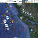
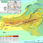
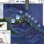
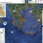
Well, I was about to head to town and noticed a magnitude M = 5.0 earthquake in Greece. I thought to myself, I wonder if that is a foreshock. It was.
Then, the M 6.8 mainshock hit while i was out and about, followed by a M = 5.2 aftershock.
Before I looked more closely, I thought this sequence might be related to the Kefallonia fault. I prepared some earthquake reports for earthquakes here in the past, in 2015 and in 2016.
Both of those earthquakes were right-lateral strike-slip earthquakes associated with the Kefallonia fault.
However, today’s earthquake sequence was further to the south and east of the strike-slip fault, in a region experiencing compression from the Ionian Trench subduction zone. But there is some overlap of these different plate boundaries, so the M 6.8 mainshock is an oblique earthquake (compressional and strike-slip). Based upon the sequence, I interpret this earthquake to be right-lateral oblique. I could be wrong.
There are records of tsunami observed on tide gage data.

Below is my interpretive poster for this earthquake

I plot the seismicity from the past month, with color representing depth and diameter representing magnitude (see legend). I include earthquake epicenters from 1918-2018 with magnitudes M ≥ 6.5 in one version.
I plot the USGS fault plane solutions (moment tensors in blue and focal mechanisms in orange), possibly in addition to some relevant historic earthquakes.
The poster below includes earthquakes that represent the different plate boundaries and tectonic regimes.

  • The 1999 M = 7.6 Izmit earthquake was quite damaging and deadly earthquake on the North Anatolian fault. To the east, the majority of this plate boundary has ruptured in the 20th century. The last portion of the fault to rupture is to the west of this M = 7.6 earthquake and those who live in Istanbul would do well to invest in earthquake resilient building design. The Iszmit earthquake generated a tsunami with run up elevations about 2 meters, though had localized larger run ups due to a submarine landslide.
  • The 1981 M = 7.2 earthquake shows that this dextral (right-lateral) strain extends through the region into eastern Greece.
  • The 2015 M = 6.5 earthquake I mention above is plotted, showing the right-lateral sense of motion associated with the Kefallonia fault. There was a tsunami observed following this earthquake, probably associated with a landslide also observed (dust was seen and photographed).
  • The 2008 M = 6.9 earthquake is a thrust earthquake and represents the convergence (compression) associated with the convergent plate boundary associated with the Ionian Trench.
  • The 2017 M = 6.6 earthquake is an interesting earthquake that shows the upper plate deformation in the Anatolia plate in western Turkey is extending. Geologic structural cross sections in this region shows that this extension has been ongoing for millions of years. Here is my earthquake report for this 2017 M 6.6 earthquake. There was a tsunami observed as a result of this earthquake, believe it or not.
  • I placed a moment tensor / focal mechanism legend on the poster. There is more material from the USGS web sites about moment tensors and focal mechanisms (the beach ball symbols). Both moment tensors and focal mechanisms are solutions to seismologic data that reveal two possible interpretations for fault orientation and sense of motion. One must use other information, like the regional tectonics, to interpret which of the two possibilities is more likely.
  • I also include the shaking intensity contours on the map. These use the Modified Mercalli Intensity Scale (MMI; see the legend on the map). This is based upon a computer model estimate of ground motions, different from the “Did You Feel It?” estimate of ground motions that is actually based on real observations. The MMI is a qualitative measure of shaking intensity. More on the MMI scale can be found here and here. This is based upon a computer model estimate of ground motions, different from the “Did You Feel It?” estimate of ground motions that is actually based on real observations.
  • I include the slab 2.0 contours plotted (Hayes, 2018), which are contours that represent the depth to the subduction zone fault. These are mostly based upon seismicity. The depths of the earthquakes have considerable error and do not all occur along the subduction zone faults, so these slab contours are simply the best estimate for the location of the fault.li>
  • I include the faults from the NOA Digital Database for Active faults in Greece (Ganas et a., 2013) as red lines.

    I include some inset figures. Some of the same figures are located in different places on the larger scale map below.

  • In the upper left corner is a small scale map showing the major tectonic fault systems in the eastern Mediterranean (Taymaz et al., 2007). The large black arrows show relative plate motions. I place a blue star in the general location of today’s earthquake sequence.
  • In the lower left corner is a generalized view of the tectonic regimes as interpreted by Taymaz et al. (2007). Today’s earthquake is in the SW Aegena/Peloponnisos plate, a region of compression associated with the Ionian Trench subduction zone. Today’s earthquake was probably right-lateral oblique, given the spatial relations between the different earthquakes.
  • In the upper right corner is a figure that shows GPS plate motion vectors (Ganas and Parsons, 2009). NOt how the vectors in the northeast are parallel to the North Anatolian fault and, as one moves to the southwest, they become normal (perpendicular) to the Ionian trench.
  • In the lower right corner is a more detailed map showing an interpretation of the faulting in the region (Kokkalas et al., 2006).
  • Here is the map with a month’s seismicity plotted.

  • Here is the map with a century’s seismicity plotted.

  • Here is the tide gage data from Katakolo, which is only 65 km from the M 6.8 epicenter.

Other Report Pages

Some Relevant Discussion and Figures

  • Here is the large scale tectonic setting map (Taymaz et al., 2007) with their figure below.

  • Summary sketch map of the faulting and bathymetry in the Eastern Mediterranean region, compiled from our observations and those of Le Pichon & Angelier (1981), Taymaz (1990), Taymaz et al. (1990, 1991a, b); S¸arogˇlu et al. (1992), Papazachos et al. (1998), McClusky et al. (2000) and Tan & Taymaz (2006). Large black arrows show relative motions of plates with respect to Eurasia (McClusky et al. 2003). Bathymetry data are derived from GEBCO/97–BODC, provided by GEBCO (1997) and Smith & Sandwell (1997a, b). Shaded relief map derived from the GTOPO-30 Global Topography Data taken after USGS. NAF, North Anatolian Fault; EAF, East Anatolian Fault; DSF, Dead Sea Fault; NEAF, North East Anatolian Fault; EPF, Ezinepazarı Fault; PTF, Paphos Transform Fault; CTF, Cephalonia Transform Fault; PSF, Pampak–Sevan Fault; AS, Apsheron Sill; GF, Garni Fault; OF, Ovacık Fault; MT, Mus¸ Thrust Zone; TuF, Tutak Fault; TF, Tebriz Fault; KBF, Kavakbas¸ı Fault; MRF, Main Recent Fault; KF, Kagˇızman Fault; IF, Igˇdır Fault; BF, Bozova Fault; EF, Elbistan Fault; SaF, Salmas Fault; SuF, Su¨rgu¨ Fault; G, Go¨kova; BMG, Bu¨yu¨k Menderes Graben; Ge, Gediz Graben; Si, Simav Graben; BuF, Burdur Fault; BGF, Beys¸ehir Go¨lu¨ Fault; TF, Tatarlı Fault; SuF, Sultandagˇ Fault; TGF, Tuz Go¨lu¨ Fault; EcF, Ecemis¸ Fau; ErF, Erciyes Fault; DF, Deliler Fault; MF, Malatya Fault; KFZ, Karatas¸–Osmaniye Fault Zone.

  • This figure shows GPS velocities in the region (Taymaz et al., 2007).

  • GPS horizontal velocities and their 95% confidence ellipses in a Eurasia-fixed reference frame for the period 1988–1997 superimposed on a shaded relief map derived from the GTOPO-30 Global Topography Data taken after USGS. Bathymetry data are derived from GEBCO/97–BODC, provided by GEBCO (1997) and Smith & Sandwell (1997a, b). Large arrows designate generalized relative motions of plates with respect to Eurasia (in mm a21) (recompiled after McClusky et al. 2000). NAF, North Anatolian Fault; EAF, East Anatolian Fault; DSF, Dead Sea Fault; NEAF, North East Anatolian Fault; EPF, Ezinepazarı Fault; CTF, Cephalonia Transform Fault; PTF, Paphos Transform Fault; CMT, Caucasus Main Thrust; MRF, Main Recent Fault.

  • Finally their summary figure showing the tectonic regimes (Taymaz et al., 2007).

  • Schematic map of the principal tectonic settings in the Eastern Mediterranean. Hatching shows areas of coherent motion and zones of distributed deformation. Large arrows designate generalized regional motion (in mm a21) and errors (recompiled after McClusky et al. (2000, 2003). NAF, North Anatolian Fault; EAF, East Anatolian Fault; DSF, Dead Sea Fault; NEAF, North East Anatolian Fault; EPF, Ezinepazarı Fault; CTF, Cephalonia Transform Fault; PTF, Paphos Transform Fault.

  • This is a tectonic summary figure from Kokkalas et al. (2006).

  • Simplified map showing the main structural features along the Hellenic arc and trench system, as well as the main active structures in the Aegean area. The mean GPS horizontal velocities in the Aegean plate, with respect to a Eurasia-fixed reference frame, are shown (after Kahle et al., 1998; McClusky et al., 2000). The lengths of vectors are
    proportional to the amount of movement. The thick black arrows indicate the mean motion vectors of the plates. The polygonal areas on the map (dashed lines) define the approximate borders of the five different structural regions discussed in the text. The borders between structural regions are not straightforward, and wide transitional zones probably exist between them. The inset shows a schematic map with the geodynamic framework in the eastern Mediterranean area (modified from McClusky et al., 2000). DSF—Dead Sea fault; EAF—East Anatolia fault; HT—Hellenic trench; KFZ— Kefallonia fault zone; MRAC—Mediterranean Ridge accretionary complex; NAF—North Anatolia fault; NAT—North Aegean trough.

  • Here is their detailed view of the faulting in the region (Kokkalas et al., 2006)

  • General simplified structural map of Greece showing the main currently active structures in the five structural regions along the Hellenic Arc, as well as some main pre-existing lineaments. Insets illustrate the main structural features of each region and the period of activity of these structures (for further details see discussion). KFZ—Kefallonia Fault zone; MCL—Mid-Cycladic lineament; NAFZ—North Anatolia fault zone; NAT—North Aegean trough; PF—Pelagonian fault.

  • Here is an even more detailed view of this region (Kokkalas et al., 2006). Note how the Convergent plate boundary “Ionian thrust” overlaps with the strike-slip faulting of the Kefallonia fault. Today’s M 6.8 happened south of where these authors map the Ionian thrust extending south from Zakynthos Island.

  • Schematic structural map of the central Hellenic Peninsula (Region II), with stress nets showing the orientation of principal stress axes. Stress net explanation as for Figure 3. Also included are cross-sections showing the geometry and kinematics of the External Hellenides in the area (A-A′) and the evolution of the synorogenic basin in the Paleros area (B-B′-B′′). AG—Abelon graben; ALG—Almyros graben; AMG—Amvrakikos graben; CG—Corinth graben; KB—Kymi basin; KF—Klenia fault zone; KFZ—Kefalonia fault zone; LF—Lapithas fault; MG—Megara graben; NG—Nedas graben; P—Parnitha area; PG—Pyrgos graben; PLB—Paleros basin; PTG—Patras graben; RG—Rio graben; S-A.G— Sperchios-Atalanti graben; SEG—South Evoikos graben; TB—Thiva basin; TG—Tithorea graben; TRG—Trihonis graben; VF—Vounargos fault.

Geologic Fundamentals

  • For more on the graphical representation of moment tensors and focal mechnisms, check this IRIS video out:
  • Here is a fantastic infographic from Frisch et al. (2011). This figure shows some examples of earthquakes in different plate tectonic settings, and what their fault plane solutions are. There is a cross section showing these focal mechanisms for a thrust or reverse earthquake. The upper right corner includes my favorite figure of all time. This shows the first motion (up or down) for each of the four quadrants. This figure also shows how the amplitude of the seismic waves are greatest (generally) in the middle of the quadrant and decrease to zero at the nodal planes (the boundary of each quadrant).

  • Here is another way to look at these beach balls.
  • There are three types of earthquakes, strike-slip, compressional (reverse or thrust, depending upon the dip of the fault), and extensional (normal). Here is are some animations of these three types of earthquake faults. The following three animations are from IRIS.
  • Strike Slip:

    Compressional:

    Extensional:

  • This is an image from the USGS that shows how, when an oceanic plate moves over a hotspot, the volcanoes formed over the hotspot form a series of volcanoes that increase in age in the direction of plate motion. The presumption is that the hotspot is stable and stays in one location. Torsvik et al. (2017) use various methods to evaluate why this is a false presumption for the Hawaii Hotspot.

  • A cutaway view along the Hawaiian island chain showing the inferred mantle plume that has fed the Hawaiian hot spot on the overriding Pacific Plate. The geologic ages of the oldest volcano on each island (Ma = millions of years ago) are progressively older to the northwest, consistent with the hot spot model for the origin of the Hawaiian Ridge-Emperor Seamount Chain. (Modified from image of Joel E. Robinson, USGS, in “This Dynamic Planet” map of Simkin and others, 2006.)

  • Here is a map from Torsvik et al. (2017) that shows the age of volcanic rocks at different locations along the Hawaii-Emperor Seamount Chain.

  • Hawaiian-Emperor Chain. White dots are the locations of radiometrically dated seamounts, atolls and islands, based on compilations of Doubrovine et al. and O’Connor et al. Features encircled with larger white circles are discussed in the text and Fig. 2. Marine gravity anomaly map is from Sandwell and Smith.

    References:

  • Ganas, A., and T. Parsons (2009), Three-dimensional model of Hellenic Arc deformation and origin of the Cretan uplift, J. Geophys. Res., 114, B06404, doi:10.1029/2008JB005599
  • Ganas, A., Oikonomou, I.A., and Tsimi, C., 2013. NOAFAULTS: A Digital Database for Active Faults in Greece in Bulletin of the Geological Society of Greece, v. XLVII, Proceedings fo the 13th International Cogfress, Chania, Sept, 2013
  • Kokkalas, S., Xypolias, P., Koukouvelas, I., and Doutsos, T., 2006, Postcollisional contractional and extensional deformation in the Aegean region, in Dilek, Y., and Pavlides, S., eds., Postcollisional tectonics and magmatism in the Mediterranean region and Asia: Geological Society of America Special Paper 409, p. 97–123, doi: 10.1130/2006.2409(06)
  • Hayes, G., 2018, Slab2 – A Comprehensive Subduction Zone Geometry Model: U.S. Geological Survey data release, https://doi.org/10.5066/F7PV6JNV.
  • Meyer, B., Saltus, R., Chulliat, a., 2017. EMAG2: Earth Magnetic Anomaly Grid (2-arc-minute resolution) Version 3. National Centers for Environmental Information, NOAA. Model. doi:10.7289/V5H70CVX
  • Taymaz, T. , Yilmaz, Y., and Dilek, Y., 2007. The geodynamics of the Aegean and Anatolia: introduction in TAYMAZ, T., YILMAZ, Y. & DILEK, Y. (eds) The Geodynamics of the Aegean and Anatolia. Geological Society, London, Special Publications, 291, 1–16. DOI: 10.1144/SP291.1 0305-8719/07

Return to the Earthquake Reports page.


Earthquake Report: Explorer plate

Last night I had completed preparing for class the next day. I was about to head to bed. I got an email from the Pacific Tsunami Warning Center notifying me that there was no risk of a tsunami due to an earthquake with a magnitude M 6.6. I noticed it was along the Sovanco fault, a transform fault (right-lateral strike-slip). Strike slip faults can produce tsunami, but they are smaller than tsunami generated along subduction zones. The recent M = 7.5 Donggala Earthquake in Sulawesi, Indonesia is an example of a tsunami generated in response to a strike-slip earthquake (tho coseismic landslides may be part of the story there too).
I thought I could put together a map in short time as I already had a knowledge base for this area (e.g. earthquake reports from 2017.01.07 and 2016.03.18). However, as I was creating base maps in Google Earth, before I completed making a set (the posters below each take 4 different basemaps displayed at different transparencies), there was the M 6.8 earthquake. Then there was the M 6.6 earthquake. I had to start all over. Twice. Heheh.
This region of the Pacific-North America plate boundary is at the northern end of the Cascadia subduction zone (CSZ). To the east, the Explorer and Juan de Fuca plates subduct beneath the North America plate to form the megathrust subduction zone fault capable of producing earthquakes in the magnitude M = 9 range. The last CSZ earthquake was in January of 1700, just almost 319 years ago.
The Juan de Fuca plate is created at an oceanic spreading center called the Juan de Fuca Ridge. This spreading ridge is offset by several transform (strike-slip) faults. At the southern terminus of the JDF Ridge is the Blanco fault, a transtensional transform fault connecting the JDF and Gorda ridges.
At the northern terminus of the JDF Ridge is the Sovanco transform fault that strikes to the northwest of the JDF Ridge. There are additional fracture zones parallel and south of the Sovanco fault, called the Heck, Heckle, and Springfield fracture zones.
The first earthquake (M = 6.6) appears to have slipped along the Sovanco fault as a right-lateral strike-slip earthquake. Then the M 6.8 earthquake happened and, given the uncertainty of the location for this event, occurred on a fault sub-parallel to the Sovanco fault. Then the M 6.5 earthquake hit, back on the Sovanco fault.
So, I would consider the M 6.6 to be a mainshock that triggered the M 6.8. The M 6.5 is an aftershock of the M 6.6.
Based upon our knowledge of how individual earthquakes can change the stress (or strain) in the surrounding earth, it is unlikely that this earthquake sequence changed the stress on the megathrust. Over time, hundreds of these earthquakes do affect the potential for earthquakes on the CSZ megathrust. But, individual earthquakes (or even a combination of these 3 earthquakes) do not change the chance that there will be an earthquake on the CSZ megathrust. The chance of an earthquake tomorrow is about the same as the chance of an earthquake today. Day to day the chances don’t change much. However, year to year, the chances of an earthquake get higher and higher. But of course, we cannot predict when an earthquake will happen.
So, if we live, work, or play in earthquake country, it is best to always be prepared for an earthquake, for tsunami, and for landslides.

Below is my interpretive poster for this earthquake

I plot the seismicity from the past month, with color representing depth and diameter representing magnitude (see legend). I include earthquake epicenters from 1918-2018 with magnitudes M ≥ 6.5 in one version.
I plot the USGS fault plane solutions (moment tensors in blue and focal mechanisms in orange), possibly in addition to some relevant historic earthquakes.
I include the earthquake mechanisms for 2 special earthquakes that happened in the past two decades along this plate boundary system. In 2001 the M 6.8 Nisqually earthquake struck the Puget Sound region of Washington causing extensive damage. This earthquake was an extensional earthquake in the downgoing JDF plate. The damage was extensive because the earthquake was close to an urban center, where there was lots of infrastructure to be damaged (the closer to an earthquake, the higher the shaking intensity).
In 2012 was a M = 7.8 earthquake along the northern extension of the CSZ. The northern part of the CSZ is a very interesting region, often called the Queen Charlotte triple junction. There are some differences than the Mendocino triple junction to the south, in northern California. There continues to be some debate about how the plate boundary faults are configured here. The Queen Charlotte is a right lateral strike slip fault that extends from south of Haida Gwaii (the large island northwest of Vancouver Island) up northwards, where it is called the Fairweather fault. There are several large strike-slip earthquakes on the Queen Charlotte/Fairweather fault system in the 20th century. However, the 2012 earthquake was a subduction zone fault, evidence that the CSZ megathrust (or some semblance of this subduction zone) extends beneath Haida Gwaii (so the CSZ and QCF appear to over lap).

  • I placed a moment tensor / focal mechanism legend on the poster. There is more material from the USGS web sites about moment tensors and focal mechanisms (the beach ball symbols). Both moment tensors and focal mechanisms are solutions to seismologic data that reveal two possible interpretations for fault orientation and sense of motion. One must use other information, like the regional tectonics, to interpret which of the two possibilities is more likely.
  • I also include the shaking intensity contours on the map. These use the Modified Mercalli Intensity Scale (MMI; see the legend on the map). This is based upon a computer model estimate of ground motions, different from the “Did You Feel It?” estimate of ground motions that is actually based on real observations. The MMI is a qualitative measure of shaking intensity. More on the MMI scale can be found here and here. This is based upon a computer model estimate of ground motions, different from the “Did You Feel It?” estimate of ground motions that is actually based on real observations.
  • I include the slab 2.0 contours plotted (Hayes, 2018), which are contours that represent the depth to the subduction zone fault. These are mostly based upon seismicity. The depths of the earthquakes have considerable error and do not all occur along the subduction zone faults, so these slab contours are simply the best estimate for the location of the fault.li>

    Magnetic Anomalies

  • In the map below, I include a transparent overlay of the magnetic anomaly data from EMAG2 (Meyer et al., 2017). As oceanic crust is formed, it inherits the magnetic field at the time. At different points through time, the magnetic polarity (north vs. south) flips, the north pole becomes the south pole. These changes in polarity can be seen when measuring the magnetic field above oceanic plates. This is one of the fundamental evidences for plate spreading at oceanic spreading ridges (like the Gorda rise).
  • Regions with magnetic fields aligned like today’s magnetic polarity are colored red in the EMAG2 data, while reversed polarity regions are colored blue. Regions of intermediate magnetic field are colored light purple.
  • We can see the roughly northeast-southwest trends of these red and blue stripes in the JDF and Pacific plates. These lines are parallel to the ocean spreading ridges from where they were formed. The stripes disappear at the subduction zone because the oceanic crust with these anomalies is diving deep beneath the Sunda plate (part of Eurasia), so the magnetic anomalies from the overlying North America plate (and accretionary prism) mask the evidence for the JDF plate.

    I include some inset figures. Some of the same figures are located in different places on the larger scale map below.

  • In the upper right corner is a map of the Cascadia subduction zone (CSZ) and regional tectonic plate boundary faults. This is modified from several sources (Chaytor et al., 2004; Nelson et al., 2004). I place a blue star in the general location of today’s seismicity.
  • In the upper left corner is a map showing the plate boundary faults associated with the northern CSZ and to the north (including the Queen Charlotte fault; Braunmiller and Nabalek, 2002). I place a red star in the general location of today’s seismicity. These earthquakes occurred in the region east of the Explorer rift. This region of the world still contains some major tectonic mysteries and this is quite exciting. This shows the Winona Block as a microplate between the Pacific and North America plates, north of the Explorer plate. The Winona Block is labeled “WIN BLOCK” on the map. Note that there are two spreading ridges on the western and central part of this block. It is possible that the Explorer ridge-rift system extends into the Winona Block to form a third spreading ridge in the Winona Block.
  • In the lower left corner is a map from Dziak (2006). Dziak (2006) used bathymetric and seismologic data to evaluate the faulting in the region and discussed how the Explorer plate is accommodating a reorganization of the plate boundary.
  • Here is the map with a month’s seismicity plotted.


  • Here is the map with a century’s seismicity plotted.


  • Here is a video showing the earthquake epicenters for the period of 1900-2017 for USGS earthquakes with magnitudes M ≥ 5.0. Here is a link to the embedded video below (2.5 MB mp4). Note how the earthquakes that happen between the northern terminus of the JDF Ridge and the southern terminus of the Queen Charlotte fault form a wide band (not a stepwise patter that might reflect steps in ridges and spreading centers). This pattern is key to unravelling the mysteries of the western Explorer plate.
    • Here is the map with the seismicity from 1900-2017 plotted. These are USGS earthquakes with magnitudes M ≥ 7.0 for this time period. I include the moment tensors from the 2012 and 2013 earthquakes (the only earthquakes for this time period that have USGS moment tensors). The 2012 earthquake generated a tsunami. I discuss the 2012 “Haida Gwaii” earthquake here.


Other Report Pages

Some Relevant Discussion and Figures

  • Here is the general tectonic map of the region (Braunmiller and Nabalek, 2002). Today’s earthquakes happened in a place that suggest the Explorer ridge extends further to the north into the Winona Block. Below I include the text from the original figure caption in blockquote.

  • Map of Explorer region and surroundings. Plate boundaries are based on Riddihough’s [1984] and Davis and Riddihough’s [1982] tectonic models. Solid lines are active plate boundaries (single lines are transform faults, double lines are spreading centers, barbed lines are subduction zones with barbs in downgoing plate direction). The wide double line outlines the width of the Sovanco fracture zone, and the dots sketch the Explorer-Winona boundary. Plate motion vectors (solid arrows) are from NUVEL-1A [DeMets et al., 1994] for Pacific-North America motion and from Wilson [1993] for Pacific-Juan de Fuca and Juan de Fuca-North America motion. Open arrows are Explorer relative plate motions averaged over last 1 Myr [Riddihough, 1984] (in text, we refer to these most recent magnetically determined plate motions as the ‘‘Riddihough model’’). Winona block motions (thin arrows), described only qualitatively by Davis and Riddihough [1982], are not to scale. Abbreviations are RDW for Revere-Dellwood- Wilson, Win for Winona, FZ for fault zone, I for island, S for seamount, Pen for peninsula.

  • Here is the larger scale figure that shows the details of the plate boundary in this region (Braunmiller and Nabalek, 2002). Below I include the text from the original figure caption in blockquote.

  • Close-up of the Pacific-Explorer boundary. Plotted are fault plane solutions (gray scheme as in Figure 3) and well-relocated earthquake epicenters. The SeaBeam data are from the RIDGE Multibeam Synthesis Project (http://imager.ldeo.columbia.edu) at the Lamont-Doherty Earth observatory. Epicenters labeled by solid triangles are pre-1964, historical earthquakes (see Appendix B). Solid lines mark plate boundaries inferred from bathymetry and side-scan data [Davis and Currie, 1993]; dashed were inactive. QCF is Queen Charlotte fault, TW are Tuzo Wilson seamounts, RDW is Revere-Dellwood-Wilson fault, DK are Dellwood Knolls, PRR is Paul Revere ridge, ER is Explorer Rift, ED is Explorer Deep, SERg is Southern Explorer ridge, ESM is Explorer seamount, SETB is Southwest Explorer Transform Boundary, SAT is Southwestern Assimilated Territory, ESDZ is Eastern Sovanco Deformation Zone, HSC is Heck seamount chain, WV is active west valley of Juan de Fuca ridge, MV is inactive middle valley.

  • This is the figure that shows an interpretation of how this plate boundary formed over the past 3 Ma (Braunmiller and Nabalek, 2002). Below I include the text from the original figure caption in blockquote.

  • Schematic plate tectonic reconstruction of Explorer region during the last 3 Myr. Note the transfer of crustal blocks (hatched) from the Explorer to the Pacific plate; horizontal hatch indicates transfer before 1.5 Ma and vertical hatch transfer since then. Active boundaries are shown in bold and inactive boundaries are thin dashes. Single lines are transform faults, double lines are spreading centers; barbed lines are subduction zones with barbs in downgoing plate direction. QCF is Queen Charlotte fault, TW are the Tuzo Wilson seamounts, RDW is Revere-Dellwood-Wilson fault, DK are the Dellwood Knolls, ED is Explorer Deep, ER is Explorer Rift, ERg is Explorer Ridge, ESM is Explorer Seamount, SOV is Sovanco fracture zone, ESDZ is Eastern Sovanco Deformation Zone, JRg is Juan de Fuca ridge, and NF is Nootka fault. The question mark indicates ambiguity whether spreading offshore Brooks peninsula ceased when the Dellwood Knolls became active (requiring only one independently moving plate) or if both spreading centers, for a short time span, where active simultaneously (requiring Winona block motion independent from Explorer plate during that time).

  • Below I include some inset maps from Audet et al. (2008 ) and Dziak (2006). Each of these authors have published papers about the Explorer plate. Dziak (2006) used bathymetric and seismologic data to evaluate the faulting in the region and discussed how the Explorer plate is accommodating a reorganization of the plate boundary. Audet et al. (2008 ) use terrestrial seismic data to evaluate the crust along northern Vancouver Island and present their tectonic map as part of this research (though they do not focus on the offshore part of the Explorer plate). I include these figures below along with their figure captions. Today’s earthquakes happened at the northwestern portion of these maps from Dziak (2006).
  • Dziak, 2006

  • This map shows the shape of the seafloor in this region and there is an inset map that shows the major fault systems here.

  • Bathymetric map of northern Juan de Fuca and Explorer Ridges. Map is composite of multibeam bathymetry and satellite altimetry (Sandwell and Smith, 1997). Principal structures are labeled: ERB—Explorer Ridge Basin, SSL—strike-slip lineation. Inset map shows conventional tectonic interpretation of region. Dashed box shows location of main figure. Solid lines are active plate boundaries, dashed line shows Winona-Explorer boundary, gray ovals represent seamount chains. Solid arrows show plate motion vectors from NUVEL-1A (DeMets et al., 1994) for Pacific–North America and from Wilson (1993) for Pacific–Juan de Fuca and Juan de Fuca–North America. Open arrows are Explorer relative motion averaged over past 1 m.y. (Riddihough, 1984). Abbreviations: RDW—Revere-Dellwood-Wilson,Win—Winona block, C.O.—Cobb offset, F.Z.—fracture zone. Endeavour segment is northernmost section of Juan de Fuca Ridge.

  • This map shows the line work Dziak (2006) used to delineate the structures shown in the bathymetric map.

  • Structural interpretation map of Explorer–Juan de Fuca plate region based on composite multibeam bathymetry and satellite altimetry data (Fig. 1). Heavy lines are structural (fault) lineations, gray circles and ovals indicate volcanic cones and seamounts, dashed lines are turbidite channels. Location of magnetic anomaly 2A is shown; boundaries are angled to show regional strike of anomaly pattern.

  • This map shows the seismicity patterns (this matches the patterns in the animation above).

  • Earthquake locations estimated using U.S. Navy hydrophone arrays that occurred between August 1991 and January 2002. Focal mechanisms are of large (Mw>4.5) earthquakes that occurred during same time period, taken from Pacific Geoscience Center, National Earthquake Information Center, and Harvard moment-tensor catalogs. Red mechanism shows location of 1992 Heck Seamount main shock.

  • Here Dziak (2006) shows how they interpret that this plate boundary is being reconfigured with time. Like the rest of the adjacent plate boundary (Queen Charlotte/Fairweather, Cascadia, San Andreas), there is an overall dextral (right-lateral) shear couple between the North America and Pacific plates. Some of the existing structures represent the orientation of faults from an earlier strain field. Eventually through going faults will align with the band of seismicity in the above map and above animation. At least, that is one hypothesis. Seems reasonable to me, given the very short record of earthquakes.

  • Tectonic model of Explorer plate boundaries. Evidence presented here is consistent with zone of shear extending through Explorer plate well south of Sovanco Fracture Zone (SFZ) to include Heck, Heckle, and Springfield seamounts, and possibly Cobb offset (gray polygon roughly outlines shear zone). Moreover, Pacific– Juan de Fuca–North American triple junction may be reorganizing southward to establish at Cobb offset. QCF—Queen Charlotte fault.

  • From Audet et al. (2008), here is another view of the fault system in this part of the plate boundary.

  • Identification of major tectonic features in western Canada. BP—Brooks Peninsula, BPfz—Brooks Peninsula fault zone, NI— Nootka Island, QCTJ—Queen Charlotte triple junction. Dotted lines delineate extinct boundaries or shear zones. Seismic stations are displayed as inverted black triangles. Station projections along line 1 and line 2 are plotted as thick white lines. White triangles represent Alert Bay volcanic field centers. Center of array locates town of Woss. Plates: N-A—North America; EXP—Explorer; JdF—Juan de Fuca; PAC—Pacific.

  • Speaking of the Queen Charlotte/Fairweather fault system, here is another map that shows the tectonics of this region. Hyndman (2015) shows the region where the 2012 Haida Gwaii earthquake ruptured. I include two more figures below. This figure Below I include the text from the original figure caption in blockquote.

  • The Queen Charlotte fault (QCF) zone, the islands of Haida Gwaii and adjacent area, and the locations of the 2012 Mw 7.8 (ellipse), 2013 Mw 7.5 (solid line), and 1949 Ms 8.1 (dashed) earthquakes. The along margin extent of the 1949 event is not well constrained.

  • This map shows the main and aftershocks from the 2012 Haida Gwaii earthquake sequence (Hyndman, 2015). This 2012 sequence is interesting because, prior to these earthquakes, it was unclear whether the fault along Haida Gwaii was a strike-slip or a thrust fault. For example, Riddihough (1984) suggests that there is no subduction going on along the Explorer plate at all. Turns out it is probably both. When this 2012 earthquake happened, I took a look at the bathymetry in Google Earth and noticed the Queen Charlotte Terrace, which looks suspiciously like an accretionary prism. This was convincing evidence for the thrust fault earthquakes. Below I include the text from the original figure caption in blockquote.

  • Aftershocks of the 2012 Mw 7.8 Haida Gwaii thrust 13 earthquake (after Cassidy et al., 2013). They approximately define the rupture area. The normal-faulting mechanisms for two of the larger aftershocks are also shown. Many of the aftershocks are within the incoming oceanic plate and within the overriding continental plate rather than on the thrust rupture plane.

  • This is a great version of this figure that shows how there are overlapping subduction (thrust) and transform (strike-slip) faults along the Haida Gwaii region (Hyndman, 2015). Below I include the text from the original figure caption in blockquote.

  • Model for the 2012 Mw 7.8 earthquake rupture and the partitioning of oblique convergence into margin parallel motion on the Queen Charlotte transcurrent fault and nearly orthogonal thrust convergence on the Haida Gwaii thrust fault.

  • Here is a figure that shows two ways of interpreting the Queen Charlotte triple junction region (Kreemer et al., 1998). Note the 1900-2017 seismicity map above, which supports the interpretation in the right panel (B). Something of trivial nature is that this article is from the pre-computer illustration era (see the squiggly hand drawn arrow in the right panel B). Below I include the text from the original figure caption in blockquote.

  • (A) Major tectonic features describing the micro-plate model for the Explorer region. The Explorer plate (EXP) is an independent plate and is in convergent motion towards the North American plate (NAM). V.I. D Vancouver Island; PAC D the Pacific plate; JdF D the Juan the Fuca plate. The accentuated zone between the Explorer and JdF ridges is the Sovanco transform zone and the two boundary lines do not indicate the presence of faults but define the boundaries of this zone of complex deformation. (B) The key features of the pseudo-plate model for the region are a major plate boundary transform fault zone between the North American and Pacific plates and the Nootka Transform, a left-lateral transform fault north of the Juan the Fuca plate.

Geologic Fundamentals

  • For more on the graphical representation of moment tensors and focal mechnisms, check this IRIS video out:
  • Here is a fantastic infographic from Frisch et al. (2011). This figure shows some examples of earthquakes in different plate tectonic settings, and what their fault plane solutions are. There is a cross section showing these focal mechanisms for a thrust or reverse earthquake. The upper right corner includes my favorite figure of all time. This shows the first motion (up or down) for each of the four quadrants. This figure also shows how the amplitude of the seismic waves are greatest (generally) in the middle of the quadrant and decrease to zero at the nodal planes (the boundary of each quadrant).

  • Here is another way to look at these beach balls.
  • There are three types of earthquakes, strike-slip, compressional (reverse or thrust, depending upon the dip of the fault), and extensional (normal). Here is are some animations of these three types of earthquake faults. The following three animations are from IRIS.
  • Strike Slip:

    Compressional:

    Extensional:

  • This is an image from the USGS that shows how, when an oceanic plate moves over a hotspot, the volcanoes formed over the hotspot form a series of volcanoes that increase in age in the direction of plate motion. The presumption is that the hotspot is stable and stays in one location. Torsvik et al. (2017) use various methods to evaluate why this is a false presumption for the Hawaii Hotspot.

  • A cutaway view along the Hawaiian island chain showing the inferred mantle plume that has fed the Hawaiian hot spot on the overriding Pacific Plate. The geologic ages of the oldest volcano on each island (Ma = millions of years ago) are progressively older to the northwest, consistent with the hot spot model for the origin of the Hawaiian Ridge-Emperor Seamount Chain. (Modified from image of Joel E. Robinson, USGS, in “This Dynamic Planet” map of Simkin and others, 2006.)

  • Here is a map from Torsvik et al. (2017) that shows the age of volcanic rocks at different locations along the Hawaii-Emperor Seamount Chain.

  • Hawaiian-Emperor Chain. White dots are the locations of radiometrically dated seamounts, atolls and islands, based on compilations of Doubrovine et al. and O’Connor et al. Features encircled with larger white circles are discussed in the text and Fig. 2. Marine gravity anomaly map is from Sandwell and Smith.


    References:

  • Atwater, B.F., Musumi-Rokkaku, S., Satake, K., Tsuju, Y., Eueda, K., and Yamaguchi, D.K., 2005. The Orphan Tsunami of 1700—Japanese Clues to a Parent Earthquake in North America, USGS Professional Paper 1707, USGS, Reston, VA, 144 pp.
  • Braunmiller, J. and Nabelek, J., 2002. Seismotectonics of the Explorer region in JGR, v. 107, NO. B10, 2208, doi:10.1029/2001JB000220, 2002
  • Chaytor, J.D., Goldfinger, C., Dziak, R.P., and Fox, C.G., 2004. Active deformation of the Gorda plate: Constraining deformation models with new geophysical data: Geology v. 32, p. 353-356.
  • Audet, P., Bostock, M.G., Mercier, J.-P., and Cassidy, J.F., 2008., Morphology of the Explorer–Juan de Fuca slab edge in northern Cascadia: Imaging plate capture at a ridge-trench-transform triple junction in Geology, v. 36, p. 895-898.
  • Clarke, S. H., and Carver, G. C., 1992. Late Holocene Tectonics and Paleoseismicity, Southern Cascadia Subduction Zone, Science, vol. 255:188-192.
  • Dziak, R.P., 2006. Explorer deformation zone: Evidence of a large shear zone and reorganization of the Pacific–Juan de Fuca–North American triple junction in Geology, v. 34, p. 213-216.
  • Flück, P., Hyndman, R. D., Rogers, G. C., and Wang, K., 1997. Three-Dimensional Dislocation Model for Great Earthquakes of the Cascadia Subduction Zone, Journal of Geophysical Research, vol. 102: 20,539-20,550.
  • Heaton, f f., Kanamori, F. F., 1984. Seismic Potential Associated with Subduction in the Northwest United States, Bulletin of the Seismological Society of America, vol. 74: 933-941.
  • Hyndman, R. D., and Wang, K., 1995. The rupture zone of Cascadia great earthquakes from current deformation and the thermal regime, Journal of Geophysical Research, vol. 100: 22,133-22,154.
  • Keemer, C., Govers, R., Furlong, K.P., and Holt, W.E., 1998. Plate boundary deformation between the Pacific and North America in the Explorer region in Tectonophysics, v. 293, p. 225-238.
  • Meyer, B., Saltus, R., Chulliat, a., 2017. EMAG2: Earth Magnetic Anomaly Grid (2-arc-minute resolution) Version 3. National Centers for Environmental Information, NOAA. Model. doi:10.7289/V5H70CVX
  • McPherson, R. M., 1989. Seismicity and Focal Mechanisms Near Cape Mendocino, Northern California: 1974-1984: M. S. thesis, Arcata, California, Humboldt State University, 75 p
  • Nelson, A.R., Asquith, A.C., and Grant, W.C., 2004. Great Earthquakes and Tsunamis of the Past 2000 Years at the Salmon River Estuary, Central Oregon Coast, USA: Bulletin of the Seismological Society of America, Vol. 94, No. 4, pp. 1276–1292
  • Plafker, G., 1972. Alaskan earthquake of 1964 and Chilean earthquake of 1960: Implications for arc tectonics in Journal of Geophysical Research, v. 77, p. 901-925.
  • Riddihough, R., 1984. Recent Movements of the Juan de Fuca Plate System in JGR, v. 89, no. B8, p. 6980-6994.
  • Wang, K., Wells, R., Mazzotti, S., Hyndman, R. D., and Sagiya, T., 2003. A revised dislocation model of interseismic deformation of the Cascadia subduction zone Journal of Geophysical Research, B, Solid Earth and Planets v. 108, no. 1.

Return to the Earthquake Reports page.


Earthquake/Landslide/Tsunami Report: Donggala Earthquake, Central Sulawesi: UPDATE #1

We continue to learn more each day as people collect additional information. Here is my initial Earthquake Report for this M 7.5 Donggala Earthquake.

In short, there was an earthquake with magnitude M = 7.5 on 2018.09.28. Minutes after the earthquake there was a tsunami that hit the coasts of Palu Bay. Possibly during the earthquake, kilometer scale landslides were triggered along the floor of Palu Valley.

These three natural disasters would be devastating on their own, but when considered in their totality, this trifecta has led to considerable suffering in central Sulawesi, Indonesia.

  • Pre- and post-earthquake remote sensing data have been used to estimate the deformation from the earthquake.
  • A collaboration between the Indonesian Government and Japanese tsunami experts (from a variety of universities) have produced a summary report from their field investigation of tsunami inundation and size.
  • Landslide experts have chimed in about how they interpret the landslides in Palu Valley.

I will attempt to summarize some of what we have learned in the past couple of weeks. I will begin with the earthquake observations, then discuss the tsunami and landslides.

M 7.5 Doggala Earthquake

The M=7.5 Donggala earthquake struck along the most active and seismically hazardous fault on the island of Sulawesi (Celebes), Indonesia. The Palu-Koro fault has a slip rate of 42 mm per year (Socquet et al., 2006), has a record of M=7-8 prehistoric earthquakes (Watkinson and Hall, 2017), as well as a record of M>7 earthquakes in the 20th century (Gómez et al., 2000). The seismic hazard associated with this fault was well evidenced prior to the earthquake (Cipta et al., 2016).

  • Here is the interpretive poster from my initial earthquake report. Go to the report page for more information about the seismotectonics of the region.

According to the National Disaster Management Authority (Badan Nasional Penanggulangan Bencana, BNPB), there were around 2.4 million people exposed to earthquake intensity MMI V or greater. The Modified Mercalli Intensity (MMI) scale is a measure of how strongly the ground shaking is from an earthquake. MMI V is described as, “Felt by nearly everyone; many awakened. Some dishes, windows broken. Unstable objects overturned. Pendulum clocks may stop.” However, the closer one is to the earthquake source, the greater the MMI intensity. There have been reported observations as large as MMI VIII.

Here is a map that shows the updated USGS model of ground shaking. The USGS prepared an updated earthquake fault slip model that was additionally informed by post-earthquake analysis of ground deformation. The original fault model extended from north of the epicenter to the northernmost extent of Palu City. Soon after the earthquake, Dr. Sotiris Valkaniotis prepared a map that showed large horizontal offsets across the ruptured fault along the entire length of the western margin on Palu Valley. This horizontal offset had an estimated ~8 meters of relative displacement. InSAR analyses confirmed that the coseismic ground deformation extended through Palu Valley and into the mountains to the south of the valley.


My 2018.10.01 BC Newshour Interview

Optical Analysis

Perhaps some of the most phenomenal results from remote sensing analyses are coming from the work of Dr. Sotiris Valkaniotis. Dr. Valkaniotis has been using the open source softare mic-mac to compare pre- and post-earthquake satellite imagery. I will call this “pixel matching” analysis, or optical analysis.

Pixels are “picture elements” that comprise what a raster is created out of. Consider a television or computer monitor. The screen is displaying rows and columns of colored light. Each cell of this “raster” display is called a pixel.

Basically, the software compares the patterns in the compared imagery to detect changes. If a group of pixels in the image move relative to other pixels, then this motion is quantified. This type of analysis is particularly useful for strike-slip earthquakes as the ground moves side by side.

Dr. Valkniotis has used a variety of imagery types. Below are a couple products that they have shared on social media. Please contact Dr. Valkaniotis for more information!

  • This was one of the first images, showing a large displacement near the coastline in western Palu.

  • Here is another way of looking at this displacement. Valkaniotis plotted the gradient (the slope of the mic-mac displacement) to show the localized deformation from the earthquake.

  • Others have used this analysis too. Here is an example from Johann Champenois who used Sentinel 2-B satellite imagery.

  • Here is an example that was prepared using Landsat satellite imagery conducted by Hawkeye Seismo. Here is their tweet. The left step in the Palu-Koro fault at the southern part of Palu Valley is clearly evident in this map.

  • Landsat-8 pixel tracking results (old school with Ampcor!) show a nice stepover in the Indonesia earthquake. This event gives a good perspective on why the valley in which Palu rests even exists in the first place

  • Here is a compilation from Valkaniotis, based upon Sentinel 2 imagery.

InSAR Analysis

Synthetic Aperture Radar (SAR) is a remote sensing method that uses Radar to make observations of Earth. These observations include the position of the ground surface, along with other information about the material properties of the Earth’s surface.
Interferometric SAR (InSAR) utilizes two separate SAR data sets to determine if the ground surface has changed over time, the time between when these 2 data sets were collected. More about InSAR can be found here and here. Explaining the details about how these data are analyzed is beyond the scope of this report. I rely heavily on the expertise of those who do this type of analysis, for example Dr. Eric Fielding.
Below are a series of different InSAR analytical results.

  • This is the result from Dr. Xiaohua Xu, prepared on 2018.10.15

  • Line-of-sight deformation from ALOS-2 for the Palu earthquake (data provided by JAXA, processed using GMTSAR). Unwrapping is challenging for this earthquake! Some near-fault region is too decorrelated to be trustworthy.

  • Below are 2 results from Dr. Fielding.

  • #InSAR map of range or line-of-sight deformation of #PaluEarthquake from NASA Caltech-JPL analysis of JAXA ALOS-2 PALSAR-2 data acquired last week. Red areas moved west or down in this unwrapped interferogram, unreliable phase masked out. Star USGS epicenter.


    #InSAR map of range or line-of-sight deformation of #PaluEarthquake from NASA Caltech-JPL analysis of JAXA ALOS-2 PALSAR-2 data acquired last week. Red areas moved west or down in this unwrapped interferogram, unreliable phase masked out. Star USGS epicenter.

  • I prepared a map using the NASA-JPL InSAR data. They post all their data online here. I used the tiff image as it is georeferenced. However, some may prefer to use the kmz file in Google Earth.
  • I include the faults mapped by Wilkinson and Hall (2017), the PGA contours from the USGS model results. More on Peak Ground Acceleration (PGA) can be found here. I also include the spatial extent of the largest landslides that I mapped using post-earthquake satellite imagery provided by Digital Globe using their open source imagery program.


Tsunami

There have been observations of tsunami waves recorded by tide gages installed at Pantoloan Port and Mumuju, Sulawesi. Locations are shown on the map above. A tsunami with a 10 cm wave height was recorded at Mumuju tide gage and a wave with a height of about 1.7 meters was recorded at Pantoloan tide gage. Learn more about the tsunami here.
Tsunami can be caused by a variety of processes, including earthquakes, volcanic eruptions, landslides, and meteorological phenomena. Earthquakes, eruptions, and landslides cause tsunami when these processes displace water in some way. We may typically associate tsunami with subduction zone earthquakes because these earthquakes are the type that generate vertical land motion along the sea floor. However, we know that strike-slip earthquakes can also generate tsunami (e.g. the 1999 Izmit, Turkey earthquake). But strike-slip earthquakes typically generate tsunami that are smaller in size.

  • Here is a great illustration of how a subduction zone earthquake can generate a tsunami (Atwater et al., 2005).


When landslides generate tsunami, they are often localized relative to the location of the landslide. The tsunami size can be rather large near the landslide and the size diminishes rapidly with distance from the landslide. An example of a landslide generated tsunami is the 1998 Papua New Guinea tsunami (an earthquake triggered a landslide, causing a “larger than expected” tsunami to inundate the land there. The size of the tsunami was very large near the landslide.
Based on post-earthquake satellite imagery from Digital Globe, the overwhelming majority of tsunami damage is localized within Palu Bay. The severity of damage is worse in southern Palu Bay where tsunami inundation is on the order of 300 feet. While at the northern part of the bay, inundation is on the order of 50 feet. In the north, most of the buildings that were destroyed by the tsunami were built over the water, though not entirely. While in the south, building damage extends further inland where buildings have been destroyed that were not built over the water. North of the mouth of the bay, there is less evidence for tsunami inundation, but there is localized damage in places.
There was a tsunami recorded at the Pantoloan Port tide gage with an amplitude of about 1 meter. At this location is also a 50 long ship that was lifted up onto a dock at the port. More details about the observations made by the joint Indonesia/Japan post-tsunami survey team cab be found at Temblor here.

Here is my plot of the Pantoloan Port tide gage.


  • Here is a map that shows the preliminary results from the field survey. These elevation data are better explained in their report.


M 7.5 Landslide Model vs. Observation Comparison

Landslides during and following the M=7.5 earthquake in central Sulawesi, Indonesia possibly caused the majority of casualties from this catastrophic natural disaster. Volunteers (citizen scientists) have used satellite aerial imagery collected after the earthquake to document the spatial extent and magnitude of damage caused by the earthquake, landslides, and tsunami.

While remote sensing methods are useful to locate damage in the region, field observations will be key in the effort to analyze the landscape response to these natural disasters. The Indonesian government and international researchers are already surveying the region and collecting these important observational details.

There are many different ways in which a landslide can be triggered. The first order relations behind slope failure (landslides) is that the “resisting” forces that are preventing slope failure (e.g. the strength of the bedrock or soil) are overcome by the “driving” forces that are pushing this land downwards (e.g. gravity). The ratio of resisting forces to driving forces is called the Factor of Safety (FOS). We can write this ratio like this:

FOS = Resisting Force / Driving Force

When FOS > 1, the slope is stable and when FOS < 1, the slope fails and we get a landslide. The illustration below shows these relations. Note how the slope angle α can take part in this ratio (the steeper the slope, the greater impact of the mass of the slope can contribute to driving forces). The real world is more complicated than the simplified illustration below.


Landslide ground shaking can change the Factor of Safety in several ways that might increase the driving force or decrease the resisting force. Keefer (1984) studied a global data set of earthquake triggered landslides and found that larger earthquakes trigger larger and more numerous landslides across a larger area than do smaller earthquakes.

Earthquakes can cause landslides because the seismic waves can cause the driving force to increase (the earthquake motions can “push” the land downwards), leading to a landslide. In addition, ground shaking can change the strength of these earth materials (a form of resisting force) with a process called liquefaction.

Sediment or soil strength is based upon the ability for sediment particles to push against each other without moving. This is a combination of friction and the forces exerted between these particles. This is loosely what we call the “angle of internal friction.” Liquefaction is a process by which pore pressure increases cause water to push out against the sediment particles so that they are no longer touching.

An analogy that some may be familiar with relates to a visit to the beach. When one is walking on the wet sand near the shoreline, the sand may hold the weight of our body generally pretty well. However, if we stop and vibrate our feet back and forth, this causes pore pressure to increase and we sink into the sand as the sand liquefies. Or, at least our feet sink into the sand.

Below is a diagram showing how an increase in pore pressure can push against the sediment particles so that they are not touching any more. This allows the particles to move around and this is why our feet sink in the sand in the analogy above. This is also what changes the strength of earth materials such that a landslide can be triggered.


Below is a diagram based upon a publication designed to educate the public about landslides and the processes that trigger them (USGS, 2004). Additional background information about landslide types can be found in Highland et al. (2008). There was a variety of landslide types that can be observed surrounding the earthquake region. So, this illustration can help people when they observing the landscape response to the earthquake whether they are using aerial imagery, photos in newspaper or website articles, or videos on social media. Will you be able to locate a landslide scarp or the toe of a landslide? This figure shows a rotational landslide, one where the land rotates along a curvilinear failure surface.


A lateral spread is a translational landslide that occurs over gentle slopes or flat terrain. The failure surface is more planar and less curvy than for rotational slides. The spread is usually caused when a confined layer of sediment is transformed from a solid into a liquid state. In the lateral spread figure below, it is the water that exists in the “silt and sand” deposits that has an increase in pore pressure to generate liquefaction, causing the failure. The overlying sediment is more cohesive, which is why we may have seen landslides move as coherent blocks across the landscape. However, these landslide blocks may disaggregate as they move, sometimes turning into a flow. This entire range of behavior can be seen in the post-earthquake aerial imagery of Palu Valley.


Here is an excellent educational video from IRIS and a variety of organizations. The video helps us learn about how earthquake intensity gets smaller with distance from an earthquake. The concept of liquefaction is reviewed and we learn how different types of bedrock and underlying earth materials can affect the severity of ground shaking in a given location. The intensity map above is based on a model that relates intensity with distance to the earthquake, but does not incorporate changes in material properties as the video below mentions is an important factor that can increase intensity in places.

If we look at the map at the top of this report, we might imagine that because the areas close to the fault shake more strongly, there may be more landslides in those areas. This is probably true at first order, but the variation in material properties and water content also control where landslides might occur.

There has been a large amount of videos posted online via social media and professional news organizations showing the impact of these landslides. Perhaps one of the best places to seek an expert informed view of landslide processes, of all types, is from Dr. David Petley and his blog, The Landslide Blog. Petley has presented a couple summaries of these observations of coseismic (during the earthquake) landslides as triggered by ground shaking from the M=7.5 Donggala earthquake.

The company Digital Globe provides high resolution satellite imagery for a fee, but they distribute imagery for free via their open data program following natural disasters. This imagery is available for noncommercial use including disaster impact analysis. Many of the preliminary analyses of impact presented on social media by subject matter experts has been based upon this imagery. Another source of fee based imagery is from Planet Lab that also provides imagery in support of peoples’ response to natural disasters via their disaster data program.

Most of the entire Palu Valley has previously been mapped as susceptible to liquefaction due to (1) the underlying materials are sediments and (2) a shallow ground water table (lots of water in the sediment, reaching close to the ground surface). The northern part of the valley is a river delta full of loose and water saturated sediments. Yet, only a small portion of the entire valley failed as these km scale lateral spreads.

Why is this? This is probably due to a combination of factors, but the biggest factor may be the heterogeneity of the underlying earth materials. These sediments probably have variation in material properties: strength (“angle of internal friction“), stickiness (“cohesion“), and porosity (spaces between sediment particles that can be filled with water).

Below is the liquefaction susceptibility map prepared in 2012. I just noticed that one of the 2 largest landslides actually happened outside of these liquefaction zones.


It is also possible that the earthquake intensity (ground shaking and seismic wave energy), that was directed in different directions, may have caused different amounts of “seismic loading” of these slopes.

Knowing how these material properties vary spatially is difficult to know as the materials in the subsurface are generally not in plain view (buried under ground). People can drill and sample the material properties (an engineering geologist) and then calculate the strength of these materials (engineer) on a site by site basis.

Until these landslides are analyzed and compared with regions that did not fail in slope failure, we will not be able to reconstruct what happened… why some areas failed and some did not.

There are landslide slope stability and liquefaction susceptibility models based on empirical data from past earthquakes. The USGS has recently incorporated these types of analyses into their earthquake event pages. More about these USGS models can be found on this page.

I prepared some maps that compare the USGS landslide and liquefaction probability maps. Below I present these results along with the MMI contours. I also include the faults mapped by Wilkinson and Hall (2017). Shown are the cities of Donggala and Palu. Also shown are the 2 tide gage locations (Pantoloan Port – PP and Mumuju – M). I also used post-earthquake satellite imagery to outline the largest landslides in Palu Valley, ones that appear to be lateral spreads.

  • Here is the landslide probability map (Jessee et al., 2018). Below the poster I include the text from the USGS website that describes how this model is prepared.


Nowicki Jessee and others (2018) is the preferred model for earthquake-triggered landslide hazard. Our primary landslide model is the empirical model of Nowicki Jessee and others (2018). The model was developed by relating 23 inventories of landslides triggered by past earthquakes with different combinations of predictor variables using logistic regression. The output resolution is ~250 m. The model inputs are described below. More details about the model can be found in the original publication. We modify the published model by excluding areas with slopes <5° and changing the coefficient for the lithology layer "unconsolidated sediments" from -3.22 to -1.36, the coefficient for "mixed sedimentary rocks" to better reflect that this unit is expected to be weak (more negative coefficient indicates stronger rock).To exclude areas of insignificantly small probabilities in the computation of aggregate statistics for this model, we use a probability threshold of 0.002.

  • Here is the liquefaction probability (susceptibility) map (Zhu et al., 2017). Note that the regions of low slopes in the valleys and coastal plains are the areas with a high chance of experiencing liquefaction. Areas of slopes >5° are excluded from this analysis.
  • Note that the large landslides (yellow polygons) are not in regions of high probability for liquefaction.


Zhu and others (2017) is the preferred model for liquefaction hazard. The model was developed by relating 27 inventories of liquefaction triggered by past earthquakes to globally-available geospatial proxies (summarized below) using logistic regression. We have implemented the global version of the model and have added additional modifications proposed by Baise and Rashidian (2017), including a peak ground acceleration (PGA) threshold of 0.1 g and linear interpolation of the input layers. We also exclude areas with slopes >5°. We linearly interpolate the original input layers of ~1 km resolution to 500 m resolution. The model inputs are described below. More details about the model can be found in the original publication.

    References:

  • Atwater, B.F., Musumi-Rokkaku, S., Satake, K., Tsuju, Y., Eueda, K., and Yamaguchi, D.K., 2005. The Orphan Tsunami of 1700—Japanese Clues to a Parent Earthquake in North America, USGS Professional Paper 1707, USGS, Reston, VA, 144 pp.
  • Cipta, A., Robiana, R., Griffin, J.D., Horspool, N., Hidayati, S., and Cummins, P., 2016. A probabilistic seismic hazard assessment for Sulawesi, Indonesia in Cummins, P. R. &Meilano, I. (eds) Geohazards in Indonesia: Earth Science for Disaster Risk Reduction, Geological Society, London, Special Publications, v. 441, http://doi.org/10.1144/SP441.6
  • Gómez, J.M., Madariaga, R., Walpersdorf, A., and Chalard, E., 2000. The 1996 Earthquakes in Sulawesi, Indonesia in BSSA, v. 90, no. 3, p. 739-751
  • Highland, L.M., and Bobrowsky, P., 2008. The landslide handbook—A guide to understanding landslides, Reston, Virginia, U.S. Geological Survey Circular 1325, 129 p.
  • Jessee, M.A.N., Hamburger, M. W., Allstadt, K., Wald, D. J., Robeson, S. M., Tanyas, H., et al. (2018). A global empirical model for near-real-time assessment of seismically induced landslides. Journal of Geophysical Research: Earth Surface, 123, 1835–1859. https://doi.org/10.1029/2017JF004494
  • Keefer, D.K., 1984. Landslides Caused by Earthquakes in GSA Bulletin, v. 95, p. 406-421
  • Socquet, A., Simons, W., Vigny, C., McCaffrey, R., Subarya, C., Sarsito, D., Ambrosius, B., and Spakman, W., 2006. Microblock rotations and fault coupling in SE Asia triple junction (Sulawesi, Indonesia) from GPS and earthquake slip vector data, J. Geophys. Res., 111, B08409, doi:10.1029/2005JB003963.
  • USGS, 2004. Landslide Types and Processes, U.S. Geological Survey Fact Sheet 2004-3072
  • Watkinson, I.M. and Hall, R., 2017. Fault systems of the eastern Indonesian triple junction: evaluation of Quaternary activity and implications for seismic hazards in Cummins, P. R. & Meilano, I. (eds) Geohazards in Indonesia: Earth Science for Disaster Risk Reduction, Geological Society, London, Special Publications, v. 441, https://doi.org/10.1144/SP441.8
  • Zhu, J., Baise, L. G., Thompson, E. M., 2017, An Updated Geospatial Liquefaction Model for Global Application, Bulletin of the Seismological Society of America, 107, p 1365-1385, doi: 0.1785/0120160198

Earthquake Report: New Britain!

Just a few hours ago there was a subduction zone megathrust earthquake along the New Britain Trench in the western equatorial Pacific Ocean.
In this region of the world, the Solomon Sea plate and the South Bismarck plate converge to form a subduction zone, where the Solomon Sea plate is the oceanic crust diving beneath the S.Bismarck plate.
The subduction zone forms the New Britain Trench with an axis that trends east-northeast. To the east of New Britain, the subduction zone bends to the southeast to form the San Cristobal and South Solomon trenches. Between these two subduction zones is a series of oceanic spreading ridges sequentially offset by transform (strike slip) faults.
Earthquakes along the megathrust at the New Britain trench are oriented with the maximum compressive stress oriented north-northwest (perpendicular to the trench). Likewise, the subduction zone megathrust earthquakes along the S. Solomon trench compress in a northeasterly direction (perpendicular to that trench).
There is also a great strike slip earthquake that shows that the transform faults are active.
This earthquake was too small and too deep to generate a tsunami.

Below is my interpretive poster for this earthquake

I plot the seismicity from the past month, with color representing depth and diameter representing magnitude (see legend). I include earthquake epicenters from 1918-2018 with magnitudes M ≥ 7.5 in one version.
I plot the USGS fault plane solutions (moment tensors in blue and focal mechanisms in orange), possibly in addition to some relevant historic earthquakes.

  • I placed a moment tensor / focal mechanism legend on the poster. There is more material from the USGS web sites about moment tensors and focal mechanisms (the beach ball symbols). Both moment tensors and focal mechanisms are solutions to seismologic data that reveal two possible interpretations for fault orientation and sense of motion. One must use other information, like the regional tectonics, to interpret which of the two possibilities is more likely.
  • I also include the shaking intensity contours on the map. These use the Modified Mercalli Intensity Scale (MMI; see the legend on the map). This is based upon a computer model estimate of ground motions, different from the “Did You Feel It?” estimate of ground motions that is actually based on real observations. The MMI is a qualitative measure of shaking intensity. More on the MMI scale can be found here and here. This is based upon a computer model estimate of ground motions, different from the “Did You Feel It?” estimate of ground motions that is actually based on real observations.
  • I include the slab 2.0 contours plotted (Hayes, 2018), which are contours that represent the depth to the subduction zone fault. These are mostly based upon seismicity. The depths of the earthquakes have considerable error and do not all occur along the subduction zone faults, so these slab contours are simply the best estimate for the location of the fault.li>

    Magnetic Anomalies

  • In the map below, I include a transparent overlay of the magnetic anomaly data from EMAG2 (Meyer et al., 2017). As oceanic crust is formed, it inherits the magnetic field at the time. At different points through time, the magnetic polarity (north vs. south) flips, the north pole becomes the south pole. These changes in polarity can be seen when measuring the magnetic field above oceanic plates. This is one of the fundamental evidences for plate spreading at oceanic spreading ridges (like the Gorda rise).
  • Regions with magnetic fields aligned like today’s magnetic polarity are colored red in the EMAG2 data, while reversed polarity regions are colored blue. Regions of intermediate magnetic field are colored light purple.
  • We can see the roughly east-west trends of these red and blue stripes. These lines are parallel to the ocean spreading ridges from where they were formed. These stripes make evident the spreading centers south of the Solomon Sea plate, forming the Woodlark Basin. Note how the color bands along the spreading centers (orange arrows pointing in direction of plate motion). What color are they? Why?

    I include some inset figures. Some of the same figures are located in different places on the larger scale map below.

  • In the upper left corner is a general overview of the plate boundaries and mapped faults in the region (Koulali et al., 2015). I place a blue star in the general location of the M 7.0 epicenter.
  • In the upper right corner is a more detailed tectonic map of the region, showing the ways that the S. Bismark plate is dissected by strike-slip faults. The active volcanoes are shown as red stars.
  • In the lower left corner are a couple figures Dr. Stephen Hicks prepared in response to an earthquake sequence earlier in 2018. On the left is a map showing recently observed seismicity. The seismicity that lies within the dashed box is used to plot the earthquakes with depth (the hypocenters). The March 2018 earthquakes are in yellow and orange. Today’s M 7.0 is shown as a blue star on both plots. The location of profile A-A’ is located in the general location on the earthquake interpretive poster.
  • Above these figures is a figure pair from Holm & Richards (2013). On the left is a map that shows land in green and the subducting Solomon Sea plate in black that turns orange with depth. The image on the right is a low angle oblique view of the slab, shoing the shape of the plate in 3-D. Note the tear in the slab. Read more about this below.
  • Here is the map with a month’s seismicity plotted.

  • Here is the map with a century’s seismicity plotted.

Other Report Pages

Some Relevant Discussion and Figures

  • Here are the figures presented by Dr. Hicks.
  • On March 26, 2018 there was an M 6.6 earthquake. Steve prepared these figures. 3 days later there was an M 6.9, which made the M 6.6 a foreshock.
  • Today’s earthquake sequence also included a foreshock-mainshock sequence. There was an M 6.1 and 3 minutes later there was the M 7.0, making the M 6.1 a foreshock. We do not know if an earthquake is a foreshock until there is a larger magnitude earthquake later.

Here is a visualization of the seismicity as presented by Dr. Steve Hicks.

  • Here is the generalized tectonic map of the region from Holm et al., 2015. I include the figure caption below as a blockquote.

  • Topography, bathymetry and regional tectonic setting of New Guinea and Solomon Islands. Arrows indicate rate and direction of plate motion of the Australian and Pacific plates (MORVEL, DeMets et al., 2010); Mamberamo thrust belt, Indonesia (MTB); North Fiji Basin (NFB).

  • Here is the slab interpretation for the New Britain region from Holm and Richards, 2013. I include the figure caption below as a blockquote.

  • 3-D model of the Solomon slab comprising the subducted Solomon Sea plate, and associated crust of the Woodlark Basin and Australian plate subducted at the New Britain and San Cristobal trenches. Depth is in kilometres; the top surface of the slab is contoured at 20 km intervals from the Earth’s surface (black) to termination of slabrelated seismicity at approximately 550 km depth (light brown). Red line indicates the locations of the Ramu-Markham Fault (RMF)–New Britain trench (NBT)–San Cristobal trench (SCT); other major structures are removed for clarity; NB, New Britain; NI, New Ireland; SI, Solomon Islands; SS, Solomon Sea; TLTF, Tabar–Lihir–Tanga–Feni arc. See text for details.

  • Here are the forward models for the slab in the New Britain region from Holm and Richards, 2013. I include the figure caption below as a blockquote.

  • Forward tectonic reconstruction of progressive arc collision and accretion of New Britain to the Papua New Guinea margin. (a) Schematic forward reconstruction of New Britain relative to Papua New Guinea assuming continued northward motion of the Australian plate and clockwise rotation of the South Bismarck plate. (b) Cross-sections illustrate a conceptual interpretation of collision between New Britain and Papua New Guinea.

  • This map shows plate velocities and euler poles for different blocks. Note the counterclockwise motion of the plate that underlies the Solomon Sea (Baldwin et al., 2012). I include the figure caption below as a blockquote.

  • Tectonic maps of the New Guinea region. (a) Seismicity, volcanoes, and plate motion vectors. Plate motion vectors relative to the Australian plate are surface velocity models based on GPS data, fault slip rates, and earthquake focal mechanisms (UNAVCO, http://jules.unavco.org/Voyager/Earth). Earthquake data are sourced from the International Seismological Center EHB Bulletin (http://www.isc.ac.uk); data represent events from January 1994 through January 2009 with constrained focal depths. Background image is generated from http://www.geomapapp.org. Abbreviations: AB, Arafura Basin; AT, Aure Trough; AyT, Ayu Trough; BA, Banda arc; BSSL, Bismarck Sea seismic lineation; BH, Bird’s Head; BT, Banda Trench; BTFZ, Bewani-Torricelli fault zone; DD, Dayman Dome; DEI, D’Entrecasteaux Islands; FP, Fly Platform; GOP, Gulf of Papua; HP, Huon peninsula; LA, Louisiade Archipelago; LFZ, Lowlands fault zone; MaT, Manus Trench; ML, Mt. Lamington; MT, Mt. Trafalgar; MuT, Mussau Trough; MV, Mt. Victory; MTB, Mamberamo thrust belt; MVF, Managalase Plateau volcanic field; NBT, New Britain Trench; NBA, New Britain arc; NF, Nubara fault; NGT, New Guinea Trench; OJP, Ontong Java Plateau; OSF, Owen Stanley fault zone; PFTB, Papuan fold-and-thrust belt; PP, Papuan peninsula; PRi, Pocklington Rise; PT, Pocklington Trough; RMF, Ramu-Markham fault; SST, South Solomons Trench; SA, Solomon arc; SFZ, Sorong fault zone; ST, Seram Trench; TFZ, Tarera-Aiduna fault zone; TJ, AUS-WDKPAC triple junction; TL, Tasman line; TT, Trobriand Trough;WD, Weber Deep;WB, Woodlark Basin;WFTB, Western (Irian) fold-and-thrust belt; WR,Woodlark Rift; WRi, Woodlark Rise; WTB, Weyland thrust; YFZ, Yapen fault zone.White box indicates the location shown in Figure 3. (b) Map of plates, microplates, and tectonic blocks and elements of the New Guinea region. Tectonic elements modified after Hill & Hall (2003). Abbreviations: ADB, Adelbert block; AOB, April ultramafics; AUS, Australian plate; BHB, Bird’s Head block; CM, Cyclops Mountains; CWB, Cendrawasih block; CAR, Caroline microplate; EMD, Ertsberg Mining District; FA, Finisterre arc; IOB, Irian ophiolite belt; KBB, Kubor & Bena blocks (including Bena Bena terrane); LFTB, Lengguru fold-and-thrust belt; MA, Mapenduma anticline; MB, Mamberamo Basin block; MO, Marum ophiolite belt; MHS, Manus hotspot; NBS, North Bismarck plate; NGH, New Guinea highlands block; NNG, Northern New Guinea block; OKT, Ok Tedi mining district; PAC, Pacific plate; PIC, Porgera intrusive complex; PSP, Philippine Sea plate; PUB, Papuan Ultramafic Belt ophiolite; SB, Sepik Basin block; SDB, Sunda block; SBS, South Bismarck plate; SIB, Solomon Islands block; WP, Wandamen peninsula; WDK, Woodlark microplate; YQ, Yeleme quarries.

  • This figure incorporates cross sections and map views of various parts of the regional tectonics (Baldwin et al., 2012). The New Britain region is in the map near the A and B sections. I include the figure caption below as a blockquote.

  • Oblique block diagram of New Guinea from the northeast with schematic cross sections showing the present-day plate tectonic setting. Digital elevation model was generated from http://www.geomapapp.org. Oceanic crust in tectonic cross sections is shown by thick black-and-white hatched lines, with arrows indicating active subduction; thick gray-and-white hatched lines indicate uncertain former subduction. Continental crust, transitional continental crust, and arc-related crust are shown without pattern. Representative geologic cross sections across parts of slices C and D are marked with transparent red ovals and within slices B and E are shown by dotted lines. (i ) Cross section of the Papuan peninsula and D’Entrecasteaux Islands modified from Little et al. (2011), showing the obducted ophiolite belt due to collision of the Australian (AUS) plate with an arc in the Paleogene, with later Pliocene extension and exhumation to form the D’Entrecasteaux Islands. (ii ) Cross section of the Papuan peninsula after Davies & Jaques (1984) shows the Papuan ophiolite thrust over metamorphic rocks of AUS margin affinity. (iii ) Across the Papuan mainland, the cross section after Crowhurst et al. (1996) shows the obducted Marum ophiolite and complex folding and thrusting due to collision of the Melanesian arc (the Adelbert, Finisterre, and Huon blocks) in the Late Miocene to recent. (iv) Across the Bird’s Head, the cross section after Bailly et al. (2009) illustrates deformation in the Lengguru fold-and-thrust belt as a result of Late Miocene–Early Pliocene northeast-southwest shortening, followed by Late Pliocene–Quaternary extension. Abbreviations as in Figure 2, in addition to NI, New Ireland; SI, Solomon Islands; SS, Solomon Sea; (U)HP, (ultra)high-pressure.

Geologic Fundamentals

  • For more on the graphical representation of moment tensors and focal mechnisms, check this IRIS video out:
  • Here is a fantastic infographic from Frisch et al. (2011). This figure shows some examples of earthquakes in different plate tectonic settings, and what their fault plane solutions are. There is a cross section showing these focal mechanisms for a thrust or reverse earthquake. The upper right corner includes my favorite figure of all time. This shows the first motion (up or down) for each of the four quadrants. This figure also shows how the amplitude of the seismic waves are greatest (generally) in the middle of the quadrant and decrease to zero at the nodal planes (the boundary of each quadrant).

  • Here is another way to look at these beach balls.
  • There are three types of earthquakes, strike-slip, compressional (reverse or thrust, depending upon the dip of the fault), and extensional (normal). Here is are some animations of these three types of earthquake faults. The following three animations are from IRIS.
  • Strike Slip:

    Compressional:

    Extensional:

  • This is an image from the USGS that shows how, when an oceanic plate moves over a hotspot, the volcanoes formed over the hotspot form a series of volcanoes that increase in age in the direction of plate motion. The presumption is that the hotspot is stable and stays in one location. Torsvik et al. (2017) use various methods to evaluate why this is a false presumption for the Hawaii Hotspot.

  • A cutaway view along the Hawaiian island chain showing the inferred mantle plume that has fed the Hawaiian hot spot on the overriding Pacific Plate. The geologic ages of the oldest volcano on each island (Ma = millions of years ago) are progressively older to the northwest, consistent with the hot spot model for the origin of the Hawaiian Ridge-Emperor Seamount Chain. (Modified from image of Joel E. Robinson, USGS, in “This Dynamic Planet” map of Simkin and others, 2006.)

  • Here is a map from Torsvik et al. (2017) that shows the age of volcanic rocks at different locations along the Hawaii-Emperor Seamount Chain.

  • Hawaiian-Emperor Chain. White dots are the locations of radiometrically dated seamounts, atolls and islands, based on compilations of Doubrovine et al. and O’Connor et al. Features encircled with larger white circles are discussed in the text and Fig. 2. Marine gravity anomaly map is from Sandwell and Smith.

Return to the Earthquake Reports page.