Earthquake Report: Sulawesi (Celebes), Indonesia

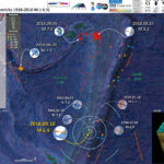
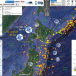
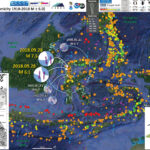
Well, around 3 AM my time (northeastern Pacific, northern CA) there was a sequence of earthquakes including a mainshock with a magnitude M = 7.5. This earthquake happened in a highly populated region of Indonesia.
This area of Indonesia is dominated by a left-lateral (sinistral) strike-slip plate boundary fault system. Sulawesi is bisected by the Palu-Kola / Matano fault system. These faults appear to be an extension of the Sorong fault, the sinistral strike-slip fault that cuts across the northern part of New Guinea.
There have been a few earthquakes along the Palu-Kola fault system that help inform us about the sense of motion across this fault, but most have maximum magnitudes mid M 6.
GPS and block modeling data suggest that the fault in this area has a slip rate of about 40 mm/yr (Socquet et al., 2006). However, analysis of offset stream channels provides evidence of a lower slip rate for the Holocene (last 12,000 years), a rate of about 35 mm/yr (Bellier et al., 2001). Given the short time period for GPS observations, the GPS rate may include postseismic motion earlier earthquakes, though these numbers are very close.
Using empirical relations for historic earthquakes compiled by Wells and Coppersmith (1994), Socquet et al. (2016) suggest that the Palu-Koro fault system could produce a magnitude M 7 earthquake once per century. However, studies of prehistoric earthquakes along this fault system suggest that, over the past 2000 years, this fault produces a magnitude M 7-8 earthquake every 700 years (Bellier et al., 2006). So, it appears that this is the characteristic earthquake we might expect along this fault.
Based on what we know about strike-slip fault earthquakes, the portions of the fault to the north and south of today’s sequence may have an increased amount of stress due to this earthquake. Stay tuned for a Temblor.net report about this earthquake where I discuss this further.
There are reports of a local tsunami with a run-up about 2 meters. However, the UNESCO Sea Level Monitoring Facility (website) does not show any tsunami observations on tide gage data in the region.
Most commonly, we associate tsunamigenic earthquakes with subduction zones and thrust faults because these are the types of earthquakes most likely to deform the seafloor, causing the entire water column to be lifted up. Strike-slip earthquakes can generate tsunami if there is sufficient submarine topography that gets offset during the earthquake. Also, if a strike-slip earthquake triggers a landslide, this could cause a tsunami. We will need to wait until people take a deeper look into this before we can make any conclusions about the tsunami and what may have caused it.
Did you feel this earthquake? If so, fill out the USGS “Did You Feel It?” form here. If not, why not? Probably because you were too far away. The closer to an earthquake, the more strong the shaking intensity and the larger chance of infrastructure damage (roads, houses, etc.). The USGS PAGER alert for this earthquake shows that there are ~282,000 people living in Palu, a city near the epicenter. The estimate for shaking intensity is a MMI VI, which could result in light damage for resistant structures and moderate damage for vulnerable structures. More about USGS PAGER alerts here. There exists a possibility that there were more than 100 fatalities from this earthquake.

UPDATE 2018.09.28 23:00

  • There have been tsunami waves recorded on a tide gage over 300 km to the south of the epicenter, at a site called Mumuju. Below is a map and a plot of water surface elevations from this source.


UPDATE 2018.09.29 07:00

I awakened this morning (my time, obviously) to find that there are over 380 reported deaths from this earthquake and tsunami. More on this later in the day (clouds are preparing to our and i need to put some of my stuff under tarps).
I prepared a report for Temblor where we present results of static coulomb stress modeling. Here is that report.

UPDATE 2018.09.29 10:45

Here is a (200 MB) video that I edited slightly. Download here. This was originally posted here.

UPDATE 2018.09.30 17:00

Below is my interpretive poster for this earthquake

I plot the seismicity from the past month, with color representing depth and diameter representing magnitude (see legend). I include earthquake epicenters from 1918-2018 with magnitudes M ≥ 6.0 in one version.
I plot the USGS fault plane solutions (moment tensors in blue and focal mechanisms in orange), possibly in addition to some relevant historic earthquakes.

  • I placed a moment tensor / focal mechanism legend on the poster. There is more material from the USGS web sites about moment tensors and focal mechanisms (the beach ball symbols). Both moment tensors and focal mechanisms are solutions to seismologic data that reveal two possible interpretations for fault orientation and sense of motion. One must use other information, like the regional tectonics, to interpret which of the two possibilities is more likely.
  • I also include the shaking intensity contours on the map. These use the Modified Mercalli Intensity Scale (MMI; see the legend on the map). This is based upon a computer model estimate of ground motions, different from the “Did You Feel It?” estimate of ground motions that is actually based on real observations. The MMI is a qualitative measure of shaking intensity. More on the MMI scale can be found here and here. This is based upon a computer model estimate of ground motions, different from the “Did You Feel It?” estimate of ground motions that is actually based on real observations.
  • I include the slab 2.0 contours plotted (Hayes, 2018), which are contours that represent the depth to the subduction zone fault. These are mostly based upon seismicity. The depths of the earthquakes have considerable error and do not all occur along the subduction zone faults, so these slab contours are simply the best estimate for the location of the fault.

    Magnetic Anomalies

  • In the map below, I include a transparent overlay of the magnetic anomaly data from EMAG2 (Meyer et al., 2017). As oceanic crust is formed, it inherits the magnetic field at the time. At different points through time, the magnetic polarity (north vs. south) flips, the north pole becomes the south pole. These changes in polarity can be seen when measuring the magnetic field above oceanic plates. This is one of the fundamental evidences for plate spreading at oceanic spreading ridges (like the Gorda rise).
  • Regions with magnetic fields aligned like today’s magnetic polarity are colored red in the EMAG2 data, while reversed polarity regions are colored blue. Regions of intermediate magnetic field are colored light purple.
  • We can see the roughly east-west trends of these red and blue stripes. These lines are parallel to the ocean spreading ridges from where they were formed. The stripes disappear at the subduction zone because the oceanic crust with these anomalies is diving deep beneath the Sunda plate (part of Eurasia), so the magnetic anomalies from the overlying Sunda plate mask the evidence for the Australia plate.

    I include some inset figures. Some of the same figures are located in different places on the larger scale map below.

  • In the upper left corner is a map from Bellier et al. (2016) that shows the plate boundary faults in the region. Relative senses of motion across these faults is shown as red arrows. The M 7.5 epicenter is shown as a blue star (as in other figures).
  • In the upper right corner is a larger scale map showing the strike-slip fautls that transect the island of Sulawesi, Indonesia (Bellier, et al., 2006)
  • In the lower right corner is a low angle oblique view of the subducting plates in this region (Hall, 2011). Note the orientation of the Sorong fault and the Sulawesi faults.
  • In the lower left corner is a large scale map showing detailed versions of these fault systems in Sulawesi. Earthquake fault mechanisms are plotted for historic earthquakes. Today’s M 7.5 occurred just to the north of the spatial extent of this map.
  • Here is the map with a month’s seismicity plotted.

  • Here is the map with a centuries worth of seismicity plotted.

Other Report Pages

Some Relevant Discussion and Figures

  • Here is the low angle oblique view of the plate boundaries in this region (Hall., 2011).

  • 3D cartoon of plate boundaries in the Molucca Sea region modified from Hall et al. (1995). Although seismicity identifies a number of plates there are no continuous boundaries, and the Cotobato, North Sulawesi and Philippine Trenches are all intraplate features. The apparent distinction between different crust types, such as Australian continental crust and oceanic crust of the Philippine and Molucca Sea, is partly a boundary inactive since the Early Miocene (east Sulawesi) and partly a younger but now probably inactive boundary of the Sorong Fault. The upper crust of this entire region is deforming in a much more continuous way than suggested by this cartoon.

  • Here is the map from Bellier et al. (2006) that shows the plate boundary faults, along with some other tectonic information.

  • Regional geodynamic sketch that presents the present day deformation model of Sulawesi area (after Beaudouin et al., 2003) and four main deformation systems around the Central Sulawesi block, highlighting the tectonic complexity of Sulawesi. Approximate location of the Central Sulawesi block rotation pole (P) [compatible with both GPS measurements (Walpersdorf et al., 1998a) and earthquake moment tensor analyses (Beaudouin et al., 2003)], as well as the major active structures are reported. Central Sulawesi Fault System (CSFS) is formed by the Palu–Koro and Matano faults. Arrows correspond to the compression and/or extension directions deduced from both inversion and moment tensor analyses of the focal mechanisms; arrow size being proportional to the deformation rate (e.g., Beaudouin et al., 2003).We also represent the focal mechanism provided by the Harvard CMT database [CMT data base, 2005] for the recent large earthquake (Mw=6.2; 2005/1/23; lat.=0.92° S; long.=120.10° E). The box indicates the approximate location of the Fig. 6 that corresponds to the geological map of the Palu basin region. The bottom inset shows the SE Asia and Sulawesi geodynamic frame where arrows represent the approximate Indo-Australian and Philippines plate motions relative to Eurasia.

  • The is the larger scale map showing the general layout of the strike-slip faults in Sulawesi (Bellier et al., 2006).

  • Sketch map of the Cenozoic Central Sulawesi fault system. ML represents the Matano Lake, and Leboni RFZ, the Leboni releasing fault zone that connects the Palu–Koro and Matano Faults. Triangles indicate faults with reverse component (triangles on the upthrown block). On this map are reported the fault kinematic measurement sites.

  • Here is a spectacular photo/sketch pair that demonstrates the excellent geomorphic evidence for this strike-slip fault (Bellier et al., 2006).The stream channels that flow down the alluvial fan in this photo are typical of the features that were used to evaluate the Holocene slip rate. There is a modest amount of vertical motion across this fault in places, causing the formation of basins like the Palu Palu Basin (a graben). The city of Palu is in the center of the Palu Palu Basin.

  • West-looking view of the Palu–Koro fault escarpment SSW of the Palu basin showing faceted spurs and a left-lateral offset of an alluvial fan. At the bottom, sketch of the photograph where white arrows point to the fault trace and black arrows point to the cumulate fan offset along the fault traces.

  • This map shows how Palu is situated relative to this fault system (Bellier et al., 2006).

  • Simplified geological map of the Palu domain (modified after Sukamto, 1973) where are reported the locations of fission-track samples. 1 — Holocene alluvial deposits; 2 — Quaternary coral reef terraces; 3 — Mio-quaternary molasses, 4 — Mio-quaternary granitic rocks and granodiorites, 5 — Middle to Upper Eocene Tinombo Formation metamorphism, 6 — Tinombo Formation magmatism, 7 and 8 — metamorphic bedrock (7 — Cretaceous Latimonjong Formation; 8 — Triassic-Jurassic Gumbasa Formation).

  • Some early GPS analysis was conducted by Waldpersdorf et al. (1998). Below is a map showing the location of these GPS observations relative tot he Palu-Koro fault.

  • The area of convergence of the Eurasian, Philippine and Australian plate is characterized by the Sula block motion. Active block boundaries are the North Sulawesi trench *(1)., the Palu-Koro (2), and the Matano (3) faults. The Palu transect is indicated buy the box, with a zoom presented in the inset. Furthermore, the two largest earthquakes (CMT) occurring during the observation period are indicated.

  • Here is a map that shows the GPS velocities as vectors in the region of Palu, Indonesia (Waldpersdorf et al., 1998).

  • Velocities of the Palu transect stations, with respect to the PALU station. Error ellipses correspond to formal uncertainties of the global solution with a confidence level of 90%.

  • Here are the Waldpersdorf et al. (1998) velocities plotted on a chart.

  • Transect station velocity components parallel to the fault, with the co-seismic deformation due to the Jan. 1996 earthquake removed. They are indicated in function of their distance to the fault. The dark grey line shows best model values (5.5 cm/yr total velocity, 12 km locking depth). Lighter grey lines correspond to locking depths of 8 and 16 km, marking an uncertainty of +-4 km.

  • Below are updated results from GPS and block model analyses from Socquet et al. (2006). Arrows are vectors that represent plate motion velocity in mm/yr (scale in upper right corner). Note how the velocities are different on either side of the Palu-Koro fault.

  • GPS velocities of Sulawesi and surrounding sites with respect to the Sunda Plate. Grey arrows belong to the Makassar Block, black arrows belong to the northern half of Sulawesi, and white arrows belong to non-Sulawesi sites (99% confidence ellipses). Numbers near the tips of the vectors give the rates in mm/yr. The main tectonic structures of the area are shown as well.

  • This map shows models plate motion velocities as informed by their block model.

  • Rotational part of the inferred velocity field in the Sulawesi area (relative to the Sunda Plate) as predicted by the Euler vectors of the best fit model (model 2). Error ellipses of predicted vectors show the 99% level of confidence. Also shown are poles of rotation and error ellipses (with respect to the Sunda Plate) from the best fit model. Curved arrows indicate the sense of rotation, and numbers indicate the rotation rate. MAKA, Makassar Block; MANA, Manado Block; ESUL, East Sula Block; NSUL, North Sula Block.

  • Here is a map that shows the plate boundary slip velocities as color (Socquet et al., 2006).

  • Best fit block model derived from both GPS and earthquakes slip vector azimuth data. Center: Observed (red) and calculated (green) velocities with respect to the Sunda Block (shown are 20% confidence ellipses, after GPS reweighting; see text). The slip rate deficit (mm/yr) for the faults included in the model is represented by a color bar. The profile of Figure 7 is located by the dashed black line. The black rectangles around Palu and Gorontalo faults localize the insets. Top right and bottom left insets show details of the measured and modeled velocities across the Gorontalo and Palu faults. The bottom right inset shows residual GPS velocities with respect to the model. The value of the coupling ratio, j, for the faults included in the model is represented by the color bar. Light blue dots represent the locations of the fault nodes where the coupling ratio is estimated. Nodes along the block boundaries are at the surface of the Earth, and the others are at depth along the fault plane. In this model, j is considered uniform along strike and depth for all the faults, except for Palu Fault and Minahassa Trench, where it is allowed to vary along strike.

  • This plot is similar to the one above, which shows how different GPS observations have different plate motion velocities relative to the faults in the area (Socquet et al., 2006).

  • Velocity profile across Makassar Trench, Palu Fault, and Gorontalo Fault (profile location in Figure 6) in Sunda reference frame. Observed GPS velocities are depicted by dots with 1-sigma uncertainty bars, while the predicted velocities are shown as curves. The profile normal component (approximately NNW) (i.e., the strike-slip component across the NW trending faults) is shown with black dots and solid line, while the profile-parallel component (normal or thrust component across the fault) is shown with grey dots and a dashed line. Where the profile crosses the faults and blocks is labeled.

  • Here are their results plotted on a map (Socquet et al., 2006).

  • (top) GPS velocities in Palu area relative to station WATA. STRM topography is used as background. (bottom) Four parallel elastic dislocations that fit best the velocities in the Palu fault zone. The fault-parallel component of the GPS velocities (with 1-sigma error bars) is plotted with respect to their distance to the main fault scarp, in the North Sula Block reference frame. The black curve represents the fault-parallel modeled velocity of the four strand model. For comparison, the fault-parallel modeled velocity predicted by the single fault model is also plotted (grey dashed curve). The location of the modeled dislocation is represented as vertical bars for each model (black and dashed grey lines, respectively).

  • Here is the fault map from Watkinson and Hall (2017).

  • Central Sulawesi overview digital elevation model (SRTM), CMT catalogue earthquakes, 35 km depth and structures that show geomorphic evidence of Quaternary tectonic activity. Rivers marked in white. Illumination from NE.

  • Here is another fantastic view of the geomorphology associated with the Palu-Koro fault (Watkinson and Hall, 2017). The hanging valley is evidence for normal displacement (extension) along this fault. Wine glass canyons are evidence for differential uplift.

  • (a) The Palu and Sapu valleys showing structures that with geomorphic evidence of Quaternary tectonic activity, plus topography and drainage. Mountain front sinuosity values in bold italic text. For location, see Figure 4. Major drainage basins for Salo Sapu and Salo Wuno are marked, separated by uplift at the western end of the Sapu valley fault system. (b) View of the Palu–Koro Fault scarp from the Palu valley, showing geomorphic evidence of Quaternary tectonic activity.

  • In this case, we can see how the river meanders are controlled by the fault. Places where stream offsets were used to measure slip rate are also shown (Watkinson and Hall, 2017).

  • Evidence of a cross-basin fault system within the Palu valley Quaternary fill. (a) Overview ASTER digital elevation model draped with ESRI imagery layer. Illumination from NW. Palu River channels traced from six separate images from 2003 to 2015. Inset shows fault pattern developed in an analogue model of a releasing bend, modified after Wu et al. (2009), reflected and rotated to mimic the Palu valley. Sidewall faults and cross-basin fault system are highlighted in the model and on the satellite imagery. (b, c) Laterally confined meander belts, interpreted as representing minor subsidence within the cross-basin fault system. (d) Laterally confined river channels directly along-strike from a Palu–Koro Fault strand seen to offset alluvial fans in the south of the valley. (c, d, e) showESRI imagery.

Geologic Fundamentals

  • For more on the graphical representation of moment tensors and focal mechnisms, check this IRIS video out:
  • Here is a fantastic infographic from Frisch et al. (2011). This figure shows some examples of earthquakes in different plate tectonic settings, and what their fault plane solutions are. There is a cross section showing these focal mechanisms for a thrust or reverse earthquake. The upper right corner includes my favorite figure of all time. This shows the first motion (up or down) for each of the four quadrants. This figure also shows how the amplitude of the seismic waves are greatest (generally) in the middle of the quadrant and decrease to zero at the nodal planes (the boundary of each quadrant).

  • Here is another way to look at these beach balls.
  • There are three types of earthquakes, strike-slip, compressional (reverse or thrust, depending upon the dip of the fault), and extensional (normal). Here is are some animations of these three types of earthquake faults. The following three animations are from IRIS.
  • Strike Slip:

    Compressional:

    Extensional:

  • This is an image from the USGS that shows how, when an oceanic plate moves over a hotspot, the volcanoes formed over the hotspot form a series of volcanoes that increase in age in the direction of plate motion. The presumption is that the hotspot is stable and stays in one location. Torsvik et al. (2017) use various methods to evaluate why this is a false presumption for the Hawaii Hotspot.

  • A cutaway view along the Hawaiian island chain showing the inferred mantle plume that has fed the Hawaiian hot spot on the overriding Pacific Plate. The geologic ages of the oldest volcano on each island (Ma = millions of years ago) are progressively older to the northwest, consistent with the hot spot model for the origin of the Hawaiian Ridge-Emperor Seamount Chain. (Modified from image of Joel E. Robinson, USGS, in “This Dynamic Planet” map of Simkin and others, 2006.)

  • Here is a map from Torsvik et al. (2017) that shows the age of volcanic rocks at different locations along the Hawaii-Emperor Seamount Chain.

  • Hawaiian-Emperor Chain. White dots are the locations of radiometrically dated seamounts, atolls and islands, based on compilations of Doubrovine et al. and O’Connor et al. Features encircled with larger white circles are discussed in the text and Fig. 2. Marine gravity anomaly map is from Sandwell and Smith.

    References:

  • Bellier, O., Sebrier, M., Beaudouin, T., Villenueve, M., Braucher, R., Bourles, D., Siame, L., Putranto, E., and Pratomo, I., 2001. High slip rate for a low seismicity along the Palu-Koro active fault in central Sulawesi (Indonesia) in Terra Nova, v. 13, No. 6, p. 463-470
  • Bellier, O., Sebrier, M., Seward, D., Beaudouin, T., Villenueve, M., and Putranto, E., 2006. Fission track and fault kinematics analyses for new insight into the Late Cenozoic tectonic regime changes in West-Central Sulawesi (Indonesia) uin Tectonophysics, v. 413, p. 201-220, doi:10.1016/j.tecto.2005.10.036
  • Hall, R., 2011. Australia-SE Asia collision: plate tectonics and crustal flow in Geological Society, London, Special Publications 2011; v. 355; p. 75-109 doi: 10.1144/SP355.5
  • Hayes, G., 2018, Slab2 – A Comprehensive Subduction Zone Geometry Model: U.S. Geological Survey data release, https://doi.org/10.5066/F7PV6JNV.
  • Meyer, B., Saltus, R., Chulliat, a., 2017. EMAG2: Earth Magnetic Anomaly Grid (2-arc-minute resolution) Version 3. National Centers for Environmental Information, NOAA. Model. doi:10.7289/V5H70CVX
  • Socquet, A., W. Simons, C. Vigny, R. McCaffrey, C. Subarya, D. Sarsito, B. Ambrosius, and W. Spakman (2006), Microblock rotations and fault coupling in SE Asia triple junction (Sulawesi, Indonesia) from GPS and earthquake slip vector data, J. Geophys. Res., 111, B08409, doi:10.1029/2005JB003963.
  • Watkinson, I.M. and Hall, R., 2017. Fault systems of the eastern Indonesian triple junction: evaluation of Quaternary activity and implications for seismic hazards in Cummins, P. R. &Meilano, I. (eds) Geohazards in Indonesia: Earth Science for Disaster Risk Reduction, Geological Society, London, Special Publications, v. 441, https://doi.org/10.1144/SP441.8,
  • Walpersdorf, A., Rangin, C., and Vigny, C., 1998. GPS compared to long-term geologic motion of the north arm of Sulawesi in EPSL, v. 159, p. 47-55
  • Zahirovic, S., Seton, M., and Müller, R.D., 2014. The Cretaceous and Cenozoic tectonic evolution of Southeast Asia in Solid Earth, v. 5, p. 227-273, doi:10.5194/se-5-227-2014


Earthquake Report: Kermadec

The earthquakes continue, every day. Today, there was a large earthquake associated with the subduction zone that forms the Kermadec Trench.
This earthquake was quite deep, so was not expected to generate a significant tsunami (if one at all).
There are several analogies to today’s earthquake. There was a M 7.4 earthquake in a similar location, but much deeper. These are an interesting comparison because the M 7.4 was compressional and the M 6.9 was extensional. There is some debate about what causes ultra deep earthquakes. The earthquakes that are deeper than about 40-50 km are not along subduction zone faults, but within the downgoing plate. This M 6.9 appears to be in a part of the plate that is bending (based on the Benz et al., 2011 cross section). As plates bend downwards, the upper part of the plate gets extended and the lower part of the plate experiences compression.
This is my first earthquake report to utilize the new slab contours (Slab 2.0) from Hayes (2018).
There has been a recent sequence of ultra deep earthquakes in the Fiji region, as well as subduction zone related earthquakes along the southern New Hebrides Trench. These links lead to my earthquake reports for those two regions: Fiji and New Hebrides.

Below is my interpretive poster for this earthquake

I plot the seismicity from the past month, with color representing depth and diameter representing magnitude (see legend). I include earthquake epicenters from 1918-2018 with magnitudes M ≥ 6.5 in one version.
I plot the USGS fault plane solutions (moment tensors in blue and focal mechanisms in orange), possibly in addition to some relevant historic earthquakes.

  • I placed a moment tensor / focal mechanism legend on the poster. There is more material from the USGS web sites about moment tensors and focal mechanisms (the beach ball symbols). Both moment tensors and focal mechanisms are solutions to seismologic data that reveal two possible interpretations for fault orientation and sense of motion. One must use other information, like the regional tectonics, to interpret which of the two possibilities is more likely.
  • I also include the shaking intensity contours on the map. These use the Modified Mercalli Intensity Scale (MMI; see the legend on the map). This is based upon a computer model estimate of ground motions, different from the “Did You Feel It?” estimate of ground motions that is actually based on real observations. The MMI is a qualitative measure of shaking intensity. More on the MMI scale can be found here and here. This is based upon a computer model estimate of ground motions, different from the “Did You Feel It?” estimate of ground motions that is actually based on real observations.
  • I include the slab 2.0 contours plotted (Hayes, 2018), which are contours that represent the depth to the subduction zone fault. These are mostly based upon seismicity. The depths of the earthquakes have considerable error and do not all occur along the subduction zone faults, so these slab contours are simply the best estimate for the location of the fault.

    Magnetic Anomalies

  • In the map below, I include a transparent overlay of the magnetic anomaly data from EMAG2 (Meyer et al., 2017). As oceanic crust is formed, it inherits the magnetic field at the time. At different points through time, the magnetic polarity (north vs. south) flips, the north pole becomes the south pole. These changes in polarity can be seen when measuring the magnetic field above oceanic plates. This is one of the fundamental evidences for plate spreading at oceanic spreading ridges (like the Gorda rise).
  • Regions with magnetic fields aligned like today’s magnetic polarity are colored red in the EMAG2 data, while reversed polarity regions are colored blue. Regions of intermediate magnetic field are colored light purple.

    I include some inset figures. Some of the same figures are located in different places on the larger scale map below.

  • In the upper right corner is a plate tectonic map from Ballance et al. (1999) that shows the plate boundary faults in this region of the western Pacific. This shows that the Pacific plate subducts westward beneath the Australia plate. I placed a blue star in the general location of the M 6.9 earthquake (same for other inset figures).
  • In the upper left corner is a portion of the map from Benz et al. (2011) that shows earthquake epicenters with color representing depth and diameter representing magnitude. There are several cross sectional data prepared and the location for these cross sections is shown on the map.
  • In the lower left corner is cross section J-J’ that shows earthquake hypocenters (3-D locations) in the region of the M 6.9 earthquake.
  • In the lower right corner, there is a cross section of the Kermadec trench that includes bathymetry of the region (topography of the sea floor). This graphic was created by scientists at Woods Hole. I label the Louisville Seamount Chain for reference to compare with the main map.
  • Here is the map with a month’s seismicity plotted.

  • Here is the map with a centuries seismicity plotted.

Other Report Pages

Some Relevant Discussion and Figures

  • Here is the tectonic map from Ballance et al., 1999.

  • Map of the Southwest Pacific Ocean showing the regional tectonic setting and location of the two dredged profiles. Depth contours in kilometres. The presently active arcs comprise New Zealand–Kermadec Ridge–Tonga Ridge, linked with Vanuatu by transforms associated with the North Fiji Basin. Colville Ridge–Lau Ridge is the remnant arc. Havre Trough–Lau Basin is the active backarc basin. Kermadec–Tonga Trench marks the site of subduction of Pacific lithosphere westward beneath Australian plate lithosphere. North and South Fiji Basins are marginal basins of late Neogene and probable Oligocene age, respectively. 5.4sK–Ar date of dredged basalt sample (Adams et al., 1994).

  • Here is a great summary of the fault mechanisms for earthquakes along this plate boundary (Yu, 2013).

  • Large subduction-zone interplate earthquakes (large open gray stars) labeled with event date, Mw, GCMT focal mechanisms, and GPS velocity vectors (gray arrows and black triangles labeled with station name). GPS velocities are listed in Table 3. Black lines indicate the Tonga–Kermadec and Vanuatu trenches. Note that the 2009/09/29 Samoa–Tonga outer trench-slope event (Mw 8.1) triggered large interplate doublets (both of Mw 7.8; Lay et al., 2010). The Pacific plate subducts westward beneath the Australian plate along the Tonga–Kermadec trench, whereas the Australian plate subducts eastward beneath the Vanuatu arc and North Fiji basin. The opposite orientation between the Tonga–Kermadec and Vanuatu subduction systems is due to complex and broad back-arc extension in the Lau and North Fiji basins (Pelletier et al., 1998).


    Regional map of moderate-sized (mb > 4:7) shallow-focus repeating earthquakes and background seismicity along the (a) Tonga–Kermadec and (b) Vanuatu (former New Hebrides) subduction zones. Shallow repeating earthquakes (black stars) and their available Global Centroid Moment Tensor (GCMT; Dziewoński et al., 1981; Ekström et al., 2003) are labeled with event date and doublet/cluster id where applicable. Colors of GCMT are used to distinguish nearby different repeaters. Source parameters for the clusters and doublets are listed in Tables 1 and 2. Background seismicity is shown as gray dots and large interplate earthquakes (moment magnitude, Mw > 7:3) since 1976 are shown as large open gray stars. Black lines indicate the trench (Bird, 2003) and slab contour at 50-km depth (Gudmundsson and Sambridge, 1998). Repeating earthquake clusters in the (a) T1 and T2 plate-interface regions in Tonga and (b) V3 plate-interface region in Vanuatu are used to study the fault-slip rate ( _d). A regional map of the Tonga–Kermadec–Vanuatu subduction zones is
    shown in the inset figure, with the gray dotted box indicating the expanded region in the main figure.

  • Here is a 3-D view of the subducting slab along the Tonga Trench (Green, 2007). While this is to the north of where the M 6.9 happened, it helps us visualize the geometry of the subducting slab. Note how there is a different shape to the slab to the north than to the south. Take a look at the seismicity map in Benz et al., 2011 for comparison.

  • Earthquakes and subducted slabs beneath the Tonga–Fiji area. The subducting slab and detached slab are defined by the historic earthquakes in this region: the steeply dipping surface descending from the Tonga Trench marks the currently active subduction zone, and the surface lying mostly between 500 and 680 km, but rising to 300 km in the east, is a relict from an old subduction zone that descended from the fossil Vitiaz Trench. The locations of the mainshocks of the two Tongan earthquake sequences discussed by Tibi et al.2 are marked in yellow (2002 sequence) and orange (1986 series). Triggering mainshocks are denoted by stars; triggered mainshocks by circles. The 2002 sequence lies wholly in the currently subducting slab (and slightly extends the earthquake distribution in it),whereas the 1986 mainshock is in that slab but the triggered series is located in the detached slab,which apparently contains significant amounts of metastable olive.

  • This is a figure from de Paor et al. (2012) that shows cross sections along the Tonga/Kermadec system. These cross sections are based on “seismic tomographic” methods. Seismic tomography is similar to CT scans, which are “computed tomography” using X-Rays. Seismic tomography uses seismic waves to interrogate Earth’s interior and are calculated using the same general concepts that are used to resolve differences in density using CT scans (“cat scans”). The colors represent the relative seismic velocity of different parts of the lithosphere. Cool colors represent higher velocities, which are found in cold slabs (compared to warmer mantle, where seismic velocities are slower). These authors use the faster velocities to locate the subducting slab. The M 6.9 earthquake happened between cross sections B and C, but the geometry in that area looks more similar to cross section C.

  • This is a schematic illustration showing the interpretation from Chang et al. (2015) of the geometry of these subducting slabs. Compare with the Green (2007) figure above.

  • A schematic diagram illustrating the slab–plume interaction beneath the Tonga–Kermadec arc. Cyan lines on the surface show trenches, as shown in Fig. 1. HP, Hikurangi Plateau; KT, Kermadec Trench; NHT, New Hebrides Trench; TT, Tonga Trench; VT, Vitiaz Trench. The Samoan plume originates from a Mega ULVZ at the core–mantle boundary (CMB). The buoyancy caused by large stress from the plume at the bottom of the Tonga slab may contribute to the slab stagnation within the mantle transition zone, while the Kermadec slab is penetrating into the lower mantle directly. At the northern end of the Tonga slab, plume materials migrate into the mantle wedge, facilitated by strong toroidal flow around the slab edge induced by fast slab retreat

  • Here is a fantastic summary of the plate boundary in this region (Bird, 2003). There are so many earthquakes here that their symbols overlap each other.

  • Boundaries (heavy colored lines) of the New Hebrides (NH), Balmoral Reef (BR), Conway Reef (CR), and Futuna (FT) plates. All are included in the New Hebrides-Fiji orogen because of evidence that they may be deforming rapidly. Surrounding plates are Australia (AU), Tonga (TO), Niuafo’ou (NI), and Pacific (PA). Conventions as in Figure 2, except coastlines are blue. Oblique Mercator projection on great circle passing E-W through (17°S, 174°E).

  • Here is another map of the bathymetry in this region of the Kermadec trench. This was produced by Jack Cook at the Woods Hole Oceanographic Institution. The Lousiville Seamount Chain is clearly visible in this graphic.

  • I put together an animation of seismicity from 1965 – 2015 Sept. 7. Here is a map that shows the entire seismicity for this period. I plot the slab contours for the subduction zone here. These were created by the USGS (Hayes et al., 2012).

  • Here is the animation. Download the mp4 file here. This animation includes earthquakes with magnitudes greater than M 6.5 and this is the kml file that I used to make this animation.
  • Finally, I would like to show a figure prepared by Dr. Gavin Hayes (USGS) that shows the relations between the two ultra deep earthquakes near Fiji. I did not prepare a report for the M 7.9 earthquake on 2018.09.06, which is the main reason I included this information in this report. Dr. Hayes shows earthquake fault mechanisms (viewed from their side) relative to depth (along with earthquake hypocenters for smaller magnitude earthquakes). The geometry for the downgoing slab is shown as a purple dashed-dotted line. More can be found about this M 7.9 earthquake here.

Geologic Fundamentals

  • For more on the graphical representation of moment tensors and focal mechnisms, check this IRIS video out:
  • Here is a fantastic infographic from Frisch et al. (2011). This figure shows some examples of earthquakes in different plate tectonic settings, and what their fault plane solutions are. There is a cross section showing these focal mechanisms for a thrust or reverse earthquake. The upper right corner includes my favorite figure of all time. This shows the first motion (up or down) for each of the four quadrants. This figure also shows how the amplitude of the seismic waves are greatest (generally) in the middle of the quadrant and decrease to zero at the nodal planes (the boundary of each quadrant).

  • Here is another way to look at these beach balls.
  • There are three types of earthquakes, strike-slip, compressional (reverse or thrust, depending upon the dip of the fault), and extensional (normal). Here is are some animations of these three types of earthquake faults. The following three animations are from IRIS.
  • Strike Slip:

    Compressional:

    Extensional:

  • This is an image from the USGS that shows how, when an oceanic plate moves over a hotspot, the volcanoes formed over the hotspot form a series of volcanoes that increase in age in the direction of plate motion. The presumption is that the hotspot is stable and stays in one location. Torsvik et al. (2017) use various methods to evaluate why this is a false presumption for the Hawaii Hotspot.

  • A cutaway view along the Hawaiian island chain showing the inferred mantle plume that has fed the Hawaiian hot spot on the overriding Pacific Plate. The geologic ages of the oldest volcano on each island (Ma = millions of years ago) are progressively older to the northwest, consistent with the hot spot model for the origin of the Hawaiian Ridge-Emperor Seamount Chain. (Modified from image of Joel E. Robinson, USGS, in “This Dynamic Planet” map of Simkin and others, 2006.)

  • Here is a map from Torsvik et al. (2017) that shows the age of volcanic rocks at different locations along the Hawaii-Emperor Seamount Chain.

  • Hawaiian-Emperor Chain. White dots are the locations of radiometrically dated seamounts, atolls and islands, based on compilations of Doubrovine et al. and O’Connor et al. Features encircled with larger white circles are discussed in the text and Fig. 2. Marine gravity anomaly map is from Sandwell and Smith.

    Social Media

    References:

  • Ballance, P.F., ablaev, A.G., Pushchin, I.K., Pletnev, S.P., Birylina, M.G., Itaya, T., Follas, H.A., and Gibson, G.W., 1999. Morphology and history of the Kermadec trench–arc–backarc basin–remnant arc system at 30 to 32°S: geophysical profile, microfossil and K–Ar data in Marine Geology, v. 149, p. 35-62.
  • Bird, P., 2003. An updated digital model of plate boundaries in Geochemistry, Geophysics, Geosystems, v. 4, doi:10.1029/2001GC000252, 52 p.
  • Benz, H.M., Herman, Matthew, Tarr, A.C., Furlong, K.P., Hayes, G.P., Villaseñor, Antonio, Dart, R.L., and Rhea, Susan, 2011. Seismicity of the Earth 1900–2010 eastern margin of the Australia plate: U.S. Geological Survey Open-File Report 2010–1083-I, scale 1:8,000,000.
  • Chang, S-J., Ferreira, A.M.G., and Faccenda, M., 2016. Upper- and mid-mantle interaction between the Samoan plume and the Tonga–Kermadec slabs in Nature Communications, v. 7, DOI: 10.1038/ncomms10799
  • Green, H.W.II, 2007. Shearing instabilities accompanying high-pressure phase transformations and the mechanics of deep earthquakes in PNAS, v. 104, no. 22, p. 9133-9138, www.pnas.org/cgi/doi/10.1073/pnas.0608045104
  • Hayes, G., 2018, Slab2 – A Comprehensive Subduction Zone Geometry Model: U.S. Geological Survey data release, https://doi.org/10.5066/F7PV6JNV.

Return to the Earthquake Reports page.


°

ñ

Earthquake Report: Hokkaido, Japan

Following the largest typhoon to strike Japan in a very long time, there was an earthquake on the island of Hokkaido, Japan today. There is lots on social media, including some spectacular views of disastrous and deadly landslides triggered by this earthquake (earthquakes are the number 1 source for triggering of landslides). These landslides may have been precipitated (sorry for the pun) by the saturation of hillslopes from the typhoon. Based upon the USGS PAGER estimate, this earthquake has the potential to cause significant economic damages, but hopefully a small number of casualties. As far as I know, this does not incorporate potential losses from earthquake triggered landslides [yet].
This earthquake is in an interesting location. to the east of Hokkaido, there is a subduction zone trench formed by the subduction of the Pacific plate beneath the Okhotsk plate (on the north) and the Eurasia plate (to the south). This trench is called the Kuril Trench offshore and north of Hokkaido and the Japan Trench offshore of Honshu.
The okhotsk plate is considered part of the North America plate on some maps. The location of the plate boundary of the Okhotsk plate are not well understood (e.g. using GPS plate motion velocities, it is difficult to find the northern boundary with the North America plate).
Many of the earthquakes in this region are related to the subduction zone. Most notably is the 2011 Tohoku-oki M 9.1 tsunamigenic earthquake. More background information about the 2011 earthquake can be found here and information about the tsunami can be found here.
The 2011 earthquake had lots of aftershocks and was quite complicated. One interesting thing that happened is that there was an extensional earthquake in the Pacific plate to the west of the Japan Trench. This M 7.7 earthquake happened along faults formed as the Pacific plate bends near where it meets the trench. Similar subduction zone / outer rise earthquake pairs are known, including some along the New Hebrides Trench in the western equatorial Pacific ocean, as well as further north along the Kuril subduction zone. I spend time discussing the 2006/2007 Kuril earthquake pair in this report.
There was also a subduction zone earthquake in 2003, the Tokachi-oki earthquake, that triggered submarine landslides. These landslides transformed into turbidity currents and these were directly observed with offshore instrumentation.
One of the interesting things about this region is that there is a collision zone (a convergent plate boundary where two continental plates are colliding) that exists along the southern part of the island of Hokkaido. The Hidaka collision zone is oriented (strikes) in a northwest orientation as a result of northeast-southwest compression. Some suggest that this collision zone is no longer very active, however, there are an abundance of active crustal faults that are spatially coincident with the collision zone.
Today’s M 6.6 earthquake is a thrust or reverse earthquake that responded to northeast-southwest compression, just like the Hidaka collision zone. However, the hypocentral (3-D) depth was about 33 km. This would place this earthquake deeper than what most of the active crustal faults might reach. The depth is also much shallower than where we think that the subduction zone megathrust fault is located at this location (the fault formed between the Pacific and the Okhotsk or Eurasia plates). Based upon the USGS Slab 1.0 model (Hayes et al., 2012), the slab (roughly the top of the Pacific plate) is between 80 and 100 km. So, the depth is too shallow for this hypothesis (Kuril Trench earthquake) and the orientation seems incorrect. Subduction zone earthquakes along the trench are oriented from northwest-southweast compression, a different orientation than today’s M 6.6.
So today’s M 6.6 earthquake appears to have been on a fault deeper than the crustal faults, possibly along a deep fault associated with the collision zone. Though I am not really certain. This region is complicated (e.g. Kita et al., 2010), but there are some interpretations of the crust at this depth range (Iwasaki et al., 2004) shown in an interpreted cross section below.
I present more about the basics behind ground shaking, triggered landslides, and possible earthquake triggering on Temblor here:

Below is my interpretive poster for this earthquake

I plot the seismicity from the past month, with color representing depth and diameter representing magnitude (see legend). I include earthquake epicenters from 1918-2018 with magnitudes M ≥ 6.5 in one version.
I plot the USGS fault plane solutions (moment tensors in blue and focal mechanisms in orange), possibly in addition to some relevant historic earthquakes.
I also include active crustal faults from the Coordinating Committee for Geoscience Programmes in East and Southeast Asia (CCOP). Note the abundance of north-northwest oriented yellow lines to the east of today’s earthquakes. While today’s earthquake was not on those crustal faults, the earthquakes and these faults are responding to similarly oriented tectonic stresses.

  • I placed a moment tensor / focal mechanism legend on the poster. There is more material from the USGS web sites about moment tensors and focal mechanisms (the beach ball symbols). Both moment tensors and focal mechanisms are solutions to seismologic data that reveal two possible interpretations for fault orientation and sense of motion. One must use other information, like the regional tectonics, to interpret which of the two possibilities is more likely.
  • I also include the shaking intensity contours on the map. These use the Modified Mercalli Intensity Scale (MMI; see the legend on the map). This is based upon a computer model estimate of ground motions, different from the “Did You Feel It?” estimate of ground motions that is actually based on real observations. The MMI is a qualitative measure of shaking intensity. More on the MMI scale can be found here and here. This is based upon a computer model estimate of ground motions, different from the “Did You Feel It?” estimate of ground motions that is actually based on real observations.
  • I include the slab contours plotted (Hayes et al., 2012), which are contours that represent the depth to the subduction zone fault. These are mostly based upon seismicity. The depths of the earthquakes have considerable error and do not all occur along the subduction zone faults, so these slab contours are simply the best estimate for the location of the fault.

    Magnetic Anomalies

  • In the map below, I include a transparent overlay of the magnetic anomaly data from EMAG2 (Meyer et al., 2017). As oceanic crust is formed, it inherits the magnetic field at the time. At different points through time, the magnetic polarity (north vs. south) flips, the north pole becomes the south pole. These changes in polarity can be seen when measuring the magnetic field above oceanic plates. This is one of the fundamental evidences for plate spreading at oceanic spreading ridges (like the Gorda rise).
  • Regions with magnetic fields aligned like today’s magnetic polarity are colored red in the EMAG2 data, while reversed polarity regions are colored blue. Regions of intermediate magnetic field are colored light purple.
  • Note the parallel magnetic anomalies to the east of Japan. These were formed about 150 million years ago at the spreading center where this portion of the Pacific plate was created. More can be found about the creation of the Pacific plate in Boschman and van Hinsbergen, 2(016).

    I include some inset figures. Some of the same figures are located in different places on the larger scale map below.

  • In the upper right corner is a low angle oblique view of the tectonic configuration in this region. Note how many subduction zones are that are interacting in different ways. This is from the AGU blog, “Trembling Earth.” I place a blue star in the general location of today’s earthquakes (same for other figures in this poster).
  • In the lower right corner is a plate tectonic map of this part of the world (Liu et al., 2013). The major plate boundary faults are shown, along with the volcanoes in the magmatic arcs. Also, seismicity is shown (the 2011 earthquake as a small blue star) and the slab contours for the Pacific and Philippine Sea plates. Color shows the age of the oceanic crust. These authors place the southern boundary of the Okhotsk plate further to the south (dashed black line), where the Izu Collision Zone intersects Japan (near the intersection of the magmatic arc associated with the Izu-Bonin Trench, with Japan).
  • In the lower left corner is a geologic map of Japan (van Horne et al., 2016). Note the orientation of the rocks in Hokkaido as they are oriented in a northwest-southeast direction in the area labeled Hidaka Collision. These rocks are oriented this way due to the northeast-southwest convergence. This map places the southern boundary of the Okhotsk plate near where the Hidaka Collision is. Compare this with the Liu map to the right.
  • In the upper left corner is a large scale portion of a figure from NUMO (Kurikami et al., 2009), a publication put together by the N to evaluate the suitability of sites for high level radioactive waste. They considered various geologic hazards in this report. This map shows some key tectonic features and geologic data. I include the legend to the right of the map. The magmatic arc is shown as a red line. The Hidaka Collision Zone is shown as a dashed blue line with arrows showing the direction of collision. The blue arrows show the direction of maximum stress, the stress field. These arrows are pointed in the direction of compression. The convergence direction along the collision zone is oriented well with today’s earthquakes, but the stress field data are not perfectly oriented.
  • Here is the map with a month’s seismicity plotted.

  • Here is the map with a centuries seismicity plotted.

Some Relevant Discussion and Figures

  • This map shows the current tectonic configuration of this region, along with some inherited features from the tectonic past (e.g. green lines). This is from NUMO’s report: “Evaluating Site Suitability for a HLW Repository (Scientific Background and Practical Application of NUMO’s Siting Factors), NUMO-TR-04-04.”

  • Also from the NUMO report, this shows the Niigata-Kobe fold and thrust belt. In addition, this map shows a northwest striking convergent plate boundary along the southeastern boundary of Hokkaido. However, it cannot explain the interesting orientation of the M 6.2 deep (240 km) earthquake.

  • Here is a great figure from Itoh et al. (2005) that shows how they interpret the Hidaka Collision Zone.

  • Maps showing tectonic context around the Japanese Islands (a) and geologic belts in Hokkaido (b; after Kato et al., 1990).

  • This map (also from Itoh et al., 2005) shows the active faults and folds mapped in the region, along with the geology.

  • Geologic map around the Umaoi anticline redrawn from Geological Survey of Japan (2002). Location of active fault and/or fold scarps (after Ikeda et al., 2002) are also shown. buQ and bdQ attached on fault traces are upthrown and downthrown sides of faults, respectively. Sampling points of surface paleomagnetic data is after Kodama et al. (1993).

  • Here is more evidence for the thrust faults associated with the Hidaka Collision Zone (Iwasaki et al., 2004). These authors used seismic refraction and seismic reflection experiments to interpret the deep crustal structures associated with the collision here. The profile shown in the next figure is denoted by the east-west oriented black arrows in the lower part of this figure.

  • Geological map of Central Hokkaido with our seismic refraction/wide-angle reflection profiles and shot points (stars). Seismic reflection lines of the Hokkaido Transect were laid out from shot L-2 to M-5 on the wide-angle line. Reflection lines carried out from 1994 to 1997 in the southernmost part of the HCZ and refraction/wide-angle reflection lines in 1984 and 1992 are also shown. SYB: Sorachi-Yezo Belt; KMB: Kamuikotan Metamorphic Belt; IB: Idon’nappu Belt; HMB: Hidaka Metamorphic Belt; HB: Hidaka Belt; YB: Yubetsu Belt; TB: Tokoro Belt; HMT: Hidaka Main Trust.

  • Here is the interpreted cross section from Iwasaki et al. (2004). Note (1) the thrust faults and (2) the depths for these different structures. There are still regions that are poorly understood. Recall the depth of the M 6.6 earthquake is about 33 km.

  • Geological interpretation of the seismic model. KMB: Kamuikotan Metamorphic Belt; IB: Idon’nappu Belt; HMB: Hidaka Metamorphic Belt; Yz: Yezo Super Group; Sr: Sorachi Group; HMT: Hidaka Main Thrust.

  • Here is the cool tectonic map from Liu et al. (2013). We all like cool maps! (right?)

  • Tectonic settings of the study region (black box). The solid sawtooth lines and the black dashed line denote the plate boundaries (Bird 2003). The red triangles denote the active volcanoes. The blue dashed lines and the pink lines denote the depth contours to the upper boundary of the subducting Pacific slab and that of the subducting Philippine Sea slab, respectively (Hasegawa et al. 2009; Zhao et al. 2012). The topography data are derived from the GEBCO_08 Grid, version 20100927, http://www.gebco.net. The ages of oceanic plates are from M¨uller et al. (2008).

  • This is a very cool figure (also from Liu et al., 2013) that shows a plot of earthquakes from 3 different perspectives. First is the map view. To the right of the map is a plot of earthquakes shown as viewed from the east of the map and this shows the hypocenters. The profile below the map shows a cross section of seismicity as viewed from the south looking north. The original figure includes more maps (A and B).

  • (c) Distribution of the 4803 earthquakes used in
    this study. The black crosses denote 3818 events (Group-1) that occurred under the seismic network. The green dots show 228 events (Group-2) that occurred outside the seismic network, selected from the events relocated by Gamage et al. (2009) using sP depth phases. The red dots denote 757 suboceanic earthquakes (Group-3) that are newly relocated in this work using P-wave, S-wave and sP depth-phase data. (d) East–west and (e) north–south vertical cross-sections of the earthquakes shown in (c).

  • Here is a map from the recent update of the Japan National Seismic Hazard Maps, resulting from knowledge gained following the 2011 M 9.1 earthquake (Fujiwara et al., 2012). The color represents the chance that a region will experience ground shaking at or greater that Japan Meteorological Agency (JMA) seismic intensity 6 in the next 30 years. JMA intensity is a scale of shaking intensity similar to the Modified Mercalli Intensity (MMI) Scale. The numbers are different, so they are difficult to compare. The JMA intensity 6 is similar to MMI X. Today’s earthquakes are in a region of slightly elevated chance of ground shaking (between 6-26%). Today’s M 6.6 earthquake may have reached

  • This is a map from the National Research Institute for Earth Science and Disaster Resilience, where data from the Strong-motion Seismograph Networks in Japan are located. This shows measurements of JMA intensity. It appears that a site near the epicenter (red star) reached JMA intensity 7.

  • This is an animation from the same source showing observations of JMA intensity recorded at the surface throughout Japan. h/t to Jascha Polet for sharing this on twitter.
  • Here is the upper figure showing the tectonic setting (Kurikami et al., 2009). Note how the Okhotsk plate has a strike-slip fault that terminates near the Hidaka Collision Zone (called a forearc-sliver fault, formed because the plate convergence is oblique to the subduction zone fault). I include their figure caption as a blockquote.

  • Tectonic setting of Kyushu within the Japanese island arc. The locations of active faults and volcanoes that have been active in the last 10,000 years are also shown.

  • This is a fantastic educational video from IRIS that discusses the plate tectonics and mentions some earthquakes in the region of Japan.

  • Here is a USGS poster than summarizes the earthquake history and plate geometry for this region. This is the USGS Open File Report 2010-1083-D (Rhea et al., 2010).

Earthquake Triggered Landslides

  • Here is the aerial video from NHK that shows some of the landslides triggered by this sequence of earthquakes today. This comes from a tweet below.
  • Well, here is a great figure from Keefer (1984) that shows that the larger the magnitude of an earthquake, the larger an area can be subject to triggering of landslides from the ground shaking from that earthquake.

  • Area affected by landslides in earthquakes of different magnitudes. Numbers beside data points are earthquakes listed in Table 1. Dots = onshore earthquakes; x = offshore earthquakes. Horizontal bars indicate range in reported magnitudes. Solid line is approximate upper bound enclosing all data.

  • In 2008 there was an earthquake in China with a magnitude M 7.9. Unfortunately this earthquake caused many deaths. Using satellite imagery, geologists identified about 60,000 individual landslides (Gorum et al., 2011). Below is a map that shows the faults in the region, as well as epicenters from the earthquakes from this sequence.

  • Location and 12May 2008Wenchuan earthquake fault surface rupturemap, and focalmechanisms of the main earthquake (12May) and two of the major aftershocks (13 May and 25 May). Also the epicenters of historic earthquakes are indicated. The following faults are indicated: WMF: Wenchuan–Maowen fault; BF: Beichuan–Yingxiu fault; PF: Pengguan fault; JGF: Jiangyou–Guanxian fault; QCF: Qingchuan fault; HYF: Huya fault;MJF:Minjian fault based on the following sources: (Surface rupture: Xu et al., 2009a,b; Epicenter and aftershocks: USGS 2008; Historic earthquakes: Kirby et al., 2000; Li et al., 2008; Xu et al., 2009a,b).

  • This map shows the region where there was a high density of landslides (Fan et al., 2012). Note how the majority of landslides are located near the larger earthquakes (the larger circles in the above map).

  • Distribution of landslide dams triggered by the Wenchuan earthquake, China. The high landslide density zone is defined by a landslide area density >0.1 km−2; also shown are epicenters of historical earthquakes (USGS, 2008) and the historical Diexi landslide dams (Dahaizi, Xiaohaizi and Diexi). White polygons are unmapped due to the presence of clouds and shadows in post-earthquake imagery. WMF: Wenchuan–Maowen fault; YBF: Yingxiu–Beichuan fault; PF: Pengguan fault; JGF: Jiangyou–Guanxian fault; QCF: Qingchuan fault; HYF: Huya fault; MJF: Minjiang fault (after X. Xu et al., 2009). MJR: Minjiang River; MYR: Mianyuan River; JJR: Jianjiang River; QR: Qingjiang River.

  • Many of these landslides dammed rivers, causing an additional hazard. These earthen dams block rivers, leading to a large lake forming upstream of these dams. The dams can be overtopped when the lakes fill with water. once the water reaches the top of the dam, they can overflow and rapidly down cut back to the level of the river prior to the dam emplacement. If this happens too rapidly, a flood can occur, putting those downstream at risk of flooding.

  • Comparison of densities of blocking and non-blocking landslides. (a) Landslide density. (b) Landslide dam point density. White dashed lines are 240-km by 25-km swath profiles. (c). Mean normalized landslide and landslide dam densities along the SW–NE profile. Red lines are Yingxiu-Beichuan fault (YBF) and Pengguan fault (PF). Yellow dash lines are the boundary of the P1–P7 watersheds in the Pengguan Massif. YX, WC, HW, BC, and QC are the cities of Yingxiu, Wenchuan, Hanwang, Beichuan and Qingchuan, respectively. MJR, JJR, FJR, and QR represent Minjiang, Jianjiang, Fujiang and Qingjiang rivers, respectively.

  • In 1959, there was an earthquake in southwestern Montana, the M 7.2 Hebgen Lake Earthquake. This earthquake triggered a landslide that dammed the Madison River. This dam created a lake now called “Earthquake Lake.” I was actually driving on a road trip following my graduation from Oregon State University in 2014. I drove to this area and arrived the day that the Earthquake Lake Visitor Center opened. Pretty cool.
  • Here is a view of the lake as it was in May, 2014. Note the dead trees. The landslide is the bare looking mountainside in the distance on the left. We are looking to the West.

  • Here is a view of the landslide from my truck.

  • Here are all the people waiting to go into the visitor center on opening day.

  • Here is another cool view of the ghost forest.

  • Here is an educational display near the lake. Click on the image and one may zoom in within their browser, or save the image and zoom in that way. The text is readable if one wants to follow along.

  • This is from the poster and shows the landslide dam after it formed.

Geologic Fundamentals

  • For more on the graphical representation of moment tensors and focal mechnisms, check this IRIS video out:
  • Here is a fantastic infographic from Frisch et al. (2011). This figure shows some examples of earthquakes in different plate tectonic settings, and what their fault plane solutions are. There is a cross section showing these focal mechanisms for a thrust or reverse earthquake. The upper right corner includes my favorite figure of all time. This shows the first motion (up or down) for each of the four quadrants. This figure also shows how the amplitude of the seismic waves are greatest (generally) in the middle of the quadrant and decrease to zero at the nodal planes (the boundary of each quadrant).

  • Here is another way to look at these beach balls.
  • There are three types of earthquakes, strike-slip, compressional (reverse or thrust, depending upon the dip of the fault), and extensional (normal). Here is are some animations of these three types of earthquake faults. The following three animations are from IRIS.
  • Strike Slip:

    Compressional:

    Extensional:

  • This is an image from the USGS that shows how, when an oceanic plate moves over a hotspot, the volcanoes formed over the hotspot form a series of volcanoes that increase in age in the direction of plate motion. The presumption is that the hotspot is stable and stays in one location. Torsvik et al. (2017) use various methods to evaluate why this is a false presumption for the Hawaii Hotspot.

  • A cutaway view along the Hawaiian island chain showing the inferred mantle plume that has fed the Hawaiian hot spot on the overriding Pacific Plate. The geologic ages of the oldest volcano on each island (Ma = millions of years ago) are progressively older to the northwest, consistent with the hot spot model for the origin of the Hawaiian Ridge-Emperor Seamount Chain. (Modified from image of Joel E. Robinson, USGS, in “This Dynamic Planet” map of Simkin and others, 2006.)

  • Here is a map from Torsvik et al. (2017) that shows the age of volcanic rocks at different locations along the Hawaii-Emperor Seamount Chain.

  • Hawaiian-Emperor Chain. White dots are the locations of radiometrically dated seamounts, atolls and islands, based on compilations of Doubrovine et al. and O’Connor et al. Features encircled with larger white circles are discussed in the text and Fig. 2. Marine gravity anomaly map is from Sandwell and Smith.

    References:

  • Chapman et al., 2009. Development of Methodologies for the Identification of Volcanic and Tectonic Hazards to Potential HLW Repository Sites in Japan –The Kyushu Case Study-, NUMO-TR-09-02, NOv. 2009, 192 pp.
  • Fan, X., et al., 2012. Transient water and sediment storage of the decaying landslide dams induced by the 2008 Wenchuan earthquake, China in Geomorphology, v. 171-172, p. 58-68, doi:10.1016/j.geomorph.2012.05.003
  • Fujiwara, H., Morikawa, N., Okumura, T., Ishikawa, Y., and Nojima, N., 2012. Revision of Probabilistic Seismic Hazard Assessment for Japan after the 2011 Tohoku-oki Mega-thrust Earthquake (M9.0) in Proceedings of the 15th World Conference on Earthquake Engineering, 15th World Conference on Earthquake Engineering, Lisbon.
  • Gorum, T., Fan, X., van Westen, C.J., Huang, R., Xu, Q., Tang, C., Wang, G., 2011. Distribution pattern of earthquake-induced landslides triggered by the 12 May 2008 Wenchuan earthquake in Geomorphology, v. 133, p. 152-167, doi:10.1016/j.geomorph.2010.12.030
  • Hayes, G. P., D. J. Wald, and R. L. Johnson, 2012. Slab1.0: A three-dimensional model of global subduction zone geometries in J. Geophys. Res., 117, B01302, doi:10.1029/2011JB008524.
  • Itoh, Y., Ishiuyama, T., and Nagasaki, Y., 2005. Deformation mode in the frontal edge of an arc–arc collision zone: subsurface geology, active faults and paleomagnetism in southern central Hokkaido, Japan in Tectonophysics, v. 395, p. 81-97 doi:10.1016/j.tecto.2004.09.003
  • Iwasaki, T., et al., 2004. Upper and middle crustal deformation of an arc–arc collision across Hokkaido, Japan, inferred from seismic refraction/wide-angle reflection experiments in Tectonophysics, v. 388, p. 59-73, doi:10.1016/j.tecto.2004.03.025
  • Keefer, D.K., 1984. Landslides caused by earthquakes in Geological Society of America Bulletin, v. 95, p. 406-421, doi: 10.1130/0016-7606(1984)95<406:LCBE>2.0.CO;2
  • Kurikami et al., 2009. Study on strategy and methodology for repository concept development for the Japanese geological disposal project, NUMO-TR-09-04, Sept. 20-09, 101 pp.
  • Lay, T., and Kanamori, H., 1980, Earthquake doublets in the Solomon Islands: Physics of the Earth and Planetary Interiors, v. 21, p. 283-304.
  • Lay, T., Ammon, C.J., Kanamori, H., Kim, M.J., and Xue, L., 2011. Outer trench-slope faulting and the 2011 Mw 9.0 off the Pacific coast of Tohoku Earthquake in Earth Planets Space, v. 63, p. 713-718.
  • Lay, T., H. Kanamori, C. J. Ammon, A. R. Hutko, K. Furlong, and L. Rivera, 2009. The 2006 – 2007 Kuril Islands great earthquake sequence in J. Geophys. Res., 114, B11308, doi:10.1029/2008JB006280.
  • Liu, X., Zhao, D., and Li, DS., 2013. Seismic heterogeneity and anisotropy of the southern Kuril arc: insight into megathrust earthquakes in Geophysical Journal International, Volume 194, Issue 2, 1 August 2013, Pages 1069–1090, https://doi.org/10.1093/gji/ggt150
  • Meyer, B., Saltus, R., Chulliat, a., 2017. EMAG2: Earth Magnetic Anomaly Grid (2-arc-minute resolution) Version 3. National Centers for Environmental Information, NOAA. Model. doi:10.7289/V5H70CVX
  • Rhea, S., Tarr, A.C., Hayes, G., Villaseñor, A., Furlong, K.P., and Benz, H.M., 2010. Seismicity of the Earth 1900-2007, Kuril-Kamchatka arc and vicinity: U.S. Geological Survey Open-File Report 2010-1083-C, 1 map sheet, scale 1:5,000,000.
  • Van Horne, A., Sato, H., Ishiyama, T., 2017. Evolution of the Sea of Japan back-arc and some unsolved issues in Tectonophysics, v. 710-711, p. 6-20, http://dx.doi.org/10.1016/j.tecto.2016.08.020

Return to the Earthquake Reports page.


°

ñ