Earthquake Report: EOTD Chile M 8.8 2010.02.27

Earthquake of the Day: 2010.02.27 M 8.8 Maule, Chile.
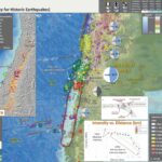
There was an earthquake with a magnitude of M 8.8 on this day in 2010. I have prepared an interpretive poster that shows the extent of ground shaking modeled for this earthquake. The attenuation relations (how the ground shaking diminishes with distance from the rutpure) generally match the ground shaking reports on the USGS “Did You Feel It?” web page.
I also include other material on the poster, including information about the 1960 M 9.5 Chile earthquake, which is the largest that we have ever recorded on modern seismologic instruments. Below are the USGS web pages for these two earthquakes. Here is the kml file for these earthquakes.

Below is my interpretive poster for this earthquake.

I plot the seismicity from the past month, with color representing depth and diameter representing magnitude (see legend). I also include seismicity from 1917-2017 for earthquakes with magnitudes M ≥ 8.0.

  • I placed a moment tensor / focal mechanism legend on the poster. There is more material from the USGS web sites about moment tensors and focal mechanisms (the beach ball symbols). Both moment tensors and focal mechanisms are solutions to seismologic data that reveal two possible interpretations for fault orientation and sense of motion. One must use other information, like the regional tectonics, to interpret which of the two possibilities is more likely. The moment tensor shows northeast-southwest compression, perpendicular to the convergence at this plate boundary. Most of the recent seismicity in this region is associated with convergence along the New Britain trench or the South Solomon trench.
  • I also include the shaking intensity contours on the map. These use the Modified Mercalli Intensity Scale (MMI; see the legend on the map). This is based upon a computer model estimate of ground motions, different from the “Did You Feel It?” estimate of ground motions that is actually based on real observations. The MMI is a qualitative measure of shaking intensity. More on the MMI scale can be found here and here. This is based upon a computer model estimate of ground motions, different from the “Did You Feel It?” estimate of ground motions that is actually based on real observations.
  • I include the slab contours plotted (Hayes et al., 2012), which are contours that represent the depth to the subduction zone fault. These are mostly based upon seismicity. The depths of the earthquakes have considerable error and do not all occur along the subduction zone faults, so these slab contours are simply the best estimate for the location of the fault. The hypocentral depth plots this close to the location of the fault as mapped by Hayes et al. (2012).

    I include some inset figures in the poster.

  • In the upper right corner, I include a time-space diagram from Moernaut et al. (2010).
  • In the upper left corner I include an inset map from the USGS Seismicity History poster for this region (Rhea et al., 2010). There is one seismicity cross section with its locations plotted on the map. The USGS plot these hypocenters along this cross section and I include that below (with the legend).
  • In the lower right corner are the MMI intensity maps for the two earthquakes listed above: 1960 M 9.5 & 2010 M 8.8. Note these are at different map scales.


Here is a version that includes the MMI contours for the 1960 earthquake as well.

  • Here is a great figure from Lin et al. (2013) that shows the tectonic context of the 2010 Maule earthquake. On the map are plotted extents of historic earthquakes along this convergent plate margin. On the right is a large scale map showing the active magmatic arc volcanoes associated with this subduction zone. Finally, there is a cross section showing where the coseismic slip and postseismic slip occurred. I include the figure captions as blockquote.

  • (a) Regional tectonic map showing slab isodepth contours (blue lines) [Cahill and Isacks, 1992], M>=4 earthquakes from the National Earthquake Information Center catalog between 1976 and 2011 (yellow circles for depths less than 50 km, and blue circles for depths greater than 50 km), active volcanoes (red triangles), and the approximate extent of large megathrust earthquakes during the past hundred years (red ellipses) modified from Campos et al. [2002]. The large white vector represents the direction of Nazca Plate with respect to stable South America [Kendrick et al., 2003]. (b) Simplified seismo-tectonic map of the study area. Major Quaternary faults are modified after Melnick et al. [2009] (black lines). The Neogene Deformation Front is modified from Folguera et al. [2004]. The west-vergent thrust fault that bounds the west of the Andes between 32 and 38S is modified from Melnick et al. [2009]. (c) Schematic cross-section along line A–A0 (Figure 1b), modified from Folguera and Ramos [2009]. The upper bound of the coseismic slip coincides with the boundary between the frontal accretionary prism and the paleo-accretionary prism [Contreras-Reyes et al., 2010], whereas the contact between the coseismic and postseismic patch is from this study. The thick solid red line and dashed red line on top of the slab represent the approximate coseismic and postseismic plus interseismic slip section of the subduction interface. The thin red and grey lines within the overriding plate are active and inactive structures in the retroarc, modified from Folguera and Ramos [2009]. The red dashed line underneath the Andean Block represents the regional décollement. Background seismicity is from the TIPTEQ catalog, recorded between November 2004 and October 2005 [Rietbrock et al., 2005; Haberland et al., 2009].

    Here is an updated interpretive poster from 2021.

      I include some inset figures in the poster.

    • In the upper right corner, I include a map showing seismicity from 2010. Note how active the margin is. Also, check out the magnetic anomaly overlay showing evidence for the formation of oceanic lithosphere at spreading ridges. These magnetic anomaly data are also overlain on the main map.
    • In the lower right corner is a map that shows a comparison between the USGS earthquake intensity models (the colored areas) and USGS Did You Feel It? (dyfi) reports. These colors are based on the Modified Mercalli Intensity (MMI) scale.
    • To the left of the intensity map is a plot showing these same data, how shaking intensity (vertical axis = MMI) diminishes (attenuates) with distance from the earthquake (horizontal axis in km).
    • Above the intensity plot is a schematic cross-section that shows where earthquakes can occur along a megathrust subduction zone fault system.
    • In the upper right are two maps that show the potential for earthquake triggered landslides (on left) and earthquake induced liquefaction (on right). These are USGS products which can be viewed on the earthquake page for this event.


Shaking Intensity

  • Here is a figure that shows a more detailed comparison between the modeled intensity and the reported intensity. Both data use the same color scale, the Modified Mercalli Intensity Scale (MMI). More about this can be found here. The colors and contours on the map are results from the USGS modeled intensity. The DYFI data are plotted as colored dots (color = MMI, diameter = number of reports).
  • In the upper panel is the USGS Did You Feel It reports map, showing reports as colored dots using the MMI color scale. Underlain on this map are colored areas showing the USGS modeled estimate for shaking intensity (MMI scale).
  • In the lower panel is a plot showing MMI intensity (vertical axis) relative to distance from the earthquake (horizontal axis). The models are represented by the green and orange lines. The DYFI data are plotted as light blue dots. The mean and median (different types of “average”) are plotted as orange and purple dots. Note how well the reports fit the green line (the model that represents how MMI works based on quakes in California).
  • Below the lower plot is the USGS MMI Intensity scale, which lists the level of damage for each level of intensity, along with approximate measures of how strongly the ground shakes at these intensities, showing levels in acceleration (Peak Ground Acceleration, PGA) and velocity (Peak Ground Velocity, PGV).

Potential for Ground Failure

  • Below are a series of maps that show the potential for landslides and liquefaction. These are all USGS data products.
    There are many different ways in which a landslide can be triggered. The first order relations behind slope failure (landslides) is that the “resisting” forces that are preventing slope failure (e.g. the strength of the bedrock or soil) are overcome by the “driving” forces that are pushing this land downwards (e.g. gravity). The ratio of resisting forces to driving forces is called the Factor of Safety (FOS). We can write this ratio like this:

    FOS = Resisting Force / Driving Force

    When FOS > 1, the slope is stable and when FOS < 1, the slope fails and we get a landslide. The illustration below shows these relations. Note how the slope angle α can take part in this ratio (the steeper the slope, the greater impact of the mass of the slope can contribute to driving forces). The real world is more complicated than the simplified illustration below.


    Landslide ground shaking can change the Factor of Safety in several ways that might increase the driving force or decrease the resisting force. Keefer (1984) studied a global data set of earthquake triggered landslides and found that larger earthquakes trigger larger and more numerous landslides across a larger area than do smaller earthquakes. Earthquakes can cause landslides because the seismic waves can cause the driving force to increase (the earthquake motions can “push” the land downwards), leading to a landslide. In addition, ground shaking can change the strength of these earth materials (a form of resisting force) with a process called liquefaction.
    Sediment or soil strength is based upon the ability for sediment particles to push against each other without moving. This is a combination of friction and the forces exerted between these particles. This is loosely what we call the “angle of internal friction.” Liquefaction is a process by which pore pressure increases cause water to push out against the sediment particles so that they are no longer touching.
    An analogy that some may be familiar with relates to a visit to the beach. When one is walking on the wet sand near the shoreline, the sand may hold the weight of our body generally pretty well. However, if we stop and vibrate our feet back and forth, this causes pore pressure to increase and we sink into the sand as the sand liquefies. Or, at least our feet sink into the sand.
    Below is a diagram showing how an increase in pore pressure can push against the sediment particles so that they are not touching any more. This allows the particles to move around and this is why our feet sink in the sand in the analogy above. This is also what changes the strength of earth materials such that a landslide can be triggered.


    Below is a diagram based upon a publication designed to educate the public about landslides and the processes that trigger them (USGS, 2004). Additional background information about landslide types can be found in Highland et al. (2008). There was a variety of landslide types that can be observed surrounding the earthquake region. So, this illustration can help people when they observing the landscape response to the earthquake whether they are using aerial imagery, photos in newspaper or website articles, or videos on social media. Will you be able to locate a landslide scarp or the toe of a landslide? This figure shows a rotational landslide, one where the land rotates along a curvilinear failure surface.

  • Below is the liquefaction susceptibility and landslide probability map (Jessee et al., 2017; Zhu et al., 2017). Please head over to that report for more information about the USGS Ground Failure products (landslides and liquefaction). Basically, earthquakes shake the ground and this ground shaking can cause landslides.
  • I use the same color scheme that the USGS uses on their website. Note how the areas that are more likely to have experienced earthquake induced liquefaction are in the valleys. Learn more about how the USGS prepares these model results here.

Some Relevant Discussion and Figures

  • Below are some figures from Moreno et al. (2011) that show estimates of locking along the plate interface in this region. I include the figure captions as blockquote.
  • The first figure shows how the region of today’s earthquake is in an area of higher locking.

  • a) Optimal distribution of locking rate in the plate interface. Predicted interseismic velocities and GPS vectors corrected by the postseismic signals are shown by green and blue arrows, respectively. b) Tradeoff curve for a broad range of the smoothing parameter (β). The optimal value for β is 0.0095 located at the inflection of the curve.

  • This second figure shows the moment released during historic earthquakes and the moment accumulated due to seismogenic locking along the megathrust.

  • a) Latitudinal distribution of the coseismic moment (Mc) released by the 1960 Valdivia (Moreno et al., 2009) (red line) and 2010 Maule (Tong et al., 2010) (blue line) earthquakes, and of accumulated deficit of moment (Md) due to interseismic locking of the plate interface 50 (orange line) and 300 (gray line) years after the 1960 earthquake, respectively. The range of errors of the Md rate is depicted by dashed lines. High rate of Md was found in the earthquake rupture boundary, where slip deficit accumulated since 1835 seems to be not completely released by the 2010 Maule earthquake. b) Schematic map showing the deformation processes that control the observed deformation in the southern Andes and the similarity between coseismic and locking patches. Blue and red contours denote the coseismic slip for the 2010 Maule (Tong et al., 2010) and 1960 Valdivia (Moreno et al., 2009) earthquakes, respectively. Patches with locking degree over 0.75 are shown by brown shaded areas. The 1960 earthquake (red star) nucleated in the segment boundary, area that appears to be highly locked at present. The 2011 Mw 7.1 aftershock (gray) may indicate that stress has been transmitted to the southern limit of the Arauco peninsula.

  • Here is a figure from Moreno et al. (2010) that shows the seismogenic locking for the region that includes the 2010 earthquake (shown with a focal mechanism from the M 8.8 earthquake. The figure caption is included below in blockquote.

  • Tectonic setting of the study area, data, observations and results. a, Shaded relief map of the Andean subduction zone in South- Central Chile. Earthquake segmentation along the margin is indicated by ellipses that enclose the approximate rupture areas of historic earthquakes (updated from refs 4–6). The inset shows the location of panel a (rectangle) relative to the South American continent. b, Compilation of GPS-observed surface velocities (1996–2008) with respect to stable South America before the 2010 Maule earthquake (for references see online-only Methods). Ellipses attached to the arrows represent 95% confidence limits. c, GPS 1 FEM modelled interface locking (fraction of plate convergence) distribution along the Andean subduction zone megathrust in the decade before the 2010 Maule earthquake. The epicentre (white star, USGS NEIC) and focal mechanism (beach ball, GCMT, http://www.globalcmt.org) of the 2010 Maule earthquake are shown in panels a and c.

  • This is also from Moreno et al. (2010) and shows the relations between different parts of the earthquake cycle. Recall these parts are the interseismic (between earthquakes), coseismic (during the earthquake), preseismic (before the earthquake), and postseismic (after the earthquake). The postseismic phase can last days to decades.

  • Relationship [sic] between pre, co- and postseismic deformation patterns. a, Coseismic slip distribution during the 2010 (blue contours; USGS slip model26) and 1960 (green contours; from ref. 30) earthquakes overlain onto pre-seismic locking pattern (red shading $0.75), as well as early (during the first 48 h post-shock) M$5 aftershock locations (the grey circle sizes scale with magnitude; GEOFON data29). b, Histograms of early (first 48 h; total number of events, 80) and late (first 3 months; total number of events, 168) aftershock density along a north–south profile (GEOFON data29, M$5). c, Residual slip deficits since 1835 as observed after the 2010 earthquake along a north–south profile (left column, based on the USGS slip model26). The middle and right columns show the effects on slip deficit of overlapping twentieth-century earthquakes (the black lines are polynomial fits to the data). Coloured data points and dates indicate earthquakes by year of occurrence.

  • This figure shows the results of analyses from Lin et al. (2013) where they estimate the spatial variation in postseismic slip associated with the 201 M 8.8 Maule earthquake. They used GPS observations along the upper plate to estimate how the fault continued to slip after the main earthquake.

  • Comparison of the postseismic slip model between the 1st and 488th day constrained by (a) horizontal GPS observations only, (b) all three components of GPS observations, and (c) three component GPS observations plus InSAR data. The coseismic slip model is of 2.5 m contour intervals (gray lines). (d) The same afterslip model as Figure 9c. Red dots are aftershocks [Rietbrock et al., 2012]. Black triangles represent the location of GPS stations. A is the afterslip downdip of the coseismic slip patch, with the black arrows indicating the along-strike extent. B and C correspond to two regions of afterslip that bound the southern and northern end of the coseismic slip patch. D is a deep slip patch that may reflect some tropospheric errors in the Andes.

  • Here is the space-time diagram from Moernaut et al., 2010. I include their figure caption below in blockquote.

  • Fig.: Setting and historical earthquakes in South-Central Chile. Data derived from Barrientos (2007); Campos et al. (2002); Melnick et al.(2009)

  • Here is the cross section of the subduction zone just to the south of the Sept/Nov 2015 swarm (Melnick et al., 2006). Below I include the text from the Melnick et al. (2006) figure caption as block text.

  • (A) Seismotectonic segments, rupture zones of historical subduction earthquakes, and main tectonic features of the south-central Andean convergent margin. Earthquakes were compiled from Lomnitz (1970, 2004), Kelleher (1972), Comte et al. (1986), Cifuentes (1989), Beck et al. (1998 ), and Campos et al. (2002). Nazca plate and trench are from Bangs and Cande (1997) and Tebbens and Cande (1997). Maximum extension of glaciers is from Rabassa and Clapperton (1990). F.Z.—fracture zone. (B) Regional morphotectonic units, Quaternary faults, and location of the study area. Trench and slope have been interpreted from multibeam bathymetry and seismic-reflection profiles (Reichert et al., 2002). (C) Profile of the offshore Chile margin at ~37°S, indicated by thick stippled line on the map and based on seismic-reflection profiles SO161-24 and ENAP-017. Integrated Seismological experiment in the Southern Andes (ISSA) local network seismicity (Bohm et al., 2002) is shown by dots; focal mechanism is from Bruhn (2003). Updip limit of seismogenic coupling zone from heat-fl ow measurements (Grevemeyer et al., 2003). Basal accretion of trench sediments from sandbox models (Lohrmann, 2002; Glodny et al., 2005). Convergence parameters from Somoza (1998 ).

  • In September through November of 2015, there was a M 8.3 earthquake further to the north. Below is my interpretive poster for that earthquake and here is my report, where I discuss the relations between the 2010, 2015, and other historic earthquakes in this region. Here is my report from September.

  • Here is a space time diagram from Beck et al. (1998 ). The 2015 earthquake occurs in the region of the 1943 and 1880 earthquakes. I updated this figure to show the latitudinal extent of the 2010 and 2015 earthquakes.

References:

Earthquake Report: Makran subduction zone (Pakistan)!

There was a good sized earthquake along the Makran subduction zone. This subduction zone is a convergent plate boundary where the Arabia plate subducts (goes beneath) northwards under the Eurasia plate. There has been one aftershock reported by the USGS. These earthquakes are in the region of an earthquake with a magnitude of M 8.1 from 1945, which generated a large tsunami in the region. There are some reports of damage. There was an aftershock to the 1945 earthquake in 1947, when there was an earthquake with a magnitude of M 6.8 occurred in almost the same location as this 2017 earthquake. However, the 2017 M 6.3 is much deeper. There is some indication that there may be underplated sediment (sediment that is scraped off of the downgoing plate and attached to the upper plate). Perhaps the 1945 and 1947 earthquakes are on a shallower fault. Perhaps their locations are poorly resolved due to poor seismometer instrument coverage at that time.

This is also a region that experienced some effects from an earthquake further to the north in 2013. On 2013.09.24 there was an earthquake with a magnitude of M 7.7 that caused ground shaking throughout the region, as well as an interesting feature that arose from the seafloor along the continental shelf (what this feature is called is in debate; some called it a mud volcano). Here is my brief report on the 2013 earthquake.

    Here are the USGS websites for these earthquakes.

  • 2017.02.07 22:03 (UTC) M 6.3
  • 2017.02.08 11:02 (UTC) M 5.2
  • 2013.09.24 11:29 (UTC) M 7.7
  • 1945.11.27 21:56 (UTC) M 8.1

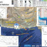
Below I present my interpretive poster for this M 6.3 earthquake. I include epicenters for earthquakes from the past century with magnitudes M ≥ 6.0. Here is the kml I created from the USGS earthquakes website.

  • I placed a moment tensor / focal mechanism legend on the poster. There is more material from the USGS web sites about moment tensors and focal mechanisms (the beach ball symbols). Both moment tensors and focal mechanisms are solutions to seismologic data that reveal two possible interpretations for fault orientation and sense of motion. One must use other information, like the regional tectonics, to interpret which of the two possibilities is more likely. The moment tensor shows north-south compression, perpendicular to the convergence at this plate boundary. I interpret this 2017 M 6.3 earthquake to be along a fault that dips to the north. Read my discussion below about the inset figure in the upper right corner.
  • I also include the shaking intensity contours on the map. These use the Modified Mercalli Intensity Scale (MMI; see the legend on the map). This is based upon a computer model estimate of ground motions, different from the “Did You Feel It?” estimate of ground motions that is actually based on real observations. The MMI is a qualitative measure of shaking intensity. More on the MMI scale can be found here and here. This is based upon a computer model estimate of ground motions, different from the “Did You Feel It?” estimate of ground motions that is actually based on real observations.
  • I include some inset figures in the poster below.

    • In the upper right corner I include a map that shows historic earthquakes in the region (Smith et al., 2013). The authors plot focal mechanisms for selected earthquakes. These earthquakes all have similar solutions as this 2017 M 6.3 earthquake. Given the low angle of subduction along this fault system, and that all these fault plane solutions have either a shallow fault or a steep fault, I suspect that these earthquakes are all occurring on a shallowly dipping fault that is southward vergent. Vergence refers to which direction the fault is oriented in the up-dip direction. The Makran subduction zone fault dips down to the north, so is southward vergent.
    • In the lower right corner I include a line drawing of the faults and plate boundaries in this region (Kukowski et al., 2000). I like this figure because it is simple yet includes some details of the complexity of the faulting in this region (especially the Murray Ridge, which is a series of enechelon east-west striking spreading ridges offset by north-east striking strike-slip faults, forming Dalyrimple Trough). This detail is missing on the USGS plate boundary fault (the red line in the main interpretive poster, as plotted in Google Earth). The paper from which this is taken is a paper where they document the northwest striking Sonne fault that crosses oblique to the fold and thrust belt of the Makran margin.
    • In the lower left corner is are two figures from Kopp et al. (2000). The upper panel shows a low angle oblique view of the bathymetry for the Makran margin in this region. The lower panel shows their interpretation of seismic reflection data that they presented in that paper. This profile is located on the upper panel, as well as on the interpretive poster as a green dashed line labeled A-A.’ These earthquakes occurred to the east of the northernmost extent of this seismic profile, but this profile gives us a good idea about the general configuration of the accretionary prism here.
    • In the upper left corner is a figure from Jaiswal et al. (2009) that shows some regions where large subduction zone tsunamigenic earthquakes have happened. There has been much work done on the 1945 tsunami (modeling, interviewing of observers, etc.).


      Here are some of the figures that I included in the poster, as well as some additional related figures. I include their original figure captions as blockquotes beneath the figures.
    • Here is the Smith et al. (2013) figure showing the historic earthquakes and their focal mechanisms.

    • Location map of the Makran Subduction Zone. Earthquakes from post-1960 (and pre-1960 with assigned magnitudes) from the EHB Catalog [Engdahl et al., 1998] are illustrated by circles. Those from pre-1960 with no assigned magnitude are small black dots. Significant possible plate boundary events with focal mechanisms from Byrne et al. [1992] and the Global CMT Catalog (magnitudes in inset table). Bathymetry is from the GEBCO_08 Grid [Smith and Sandwell, 1997]. Strike lengths of three rupture scenarios for magnitude calculations are indicated by shaded bars. The thermal modeling profile is marked as a black line. Triangles are volcanoes.

    • Here are two figures from Kukowski et al. (2000) showing the faults and their interpretations of this large strike-slip fault that cuts oblique to the margin.

    • A: Plate tectonic sketch indicating position and framework of newly identified Ormara plate. ONF is Ornach Nal fault; OFZ is Owen Fracture Zone;TJ is triple junction. For symbols see Figure 1 and text. B:Velocity diagram for triple junction among Arabian, Ormara, and Indian plates.


      A:Three-dimensional perspective, shaded bathymetric image of Makran accretionary wedge, showing Sonne strike-slip fault and erosive canyons crossing wedge. B:Tectonic interpretation showing offset of accretionary ridges and extensional jog of Sonne fault, which may result from some rotation of Ormara plate.

    • Here are a series of figures from Kopp et al. (2000). The upper figure is the low angle oblique view of the region that they studied. The lower figure includes the seismic data and their interpretation (that led to their interpretation presented in the interpretive poster above).

    • Bathymetric map of the MAKRAN accretionary wedge with profile and OBH locations. The labelled lines/OBH are discussed in the text.


      Prestack depth migration and interpretation of CAM30. The migration was calculated with velocities derived from depth-focusing (cdp 0±3200) and semblance (cdp 3200±4800) analysis. A post-migration radon filter was applied to reduce residual multiples. The interpretation is based on the distinct seismic signature of sedimentary reflectors in the abyssal plain and within the ®rst two thrusts (Fruehn et al., 1997).

    • There was a semi-recent paper where some important discoveries were made regarding the sediment routing along this margin (Bourget et al., 2011). This paper includes material that may eventually lead to an earthquake history for this margin. I include a few of their figures below.
    • This figure shows the geomorphology of the Makran continental margin and how the authors interpret there to be different sedimentary pathways.

    • Slope map of the Makran turbidite system, showing the seven canyon systems (yellow), their main pathway (red) and the main architectural elements in the abyssal plain. Longitudinal depth profiles of these canyon pathways are shown in Fig. 4. The cross-section (below) shows a general longitudinal profile of the Makran margin from the upper slope (Canyon 5) to the Oman abyssal plain, with main slope changes.

    • This is a illustration showing how some turbidity currents may interact with the submarine landforms.

    • Interpretative cartoon showing the sedimentary processes within the plunge pools at the deformation front.

    • This figure links the offshore sediment routing systems with the onshore sources of sediment.

    • (A) 3D onshore topography (SRTM data) and offshore bathymetry (MARABIE and CHAMAK cruises merged with the ETOPO 1 database) of the Makran accretionary prism, showing the structural organization of the margin. Significant streams/rivers and submarine canyons are drawn. Note the shallowing of the deformation front depth (red line) towards the east, joining the western edge of the India plate in the triple-junction area (simplified after Ellouz-Zimmermann et al., 2007b; Mouchot, 2009). (B) Along-strike evolution of the depth of the deformation front (black dashed line) and the length of the Makran submarine canyons (red continuous line). (C) Along-strike evolution of the Makran watersheds size (km2). Note that the largest watersheds are confined in the eastern Makran and Kirthar range, corresponding to the triple-junction area where the higher reliefs are observed.

    • This is their summary illustration showing their interpretation of the factors controlling sedimentation along this margin.

    • Summary of the impact of the variability of the forcing parameters (tectonics and fluvial input) on the theoretical ‘equilibrium’ conditions of the Makran canyons, and its implication for sediment distribution and turbidite system architecture at large (continental slope) and small (architectural elements in the abyssal plain) scales of observation.

    • Here are some photos of some damage from the town of Pasni in Gwadar. These were posted on social media by Faiz Baluch.


    M 7.7 Earthquake Observations

    • The 2013 M 7.7 Pakistan earthquake produced some interesting effects along the coast. Here are some photos of the island that formed as a result of this earthquake.
    • Here is an aerial image of the island published by RT as acquired by NASA.

    • Here is a satellite image of before and after shots as prepared by Danielle Madugo.

    • Here are three photos taken from people who visited the island.


    • This is a fascinating observation. Following the 1945 M 8.1 earthquake, a similar island formed in this region. Schluter et al. (2002) published a paper where they put forth their interpretations for the formation of these mud volcanoes.

    References:

    • Kopp, C., Fruehn, J., Flueh, E.R., Reichart, C., Kukoski, N., Bialas, J., and Klaeschen, D., 2000. Structure of the Makran subduction zone from wide-angle and reflection seismic data in Tectonophysics, p. 171-191
    • Kukowski, N., Schilhorn, T., Flueh, E.R., and Huhn, K., 2000. Newly identified strike-slip plate boundary in the northeastern Arabian Sea in Geology, v. 28, no. 4, p. 355-358.
    • Schluter, H.U., Prexl, A., Gaedicke, C., Roseser, H. , Reichert, C., Meyer, H., and von Daniels, C., 2002. The Makran accretionary wedge: sediment thicknesses and ages and the Origin of mud volcanoes in Marine Geology, v. 185, p. 219-232.
    • Smith, G.L., McNeill, L.C., WEang, K., He, J., Henstock, T., 2013. Thermal structure and megathrust seismogenic potential of the Makran subduction zone in GRL v. 40, p. 1528-1533, doi:10.1002/grl.50374

    Radio Show Material: KHUM with Lyndsey Battle

    Radio Show KHUM with Lyndsey Battle

    Reinterpretation of a classic by Dana Gould.

    Strawman Questions

    What is a fact?

    How can we decipher facts from “alternative facts?”

    • Scientific Method?
      • What do we want? Evidence based science
      • When do we want it? After peer review
    • What does the peer review process look like?

    I addressed these questions during the radio show, but did not document this before the show. Please listen to the show to hear more about this.

    How does culture shape science?

    In a broadly stroking nutshell, culture is a broad range of things that relates people to their existence and their belief systems. So, in that sense, changes in our belief systems have affected how science is practiced and how people believe in science. In times past, people based their beliefs mostly on religious principles put forth by some religious authority. Through centuries of struggle, science responded to this by developing and forming based on a belief that there is a natural-systems-explanation for all observable phenomena.

    How does science shape policy?

    Policy is often based on the rule of law and how organizations want to implement those laws. So, policy is often in the realm of the attorney at law and how actions using these policies satisfy the laws. Often science is used by law makers when they write bills to be considered.
    Some policies are based more on how best to accomplish a certain task. For example, managing rivers to reduce flood hazards or protecting public land for recreation value.
    Science can inform both legal and other policy development. For example,

    1. Studying river flows for decades to centuries gives us the facts with which to define flood hazard zones.
      1. Affects county building codes (policy)
      2. Affects insurance rates (side effect)
    2. USGS National Seismic Hazard Map is based upon 3 & 4
      1. Affects county building codes (policy)
      2. Affects insurance rates (side effect)
    3. Studying earthquake recurrence of the past to help inform us of the likelihood of a future earthquake
    4. tudying how subduction zone faults slip and how that might affect
      1. ground shaking
      2. landslides
      3. tsunami

    Example of Local Policy influenced by facts:

    • Dissect policy to facts
    • Replace facts w/alt-facts
    • Rebuild policy with alt facts and talk about how they differ?
    • What is the potential impact on society of new alt-fact based policy?

    1. Fact Based Policy: Tsunami Evacuation Zones (very generally)
      • Step 1: develop numerical model for tsunami inundation
      • Step 2: for evacuation zones, extend inundation limits to easy to identify geographic features
        • i.e. easier to identify a road than a position out in a cow pasture with no landmarks
      • Step 3: prepare maps and place signs
      • Step 4: develop county/city/community response plans and community evacuation routes
      • Step 5: rehearse these plans and have tsunami drills
    2. Alt-Fact Based Policy: Building in the Flood Zone
      • FEMA Flood Zones are based upon:
        • scientific analyses of river flows and
        • statistical estimates of likelihood (probabilities)
        • numerical modeling of river flows
      • Imagine adopting alt-facts that suggest floods would be different than FEMA Flood Hazard Maps.
      • Change county development policy (e.g. General Plan Update or other modification)
      • Build large residential development in flood plain prior to a major flood. The flood destroys some percent of the development. Alt-Fact policy can be expensive.

    Can we talk about the idea of arguing (or creating policy) from evidence vs. ideology?

    • In my opinion, are evidence based facts powerful enough tools to counter an approach of irrational bombardment?
      • This is a very interesting question. There are some varying opinions on this.
        • Atul Gawande (New Yorker, 2016) suggests avoid arguing with people about their skewed views, but to help them develop their own critical skills. e.g. “Rebutting bad science may not be effective, but asserting the true facts of good science is. And including the narrative that explains them is even better.”
        • If I focus on the facts instead of bashing the Alt-Facts, I am probably more successful. Of course, I am not perfect at this. Sometimes I do spend time trying to help someone change their mind.
    • How do we better ground ourselves in a reality based on facts in a world where it becoming hard to recognize facts based from science?
      • This is very challenging. It takes time to evaluate information and sometimes it requires a certain level of expertise. For example, it takes a hydrologist and an engineer to estimate what the flood hazards would be for a certain region.
      • If we are not experts, we need to develop some other way to evaluate the credibility of a source of information. This is a somewhat indirect way to assess how factual something is. Everyone should develop their own rules. Here are some that I have developed for evaluating an article online or in a journal, in no particular order (there are other lists online elsewhere).
        1. References – what are the sources of information? Are these from peer reviewed literature? Are there lots of references (like a meta-analysis like the IPCC Assessment Reports)? Does the article only refer to other articles with the same URL (web address) as the main article? (climate change denier websites do this, as do websites for extremist organizations)
        2. Contrasting Views – are there alternate hypotheses discussed?
        3. Publisher – is the article published by a peer review journal publisher (like Elsevier, Nature, Science, etc.)? Is the article from a newspaper that has an editorial board? Newspapers have a lower credibility than a peer review journal, but more credibility than an op-ed in the same newspaper. Is the article in a blog? Blogs can be OK, but they generally don’t have the same level of review as other sources. Blogs can be terrible sources of information too.
        4. Primary Source – is the article the primary source for this information or does the entire article exist as an article from some other publisher. The primary source of the article is the most credible. Beware of articles that are copied word-for-word between different websites. This is a strategy to artificially increase the apparent credibility of an article. I initially noticed this strategy on early climate change denier websites.

    Strawman Discussion

    • I prepared this document as a strawman discussion for the radio show on KHUM. I had a conversation with Lyndsey Battle on 2/4/17 at noon. Here I discuss facts, science, and scientific philosophy. My discussion is outlined generally like this:
      1. Facts
      2. Scientific Method
      3. Facts vs. Alt-Facts
      4. Scientific Philosophy
      5. Resources

    Facts

    Facts are things that have actually occurred or correct. If these things did not occur or are incorrect are not facts. How can we tell if something is a fact? Facts are verifiable based upon empirical observation (see scientific method below), as opposed to theoretical statements.
    Opinions are statements or viewpoints. Opinions can be based upon facts. Opinions can be based upon ideas that people have, often theoretical positions. Fact-based opinions generally are more “real” than theoretical-based opinions because they are based upon real and verifiable observations. Anyone and everyone can have opinions, but we need to evaluate opinions based on their credibility. If someone has an opinion that is theoretical but in opposition to a fact, their opinion loses credibility. Likewise, if someone has an opinion that is based upon a fact, their opinion gains credibility. As Scotty (the engineer) on the Star Trek the original series said, “Everyone is entitled to an opinion,” those stating their opinions may be incorrect if they are not based upon fact.

    Here is a video about facts and the anthropogenic forcing of climate change

    Scientific Method

    I start every single science class that I teach with a review of the scientific method as all science is based on this process. There are no hard rules about these steps as when one asks 5 scientists what the steps are, one will get 5 or more answers. Here are the steps that I propose to students.

    1. Make an/some observation(s)
    2. Form an/some hypothesis/hypotheses to explain the observation(s)
    3. Formulate an/some experiment(s) to test the hypothesis
    4. Conduct the test
    5. Evaluate and analyze the results to accept, reject, or modify the hypothesis/hypotheses.

    I use a part of the story from Star Trek Nemesis, a film with the cast from The Next Generation television series. In short, the Enterprise crew finds the prototype artificial person for Data on a planet. Geordi, the engineer, downloads all of Data’s “memories” into the prototype (named “Before,” heheh). Data hypothesized that “Before” would be as perfect as he is after he knew all that Data knows. After Data’s memories are downloaded and “Before” is disconnected from Data, Data asks “Before” where he is. They are in the Engineering section of the Enterprise and if everything worked correctly “Before” should know this. Before answers to Data, “I am in a room with lights.” Data’s test failed, but the reason I use this story is to help students know that they all have the basic skills required to be a scientist, the skills of observation. Before made the basic observations that he was in a room and that there were lights on. It is ironic that the scene also represents an example of the entire scientific method, in addition to being an easy to remember analogy about simple observational skills. Also, this can empower students to realize that they are capable of being scientists and all they need to do is rely on their basic senses. I remind students that when they are confronted with challenges to understand things, if they rely on these basic senses, they can reason through these challenges.
    Here is a great overview video about the scientific method as shared on social media by Dr. David Bazard, Dean of the Department of Science at the College of the Redwoods. Here is the YT link to the embedded video below.

    Facts vs. Alt-Facts

    This is one of the simplest principles of all. Alt-Facts are not facts because they violate the definition of what a fact is. They are not based upon real observations. They are not based upon verifiable tests. Alt-Facts are not real. Alt-facts are an imaginary representation.
    To present an Alt-Fact as a fact is a dishonest representation of reality. Recently I heard an interview on NPR (while listening to KHSU public radio) of a journalist. They were asked why they did not state that the comments from a particular political entity was a lie. The journalist claimed that because they had not been able to establish intent [to be dishonest], they could not call it a lie. However, the difference between being dishonest and telling a lie is not that much different, in my opinion.
    My friend, Stephen Tillinghast, likes to use the phrase “post-factual” society to describe our culture. This makes me think about what my professors used to say when I was a younger student in the early 1990s. My professors would discuss how they would need to lower their standards and level of academic scholarship each year because the students were sequentially lesser prepared. They would discuss how entering students would be covering material that used to be covered in High School. I came up with the term “the dumbing down of America.” I am sure I did not coin this phrase, but it was my first observation of this phenomena as presented to me by professors and mentors who had decades of observations prior to my coming on the scene. Now that I have been teaching introductory science courses for 5 years, I have found that, in large part, the observations from my mentors of decades past are cogent and applicable today. Considering the recent political cycle and the formation of a political group called the alt-right, I coined a term “Alt-Fact.” Of course, I learned shortly after that David Frum had coined the term a day or two before I did. I am sure there are probably others who also used this term.
    Why are people so fooled to believe Alt-Facts? There are probably many reasons ranging from exposure or lack of exposure to television, books, science classes, video games, social media, etc. Perhaps the largest factor may be the overstimulation from information presented online. With the plethora of information online, it is challenging to evaluate the credibility of all this information. It is time consuming and requires a certain amount of expertise in a certain subject matter. I first started developing my skills to distinguish fact from alt-fact when I was taking an atmospheric science class at Oregon State University. I started evaluating websites that discussed the anthropogenic forcing of climate change. Some websites promoted a climate change denial perspective. I learned that there was a wide range of strategies that websites like these used to promote misinformation as fact based reasoning. I soon realized that I could quickly evaluate the credibility of a source of information based upon some simple rules. These rules were based upon my observation of the climate change denier websites. I discuss this below when I talk about my website about the radiation from the Fukushima-Daiichi Nuclear Power Plant.
    There are many aspects of websites that reveal that they are not credible sources of information and I reveal these aspects as I evaluate each source of information about Fukushima radiation on that webpage. I put together a similar page for modern climate change websites.

    Scientific Philosophy

    I present some great quotes from an editorial presented by Atul Gawande on 6/10/2016. This article came to my social media feed as tweeted by Rich Boone, the Dean of the College of Natural Resources and Sciences. Below are some cogent observations by Gawande, interspersed with some observations of my own.
    Quotes From “THE MISTRUST OF SCIENCE” Other quotes are also below in blockquote.

    “The great physicist Edwin Hubble, speaking at Caltech’s commencement in 1938, said a scientist has “a healthy skepticism, suspended judgement, and disciplined imagination”—not only about other people’s ideas but also about his or her own. The scientist has an experimental mind, not a litigious one.”

    “Ultimately, you hope to observe the world with an open mind, gathering facts and testing your predictions and expectations against them. Then you make up your mind and either affirm or reject the ideas at hand. But you also hope to accept that nothing is ever completely settled, that all knowledge is just probable knowledge. A contradictory piece of evidence can always emerge. Hubble said it best when he said, “The scientist explains the world by successive approximations.” “

    “People are prone to resist scientific claims when they clash with intuitive beliefs.”

    This reminds me of a book I read for one of my anthropology courses about women who lived in Cairo, “Baladi Women of Cairo: Playing With an Egg and a Stone.” https://www.rienner.com/title/Baladi_Women_of_Cairo_Playing_with_an_Egg_and_a_Stone
    I was growing up in a world (in the 1990s) that was dominated by allopathic medicine while I was surrounded by naturopaths and herbalists, who certainly bring value to our health. The stories in the book rang true with me because they told of how the Baladi Women (women living in an urban setting) in Cairo were also living in a juxtaposition of sometimes competing health care techniques. When confronted with healthcare choices, they challenged themselves to consider either western medicine or traditional medicine. There were values from using either modality. This ethnology is a work of cultural anthropology in that it seeks an understanding of others based upon their beliefs and how these become developed often as a learned perspective.

    The sociologist Gordon Gauchat studied U.S. survey data from 1974 to 2010 and found some deeply alarming trends. Despite increasing education levels, the public’s trust in the scientific community has been decreasing.

    Today, we have multiple factions putting themselves forward as what Gauchat describes as their own cultural domains, “generating their own knowledge base that is often in conflict with the cultural authority of the scientific community.”

    They [the groups] all harbor sacred beliefs that they do not consider open to question.

    Science’s defenders have identified five hallmark moves of pseudoscientists. They argue that the scientific consensus emerges from a conspiracy to suppress dissenting views. They produce fake experts, who have views contrary to established knowledge but do not actually have a credible scientific track record. They cherry-pick the data and papers that challenge the dominant view as a means of discrediting an entire field. They deploy false analogies and other logical fallacies. And they set impossible expectations of research: when scientists produce one level of certainty, the pseudoscientists insist they achieve another.

    I have found some of these practices on a variety of websites that promote alt-fact views about chemtrails, climate change, and radiation from Fukashima. The first major effort I used my website for was to help people develop their own critical skills to distinguish between more and less credible sources of information regarding the dangers of radiation from the terrible and continuing disaster at the Fukashima-Daiichi Nuclear Power Plant following the 2011 Tohoko-oki magnitude M 9.0 earthquake and tsunami. Many of my friends on social media are not scientists and they were sharing these conspiracy theory websites like globalresearch.ca. I found myself spending too much time explaining my rationale to everyone individually. Therefore, I put together a web page where I model how to form ways to distinguish more and less credible information. I did not want to tell people what to think, but what skills they can use to distinguish these information sources on their own. I created three categories of decreasing credibility and placed every source on the subject matter into one of these categories.
    Turns out it was a good strategy, to avoid arguing with people about their skewed views, but to help them develop their own critical skills. As Gawande mentions, “Describing facts that contradict an unscientific belief actually spreads familiarity with the belief and strengthens the conviction of believers. That’s just the way the brain operates; misinformation sticks, in part because it gets incorporated into a person’s mental model of how the world works. Stripping out the misinformation therefore fails, because it threatens to leave a painful gap in that mental model—or no model at all.” But more importantly, “Rebutting bad science may not be effective, but asserting the true facts of good science is. And including the narrative that explains them is even better.” In my Fukashima radiation page, I explain why I place each sources of information into each category.
    It is difficult to tell the difference between fact and opinion these days, especially with the tremendous amount of information on the internet. It is almost impossible, in many cases, to be able to completely review a subject if one is not an expert in that subject. Even individual scientists, who are subject matter experts, cannot do this. As Gawande mentions, “Few working scientists can give a ground-up explanation of the phenomenon they study; they rely on information and techniques borrowed from other scientists. Knowledge and the virtues of the scientific orientation live far more in the community than the individual.”
    For people live in a world of belief. And modern science is founded on this, the belief that there is a natural systems explanation for observable phenomena. Modern Science arose as a response to the dark ages when religious philosophy dominated our belief systems. Science sure existed before that, but modern science was a rebirth of older practices.
    Some quotes I like to use that reflect how people incorporate science into their belief systems, some more successfully than others.

    • “correlation is not causation”
    • This is possibly the most common mistake that people make.
      Determining causality is one of the most important parts of science because understanding causality allows us to form policy and make smart decisions.
      For example,

      • Someone sees a plane fly overhead, they get sick, and blame the airplane. Maybe they got sick because they were losing sleep worrying about planes that might cause them to get sick.
      • Someone measures differences in radiation between a parking lot and the beach and conclude Fukushima radiation has reached California. The higher radiation at the beach is actually from the feldspar being moved around by the waves.
    • “the absence of evidence is not evidence of absence”
    • In other words, it is possible that there is evidence to support or reject an hypothesis, but we have not (1) observed it or (2) been able to observe it. This is related to the next quote:

    • “we cannot test hypotheses about phenomena for which we cannot yet observe”
    • In other words, one needs to be able to (1) observe phenomena and (2) measure those phenomena before these phenomena can be evaluated with science. Prior to our ability to measure the presence and abundance of different isotopes of Carbon, we could not use radiocarbon dating to evaluate the time when something died. Or, prior to the development of lenses and microscopes, we could not evaluate the existence nor function of cells and subcellular structures.
      The development of new abilities to make observations (and to causal linkages between observations) is the key to scientific discovery. It is extremely unlikely that we know everything that there is to know. For example, recently there was a discovery of a new organ in our body, the mesentery. Scientists needed to be able to measure its structure and function.
      http://www.thelancet.com/journals/langas/article/PIIS2468-1253(16)30026-7/abstract

    Scientific Discovery requires imagination. One needs to think outside of the box in order to create new discoveries. I love using the word create in my science classes.
    Gawande concludes with some thoughts on truth that I fully agree with. That there is no truth, but that scientists (all of us) are truth-seekers. The scientific method is a cycle with ongoing improvements in methods, observation techniques, and inventions (creativity). There is no end.

    The mistake, then, is to believe that the educational credentials you get today give you any special authority on truth. What you have gained is far more important: an understanding of what real truth-seeking looks like. It is the effort not of a single person but of a group of people—the bigger the better—pursuing ideas with curiosity, inquisitiveness, openness, and discipline. As scientists, in other words.

    I guess the cliché that goes along with this is, “the more one knows, the more they know that they don’t know.” Like life, the seeking of scientific facts in a journey, not a destination.

    Resources

    Chemtrails Easily Debunked