An earthquake occured this morning in Compton! Initially a 3.2, is currently a M = 2.9, as reported by the USGS (here is their web page).
Here is a map that shows the faults, the earthquakes from the past decade, the shaking intensity (using the Modified Mercalli Shaking Intensity Scale), along with some interpretive graphics.
There have been lots of earthquakes along the Newport Inglewood fault system. Today’s earthquake appears to be along the Compton thrust fault, a compressional fault that connects to the NIF at depth (see inset graphic below, from UNAVCO). A recent earthquake was in 2015.04.13 and here is my page about that earthquake.
Here is a page for an earthquake in May of 2015. Below is a map showing the earthquakes from mid 2015:
Monthly Archives: August 2015
Earthquake between the San Andreas and Maacama!
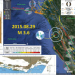
Saturday morning (2015.08.29), residents in Fort Bragg were awakened by a M 3.6 earthquake along a fault that lies between the San Andreas fault (SAF) to the west and the Maacama fault (MF) to the east. Here is the USGS web site for this earthquake. The San Andreas fault is a right-lateral strike-slip transform plate boundary between the Pacific and North America plates. The plate boundary is composed of faults that are parallel to sub-parallel to the SAF and extend from the west coast of CA to the Wasatch fault (WF) system in central Utah (the WF runs through Salt Lake City and is expressed by the mountain range on the east side of the basin that Salt Lake City is built within). There was a recent earthquake along the San Andreas fault in the Point Arena region in July of 2015.
The three main faults in the region north of San Francisco are the SAF, the MF, and the Bartlett Springs fault (BSF). Here is a map that shows Saturday’s epicenter as a red star. I also place a graphical depiction of the USGS moment tensor for this earthquake. The SAF, MF, and BSF are all right lateral strike-slip fault systems. There are no active faults mapped in the region of Saturday’s epicenter, but I interpret this earthquake to have right-lateral slip. Without more seismicity or mapped faults to suggest otherwise, this is a reasonable interpretation.
I also include the shaking intensity contours on the map. These use the Modified Mercalli Intensity Scale (see the legend on the map). This is based upon a computer model estimate of ground motions, different from the “Did You Feel It?” estimate of ground motions that is actually based on real observations. See the attenuation plot versus distance below to compare the difference between this model estimate and the real observations. The fit is pretty good.
I also plot the seismicity from 1960 through Aug 2015 as circles colored by depth. These epicenters are also in an animation further down on this page.
Here is a map that shows the distribution of how the shaking was felt as a result of this earthquake. This is a compilation of data from the USGS “Did You Feel It?” web site, configured to receive data from observations made by people.
This plot shows how the ground motions decay with distance from the earthquake. The blue dots show the survey results and the orange line shows how a computer simulation based attenuation model suggests that the ground motions would reduce with distance from the earthquake. The orange dots show the median data for each data bin. Note how well the observations fit the attenuation (i.e. Ground Motion Prediction Equation) models.
I place a map shows the configuration of faults in central (San Francisco) and northern (Point Delgada – Punta Gorda) CA (Wallace, 1990). Here is the caption for this map, that is on the lower left corner of my map. Below the citation is this map presented on its own.
Geologic sketch map of the northern Coast Ranges, central California, showing faults with Quaternary activity and basin deposits in northern section of the San Andreas fault system. Fault patterns are generalized, and only major faults are shown. Several Quaternary basins are fault bounded and aligned parallel to strike-slip faults, a relation most apparent along the Hayward-Rodgers Creek-Maacama fault trend.
I also plot a map that shows some slip rates for the faults that make up the Pacific-North America plate boundary system (Wallace, 1990). Here is the caption for this map, that is on the lower left corner of my map. Below the citation is this map presented on its own.
Sketch map of western and southwestern California, showing selected major faults exhibiting evidence of Quaternary activity in the San Andreas fault system. Average Quaternary slip rates are based on measured values from published sources and, where measurements are incomplete or unavailable, on interpreted geologic and geomorphic evidence. Slip components on northwest-trending faults are predominantly horizontal, right lateral, and consistent with North American-Pacific plate motion Group of east-west-trending faults between lat 34°00′ and 35°30′ N. exhibit a more complex slip pattern, including chiefly reverse faulting but also some strike slip. Areas above 600-m elevation (colored) exhibit evidence of late Cenozoic uplift and enclose most areas of Quaternary uplift, but elevation pattern reveals no such major local uplifts as those near Ventura (approx 1 cm/yr) and along the Newport-Inglewood fault zone (NI). Faults dotted where concealed by water.
About 75% of the relative plate motion is accommodated along the SAF and its synthetic sister faults in the northern CA region. The rest of the plate boundary motion is accommodated along the Eastern CA shear zone and Walker Lane, along with the Central Nevada Seismic Belt, and the Wasatch fault systems. In Northern CA, there is about 33-37 mm/yr strain accumulated on the SAF plate boundary system. About 18-25 mm/yr is on the SAF, 8-11 mm/yr on the MF, and 5-7 mm/yr on the Bartlett Springs fault system (Geist and Andrews, 2000).
I created an animation that shows the seismicity of this region from 1960 through Sunday, 2015.08.30. This is the USGS query that I used to create the animation, in the form of a kml file. Here is a static map that shows all earthquakes for this region.
Here is the animation. Either download the file here or click on the animation below.
Here is a map that shows the shaking potential for earthquakes in CA. This comes from the state of California here.
Earthquake shaking hazards are calculated by projecting earthquake rates based on earthquake history and fault slip rates, the same data used for calculating earthquake probabilities. New fault parameters have been developed for these calculations and are included in the report of the Working Group on California Earthquake Probabilities. Calculations of earthquake shaking hazard for California are part of a cooperative project between USGS and CGS, and are part of the National Seismic Hazard Maps. CGS Map Sheet 48 (revised 2008) shows potential seismic shaking based on National Seismic Hazard Map calculations plus amplification of seismic shaking due to the near surface soils.
This is a map that shows the probability of earthquakes along these fault systems in the San Francisco Bay region.
-
References
- Geist, E.L. and Andrews D.J., 2000. Slip rates on San Francisco Bay area faults from anelastic deformation of the continental lithosphere, Journal of Geophysical Research, v. 105, no. B11, p. 25,543-25,552.
- Wallace, Robert E., ed., 1990, The San Andreas fault system, California: U.S. Geological Survey Professional Paper 1515, 283 p. [http://pubs.usgs.gov/pp/1988/1434/].
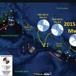
Earthquake near the Santa Cruz Islands (western Pacific)!
Yesterday we had a large magnitude earthquake along a plate boundary that connects the South Solomon trench with the New Hebrides trench. This region had a swarm of earthquakes in May. Here is the USGS website for the M 6.6 earthquake.
Below is a map that shows my interpretation some earthquakes along these plate boundaries. I plot the moment tensors for each earthquake. I placed a moment tensor / focal mechanism legend in the upper right corner of the map. There is more material from the USGS web sites about moment tensors and focal mechanisms (the beach ball symbols). Both moment tensors and focal mechanisms are solutions to seismologic data that reveal two possible interpretations for fault orientation and sense of motion. One must use other information, like the regional tectonics, to interpret which of the two possibilities is more likely.
Yesterday’s M 6.6 earthquake appears to plot along a strike-slip fault system. In May, three earthquakes each had strike-slip moment tensors. Yesterday’s earthquake has an oblique moment tensor, which shows mostly compression (thrust/reverse) with slight left-lateral possible motion. I use the earthquakes in May to help me interpret this moment tensor. In the past few days (2015.08.10 and 2015.08.12) there has been a swarm of earthquakes in the downgoing plate along the South Solomon trench. I interpret that these are along north-striking fracture zone/transform faults in the Woodlark Basin. In July, there was a M 7.0 earthquake near the Santa Cruz Islands that has an extensional moment tensor. This earthquake appears to be located along the outer rise, which is a region where the Pacific plate is bending. The bending creates extensional stresses, causing extensional earthquakes. Based on the orientation (strike) of this extensional earthquake, yesterday’s M 6.6 could possibly have been in a region of increased coulomb stress. It might be that the May and July earthquakes all created increased stress that led to yesterday’s M 6.6 earthquake.
-
Here are links to the four earthquakes shown on the above map.
- 2015.07.18 M 7.0
- 2015.08.10 M 6.6
- 2015.08.12 M 6.4
- 2015.08.15 M 6.6
Here is a map that shows the three earthquakes that happened in May, 2015. Note how the easternmost earthquake dips slightly to the north, which matches the dip of yesterday’s M 6.6 earthquake (presuming my interpretation is correct).
-
The USGS has two tectonic summary posters for this region. They overlap slightly where yesterday’s earthquake occurred.
- Seismicity of the Earth 1900–2010 Eastern Margin of the Australia Plate: OFR 2010-1083-I
- Seismicity of the Earth 1900–2010 New Guinea and Vicinity: OFR 2010-1083-H (This one is possibly better for this region.)
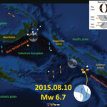
Solomon Islands Earthquake!
Today we had another earthquake in this tectonically active region of the world. Initially posted as a magnitude 7.0, the USGS considers this a M = 6.6 earthquake.
Here is a map showing the epicenter as an orange circle. I placed the USGS moment tensor, along with my interpretation of the sense of motion, on the map. I placed a moment tensor / focal mechanism legend in the upper right corner of the map. There is more material from the USGS web sites about moment tensors and focal mechanisms (the beach ball symbols). This entire region is fairly tectonically active, with numerous large magnitude earthquakes in the past two years. I summarize some of these earthquakes below. Both moment tensors and focal mechanisms are solutions to seismologic data that reveal two possible interpretations for fault orientation and sense of motion. One must use other information, like the regional tectonics, to interpret which of the two possibilities is more likely. Based on the orientation of the transform boundaries associated with the Woodlark Basin spreading ridges, I interpret this to be a north striking right lateral earthquake.
Here is a generalized tectonic map of this region (credit IRIS).
In July 2015, there was an earthquake with a similar moment tensor, in the same region. Here is my post about that earthquake. Here is my map that shows the location of that earthquake.
In May of 2015, there was a thrust/reverse fault earthquake to the east of this M 6.6 earthquake. Here is a summary map that I put together with that, along with some other recent earthquakes plotted. The page for the May earthquake is here.
There were also three M = 6.8-6.9 earthquakes further to the south along a transform plate boundary (mapped as a subduction zone by the USGS). Here is a map that shows the location of this May earthquake swarm.
Finally, further to the North, along the New Britain trench, we have had a series of earthquakes since 2000. I plot these in this map and discuss them a little further on this page.
I put together this map to show how the New Britain and Solomon trenches meet. Earthquakes along the New Britain trench have principal stress aligned perpendicular to the New Britain trench and earthquakes along the Solomon trench have principal stresses aligned perpendicular to the Solomon trench due to strain partitioning in the upper plate. I provide more links and explanations about these earthquakes on this page.