Earthquake Report: Cayman Islands

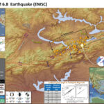
Contrary to what some people spread around on the internets (some of them major earthquake experts), strike-slip earthquakes can and do generate tsunami (just like this one). More on this below.
I am in Portland, Oregon this week, attending the Winter National Tsunami Hazard Mitigation Program Meeting. While one of our workshops, several of us got an alert about a M 7.3 earthquake offshore of Cuba and Jamaica. My colleagues from Puerto Rico were immediately interested to learn more about this. We noticed that nothing was being posted to tsunami.gov.
https://earthquake.usgs.gov/earthquakes/eventpage/us60007idc/executive
The location is familiar with me as I have written reports for earthquakes in this region over the past couple of years. This earthquake happened along a strike-slip plate boundary fault. Thus, the chance of a large tsunami is low. However, strike-slip earthquakes DO generate tsunami, albeit smaller than those created by subduction zone earthquakes. In addition, earthquakes can trigger submarine landslides, which can also serve to cause tsunami (these can be very large, but generally impact the area near the landslide, like the 1998 Papua New Guinea tsunami.).
In a few minutes, the earthquake magnitude was updated to M 7.7. This is quite common, as seismological data are analyzed with greater detail after the initial automatic magnitude calculation.
A few minutes later, the USGS moment tensor (earthquake mechanism) was posted online, confirming that it was a strike-slip earthquake.
The IOC tide gage network was not working, so I could not check for tsunami observations until later. However, the Pacific Tsunami Warning Center sent out an email to the International Tsunami Bulletin Board (email list restricted to tsunami scientists) with arrival times. There was a suggestion that tsunami waves up to 1 meter may arrive along the coast in the region.
At lunch time, I went to my hotel room to put together an interpretive poster (thanks boss!) to send out on social media. By that time, a small tsunami wave had been observed at the tide gage on the west coast of Cayman Island. The PTWC sent out their final email, stating a 0.4 foot tsunami was recorded there. I went to the IOC website and the gage data were quite noisy, but it matched the PTWC email. Here is a link to the George Town Tide Gage.
Just as I was about to tweet the poster, the USGS earthquake fault slip model was published online (so I added that to the poster).
After lunch, as the workshop continued, there was a M 6.1 earthquake. I noticed it was west of the slip model. I had considered an alternate hypothesis (that the M 6.1 was triggered, not an aftershock), but now think that this is just part of the M 7.7 slip patch. Looking at the back projection data from IRIS, it suggests that this earthquake initiated in the east and propagated to the west. It makes sense to me that the fault reached a zone where the fault slip slowed down, until it reached the patch that slipped during the M 6.1. (simplifying this for this report)
Was this Cayman Islands Earthquake Sequence related to the ongoing Puerto Rico Earthquake Sequence? Probably not. They are simply too far from each other.
There are two types of earthquake triggering: static and dynamic. Triggering happens when an earthquake on one fault changes the stress on a different fault, causing that other fault to slip during an earthquake. These stress changes are small, so the “receiver” fault needs to be at a state of stress that is high enough that it would be almost ready to slip before the “source” earthquake.
Dynamic triggering happens when seismic waves from the source earthquake travel through the Earth, triggering an earthquake on the receiver fault. These changes in stress may take a while before the triggered earthquake happens, but generally, we think that this would happen while these waves are traveling through the area.
Static triggering happens when a source earthquake changes the stress in the crust surrounding the source earthquake. This change typically lasts months to years and won’t extend beyond two fault lengths of the source earthquake. So, If the source quake had a rupture length of 50 km, static triggering probably would not happen more than 100km from the source quake. This is just a rule of thumb… BUT the M 7.7 is very far from Puerto Rico, so is probably unrelated to the Puerto Rico Sequence.

Earthquake Description

This M 7.7 earthquake happened along the Oriente fault, which is the Septentrional fault further to the east. This fault is one of the boundaries between the North America plate to the north and the Caribbean plate to the south in a region called the Greater Antilles.
Further to the east, this plate boundary changes into a subduction zone along the Lesser Antilles. This subduction zone is the source of a great amount of research. There is some evidence that the megathrust subduction zone fault is not locked, so it is slipping and not capable of generating Great (M>8) earthquakes. However, I was on a team of French geologists aboard the Pourquoi Pas? in 2016. We were coring the deep sea to investigate the sedimentary record of Great earthquakes. Based on our analysis, it appears that the fault is capable of producing these large earthquakes, but the average time between earthquakes (the recurrence interval) is on he order of several millenia.
To the west of the M 7.7 earthquake, there is an oceanic spreading ridge where crust is created, forming the Cayman Trough. As the boundary steps to the south, the relative plate motion is focused on another left-lateral strike-slip fault, the Swan Island fault. This fault extends further to the west into Central America and turns into the Motagua Polochic fault system (there are actually multiple faults hypothesized to be the active part of this plate boundary here). I discuss this more in an Earthquake Report here.

Below is my interpretive poster for this earthquake

  • I plot the seismicity from the past 3 months, with diameter representing magnitude (see legend). I include earthquake epicenters from 1920-2020 with magnitudes M ≥ 6.0 in one version.
  • I plot the USGS fault plane solutions (moment tensors in blue and focal mechanisms in orange), possibly in addition to some relevant historic earthquakes.
  • A review of the basic base map variations and data that I use for the interpretive posters can be found on the Earthquake Reports page.
  • Some basic fundamentals of earthquake geology and plate tectonics can be found on the Earthquake Plate Tectonic Fundamentals page.

    I include some inset figures. Some of the same figures are located in different places on the larger scale map below.

  • In the lower right corner is a map from Pindell and Kennan (2009) that shows the major plate tectonic faults in the Caribbean. I place a yellow star in the general location of today’s M 7.7 earthquake.
  • In the upper right corner is a map from Symithe et al. (2015). I have used this figure in many of my reports because it is so awesome!!! This map includes the faults of the region, but also includes earthquake mechanisms (e.g. focal mechanisms).
  • To the left of the Symithe map is the USGS model for the earthquake fault that slipped during this earthquake. The color represents the amount of slip. I placed a red line with circles at the end on the map where this fault model is located. Don’t forget, this is just a model (but it matches the data that the USGS uses to constrain the model).
  • In the upper left corner is a map that shows a comparison of the USGS model for shaking intensity (using the Modified Mercalli Intensity (MMI) scale) and the USGS “Did You Feel It?” observations.
    • The shaking intensity model is based on the results of analyzing thousands of earthquakes and using these earthquakes to develop a relation between earthquake size (e.g. magnitude) and how strongly it shakes based on the distance to the earthquake.
    • The “DYFI” observations are based on the results of surveys that people submit to the USGS website. The questions people answer are about their observations of the earthquake. Here are some basic facts about this DYFI program and here is some scientific background behind the DYFI program.
  • To the right of the intensity map is a plot of the data from the map. The vertical axis represents intensity (MMI) and the horizontal axis represents the distance from the earthquake. The solid lines represent the model results from the USGS. These are the models that the USGS used to create the color on the map to the left. The DYFI observations are the blue dots (the brown dots show averages ofthe blue dots). There is a decent match, but it is far from perfect.
  • Here is the map with 3 month’s seismicity plotted.

  • Here is the tsunami observation posted by the PTWC. A few years ago, it was conventional wisdom (at least, in my mind) that strike-slip earthquakes were not a producer of tsunami. In the past few years, however, most every large strike-slip submarine earthquake has generated a tsunami. We need to break this old way of viewing this.
  • The main difference for tsunami from strike-slip earthquakes is that they are smaller than from subduction or thrust faults. BUT, even a tsunami with a size of about 2-3 meters can cause millions of dollars of damage. These are still dangerous events, even though they are not as dangerous as larger tsunami.

  • As we can see from the plot below, it will take someone more skilled than I to understand the tsunami waves observed here. However, even I can see that there was a change in water surface elevation at about the right time given the distance to the earthquake from the Cayman Islands.

  • UPDATE: 2020.01.29 – This morning I saw a tweet from Christoph Gruetzner and I realized that I had only reviewed the tide gage data from nearest the quake. Below is a plot from a site in Mexico which clearly shows a tsunami wave train. This is a better record that the one above from Cayman Island. The Cayman gage is located on the western side of the island, not optimal to record waves sourced from the east (why it is so noisy). This Puerto Morelos gage (below) is a much better record, albeit still a small wave that is in a location with significant background wave “noise.”

  • Here is a figure that includes a map showing the location of these two tide gages. I will update this later, gotta get to the meeting today.

Some Relevant Discussion and Figures

  • Here is the tectonic map from Symithe et al. (2015). I include their figure caption below in blockquote.

  • Seismotectonic setting of the Caribbean region. Black lines show the major active plate boundary faults. Colored circles are precisely relocated seismicity [1960–2008, Engdahl et al., 1998] color coded as a function of depth. Earthquake focal mechanism are from the Global CMT Catalog (1976–2014) [Ekstrom et al., 2012], thrust focal mechanisms are shown in blue, others in red. H = Haiti, DR = Dominican Republic, MCS = mid-Cayman spreading center, WP = Windward Passage, EPGF = Enriquillo Plaintain Garden fault.

  • Here is the tectonic map from Garcia-Casco et al. (2011). I include their figure caption below in blockquote.

  • Plate tectonic configuration of the Caribbean region showing the location of the study cases presented in this issue (numbers refer to papers, arranged as in the issue), and other important geological features of the region (compiled from several sources).

  • Here is the Benz et al. (2011) Seismicity of the Earth poster for this region.

  • Here is the map from Mann et a. (1991). Note how today’s earthquake is in an area that may have overlapping faults of different types.

  • A. Tectonic map of Cayman trough region showing strike-slip faults (heavy lines), oceanic crust (gray) in Cayman trough, and magnetic anomaly identifications (numbered bars) (after Rosencrantz et a., 1988). Arrows show relative displacement directions. Fault zones: OFZ – Oriente; DFZ- Dunvale; EPGFZ – Enriquillo-Plantain Garden; WFZ – Walton; SIFZ – Swan Islands; MFZ – Motagua. Bl. Late Miocene reconstruction of Cayman trough. C. Early Miocene reconstruction.

  • Here is the large scale map from ten Brink et al. (2002) showing the bathymetry surrounding the Mid-Cayman Rise.

  • Bathymetry of central Cayman Trough adapted from Jacobs et al. (1989). Contour interval: 250 m. Dotted line: location of gravity transect.

  • Here is the USGS Tectonic Summary for this 2018.01.10 M 7.6 earthquake. A more comprehensive review can be found here.
    • The January 10, 2018, M 7.6 Great Swan Island, Honduras earthquake occurred as the result of strike slip faulting in the shallow crust near the boundary between the North America and Caribbean plates. Early focal mechanism solutions indicate that rupture occurred on a steeply dipping structure striking either west-northwest (right-lateral), or west-southwest (left-lateral). At the location of this earthquake, the North America plate moves to the west-southwest with respect to the Caribbean plate at a rate of approximately 19 mm/yr. Local to the January 10, 2018 earthquake, this motion is predominantly accommodated along the Swan Islands transform fault, a left-lateral structure. The location, depth and focal mechanism solution of today’s earthquake are consistent with rupture occurring along this plate boundary structure, or on a nearby and closely related fault.
    • While commonly plotted as points on maps, earthquakes of this size are more appropriately described as slip over a larger fault area. Strike-slip-faulting events of the size of the January 10, 2018, earthquake are typically about 140×20 km (length x width).
    • Nine other earthquakes of M 6 or larger have occurred within 400 km of the January 10, 2018 event over the preceding century. Previous strong earthquakes along the North America-Caribbean plate boundary in this region include the destructive M 7.5 Guatemala earthquake of February 4, 1976, which resulted in more than 23,000 fatalities. The 1976 earthquake occurred on the Motagua fault, a segment of the plate boundary that lies in southern Guatemala, about 650 km west-southwest of the hypocenter of the January 10, 2018, event. In May 2009, a M 7.3 earthquake occurred along the Swan Island transform fault approximately 300 km west of the January 10, 2018 event. The 2009 earthquake (which was much closer to land than the 2018 event) resulted in 7 fatalities, 40 injuries and 130 buildings being damaged or destroyed.

    References:

    Basic & General References

  • Frisch, W., Meschede, M., Blakey, R., 2011. Plate Tectonics, Springer-Verlag, London, 213 pp.
  • Hayes, G., 2018, Slab2 – A Comprehensive Subduction Zone Geometry Model: U.S. Geological Survey data release, https://doi.org/10.5066/F7PV6JNV.
  • Holt, W. E., C. Kreemer, A. J. Haines, L. Estey, C. Meertens, G. Blewitt, and D. Lavallee (2005), Project helps constrain continental dynamics and seismic hazards, Eos Trans. AGU, 86(41), 383–387, , https://doi.org/10.1029/2005EO410002. /li>
  • Jessee, M.A.N., Hamburger, M. W., Allstadt, K., Wald, D. J., Robeson, S. M., Tanyas, H., et al. (2018). A global empirical model for near-real-time assessment of seismically induced landslides. Journal of Geophysical Research: Earth Surface, 123, 1835–1859. https://doi.org/10.1029/2017JF004494
  • Kreemer, C., J. Haines, W. Holt, G. Blewitt, and D. Lavallee (2000), On the determination of a global strain rate model, Geophys. J. Int., 52(10), 765–770.
  • Kreemer, C., W. E. Holt, and A. J. Haines (2003), An integrated global model of present-day plate motions and plate boundary deformation, Geophys. J. Int., 154(1), 8–34, , https://doi.org/10.1046/j.1365-246X.2003.01917.x.
  • Kreemer, C., G. Blewitt, E.C. Klein, 2014. A geodetic plate motion and Global Strain Rate Model in Geochemistry, Geophysics, Geosystems, v. 15, p. 3849-3889, https://doi.org/10.1002/2014GC005407.
  • Meyer, B., Saltus, R., Chulliat, a., 2017. EMAG2: Earth Magnetic Anomaly Grid (2-arc-minute resolution) Version 3. National Centers for Environmental Information, NOAA. Model. https://doi.org/10.7289/V5H70CVX
  • Müller, R.D., Sdrolias, M., Gaina, C. and Roest, W.R., 2008, Age spreading rates and spreading asymmetry of the world’s ocean crust in Geochemistry, Geophysics, Geosystems, 9, Q04006, https://doi.org/10.1029/2007GC001743
  • Pagani,M. , J. Garcia-Pelaez, R. Gee, K. Johnson, V. Poggi, R. Styron, G. Weatherill, M. Simionato, D. Viganò, L. Danciu, D. Monelli (2018). Global Earthquake Model (GEM) Seismic Hazard Map (version 2018.1 – December 2018), DOI: 10.13117/GEM-GLOBAL-SEISMIC-HAZARD-MAP-2018.1
  • Silva, V ., D Amo-Oduro, A Calderon, J Dabbeek, V Despotaki, L Martins, A Rao, M Simionato, D Viganò, C Yepes, A Acevedo, N Horspool, H Crowley, K Jaiswal, M Journeay, M Pittore, 2018. Global Earthquake Model (GEM) Seismic Risk Map (version 2018.1). https://doi.org/10.13117/GEM-GLOBAL-SEISMIC-RISK-MAP-2018.1
  • Zhu, J., Baise, L. G., Thompson, E. M., 2017, An Updated Geospatial Liquefaction Model for Global Application, Bulletin of the Seismological Society of America, 107, p 1365-1385, https://doi.org/0.1785/0120160198
  • Specific References

  • Benz, H.M., Tarr, A.C., Hayes, G.P., Villaseñor, Antonio, Furlong, K.P., Dart, R.L., and Rhea, Susan, 2011. Seismicity of the Earth 1900–2010 Caribbean plate and vicinity: U.S. Geological Survey Open-File Report 2010–1083-A, scale 1:8,000,000.
  • Franco, A., C. Lasserre H. Lyon-Caen V. Kostoglodov E. Molina M. Guzman-Speziale D. Monterosso V. Robles C. Figueroa W. Amaya E. Barrier L. Chiquin S. Moran O. Flores J. Romero J. A. Santiago M. Manea V. C. Manea, 2012. Fault kinematics in northern Central America and coupling along the subduction interface of the Cocos Plate, from GPS data in Chiapas (Mexico), Guatemala and El Salvador in Geophysical Journal International., v. 189, no. 3, p. 1223-1236. DOI: https://doi.org/10.1111/j.1365-246X.2012.05390.x
  • Garcia-Casco, A., Projenza, J.A., Iturralde-Vinent, M.A., 2011. Subduction Zones of the Caribbean: the sedimentary, magmatic, metamorphic and ore-deposit records UNESCO/iugs igcp Project 546 Subduction Zones of the Caribbean in Geologica Acta, v. 9, no., 3-4, p. 217-224
  • Mann, P., Tyburski, S.A., and Rosencratz, E., 1991. Neogene development of the Swan Islands restraining-bend complex, Caribbean Sea in Geology, v. 19, p. 823-826.
  • Symithe, S., E. Calais, J. B. de Chabalier, R. Robertson, and M. Higgins, 2015. Current block motions and strain accumulation on active faults in the Caribbean in J. Geophys. Res. Solid Earth, v. 120, p. 3748–3774, doi:10.1002/2014JB011779.
  • Ten Brink, U.S., Coleman, D.F., and Dillon, W.P., 2002. The nature of the crust under Cayman Trough from gravity in Marine and Petroleum Geology, v. 119, p. 971-987.

Return to the Earthquake Reports page.


Earthquake Report: East Anatolia fault zone

This M 6.7 earthquake was the result of slip probably along a left-lateral strike-slip fault associated with the East Anatolia fault zone (EAF). The event was shallow and produced strong ground shaking in the region.

https://earthquake.usgs.gov/earthquakes/eventpage/us60007ewc/executive

As I write this, there have been about 5 building collapses and 22 deaths. The high number of deaths may be due to the building design used in the region.

The EAF accommodates the relative plate motion between the Anatolia and Arabia plates. Because the northern motion of the Arabia plate is oblique to the plate boundary, the tectonic strain (deformation of the Earth) is proportioned on different fault types. We call this strain partitioning.

The lateral strain is localized along the EAF in the form of strike-slip faults. The compressive strain formed the Southeast Anatolia fault zone, a series of imbricate thrust faults south and east of the EAF.

Further to the west, this north-south compression results in the subduction of the Africa plate northwards beneath the Anatolia and Eurasia plates. This subduction forms the Hellenic trench.

On the northern part of Turkey is bordered by a right-lateral strike-slip fault, the North Anatolia fault. Last year (2019) was the 20 year commemoration of the 1999 Izmit M 7.6 earthquake.

The M 6.7 earthquake may have caused landslides or liquefaction in places, but the chances of this are modest at best.

Geologists have studied the EAF and subdivided the fault into segments based on their mapping efforts. This M 6.7 is within the Pütürge segment of the EAF. If we look at the historic record of the EAF here, we find that the M 6.7 happened in a part of the fault that does not have an historic rupture. There was an earthquake in 1875 that appears to end to the north of the M 6.7 and there is an earthquake in 1893 that appears to terminate just to the south of the M 6.7.

Below is my interpretive poster for this earthquake

  • I plot the seismicity from the past year, with diameter representing magnitude (see legend). I include earthquake epicenters from 1920-2020 with magnitudes M ≥ 6.5 in one version.
  • I plot the USGS fault plane solutions (moment tensors in blue and focal mechanisms in orange), possibly in addition to some relevant historic earthquakes.
  • A review of the basic base map variations and data that I use for the interpretive posters can be found on the Earthquake Reports page.
  • Some basic fundamentals of earthquake geology and plate tectonics can be found on the Earthquake Plate Tectonic Fundamentals page.

    I include some inset figures. Some of the same figures are located in different places on the larger scale map below.

  • In the upper right corner is a map from Armijo et al. (1999) that shows the plate boundary faults and tectonic plates in the region. This M 6.7 earthquake, denoted by the blue star, is along the East Anatolia fault, a left-lateral strike-slip plate boundary fault.
  • In the upper left corner is a comparison of the shaking intensity modeled by the USGS and the shaking intensity based on peoples’ “boots on the ground” observations. People felt intensities exceeding MMI 7.
  • To the right of the intensity map is a figure from Duman and Emre (2013). This shows the historic earthquakes along the EAF.
  • In the lower right corner is a larger scale map showing the tectonic geomorphology of the region (how the landscape is sculpted by tectonic forces).
  • To the right of the legend are two maps that show (left) liquefaction susceptibility and (right) landslide probability. These are based on empirical models from the USGS that show the chance an area may have experienced these processes that may have happened as a result of the ground shaking from the earthquake. I spend more time explaining these types of models and what they represent in this Earthquake Report for the recent event in Albania.
  • Here is the map with a month’s (ESMC catalog) and a century’s seismicity plotted (USGS NEIC catalog).

  • Here is the map with a month’s and a year’s seismicity plotted (CSEM EMSC catalog).
  • In the upper left corner is a map that shows the tectonic strain in the region. Areas of red are deforming more from tectonic motion than are areas that are blue. Learn more about the Global Strain Rate Map project here.
  • I also show a figure from Wells and Coppersmith (1994). These authors used a global dataset of earthquakes to develop an empirical relation between earthquakes and various parameters. They found relations between the physical size of an earthquake versus earthquake magnitude. These plots show how the magnitude of an earthquake relates to the “surface rupture length in km.” The surface rupture length is the length of the fault that actually caused the ground surface to be offset during the earthquake.
  • The table shows calculated magnitudes based on surface rupture lengths of different length. Given the formula in the Wells and Coppersmith (1994) plot shown, an earthquake with a surface rupture length of 35 km would have a magnitude of M 6.8. Note how the aftershock zone is about 75 km long. We will see in the coming week or two if there is a potential for finding surface rupture. Geologists will use satellite data to measure ground offset. This type of remote sensing analysis can help people locate field observations of surface rupture. This kind of analysis was very helpful for our mapping following the July 2019 Ridgecrest Earthquake Sequence.

  • Let’s take a look at the USGS fault slip model. USGS seismologists analyze seismologic data (from broadband seismometers) to model the distribution of slip for this earthquake. Below is their model that is based on a southwest-northeast striking (trending) fault (parallel to the EAF). Maximum slip is less than 2 meters.
  • Note the coincidence between the estimated length of surface rupture length in the table above (35 km) and this slip model. The slip model shows slip on the fault at or near the surface for about 40 km or so.

  • Because this 1999 earthquake is important for many reasons, I will be writing up an Earthquake Report for that event sometime soon. In the meantime, here is a poster I put together for that event.
  • Of particular note is that this August earthquake generated a small tsunami. I use this in my tsunami talks to highlight how there are non-traditional tsunami sources that need to be considered when mitigating tsunami hazards. Even though this tsunami was only a couple meters high, that is enough to damage harbors, boats, and people.

Other Report Pages

Some Relevant Discussion and Figures

  • This is the plate tectonic map from Armijo et al., 1999.

  • Tectonic setting of continental extrusion in eastern Mediterranean. Anatolia-Aegean block escapes westward from Arabia-Eurasia collision zone, toward Hellenic subduction zone. Current motion relative to Eurasia (GPS [Global Positioning System] and SLR [Satellite Laser Ranging] velocity vectors, in mm/yr, from Reilinger et al., 1997). In Aegean, two deformation regimes are superimposed (Armijo et al., 1996): widespread, slow extension starting earlier (orange stripes, white diverging arrows), and more localized, fast transtension associated with later, westward propagation of North Anatolian fault (NAF). EAF—East Anatolian fault, K—Karliova triple junction, DSF—Dead Sea fault,NAT—North Aegean Trough, CR—Corinth Rift.Box outlines Marmara pull-apart region, where North Anatolian fault enters Aegean.

  • Here is the tectonic map from Dilek and Sandvol (2009).

  • Tectonic map of the Aegean and eastern Mediterranean region showing the main plate boundaries, major suture zones, fault systems and tectonic units. Thick, white arrows depict the direction and magnitude (mm a21) of plate convergence; grey arrows mark the direction of extension (Miocene–Recent). Orange and purple delineate Eurasian and African plate affinities, respectively. Key to lettering: BF, Burdur fault; CACC, Central Anatolian Crystalline Complex; DKF, Datc¸a–Kale fault (part of the SW Anatolian Shear Zone); EAFZ, East Anatolian fault zone; EF, Ecemis fault; EKP, Erzurum–Kars Plateau; IASZ, Izmir–Ankara suture zone; IPS, Intra–Pontide suture zone; ITS, Inner–Tauride suture; KF, Kefalonia fault; KOTJ, Karliova triple junction; MM, Menderes massif; MS, Marmara Sea; MTR, Maras triple junction; NAFZ, North Anatolian fault zone; OF, Ovacik fault; PSF, Pampak–Sevan fault; TF, Tutak fault; TGF, Tuzgo¨lu¨ fault; TIP, Turkish–Iranian plateau (modified from Dilek 2006).

  • This is the Woudloper (2009) tectonic map of the Mediterranean Sea. The yellow/orange band represents the Alpide Belt, a convergent plate boundary that extends from western Europe, through the Middle East, beneath northern India and Nepal (forming the Himalayas), through Indonesia, terminating east of Australia.

  • Below is a series of figures from Jolivet et al. (2013). These show various data sets and analyses for Greece and Turkey.
  • Upper Panel (A): This is a tectonic map showing the major faults and geologic terranes in the region. The fault possibly associated with today’s earthquake is labeled “Neo Tethys Suture” on the map, for the Eastern Anatolia fault.
  • Lower Panel (B): This shows historic seismicity for the region. Note the general correlation with the faults in the upper panel.

  • A: Tectonic map of the Aegean and Anatolian region showing the main active structures
    (black lines), the main sutures zones (thick violet or blue lines), the main thrusts in the Hellenides where they have not been reworked by later extension (thin blue lines), the North Cycladic Detachment (NCDS, in red) and its extension in the Simav Detachment (SD), the main metamorphic units and their contacts; AlW: Almyropotamos window; BD: Bey Daglari; CB: Cycladic Basement; CBBT: Cycladic Basement basal thrust; CBS: Cycladic Blueschists; CHSZ: Central Hellenic Shear Zone; CR: Corinth Rift; CRMC: Central Rhodope Metamorphic Complex; GT: Gavrovo–Tripolitza Nappe; KD: Kazdag dome; KeD: Kerdylion Detachment; KKD: Kesebir–Kardamos dome; KT: Kephalonia Transform Fault; LN: Lycian Nappes; LNBT: Lycian Nappes Basal Thrust; MCC: Metamorphic Core Complex; MG: Menderes Grabens; NAT: North Aegean Trough; NCDS: North Cycladic Detachment System; NSZ: Nestos Shear Zone; OlW: Olympos Window; OsW: Ossa Window; OSZ: Ören Shear Zone; Pel.: Peloponnese; ÖU: Ören Unit; PQN: Phyllite–Quartzite Nappe; SiD: Simav Detachment; SRCC: South Rhodope Core Complex; StD: Strymon Detachment; WCDS: West Cycladic Detachment System; ZD: Zaroukla Detachment. B: Seismicity. Earthquakes are taken from the USGS-NEIC database. Colour of symbols gives the depth (blue for shallow depths) and size gives the magnitude (from 4.5 to 7.6).

  • Upper Panel (C): These red arrows are Global Positioning System (GPS) velocity vectors. The velocity scale vector is in the lower left corner. The main geodetic (study of plate motions and deformation of the earth) signal here is the westward motion of the North Anatolian fault system as it rotates southward as it traverses Greece. The motion trends almost south near the island of Crete, which is perpendicular to the subduction zone.
  • Lower Panel (D): This map shows the region of mid-Cenozoic (Oligo-Miocene) extension (shaded orange). It just happens that there is still extension going on in parts of this prehistoric extension.

  • C: GPS velocity field with a fixed Eurasia after Reilinger et al. (2010) D: the domain affected by distributed post-orogenic extension in the Oligocene and the Miocene and the stretching lineations in the exhumed metamorphic complexes.

  • Upper Panel (E): This map shows where the downgoing slab may be located (in blue), along with the volcanic centers associated with the subduction zone in the past.
  • Lower Panel (F): This map shows the orientation of how seismic waves orient themselves differently in different places (anisotropy). We think seismic waves travel in ways that reflects how tectonic strain is stored in the earth. The blue lines show the direction of extension in the asthenosphere, green lines in the lithospheric mantle, and red lines for the crust.

  • E: The thick blue lines illustrate the schematized position of the slab at ~150 km according to the tomographic model of Piromallo and Morelli (2003), and show the disruption of the slab at three positions and possible ages of these tears discussed in the text. Velocity anomalies are displayed in percentages with respect to the reference model sp6 (Morelli and Dziewonski, 1993). Coloured symbols represent the volcanic centres between 0 and 3 Ma after Pe-Piper and Piper (2006). F: Seismic anisotropy obtained from SKS waves (blue bars, Paul et al., 2010) and Rayleigh waves (green and orange bars, Endrun et al., 2011). See also Sandvol et al. (2003). Blue lines show the direction of stretching in the asthenosphere, green bars represent the stretching in the lithospheric mantle and orange bars in the lower crust.

  • Upper Panel (G): This is the map showing focal mechanisms in the poster above. Note the strike slip earthquakes associated with the North Anatolia and East Anatolia faults and the thrust/reverse mechanisms associated with the thrust faults.

  • G: Focal mechanisms of earthquakes over the Aegean Anatolian region.

  • Here is a map showing tectonic domains (Taymaz et al., 2007).

  • Schematic map of the principal tectonic settings in the Eastern Mediterranean. Hatching shows areas of coherent motion and zones of distributed deformation. Large arrows designate generalized regional motion (in mm a21) and errors (recompiled after McClusky et al. (2000, 2003). NAF, North Anatolian Fault; EAF, East Anatolian Fault; DSF, Dead Sea Fault; NEAF, North East Anatolian Fault; EPF, Ezinepazarı Fault; CTF, Cephalonia Transform Fault; PTF, Paphos Transform Fault.

  • Here is a tectonic overview figure from Duman and Emre, 2013.

  • The main fault systems of the AN–AR and TR–AF plate boundaries (modified from Sengor & Yılmaz 1981; Saroglu et al. 1992a, b; Westaway 2003; Emre et al. 2011a, b, c). Arrows indicate relative plate motions (McClusky et al. 2000). Abbreviations: AN, Anatolian microplate; AF, African plate; AR, Arabian plate; EU, Eurasian plate; NAFZ, North Anatolian Fault Zone; EAFZ, East Anatolian Fault Zone; DSFZ, Dead Sea Fault Zone; MF; Malatya Fault, TF, Tuzgo¨lu¨ fault; EF, Ecemis¸ fault; SATZ, Southeast Anatolian Thrust Zone; SS, southern strand of the EAFZ; NS, northern strand of the EAFZ.

  • This is a map that shows the subdivisions of the EAF (Duman and Emre, 2013). Note Lake Hazar for reference.

  • Map of the East Anatolian strike-slip fault system showing strands, segments and fault jogs. Abbreviations: FS, fault Segment; RB, releasing bend; RS, releasing stepover; RDB, restraining double bend; RSB, restraining bend; PB, paired bend; (1) Du¨zic¸i–Osmaniye fault segment; (2) Erzin fault segment; (3) Payas fault segment; (4) Yakapınar fault segment; (5) C¸ okak fault segment; (6) Islahiye releasing bend; (7) Demrek restraining stepover; (8) Engizek fault zone; (9) Maras¸ fault zone.

  • This map shows the fault mapping from Duman and Emre, 2013. Note Lake Hazar for reference. We can see some of the thrust faults mapped as part of the Southeast Anatolia fault zone.

  • Map of the (a) Palu and (b) Puturge segments of the East Anatolian fault. Abbreviations: LHRB, Lake Hazar releasing bend; PS, Palu segment; ES, Erkenek segment; H, hill; M, mountain; C, creek; (1) left lateral strike-slip fault; (2) normal fault; (3) reverse or thrust fault; (4) East Anatolian Fault; (5) Southeastern Anatolian Thrust Zone; (6) syncline;(7) anticline; (8) undifferentiated Holocene deposits; (9) undifferentiated Quaternary deposits; (10) landslide.

  • This is the figure from Duman and Emre (2013) that shows the spatial extent for historic earthquakes on the EAF.

  • Surface ruptures produced by large earthquakes during the 19th and 20th centuries along the EAF. Data from Arpat (1971), Arpat and S¸arog˘lu (1972), Seymen and Aydın (1972), Ambraseys (1988), Ambraseys and Jackson (1998), Cetin et al. (2003), Herece (2008), Karabacak et al. (2011) and this study. Ruptured fault segments are highlighted.

Seismic Hazard and Seismic Risk

  • These are the two seismic maps from the Global Earthquake Model (GEM) project, the GEM Seismic Hazard and the GEM Seismic Risk maps from Pagani et al. (2018) and Silva et al. (2018).
    • The GEM Seismic Hazard Map:

    • The Global Earthquake Model (GEM) Global Seismic Hazard Map (version 2018.1) depicts the geographic distribution of the Peak Ground Acceleration (PGA) with a 10% probability of being exceeded in 50 years, computed for reference rock conditions (shear wave velocity, VS30, of 760-800 m/s). The map was created by collating maps computed using national and regional probabilistic seismic hazard models developed by various institutions and projects, and by GEM Foundation scientists. The OpenQuake engine, an open-source seismic hazard and risk calculation software developed principally by the GEM Foundation, was used to calculate the hazard values. A smoothing methodology was applied to homogenise hazard values along the model borders. The map is based on a database of hazard models described using the OpenQuake engine data format (NRML). Due to possible model limitations, regions portrayed with low hazard may still experience potentially damaging earthquakes.
    • Here is a view of the GEM seismic hazard map for Europe.

    • The USGS Seismic Hazard Map:
    • Here is a map that displays an estimate of seismic hazard for the region (Jenkins et al., 2010). This comes from Giardini et al. (1999).

    • The Global Seismic Hazard Map. Peak ground acceleration (pga) with a 10% chance of exceedance in 50 years is depicted in m/s2. The site classification is rock everywhere except Canada and the United States, which assume rock/firm soil site classifications. White and green correspond to low seismicity hazard (0%-8%g), yellow and orange correspond to moderate seismic hazard (8%-24%g), pink and dark pink correspond to high seismicity hazard (24%-40%g), and red and brown correspond to very high seismic hazard (greater than 40%g).

    • The GEM Seismic Risk Map:

    • The Global Seismic Risk Map (v2018.1) presents the geographic distribution of average annual loss (USD) normalised by the average construction costs of the respective country (USD/m2) due to ground shaking in the residential, commercial and industrial building stock, considering contents, structural and non-structural components. The normalised metric allows a direct comparison of the risk between countries with widely different construction costs. It does not consider the effects of tsunamis, liquefaction, landslides, and fires following earthquakes. The loss estimates are from direct physical damage to buildings due to shaking, and thus damage to infrastructure or indirect losses due to business interruption are not included. The average annual losses are presented on a hexagonal grid, with a spacing of 0.30 x 0.34 decimal degrees (approximately 1,000 km2 at the equator). The average annual losses were computed using the event-based calculator of the OpenQuake engine, an open-source software for seismic hazard and risk analysis developed by the GEM Foundation. The seismic hazard, exposure and vulnerability models employed in these calculations were provided by national institutions, or developed within the scope of regional programs or bilateral collaborations.
  • Here is a view of the GEM seismic risk map for Europe.

    References:

    Basic & General References

  • Frisch, W., Meschede, M., Blakey, R., 2011. Plate Tectonics, Springer-Verlag, London, 213 pp.
  • Hayes, G., 2018, Slab2 – A Comprehensive Subduction Zone Geometry Model: U.S. Geological Survey data release, https://doi.org/10.5066/F7PV6JNV.
  • Holt, W. E., C. Kreemer, A. J. Haines, L. Estey, C. Meertens, G. Blewitt, and D. Lavallee (2005), Project helps constrain continental dynamics and seismic hazards, Eos Trans. AGU, 86(41), 383–387, , https://doi.org/10.1029/2005EO410002. /li>
  • Jessee, M.A.N., Hamburger, M. W., Allstadt, K., Wald, D. J., Robeson, S. M., Tanyas, H., et al. (2018). A global empirical model for near-real-time assessment of seismically induced landslides. Journal of Geophysical Research: Earth Surface, 123, 1835–1859. https://doi.org/10.1029/2017JF004494
  • Kreemer, C., J. Haines, W. Holt, G. Blewitt, and D. Lavallee (2000), On the determination of a global strain rate model, Geophys. J. Int., 52(10), 765–770.
  • Kreemer, C., W. E. Holt, and A. J. Haines (2003), An integrated global model of present-day plate motions and plate boundary deformation, Geophys. J. Int., 154(1), 8–34, , https://doi.org/10.1046/j.1365-246X.2003.01917.x.
  • Kreemer, C., G. Blewitt, E.C. Klein, 2014. A geodetic plate motion and Global Strain Rate Model in Geochemistry, Geophysics, Geosystems, v. 15, p. 3849-3889, https://doi.org/10.1002/2014GC005407.
  • Meyer, B., Saltus, R., Chulliat, a., 2017. EMAG2: Earth Magnetic Anomaly Grid (2-arc-minute resolution) Version 3. National Centers for Environmental Information, NOAA. Model. https://doi.org/10.7289/V5H70CVX
  • Müller, R.D., Sdrolias, M., Gaina, C. and Roest, W.R., 2008, Age spreading rates and spreading asymmetry of the world’s ocean crust in Geochemistry, Geophysics, Geosystems, 9, Q04006, https://doi.org/10.1029/2007GC001743
  • Pagani,M. , J. Garcia-Pelaez, R. Gee, K. Johnson, V. Poggi, R. Styron, G. Weatherill, M. Simionato, D. Viganò, L. Danciu, D. Monelli (2018). Global Earthquake Model (GEM) Seismic Hazard Map (version 2018.1 – December 2018), DOI: 10.13117/GEM-GLOBAL-SEISMIC-HAZARD-MAP-2018.1
  • Silva, V ., D Amo-Oduro, A Calderon, J Dabbeek, V Despotaki, L Martins, A Rao, M Simionato, D Viganò, C Yepes, A Acevedo, N Horspool, H Crowley, K Jaiswal, M Journeay, M Pittore, 2018. Global Earthquake Model (GEM) Seismic Risk Map (version 2018.1). https://doi.org/10.13117/GEM-GLOBAL-SEISMIC-RISK-MAP-2018.1
  • Zhu, J., Baise, L. G., Thompson, E. M., 2017, An Updated Geospatial Liquefaction Model for Global Application, Bulletin of the Seismological Society of America, 107, p 1365-1385, https://doi.org/0.1785/0120160198
  • Specific References

  • Armijo, R., Meyer, B., Hubert, A., and Barka, A., 1999. Westward propagation of the North Anatolian fault into the northern Aegean: Timing and kinematics in Geology, v. 27, no. 3, p. 267-270
  • Basili R., G. Valensise, P. Vannoli, P. Burrato, U. Fracassi, S. Mariano, M.M. Tiberti, E. Boschi (2008), The Database of Individual Seismogenic Sources (DISS), version 3: summarizing 20 years of research on Italy’s earthquake geology, Tectonophysics, doi:10.1016/j.tecto.2007.04.014
  • Brun, J.-P., Sokoutis, D., 2012. 45 m.y. of Aegean crust and mantle flow driven by trench retreat. Geol. Soc. Am., v. 38, p. 815–818.
  • Caputo, R., Chatzipetros, A., Pavlides, S., and Sboras, S., 2012. The Greek Database of Seismogenic Sources (GreDaSS): state-of-the-art for northern Greece in Annals of Geophysics, v. 55, no. 5, doi: 10.4401/ag-5168
  • Dilek, Y., 2006. Collision tectonics of the Mediterranean region: Causes and consequences in Dilek, Y., and Pavlides, S., eds., Postcollisional tectonics and magmatism in the Mediterranean region and Asia: Geological Society of America Special Paper 409, p. 1–13
  • Dilek, Y. and Sandvol, E., 2006. Collision tectonics of the Mediterranean region: Causes and consequences in Dilek, Y., and Pavlides, S., eds., Postcollisional tectonics and magmatism in the Mediterranean region and Asia: Geological Society of America Special Paper 409, p. 1–13
  • DISS Working Group (2015). Database of Individual Seismogenic Sources (DISS), Version 3.2.0: A compilation of potential sources for earthquakes larger than M 5.5 in Italy and surrounding areas. http://diss.rm.ingv.it/diss/, Istituto Nazionale di Geofisica e Vulcanologia; DOI:10.6092/INGV.IT-DISS3.2.0.
  • Duman, T.Y. and Emre, O., 2013. The East Anatolian Fault: geometry, segmentation and jog characteristics in Geological Society of London, Special Publications, v. 372, doi: 10.1144/SP372.14
  • Ersoy, E.Y., Cemen, I., Helvaci, C., and Billor, Z., 2014. Tectono-stratigraphy of the Neogene basins in Western Turkey: Implications for tectonic evolution of the Aegean Extended Region in Tectonophysics v. 635, p. 33-58.
  • Jenkins, Jennifer, Turner, Bethan, Turner, Rebecca, Hayes, G.P., Sinclair, Alison, Davies, Sian, Parker, A.L., Dart, R.L., Tarr, A.C., Villaseñor, Antonio, and Benz, H.M., compilers, 2013, Seismicity of the Earth 1900–2010 Middle East and vicinity (ver 1.1, Jan. 28, 2014): U.S. Geological Survey Open-File Report 2010–1083-K, scale 1:7,000,000, https://pubs.usgs.gov/of/2010/1083/k/.
  • Jolivet, L., et al., 2013. Aegean tectonics: Strain localisation, slab tearing and trench retreat in Tectonophysics, v. 597-598, p. 1-33
  • Kokkalas, S., et al., 2006. Postcollisional contractional and extensional deformation in the Aegean region in GSA Special Papers, v. 409, p. 97-123.
  • Kurt, H., Demirbag, E., and Kuscu, I., 1999. Investigation of the submarine active tectonism in the Gulf of Gokova, southwest Anatolia–southeast Aegean Sea, by multi-channel seismic reflection data in Tectonophysics, v. 305, p. 477-496
  • Papazachos, B.C., Papadimitrious, E.E., Kiratzi, A.A., Papazachos, C.B., and Louvari, E.k., 1998. Fault Plane Solutions in the Aegean Sea and the Surrounding Area and their Tectonic Implication, in Bollettino Di Geofisica Terorica Ed Applicata, v. 39, no. 3, p. 199-218.
  • Taymaz, T., Yilmaz, Y., and Dilek, Y., 2007. The geodynamics of the Aegean and Anatolia: introduction in Geological Society Special Publications, v. 291, p. 1-16.
  • Wouldloper, 2009. Tectonic map of southern Europe and the Middle East, showing tectonic structures of the western Alpide mountain belt. Only Alpine (tertiary) structures are shown.

Return to the Earthquake Reports page.


Earthquake Report: Puerto Rico!

Welcome to the next decade of the 21st century. We may look back a decade to review the second most deadly earthquake in the 21st century, from the magnitude M 7.0 Haiti Earthquake on 12 Jan 2010. I put together an overview of this event sequence here.
Since late December, southwestern Puerto Rico has seen a sequence of smaller (M3-5) earthquakes, culminating with the 29 Dec 2019 M 5 which later turned out to be a foreshock (there was also a M 4.7 that was a foreshock to the M5). Then on 6 Jan, there was a M 5.8, which was now the mainshock. Then, on the following day, there was the real mainshock, the M 6.4. Lots of other earthquakes too. The largest aftershock was the M 5.9 on 11 Jan. Below I include some comparisons for the M 6.4 and M 5.9 quakes.
Here is a plot showing the cumulative energy release from this sequence. I used the USGS NEIC earthquake catalog for events M≥0. Time is on the horizontal axis and energy release (in joules) on the vertical axis. For every earthquake, the plot steps up relative to the energy released by that quake.


These earthquakes in Puerto Rico have been deadly and damaging. Many structures there are constructed with soft stories on the ground level (the buildings are uplifted to mitigate hurricane flood hazards). Unfortunately, these soft story structures don’t perform well when subjected to earthquake shaking. Thus, there have been many structure collapses. Luckily, there have been only a few deaths. While we may all agree that having no deaths is best, there could have been more.
The M 6.4 even generated a small tsunami. This was localized and was observed clearly on only one tide gage (The Magueyes Island gage).
Here is the tsunami record, along with a map showing the location of the tide gage in southwestern Puerto Rico. These data are from a site that is my “go-to” website for looking for tsunami in tide gage data. I generally look here first.

USGS Earthquake Event Pages

The latest aftershock forecast was tweeted here. I hope people follow this link to stay up to date on these forecasts.


Here is a screenshot of the forecast updated today (12 Jan 2020). Head to the USGS site to stay up to date.

  • Speaking of aftershocks, here is a tweet that discusses what aftershocks and how we use the temporal distribution of earthquake size to distinguish between a typical foreshock-mainshock-aftershock sequence.
  • The graphic below was prepared by the Swiss Seismological Service and ETH Zurich for their discussion about these two phenomena. There is probably a continuum between these two, but there was some debate about this on the twitterverse today.

  • In so-called ‘earthquake swarms’, numerous earthquakes occur locally over an extended period without a clear sequence of foreshocks, main quakes and aftershocks. The Swiss Seismological Service (SED) registers several of earthquakes swarms every year. They are therefore nothing extraordinary. Swarms usually end after a few days or months. Only seldom does the strength and number of earthquakes increase over time or do occur single, damaging events. How an earthquake swarm develops over time is just as difficult to predict as earthquakes are in general.

    Many earthquake swarms occur in regions with complex contiguous fracture systems. The theory is that they are related to the movement of fluid gases and liquids in the Earth’s crust.

  • Now compare with this figure from Dr. Kasey Aderhold. Dr. Aderhold put this together to compare these earthquakes with the figure above. Sr. Aderhold is who shared that link on social media (in social media section below).

UPDATE: 2020.02.02 -palindrome day!

Below is my interpretive poster for this earthquake

  • I plot the seismicity from the past 2 months, with diameter representing magnitude (see legend). I include earthquake epicenters from 1920-2020 with magnitudes M ≥ 5.0.
  • I plot the USGS fault plane solutions (moment tensors in blue and focal mechanisms in orange), possibly in addition to some relevant historic earthquakes.
  • A review of the basic base map variations and data that I use for the interpretive posters can be found on the Earthquake Reports page.
  • Some basic fundamentals of earthquake geology and plate tectonics can be found on the Earthquake Plate Tectonic Fundamentals page.
  • Here is the map with 2 month’s seismicity plotted.
  • I digitized Bruna et al. (2015) fault lines. To the southeast of the M 6.4 there is mapped a northeast striking (trending) normal fault that dips to the northwest. This seemed to be the best candidate as a source for the M 6.4 earthquake. The earliest earthquakes were strike-slip oblique-normal events, so initially I thought this was a strike-slip sequence. But, as quakes kept happening, they had more extensional mechanisms.
  • To the east of the hypothetical M 6.4 source normal fault there are 2 pairs of opposing normal faults. These look typical of a transtension configuration (a strike-slip fault setting with fault geometry that includes extension parallel to the strike-slip faults). These 2 pairs of faults appear to be forming tectonic basins. The M 6.4 hypothetical source fault does not have a mapped counterpart, but the location of that hypothetical counterpart would be close to the shoreline (so could have been missed by the marine geologists who mapped the other faults further offshore).
  • Below these interpretive posters, I include an animation from Dr. Anthony Lomax below that shows a better view of this hypothetical fault geometry.

  • This is an earlier poster from 7 Jan, which has a couple inset figures.
    • In the upper left corner is a tectonic overview map from Symithe et al. (2015). I placed a blue star where the M 6.4 is located.
    • In the upper right corner is a regional-scale earthquake fault map from Bruna et al. (2015). The blue star appears again.
    • In the lower right corner I show the Bruna map with seismicity plotted. I georeferenced the Bruna map and labeled some of the faults mapped by Bruna et al. (2015).


  • This is the interpretation poster from the 29 December 2019 M 5.0 earthquake. I included the earthquake from a more zoomed out (small scale) view.
  • In the upper left corner is a general view of the faults in Puerto Rico (Piety et al., 2018). I placed a blue star in the location of the M 6.4 earthquake. There are many more faults plotted in the upper right figure from Bruna et al. (2015).
  • The M 6.4 was the most damaging earthquake in Puerto Rico since the 1918 earthquake as shown on this poster. Note how both the 2020 M 6.4 and the 1918 M 7.1 were normal type (extensional) earthquakes.

  • Here is the interpretive poster for the 2010 Haiti M 7.0 earthquake. Check out how there are more tectonic basins to the west of Puerto Rico.

  • Here is the animation from Dr. Anthony Lomax. He states that he “relocated seismicity M1.0+ using Lin & Huérfano 2011 Min 1D model & NonLinLoc-EDT with station corrections. The animation shows seismicity aligned to dip to the northwest.” This matches the hypothetical source fault mapped by Bruna et al. (2015). VERY COOL!

Background Information

  • Here is the tectonic map from Symithe et al. (2015). Puerto Rico is in a place where the plate boundary between the North America and Caribbean plates transitions from subduction (to the east, the Lesser Antilles) to transform (to the west, the Greater Antilles). The Lesser Antilles Great (M>8) earthquake recurrence appears to be several thousand years (based on turbidite stratigraphy from our 2016 cruise). We currently don’t know how far west of the Aves Ridge that subduction zone earthquakes happen. It is possible, but the convergence is highly oblique, similar to the northern part of the 2004 Sumatra-Andaman subduction zone earthquake. Interestingly, there is a series of spreading ridges and transform faults to the east of the Sunda trench (in the Andaman Sea), just like there are the same features to the west of the Greater Antilles (e.g. the Cayman Trough).

  • Seismotectonic setting of the Caribbean region. Black lines show the major active plate boundary faults. Colored circles are precisely relocated seismicity [1960–2008, Engdahl et al., 1998] color coded as a function of depth. Earthquake focal mechanism are from the Global CMT Catalog (1976–2014) [Ekstrom et al., 2012], thrust focal mechanisms are shown in blue, others in red. H = Haiti, DR = Dominican Republic, MCS = mid-Cayman spreading center, WP = Windward Passage, EPGF = Enriquillo Plaintain Garden fault

  • This is another map showing earthquake history, fault location, and earthquake slip direction from Calais et al. (2016). Note how the relative plate motion near Puerto Rico is oriented parallel to the plate boundary (the Puerto Rico trench). This suggests that most of the plate motion would result in strike-slip earthquakes. However, the relative motion is oblique, so subduction zone earthquakes are still possibble.

  • Seismicity and kinematics of the NE Caribbean. The inset shows Caribbean and surrounding plates, red arrows show relative motions in cm/yr: a: NEIC seismicity 1974–2015 is shown with circles colored as a function of depth, stars show large (M > 7) instrumental and historical earthquakes; b: red and blue bars show earthquake slip vector directions derived from the gCMT database [www.globalcmt.org], black arrows show the present-day relative motion of the NA plate with respect to the Caribbean.

  • Here are some figures from Bruna et al. (2015). First I present their tectonic overview figure.

  • Contoured bathymetry map of the northeastern Caribbean showing a summarized tectonic setting. Isobaths based on satellite-derived bathymetry gridded at 1 arcminute intervals (Smith and Sandwell, 1997) using the free software Generic Mapping Tools (GMT; Wessel and Smith, 1998). The purple dashed rectangle marks the study area. Thick green arrows show the relative convergence motion between the North American and the Caribbean plates. GPS-derived velocities with respect to the North American plate are shown with thin red arrows, the arrow length being proportional to the displacement rate (Manaker et al., 2008). Error ellipse for each vector represents two-dimensional error, 95% confidence limit. The thick blue dashed line marks the Hispaniola-PRVI block boundary as suggested by ten Brink and Lopez-Venegas (2012). The green area shows the extension of the Muertos thrust belt (Granja Bru~na et al., 2009, 2014, this study). NOAM ¼ North American. CARIB ¼ Caribbean. EPGFZ ¼ Enriquillo-Plantain Garden fault zone. SFZ ¼ Septentrional fault zone. BF ¼ Bunce fault. SB ¼ Sombrero basin. PRVI BLOCK ¼ Puerto RicoeVirgin Islands block. VIB ¼ Virgin Islands basin. MR ¼ Mona rift. IFZ ¼ Investigator fault zone. JS ¼ Jaguey spur. SCR ¼ St. Croix rise. SCI ¼ St. Croix Island. The inset map shows GPS-derived velocities with respect to St. Croix Island (SCI), the arrow length being proportional to the displacement rate (ten Brink and Lopez-Venegas, 2012). Error ellipse for each vector represents two-dimensional error, 95% confidence limit. MI ¼ Mona Island. CI ¼ Culebra Island. STI ¼ St. Thomas Island. AI ¼ Anegada Island. SCI ¼ St. Croix Island. IFZ ¼ Investigator fault zone.

  • Here is a map that shows the major earthquake faults in Puerto Rico (Piety et al., 2018). There are many more.

  • Map of Puerto Rico showing known and possible Quaternary-active faults. Well-located faults are shown by solid lines; inferred fault locations are shown by dashed lines. The northwest end of the Great Southern Puerto Rico fault zone (GSPRFZ) likely follows the Cerro Goden fault, but an alternative location shown by Jansma et al. (2000) and Jansma and Mattioli (2005) is indicated by the dashed lines. The GSPRFZ is shown by double lines because the fault zone mapped in bedrock is up to 2 km wide. Map base is a digital elevation model (DEM) created from 30-m (∼1 arcsec) National Elevation Dataset (NED) (see Data and Resources). Bathymetric contours are from ten Brink et al. (2004).

  • This is the fault map that I used to digitize fault data in my posters above (Bruna et al., 2015). These faults were mapped using bathymetric mapping and seismic reflection analyses.

  • Regional morphotectonic interpretation. Faults picked from the seismic data and correlated along strike with the aid of swath bathymetry data. Thick orange lines mark the major onshore structures (GSPRFZ ¼ Great Southern Puerto Rico fault zone; LVF ¼ Lajas Valley fault). Thin orange lines show the faults mapped by Bawiec (1999). FC ¼ Frederickted canyon. WIFZ ¼ Western sector of the Investigator fault zone. CIFZ ¼ Central sector of the Investigator fault zone. EIFZ ¼ Eastern sector of the Investigator fault zone. PF ¼ Ponce fault. BTF ¼ Bajo Tasmanian fault. CMF ¼ Caja de Muertos fault. CF ¼ Central fault. MPC ¼ Mona passage canyon. R ¼ Recess. S ¼ Salient in the deformation front. Ss ¼ Salient in the deformation front referred in Section 4.1. JP ¼ Jungfern passage. WC ¼ Whiting canyon. VC ¼ Vieques canyon. Z ¼ Bench in the northern flank of St. Croix rise. PRSBF ¼ Puerto Rican sub-basin fault. RR ¼ Relay ramp.W¼ Canyon referred to in Section 4.4.3. Q ¼ 080-oriented fault in Section 4.4.3. T ¼ possible source of the 1867 earthquake (Barkan and ten Brink, 2010) referred in Section 5.2.

  • This plot shows the GPS observations in the Caribbean. Symithe et al. (2015) used these data to estimate the amount of seismogenic coupling (how much the faults are “locked”) in the region.

  • (top) GPS velocities used in the model shown with respect to the North American plate defined by the velocity of 25 GPS sites located in the stable interior of the plate [Calais et al., 2006]. (bottom) GPS velocities shown with respect to the Caribbean plate as defined in the best fit block model described in the text. Error ellipses are 95% confidence. Blue arrows show GPS velocities from Pérez et al. [2001] in Venezuela because of their large uncertainty and the lack of common sites with our solution, which prevents us from rigorously combining them to our solution. They are not used in the model but used to show that they are consistent with the rest of the velocity field.

  • This map shows cross sections of seismicity in the region (Symithe et al., 2015). The profile for Puerto Rico is B-B.’ Note that subduction from the north is reasonable given the seismicity, while subduction from the south is not supported by the seismicity. Recall that the absence of evidence is not evidence of absence and that the Cascadia subduction zone lacks seismicity but we have a 10,000 year record of megathrust subduction zone earthquakes there. In other words, just because there is no seismicity, that does not mean that there is no active subduction potentially leading to subduction zone type earthquakes.

  • Earthquake focal mechanisms [Ekstrom et al., 2012] and locations [Engdahl et al., 1998] along the subduction interface and cross sections showing with a thick black line the position of the Caribbean-North America plate interface used in the model. Other faults are shown with thick dashed black lines. SF = Septentrional fault, PRT = Puerto Rico trench, MT = Muertos trench, LAT = Lesser Antilles trench, NHT = Northern Hispaniola trench. White dots on the map (top) show the vertices of the triangles used to discretize the subduction interface. Grey lines on cross section show the bathymetry with significant vertical exaggeration compared to the earthquake depth scale. The area used for each cross
    section is shown by a black rectangle on the top map.

  • Here is another hypothetical view of the plate configuration from Xu et al. (2015). Note the regions of extension, one to the northwest of Puerto Rico (the Mona Rift, which also just had a large earthquake near the 1918 quake) and the Anegada Passage (AP).

  • Hypothesized model of the tectonic relationships. The PRVI sits between two subducting slabs; the dip angles of the two subducting slabs increase from east to west. The North American Plate splits in the eastern PRVI (modified after ten Brink, 2005). North arrow is black. Red arrows show the directions of movement for the PRVI and Hispaniola microplate with respect to the North American Plate. The light grey area at the centre is above 2 km bathymetry line. PRVI, Puerto Rico Virgin Islands; AP, Anegada Passage

  • Speaking of the recent quake in the Mona Rift, here is my interpretive poster for that sequence. As we saw in Xu et al. (2015), the Mona Rift is an area where the crust is stretching in an east-west direction. The 1918 M 7.1 earthquake and the 24 September 2019 M 6.0 Mona Rift earthquakes are extensional in an east-west direction. There were about 100 fatalities and there was millions of dollars of damage. The Puerto Rico Seismic Network has a review page for the 1918 earthquake.

  • Here are some plots showing GPS motion rates relative to topography and seismicity in the region (Symithe et al., 2015).
  • First, look at the profile that crosses Haiti, A-A’ (south to north, from left to right).The profile for Haiti clearly shows steps in the GPS velocity profiles. This is evidence for strike-slip faults as tectonic strain from relative plate motions is accumulated along fault boundaries, there are steps in the plate motion rates. These steps are located where the profile crosses two major strike slip faults in Haiti.
  • Next look at profile B-B’ which crosses Puerto Rico. There is no observed strike-slip strain accumulating in Puerto Rico, except there is a step in the north, far offshore of Puerto Rico. There exist several major active strike-slip faults in Puerto Rico, but they are not found in these geodetic data (PIety et al., 2018).

  • Sections across the Lesser and Greater Antilles subduction showing topography (grey line), earthquake hypocenter [Engdahl et al., 1998], velocity magnitude at the GPS sites (red circles with 95% confidence error bar), velocity predicted by the best fit model (solid red line), and velocity predicted by a forward model where we impose full coupling on the subduction interface (dashed blue line). The misfit of the data to a fully locked plate interface is apparent on the three Lesser Antilles cross sections.

  • This is a larger scale view of GPS site motion in the region from Calais et al. (2016).

  • Velocities at selected GPS sites in the NE Caribbean shown with respect to the Caribbean plate (a) and to the North American plate (b). Error ellipses are 95% confidence.

  • While this does not implicate these earthquake sequence, it helps us get a comprehensive view of the tectonics of Puerto Rico. First I show the faults used in their model, then I show the figure showing how much these authors estimate that the faults are locked.

  • Block geometry used in the models tested. Solid black lines show the block boundaries for the best fit model, thick dashed lines show other tested block boundaries. NHIS = North Hispaniola, PRVI = Puerto Rico and Virgin Islands, GONA = Gonave, HISP = Hispaniola, NLAB = North Lesser Antilles Block, SJAM = South Jamaica. CARW = Caribbean West, CARE = Caribbean East, NVEN = North Venezuela, MARA = Maracaibo, ANDE = Andes, HFBT = Hispaniola fault and thrust belt, NMF = Neiba-Matheux thrust, SJF = South Jamaica fault. Thin dashed lines are depth contours of the subduction interface used in the model, derived from the earthquake hypocenters cross sections shown in Figure 4.


    Coupling ratio estimated along the Greater-Lesser Antilles subduction interface estimated on the discretized plate interface also shown in Figure 4. Residual velocities are shown with black arrows. We omitted their error ellipses for a sake of readability. The thin dashed line indicates the boundary of the Bahamas Platform. Note the coincidence between the transition from coupled to uncoupled plate interface with the transition from Bahamas Platform collision to oceanic subduction at the Puerto Rico trench.

  • Here is another view of plate coupling for the region from Manaker et al. (2008). Apologies for the resolution as this may remind us all to provide high quality figures to the publisher of our journal articles.

  • Fault slip rates and slip rate deficit from the best-fit model. Open circles represent the surface projection of fault nodes. Heavy black lines show the model block boundaries. Vertical faults are shown to the right of each main figure. (a) Fault slip rates (mm yr−1). (b) Slip rate deficit (mm yr−1).

Tectonic Strain and Seismic Hazard

  • As the tectonic plates move relative to each other, and stuck earthquake faults resist this motion, the crust surrounding and including these faults can deform to change shape and volume. This change in shape or volume is called strain.
  • Regions of high tectonic strain are areas that are changing shape or volume more than in areas of low strain. The map below shows a Global Strain Rate Map for the region (Kreemer et al., 2014).

  • These figures show the chance of the region will experience ground shaking over a period of 50 years (the life of a building) from Mueller et al. (2010). These maps show the chance that a region will shake with a given acceleration (units are in percent g, where g = gravity; if the ground shakes with accelleration exceeding 100% g, then rocks and other things can be thrown into the air).
  • Many of us are familiar with the concept of the 100 year flood, a flood that may occur every 100 years on average. However, there could be more than one 100 year flood in a year because it is just a statistical average that can change with time. The same is true for earthquake statistics.
  • Basically, the 2% in 50 year map represents the 250 year earthquake. The 10% in 50 year map represents a 500 year earthquake.
  • Read more about the statistics used in these seismic hazard maps here.
  • The USGS National Seismic Hazard Site is here.

Earthquake Shaking Intensity

  • Here is a figure that shows a more detailed comparison between the modeled intensity and the reported intensity, for both the M 6.4 and M 5.9 events. Both data use the same color scale, the Modified Mercalli Intensity Scale (MMI). More about this can be found here. The colors and contours on the map are results from the USGS modeled intensity. The DYFI data are plotted as colored polygons (color = MMI, labeled as “dyfi x.x”).
  • In the lower center are plots showing MMI intensity (vertical axis) relative to distance from the earthquake (horizontal axis) for each event. The models are represented by the green and orange lines. The DYFI data are plotted as light blue dots.
  • What do you think? Do these earthquake intensity models (from the USGS) match the observations? What do you think may control how well they do or do not fit the model? What might affect ground shaking locally or regionally?

  • Here is a video from IRIS that helps us learn about what controls the shaking intensity.

Earthquake Triggered Landslides

    There are many different ways in which a landslide can be triggered. The first order relations behind slope failure (landslides) is that the “resisting” forces that are preventing slope failure (e.g. the strength of the bedrock or soil) are overcome by the “driving” forces that are pushing this land downwards (e.g. gravity). The ratio of resisting forces to driving forces is called the Factor of Safety (FOS). We can write this ratio like this:

    FOS = Resisting Force / Driving Force

    When FOS > 1, the slope is stable and when FOS < 1, the slope fails and we get a landslide. The illustration below shows these relations. Note how the slope angle α can take part in this ratio (the steeper the slope, the greater impact of the mass of the slope can contribute to driving forces). The real world is more complicated than the simplified illustration below.


    Landslide ground shaking can change the Factor of Safety in several ways that might increase the driving force or decrease the resisting force. Keefer (1984) studied a global data set of earthquake triggered landslides and found that larger earthquakes trigger larger and more numerous landslides across a larger area than do smaller earthquakes. Earthquakes can cause landslides because the seismic waves can cause the driving force to increase (the earthquake motions can “push” the land downwards), leading to a landslide. In addition, ground shaking can change the strength of these earth materials (a form of resisting force) with a process called liquefaction.
    Sediment or soil strength is based upon the ability for sediment particles to push against each other without moving. This is a combination of friction and the forces exerted between these particles. This is loosely what we call the “angle of internal friction.” Liquefaction is a process by which pore pressure increases cause water to push out against the sediment particles so that they are no longer touching.
    An analogy that some may be familiar with relates to a visit to the beach. When one is walking on the wet sand near the shoreline, the sand may hold the weight of our body generally pretty well. However, if we stop and vibrate our feet back and forth, this causes pore pressure to increase and we sink into the sand as the sand liquefies. Or, at least our feet sink into the sand.
    Below is a diagram showing how an increase in pore pressure can push against the sediment particles so that they are not touching any more. This allows the particles to move around and this is why our feet sink in the sand in the analogy above. This is also what changes the strength of earth materials such that a landslide can be triggered.


    Below is a diagram based upon a publication designed to educate the public about landslides and the processes that trigger them (USGS, 2004). Additional background information about landslide types can be found in Highland et al. (2008). There was a variety of landslide types that can be observed surrounding the earthquake region. So, this illustration can help people when they observing the landscape response to the earthquake whether they are using aerial imagery, photos in newspaper or website articles, or videos on social media. Will you be able to locate a landslide scarp or the toe of a landslide? This figure shows a rotational landslide, one where the land rotates along a curvilinear failure surface.

  • Here is a map that I put together using the data available from the USGS Earthquake Event pages. More about these models can be found here.
  • The map on the left shows liquefaction susceptibility from the M 6.4 and the map on the right is for the M 5.9 earthquake. The M 6.4 event affects a much more broad region with greater intensity.
  • These models use empirical relations (earthquake data) between earthquake size, earthquake distance, and material properties of the Earth.
  • The largest assumption is that for the Earth materials. This model uses a global model for the seismic velocity in the upper 30 meters (i.e. the Vs30). This global model basically takes the topographic slope of the ground surface and converts that to Vs30. So, the model is basically based on a slope map. This is imperfect, but works moderately well at a global scale. A model based on real Earth material data would be much much better.

Surface Deformation from Remote Sensing

  • Dr. Eric Fielding used satellite data (“Interferometric Synthetic Aperture RADAR,” or “InSAR”) to estimate how much the ground surface moved. Below is the first result where red

    References:

    Basic & General References

  • Frisch, W., Meschede, M., Blakey, R., 2011. Plate Tectonics, Springer-Verlag, London, 213 pp.
  • Hayes, G., 2018, Slab2 – A Comprehensive Subduction Zone Geometry Model: U.S. Geological Survey data release, https://doi.org/10.5066/F7PV6JNV.
  • Holt, W. E., C. Kreemer, A. J. Haines, L. Estey, C. Meertens, G. Blewitt, and D. Lavallee (2005), Project helps constrain continental dynamics and seismic hazards, Eos Trans. AGU, 86(41), 383–387, , https://doi.org/10.1029/2005EO410002. /li>
  • Jessee, M.A.N., Hamburger, M. W., Allstadt, K., Wald, D. J., Robeson, S. M., Tanyas, H., et al. (2018). A global empirical model for near-real-time assessment of seismically induced landslides. Journal of Geophysical Research: Earth Surface, 123, 1835–1859. https://doi.org/10.1029/2017JF004494
  • Kreemer, C., J. Haines, W. Holt, G. Blewitt, and D. Lavallee (2000), On the determination of a global strain rate model, Geophys. J. Int., 52(10), 765–770.
  • Kreemer, C., W. E. Holt, and A. J. Haines (2003), An integrated global model of present-day plate motions and plate boundary deformation, Geophys. J. Int., 154(1), 8–34, , https://doi.org/10.1046/j.1365-246X.2003.01917.x.
  • Kreemer, C., G. Blewitt, E.C. Klein, 2014. A geodetic plate motion and Global Strain Rate Model in Geochemistry, Geophysics, Geosystems, v. 15, p. 3849-3889, https://doi.org/10.1002/2014GC005407.
  • Meyer, B., Saltus, R., Chulliat, a., 2017. EMAG2: Earth Magnetic Anomaly Grid (2-arc-minute resolution) Version 3. National Centers for Environmental Information, NOAA. Model. https://doi.org/10.7289/V5H70CVX
  • Müller, R.D., Sdrolias, M., Gaina, C. and Roest, W.R., 2008, Age spreading rates and spreading asymmetry of the world’s ocean crust in Geochemistry, Geophysics, Geosystems, 9, Q04006, https://doi.org/10.1029/2007GC001743
  • Pagani,M. , J. Garcia-Pelaez, R. Gee, K. Johnson, V. Poggi, R. Styron, G. Weatherill, M. Simionato, D. Viganò, L. Danciu, D. Monelli (2018). Global Earthquake Model (GEM) Seismic Hazard Map (version 2018.1 – December 2018), DOI: 10.13117/GEM-GLOBAL-SEISMIC-HAZARD-MAP-2018.1
  • Silva, V ., D Amo-Oduro, A Calderon, J Dabbeek, V Despotaki, L Martins, A Rao, M Simionato, D Viganò, C Yepes, A Acevedo, N Horspool, H Crowley, K Jaiswal, M Journeay, M Pittore, 2018. Global Earthquake Model (GEM) Seismic Risk Map (version 2018.1). https://doi.org/10.13117/GEM-GLOBAL-SEISMIC-RISK-MAP-2018.1
  • Zhu, J., Baise, L. G., Thompson, E. M., 2017, An Updated Geospatial Liquefaction Model for Global Application, Bulletin of the Seismological Society of America, 107, p 1365-1385, https://doi.org/0.1785/0120160198
  • Specific References

  • Bruna, J.L.G., ten Brink, U.S., Munoz-Martin, A., Carbo-Gorosabel, A., and Estrada, P.L., 2015. Shallower structure and geomorphology of the southern Puerto Rico offshore margin in Marine and Petroleum Geology, v. 67, p. 30-56, http://dx.doi.org/10.1016/j.marpetgeo.2015.04.014
  • Calais, E., Symithe, S., de Lepinay, B.B., Prepetit, C., 2016. Plate boundary segmentation in the northeastern Caribbean from geodetic measurements and Neogene geological observations in Comptes Rendus Geoscience, v. 348, p. 42-51, http://dx.doi.org/10.1016/j.crte.2015.10.007
  • Manaker, D.M., Calais, E., Freed, A.M., Ali, S.T., Przybylski, P., Mattioli, G., Jansma, O., Prepetit, C., de Chabalier, J.B., 2008. Interseismic Plate coupling and strain partitioning in the Northeastern Caribbean in GJI, v. 174, p. 889-903, doi: 10.1111/j.1365-246X.2008.03819.x
  • Piety, L.A., Redwine, J.R., Derouin, S.A., Prentice, C.S., Kelson, K.I., Klinger, R.E., and Mahan, S., 2018. Holocene Surface Ruptures on the Salinas Fault and Southeastern Great Southern Puerto Rico Fault Zone, South Coastal Plain of Puerto Rico in BSSA, v. 108, no. 2, p. 619-638, doi: 10.1785/0120170182
  • Symithe, S., E. Calais, J. B. de Chabalier, R. Robertson, and M. Higgins, 2015. Current block motions and strain accumulation on active faults in the Caribbean, J. Geophys. Res. Solid Earth, 120, 3748–3774, doi:10.1002/2014JB011779.
  • Xu, X., Keller, G.R., and Guo, X., 2015. Dip variations of the North American and North Caribbean Plates dominate the tectonic activity of Puerto Rico–Virgin Islands and adjacent areas in Geological Journal, doi: 10.1002/gj.2708

Return to the Earthquake Reports page.


Earthquake Report: Gorda plate

On 10 February 2010 there was an earthquake with a magnitude of M 6.5, within the Gorda plate. This event was feld widely in the region, as well as statewide. In Humboldt County, we even made t-shirts about this quake. I write this report after ten years of reflection.
The Cascadia subduction zone is formed where the Gorda and Juan de Fuca plates subduct northeastward beneath the North America plate.
The Gorda is losing the battle between the JdF plate to the north and the Pacific plate to the south, both of which are colder, older, and more dense (basically, they form a vise that is squeezing Gorda so much that it deforms internally). This internal deformation results in the formation of left lateral strike slip faults in the southern GP that form on preexisting faults (originally formed at the Gorda rise, where the Gorda plate crust is created).
In the map below, I include a transparent overlay of the magnetic anomaly data from EMAG2 (Meyer et al., 2017). As oceanic crust is formed, it inherits the magnetic field at the time. At different points through time, the magnetic polarity (north vs. south) flips, the north pole becomes the south pole. These changes in polarity can be seen when measuring the magnetic field above oceanic plates. This is one of the fundamental evidences for plate spreading at oceanic spreading ridges (like the Gorda rise).
Regions with magnetic fields aligned like today’s magnetic polarity are colored red in the EMAG2 data, while reversed polarity regions are colored blue. Regions of intermediate magnetic field are colored light purple.
Note that along the Gorda rise, the magnetic anomaly is red, showing that the spreading ridge has a normal polarity, like that of today. Prior to about 780,000 years ago, the polarity was reversed. During the Bruhnes-Matuyama magnetic polarity reversal, the polarity flipped to the way it is today. Note how as one goes away from the Gorda rise (east or west), the magnetic anomaly changes color to blue. At the boundary between red and blue is the Bruhnes-Matuyama magnetic polarity reversal. The earthquakes from today occurred within this blue region, so the oceanic crust is older than about 780,000 years old, probably older than a million years old.
The structures in the Gorda plate in this region are largely inherited from the extensional tectonic and volcanic processes at the Gorda rise. However, the Gorda plate is being pulverized by the surrounding tectonic plates. There are several interpretations about how the plate is deforming and some debate about whether the Gorda plate is even behaving like a plate. These normal fault (extensional) structures have been reactivating as left-lateral strike-slip faults as a result of this deformation. This region is called the Mendocino deformation zone (a.k.a. the Triangle of Doom).

Below is my interpretive poster for this earthquake

  • I plot the seismicity from the past month, with color representing depth and diameter representing magnitude (see legend). I include earthquake epicenters from 1919-2019 with magnitudes M ≥ 3.0 in one version.
  • I plot the USGS fault plane solutions (moment tensors in blue and focal mechanisms in orange), possibly in addition to some relevant historic earthquakes.
  • A review of the basic base map variations and data that I use for the interpretive posters can be found on the Earthquake Reports page.
  • Some basic fundamentals of earthquake geology and plate tectonics can be found on the Earthquake Plate Tectonic Fundamentals page.

    I include some inset figures. Some of the same figures are located in different places on the larger scale map below.

  • In the upper corner is a map showing the main plate boundary faults (from the Global Earthquake Model, GEM), historic seismicity (gray = 1 century, light orange = 1 year, dark orange = 1 month). The coastline is from “Natural Earth” (a source for free GIS data).
  • In the upper right corner is a map with historic seismicity (1 century) overlain upon a Global Strain Rate dataset (Kreemer et al., 2014). Red shows areas of high strain and blue represents areas of low strain. Strain is the change in shape or volume of a material. The strain in this figure is from deformation of the crust due to plate tectonics.
  • In the lower right corner is a large scale view of the seismicity plotted in the upper right corner inset map. I placed a dashed black line to represent an hypothetical fault, ~60 km long, that may have ruptured during this earthquake.
  • To the left of the strain map is a figure from Rollins and Stein (2010) that displays faults, in blue, that have ruptured historically. These authors studied how these different earthquakes may have changed the stress on faults in the region.
  • Here is the map with a month’s seismicity plotted.

Earthquake Shaking Intensity

  • Here is a figure that shows a more detailed comparison between the modeled intensity and the reported intensity. Both data use the same color scale, the Modified Mercalli Intensity Scale (MMI). More about this can be found here. The colors and contours on the map are results from the USGS modeled intensity (labeled as “MMI X”). The DYFI data are plotted as colored polygons (color = MMI, labeled as “DYFI #.#”).
  • In the lower right corner is a map of the region, showing the modeled intensities, with some cities labeled.
  • In the upper right corner is a plot showing MMI intensity (vertical axis) relative to distance from the earthquake (horizontal axis). The USGS model is represented by the orange lines. The DYFI data are plotted as light blue dots.
  • On the bottom, to the right of the legend, are the DYFI results for California and Oregon. Note the area between the earthquake and Medford is slightly elevated compared to other regions of similar distance from the earthquake. This may be due to directivity in the ground motions (the fault points directly to this area of increased intensity).
  • The earthquake mechanisms that I plotted are largely from Gorda plate earthquakes, though there are a couple from the Mendocino fault. The Gorda plate is internally deforming (and some don’t even consider it to be a plate). There are faults that were formed at the Gorda Rise (as normal faults) that, due to the internal deformation, are reactivating as left-lateral strike-slip faults. Note that the Mendocino fault is a right-lateral strike-slip fault.

Some Relevant Discussion and Figures

  • Here is a map of the Cascadia subduction zone, modified from Nelson et al. (2006). The Juan de Fuca and Gorda plates subduct norteastwardly beneath the North America plate at rates ranging from 29- to 45-mm/yr. Sites where evidence of past earthquakes (paleoseismology) are denoted by white dots. Where there is also evidence for past CSZ tsunami, there are black dots. These paleoseismology sites are labeled (e.g. Humboldt Bay). Some submarine paleoseismology core sites are also shown as grey dots. The two main spreading ridges are not labeled, but the northern one is the Juan de Fuca ridge (where oceanic crust is formed for the Juan de Fuca plate) and the southern one is the Gorda rise (where the oceanic crust is formed for the Gorda plate).

  • Here is a version of the CSZ cross section alone (Plafker, 1972). This shows two parts of the earthquake cycle: the interseismic part (between earthquakes) and the coseismic part (during earthquakes). Regions that experience uplift during the interseismic period tend to experience subsidence during the coseismic period.

The Gorda and Juan de Fuca plates subduct beneath the North America plate to form the Cascadia subduction zone fault system. In 1992 there was a swarm of earthquakes with the magnitude Mw 7.2 Mainshock on 4/25. Initially this earthquake was interpreted to have been on the Cascadia subduction zone (CSZ). The moment tensor shows a compressional mechanism. However the two largest aftershocks on 4/26/1992 (Mw 6.5 and Mw 6.7), had strike-slip moment tensors. These two aftershocks align on what may be the eastern extension of the Mendocino fault.
There have been several series of intra-plate earthquakes in the Gorda plate. Two main shocks that I plot of this type of earthquake are the 1980 (Mw 7.2) and 2005 (Mw 7.2) earthquakes. I place orange lines approximately where the faults are that ruptured in 1980 and 2005. These are also plotted in the Rollins and Stein (2010) figure above. The Gorda plate is being deformed due to compression between the Pacific plate to the south and the Juan de Fuca plate to the north. Due to this north-south compression, the plate is deforming internally so that normal faults that formed at the spreading center (the Gorda Rise) are reactivated as left-lateral strike-slip faults. In 2014, there was another swarm of left-lateral earthquakes in the Gorda plate. I posted some material about the Gorda plate setting on this page.

  • Here is a map from Chaytor et al. (2004) that shows some details of the faulting in the region. The moment tensor (at the moment i write this) shows a north-south striking fault with a reverse or thrust faulting mechanism. While this region of faulting is dominated by strike slip faults (and most all prior earthquake moment tensors showed strike slip earthquakes), when strike slip faults bend, they can create compression (transpression) and extension (transtension). This transpressive or transtentional deformation may produce thrust/reverse earthquakes or normal fault earthquakes, respectively. The transverse ranges north of Los Angeles are an example of uplift/transpression due to the bend in the San Andreas fault in that region.

  • A: Mapped faults and fault-related ridges within Gorda plate based on basement structure and surface morphology, overlain on bathymetric contours (gray lines—250 m interval). Approximate boundaries of three structural segments are also shown. Black arrows indicated approximate location of possible northwest- trending large-scale folds. B, C: uninterpreted and interpreted enlargements of center of plate showing location of interpreted second-generation strike-slip faults and features that they appear to offset. OSC—overlapping spreading center.

  • These are the models for tectonic deformation within the Gorda plate as presented by Jason Chaytor in 2004.

  • Mw = 5 Trinidad Chaytor

    Models of brittle deformation for Gorda plate overlain on magnetic anomalies modified from Raff and Mason (1961). Models A–F were proposed prior to collection and analysis of full-plate multibeam data. Deformation model of Gulick et al. (2001) is included in model A. Model G represents modification of Stoddard’s (1987) flexural-slip model proposed in this paper.

  • In this map below, I label a number of other significant earthquakes in this Mendocino triple junction region. Another historic right-lateral earthquake on the Mendocino fault system was in 1994. There was a series of earthquakes possibly along the easternmost section of the Mendocino fault system in late January 2015, here is my post about that earthquake series.

  • Here is a map from Rollins and Stein, showing their interpretations of different historic earthquakes in the region. This was published in response to the January 2010 Gorda plate earthquake. The faults are from Chaytor et al. (2004).

  • Tectonic configuration of the Gorda deformation zone and locations and source models for 1976–2010 M ≥ 5.9 earthquakes. Letters designate chronological order of earthquakes (Table 1 and Appendix A). Plate motion vectors relative to the Pacific Plate (gray arrows in main diagram) are from Wilson [1989], with Cande and Kent’s [1995] timescale correction.

  • The surface of North America responded from the M 6.5 earthquake by moving in directions relative to the source fault.
  • On the USGS map below, the blue arrows represent the direction and amount that a GPS site moved during the earthquake. The base of the arrows represent the GPS site location. The length of the arrow represents the amount of movement. The circles represent the uncertainty (error) for each measurement.
  • One observation we can make is the direction of motion for the Trinidad GPS site (the most northwestern site) as it moves to the southwest. If we project the M 6.5 fault landward, it trends east of Trinidad. So, Trinidad is on the side of the fault (in the Gorda plate) that moved to the southwest. Because Trinidad moved to the southwest (in the same motion as the Gorda plate), this demonstrates that the Cascadia megathrust subduction zone fault is seismogenically locked.
  • We think that these areas where the fault is locked between earthquakes are the regions of the fault that slip during earthquakes.

Stress Triggering

  • When an earthquake fault slips, the crust surrounding the fault squishes and expands, deforming elastically (like in one’s underwear). These changes in shape of the crust cause earthquake fault stresses to change. These changes in stress can either increase or decrease the chance of another earthquake.
  • I wrote more about this type of earthquake triggering for Temblor here. Head over there to learn more about “static coulomb stress triggering.”
  • Rollins and Stein (2010) conducted this type of analysis for the 2010 M 6.5 Gorda Earthquake. They found that some of the faults in the region experienced an increase in fault stress (the red areas on the figure below). These changes in stress are very small, so require a fault to be at the “tipping point” for these changes in stress to cause an earthquake.
  • There was a triggered earthquake in this sequence. There was a M 5.9 event about 25 days after the mainshock, this earthquake happened in a region that saw increased stress after the M 6.5. The M 5.9 appears to have been on the same fault as the M 6.5
  • First, here is the fault model that Rollins and Stein used in their analysis of stress changes from the 2010 earthquake.

  • Source models for earthquakes S and T, 10 January 2010, M = 6.5, and 4 February 2010, Mw = 5.9.

  • Let’s take a look at some examples of analogic earthquakes to the 2010 temblor. First, here is a plot showing changes in stress following the 1980 Trinidad Earthquake (a very damaging earthquake in the region). This is the largest historic earthquake in the region at magnitude M 7.3 (other than the 1906 San Francisco Earthquake).

  • Coulomb stress changes imparted by the 1980 Mw = 7.3 earthquake (B) to a matrix of faults representing the Mendocino Fault Zone, the Cascadia subduction zone, and NE striking left‐lateral faults in the Gorda zone. The Mendocino Fault Zone is represented by right‐lateral faults whose strike rotates from 285° in the east to 270° in the west; Cascadia is represented by reverse faults striking 350° and dipping 9°; faults in the Gorda zone are represented by vertical left‐lateral faults striking 45°. The boundary between the left‐lateral “zone” and the reverse “zone” in the fault matrix is placed at the 6 km depth contour on Cascadia, approximated by extending the top edge of the Oppenheimer et al.
    [1993] model for the 1992 Cape Mendocino earthquake (J). Calculation depth is 5 km. The numbered brackets are groups of aftershocks from Hill et al. [1990].

  • Next let’s look at the stress changes following the 2005 M 7.2 earthquake.

  • Coulomb stress changes imparted by the Shao and Ji (2005) variable slip model for the 15 June 2005 Mw = 7.2 earthquake (P) to the epicenter of the 17 June 2005 Mw = 6.6 earthquake (Q). Calculation depth is 10 km.

  • Here is the figure we have all been waiting for (actually, the next one is cool too). This figure shows the changes in stress associated with the 2010 M 6.5 earthquake. Remember, these are just models.

  • Coulomb stress changes imparted by the D. Dreger (unpublished report, 2010, [no longer] available at http://seismo.berkeley.edu/∼dreger/jan10210_ff_summary.pdf) model for the January 2010 M = 6.5 shock (S) to nearby faults. East of the dashed line, stress changes are resolved on the Cascadia subduction zone, represented by a northward extension of the Oppenheimer et al. [1993] rupture plane for the 1992 Mw = 6.9 Cape Mendocino earthquake. West of the dashed line, stress changes are resolved on the NW striking nodal plane for the February 2010 Mw = 5.9 earthquake (T) at a depth of 23.6 km.

  • This is the main take-away figure from Rollins and Stein (2010). For each map, there is a source fault (in black) and receiver faults (red or blue, depending on the change in stress).
  • For example, in a, the source is a gorda plate left-lateral strike-slip fault. Parts of the Cascadia megathrust are represented on the right (triangles, labeled thrust). They also model changes in stress on the Mendocino fault (the red and blue lines at the bottom of “a”).

  • And, you thought it couldn’t get any better. Here is yet another fantastic figure showing the stress change on the Cascadia megathrust fault and on the Mendocino fault following the 2010 M 6.5 earthquake.


    References:

    Basic & General References

  • Frisch, W., Meschede, M., Blakey, R., 2011. Plate Tectonics, Springer-Verlag, London, 213 pp.
  • Hayes, G., 2018, Slab2 – A Comprehensive Subduction Zone Geometry Model: U.S. Geological Survey data release, https://doi.org/10.5066/F7PV6JNV.
  • Holt, W. E., C. Kreemer, A. J. Haines, L. Estey, C. Meertens, G. Blewitt, and D. Lavallee (2005), Project helps constrain continental dynamics and seismic hazards, Eos Trans. AGU, 86(41), 383–387, , https://doi.org/10.1029/2005EO410002. /li>
  • Jessee, M.A.N., Hamburger, M. W., Allstadt, K., Wald, D. J., Robeson, S. M., Tanyas, H., et al. (2018). A global empirical model for near-real-time assessment of seismically induced landslides. Journal of Geophysical Research: Earth Surface, 123, 1835–1859. https://doi.org/10.1029/2017JF004494
  • Kreemer, C., J. Haines, W. Holt, G. Blewitt, and D. Lavallee (2000), On the determination of a global strain rate model, Geophys. J. Int., 52(10), 765–770.
  • Kreemer, C., W. E. Holt, and A. J. Haines (2003), An integrated global model of present-day plate motions and plate boundary deformation, Geophys. J. Int., 154(1), 8–34, , https://doi.org/10.1046/j.1365-246X.2003.01917.x.
  • Kreemer, C., G. Blewitt, E.C. Klein, 2014. A geodetic plate motion and Global Strain Rate Model in Geochemistry, Geophysics, Geosystems, v. 15, p. 3849-3889, https://doi.org/10.1002/2014GC005407.
  • Meyer, B., Saltus, R., Chulliat, a., 2017. EMAG2: Earth Magnetic Anomaly Grid (2-arc-minute resolution) Version 3. National Centers for Environmental Information, NOAA. Model. https://doi.org/10.7289/V5H70CVX
  • Müller, R.D., Sdrolias, M., Gaina, C. and Roest, W.R., 2008, Age spreading rates and spreading asymmetry of the world’s ocean crust in Geochemistry, Geophysics, Geosystems, 9, Q04006, https://doi.org/10.1029/2007GC001743
  • Pagani,M. , J. Garcia-Pelaez, R. Gee, K. Johnson, V. Poggi, R. Styron, G. Weatherill, M. Simionato, D. Viganò, L. Danciu, D. Monelli (2018). Global Earthquake Model (GEM) Seismic Hazard Map (version 2018.1 – December 2018), DOI: 10.13117/GEM-GLOBAL-SEISMIC-HAZARD-MAP-2018.1
  • Silva, V ., D Amo-Oduro, A Calderon, J Dabbeek, V Despotaki, L Martins, A Rao, M Simionato, D Viganò, C Yepes, A Acevedo, N Horspool, H Crowley, K Jaiswal, M Journeay, M Pittore, 2018. Global Earthquake Model (GEM) Seismic Risk Map (version 2018.1). https://doi.org/10.13117/GEM-GLOBAL-SEISMIC-RISK-MAP-2018.1
  • Zhu, J., Baise, L. G., Thompson, E. M., 2017, An Updated Geospatial Liquefaction Model for Global Application, Bulletin of the Seismological Society of America, 107, p 1365-1385, https://doi.org/0.1785/0120160198
  • Specific References

  • Atwater, B.F., Musumi-Rokkaku, S., Satake, K., Tsuju, Y., Eueda, K., and Yamaguchi, D.K., 2005. The Orphan Tsunami of 1700—Japanese Clues to a Parent Earthquake in North America, USGS Professional Paper 1707, USGS, Reston, VA, 144 pp.
  • Chaytor, J.D., Goldfinger, C., Dziak, R.P., and Fox, C.G., 2004. Active deformation of the Gorda plate: Constraining deformation models with new geophysical data: Geology v. 32, p. 353-356.
  • Dengler, L.A., Moley, K.M., McPherson, R.C., Pasyanos, M., Dewey, J.W., and Murray, M., 1995. The September 1, 1994 Mendocino Fault Earthquake, California Geology, Marc/April 1995, p. 43-53.
  • Frisch, W., Meschede, M., Blakey, R., 2011. Plate Tectonics, Springer-Verlag, London, 213 pp.
  • Geist, E.L. and Andrews D.J., 2000. Slip rates on San Francisco Bay area faults from anelastic deformation of the continental lithosphere, Journal of Geophysical Research, v. 105, no. B11, p. 25,543-25,552.
  • Irwin, W.P., 1990. Quaternary deformation, in Wallace, R.E. (ed.), 1990, The San Andreas Fault system, California: U.S. Geological Survey Professional Paper 1515, online at: http://pubs.usgs.gov/pp/1990/1515/
  • Lin, J., R. S. Stein, M. Meghraoui, S. Toda, A. Ayadi, C. Dorbath, and S. Belabbes (2011), Stress transfer among en echelon and opposing thrusts and tear faults: Triggering caused by the 2003 Mw = 6.9 Zemmouri, Algeria, earthquake, J. Geophys. Res., 116, B03305, doi:10.1029/2010JB007654.
  • McCrory, P.A.,. Blair, J.L., Waldhauser, F., kand Oppenheimer, D.H., 2012. Juan de Fuca slab geometry and its relation to Wadati-Benioff zone seismicity in JGR, v. 117, B09306, doi:10.1029/2012JB009407.
  • Meyer, B., Saltus, R., Chulliat, a., 2017. EMAG2: Earth Magnetic Anomaly Grid (2-arc-minute resolution) Version 3. National Centers for Environmental Information, NOAA. Model. doi:10.7289/V5H70CVX
  • Nelson, A.R., Asquith, A.C., and Grant, W.C., 2004. Great Earthquakes and Tsunamis of the Past 2000 Years at the Salmon River Estuary, Central Oregon Coast, USA: Bulletin of the Seismological Society of America, Vol. 94, No. 4, pp. 1276–1292
  • Rollins, J.C. and Stein, R.S., 2010. Coulomb stress interactions among M ≥ 5.9 earthquakes in the Gorda deformation zone and on the Mendocino Fault Zone, Cascadia subduction zone, and northern San Andreas Fault: Journal of Geophysical Research, v. 115, B12306, doi:10.1029/2009JB007117, 2010.
  • Stoffer, P.W., 2006, Where’s the San Andreas Fault? A guidebook to tracing the fault on public lands in the San Francisco Bay region: U.S. Geological Survey General Interest Publication 16, 123 p., online at http://pubs.usgs.gov/gip/2006/16/
  • Yue, H., Zhang, Z., Chen, Y.J., 2008. Interaction between adjacent left-lateral strike-slip faults and thrust faults: the 1976 Songpan earthquake sequence in Chinese Science Bulletin, v. 53, no. 16, p. 2520-2526
  • Wallace, Robert E., ed., 1990, The San Andreas fault system, California: U.S. Geological Survey Professional Paper 1515, 283 p. [http://pubs.usgs.gov/pp/1988/1434/].

Return to the Earthquake Reports page.


Earthquake Report: 2010 Haiti M 7.0

This is the ten year commemoration of the 2010 magnitude 7 earthquake in Haiti that caused widespread damage and casualties, triggered thousands of landslides, caused tsunami, triggered a turbidity current, and caused thousands to be internally displaced.
https://earthquake.usgs.gov/earthquakes/eventpage/usp000h60h/executive
Here I review some of the earthquake related materials from this temblor.
The M 7 earthquake happened on a strike-slip fault system that accommodates relative plate motion between the North America and Caribbean plates. There is a history and prehistory of earthquakes on this fault system.
This event was quite deadly. Here is a comparison of this earthquake relative to other earthquakes (Billham, 2010).

Deaths from earthquakes since 1900. The toll of the Haiti quake is more than twice that of any previous magnitude-7.0 event, and the fourth worst since 1900.

Below is my interpretive poster for this earthquake

  • I plot the seismicity from the past month, with color representing depth and diameter representing magnitude (see legend). I include earthquake epicenters from 1920-2020 with magnitudes M ≥ 6.0.
  • I plot the USGS fault plane solutions (moment tensors in blue and focal mechanisms in orange), possibly in addition to some relevant historic earthquakes.
  • A review of the basic base map variations and data that I use for the interpretive posters can be found on the Earthquake Reports page.
  • Some basic fundamentals of earthquake geology and plate tectonics can be found on the Earthquake Plate Tectonic Fundamentals page.

    I include some inset figures. Some of the same figures are located in different places on the larger scale map below.

  • In the lower right corner is an inset map showing the major plate boundary faults from the Global Earthquake Model (GEM). The M 7.0 is shown as a yellow circle (as the same for the other insets).
  • In the upper left corner is a tectonic overview figure from Symithe et al. (2015) showing earthquakes colored relative to depth.
  • To the right of the Symithe et al. (2015) map is a plot showing horizontal motion based on GPS sites. The north-south profile (A-A’ in green) shows how horizontal GPS motions change as the profile crosses the two main faults. Because of these offsets, we can infer these faults are seismogenically locked and storing tectonic strain. The Enriquillo fault is accumulating about 8 mm/year of strain and the Septentrional fault is accumulating about 8 mm/year of tectonic strain. In general, if these faults rupture every 100 years, they might slip 80 mm. This is a rough approximation and there are lots of complications for such an estimate. But what is true, these faults cannot slip more than they can accumulate over time due to plate motions.
  • In the upper right corner is a map that shows the tectonic strain (deformation of the crust) due to earthquakes and interseismic ground motion (Kreemer et al., 2014).
  • To the left of the strain map are two figures from Frankel et al. (2011) that show the chance of shaking of a certain magnitude (percent gravity, or “g”) for a 50 year period (the life of a building).
  • In the lower center are 2 figures from Hayes et al. (2010) that show the USGS fault slip models.
  • Here is the map with a month’s and century’s seismicity plotted.

  • Here is a great tectonic overview for the entire Caribbean region from Symithe et al. (2015).

  • Seismotectonic setting of the Caribbean region. Black lines show the major active plate boundary faults. Colored circles are precisely relocated seismicity [1960–2008, Engdahl et al., 1998] color coded as a function of depth. Earthquake focal mechanism are from the Global CMT Catalog (1976–2014) [Ekstrom et al., 2012], thrust focal mechanisms are shown in blue, others in red. H = Haiti, DR = Dominican Republic, MCS = mid-Cayman spreading center, WP = Windward Passage, EPGF = Enriquillo Plaintain Garden fault.

  • Here is a video from IRIS that reviews the 2010 Haiti Earthquake.
      • These figures show the chance of the region will experience ground shaking over a period of 50 years (the life of a building) from Frankel et al. (2011). These maps are based on a model that uses the seismic velocity of materials in the upper 30 meters using the topographic slope as a proxy for Earth materials. Some consider this a better estimate of shaking likelihood compared to models that consider a fixed parameter for Earth materials (e.g. bedrock of a specific range in seismic velocities).

      • Hazard maps using grid of VS30 values shown in Figure 7: (top) PGA (%g) with 10% probability of exceedance, (bottom) PGA (%g) with 2% probability of exceedance in 50 years.

      • This is an excellent tectonic overview figure from Calais et al. (2010). The upper panel shows the main tectonic faults and historic seismicity. The lower panel shows the location of some of the known historic earthquake slip patches (where the faults slipped during the earthquakes).

      • Tectonic setting of the northeastern Caribbean and Hispaniola. a, Major active plate-boundary faults (black lines), instrumental seismicity (National Earthquake Information Center database, 1974–present) and Caribbean–North America relative motion (arrow). P.R. Puerto Rico; D.R. Dominican Republic. b, Summary of the present-day tectonic setting of Hispaniola. Estimated historical rupture areas are derived from archives. 1860, 1953 and 1701 are the dates of smaller magnitude, poorly located events. Vertical strike-slip events are shown as lines; dip-slip events are shown as projected surface areas. The red arrows show geodetically inferred long-term slip rates (labelled in mmyr-1) of active faults in the region from the block model discussed here (the arrows show motion of the southern with respect to the northern block).

      • Here is a more localized view of the tectonics of Hispaniola (Fleur et al., 2015). Because the relative motion between the North America and Caribbean plates (and all the other complicated blocks, fault orientations, etc.) is oblique to the plate boundary, there are both strike-slip and thrust faults (the result of strain partitioning).

      • Tectonic setting and active faulting in Haiti. (a) Major anticlines (lines with arrows, dashed white: growing and grey: older), active thrusts (black), and strike-slip faults (EPGF and SF: in red) from this study [Mann et al., 1995; Pubellier et al., 2000; Mauffret and Leroy, 1997; Granja Bruña et al., 2014]. Blue (1): rigid Beata oceanic crust block. Dark purples: toleitic complex oceanic crust outcrops. Orange: Cul-de-Sac and Enriquillo (CSE) ramp basins; brown (2): Hispaniola volcanic arc. Black crosses: metamorphic Cretaceous basement; yellow: rigid Bahamas bank. Haiti FTB: Haiti fold and thrust belt. Grey line: trench. Double black arrows: regional compression deduced from mean orientations of folds and thrusts. (b) Active faulting in southern Haiti. Topography and bathymetry (contours each 200 m) from Global Multi-Resolution Topography (GMRT) synthesis (http://www.geomapapp.org). Faults, folds, and symbols as in Figure 1a. Simple red and black arrows: strike-slip motion. In orange: push-down troughs of Port-au-Prince Bay and Azuei and Enriquillo Lakes in the CSE ramp basin. Inset (bottom left): fault geometry and kinematics. Grey ellipse: zone with en echelon troughs in N100°E direction. Inset (top right): simplified strain ellipse in southern Haiti.

      • This shows a fantastic visualization of the tectonics of southern Hispaniola (Fleur et al., 2015). Most of the faults are thrust faults and the Equillon fault system bisects them.

      • (a) Active faulting and seismicity in the southeastern part of Haiti. Topography and bathymetry (contours each 100 m), from Advanced Spaceborne Thermal Emission and Reflection (http://asterweb.jpl.nasa.gov/) and Shuttle Radar Topography Mission 30+ (http://www2.jpl.nasa.gov/srtm/), respectively, and the 1:25000 bathymetric chart of the Hydrographic and Oceanographic Department of the French Navy (contours at 2, 5, 10, 20, 30, 50, 100, and 130m) in the Port-au-Prince Bay. Faults, folds, and symbols as in Figure 1. Red star: 2010 main shock epicenter from Mercier de Lépinay et al. [2011] with the centroid moment tensor from Harvard University (http://www.globalcmt.org); seismicity from Douilly et al. [2013], and focal mechanisms from Nettles and Hjörleifsdóttir [2010]. Location of Figure 3a is indicated. PAP, Port-au-Prince. Folds in CSE ramp basin with locations of Figures 4a and 4b are indicated: PaPT: Port-au-Prince thrust; DT: Dumay thrust; NaC: Nan Cadastre thrust (see Figure 4b); Jac: Jacquet thrust; Gan: Ganthier thrust (see figure 4a). Red and white star near DT: location of Figure 4d. (b) NNE-SSW geological cross section across the Cul-de-Sac-Enriquillo plain. Geology from www.bme.gouv.ht and Mann et al. [1991b] (supporting information Figure S5) with colors of units as in Figure 2c. Profile location shown in Figure 2a; topography as in Figure 1. No vertical exaggeration. (c) Three-dimensional block diagram showing the geology, the aftershocks [from Douilly et al., 2013], and the fault system along a N-S cross section (location in Figure 2a). The block highlighted in red is uplifting in between the LT and the EPGF.

      • These figures show the tectonic geomorphology of the area near Port-au-Prince (Fleur et al., 2015).

      • (a) Active faulting in the 2010 earthquake epicentral area. Active faults, symbols, topography, and bathymetry as in Figure 2a. Location of Figure 3b is indicated. SSW-NNE topographic profiles are shown in the inset. ΔR: fault throw at the seafloor. Vertical exaggeration (VE): 20X; α: slope of the Léogâne delta fan. (b) The Lamentin thrust in Carrefour. Topography from lidar data (contours at 5m vertical interval). Rivers in blue, with thicker traces for larger ones. Inset in the lower left corner: topographic profile BB′ along of the Lamentin fold crest (VE: 5X). Inset in the upper right corner: topographic profile AA′ perpendicular to the Lamentin thrust system (VE: 2.5X) and the most plausible geometry of the thrusts (with no vertical exaggeration). In yellow: upper Miocene limestone; in grey: Quaternary conglomerates. MT:main thrust. The width of the fold and the slope of the fan surface constrain the rooting depth of the emergent ramp to the décollement [e.g.,Meyer et al., 1998].

      • Here are some maps and photos of field evidence for active faulting in the area (Fleur et al., 2015).

      • Active folding in the Cul-de-Sac-Enriquillo ramp basin. (a) Aerial photograph of the 8 km long Ganthier Quaternary fold. (b) Lidar topography of the Nan Cadastre Quaternary thrust folding. Inset: topographic profile AA′ and possible interpretation at depth. (c) Field photograph along the eastern flank of the Bois Galette River (location in Figure 4a) showing the folded alluvial sediments of the Ganthier fold dipping ~30°N. (d) Field photograph and interpretation of the 50 ± 15° southward dipping Dumay thrusts (in red) exposed in cross section on the eastern bank of the Rivière Grise (location in Figure 2a). The fault offsets by several tens of centimeters Quaternary sediments (lacustrine and conglomerates) incised by the river.

      • This figure shows the interseismic (between earthquakes) GPS plate motion vectors (Calais et al., 2011). Each red arrow represents the direction and velocity (speed) that a GPS site is moving over the past decade or two.
      • The panel on the right shows a north-south transect of velocities relative to strike-slip (blue) and thrust (red) motion. There is clear evidence for decadal scale (“active”) strike-slip tectonic strain (deformation) across both Enriquillo and Septentrional faults. There is also compressional deformation across these fault zones, though much more compression across the Enriquillo fault (there is considerable noise in the compressional plot).

      • Interseismic GPS velocities. The GPS velocity field is determined from GPS campaigns before the 12 January 2010 earthquake. The ellipses and error bars are 95% confidence. a, Velocities with respect to the North American plate. b, Velocities with respect to the Caribbean plate. c, Velocity profile perpendicular to the plate boundary (coloured circles and one-sigma error bars) and best-fit elastic block model (solid lines). Blue D profile-perpendicular (‘strike-slip’) velocity components; orange D profile-parallel (‘shortening’) velocity components. The profile trace and width are indicated by dashed lines in a and b.

      • Here is an updated geodetic figure from Symithe and Calais (2016) showing strike-slip and thrust strain.

      • GPS velocities shown with respect to the North American plate (A) and to the Caribbean plate (B). Error ellipses are 95% confidence. (C) North–south profile including GPS sites shown with the dashed box shown on panels A and B. Velocities are projected onto directions parallel (blue) and normal (red) to the EPGF direction. MS = Massif de la Selle, CdS = Cul-de-Sac basin, MN= Matheux-Neiba range, PC= Plateau Central, PN= Plaine du Nord, EF= Enriquillo fault, SF= Septentrional fault.

      • Here is their interpretation about how this interseismic motion relates to the geologic structures (Symithe and Calais, 2016)..

      • Top and middle: comparison between the best-fit model (solid lines) and GPS observations for the strike-slip (blue) and shortening (red) components for the one– fault model, i.e. with oblique slip on the south-dipping fault. Bottom: interpretative geological cross-section using information from Saint Fleur et al. (2015). The red line indicates the model fault with its locked portion shown as solid. The surface trace of the fault in the best-fit model coincides with the northern limb of the Ganthier fold, indicated by the letter G. The gradient of GPS velocities coincides with the southern edge of the Cul-de-Sac basin, while the Matheux range appears devoid from present-day strain accumulation. D = Dumay locale where Terrier et al. (2014) report reverse faulting affecting Quaternary sediments. G = Ganthier fold (Mann et al., 1995).

      • This figure shows the coseismic displacements in the region (Calais et al., 2010). The map shows horizontal motion. The plot on the right shows these displacements in 3 directions (north-south in black; east-west in blue; up-down in red)

      • Coseismic displacements from GPS measurements. a, Map of horizontal coseismic displacements. Note the significant component of shortening, similar to the interseismic velocity field (Fig. 2). The orange arrows have been shortened by 50% to fit within the map. Displacements at stations TROU and DFRT, cited in the text, are labelled. NR Can Natural
        Resources Canada. b, Position time series at station DFRT (orange arrow labelled on a) showing four pre-earthquake measurement epochs and the post-earthquake epoch. Note the steady interseismic strain accumulation rate and the sudden coseismic displacement.

      • This figure shows the earthquake surface deformation as measured using satellite data (interferrometric RADAR). The figure also shows a slip model showing the relative amount of slip. Finally, a cross section showing the orientation of the fault that slipped. This is also from Calais et al. (2010).

      • Deformation observations and rupture model. a, Interferogram (descending track, constructed from images acquired on 9 March 2009 and 25 January 2010), GPS observed (black) and model (red) coseismic displacements. The yellow circles show aftershocks. G D Greissier, L D Léogâne, PaP D Port-au-Prince. EF D Enriquillo–Plantain Garden fault. The black rectangle shows the surface projection of the modelled rupture; the black–white dashed line is the intersection with the surface. LOS displ:D line-of-sight displacement. b, Total slip distribution from a joint inversion of InSAR and GPS data, viewed from the northwest. c, Interpretative cross-section between points A and B indicated on a. The red line shows coseismic rupture.

      • Here is a figure showing the aftershocks for the Haiti Earthquake sequence (Douilly et al., 2013). They sampled the seismicity in various transects (A, B, C, D, E, and F) and plotted these seismicity in cross sections below the map. These authors use these plots to evaluate hypothetical fault models.

      • Cross sections perpendicular to the Enriquillo fault illustrating possible fault structures. Hypocenters within the rectangular boxes are included in the corresponding cross section. The open triangles in the cross sections indicate the surface trace of the Enriquillo fault. The red line shows the main earthquake rupture on the Léogâne fault; blue lines show the Trois Baies thrust fault; green lines show south-dipping antithetic structures delineated by aftershocks possibly triggered by Coulomb stress changes following the mainshock. The black lines in the cross sections show the hypothesized location of the Enriquillo fault, which is believed to dip from 65° north (Prentice et al., 2010) to vertical.

      Earthquake Stress Triggering

      • When an earthquake fault slips, the crust surrounding the fault squishes and expands, deforming elastically (like in one’s underwear). These changes in shape of the crust cause earthquake fault stresses to change. These changes in stress can either increase or decrease the chance of another earthquake.
      • I wrote more about this type of earthquake triggering for Temblor here. Head over there to learn more about “static coulomb stress triggering.”
      • Lin et al. (2010) conducted this type of analysis for the 2010 M 7.0 Haiti Earthquake. They found that some of the faults in the region experienced an increase in fault stress (the red areas on the figure below). These changes in stress are very small, so require a fault to be at the “tipping point” for these changes in stress to cause an earthquake.
      • There has not yet been a triggered earthquake in this region. However, we don’t know much about how long these stress changes really can affect an earthquake fault (it is thought to last only a few years at most, but some suggest it may last centuries).
      • This first figure from Lin et al. (2010) shows the changes in stress on some nearby faults.

      • Coulomb stress changes imparted by the January 12, 2010, Mw=7.0 rupture resolved on surrounding faults inferred from Mann and others (2002). Thrust faults dip 45°.

      • This second figure from Lin et al. (2010) shows the regional changes in stress.

      • Coulomb stress changes imparted by the January 12, 2010, Mw=7.0 rupture to the Septentrional Fault, assuming a friction of 0.4 (a friction of 0.0 yields a similar result, with the peak stress shifted 25 km to the west). Stress changes are positive but very small. The two 1/26/10 aftershocks are the only events thus far to locate well off the source model; if they are left-lateral events on roughly E-W planes, then they would have been promoted by stress imparted by the January 12 mainshock rupture.

      • This figure shows a slip model for the earthquake (compared with coastal uplift observations) and the results of a static coulomb stress modeling.
      • In the upper panel, color represents the amount the fault slipped in centimeters.
      • In the lower panel, red areas are areas that experienced an increase in stress on a fault and blue areas experienced a stress decrease. The left map shows these stress changes imparted on south vergent (north dipping) thrust faults. The panel on the right shows north vergent (south dipping) receiver thrust faults.

      • Newstatic slipmodel for the 2010 Haiti earthquake and induced Coulomb stress changes. (a) Axonometric view from SE showing the slip distribution on two faults (EPGF and LT) determined by modeling geodetic data (GPS and interferometry) and coastal uplift values recorded by coral (see supporting information). Arrows (white for EPGF and black for LT) indicate the motion of the hanging wall with respect to the footwall. Land surfaces in grey. Red lines: active faults. Blue bars: coastal uplift measured by using corals from Hayes et al. [2010]. Red bars: uplift predicted by our model. Focal mechanisms indicated the EPGF (dark yellow) and Lamentin fault (green) geometry. (b) Coulomb stress changes induced by the slip model we determined, in map view at 7.5 km depth. Black rectangles: modeled faults. Epicentral locations of aftershocks from Douilly et al. [2013]. Insets in the upper left corners: parameters of the receiver faults used for the Coulomb stress calculation. Calculated for receiver faults having the same geometry as the strike-slip EPGF (dark yellow lines) and as the Lamentin thrust (dark green lines), respectively (Figure 5b, left and right).

      • Here is another static coulomb stress transfer model from Symithe et al. (2013). The difference between the upper and lower panels reflects the different fault friction parameter used in these two models.

      • Calculated coseismic Coulomb stress change on the regional faults of southern Haiti based on coseismic slip associated with our preferred model (Fig. 5c) and two assumptions of apparent friction. The Enriquillo fault is assumed to dip 65° to the south with a rake of 20°. The Trois Baies fault is assumed to dip 55° to the north with a rake of 70°. All other faults are assumed to dip at 60° and a rake of 90° (pure
        thrust). Major cities are noted by green circles.

      Earthquake Humanitarian Impact

      • Here is a summary figure from USAID that shows the humanitarian impact from the earthquake and other related factors. The gray arrows show the location and quantity of internally displaced persons (people who moved within Haiti following the earthquake).


      • Here is a figure that is the result of some analyses of the rate at which people displaced themselves internally (Lu et al., 2012).

      • Overview of population movements. (A) Shows the geography of Haiti, with distances from PaP marked. The epicenter of the earthquake is marked by a cross. (B) Gives the proportion of individuals who traveled more than d km between day t − 1 and t. Distances are calculated by comparing the person’s current location with his or her latest observed location. In (C), we graph the change in the number of individuals in the various provinces in Haiti. (D) Gives a cumulative probability distribution of the daily travel distances d for people in PaP at the time of the earthquake. (E) Shows the cumulative probability distribution of d for people outside PaP at the time of the earthquake. Finally, (F) gives the exponent α of the power-law dependence of d—the probability of d is proportional to d−α. These are obtained by a maximum-likelihood method (33), and differ from the slopes of the lines in (D) and (E) by unity since these are the cumulative distributions.

      Earthquake Shaking Intensity

      • Here is a figure that shows a more detailed comparison between the modeled intensity and the reported intensity. Both data use the same color scale, the Modified Mercalli Intensity Scale (MMI). More about this can be found here. The colors and contours on the map are results from the USGS modeled intensity. The DYFI data are plotted as colored dots (color = MMI, diameter = number of reports).
      • In the upper right corner is a plot showing MMI intensity (vertical axis) relative to distance from the earthquake (horizontal axis). The models are represented by the green and orange lines. The DYFI data are plotted as light blue dots.

      Earthquake Triggered Landslides

        There are many different ways in which a landslide can be triggered. The first order relations behind slope failure (landslides) is that the “resisting” forces that are preventing slope failure (e.g. the strength of the bedrock or soil) are overcome by the “driving” forces that are pushing this land downwards (e.g. gravity). The ratio of resisting forces to driving forces is called the Factor of Safety (FOS). We can write this ratio like this:

        FOS = Resisting Force / Driving Force

        When FOS > 1, the slope is stable and when FOS < 1, the slope fails and we get a landslide. The illustration below shows these relations. Note how the slope angle α can take part in this ratio (the steeper the slope, the greater impact of the mass of the slope can contribute to driving forces). The real world is more complicated than the simplified illustration below.


        Landslide ground shaking can change the Factor of Safety in several ways that might increase the driving force or decrease the resisting force. Keefer (1984) studied a global data set of earthquake triggered landslides and found that larger earthquakes trigger larger and more numerous landslides across a larger area than do smaller earthquakes. Earthquakes can cause landslides because the seismic waves can cause the driving force to increase (the earthquake motions can “push” the land downwards), leading to a landslide. In addition, ground shaking can change the strength of these earth materials (a form of resisting force) with a process called liquefaction.
        Sediment or soil strength is based upon the ability for sediment particles to push against each other without moving. This is a combination of friction and the forces exerted between these particles. This is loosely what we call the “angle of internal friction.” Liquefaction is a process by which pore pressure increases cause water to push out against the sediment particles so that they are no longer touching.
        An analogy that some may be familiar with relates to a visit to the beach. When one is walking on the wet sand near the shoreline, the sand may hold the weight of our body generally pretty well. However, if we stop and vibrate our feet back and forth, this causes pore pressure to increase and we sink into the sand as the sand liquefies. Or, at least our feet sink into the sand.
        Below is a diagram showing how an increase in pore pressure can push against the sediment particles so that they are not touching any more. This allows the particles to move around and this is why our feet sink in the sand in the analogy above. This is also what changes the strength of earth materials such that a landslide can be triggered.


        Below is a diagram based upon a publication designed to educate the public about landslides and the processes that trigger them (USGS, 2004). Additional background information about landslide types can be found in Highland et al. (2008). There was a variety of landslide types that can be observed surrounding the earthquake region. So, this illustration can help people when they observing the landscape response to the earthquake whether they are using aerial imagery, photos in newspaper or website articles, or videos on social media. Will you be able to locate a landslide scarp or the toe of a landslide? This figure shows a rotational landslide, one where the land rotates along a curvilinear failure surface.

      • Here is a map that I put together using the GIS data available from Harp et al. (2016).

      • Here is a map from Gorum et al. (2023) that also shows the landslide distribution across the landscape.

      • Tectonic setting and landslide distribution map of the study area. (a) Area surrounding the Mw 7.0 January 2010 Haiti earthquake epicenter; beach ball shows focal mechanism (earthquake.usgs.gov). (b) Tectonic setting of the Caribbean plate boundaries. Red star and the points are locations of main shock and major aftershock distributions, respectively. (c) Topographic setting and mean local relief (white circles with±1σ whiskers) of pre- and post-earthquake landslides: alluvial plains and fans (APF), coastal cliff (CSC), deeply incised valley (DIV), dissected hilly and mountainous terrain (HDHM), round crested slopes and hills (RLH), moderately steep slopes (MR), plateau escarpments (PE), and steep faulted hills (SFH).

      • This shows a large scale comparison of landslides with different temporal origins (Gorum et al., 2013).

      • Distribution of (a) coseismic and (b) aseismic landslides along a reach of the Momance River, Haiti; black star is location of 2010 earthquake epicenter; white arrow is flow direction. Old landslides may likely be of prehistoric origin.

      • These authors considered topographic relief as a control for landslide triggering.

      • Regional distribution of co- and aseismic landslides, and re-activated slope failures. (a) Normalized spatial density of pre-earthquake aseismic landslides within 1-km radius (see text). (b) Spatial density of coseismic landslides. (c) Spatial density of re-activated landslides. (d and e) Fraction of area affected by (d) aseismic and (e) coseismic
        landslides per 0.01° latitude; circles are individual landslide locations scaled by area (see legend in panel g). Thin black dashed lines are areas affected by the landslides; thick black dashed lines are mean local relief of coseismically uplifted and subsided areas. (f and g) Histograms of (f) point density [km−2] and (g) rate [%] of re-activated landslides for 0.01° latitude bins; PaP: Port-au-Prince; PG: Petit Goave.

      • Here these authors compare uplift and subsidence measured from satellites (Gorum et al., 2013).

      • Distribution of coseismic deformation, slip, and landslide density. (a) Vertical-deformation signal from InSAR (after Hayes et al., 2010); black circles are mapped coseismic landslides; the black star is the epicenter. (b) Normalized landslide density map (cf. Fig. 4). (c) Rupture model and coseismic slip amplitudes from inversion of InSAR data, field based off-set measurements, and broadband teleseismic body-waveform data (after Hayes et al., 2010). (d) Block diagram of the Léogâne thrust and Enriquillo–Plantain Garden Fault blind rupture. Normalized landslide density superimposed on data by Mercier de Lépinay et al. (2011). Inset block diagram shows proposed fault geometry by Hayes et al., (2010) for Haiti earthquake ruptures. Thick solid lines are surface projections of each fault; PaP: Port-au-Prince.

      • Here is the conclusion figure from Gorum et al. (2013) that shows some of the controlling factors for earthquake triggered landslides.

      • Along-strike (W–E) distribution of (a) mean coseismic deformation (Hayes et al., 2010), (b) coseismic and re-activated normalized landslide density, (c) mean local relief, and (d)mean hillslope gradient in the uplifted section.N–S distribution of (e) mean coseismic deformation (Hayes et al., 2010), (f) coseismic and re-activated landslide density, (g)mean local relief, and (h) mean hillslope gradient in both uplifted and subsided parts. Inset maps show locations of the swaths. Black lines (c, d, g and h) and shadings are means and±1 σ in 60-m bins. Light and dark grey boxes delimit peaks in normalized landslide density (b), and sub-sections of differing dominant fault geometries in (e). Dashed grey lines are regional means; scale differs between panels (b and f) in coseismic and re-activated landslide density.

      • This is a take away figure putting the Haiti earthquake triggered landslides in context with other earthquakes.

      • Summary of coseismic landslide inventory data from documented reverse or thrust-fault earthquakes. Left panel shows extent of faulting recorded in historical (grey bars) and recent earthquakes (black bars; modified after McCalpin, 2009). Thick and thin black bars are lengths of surface and blind fault ruptures; estimates of surface rupture lengths (grey bars) and maximum coseismic uplift (light grey arrows) from Wells and Coppersmith (1994); lower limits from Bonilla (1988). Maximum coseismic uplift (MCU, dark grey arrows) and surface/blind ruptures: (1)Wenchuan, China, Mw 7.9 (Liu-Zeng et al., 2009); (2) Chi-Chi, Taiwan, Mw 7.6 (Chen et al., 2003); (3) Haiti Mw 7.0 (Hayes et al., 2010); (4) Iwate-Miyagi, Japan, Mw 6.9 (Ohta et al., 2008); (5) Northridge, USA, Mw 6.7 (Shen et al., 1996); and (6) Lorca, Spain, Mw 5.2 (Martinez-Diaz et al., 2012). Right panel shows hanging wall and foot-wall areas affected by coseismic landsliding, and box-and-whisker plots of local relief. Box delimits lower and upper quartiles and median; whiskers are 5th and 95th percentiles; open circles are outliers. Landslide inventory data from Gorum et al. (2011), Liao and Lee (2000), Yagi et al. (2009), Harp and Jibson (1995), and Alfaro et al. (2012); landslide lower limits are from Keefer (1984).

      Earthquake Triggered Turbidity Currents

      • Cecilia McHugh used NSF rapid response funding to collect geophysical (e.g. bathymetry, subsurface seismic profiles) and sedimentary core data in the epicentral region of the M 7.0 Haiti Earthquake. McHugh et al. (2011) discovered that the earthquake triggered turbidity currents (submarine landslides) that (A) caused suspended sediment to be found in the water column after the earthquake and (B) led to the deposition of a turbidite.
      • McHugh et al. (2011) found evidence for prior earthquake triggered turbidites in the form of sedimentary deposits. These deposits were found in sedimentary cores and in subsurface imaging (seismic reflection data).
      • Here is a sediment core that includes the 2010 seismoturbidite, as well as several previous likely seismoturbidites.

      • A: Bulk density, magnetic suscep- GC-2 tibility, 234Th (dpm/g), and photo of GC2 recovered from Canal du Sud at 1753 m. The 12 January turbidite contains 5-cm-thick basal bed of black sand and 50 cm of mud above, forming turbidite-homogenite unit. Bulk density decreases upward to nearly seawater values, and magnetic susceptibility signal is higher near base, corresponding to sand rich in magnetic minerals analyzed at 55, 113, and 143 cm (plag—plagioclase; qtz—quartz). Boxes delineate 12 January and older events.

      • Here is a seismic reflection profile from McHugh et al. (2011). The dark layers are muddy layers between the turbidites. The plot on the right shows evidence for the suspended sediment.

      • A: Semitransparent lens on Chirp profile is 12 January earthquake-generated turbidite. B: CTD (conductivity, temperature, depth) transmissometer measurements of water column obtained at 1750 m. Anomaly in beam attenuation in lower 600 m is interpreted as sediment plume that has remained in suspension since 12 January.

      Earthquake Triggered Tsunami

      • Here is a plot from Fritz et al. (2012) that shows field observations from the tsunami.

      • Tsunami flow depths and runup heights measured along coastlines in the Gulf of Gonaˆve and along Hispaniola’s south coast.

        Social Media

        References:

        Basic & General References

      • Frisch, W., Meschede, M., Blakey, R., 2011. Plate Tectonics, Springer-Verlag, London, 213 pp.
      • Hayes, G., 2018, Slab2 – A Comprehensive Subduction Zone Geometry Model: U.S. Geological Survey data release, https://doi.org/10.5066/F7PV6JNV.
      • Holt, W. E., C. Kreemer, A. J. Haines, L. Estey, C. Meertens, G. Blewitt, and D. Lavallee (2005), Project helps constrain continental dynamics and seismic hazards, Eos Trans. AGU, 86(41), 383–387, , https://doi.org/10.1029/2005EO410002. /li>
      • Jessee, M.A.N., Hamburger, M. W., Allstadt, K., Wald, D. J., Robeson, S. M., Tanyas, H., et al. (2018). A global empirical model for near-real-time assessment of seismically induced landslides. Journal of Geophysical Research: Earth Surface, 123, 1835–1859. https://doi.org/10.1029/2017JF004494
      • Kreemer, C., J. Haines, W. Holt, G. Blewitt, and D. Lavallee (2000), On the determination of a global strain rate model, Geophys. J. Int., 52(10), 765–770.
      • Kreemer, C., W. E. Holt, and A. J. Haines (2003), An integrated global model of present-day plate motions and plate boundary deformation, Geophys. J. Int., 154(1), 8–34, , https://doi.org/10.1046/j.1365-246X.2003.01917.x.
      • Kreemer, C., G. Blewitt, E.C. Klein, 2014. A geodetic plate motion and Global Strain Rate Model in Geochemistry, Geophysics, Geosystems, v. 15, p. 3849-3889, https://doi.org/10.1002/2014GC005407.
      • Meyer, B., Saltus, R., Chulliat, a., 2017. EMAG2: Earth Magnetic Anomaly Grid (2-arc-minute resolution) Version 3. National Centers for Environmental Information, NOAA. Model. https://doi.org/10.7289/V5H70CVX
      • Müller, R.D., Sdrolias, M., Gaina, C. and Roest, W.R., 2008, Age spreading rates and spreading asymmetry of the world’s ocean crust in Geochemistry, Geophysics, Geosystems, 9, Q04006, https://doi.org/10.1029/2007GC001743
      • Pagani,M. , J. Garcia-Pelaez, R. Gee, K. Johnson, V. Poggi, R. Styron, G. Weatherill, M. Simionato, D. Viganò, L. Danciu, D. Monelli (2018). Global Earthquake Model (GEM) Seismic Hazard Map (version 2018.1 – December 2018), DOI: 10.13117/GEM-GLOBAL-SEISMIC-HAZARD-MAP-2018.1
      • Silva, V ., D Amo-Oduro, A Calderon, J Dabbeek, V Despotaki, L Martins, A Rao, M Simionato, D Viganò, C Yepes, A Acevedo, N Horspool, H Crowley, K Jaiswal, M Journeay, M Pittore, 2018. Global Earthquake Model (GEM) Seismic Risk Map (version 2018.1). https://doi.org/10.13117/GEM-GLOBAL-SEISMIC-RISK-MAP-2018.1
      • Zhu, J., Baise, L. G., Thompson, E. M., 2017, An Updated Geospatial Liquefaction Model for Global Application, Bulletin of the Seismological Society of America, 107, p 1365-1385, https://doi.org/0.1785/0120160198
      • Specific References

      • Billham, R., 2010. Lessons from the Haiti Earthquake in Nature, v. 463, doi:10.1038/463878a
      • Calais, E., Mazabraud, Y., de Lepinay, B.M., Mann, P., Mattioli, G., and Jansma, P., 2002. Strain partitioning and fault slip rates in the northeastern Caribbean from GPS measurements in GRL, v. 29, no. 18, doi:10.1029/2002GL015397
      • Calais, E., Freed, A., Mattioli, G., Amerlung, F., Jonsson, S., Jansma, P., Hong, S-H., Dixon, T., Prepetit, C., and Momplaisir, R., 2010. Transpressional rupture of an unmapped fault
        during the 2010 Haiti earthquake in Nature Geoscience, http://www.nature.com/doifinder/10.1038/ngeo992
      • Douilly, R., Haase, J.S., Ellsworth, W.L., Bouin, M-P., Calais, E., Symithe, S.J., Aerbruster, J.G., de Lepinay, B.M., Deschamps, A., Mildor, S-L., Meremonte, M.E., and Hough, S.E., 2013. Crustal Structure and Fault Geometry of the 2010 Haiti Earthquake from Temporary Seismometer Deployments in BSSA, v. 103, no. 4, p. 2305-2325, doi: 10.1785/0120120303
      • Douilly, R., H. Aochi, E. Calais, and A. M. Freed, 2015. Three-dimensional dynamic rupture simulations across interacting faults: The Mw7.0, 2010, Haiti earthquake, J. Geophys. Res. Solid Earth, 120, 1108–1128, doi:10.1002/2014JB011595.
      • Frankel, A., Harmsen, S., Mueller, C., Calais, E., and Haase, J., 2011. Seismic Hazard Maps for Haiti in Earthquake Spectra, v. 27, no. 1, p. S23-S41
      • Fritz, H.M., Hillaire, J.V., Moliere, E., Wei, Y., and Mohammed, F., 2012. Twin Tsunamis Triggered by the 12 January 2010 Haiti Earthquake in Pure and Applied Geophysics, doi:10.1007/s00024-012-0479-3
      • Gorum, T., van Westen, C.J., Korup, O., van der Meijde, M., Fan, X., and van der Meer, F.D., 2013. Complex rupture mechanism and topography control symmetry of mass-wasting pattern, 2010 Haiti earthquake in Geomorphology, v. 184, p. 127-138, http://dx.doi.org/10.1016/j.geomorph.2012.11.027
      • Harp, E.L., Jibson, R.W., and Schmitt, R.G., 2016, Map of landslides triggered by the January 12, 2010, Haiti earthquake: U.S. Geological Survey Scientific Investigations Map 3353, 15 p., 1 sheet, scale 1:150,000, http://dx.doi.org/10.3133/sim3353.
      • Lin, Jian, Stein, Ross S., Sevilgen, Volkan, and Toda, Shinji, 2010. USGS-WHOI-DPRI Coulomb stress-transfer model for the January 12, 2010, MW=7.0 Haiti earthquake: U.S. Geological Survey Open-File Report 2010-1019, 7 p. http://pubs.usgs.gov/of/2010/1019/.
      • Liu, J. Y., H. Le, Y. I. Chen, C. H. Chen, L. Liu, W. Wan, Y. Z. Su, Y. Y. Sun, C. H. Lin, and M. Q. Chen, 2011. Observations and simulations of seismoionospheric GPS total electron content anomalies before the 12 January 2010 M7 Haiti earthquake, J. Geophys. Res., 116, A04302, doi:10.1029/2010JA015704.
      • Lu, X., Bengtsson, L., and olme, P., 2012. Predictability of population displacement after the 2010 Haiti earthquake in PNAS, v. 109, no. 29, https://doi.org/10.1073/pnas.1203882109
      • McHugh, C.M., Seeber, L., Braudy, N., Cormier, M-H., Davis, M.B., Diebold, J.B., Dieudonne, N., Douilly, R., R., Guilick, S.P.S., Hornbach, M.J., Johnson III,, H.E., Mishkin, K.R., Sorlien, C.C., Steckler, M.S., Symithe, S.J., and Templeton, J., 2011. Offshore sedimentary effects of the 12 January 2010 Haiti earthquake in Geology, v. 39, no. 8, p. 723-726, doi:10.1130/G31815.1
      • Saint Fleur, N., N. Feuillet, R. Grandin, E. Jacques, J. Weil-Accardo, and Y. Klinger, 2015. Seismotectonics of southern Haiti: A new faulting model for the 12 January 2010M7.0 earthquake, Geophys. Res. Lett., 42, 10,273–10,281, doi:10.1002/2015GL065505.
      • Symithe, S., E. Calais, Haase, J.S., Freed, A.M., and Douilly, R., 2013. Coseismic Slip Distribution of the 2010 M 7.0 Haiti Earthquake and Resulting Stress Changes on Regional Faults in BSSA, v. 103, np. 4, p. 2326-2343, doi: 10.1785/0120120306
      • Symithe, S., E. Calais, J. B. de Chabalier, R. Robertson, and M. Higgins, 2015. Current block motions and strain accumulation on active faults in the Caribbean, J. Geophys. Res. Solid Earth, 120, 3748–3774, doi:10.1002/2014JB011779.
      • Symithe, S. and E. Calais, 2016. Present-day Shortening in Southern Haiti from GPS measurements and implications for seismic hazard in Tectonophysics, v. 689, p. 117-124, http://dx.doi.org/10.1016/j.tecto.2016.04.034

      Return to the Earthquake Reports page.