Earthquake Report: Albania

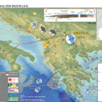
A couple days ago there was a deadly earthquake along the coast of Albania near the cities of Durrës and Mamurras. This M 6.4 earthquake caused many deaths and significant damage to buildings.
https://earthquake.usgs.gov/earthquakes/eventpage/us70006d0m/executive
The west coast of Albania is a convergent plate boundary and there is a fold and thrust belt (thrust faults and folds formed due to the compression from plate convergence). Here, the Adria plate is diving beneath the Pelagonia (Eurasia) plate to form the Adriatic collision zone. The convergence here forms the Hellenides mountains. However, much of the tectonics in the region is currently extensional.
This plate boundary system is generally part of the Alpide Belt, a convergent plate boundary that extends from Indonesia/Australia (Sumatra and Java subduction zones), through the Himalayas, through the Middle East (Makran and Zagros thrusts), through the Mediterranean (Greece, Italy), Europe (e.g. the Alps, Carpathians, Pyrenees, etc.), and northern Africa (the Atlas mtns). However, there are lots of microplates and tectonic blocks that slice-and-dice the region with strike-slip faults (like the Dead Sea Fault, the North and East Anatolian faults in Turkey, and the Cephalonia/Kefallonia transform fault in western Greece).
Here is a view of the Alpide Belt as it transects Africa, Europe, and the Middle East (Woudloper, 2009).


There was a sequence of earthquakes in September earlier this year. These are possibly either foreshocks to this November sequence, or they changed the stress in the surrounding crust to trigger the November sequence, or they are unrelated to the November sequence.
The Global Earthquake Model (GEM) program has several data products, including a global fault database and global seismic hazard and risk maps. The fault database is a compilation of many regional and national databases. In the eastern Mediterranean, the GEM faults are from the European Database of Seismogenic Faults (EDSF) and (earlier form) the
Database of Individual Seismogenic Sources (DISS).
There are some candidate faults that we can take a look at as possible sources for both the September and November sequences.
In the past several years, the rapid group-interpretation and dissemination of earthquake and tsunami data (largely via social media platforms) has changed the rate at which we learn about these events. In previous decades, it might take months to years for this information to be collected, processed, and disseminated (via peer review papers). Now, with remote sensing techniques (seismometers, satellite or aerial data, GPS, and tide gages, all of which provide near real time data) and advanced analytical methods bring us these results in days to weeks.
In the days since the earthquake, there have been many of these rapidly developed tectonic realizations. Take a look at the social media posts at the bottom of this report for some examples of this.

Below is my interpretive poster for this earthquake

  • I plot the seismicity from the past month, half year, and century, with diameter representing magnitude (see legend). I include earthquake epicenters from 1919-2019 with magnitudes M ≥ 6.0.
  • I plot the USGS fault plane solutions (moment tensors in blue and focal mechanisms in orange), possibly in addition to some relevant historic earthquakes.
  • A review of the basic base map variations and data that I use for the interpretive posters can be found on the Earthquake Reports page.
  • Some basic fundamentals of earthquake geology and plate tectonics can be found on the Earthquake Plate Tectonic Fundamentals page.

    I include some inset figures. Some of the same figures are located in different places on the larger scale map below.

  • In the lower right corner is a generalized tectonic fault map from Burchfiel et al. (2008). convergent plate boundary faults are shown with triangle symbols and red or blue lines. Strike-slip faults are shown in black. I place a yellow star in the general location of the M 6.4 temblor in these inset figures.
  • In the upper right corner is a more detailed tectonic map for this entire part of the Earth highlighting the major collision zones (Dilek, 2006). There is a cross section through the crust to the left of this map (D-D’ in orange). The western part of the cross section extends through southern Italy. The eastern portion extends through the Balkans.
  • Here is the map with a month’s, a half year’s, and a century’s seismicity plotted.
  • I highlight some earthquakes that happened in Italy in 2009 and 2016. More about those sequences can be found in the Earthquake Report here.

Below is a poster that shows possible fault sources

  • There are 3 recognized faults in the area of this September/November sequence – the Vore, Shijak, and Lushnje faults.
  • Given the data in the database, these faults may be capable of earthquakes with magnitudes of 5.5, 5.8, and 7.2 respectively.
  • Most thrust faults in the region are southwest vergent (they dip down eastwards into the Earth). However, the Vore fault is northeast vergent.
  • 1979 earthquake focal mechanisms along the Montenegro system are from Benetatos and Kiratzi (2006).

Shaking Intensity and Potential for Ground Failure

  • Below are a series of maps that show the shaking intensity and potential for landslides and liquefaction. These are all USGS data products.
  • There are many different ways in which a landslide can be triggered. The first order relations behind slope failure (landslides) is that the “resisting” forces that are preventing slope failure (e.g. the strength of the bedrock or soil) are overcome by the “driving” forces that are pushing this land downwards (e.g. gravity). The ratio of resisting forces to driving forces is called the Factor of Safety (FOS). We can write this ratio like this:

    FOS = Resisting Force / Driving Force

    When FOS > 1, the slope is stable and when FOS < 1, the slope fails and we get a landslide. The illustration below shows these relations. Note how the slope angle α can take part in this ratio (the steeper the slope, the greater impact of the mass of the slope can contribute to driving forces). The real world is more complicated than the simplified illustration below.


    Landslide ground shaking can change the Factor of Safety in several ways that might increase the driving force or decrease the resisting force. Keefer (1984) studied a global data set of earthquake triggered landslides and found that larger earthquakes trigger larger and more numerous landslides across a larger area than do smaller earthquakes. Earthquakes can cause landslides because the seismic waves can cause the driving force to increase (the earthquake motions can “push” the land downwards), leading to a landslide. In addition, ground shaking can change the strength of these earth materials (a form of resisting force) with a process called liquefaction.
    Sediment or soil strength is based upon the ability for sediment particles to push against each other without moving. This is a combination of friction and the forces exerted between these particles. This is loosely what we call the “angle of internal friction.” Liquefaction is a process by which pore pressure increases cause water to push out against the sediment particles so that they are no longer touching.
    An analogy that some may be familiar with relates to a visit to the beach. When one is walking on the wet sand near the shoreline, the sand may hold the weight of our body generally pretty well. However, if we stop and vibrate our feet back and forth, this causes pore pressure to increase and we sink into the sand as the sand liquefies. Or, at least our feet sink into the sand.
    Below is a diagram showing how an increase in pore pressure can push against the sediment particles so that they are not touching any more. This allows the particles to move around and this is why our feet sink in the sand in the analogy above. This is also what changes the strength of earth materials such that a landslide can be triggered.


    Below is a diagram based upon a publication designed to educate the public about landslides and the processes that trigger them (USGS, 2004). Additional background information about landslide types can be found in Highland et al. (2008). There was a variety of landslide types that can be observed surrounding the earthquake region. So, this illustration can help people when they observing the landscape response to the earthquake whether they are using aerial imagery, photos in newspaper or website articles, or videos on social media. Will you be able to locate a landslide scarp or the toe of a landslide? This figure shows a rotational landslide, one where the land rotates along a curvilinear failure surface.

  • Below is the liquefaction susceptibility and landslide probability map (Jessee et al., 2017; Zhu et al., 2017). Please head over to that report for more information about the USGS Ground Failure products (landslides and liquefaction). Basically, earthquakes shake the ground and this ground shaking can cause landslides. We can see that there is a low probability for landslides. However, we have already seen photographic evidence for landslides and the lower limit for earthquake triggered landslides is magnitude M 5.5 (from Keefer 1984)
  • I use the same color scheme that the USGS uses on their website. Note how the areas that are more likely to have experienced earthquake induced liquefaction are in the valleys. Learn more about how the USGS prepares these model results here.

USGS Shaking Intensity

  • Here is a figure that shows a more detailed comparison between the modeled intensity and the reported intensity. Both data use the same color scale, the Modified Mercalli Intensity Scale (MMI). More about this can be found here. The colors and contours on the map are results from the USGS modeled intensity. The DYFI data are plotted as colored dots (color = MMI, diameter = number of reports).
  • In the upper right corner is a plot showing MMI intensity (vertical axis) relative to distance from the earthquake (horizontal axis). The models are represented by the green and orange lines. The DYFI data are plotted as light blue dots. The mean and median (different types of “average”) are plotted as orange and purple dots. Note how well the reports fit the green line (the model that represents how MMI works based on quakes in California).
  • In the upper left corner is the USGS Did You Feel It reports map, showing reports as colored dots using the MMI color scale.

Other Report Pages

Some Relevant Discussion and Figures

  • Here is another map of the region showing the compression in this region (Burchfiel et al., 2008 ). I include the figure caption below in blockquote.

  • Location of the South Balkan extensional system (SBER) withing the eastern European region. The system today is within the southern Balkan region north of the North Anatolian fault (NAF), shown by the horizontal line patter. Retreating subduction zones and related backarc extensional areas for the Mediterranean region are shown in blue , and advancing subduction zones an related are a of backarc shortening are shown in red). Backarc extensional regions are shown by dotted pattern. KF = Kefalonia fault zone.

  • Here is the tectonic map from Dilek and Sandvol (2009).

  • Tectonic map of the Aegean and eastern Mediterranean region showing the main plate boundaries, major suture zones, fault systems and tectonic units. Thick, white arrows depict the direction and magnitude (mm a21) of plate convergence; grey arrows mark the direction of extension (Miocene–Recent). Orange and purple delineate Eurasian and African plate affinities, respectively. Key to lettering: BF, Burdur fault; CACC, Central Anatolian Crystalline Complex; DKF, Datc¸a–Kale fault (part of the SW Anatolian Shear Zone); EAFZ, East Anatolian fault zone; EF, Ecemis fault; EKP, Erzurum–Kars Plateau; IASZ, Izmir–Ankara suture zone; IPS, Intra–Pontide suture zone; ITS, Inner–Tauride suture; KF, Kefalonia fault; KOTJ, Karliova triple junction; MM, Menderes massif; MS, Marmara Sea; MTR, Maras triple junction; NAFZ, North Anatolian fault zone; OF, Ovacik fault; PSF, Pampak–Sevan fault; TF, Tutak fault; TGF, Tuzgo¨lu¨ fault; TIP, Turkish–Iranian plateau (modified from Dilek 2006).

  • Below is a series of figures from Jolivet et al. (2013). These show various data sets and analyses for Greece and Turkey.
  • Upper Panel (A): This is a tectonic map showing the major faults and geologic terranes in the region. The fault possibly associated with today’s earthquake is labeled OU on the map, for the Ula-Oren fault.
  • Lower Panel (B): This shows historic seismicity for the region. Note the general correlation with the faults in the upper panel.

  • A: Tectonic map of the Aegean and Anatolian region showing the main active structures
    (black lines), the main sutures zones (thick violet or blue lines), the main thrusts in the Hellenides where they have not been reworked by later extension (thin blue lines), the North Cycladic Detachment (NCDS, in red) and its extension in the Simav Detachment (SD), the main metamorphic units and their contacts; AlW: Almyropotamos window; BD: Bey Daglari; CB: Cycladic Basement; CBBT: Cycladic Basement basal thrust; CBS: Cycladic Blueschists; CHSZ: Central Hellenic Shear Zone; CR: Corinth Rift; CRMC: Central Rhodope Metamorphic Complex; GT: Gavrovo–Tripolitza Nappe; KD: Kazdag dome; KeD: Kerdylion Detachment; KKD: Kesebir–Kardamos dome; KT: Kephalonia Transform Fault; LN: Lycian Nappes; LNBT: Lycian Nappes Basal Thrust; MCC: Metamorphic Core Complex; MG: Menderes Grabens; NAT: North Aegean Trough; NCDS: North Cycladic Detachment System; NSZ: Nestos Shear Zone; OlW: Olympos Window; OsW: Ossa Window; OSZ: Ören Shear Zone; Pel.: Peloponnese; ÖU: Ören Unit; PQN: Phyllite–Quartzite Nappe; SiD: Simav Detachment; SRCC: South Rhodope Core Complex; StD: Strymon Detachment; WCDS: West Cycladic Detachment System; ZD: Zaroukla Detachment. B: Seismicity. Earthquakes are taken from the USGS-NEIC database. Colour of symbols gives the depth (blue for shallow depths) and size gives the magnitude (from 4.5 to 7.6).

  • Upper Panel (C): These red arrows are Global Positioning System (GPS) velocity vectors. The velocity scale vector is in the lower left corner. The main geodetic (study of plate motions and deformation of the earth) signal here is the westward motion of the North Anatolian fault system as it rotates southward as it traverses Greece. The motion trends almost south near the island of Crete, which is perpendicular to the subduction zone.
  • Lower Panel (D): This map shows the region of mid-Cenozoic (Oligo-Miocene) extension (shaded orange). It just happens that there is still extension going on in parts of this prehistoric extension.

  • C: GPS velocity field with a fixed Eurasia after Reilinger et al. (2010) D: the domain affected by distributed post-orogenic extension in the Oligocene and the Miocene and the stretching lineations in the exhumed metamorphic complexes.

  • Upper Panel (E): This map shows where the downgoing slab may be located (in blue), along with the volcanic centers associated with the subduction zone in the past.
  • Lower Panel (F): This map shows the orientation of how seismic waves orient themselves differently in different places (anisotropy). We think seismic waves travel in ways that reflects how tectonic strain is stored in the earth. The blue lines show the direction of extension in the asthenosphere, green lines in the lithospheric mantle, and red lines for the crust.

  • E: The thick blue lines illustrate the schematized position of the slab at ~150 km according to the tomographic model of Piromallo and Morelli (2003), and show the disruption of the slab at three positions and possible ages of these tears discussed in the text. Velocity anomalies are displayed in percentages with respect to the reference model sp6 (Morelli and Dziewonski, 1993). Coloured symbols represent the volcanic centres between 0 and 3 Ma after Pe-Piper and Piper (2006). F: Seismic anisotropy obtained from SKS waves (blue bars, Paul et al., 2010) and Rayleigh waves (green and orange bars, Endrun et al., 2011). See also Sandvol et al. (2003). Blue lines show the direction of stretching in the asthenosphere, green bars represent the stretching in the lithospheric mantle and orange bars in the lower crust.

  • Upper Panel (G): This is the map showing focal mechanisms in the poster above. Note the strike slip earthquakes associated with the North Anatolian fault and the thrust/reverse mechanisms associated with the thrust faults.

  • G: Focal mechanisms of earthquakes over the Aegean Anatolian region.

  • Here is a figure showing a north-south cross section through this region, from ~95 million years ago until about 2 million years ago (Dilek and Sandvol, 2009). This figure shows how the regional tectonics have developed over time, with the modern subduction zone in the south, the North Anatolian transform fault in the north, and an extensional metamorphic core complex in the center (“Core Complex” on cross section). Today’s earthquake is along the southern boundary of this core complex.

  • Late Mesozoic–Cenozoic geodynamic evolution of the western Anatolian orogenic belt as a result of collisional and extensional processes in the upper plate of north-dipping subduction zone(s) within the Tethyan realm.

  • The following three figures are from Dilek et al., 2006. The locations of the cross sections are shown on the map as orange lines.
  • Here is the map (Dilek et al., 2006). I include the figure caption below in blockquote.

  • Simplified tectonic map of the Mediterranean region showing the plate boundaries, collisional zones, and directions of extension and tectonic transport. Red lines A through G show the approximate profile lines for the geological traverses depicted in Figure 2. MHSZ—mid-Hungarian shear zone; MP—Moesian platform; RM—Rhodope massif; IAESZ— Izmir-Ankara-Erzincan suture zone; IPS—Intra-Pontide suture zone; ITS—inner Tauride suture zone; NAFZ—north Anatolian fault zone; KB—Kirsehir block; EKP—Erzurum-Kars plateau; TIP—Turkish-Iranian plateau.

  • Here are cross sections A-D (Dilek et al., 2006). I include the figure caption for cross section D-D’ below in blockquote.

  • Simplified tectonic cross-sections across various segments of the broader Alpine orogenic belt. (D) Southern Apennines–Albanides–Hellenides. Note the break where the Adriatic Sea is located between the western and eastern sections along this traverse. The Adria plate and the remnant Ionian oceanic lithosphere underlie the Apenninic-Maghrebian orogenic belt. The Alpine-Tethyan and Apulian platform units are telescoped along ENE-vergent thrust faults. The Tyrrhenian Sea opened up in the latest Miocene as a back-arc basin behind the Apenninic-Maghrebian mountain belt. The Aeolian volcanoes in the Tyrrhenian Sea represent the volcanic arc system in this subduction-collision zone environment. Modified from Lentini et al. (this volume). The eastern section of this traverse across the Albanides-Hellenides in the northern Balkan Peninsula shows a bidivergent crustal architecture, with the Jurassic Tethyan ophiolites (Mirdita ophiolites in Albania and Western Hellenic ophiolites in Greece) forming the highest tectonic nappe, resting on the Cretaceous and younger flysch deposits of the Adria affinity to the west and the Pelagonia affinity to the east. Following the emplacement of the Mirdita- Hellenic ophiolites onto the Pelagonian ribbon continent in the Early Cretaceous, the Adria plate collided with Pelagonia-Europe obliquely starting around ca. 55 Ma. WSW-directed thrusting, developed as a result of this oblique collision, has been migrating westward into the peri-Adriatic depression. Modified from Dilek et al. (2005).

Seismic Hazard and Seismic Risk

  • As a reminder, this region is in the most seismically hazardous region of the Mediterranean. Here is the 50% probability of exceedance map (for 50 yrs) from Giardini et al. (2013).

  • This morning (28 Nov, Thanksgiving here in California), I put together this figure that shows the seismic hazard and seismic risk for Europe.
  • The GEM Seismic Hazard and the GEM Seismic Risk maps from Pagani et al. (2018) and Silva et al. (2018).

  • I prepared a map using the USGS earthquake data products. This map shows their modeled estimate of PGA for this earthquake. Their model shows ground accelerations (shaking) greater than 50% g. This is consistent with the GEM seismic hazard map above (suggesting this area could have ground shaking between 55% and 90% g. The labels in the poster are associated with the black PGA contours, while the colors follow the legend.

  • The GEM Seismic Hazard Map:


  • The Global Earthquake Model (GEM) Global Seismic Hazard Map (version 2018.1) depicts the geographic distribution of the Peak Ground Acceleration (PGA) with a 10% probability of being exceeded in 50 years, computed for reference rock conditions (shear wave velocity, VS30, of 760-800 m/s). The map was created by collating maps computed using national and regional probabilistic seismic hazard models developed by various institutions and projects, and by GEM Foundation scientists. The OpenQuake engine, an open-source seismic hazard and risk calculation software developed principally by the GEM Foundation, was used to calculate the hazard values. A smoothing methodology was applied to homogenise hazard values along the model borders. The map is based on a database of hazard models described using the OpenQuake engine data format (NRML); those models originally implemented in other software formats were converted into NRML. While translating these models, various checks were performed to test the compatibility between the original results and the new results computed using the OpenQuake engine. Overall the differences between the original and translated model results are small, notwithstanding some diversity in modelling methodologies implemented in different hazard modelling software. The hashed areas in the map (e.g. Greenland) are currently not covered by a hazard model. The map and the underlying database of models are a dynamic framework, capable to incorporate newly released open models. Due to possible model limitations, regions portrayed with low hazard may still experience potentially damaging earthquakes.

  • The GEM Seismic Risk Map:


  • The Global Seismic Risk Map (v2018.1) presents the geographic distribution of average annual loss (USD) normalised by the average construction costs of the respective country (USD/m2) due to ground shaking in the residential, commercial and industrial building stock, considering contents, structural and non-structural components. The normalised metric allows a direct comparison of the risk between countries with widely different construction costs. It does not consider the effects of tsunamis, liquefaction, landslides, and fires following earthquakes. The loss estimates are from direct physical damage to buildings due to shaking, and thus damage to infrastructure or indirect losses due to business interruption are not included. The average annual losses are presented on a hexagonal grid, with a spacing of 0.30 x 0.34 decimal degrees (approximately 1,000 km2 at the equator). The average annual losses were computed using the event-based calculator of the OpenQuake engine, an open-source software for seismic hazard and risk analysis developed by the GEM Foundation. The seismic hazard, exposure and vulnerability models employed in these calculations were provided by national institutions, or developed within the scope of regional programs or bilateral collaborations. This global map and the underlying databases are based on best available and publicly accessible datasets and models. Due to possible model limitations, regions portrayed with low risk may still experience potentially damaging earthquakes.

Return to the Earthquake Reports page.


Earthquake Report: Halmahera, Indonesia

While I was back in the Ridgecrest, CA area further documenting our slickenline observations from the 5 July 2019 M 7.1 Ridgecrest Earthquake, there was a tsunamigenic earthquake in the Molucca Sea near Halmahera, Indonesia. Some of my earliest earthquake reports were from this region, but I have not had the opportunity to write anything up for earthquakes in this area for a few years.
https://earthquake.usgs.gov/earthquakes/eventpage/us60006bjl/executive
The Halmahera Strait/Molucca Sea region is interesting as there is a pair of divergent subduction zones here. Basically, one dips to the east and one dips to the west, though it is a little more complicated.
McCaffrey et al. (1980) presented one of the first views of the subduction/thrust tectonics in this region. Since then, advances in marine geophysical methods have furthered our understanding and have generally re-enforced the early hypotheses rather well.
There was a minor tsunami recorded at a tide gage that was only 135 km (65 miles) from the epicenter. Here are those data plotted relative to time. The wave has a wave height of about 20 cm. The waves lasted several hours (it appears that maybe the waves resonated in the harbor).


In the interest of keeping this simple, I first present the interpretive poster, then I present some key figures that provide a seismotectonic context to this sequence.

Below is my interpretive poster for this earthquake

  • I plot the seismicity from the past month, with diameter representing magnitude (see legend). I include earthquake epicenters from 1919-2019 with magnitudes M ≥ 7.0 in one version.
  • I plot the USGS fault plane solutions (moment tensors in blue and focal mechanisms in orange), possibly in addition to some relevant historic earthquakes.
  • A review of the basic base map variations and data that I use for the interpretive posters can be found on the Earthquake Reports page.
  • Some basic fundamentals of earthquake geology and plate tectonics can be found on the Earthquake Plate Tectonic Fundamentals page.

    I include some inset figures. Some of the same figures are located in different places on the larger scale map below.

  • In the upper right corner are a series of panels from Zhang et al. (2017). The upper panel shows the major plate boundaries (subduction zones). I place a yellow star in the general location of this M 7.1 temblor. The middle panel shows a cross section of the Halmahera Strait where we can see the Mulucca Sea plate is diving to the east under the Philippine Sea plate and to the west under the Eurasia plate. This matches early cross sections (e.g. McCaffrey et al., 1980). The cross section is located along the red line on the poster (A-B). The lower panel shows seismicity for this area and we can see earthquakes trend deeper in bothe directions (east and west), though deeper to the west (red dots). Lines A-A’, B-B’, C-C’, D-D’, and E-E’ represent the locations of profiles included in the upper left figure.
  • In the upper left corner is a series of cross sections A-A’, B-B’, C-C’, D-D’, and E-E’. These are profiles showing material properties of the Earth based on seismic tomographic analysis. Seismic tomography is based on the same principles as CT scans. So, we can imagine that these profiles are like X-Ray scans of the Earth’s interior. Blue represents materials with faster seismic velocity (older and colder oceanic crust) and red represents materials with slower seismic velocity (generally hotter crust).
  • In the lower left corner is a plot of the tide gage data from Bitung, Sulawesi (location shown on interpretive poster).
  • Here is the map with a month’s and century’s seismicity plotted.

  • Here is a map that shows shaking intensity using the MMI scale. The colors and black contours are from the USGS shaking intensity model. I also include some of the “Did You Feel It?” report observations (e.g. labeled “DYFI 4.9”).
  • In the upper left corner is a plot from the USGS that includes both modeled data (the orange and green lines) and DYFI data (the points and whisker plots). The legend informs us about the source of these different data.

Other Report Pages

Some Relevant Discussion and Figures

  • Here is a tectonic map for this part of the world from Zahirovic et al., 2014. I left out all the acronym definitions (you’re welcome), but they are listed in the paper.

  • Regional tectonic setting with plate boundaries (MORs/transforms = black, subduction zones = teethed red) from Bird (2003) and ophiolite belts representing sutures modified from Hutchison (1975) and Baldwin et al. (2012). West Sulawesi basalts are from Polvé et al. (1997), fracture zones are from Matthews et al. (2011) and basin outlines are from Hearn et al. (2003).

  • Here are the figures from Zhang et al. (2017). First I present the tectonic overview figure, with captions below.

  • (a) Sketch of the Molucca Sea subduction zone and its vicinity. (b) Cross section (A-B) demonstrating the structure of arc-arc collision zone (modified after Hall and Smyth [2008]). (c) Distribution of earthquake events (2011.1.1–2015.12.31) and focal mechanism; the insert shows the vertical profile of epicenters sliced at position B-B0 . The black
    dashed line in Figure 1a is the position of cross section A-B in Figure 1b, and the red solid lines in Figure 1c are the cross sections of the seismic tomographic velocity model in Figure 2.

  • Here is the seismic tomography profile figure.

  • Vertical slices of seismic velocity beneath the Molucca Sea and its surrounding regions, in which positive velocity anomalies outline the unique shape of the subducting Molucca Sea plate. The tomographic images are sliced from the global P wave velocity anomaly model UU-P07 [Amaru, 2007] along positions shown in Figure 1c.

  • If we look at the first Zhang et al. (2017) figure above, the seismicity shows that the slab dipping to the west has earthquakes that extend much deeper than the zone dipping to the east. These authors hypothesized about why these subduciton zones are assymetrical (possibly due to mantle flow around the downgoing ocean crustal slabs). Zhang et al. (2017) conducted numerical analysis of mantle flow.
  • Here is a figure that shows some illustrations depicting possible tectonic configurations for this region.

  • Cartoon of end-member models illustrating effects of the order of subduction initiation, the mobility and thickness of the overriding plates on slab morphology, and migration of the overriding plates during DDS. Idealized DDS features (a) symmetrical subduction of slabs and (b–d) asymmetrical plate shape resulted from influence of order of subduction initiation, mobility, and thickness of overriding plates, respectively. (e) Tentative interpretation of formation of the asymmetrical DDS observed in the Molucca Sea region. Size of arrows indicate relative scale of the subduction-induced mantle flow.

  • Zhang et al., 2017 present below different possible configurations of double subduction zones.

  • Cartoons illustrating several forms of double subduction. (a) Divergent double subduction (descripted in this study and by Soesoo et al. [1997], Di Leo et al. [2014], Li et al., [2014], etc.). (b) Double subduction with opposite dipping directions (descripted by Maruyama et al. [ 2007]). (c and d) Convergent double subduction (descripted by Jagoutz et al. [2015] and Billen [2015]). In all of these case, sustainable subduction of the oceanic plate(s) requires smooth escape (Figures 17a and 17c) of the slab-trapped mantle or replenishment of external materials of mantle into the void space left by slab rollback (Figures 17b and 17d). The toroidal mantle flow (orange arrows) plays a dominant role in
    redistribution of material during all these types of double subduction.

  • Based on their analyses, Zhang et al. (2017) make some conclusions about the divergent subduction zones in this region.
    1. The self-sustaining, asymmetrical subduction of the Molucca Sea plate may drive the convergence of the overriding plates and collision of magmatic arcs, even in an extensional setting of SE Asia.
    2. The earlier and faster subduction on the western Sangihe side with respect to the eastern Halmahera side predominantly led to formation of the present-day asymmetrical shape of the subducting Molucca Sea plate.
    3. The relative immobility of the western overriding Eurasian plate may have promoted the westward migration of the Halmahera arc in the Molucca Sea subduction zone.
    4. Bending of arcs was probably a consequence of the toroidal mantle flow induced by rollback of the subducting Molucca Sea plate on its both sides.
    5. DDS is unsustainable without effective escape of the slab-trapped mantle via toroidal flow. It is therefore likely that DDS is confined to narrow and short oceanic plates and is related to closure of archipelagic oceans and accretion of arcs in accretionary orogenic belts.
  • Here are maps showing the regional tectonics (Smoczyk et al., 2013).

  • Along its western margin, the Philippine Sea plate is associated with a zone of oblique convergence with the Sunda plate. This highly active convergent plate boundary extends along both sides the Philippine Islands, from Luzon in the north to Sulawesi in the south. The tectonic setting of the Philippines is unusual in several respects: it is characterized by opposite-facing subduction systems on its east and west sides; the archipelago is cut by a major transform fault, the Philippine Fault; and the arc complex itself is marked by volcanism, faulting, and high seismic activity. Subduction of the Philippine Sea plate occurs at the eastern margin of the archipelago along the Philippine Trench and its northern extension, the East Luzon Trough. The East Luzon Trough is thought to be an unusual example of a subduction zone in the process of formation, as the Philippine Trench system gradually extends northward (Hamburger and others, 1983).

  • This shows Global Positioning System (GPS) velocities at various locations. These plate motions are represented as vectors in mm/yr. (see legend) Note that the plate motion vectors on either side of the Halmahera Strait are opposing each other, evidence of the contraction/convergence/compression across these plate boundary faults. Below I include the text from the original figure caption in blockquote.

  • Topographic and tectonic map of the Indonesian archipelago and surrounding region. Labeled, shaded arrows show motion (NUVEL-1A model) of the first-named tectonic plate relative to the second. Solid arrows are velocity vectors derived from GPS surveys from 1991 through 2001, in ITRF2000. For clarity, only a few of the vectors for Sumatra are included. The detailed velocity field for Sumatra is shown in Figure 5. Velocity vector ellipses indicate 2-D 95% confidence levels based on the formal (white noise only) uncertainty estimates. NGT, ew Guinea Trench; NST, North Sulawesi Trench; SF, Sumatran Fault; TAF, Tarera-Aiduna Fault. Bathymetry [Smith and Sandwell, 1997] in this and all subsequent figures contoured at 2 km intervals

  • This is one of my favorite figures of all time (Hall, 2011). Today’s earthquake sequence happened in the center of the middle panel, between the cyan (Molluca plate) and yellow plates. Read below for more details.

  • 3D cartoon of plate boundaries in the Molucca Sea region modified from Hall et al. (1995). Although seismicity identifies a number of plates there are no continuous boundaries, and the Cotobato, North Sulawesi and Philippine Trenches are all intraplate features. The apparent distinction between different crust types, such as Australian continental crust and oceanic crust of the Philippine and Molucca Sea, is partly a boundary inactive since the Early Miocene (east Sulawesi) and partly a younger but now probably inactive boundary of the Sorong Fault. The upper crust of this entire region is deforming in a much more continuous way than suggested by this cartoon.

  • Here is a map and cross section presented by Waltham et al. (2008). They use a variety of data sources as a basis for their interpretations (seismic reflection data, gravity data). Note how the Molucca Sea plate subducts both to the west and to the east. Below I include the text from the original figure caption in blockquote.

  • (A) Location and major tectonic features of the Molucca Sea region. Small, black-filled triangles are modern volcanoes. Bathymetric contours are at 200, 2000, 4000, and 6000 m. Large barbed lines are subduction zones, and small barbed lines are thrusts. (B) Cross section across the Halmahera and Sangihe Arcs on section line B. Thrusts on each side of the Molucca Sea are directed outward toward the adjacent arcs, although the subducting Molucca Sea plate dips east beneath Halmahera and west below the Sangihe Arc. (C) Inset is the restored cross section of the Miocene–Pliocene Weda Bay Basin of SW Halmahera on section line C, fl attened to the Pliocene unconformity, showing estimated thickness of the section

  • Early work done in the region was presented by McCaffrey et al. (1980). Here is a map showing seismic refraction lines that they used to constrain the structures in this region. Below I include the text from the original figure caption in blockquote.

  • Map of the Molucca Sea, eastern Indonesia, showing I~tions of seismic refraction lines (solid straight lines) and gravity traverses (dashed-dotted lines). Thrust faults are shown with teeth on hanging wall. Triangles represent active volcanoes defining the Sangihe and Halmahera magmatic arcs. Isobath interval is 1 km from Mammericks et al. [1976].

  • Here is a cross section that shows the gravity model they used to interpret this region.

  • Gravity model for the central Molucca Sea. (II) Crustal model with layers designated by their density contrasts and refraction control points by open circles and vertical bars. (b) Mantle structure used in modeling the gravity profiles in the central Molucca Sea. Figure 124 fits into the small box at the apex of the inverted-V-ehaped lithosphere. Slab dimensions are controlled by earthquake foci (dots) from Hlltherton 11M Dickinaon [1969J, and mantle densities are taken from Grow 11M Rowin [1975J. The column at the left shows assumed densities for the range of depths between the tick marks. The small v pattern represents oceanic crust, and island arc crust is designated by a short parallel line pattern. East is to the right of the figure.

  • Here is another tectonic map showing the Sorong fault and some splay faults (dashed lines running along Halmahera), one of which may be involved in today’s earthquake.

  • Location map and active faults of the Molucca Sea region. Fault colours: blue, convergence; red, transvergence; yellow, divergence; grey, uncertain motion. Fault abbreviations: CF, Catabato Fault; GF, Gorontalo Fault; NST, North Sulawesi Trench; PKF, Palu-Koro Fault; SF, Sorong Fault.

Seismic Hazard and Seismic Risk

  • These are the two maps shown in the map above, the GEM Seismic Hazard and the GEM Seismic Risk maps from Pagani et al. (2018) and Silva et al. (2018).
    • The GEM Seismic Hazard Map:


    • The Global Earthquake Model (GEM) Global Seismic Hazard Map (version 2018.1) depicts the geographic distribution of the Peak Ground Acceleration (PGA) with a 10% probability of being exceeded in 50 years, computed for reference rock conditions (shear wave velocity, VS30, of 760-800 m/s). The map was created by collating maps computed using national and regional probabilistic seismic hazard models developed by various institutions and projects, and by GEM Foundation scientists. The OpenQuake engine, an open-source seismic hazard and risk calculation software developed principally by the GEM Foundation, was used to calculate the hazard values. A smoothing methodology was applied to homogenise hazard values along the model borders. The map is based on a database of hazard models described using the OpenQuake engine data format (NRML). Due to possible model limitations, regions portrayed with low hazard may still experience potentially damaging earthquakes.
    • Here is a view of the GEM seismic hazard map for Indonesia.

    • The USGS Seismic Hazard Map:
    • Here is another version of the seismic hazard for this region (Smoczyk et al., 2013). The GEM map suggests that the islands along the Halmahera Strait may have accelerations between 0.8-1.6 m2. This translates to 0.08 to 0.16 g. The GEM seismic hazard map shows a potential shaking of 0.20-0.35 g, slightly higher.

    • The GEM Seismic Risk Map:


    • The Global Seismic Risk Map (v2018.1) presents the geographic distribution of average annual loss (USD) normalised by the average construction costs of the respective country (USD/m2) due to ground shaking in the residential, commercial and industrial building stock, considering contents, structural and non-structural components. The normalised metric allows a direct comparison of the risk between countries with widely different construction costs. It does not consider the effects of tsunamis, liquefaction, landslides, and fires following earthquakes. The loss estimates are from direct physical damage to buildings due to shaking, and thus damage to infrastructure or indirect losses due to business interruption are not included. The average annual losses are presented on a hexagonal grid, with a spacing of 0.30 x 0.34 decimal degrees (approximately 1,000 km2 at the equator). The average annual losses were computed using the event-based calculator of the OpenQuake engine, an open-source software for seismic hazard and risk analysis developed by the GEM Foundation. The seismic hazard, exposure and vulnerability models employed in these calculations were provided by national institutions, or developed within the scope of regional programs or bilateral collaborations.

Tsunami Hazard

  • Here are two maps that show the results of probabilistic tsunami modeling for the nation of Indonesia (Horspool et al., 2014). These results are similar to results from seismic hazards analysis and maps. The color represents the chance that a given area will experience a certain size tsunami (or larger).
  • The first map shows the annual chance of a tsunami with a height of at least 0.5 m (1.5 feet). The second map shows the chance that there will be a tsunami at least 3 meters (10 feet) high at the coast.

  • Annual probability of experiencing a tsunami with a height at the coast of (a) 0.5m (a tsunami warning) and (b) 3m (a major tsunami warning).

    Social Media

    References:

    Basic & General References

  • Frisch, W., Meschede, M., Blakey, R., 2011. Plate Tectonics, Springer-Verlag, London, 213 pp.
  • Hayes, G., 2018, Slab2 – A Comprehensive Subduction Zone Geometry Model: U.S. Geological Survey data release, https://doi.org/10.5066/F7PV6JNV.
  • Holt, W. E., C. Kreemer, A. J. Haines, L. Estey, C. Meertens, G. Blewitt, and D. Lavallee (2005), Project helps constrain continental dynamics and seismic hazards, Eos Trans. AGU, 86(41), 383–387, , https://doi.org/10.1029/2005EO410002. /li>
  • Kreemer, C., J. Haines, W. Holt, G. Blewitt, and D. Lavallee (2000), On the determination of a global strain rate model, Geophys. J. Int., 52(10), 765–770.
  • Kreemer, C., W. E. Holt, and A. J. Haines (2003), An integrated global model of present-day plate motions and plate boundary deformation, Geophys. J. Int., 154(1), 8–34, , https://doi.org/10.1046/j.1365-246X.2003.01917.x.
  • Kreemer, C., G. Blewitt, E.C. Klein, 2014. A geodetic plate motion and Global Strain Rate Model in Geochemistry, Geophysics, Geosystems, v. 15, p. 3849-3889, https://doi.org/10.1002/2014GC005407.
  • Meyer, B., Saltus, R., Chulliat, a., 2017. EMAG2: Earth Magnetic Anomaly Grid (2-arc-minute resolution) Version 3. National Centers for Environmental Information, NOAA. Model. https://doi.org/10.7289/V5H70CVX
  • Müller, R.D., Sdrolias, M., Gaina, C. and Roest, W.R., 2008, Age spreading rates and spreading asymmetry of the world’s ocean crust in Geochemistry, Geophysics, Geosystems, 9, Q04006, https://doi.org/10.1029/2007GC001743
  • Specific References

  • Hall, R., 2011. Australia-SE Asia collision: plate tectonics and crustal flow in Geological Society, London, Special Publications 2011; v. 355; p. 75-109 doi: 10.1144/SP355.5
  • Hall., R., Audley-Charles, M.G., Banner, F.T., Hidayat, S., Tobing, S.L., 1988. Basement rocks of the Halmahera region, eastern Indonesia: a Late Cretaceous-early Tertiary arc and fore-arc in Journal of the Geological Society, v. 145, p. 65-84
  • Horspool, N., Pranantyo, I., Griffin, J., Latief, H., Natawidjaja, D. H., Kongko, W., Cipta, A., Bustaman, B., Anugrah, S. D., and Thio, H. K., 2014. A probabilistic tsunami hazard assessment for Indonesia, Nat. Hazards Earth Syst. Sci., 14, 3105-3122, https://doi.org/10.5194/nhess-14-3105-2014, 2014.
  • McCaffrey, R., Silver, E.A., and Raitt, R.W., 1980. Crustal Structure of the Molucca Sea Collision Zone, Indonesia in The Tectonic and Geologic Evolution of Southeast Asian Seas and Islands-Geophysical Monograph 23, p. 161-177.
  • Pagani,M. , J. Garcia-Pelaez, R. Gee, K. Johnson, V. Poggi, R. Styron, G. Weatherill, M. Simionato, D. Viganò, L. Danciu, D. Monelli (2018). Global Earthquake Model (GEM) Seismic Hazard Map (version 2018.1 – December 2018), DOI: 10.13117/GEM-GLOBAL-SEISMIC-HAZARD-MAP-2018.1
  • Silva, V ., D Amo-Oduro, A Calderon, J Dabbeek, V Despotaki, L Martins, A Rao, M Simionato, D Viganò, C Yepes, A Acevedo, N Horspool, H Crowley, K Jaiswal, M Journeay, M Pittore, 2018. Global Earthquake Model (GEM) Seismic Risk Map (version 2018.1). https://doi.org/10.13117/GEM-GLOBAL-SEISMIC-RISK-MAP-2018.1
  • Smoczyk, G.M., Hayes, G.P., Hamburger, M.W., Benz, H.M., Villaseñor, Antonio, and Furlong, K.P., 2013. Seismicity of the Earth 1900–2012 Philippine Sea plate and vicinity: U.S. Geological Survey Open-File Report 2010–1083-M, 1 sheet, scale 1:10,000,000.
  • Zahirovic et al., 2014. The Cretaceous and Cenozoic tectonic evolution of Southeast Asia in Solid Earth, v. 5, p. 227-273, doi:10.5194/se-5-227-2014.
  • Zhang, Q., F. Guo, L. Zhao, and Y. Wu, 2017. Geodynamics of divergent double subduction: 3-D numerical modeling of a Cenozoic example in the Molucca Sea region, Indonesia, J. Geophys. Res. Solid Earth, 122, 3977–3998, doi:10.1002/2017JB013991.
  • Zulkifli, M., Rudyanto, A., and Sakti, A.P., 2016. The View of Seismic Hazard in The Halmahera Region in proceedings from International Symposium on Earth Hazard and Disaster Mitigation (ISEDM) 2016 AIP Conf. Proc. 1857, 050004-1–050004-7; doi:10.1063/1.4987082

Return to the Earthquake Reports page.