Volcano Report: Pavlof

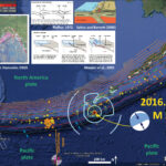
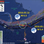
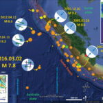
Pavlof Volcano (PV) is erupting. PV is located near Sand Point Alaska, along the eastern Aleutian Magmatic Arc. The Alaska Volcano Observatory placed the PV into alert level “warning” and aviation color code red. Below is the description of the current conditions in blockquote:

Pavlof Volcano began erupting abruptly this afternoon, sending an ash cloud to 20,000 ft ASL as reported by a pilot. As of 4:18 pm AKDT (00:18 UTC), ash was reportedly moving northward from the volcano. Seismicity began to increase from background levels at about 3:53 pm (23:53 UTC) with quick onset of continuous tremor, which remains at high levels. AVO is raising the Aviation Color Code to RED and the Volcano Alert Level to WARNING.

Here is the AVO page for Pavlof.
This is a map that shows the Volcanoes in this region (Schaefer et al., 2014). Here is a link to a larger sized, higher resolution version of the map (34 MB pdf).


This is a screen shot showing the alert status and the definition of “red.” This page is dynamic, so if you click on the above link to the AVO page, it will have different content. I include images from the Forecast parts of the page below.

Pavlof Volcano Description

From the AVO:

Pavlof Volcano is a snow- and ice-covered stratovolcano located on the southwestern end of the Alaska Peninsula about 953 km (592 mi) southwest of Anchorage. The volcano is about 7 km (4.4 mi) in diameter and has active vents on the north and east sides close to the summit. With over 40 historic eruptions, it is one of the most consistently active volcanoes in the Aleutian arc. Eruptive activity is generally characterized by sporadic Strombolian lava fountaining continuing for a several-month period. Ash plumes as high as 49,000 ft ASL have been generated by past eruptions of Pavlof, and during the 2013 eruption, ash plumes as high as 27,000 feet above sea level extending as much as 500 km (310 mi) beyond the volcano were generated. The nearest community, Cold Bay, is located 60 km (37 miles) to the southwest of Pavlof.

    Forecasts

  • Ashfall Forecast
    • This and all following ashfall graphics is the output of a mathematical model of volcanic ash transport and deposition on the ground (Ash3D, USGS).
    • This model shows expected ashfall accumulation (deposit thickness) for actual or hypothetical eruptions.
    • AVO produces this graphic when a volcano is restless by assuming a reasonable hypothetical eruption, in order to provide a pre-eruptive forecast of areas likely to be affected. During an eruption, AVO updates the forecast with actual observations (eruption start time and duration, plume height) as they become available.
    • Colored contour lines represent points of equal ash thickness on the ground. Small accumulations of ash may occur beyond the “Trace” contour. Actual deposit thickness may vary from the forecast as the modelled points are based on our best estimates. Thickness terms are explained here.
    • This graphic does not show ash cloud movement in the atmosphere; please refer to the other graphics for ash cloud forecasts. Click here to return to other models output.


  • Ash Cloud Height Forecast
    • This model shows expected movement of an ash cloud in the atmosphere for actual or hypothetical eruptions.
    • AVO produces this graphic when a volcano is restless by assuming a reasonable hypothetical eruption, in order to provide a pre-eruptive forecast of airspace likely to be affected. During an eruption, AVO updates the forecast with actual observations (eruption start time and duration, plume height) as they become available.
    • Colors represent the height of the top of the ash cloud, in feet above sea level, as it drifts downwind.
    • This graphic does not show ashfall deposition on the ground; go here for ashfall graphic. Note that it is possible for ash clouds to move overhead with little or no fallout on the ground.
    • For more information about ASH3D, see USGS Open-File Report 2013-1122.


  • Ash Cloud Load Forecast
    • This model shows expected load (amount) of ash in the atmosphere for actual or hypothetical eruptions.
    • AVO produces this graphic when a volcano is restless by assuming a reasonable hypothetical eruption, in order to provide a pre-eruptive forecast of airspace likely to be affected. During an eruption, AVO updates the forecast with actual observations (eruption start time and duration, plume height) as they become available.
    • Colors represent amounts of ash in the atmosphere, summed from the bottom to the top of the cloud. Warmer colors represent areas of greater ash; colder colors mean less ash.
      This graphic does not show ashfall deposition on the ground; go here for ashfall graphic. Note that it is possible for ash clouds to move overhead with little or no fallout on the ground.


  • Puff Cloud Height Forecast
    • This model shows expected movement of an ash cloud in the atmosphere for actual or hypothetical eruptions.
    • AVO produces this graphic when a volcano is restless by assuming a reasonable hypothetical eruption, in order to provide a pre-eruptive forecast of airspace likely to be affected. During an eruption, AVO will update the forecast with actual observations (eruption start time and duration, plume height) as they become available.
    • Colored dots represent the estimated height of the top of the ash cloud, in feet above sea level, as it drifts downwind. [Change the color bar legend to “Height of top of ash cloud”]
    • This graphic does not show ashfall deposition on the ground; go here for ashfall graphic. Note that it is possible for ash clouds to move overhead with little or no fallout on the ground.
    • For more information about Puff, see http://pafc.arh.noaa.gov/puff/index.html.


  • Trajectory Forecast
    • This trajectory graphic is the output of a mathematical model showing wind direction and speed at different altitudes above sea level (HYSPLIT, NOAA). It does not contain information about ash emissions from the volcano.
    • Colored lines show the direction an ash cloud emanating from a point source (the volcano) would travel at different altitudes in feet above ground level. A given eruption cloud may not reach all altitudes shown.
    • Symbols are spaced one hour apart and reflect the forecast speed of the ash cloud.
    • This model is updated every 6 hours.
      • UTC to AKDT conversion (Alaska Daylight Time):

      • 0000 UTC = 4:00 PM AKDT on the previous day as UTC
      • 0600 UTC = 10:00 PM AKDT on the previous day as UTC
      • 1200 UTC = 4:00 AM AKDT on the same day as UTC
      • 1800 UTC= 10:00 AM AKDT on the same day as UTC
    • For more information about HYSPLIT see: http://www.arl.noaa.gov/ready/traj_alaska.html.


    Earthquakes Also

  • Interesting that to the west there have been a few earthquakes recently. Here is a map that shows those regions, along with the volcano locations. Note Pavlof is along the eastern part of this map, approximately 900 km east of the Amlia fracture zone (which is just east of the largest cluster of earthquakes.


    Images from the 2014/11/12-16 eruption

  • In 2014/11/12 Pavlof Volcano began erupting. The report from the Global Volcanism Project for that eruption is here.
    • 2014/11/16 07:02 AM UTC – NASA EO-1 Advanced Land Imager image high temperature flowage deposit on the northwest flank of Pavlof Volcano. This shortwave infrared image is sensitive to very high temperatures. This flowage deposit likely contains both new lava and hot rock debris, but the distribution has not yet been determined. The deposit extends for about 3.3 miles (5.4 km) from the vent.

    • 2016/11/15 21:46 PM UTC – Satellite image from the USGS/NASA Landsat-8 satellite showing the eruption cloud at Pavlof Volcano on November 15 at 12:46 pm AKST (21:46 UTC). This is just a portion of the eruption cloud, which extended for more than 250 miles to the northwest at the time this image was collected. In this image, the distance from the erupting vent to the upper left corner of the image is 45 miles (70 km). The shadow of the eruption cloud on the underlying meteorological clouds can be seen in this image. Pilots reported the height of the cloud at 35,000 ft (10.7 km) above sea level.

    References:

  • Global Volcanism Program, 2015. Report on Pavlof (United States). In: wunderman, R (ed.), Bulletin of the Global Volcanism Network, 40:4. Smithsonian Institution. http://dx.doi.org/10.5479/si.GVP.BGVN201504-312030.
  • Schaefer, J.R., Cameron, C.E., and Nye, C.J., 2014, Historically active volcanoes of Alaska, in Schaefer, J.R., Cameron, C.E., and Nye, C.J., Historically active volcanoes of Alaska: Alaska Division of Geological & Geophysical Surveys Miscellaneous Publication 133 v. 1.2, 1 sheet, scale 1:3,000,000. doi:10.14509/20181

Earthquake Report: Nikolski!

As I was writing my page on the 1964 Great Alaska Earthquake (here), there was a M 5.7 earthquake along the Aleutian Trench east of the Amlia fracture zone. Here is the USGS web page for this earthquake. The region around the AFZ is quite active, with the most recent series of earthquakes this month. Here is my earthquake report on those earthquakes.
I put together a quick earthquake report poster posted below. I include the USGS moment tensor. More on the tectonics of Alaska can be found in this USGS Open-File Report (Benz et al., 2010).
There is a legend that shows how moment tensors can be interpreted. Moment tensors are graphical solutions of seismic data that show two possible fault plane solutions. One must use local tectonics, along with other data, to be able to interpret which of the two possible solutions is correct. The legend shows how these two solutions are oriented for each example (Normal/Extensional, Thrust/Compressional, and Strike-Slip/Shear). There is more about moment tensors and focal mechanisms at the USGS.

    I include some inset figures.

  • In the upper left corner, I place a map created by Peter Haeussler, USGS, which shows the historic earthquakes along the Alaska and Aleutian subduction zones.
  • To the right of Hauessler’s map, I show a cross section of a subduction zone through the two main parts of the earthquake cycle. The interseismic part (in-between earthquakes) and the coseismic part (during earthquakes). This was developed by George Plafker and published in his 1972 paper on the Good Friday Earthquake.
  • To the right of that is from Saltus and Barnett (2000) shows an oblique cross section of the Aleutian subduction zone that is a part of the “Eastern Aleutian Volcanic Arc Digital Model.’
  • Below the Plafker and Saltus and Bernett figures is a figure from Atwater et al. (2005) that shows the earthquake cycle and how a tsunami can be generated at a subduction zone.
  • In the lower right corner, I include the USGS intensity map.


More Alaska-Aleutian related earthquakes can be found in my earthquake reports posted here.

Good Friday Earthquake: 1964/03/27 in Alaska

Today we commemorate the Good Friday Earthquake, which occurred on March 27, 1964. This is the second largest earthquake ever recorded on modern seismographic instruments. I summarize some of the information that we have about this earthquake, but this is far from a comprehensive display. The Good Friday Earthquake is one of the most studied earthquakes, along with the 20122/03/11 Tohoku-Oki earthquake. Much of what we learned about the 1964 earthquake was originally presented in a series of USGS Professional Papers here.
https://earthquake.usgs.gov/earthquakes/eventpage/official19640328033616_30/executive
Below is an educational video from the USGS that presents material about subduction zones and the 1964 earthquake and tsunami in particular.
Youtube Source IRIS
mp4 file for downloading.

    Credits:

  • Animation & graphics by Jenda Johnson, geologist
  • Directed by Robert F. Butler, University of Portland
  • U.S. Geological Survey consultants: Robert C. Witter, Alaska Science Center Peter J. Haeussler, Alaska Science Center
  • Narrated by Roger Groom, Mount Tabor Middle School

This is a map from Haeussler et al. (2014). The region in red shows the area that subsided and the area in blue shows the region that uplifted during the earthquake. These regions were originally measured in the field by George Plafker and published in several documents, including this USGS Professional Paper (Plafker, 1969).


Here is a cross section showing the differences of vertical deformation between the coseismic (during the earthquake) and interseismic (between earthquakes).


This figure, from Atwater et al. (2005) shows the earthquake deformation cycle and includes the aspect that the uplift deformation of the seafloor can cause a tsunami.


Here is a figure recently published in the 5th International Conference of IGCP 588 by the Division of Geological and Geophysical Surveys, Dept. of Natural Resources, State of Alaska (State of Alaska, 2015). This is derived from a figure published originally by Plafker (1969). There is a cross section included that shows how the slip was distributed along upper plate faults (e.g. the Patton Bay and Middleton Island faults).


Here is a graphic showing the sediment-stratigraphic evidence of earthquakes in Cascadia, but the analogy works for Alaska also. Atwater et al., 2005. There are 3 panels on the left, showing times of (1) prior to earthquake, (2) several years following the earthquake, and (3) centuries after the earthquake. Before the earthquake, the ground is sufficiently above sea level that trees can grow without fear of being inundated with salt water. During the earthquake, the ground subsides (lowers) so that the area is now inundated during high tides. The salt water kills the trees and other plants. Tidal sediment (like mud) starts to be deposited above the pre-earthquake ground surface. This sediment has organisms within it that reflect the tidal environment. Eventually, the sediment builds up and the crust deforms interseismically until the ground surface is again above sea level. Now plants that can survive in this environment start growing again. There are stumps and tree snags that were rooted in the pre-earthquake soil that can be used to estimate the age of the earthquake using radiocarbon age determinations. The tree snags form “ghost forests.


This is a photo that I took along the Seward HWY 1, that runs east of Anchorage along the Turnagain Arm. I attended the 2014 Seismological Society of America Meeting that was located in Anchorage to commemorate the anniversary of the Good Friday Earthquake. This is a ghost forest of trees that perished as a result of coseismic subsidence during the earthquake. Copyright Jason R. Patton (2014). This region subsided coseismically during the 1964 earthquake. Here are some photos from the paleoseismology field trip. (Please contact me for a higher resolution version of this image: quakejay at gmail.com)


Here is the USGS shakemap for this earthquake. The USGS used a fault model, delineated as black rectangles, to model ground shaking at the surface. The color scale refers to the Modified Mercalli Intensity scale, shown at the bottom.

http://earthjay.com/earthquakes/19640327_alaska/intensity.jpg

There is a great USGS Open File Report that summarizes the tectonics of Alaska and the Aleutian Islands (Benz et al., 2010). I include a section of their poster here. Below is the map legend.


Below is my interpretive poster for this earthquake

  • I plot the seismicity from the past 3 months, with diameter representing magnitude (see legend). I include earthquake epicenters from 1900-2016 with magnitudes M ≥ 7.0.
  • I plot the fault plane solution.
  • A review of the basic base map variations and data that I use for the interpretive posters can be found on the Earthquake Reports page. I have improved these posters over time and some of this background information applies to the older posters.
  • Some basic fundamentals of earthquake geology and plate tectonics can be found on the Earthquake Plate Tectonic Fundamentals page.


    I include some inset figures. Some of the same figures are located in different places on the larger scale map below.


Most recently, there was an earthquake along the Alaska Peninsula, a M 7.1 on 2016.01.24. Here is my earthquake report for this earthquake. Here is a map for the earthquakes of magnitude greater than or equal to M 7.0 between 1900 and today. This is the USGS query that I used to make this map. One may locate the USGS web pages for all the earthquakes on this map by following that link.


Here is an interesting map from Atwater et al., 2001. This figure shows how the estuarine setting in Portage, Alaska (along Turnagain Arm, southeast of Anchorage) had recovered its ground surface elevation in a short time following the earthquake. Within a decade, the region that had coseismically subsided was supporting a meadow with shrubs. By 1980, a spruce tree was growing here. This recovery was largely due to sedimentation, but an unreconciled amount of postseismic tectonic uplift contributed also. I include their figure caption as a blockquote.

(A and B) Tectonic setting of the 1964 Alaska earthquake. Subsidence from Plafker (1969). (C) Postearthquake deposits and their geologic setting in the early 1970s. (D–F) Area around Portage outlined in C, showing the landscape two years before the earthquake (D), two years after the earthquake (E), and nine years after the earthquake (F). In F, location of benchmark P 73 is from http://www.ngs.noaa.gov/cgi-bin/ds2.prl and the Seward (D-6) SE 7.5-minute quadrangle, provisional edition of 1984.

    Here is the tsunami forecast animation from the National Tsunami Warning Center. Below the animation, I include their caption as a blockquote. This includes information about the earthquake and the formation of the warning center.

  • Here is a link to the file for the embedded video below (22 MB 720 mp4)
  • Here is a link to the higher resolution file for the embedded video below (44 MB 1080 mp4)
  • At 5:36 pm on Friday, March 27, 1964 (28 March, 03:36Z UTC) the largest earthquake ever measured in North America, and the second-largest recorded anywhere, struck 40 miles west of Valdez, Alaska in Prince William Sound with a moment magnitude we now know to be 9.2. Almost an hour and a half later the Honolulu Magnetic and Seismic Observatory (later renamed the Pacific Tsunami Warning Center, or PTWC) was able to issue its first “tidal wave advisory” that noted that a tsunami was possible and that it could arrive in the Hawaiian Islands five hours later. Upon learning of a tsunami observation in Kodiak Island, Alaska, an hour and a half later the Honolulu Observatory issued a formal “tidal wave/seismic sea-wave warning” cautioning that damage was possible in Hawaii and throughout the Pacific Ocean but that it was not possible to predict the intensity of the tsunami. The earthquake did in fact generate a tsunami that killed 124 people (106 in Alaska, 13 in California, and 5 in Oregon) and caused about $2.3 billion (2016 dollars) in property loss all along the Pacific coast of North America from Alaska to southern California and in Hawaii. The greatest wave heights were in Alaska at over 67 m or 220 ft. and waves almost 10 m or 32 ft high struck British Columbia, Canada. In the “lower 48” waves as high as 4.5 m or 15 ft. struck Washington, as high as 3.7 m or 12 ft. struck Oregon, and as high as 4.8 m or over 15 ft. struck California. Waves of similar size struck Hawaii at nearly 5 m or over 16 ft. high. Waves over 1 m or 3 ft. high also struck Mexico, Chile, and even New Zealand.
  • As part of its response to this event the United States government created a second tsunami warning facility in 1967 at the Palmer Observatory, Alaska–now called the National Tsunami Warning Center (NTWC, http://ntwc.arh.noaa.gov/ )–to help mitigate future tsunami threats to Alaska, Canada, and the U.S. Mainland.
  • Today, more than 50 years since the Great Alaska Earthquake, PTWC and NTWC issue tsunami warnings in minutes, not hours, after a major earthquake occurs, and will also forecast how large any resulting tsunami will be as it is still crossing the ocean. PTWC can also create an animation of a historical tsunami with the same tool that it uses to determine tsunami hazards in real time for any tsunami today: the Real-Time Forecasting of Tsunamis (RIFT) forecast model. The RIFT model takes earthquake information as input and calculates how the waves move through the world’s oceans, predicting their speed, wavelength, and amplitude. This animation shows these values through the simulated motion of the waves and as they travel through the world’s oceans one can also see the distance between successive wave crests (wavelength) as well as their height (half-amplitude) indicated by their color. More importantly, the model also shows what happens when these tsunami waves strike land, the very information that PTWC needs to issue tsunami hazard guidance for impacted coastlines. From the beginning the animation shows all coastlines covered by colored points. These are initially a blue color like the undisturbed ocean to indicate normal sea level, but as the tsunami waves reach them they will change color to represent the height of the waves coming ashore, and often these values are higher than they were in the deeper waters offshore. The color scheme is based on PTWC’s warning criteria, with blue-to-green representing no hazard (less than 30 cm or ~1 ft.), yellow-to-orange indicating low hazard with a stay-off-the-beach recommendation (30 to 100 cm or ~1 to 3 ft.), light red-to-bright red indicating significant hazard requiring evacuation (1 to 3 m or ~3 to 10 ft.), and dark red indicating a severe hazard possibly requiring a second-tier evacuation (greater than 3 m or ~10 ft.).
  • Toward the end of this simulated 24 hours of activity the wave animation will transition to the “energy map” of a mathematical surface representing the maximum rise in sea-level on the open ocean caused by the tsunami, a pattern that indicates that the kinetic energy of the tsunami was not distributed evenly across the oceans but instead forms a highly directional “beam” such that the tsunami was far more severe in the middle of the “beam” of energy than on its sides. This pattern also generally correlates to the coastal impacts; note how those coastlines directly in the “beam” are hit by larger waves than those to either side of it.

Earthquake Report: Explorer plate!

We just had an earthquake along a fracture zone within the Explorer plate. The Explorer plate is the northernmost subducting plate in the Cascadia subduction zone system. I post material about the CSZ here and here.
Below is my earthquake report poster for this earthquake. The M 5.2 earthquake is plotted as an orange circle and I include the USGS moment tensor. Here is the USGS web page for this M 5.2 earthquake. Based upon the bathymetry and the papers below (Dziak, 2006; Audet et al., 2008 ), I interpret this earthquake to be a right-lateral strike-slip earthquake.
There is a legend that shows how moment tensors can be interpreted. Moment tensors are graphical solutions of seismic data that show two possible fault plane solutions. One must use local tectonics, along with other data, to be able to interpret which of the two possible solutions is correct. The legend shows how these two solutions are oriented for each example (Normal/Extensional, Thrust/Compressional, and Strike-Slip/Shear). There is more about moment tensors and focal mechanisms at the USGS.
In 2012/10/22 there was a subduction zone earthquake along the plate boundary near Haida Gwaii, the island to the northwest of the label “Queen Charlotte Sound.” Here is the USGS web site for the M 7.8 Haida Gwaii earthquake. Earlier maps show this boundary to be strike slip (large earthquakes to the north were strike slip), but the M 7.8 clearly shows that there is compressional tectonics here. Looking at the bathymetry available, there is also an accretionary prism here as well. Note that I label this boundary as strike-slip and convergent.
I include some inset maps from Audet et al. (2008 ) and Dziak (2006). Each of these authors have published papers about the Explorer plate. Dziak (2006) used bathymetric and seismologic data to evaluate the faulting in the region and discussed how the Explorer plate is accommodating a reorganization of the plate boundary. Audet et al. (2008 ) use terrestrial seismic data to evaluate the crust along northern Vancouver Island and present their tectonic map as part of this research (though they do not focus on the offshore part of the Explorer plate). I include these figures below along with their figure captions.
The Cascadia subduction zone is an approximately 1,200-kilometer convergent plate boundary that extends from northern California to Vancouver Island, Canada (inset figure). The Explorer, Juan de Fuca, and Gorda plates are subducting eastwardly below the North American plate. Seismicity, crustal deformation, and geodesy provide evidence that the Cascadia subduction zone is locked and is capable of producing a great (magnitude greater than or equal to 8.5) earthquake (Heaton and Kanamori, 1984; McPherson, 1989; Clarke and Carver, 1992; Hyndman and Wang, 1995; Flück and others, 1997).

  • Dziak, 2006

  • Bathymetric map of northern Juan de Fuca and Explorer Ridges. Map is composite of multibeam bathymetry and satellite altimetry (Sandwell and Smith, 1997). Principal structures are labeled: ERB—Explorer Ridge Basin, SSL—strike-slip lineation. Inset map shows conventional tectonic interpretation of region. Dashed box shows location of main figure. Solid lines are active plate boundaries, dashed line shows Winona-Explorer boundary, gray ovals represent seamount chains. Solid arrows show plate motion vectors from NUVEL-1A (DeMets et al., 1994) for Pacific–North America and from Wilson (1993) for Pacific–Juan de Fuca and Juan de Fuca–North America. Open arrows are Explorer relative motion averaged over past 1 m.y. (Riddihough, 1984). Abbreviations: RDW—Revere-Dellwood-Wilson,Win—Winona block, C.O.—Cobb offset, F.Z.—fracture zone. Endeavour segment is northernmost section of Juan de Fuca Ridge.

  • Dziak, 2006

  • Structural interpretation map of Explorer–Juan de Fuca plate region based on composite multibeam bathymetry and satellite altimetry data (Fig. 1). Heavy lines are structural (fault) lineations, gray circles and ovals indicate volcanic cones and seamounts, dashed lines are turbidite channels. Location of magnetic anomaly 2A is shown; boundaries are angled to show regional strike of anomaly pattern.

  • Dziak, 2006

  • Earthquake locations estimated using U.S. Navy hydrophone arrays that occurred between August 1991 and January 2002. Focal mechanisms are of large (Mw>4.5) earthquakes that occurred during same time period, taken from Pacific Geoscience Center, National Earthquake Information Center, and Harvard moment-tensor catalogs. Red mechanism shows location of 1992 Heck Seamount main shock.

  • Dziak, 2006

  • Tectonic model of Explorer plate boundaries. Evidence presented here is consistent with zone of shear extending through Explorer plate well south of Sovanco Fracture Zone (SFZ) to include Heck, Heckle, and Springfield seamounts, and possibly Cobb offset (gray polygon roughly outlines shear zone). Moreover, Pacific– Juan de Fuca–North American triple junction may be reorganizing southward to establish at Cobb offset. QCF—Queen Charlotte fault.

  • Audet et al., 2008

  • Identification of major tectonic features in western Canada. BP—Brooks Peninsula, BPfz—Brooks Peninsula fault zone, NI— Nootka Island, QCTJ—Queen Charlotte triple junction. Dotted lines delineate extinct boundaries or shear zones. Seismic stations are displayed as inverted black triangles. Station projections along line 1 and line 2 are plotted as thick white lines. White triangles represent Alert Bay volcanic field centers. Center of array locates town of Woss. Plates: N-A—North America; EXP—Explorer; JdF—Juan de Fuca; PAC—Pacific.

      References:

    • AUdet, P., Bostock, M.G., Mercier, J.-P., and Cassidy, J.F., 2008., Morphology of the Explorer–Juan de Fuca slab edge in northern Cascadia: Imaging plate capture at a ridge-trench-transform triple junction in Geology, v. 36, p. 895-898.
    • Clarke, S. H., and Carver, G. C., 1992. Late Holocene Tectonics and Paleoseismicity, Southern Cascadia Subduction Zone, Science, vol. 255:188-192.
    • Dziak, R.P., 2006. Explorer deformation zone: Evidence of a large shear zone and reorganization of the Pacific–Juan de Fuca–North American triple junction in Geology, v. 34, p. 213-216.
    • Flück, P., Hyndman, R. D., Rogers, G. C., and Wang, K., 1997. Three-Dimensional Dislocation Model for Great Earthquakes of the Cascadia Subduction Zone, Journal of Geophysical Research, vol. 102: 20,539-20,550.
    • Heaton, f f., Kanamori, F. F., 1984. Seismic Potential Associated with Subduction in the Northwest United States, Bulletin of the Seismological Society of America, vol. 74: 933-941.
    • Hyndman, R. D., and Wang, K., 1995. The rupture zone of Cascadia great earthquakes from current deformation and the thermal regime, Journal of Geophysical Research, vol. 100: 22,133-22,154.
    • McPherson, R. M., 1989. Seismicity and Focal Mechanisms Near Cape Mendocino, Northern California: 1974-1984: M. S. thesis, Arcata, California, Humboldt State University, 75 p
    • Plafker, G., 1972. Alaskan earthquake of 1964 and Chilean earthquake of 1960: Implications for arc tectonics in Journal of Geophysical Research, v. 77, p. 901-925.
    • Wang, K., Wells, R., Mazzotti, S., Hyndman, R. D., and Sagiya, T., 2003. A revised dislocation model of interseismic deformation of the Cascadia subduction zone Journal of Geophysical Research, B, Solid Earth and Planets v. 108, no. 1.

Earthquake Report: Atka strikes again!

Today we had another cluster of seismic activity in the Aleutians, just west of the Amlia fracture zone. This series of earthquakes occurred just west of some earthquakes from last week or so. Here is my earthquake report for those earthquakes. I discuss the seismicity from this region from the past couple of years on that report page. Here is the USGS web page for today’s M 6.0 earthquake.
Below is a map that shows today’s earthquakes as orange circles, with diameter representing earthquake magnitude. I also place the USGS moment tensors for the three largest earthquakes (M 5.4, M 6.0, and M 6.3). Today’s earthquakes appear a little too shallow to be on the megathrust, so might be on faults in the North America plate. The depth estimates could be incorrect.
There is a legend that shows how moment tensors can be interpreted. Moment tensors are graphical solutions of seismic data that show two possible fault plane solutions. One must use local tectonics, along with other data, to be able to interpret which of the two possible solutions is correct. The legend shows how these two solutions are oriented for each example (Normal/Extensional, Thrust/Compressional, and Strike-Slip/Shear). There is more about moment tensors and focal mechanisms at the USGS.
These earthquakes are the result of north-northwest compression from the subduction of the Pacific plate underneath the North America plate to the north. These earthquakes occurred in the region of the subduction zone west of where the Amlia fracture zone is aligned. The AMZ is a left lateral strike slip oriented fracture zone, which displaces crust of unequal age, beneath the megathrust. The difference in age results in a variety of factors that may contribute to differences in fault stress across the fracture zone (buoyancy, thermal properties, etc). For example, older crust is colder and denser, so it sinks lower into the mantle and exerts a different tectonic force upon the overriding plate.

    I include some inset figures.

  • The lower right figure from Saltus and Barnett (2000) shows an oblique cross section of the Aleutian subduction zone that is a part of the “Eastern Aleutian Volcanic Arc Digital Model.’
  • In the lower left corner, I place a map created by Peter Haeussler, USGS, which shows the historic earthquakes along the Alaska and Aleutian subduction zones.
  • Above Hauessler’s map, I show a cross section of a subduction zone through the two main parts of the earthquake cycle. The interseismic part (in-between earthquakes) and the coseismic part (during earthquakes). This was developed by George Plafker and published in his 1972 paper on the Good Friday Earthquake.


This map is particularly useful on its own. This is the map that shows historic earthquake slip regions as pink polygons (Peter Haeussler, USGS). Dr. Haeussler also plotted the magnetic anomalies (grey regions), the arc volcanoes (black diamonds), and the plate motion vectors (mm/yr, NAP vs PP).


Speaking of the 1964 earthquake, here is a map that shows the regions of coseismic uplift and subsidence observed following that earthquake. The 27 March, 1964 M 9.2 earthquake is the second largest earthquake ever recorded on modern seismometers. This figure can be compared to the cross section below.


Here is the Plafker (1972)cross-section graphic on its own.


This figure shows a summary of the measured horizontal and vertical displacements from the Good Friday Earthquake. I include a figure caption from here below as a blockquote.

Profile and section of coseismic deformation associated with the 1964 Alaska earthquake across the Aleutian arc (oriented NW-SE through Middleton and Montague Islands). Profile of horizontal and vertical components of coseismic slip (above) and inferred slip partitioning between the megathrust and intraplate faults (below). From Plafker (1965, 1967; 1972)

Here is a graphic showing the sediment-stratigraphic evidence of earthquakes in Cascadia, but the analogy works for Alaska also. Atwater et al., 2005. There are 3 panels on the left, showing times of (1) prior to earthquake, (2) several years following the earthquake, and (3) centuries after the earthquake. Before the earthquake, the ground is sufficiently above sea level that trees can grow without fear of being inundated with salt water. During the earthquake, the ground subsides (lowers) so that the area is now inundated during high tides. The salt water kills the trees and other plants. Tidal sediment (like mud) starts to be deposited above the pre-earthquake ground surface. This sediment has organisms within it that reflect the tidal environment. Eventually, the sediment builds up and the crust deforms interseismically until the ground surface is again above sea level. Now plants that can survive in this environment start growing again. There are stumps and tree snags that were rooted in the pre-earthquake soil that can be used to estimate the age of the earthquake using radiocarbon age determinations. The tree snags form “ghost forests.


This is a photo that I took along the Seward HWY 1, that runs east of Anchorage along the Turnagain Arm. I attended the 2014 Seismological Society of America Meeting that was located in Anchorage to commemorate the anniversary of the Good Friday Earthquake. This is a ghost forest of trees that perished as a result of coseismic subsidence during the earthquake. Copyright Jason R. Patton (2014). (Please contact me for a higher resolution version of this image: quakejay at gmail.com)


Below is an educational video from the USGS that presents material about subduction zones and the 1964 earthquake and tsunami in particular.
Youtube Source IRIS
WMV file for downloading.
mp4 file for downloading.

    Credits:

  • Animation & graphics by Jenda Johnson, geologist
  • Directed by Robert F. Butler, University of Portland
  • U.S. Geological Survey consultants: Robert C. Witter, Alaska Science Center Peter J. Haeussler, Alaska Science Center
  • Narrated by Roger Groom, Mount Tabor Middle School

Earthquake Report: Aleutians, Atka (near Amlia fracture zone)!

This morning we had a series of earthquakes along the Aleutian trench near Atka and the Amlia fracture zone. This is a very active part of this plate boundary and I summarize some of this below. The USGS has a great review of the tectonics of the Aluetian Arc in an Open File report here.

    Here are the USGS web pages for the larger earthquakes in this region today, in order of occurrence:

  • 2016.03.12 11:55 M 4.6
  • 2016.03.12 13:23 M 5.4
  • 2016.03.12 14:15 M 4.0 (out board of trench)
  • 2016.03.12 18:01 M 4.6
  • 2016.03.12 18:06 M 6.3

Below is my interpretive map where I use Google Earth and the kml (keyhole markup language) files from the USGS to plot epicenters, Modified Mercalli Intensity Scale (MMI) contours, and the subduction zone slab contours for this region (Hayes et al., 2012). I also place the USGS moment tensors for the two largest earthquakes (M 5.4 and M 6.3). The MMI is a qualitative measure of shaking intensity. More on the MMI scale can be found here and here.
There is a legend that shows how moment tensors can be interpreted. Moment tensors are graphical solutions of seismic data that show two possible fault plane solutions. One must use local tectonics, along with other data, to be able to interpret which of the two possible solutions is correct. The legend shows how these two solutions are oriented for each example (Normal/Extensional, Thrust/Compressional, and Strike-Slip/Shear). There is more about moment tensors and focal mechanisms at the USGS.
These earthquakes are the result of north-northwest compression from the subduction of the Pacific plate underneath the North America plate to the north. These earthquakes occurred in the region of the subduction zone west of where the Amlia fracture zone is aligned. The AMZ is a left lateral strike slip oriented fracture zone, which displaces crust of unequal age, beneath the megathrust. The difference in age results in a variety of factors that may contribute to differences in fault stress across the fracture zone (buoyancy, thermal properties, etc). For example, older crust is colder and denser, so it sinks lower into the mantle and exerts a different tectonic force upon the overriding plate.
The red-orange-yellow lines are slab contour lines from Hayes et al. (2012). These lines are a best estimate for the depth to the subduction zone fault. These are based largely upon seismicity and there is currently an effort to update these contours to integrate other data types.

    I include some inset figures.

  • The lower right figure from Saltus and Barnett (2000) shows an oblique cross section of the Aleutian subduction zone that is a part of the “Eastern Aleutian Volcanic Arc Digital Model.’
  • In the lower left corner, I place a map created by Peter Haeussler, USGS, which shows the historic earthquakes along the Alaska and Aleutian subduction zones.
  • Above Hauessler’s map, I show a cross section of a subduction zone through the two main parts of the earthquake cycle. The interseismic part (in-between earthquakes) and the coseismic part (during earthquakes). This was developed by George Plafker and published in his 1972 paper on the Good Friday Earthquake.


In July 2015, just to the east, there were some earthquakes near the Fox Islands. Here is my earthquake report for those earthquakes. Below is a map showing my interpretation.


The region near the Amlia fracture zone was active in September of 2015 also. Here is my earthquake report from that series of earthquakes. Below is a map from this 2015/09 report that shows some late 20th and early 21st century earthquakes and their moment tensors for this region of the Aleutian subduction zone.


Shortly after, in November 2015, there was more activity in this region. Here is my summary report on those earthquakes. Below is a map that shows earthquake epicenters and moment tensors from November 2015.


This map is particularly useful on its own. This is the map that shows historic earthquake slip regions as pink polygons (Peter Haeussler, USGS). Dr. Haeussler also plotted the magnetic anomalies (grey regions), the arc volcanoes (black diamonds), and the plate motion vectors (mm/yr, NAP vs PP).


Speaking of the 1964 earthquake, here is a map that shows the regions of coseismic uplift and subsidence observed following that earthquake. The 27 March, 1964 M 9.2 earthquake is the second largest earthquake ever recorded on modern seismometers. This figure can be compared to the cross section below.


Here is the Plafker (1972)cross-section graphic on its own.


This figure shows a summary of the measured horizontal and vertical displacements from the Good Friday Earthquake. I include a figure caption from here below as a blockquote.

Profile and section of coseismic deformation associated with the 1964 Alaska earthquake across the Aleutian arc (oriented NW-SE through Middleton and Montague Islands). Profile of horizontal and vertical components of coseismic slip (above) and inferred slip partitioning between the megathrust and intraplate faults (below). From Plafker (1965, 1967; 1972)

Here is a graphic showing the sediment-stratigraphic evidence of earthquakes in Cascadia, but the analogy works for Alaska also. Atwater et al., 2005. There are 3 panels on the left, showing times of (1) prior to earthquake, (2) several years following the earthquake, and (3) centuries after the earthquake. Before the earthquake, the ground is sufficiently above sea level that trees can grow without fear of being inundated with salt water. During the earthquake, the ground subsides (lowers) so that the area is now inundated during high tides. The salt water kills the trees and other plants. Tidal sediment (like mud) starts to be deposited above the pre-earthquake ground surface. This sediment has organisms within it that reflect the tidal environment. Eventually, the sediment builds up and the crust deforms interseismically until the ground surface is again above sea level. Now plants that can survive in this environment start growing again. There are stumps and tree snags that were rooted in the pre-earthquake soil that can be used to estimate the age of the earthquake using radiocarbon age determinations. The tree snags form “ghost forests.


This is a photo that I took along the Seward HWY 1, that runs east of Anchorage along the Turnagain Arm. I attended the 2014 Seismological Society of America Meeting that was located in Anchorage to commemorate the anniversary of the Good Friday Earthquake. This is a ghost forest of trees that perished as a result of coseismic subsidence during the earthquake. Copyright Jason R. Patton (2014). (Please contact me for a higher resolution version of this image: quakejay at gmail.com)


Below is an educational video from the USGS that presents material about subduction zones and the 1964 earthquake and tsunami in particular.
Youtube Source IRIS
WMV file for downloading.
mp4 file for downloading.

    Credits:

  • Animation & graphics by Jenda Johnson, geologist
  • Directed by Robert F. Butler, University of Portland
  • U.S. Geological Survey consultants: Robert C. Witter, Alaska Science Center Peter J. Haeussler, Alaska Science Center
  • Narrated by Roger Groom, Mount Tabor Middle School

Earthquake Report: Sumatra!

We just had a M = 7.8 earthquake southwest of the Island of Sumatra, a volcanic arc formed from the subduction of the India-Australia plate beneath the Sunda plate (part of Eurasia). Here is the USGS website for this earthquake.
Here is my preliminary earthquake report poster. I will update this after class.
I have presented materials related to the 2004 Sumatra-Andaman subduction zone earthquake here and more here.
I include a map in the upper right corner that shows the historic earthquake rupture areas.


Here is a poster that shows some earthquakes in the Andaman Sea. This is from my earthquake report from 2015.11.08.


This map shows the fracture zones in the India-Australia plate.