Well, I prepared this report for the 30th anniversary of the 18 Oct 1989 Loma Prieta M 6.9 earthquake in central California, a.k.a. the World Series Earthquake (it happened during the 1989 World Series game at Candlestick Park in San Francisco). The date was 17 October in CA, but 18 Oct in England (UTC time).
https://earthquake.usgs.gov/earthquakes/eventpage/nc216859/executive
Learn more about how to prepare for the next SF Bay Area quake here.
There is a treasure trove of information about this earthquake, the impacts from the earthquake, and the response of people to these impacts. The “go to” place to start looking at some of these resources is from the USGS here. Some of the information I gleaned for this report came from one of the links on that page.
I was a sophomore at the California Institute of the Arts (studying cinematography with an interest of being a DP) in October 1989. The previous year I was living at a housing coop (UCHA at 500 Landfair Ave in Westwood) while attending UCLA. One of my good friends (David Silver) from the coop was from Santa Cruz, so I called him to find out if his family was OK (they were).
That was the closest I came to experiencing the quake and this was almost a decade before I started growing my interest in geology and plate tectonics.
The earthquake had a major impact upon the entire SF Bay area. Freeway overpasses collapsed. A section of the Bay Bridge fell. Many houses were damaged. Fires started. The ground along the coast liquefied.
All of this may happen again when the next big earthquake hits.
The good thing is that, given a little bit of information, people are much more capable of experiencing an earthquake with a reduced amount of suffering. Some stuff we cannot completely prevent, but a little bit of knowledge goes a long way. If you did not participate in a shakeout this year, sign up so you can do so next year. Or, check out shakeout to see what you can learn even without the shakeout going on. If you don’t live in California or the USA, there are still lots of things that you can learn! There are shakeouts in other states and in other countries too!
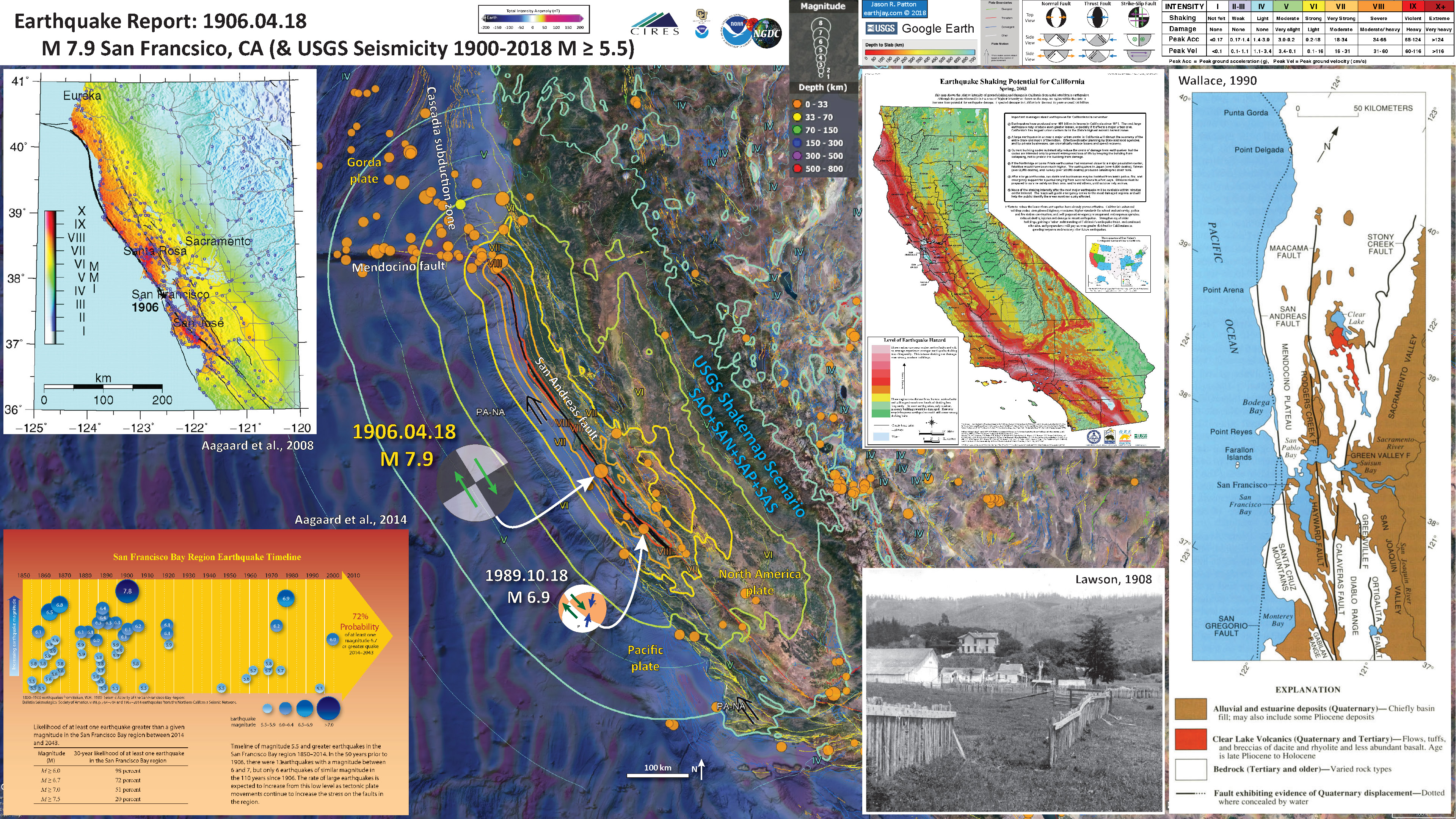
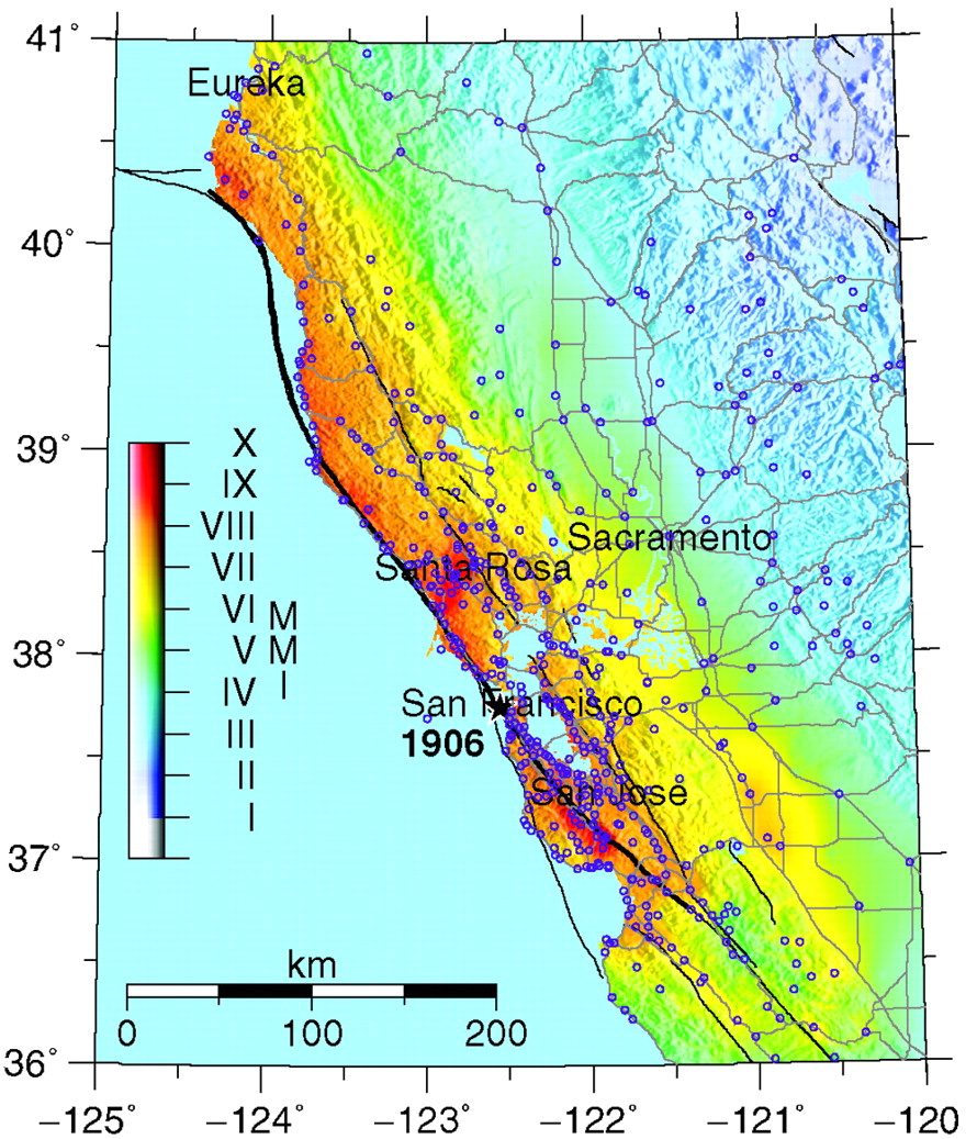
Below I present several interpretive posters, as well as some figures from papers and public reports (e.g. from the USGS).
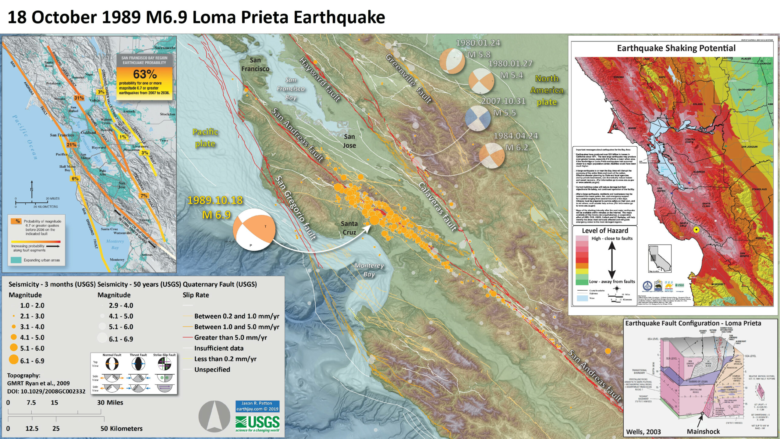
Below is my interpretive poster for this earthquake
- I plot the seismicity from the 3 months including and after the M 6.9 earthquake, with orange circles with the symbol diameter representing magnitude (see legend). I include earthquake epicenters from 1969-2019 with magnitudes M ≥ 2.5 in one version (gray circles). I use the USGS Quaternary fault and fold database as a source for the tectonic faults on the map, with color showing their slip rates.
- I plot the USGS fault plane solutions (moment tensors in blue and focal mechanisms in orange), possibly in addition to some relevant historic earthquakes.
- A review of the basic base map variations and data that I use for the interpretive posters can be found on the Earthquake Reports page.
- Some basic fundamentals of earthquake geology and plate tectonics can be found on the Earthquake Plate Tectonic Fundamentals page.
- In the upper left corner there is a map that shows the major faults in the SF Bay region. The fault lines are colored (yellow to orange) that shows the chance that a given fault may slip between 2007 and 2036. The Hayward/Rodgers Creek fault system has the highest chance of having an earthquake in the next 17 years (about 31%). This is based on our knowledge of earthquakes from the past and into the prehistoric time. The region of the San Andreas fault that was involved in the Loma Prieta temblor is labeled with black arrows.
- In the upper right corner is a map from the USGS, the Governor’s Office for Emergency Services (CalOES), and the California Geological Survey (CGS, where I work) that uses our knowledge of past earthquakes and the bedrock geology (or lack thereof) to show the potential for strong ground shaking from future earthquakes. High hazard areas are colored pink and are close to the faults (compare with the map in the upper left corner). Areas of low hazard are further away from faults. I placed a yellow circle in the general location of the M 6.9 epicenter.
- In the lower right corner is a detailed figure from McLaughlin and Clark (2003) (labeled Wells, 2003) that shows their interpretation of the faults in the area. The mainshock is labeled by a black star.
I include some inset figures. Some of the same figures are located in different places on the larger scale map below.
- Here is the map with 3 month’s seismicity plotted.

USGS Shaking Intensity
- Here is a figure that shows a more detailed comparison between the modeled intensity and the reported intensity. Borth data use the same color scale, the Modified Mercalli Intensity Scale (MMI). More about this can be found here. The colored contours on the map are results from the USGS modeled intensity. The DYFI data are plotted as colored regions (color = MMI). I labeled some of the DYFI regions (e.g. DYFI 8.1) and MMI contours (e.g. MMI 7).
- in the lower left-center there are two inset maps. The map on the left is the MMI shakemap from the USGS. The map on the right is shows the same DYFI regions as shown in the main map.
- In the upper left corner is a plot showing MMI intensity (vertical axis) relative to distance from the earthquake (horizontal axis). The models are represented by the green and orange lines. The DYFI data are plotted as light blue dots. The mean and median (different types of “average”) are plotted as orand and purple dots. Note how well the reports fit the green line (the model that represents how MMI works based on quakes in California). I plot Santiago relative to distance from the earthquake with a blue arrow (compare with the poster).

Shaking Intensity and Potential for Ground Failure
- Below are a series of maps that show the shaking intensity and potential for landslides and liquefaction. These are all USGS data products.
- Keefer (1998) presented a review of the earthquake triggered landslides from the Loma Prieta earthquake.
- Below Keefer and Manson (1998) present a summary of observed earthquake triggered landslides, with Loma Prieta plotted as a circle. This plot shows the area affected by landslides relative to earthquake magnitude. This makes sense, that the larger the earthquake, the larger the area the landslides could be triggered by the earthquake.
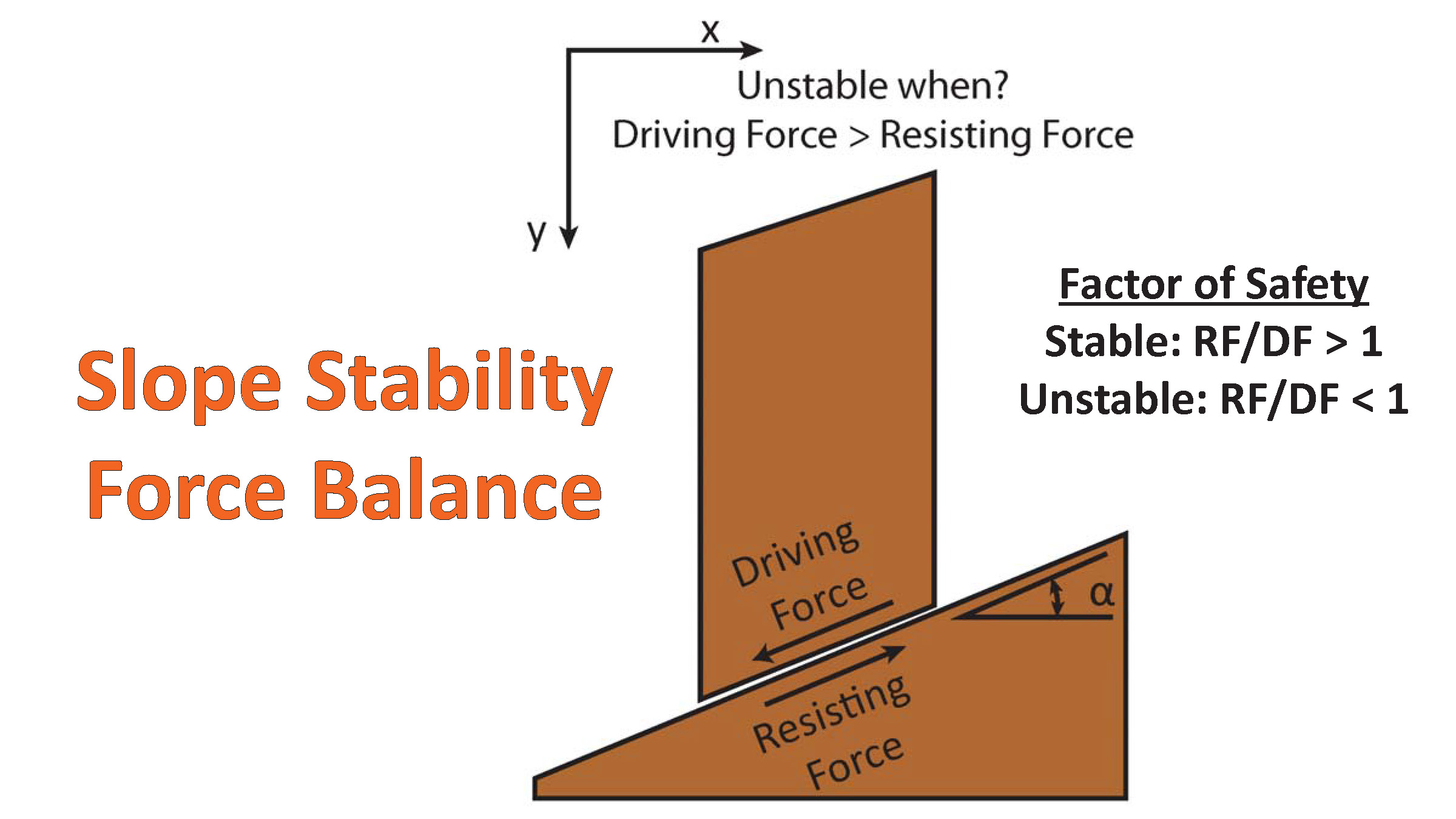
There are many different ways in which a landslide can be triggered. The first order relations behind slope failure (landslides) is that the “resisting” forces that are preventing slope failure (e.g. the strength of the bedrock or soil) are overcome by the “driving” forces that are pushing this land downwards (e.g. gravity). The ratio of resisting forces to driving forces is called the Factor of Safety (FOS). We can write this ratio like this:
FOS = Resisting Force / Driving Force
When FOS > 1, the slope is stable and when FOS < 1, the slope fails and we get a landslide. The illustration below shows these relations. Note how the slope angle α can take part in this ratio (the steeper the slope, the greater impact of the mass of the slope can contribute to driving forces). The real world is more complicated than the simplified illustration below.
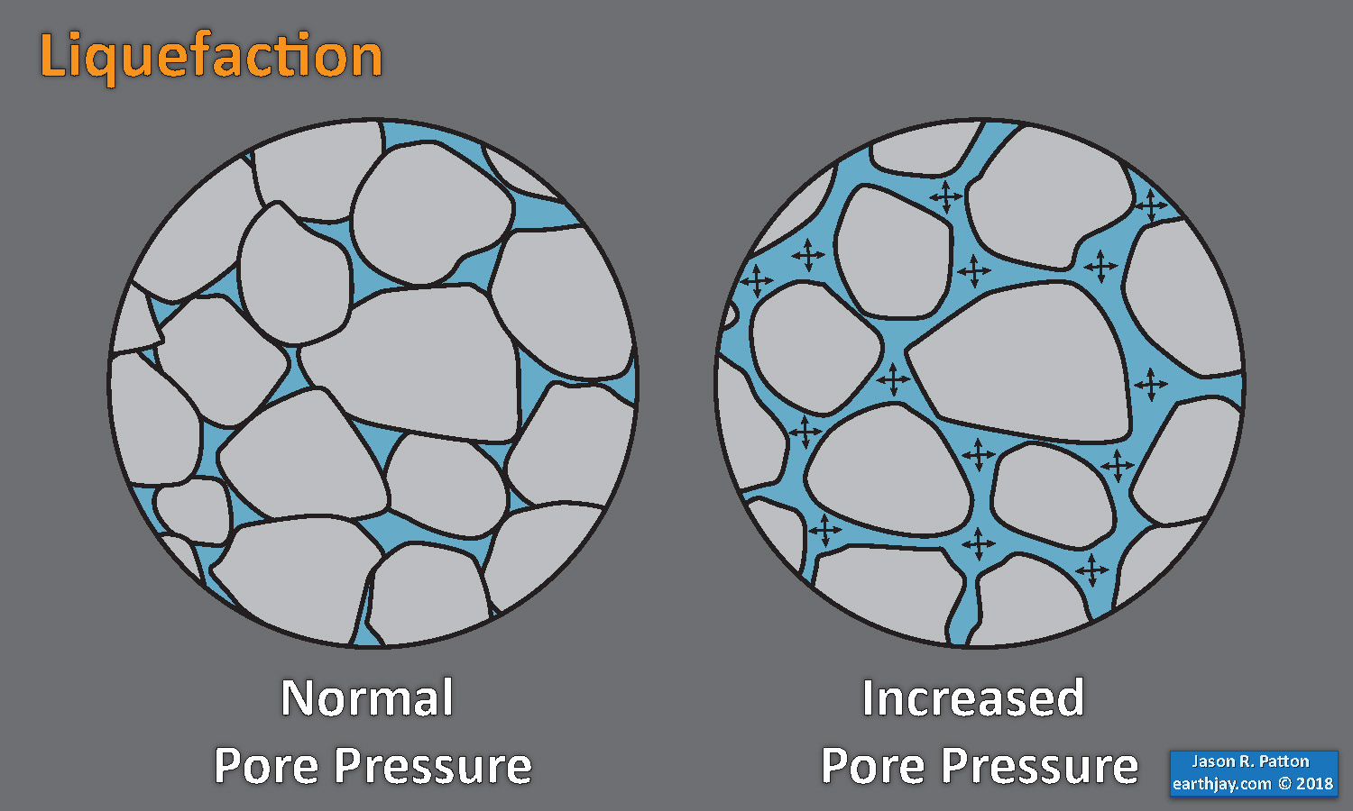
Landslide ground shaking can change the Factor of Safety in several ways that might increase the driving force or decrease the resisting force. Keefer (1984) studied a global data set of earthquake triggered landslides and found that larger earthquakes trigger larger and more numerous landslides across a larger area than do smaller earthquakes. Earthquakes can cause landslides because the seismic waves can cause the driving force to increase (the earthquake motions can “push” the land downwards), leading to a landslide. In addition, ground shaking can change the strength of these earth materials (a form of resisting force) with a process called liquefaction.
Sediment or soil strength is based upon the ability for sediment particles to push against each other without moving. This is a combination of friction and the forces exerted between these particles. This is loosely what we call the “angle of internal friction.” Liquefaction is a process by which pore pressure increases cause water to push out against the sediment particles so that they are no longer touching.
An analogy that some may be familiar with relates to a visit to the beach. When one is walking on the wet sand near the shoreline, the sand may hold the weight of our body generally pretty well. However, if we stop and vibrate our feet back and forth, this causes pore pressure to increase and we sink into the sand as the sand liquefies. Or, at least our feet sink into the sand.
Below is a diagram showing how an increase in pore pressure can push against the sediment particles so that they are not touching any more. This allows the particles to move around and this is why our feet sink in the sand in the analogy above. This is also what changes the strength of earth materials such that a landslide can be triggered.
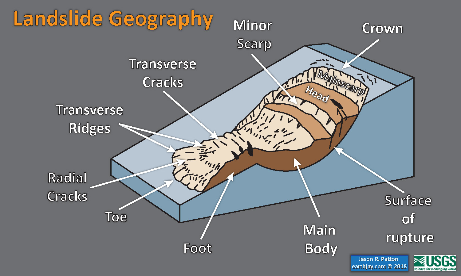
Below is a diagram based upon a publication designed to educate the public about landslides and the processes that trigger them (USGS, 2004). Additional background information about landslide types can be found in Highland et al. (2008). There was a variety of landslide types that can be observed surrounding the earthquake region. So, this illustration can help people when they observing the landscape response to the earthquake whether they are using aerial imagery, photos in newspaper or website articles, or videos on social media. Will you be able to locate a landslide scarp or the toe of a landslide? This figure shows a rotational landslide, one where the land rotates along a curvilinear failure surface.
Here is an excellent educational video from IRIS and a variety of organizations. The video helps us learn about how earthquake intensity gets smaller with distance from an earthquake. The concept of liquefaction is reviewed and we learn how different types of bedrock and underlying earth materials can affect the severity of ground shaking in a given location. The intensity map above is based on a model that relates intensity with distance to the earthquake, but does not incorporate changes in material properties as the video below mentions is an important factor that can increase intensity in places.
Here is a map with landslide probability on the left (Jessee et al., 2017) and a map showing liquefaction susceptibility on the right (Zhu et al., 2017). Please head over to that report for more information about the USGS Ground Failure products (landslides and liquefaction). Basically, earthquakes shake the ground and this ground shaking can cause landslides. We can see that there is a moderate probability for landslides and high probability for liquefaction.

Our primary landslide model is the empirical model of Nowicki Jessee and others (2018). The model was developed by relating 23 inventories of landslides triggered by past earthquakes with different combinations of predictor variables using logistic regression.
Zhu and others (2017) is the preferred model for liquefaction hazard. The model was developed by relating 27 inventories of liquefaction triggered by past earthquakes to globally-available geospatial proxies (summarized below) using logistic regression. We have implemented the global version of the model and have added additional modifications.

Area of landslides generated by 1989 Loma Prieta earthquake, A, as a function of earthquake magnitude, M, in comparison with other historical earthquakes with epicenters onshore (dots) and offshore (x’s). Most data points and upper-bound curve (solid line) from Keefer (1984); additional data points and log-linear mean (dashed line) from Keefer and Wilson (1989).
Shaking Visualization & Videos
- Below is a great visualization of the ground shaking from the ’89 shaker. This comes from the USGS here. Note how the majority of the urban areas did NOT have strong ground shaking from this earthquake, even though that lots of the damage was in those areas. Imagine what will happen when the Hayward or San Andreas faults rupture next.
- From the USGS: The movie shows the propagation of seismic waves away from the epicenter, which lies in the Santa Cruz Mountains, about ten miles northeast of the of the city of Santa Cruz. The residual colors indicate the peak shaking intensity at locations up to the time in seconds indicated near the top center of the movie. The current intensity, at the time indicated, is indicated by shading of the colors.
- From the USGS: One striking observation for those who experienced the 1989 Loma Prieta earthquake’s shaking is the comparison of the extent and intensity of shaking with the 1906 earthquake. The Loma Prieta rupture was about 30 times smaller in energy than the great 1906 earthquake.
- From the USGS: he rupture in the Loma Prieta earthquake began at a depth of about 12 miles and appears to have ruptured a 25 mile long portion of the San Andreas fault. Unlike the 1906 earthquake, the rupture in the Loma Prieta earthquake did not reach the surface. As in the 1906 earthquake, the strongest shaking was concentrated along the fault. In 1989 the two areas of most intense shaking were north and south of the epicenter in the Santa Cruz mountains.
The movie’s color the landscape in each frame according to the maximum (peak) intensity of shaking (amplitude of the ground motion) up to that point in time. The color scale is the same as the one used in ShakeMap. In order to show the intensity of the current shaking, the colors darken as the shaking intensifies. At some locations, the most intense shaking lasts for several seconds, so the colors will darken as seismic waves continue to cause strong shaking. The first example shows how the colors change as the shaking at a location progresses from no shaking through weak, moderate, and strong shaking, peaking at a violent shaking level (very dark red), before the shaking dies off (red becomes brighter). The second example shows the color progression for a location that peaks at a strong level of shaking.
- Here is a spectacular video from the California Highway Patrol.
- Here is a documentary from NBC from 2019
Some Relevant Discussion and Figures
Loma Prieta – Geologic Setting
- McLaughlin and Clark (2003) present two great maps that show the plate tectonic setting associated with the Loma Prieta earthquake.
- We see maps that show the major faults associated with the Pacific-North America plate boundary. The big player is the San Andreas fault, a right-lateral strike-slip fault (see more in the geological fundamentals section to learn more about strike-slip faults).
- Here is the cross-section presented by McLaughlin and Clark (2003). We can see how Wells interprets the subsurface geology to be configured. First we see a deeper and more zoomed out view of the plate tectonics here. Then we see a larger scale version showing the faults in greater detail.


Figure caption is for both maps from McLaughlin and Clark. Loma Prieta region, Calif., showing major fault blocks and fault zones. A, Regional setting. BSF, Bartlett Springs fault; CA, Calaveras fault; CSZ, Cascadia subduction zone; FF, Franklin fault; GF, Garberville fault; GLF, Garlock fault; HAY, Hayward fault; HF, Hosgri fault; MF, Maacama fault; MFZ, Mendocino Fracture Zone; NAD, Navarro discontinuity; NSAF, northern section of the San Andreas fault (north of the San Francisco peninsula); PF, Pilarcitos fault; PFZ, Pioneer Fracture Zone; PLT, Pleito thrust; PRT, Pastoria-Rand thrust zone; RCF, Rodgers Creek fault; SAF, San Andreas fault, including Peninsular segment; SGF, San Gregorio fault; SNF, Sur-Nacimiento fault; TBF, Tolay-Bloomfield fault; ZVF, Zayante-Vergeles fault. B, San Francisco Bay block, showing locations of plate 1 and figure 2A. Star, epicenter of October 18, 1989, main shock.

Schematic cross section across the California margin at latitude of Loma Prieta (fig. 1), showing hypothetical deep structure of the San Andreas fault system, tectonic wedging, and plate boundary relations. Depth, thickness, and compositions of crust and mantle units and location of midcrustal decollement are partly inferred from seismic reflection and refraction models of Fuis and Mooney (1990), Page and Brocher (1993), and Brocher and others (this chapter). Depth to present top of slab window (Dickinson and Snyder, 1979), configuration of lithified materials underplated in older, shallower roof area of window, and hypothetical boundary relation between the Pacific and North American plates are based on thermal and seismic models of Furlong and others (1989). CAL, Calaveras fault; SAF, San Andreas fault; SAR, Sargent fault; SGF, San Gregorio fault; TESLA–ORT, Tesla-Ortigalita fault; ZAY, Zayante fault.
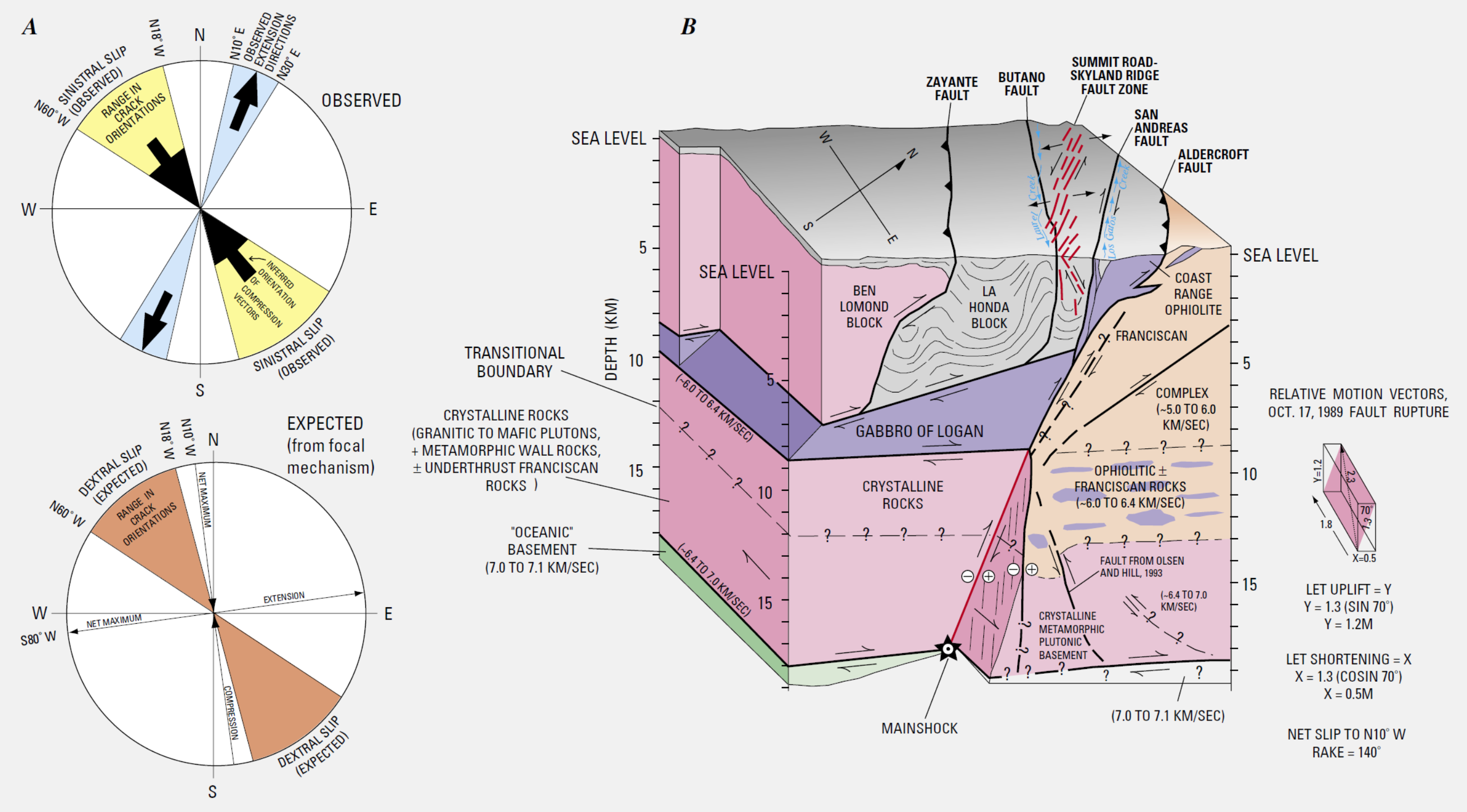
Surface deformation and crustal structure in the Summit Road-Skyland Ridge area (fig. 2B). A, Rose diagrams comparing observed and expected horizontal surface-deformation fields during 1989 Loma Prieta earthquake. B, Block diagram showing inferred crustal structure across the San Andreas fault and possible relation to primary and secondary slip during 1989 Loma Prieta earthquake. Red echelon faults at surface and shallow subsurface are fissures in the Summit Road-Skyland Ridge fault zone. Loma Prieta rupture is shown in red at depth, extending upward from main shock to base of the gabbro of Logan. Deep configuration of the San Andreas fault is partly inferred from Olson and Hill (1993). Crustal structure to about 10-km depth is partly inferred from Jachens and Griscom (this chapter), and below about 10-km depth is highly speculative and inferred from indicated seismic velocities (Fuis and Mooney, 1990; Rufus Catchings, oral commun., 1993; see Brocher and others, this chapter).
Central California – Earthquake Hazard
- Based on our knowledge of prehistoric and historic earthquakes, the USGS and CGS have made estimates of the chance that faults may rupture in the next couple of decades (Aagaard et al., 2014). Below is a map from this report that shows the major faults and the likelihood that they may cause an earthquake in between 2014 & 2043. Note that the Hayward fault has the highest chance of slipping over this time period.

Loma Prieta – Earthquake Fault Slip Distribution
- There are a number of slip models for the Loma Prieta Earthquake. These show the amount that the fault slipped during an earthquake. This type of modeling can be constrained by a number of factors including GPS geodetic data or seismic data.
- Below is a figure from Jiang and Lapusta (2016). There are slip models for 3 different earthquakes. Slip is represented by color. Earthquake locations are shown as circles. B shows the depth distribution of the earthquakes.
- These authors were investigating how faults behave. Below is another schematic illustration showing their different fault models (conventional vs. deeper-penetration).

(A) Spatial relations of the inferred coseismic slip during large earthquakes (in color, with hypocenters as red stars) and microseismicity before (blue circles) and after (black circles), over time periods shown in (B).The large earthquakes are: (i) 2004 Mw 6.0 Parkfield (6, 16), (ii) 1989 Mw 6.9 Loma Prieta (32), and (iii) 2002 Mw 7.9 Denali (33). Small earthquakes within 2, 4, and 5 km of the fault for the three cases, respectively, are projected onto the fault plane (except iii) and plotted using a circular crack model with the same seismic moment and 3 MPa stress drop. (B) (Left) Time evolution of the depths of seismicity (gray circles) and (right) the depth distribution of normalized total seismic moment released before (blue lines), during (red lines), and after (gray) the mainshock (MS).We considered seismicity and coseismic fault slip inside the regions of largest slip outlined by the red dashed lines in (A). Seismic moment release before the Denali event is not shown because of the small number of events.
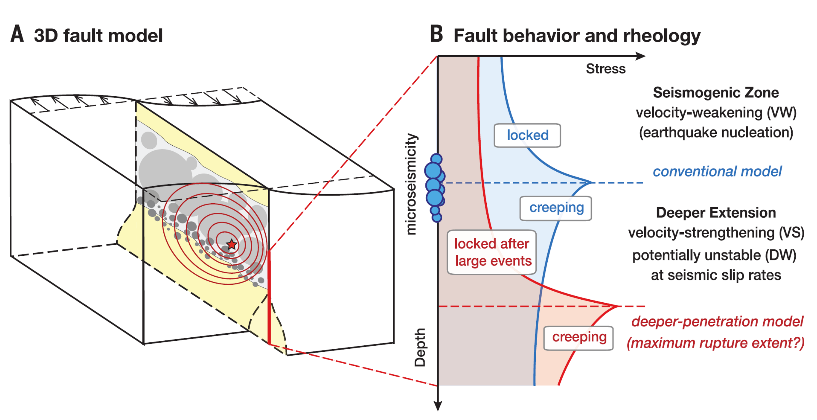
(A) A strike-slip fault model with the seismogenic zone (light gray areas), creeping regions (yellow), and fault heterogeneity (dark gray circles). The initiation point and rupture fronts of a large earthquake are illustrated by the red star and contours, respectively. (B) The locked seismogenic zone and creeping regions below are typically interpreted as having VW and VS rate-and-state friction properties, respectively. In purely rate-and-state models, the VW/VS boundary and locked-creeping transition nearly coincide, and the associated concentrated shear stressing induced at the locked-creeping transition (blue line) promotes microseismicity at the bottom of the seismogenic zone in the interseismic period (blue circles). However, large earthquake rupture may extend seismic slip deeper than the VW/VS boundary, due to enhanced dynamic weakening (DW) at high slip rates, putting the locked-creeping transition and the associated concentrated stressing (red line) within the VS region and hence suppressing microseismicity nucleation.
More about the background seismotectonics
- I place a map shows the configuration of faults in central (San Francisco) and northern (Point Delgada – Punta Gorda) CA (Wallace, 1990). Here is the caption for this map, that is on the lower left corner of my map. Below the citation is this map presented on its own.
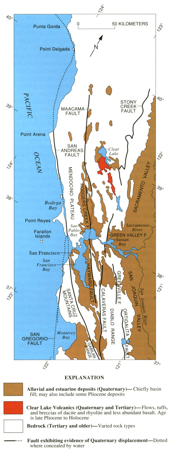
Geologic sketch map of the northern Coast Ranges, central California, showing faults with Quaternary activity and basin deposits in northern section of the San Andreas fault system. Fault patterns are generalized, and only major faults are shown. Several Quaternary basins are fault bounded and aligned parallel to strike-slip faults, a relation most apparent along the Hayward-Rodgers Creek-Maacama fault trend.
- Here is the figure showing the evolution of the SAF since its inception about 29 Ma. I include the USGS figure caption below as a blockquote.
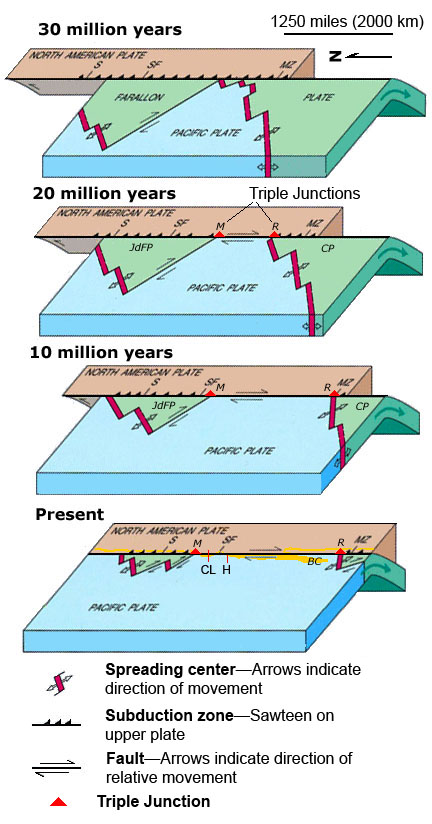
EVOLUTION OF THE SAN ANDREAS FAULT.
This series of block diagrams shows how the subduction zone along the west coast of North America transformed into the San Andreas Fault from 30 million years ago to the present. Starting at 30 million years ago, the westward- moving North American Plate began to override the spreading ridge between the Farallon Plate and the Pacific Plate. This action divided the Farallon Plate into two smaller plates, the northern Juan de Fuca Plate (JdFP) and the southern Cocos Plate (CP). By 20 million years ago, two triple junctions began to migrate north and south along the western margin of the West Coast. (Triple junctions are intersections between three tectonic plates; shown as red triangles in the diagrams.) The change in plate configuration as the North American Plate began to encounter the Pacific Plate resulted in the formation of the San Andreas Fault. The northern Mendocino Triple Junction (M) migrated through the San Francisco Bay region roughly 12 to 5 million years ago and is presently located off the coast of northern California, roughly midway between San Francisco (SF) and Seattle (S). The Mendocino Triple Junction represents the intersection of the North American, Pacific, and Juan de Fuca Plates. The southern Rivera Triple Junction (R) is presently located in the Pacific Ocean between Baja California (BC) and Manzanillo, Mexico (MZ). Evidence of the migration of the Mendocino Triple Junction northward through the San Francisco Bay region is preserved as a series of volcanic centers that grow progressively younger toward the north. Volcanic rocks in the Hollister region are roughly 12 million years old whereas the volcanic rocks in the Sonoma-Clear Lake region north of San Francisco Bay range from only few million to as little as 10,000 years old. Both of these volcanic areas and older volcanic rocks in the region are offset by the modern regional fault system. (Image modified after original illustration by Irwin, 1990 and Stoffer, 2006.)
- Here is a map that shows the shaking potential for earthquakes in CA. This comes from the state of California here.
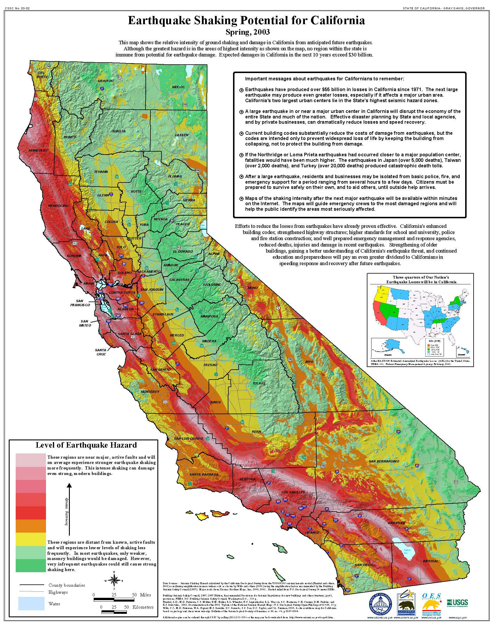
Earthquake shaking hazards are calculated by projecting earthquake rates based on earthquake history and fault slip rates, the same data used for calculating earthquake probabilities. New fault parameters have been developed for these calculations and are included in the report of the Working Group on California Earthquake Probabilities. Calculations of earthquake shaking hazard for California are part of a cooperative project between USGS and CGS, and are part of the National Seismic Hazard Maps. CGS Map Sheet 48 (revised 2008) shows potential seismic shaking based on National Seismic Hazard Map calculations plus amplification of seismic shaking due to the near surface soils.
Hayward Fault Scenarios
- The USGS prepares earthquake shakemap scenarios for known earthquake sources in the US.
- Below is a summary of what these scenarios are and how they can be used (from the USGS).
- Last year there was an effort to educate the public about earthquake hazards in the San Francisco Bay Area. This effort surrounded the 150 year anniversary of the last major earthquake on the Hayward fault. More can be found about the Haywired Project here.
- I prepare below an interpretive poster that highlights three of the earthquake scenarios for the Hayward fault system, each with increasing magnitude (M 6.9, M 7.3, and M 7.6). Due to the uncertainty about which faults may rupture next, multiple scenarios are used to simulate earthquake effects.
- The poster below shows the scenario earthquake fault in white (the source of the ground shaking). Earthquake intensity (using the Modified Mercalli Intensity scale) is represented by a color scale (see legend). The inset map on the right shows USGS seismicity between 1919 and 2019.
- Look at how the same MMI extends for a larger distance across the flat areas (like Sacramento Valley). This is because the sedimentary basins in those areas amplify the seismic waves, so the ground shaking is stronger there.
- The effect is evidenced in most valleys, such as Napa, Santa Clara, and Salinas.
A scenario represents one realization of a potential future earthquake by assuming a particular magnitude, location, and fault-rupture geometry and estimating shaking using a variety of strategies.
In planning and coordinating emergency response, utilities, local government, and other organizations are best served by conducting training exercises based on realistic earthquake situations—ones similar to those they are most likely to face. ShakeMap Scenario earthquakes can fill this role. They can also be used to examine exposure of structures, lifelines, utilities, and transportation corridors to specified potential earthquakes.
A ShakeMap earthquake scenario is a predictive ShakeMap with an assumed magnitude and location, and, optionally, specified fault geometry.

- I also prepared an earthquake scenario for the San Andreas fault for the report on the 1906 San Francisco Earthquake.
- Here is the USGS ShakeMap (Aargard et al., 2008)
ShakeMap for the 1906 San Francisco earthquake based on the Boatwright and Bundock (2005) intensities (processed 18 October 2005). Open circles identify the intensity sites used to construct the ShakeMap.
Geologic Fundamentals
- For more on the graphical representation of moment tensors and focal mechnisms, check this IRIS video out:
- Here is a fantastic infographic from Frisch et al. (2011). This figure shows some examples of earthquakes in different plate tectonic settings, and what their fault plane solutions are. There is a cross section showing these focal mechanisms for a thrust or reverse earthquake. The upper right corner includes my favorite figure of all time. This shows the first motion (up or down) for each of the four quadrants. This figure also shows how the amplitude of the seismic waves are greatest (generally) in the middle of the quadrant and decrease to zero at the nodal planes (the boundary of each quadrant).
- There are three types of earthquakes, strike-slip, compressional (reverse or thrust, depending upon the dip of the fault), and extensional (normal). Here is are some animations of these three types of earthquake faults. The following three animations are from IRIS.
Strike Slip:
Compressional:
Extensional:
- This is an image from the USGS that shows how, when an oceanic plate moves over a hotspot, the volcanoes formed over the hotspot form a series of volcanoes that increase in age in the direction of plate motion. The presumption is that the hotspot is stable and stays in one location. Torsvik et al. (2017) use various methods to evaluate why this is a false presumption for the Hawaii Hotspot.
- Here is a map from Torsvik et al. (2017) that shows the age of volcanic rocks at different locations along the Hawaii-Emperor Seamount Chain.
A cutaway view along the Hawaiian island chain showing the inferred mantle plume that has fed the Hawaiian hot spot on the overriding Pacific Plate. The geologic ages of the oldest volcano on each island (Ma = millions of years ago) are progressively older to the northwest, consistent with the hot spot model for the origin of the Hawaiian Ridge-Emperor Seamount Chain. (Modified from image of Joel E. Robinson, USGS, in “This Dynamic Planet” map of Simkin and others, 2006.)
Hawaiian-Emperor Chain. White dots are the locations of radiometrically dated seamounts, atolls and islands, based on compilations of Doubrovine et al. and O’Connor et al. Features encircled with larger white circles are discussed in the text and Fig. 2. Marine gravity anomaly map is from Sandwell and Smith.
- 1906.04.18 M 7.9 San Francisco
- 2017.12.14 M 4.3 Laytonville
- 2016.11.06 M 4.1 Laytonville, CA
- 2016.11.03 M 3.8 Laytonville, CA
- 2016.08.10 M 5.1 Lake Pillsbury, CA
- 2015.08.30 M 3.6 Mendocino County, CA
- 2015.07.27 M 3.5 Point Arena, CA
- 2018.07.30 M 3.7 San Pablo Bay
- 2018.01.04 M 4.4 Berkeley
- 1989.10.18 M 6.9 Loma Prieta
- 2019.07.04 M 6.4 Ridgecrest
- 2019.07.05 M 6.4 / 7.1 Ridgecrest Update #1
- 2019.07.18 M 6.4 / 7.1 Ridgecrest Update #2
- 2019.07.20 M 6.4 / 7.1 Ridgecrest Update #3
- 2016.02.23 M 4.9 Bakersfield
- 2015.12.30 M 4.4 San Bernardino, CA
- 2015.05.03 M 3.8 Los Angeles, CA
- 2015.04.13 M 3.3 Los Angeles, CA
- 2014.04.01 M 5.1 La Habra p-3
- 2014.03.29 M 5.1 La Habra p-2
- 2014.03.28 M 5.1 La Habra p-1
- 2016.08.04 M 4.5 Honey Lake, CA
San Andreas fault
General Overview
Earthquake Reports
Northern CA
Central CA
Southern CA
Eastern CA
- 2019.06.05 M 4.3 San Clemente Island
- 2018.04.05 M 5.3 Channel Islands
- 2018.04.05 M 5.3 Channel Islands Update #1
- 1994.11.17 M 6.7 Northridge, CA
- 1971.02.09 M 6.7 Sylmar, CA
Southern CA
Earthquake Reports
Social Media
- Frisch, W., Meschede, M., Blakey, R., 2011. Plate Tectonics, Springer-Verlag, London, 213 pp.
- Holt, W. E., C. Kreemer, A. J. Haines, L. Estey, C. Meertens, G. Blewitt, and D. Lavallee (2005), Project helps constrain continental dynamics and seismic hazards, Eos Trans. AGU, 86(41), 383–387, , https://doi.org/10.1029/2005EO410002. /li>
- Müller, R.D., Sdrolias, M., Gaina, C. and Roest, W.R., 2008, Age spreading rates and spreading asymmetry of the world’s ocean crust in Geochemistry, Geophysics, Geosystems, 9, Q04006, https://doi.org/10.1029/2007GC001743
- Aargard, B.T. and Beroza, G.C., 2008. The 1906 San Francisco Earthquake a Century Later: Introduction to the Special Section in BSSA, v. 98, no. 2, p. 817-822, https://doi.org/10.1785/0120060401
- Aargard, B.T. et al., 2008. Ground-Motion Modeling of the 1906 San Francisco Earthquake, Part II: Ground-Motion Estimates for the 1906 Earthquake and Scenario Events in BSSA, v. 98, no. 2, p. 1012-1046, https://doi.org/10.1785/0120060410
- Aagaard, B.T., Blair, J.L., Boatwright, J., Garcia, S.H., Harris, R.A., Michael, A.J., Schwartz, D.P., and DiLeo, J.S., 2016, Earthquake outlook for the San Francisco Bay region 2014–2043 (ver. 1.1, August 2016): U.S. Geological Survey Fact Sheet 2016–3020, 6 p., http://dx.doi.org/10.3133/fs20163020.
- Jessee, M.A.N., Hamburger, M. W., Allstadt, K., Wald, D. J., Robeson, S. M., Tanyas, H., et al. (2018). A global empirical model for near-real-time assessment of seismically induced landslides. Journal of Geophysical Research: Earth Surface, 123, 1835–1859. https://doi.org/10.1029/2017JF004494
- Jiang, J. and Lapusta, N., 2016. Deeper penetration of large earthquakes on seismically quiescent faults in Science, v. 352, no. 6291, p. 1293-1297, DOI: 10.1126/science.aaf1496
- Keefer, D.K., 1984. Landslides Caused by Earthquakes in GSA Bulletin, v. 95, p. 406-421
- Keefer, D.K., 1998. The Loma Prieta, California, Earthquake of October 17, 1989: Strong Ground Motion and Ground Failure in Keefer, D.K., Manson, M.W., Griggs, G.B., Plant, Nathaniel, Schuster, R.L., Wieczorek, G.F., Hope, D.G., Harp, E.L., Nolan, J.M., Weber, G.E., Cole, W.F., Marcum, D.R., Shires, P.O., and Clark, B.R., Chapter C. The Loma Prieta, California, Earthquake of October 17, 1989 – Landslides, USGS Professional Paper 1551-C, https://doi.org/10.3133/pp1551C
- Keefer, D.K. and Mason M.W., 1998. Regional Distribution and Characteristics of Landslides Generated by the Earthquake in Keefer, D.K., Manson, M.W., Griggs, G.B., Plant, Nathaniel, Schuster, R.L., Wieczorek, G.F., Hope, D.G., Harp, E.L., Nolan, J.M., Weber, G.E., Cole, W.F., Marcum, D.R., Shires, P.O., and Clark, B.R., Chapter C. The Loma Prieta, California, Earthquake of October 17, 1989 – Landslides, USGS Professional Paper 1551-C, https://doi.org/10.3133/pp1551C
- McLaughlin, R.J. and Clark, J.C., 2003. Stratigraphy and Structure Across the San Andreas Fault Zone in the Loma Preita Region and Deformation During the Earthquake in Wells, R.E., ed., The Loma Prieta, California, Earthquake of October 17, 1989—Geologic Setting and Crustal Structure, USGS Professional Paper 11550-E, http://pubs.usgs.gov/pp/p1550e/
- Stoffer, P.W., 2006, Where’s the San Andreas Fault? A guidebook to tracing the fault on public lands in the San Francisco Bay region: U.S. Geological Survey General Interest Publication 16, 123 p., online at http://pubs.usgs.gov/gip/2006/16/
- USGS, 2004. Landslide Types and Processes, U.S. Geological Survey Fact Sheet 2004-3072
- Wallace, Robert E., ed., 1990, The San Andreas fault system, California: U.S. Geological Survey Professional Paper 1515, 283 p. [http://pubs.usgs.gov/pp/1988/1434/].
- Zhu, J., Baise, L. G., Thompson, E. M., 2017, An Updated Geospatial Liquefaction Model for Global Application, Bulletin of the Seismological Society of America, 107, p 1365-1385, doi: 0.1785/0120160198
References:
Basic & General References
Specific References
Return to the Earthquake Reports page.