There was just an earthquake associated with the plate boundary that forms the Kermadec Trench, a deep oceanic trench that extends north from New Zealand, towards the Fiji Islands.
https://earthquake.usgs.gov/earthquakes/eventpage/us6000417i/executive
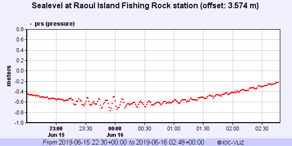
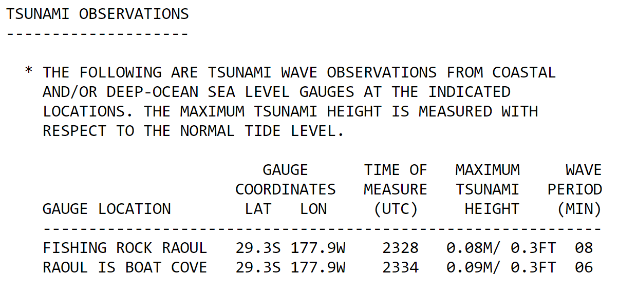
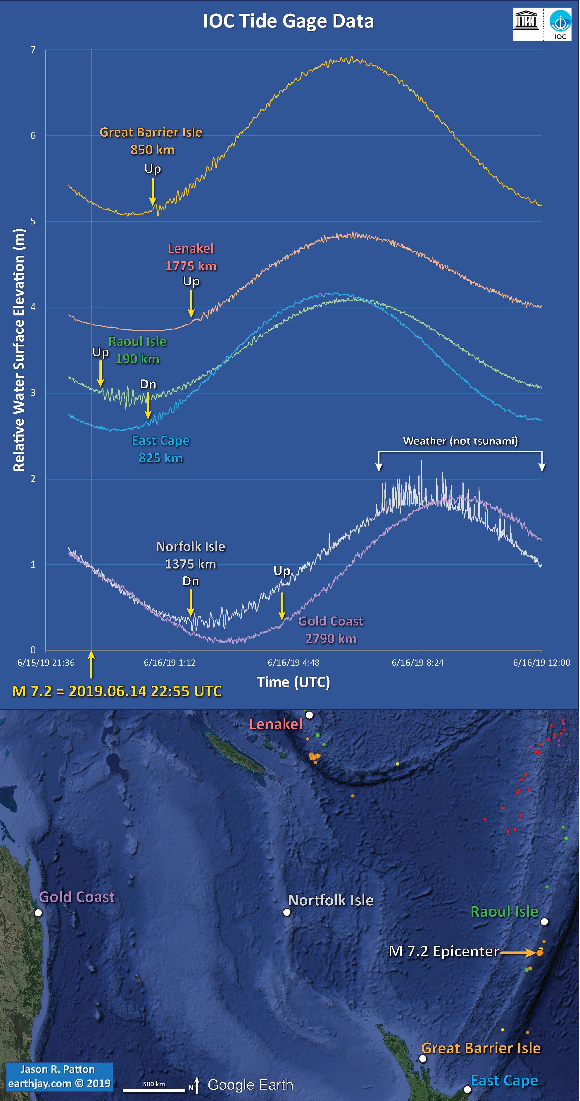
A minor tsunami (~25 cm in size) has been recorded at Raoul Island, due west of the earthquake, the closest gage to the temblor. Tide gages in New Zealand just began recording a small tsunami the moments I started writing this report (about an hour ± after the earthquake).
This tsunami is small enough that it probably won’t cause much damage. However, tidal inlets and harbors can have currents that are higher in response to even small tsunami, if the shape of the seafloor/harbor is optimal for this. However, further away from the earthquake, the tsunami will be even smaller; so small that it may not be observable in tide gage data.
- These are the tide gage data from Raoul Island.
- These are data from 15 Jun 22:30 UTC until 16 Jun 02:48 UTC.
- Here are the tsunami observations as reported by the Pacific Tsunami Warning Center found at http://tsunami.gov
In this part of the world, there is a convergent plate boundary where the Pacific plate dives westward beneath the Australia plate forming the Kermadec megathrust subduction zone fault. This fault has a history of earthquakes with magnitudes commonly exceeding M 7 and some exceeding M 8.
There was recently an M 6.9 earthquake in this same area and here is my earthquake report for that shaker.
While we cannot predict earthquakes, based on the historic record, this earthquake may be all that happens right now. But our historic record is incredibly short, so people must remain vigilant at all times.
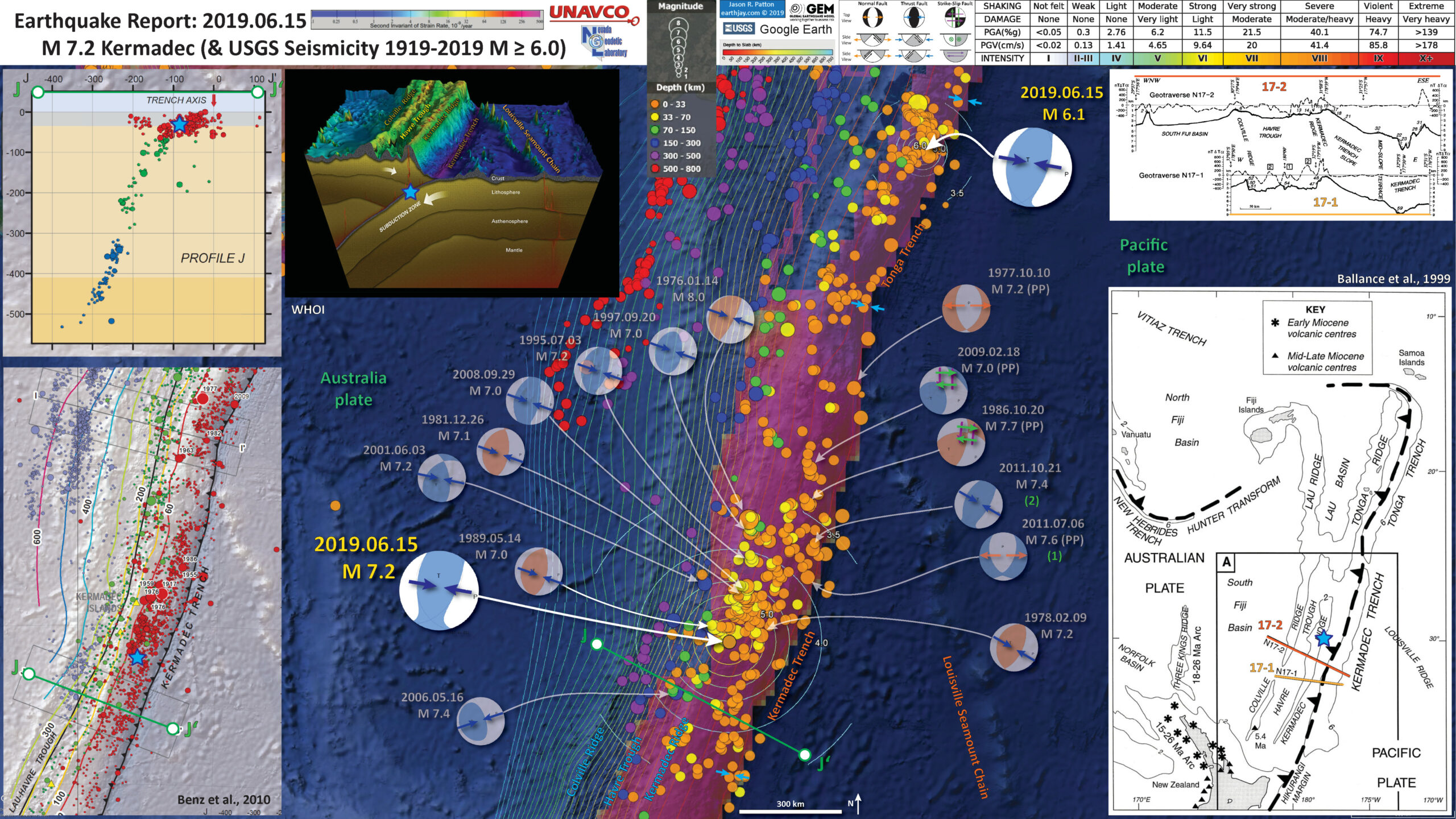
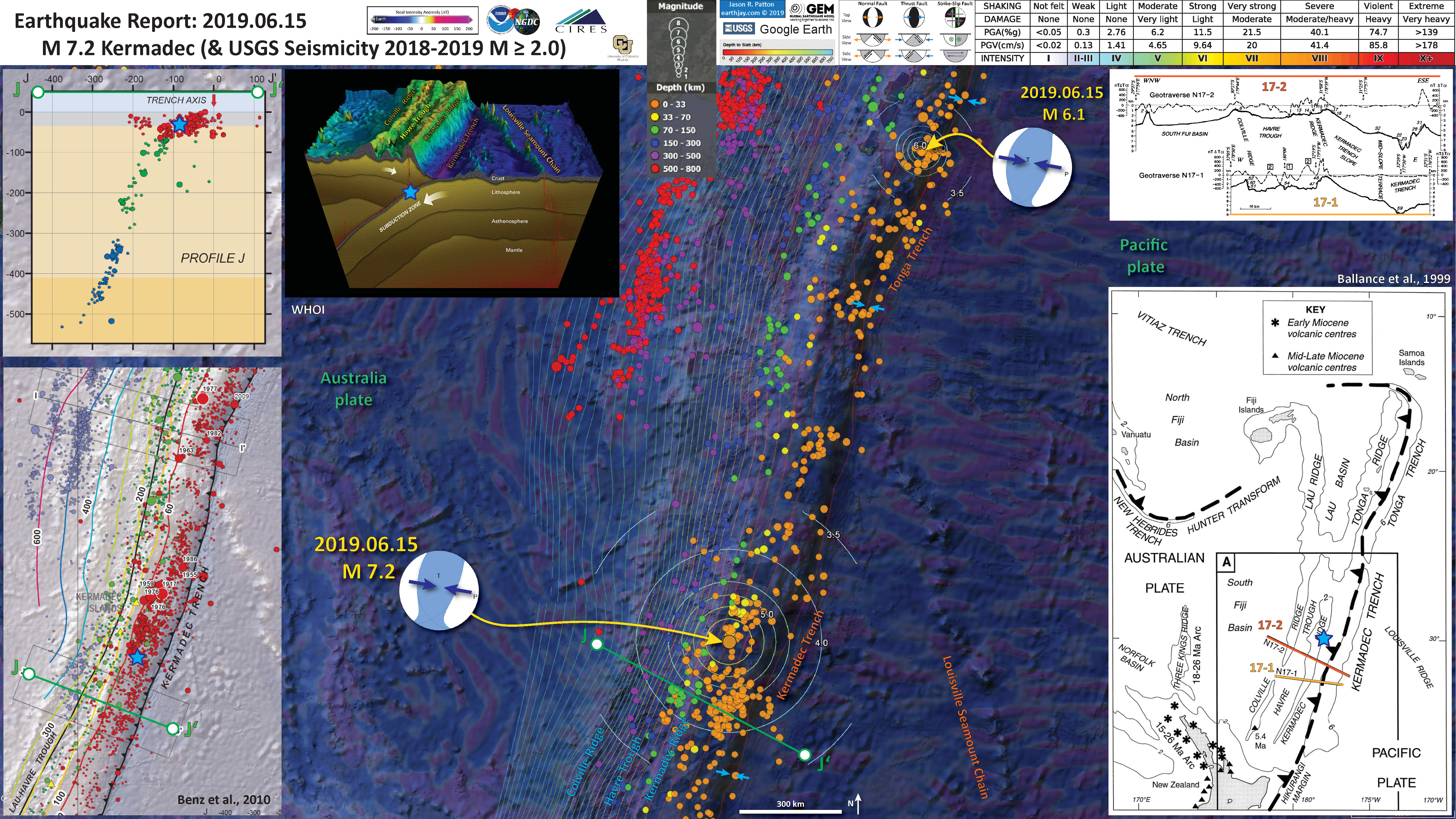
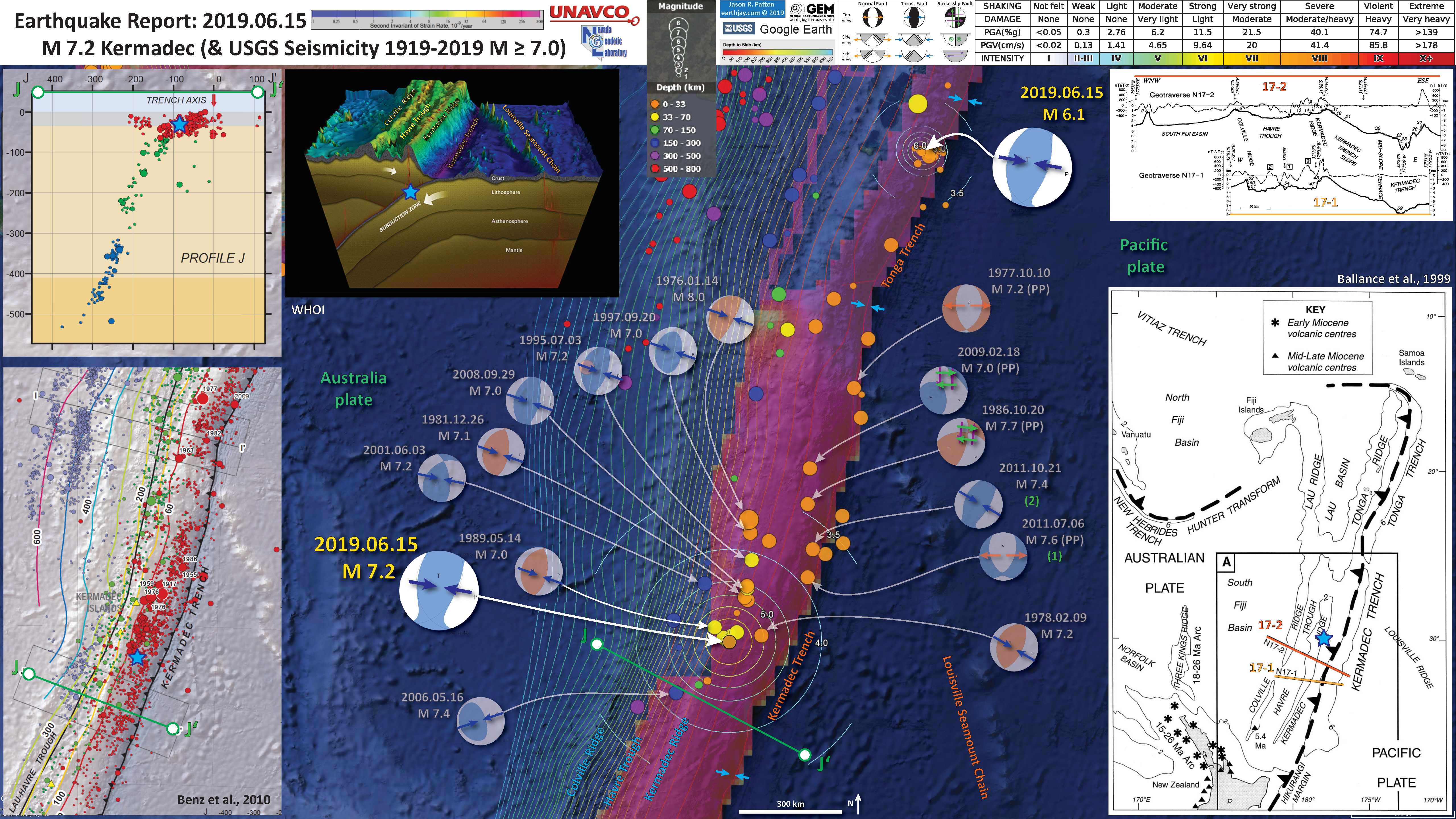
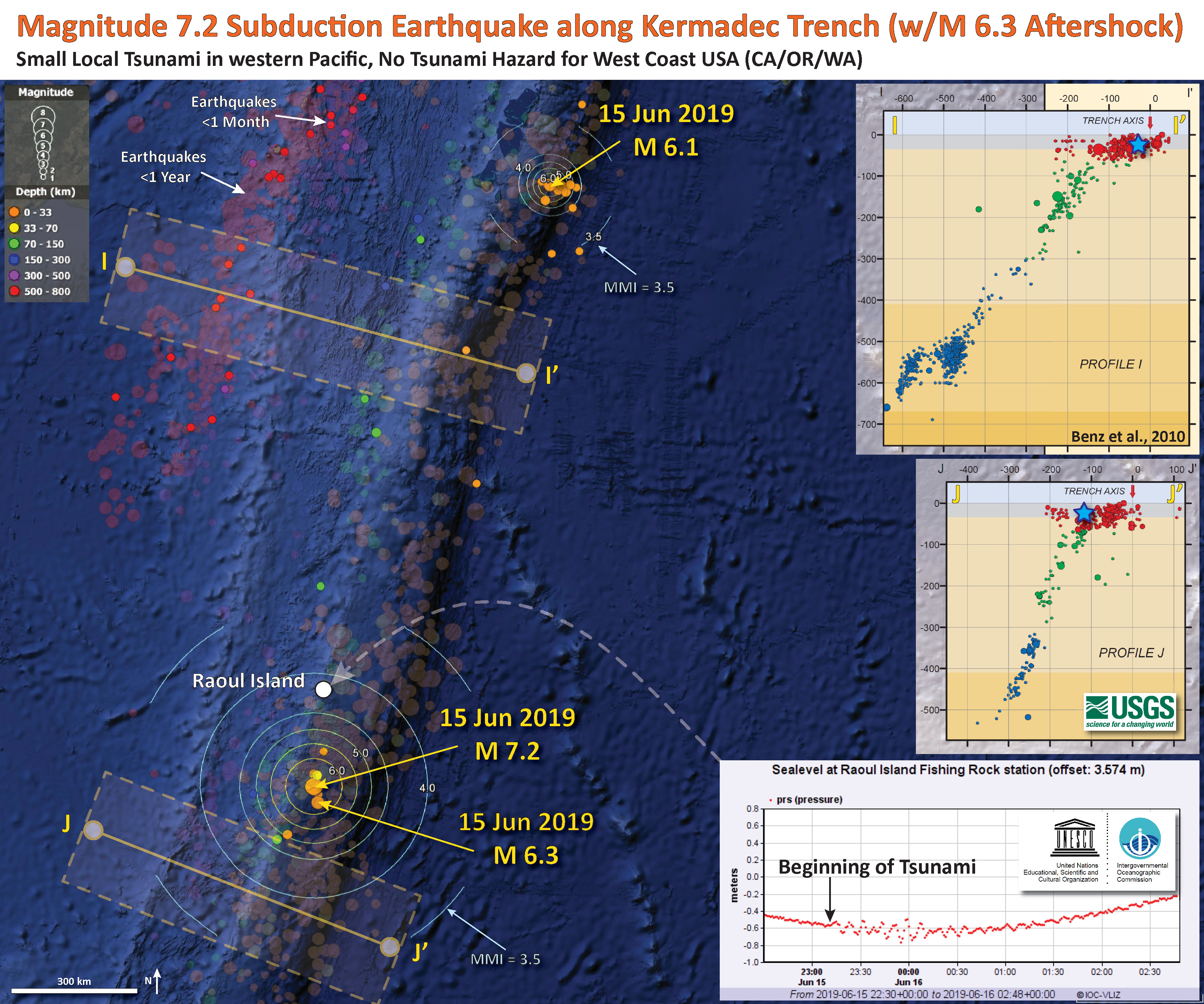
Below is my interpretive poster for this earthquake
I plot the seismicity from the past month, with color representing depth and diameter representing magnitude (see legend). I include earthquake epicenters from 1919-2019 with magnitudes M ≥ 6.0 and 7.0 in two versions.
I plot the USGS fault plane solutions (moment tensors in blue and focal mechanisms in orange), possibly in addition to some relevant historic earthquakes (including a M 6.1 earthquake that happened about an hour prior to the M 7.2. This is very close in time. The M 6.1 is too small of a magnitude to change the static coulomb stress significantly. It seems possible that there was dynamic triggering though (???). I will need to think about this a little more (check out the literature on dynamic triggering, to see what time window that may be a relevant trigger).
- I placed a moment tensor / focal mechanism legend on the poster. There is more material from the USGS web sites about moment tensors and focal mechanisms (the beach ball symbols). Both moment tensors and focal mechanisms are solutions to seismologic data that reveal two possible interpretations for fault orientation and sense of motion. One must use other information, like the regional tectonics, to interpret which of the two possibilities is more likely.
- I also include the shaking intensity contours on the map. These use the Modified Mercalli Intensity Scale (MMI; see the legend on the map). This is based upon a computer model estimate of ground motions, different from the “Did You Feel It?” estimate of ground motions that is actually based on real observations. The MMI is a qualitative measure of shaking intensity. More on the MMI scale can be found here and here. This is based upon a computer model estimate of ground motions, different from the “Did You Feel It?” estimate of ground motions that is actually based on real observations.
- I include the slab 2.0 contours plotted (Hayes, 2018), which are contours that represent the depth to the subduction zone fault. These are mostly based upon seismicity. The depths of the earthquakes have considerable error and do not all occur along the subduction zone faults, so these slab contours are simply the best estimate for the location of the fault.
- In the map below, I include a transparent overlay of the magnetic anomaly data from EMAG2 (Meyer et al., 2017). As oceanic crust is formed, it inherits the magnetic field at the time. At different points through time, the magnetic polarity (north vs. south) flips, the North Pole becomes the South Pole. These changes in polarity can be seen when measuring the magnetic field above oceanic plates. This is one of the fundamental evidences for plate spreading at oceanic spreading ridges (like the Gorda rise).
- Regions with magnetic fields aligned like today’s magnetic polarity are colored red in the EMAG2 data, while reversed polarity regions are colored blue. Regions of intermediate magnetic field are colored light purple.
- We can see the roughly east-west trends of these red and blue stripes. These lines are parallel to the ocean spreading ridges from where they were formed. The stripes disappear at the subduction zone because the oceanic crust with these anomalies is diving deep beneath the Sunda plate (part of Eurasia), so the magnetic anomalies from the overlying Sunda plate mask the evidence for the Australia plate.
Magnetic Anomalies
- In a map below, I include a transparent overlay of the Global Strain Rate Map (Kreemer et al., 2014).
- The mission of the Global Strain Rate Map (GSRM) project is to determine a globally self-consistent strain rate and velocity field model, consistent with geodetic and geologic field observations. The overall mission also includes:
- contributions of global, regional, and local models by individual researchers
- archive existing data sets of geologic, geodetic, and seismic information that can contribute toward a greater understanding of strain phenomena
- archive existing methods for modeling strain rates and strain transients
- The completed global strain rate map will provide a large amount of information that is vital for our understanding of continental dynamics and for the quantification of seismic hazards.
- The version used in the poster(s) below is an update to the original 2004 map (Kreemer et al., 2000, 2003; Holt et al., 2005).
Global Strain
- In the lower right corner is a map that shows the major islands, the major plate tectonic boundaries (the faults, the volcanoes), and the location of two profiles shown above (Ballance et al., 1999. I place a blue star in the general location of the earthquake.
- In the upper right corner are these two profiles (17-1 & 17-2). These profiles show how the elevation changes (solid line) and how the geomagnetic properties intensity, declination, inclination (dashed) vary across the plate boundary.
- In the lower left corner is a map from Benz et al. (2010) that shows earthquakes with circles that represent magnitude (diameter) and depth (color). Deeper = blue & shallower = red. There is a cross section (cut into the earth) profile through this seismicity that uses a source area as shown by a rectangle (the green line J-J’).
- In the upper left corner is cross section J-J’ that shows earthquake hypocenters (3-D locations) in the region of the M 7.2 earthquake.
- there is a cross section of the Kermadec trench that includes bathymetry of the region (topography of the sea floor). This graphic was created by scientists at Woods Hole. I label the Louisville Seamount Chain for reference to compare with the main map.
I include some inset figures. Some of the same figures are located in different places on the larger scale map below.
- Here is the map with a month’s seismicity M ≥ 0.5 plotted (and magnetic anomalies).
- Here is the map with a years’s seismicity M ≥ 2.0 plotted (and magnetic anomalies).
- Here is the map with a century’s seismicity M ≥ 6.0 plotted (and strain).

- Here is the map with a century’s seismicity M ≥ 7.0 plotted (and strain).
Other Report Pages
Tide Gage Data
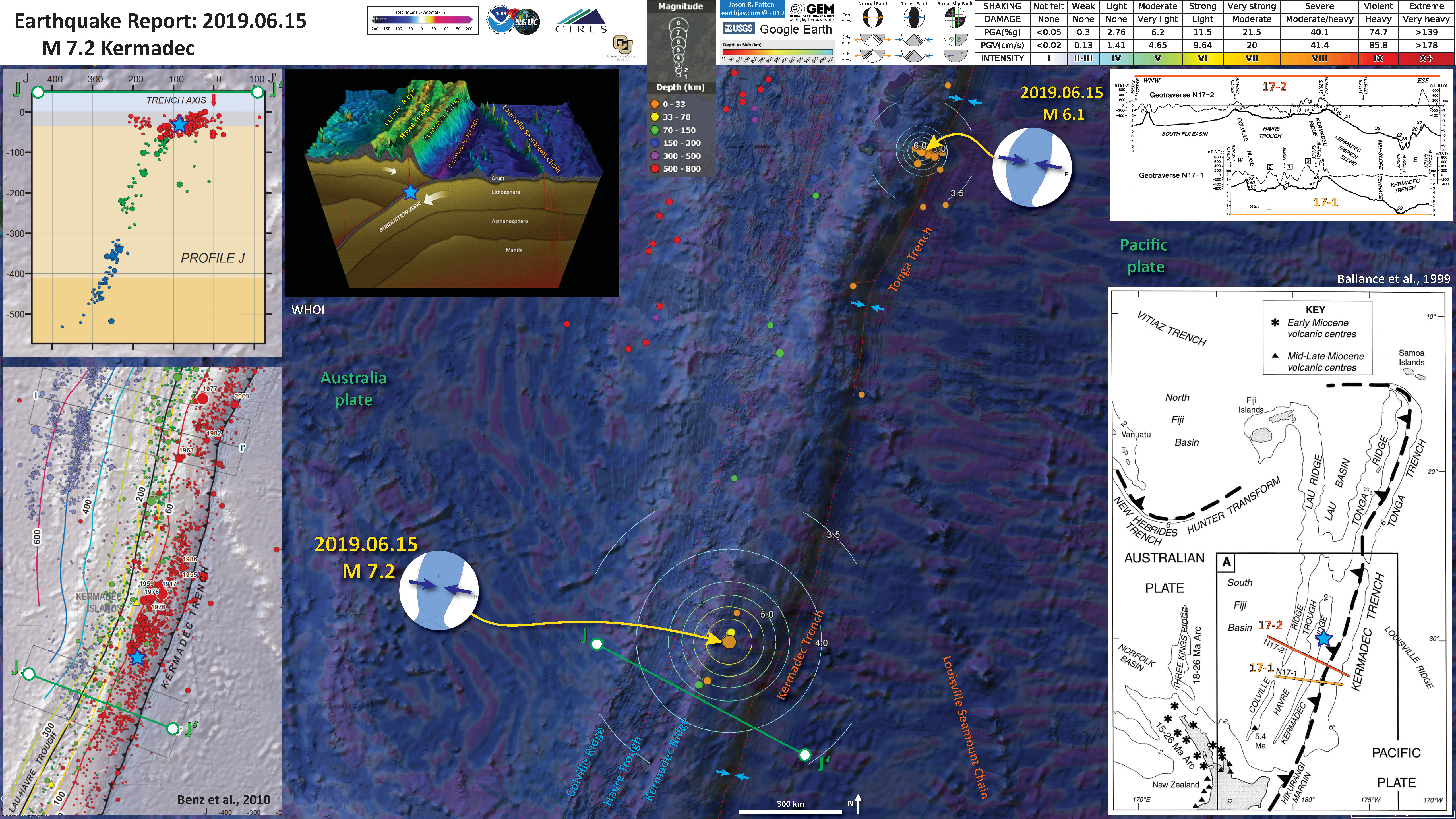
- First I present a tide gage summary map with the earthquakes from the past month shown transparently. Below are some of the tide gage data plots. These are all available from the International Oceanographic Commission.
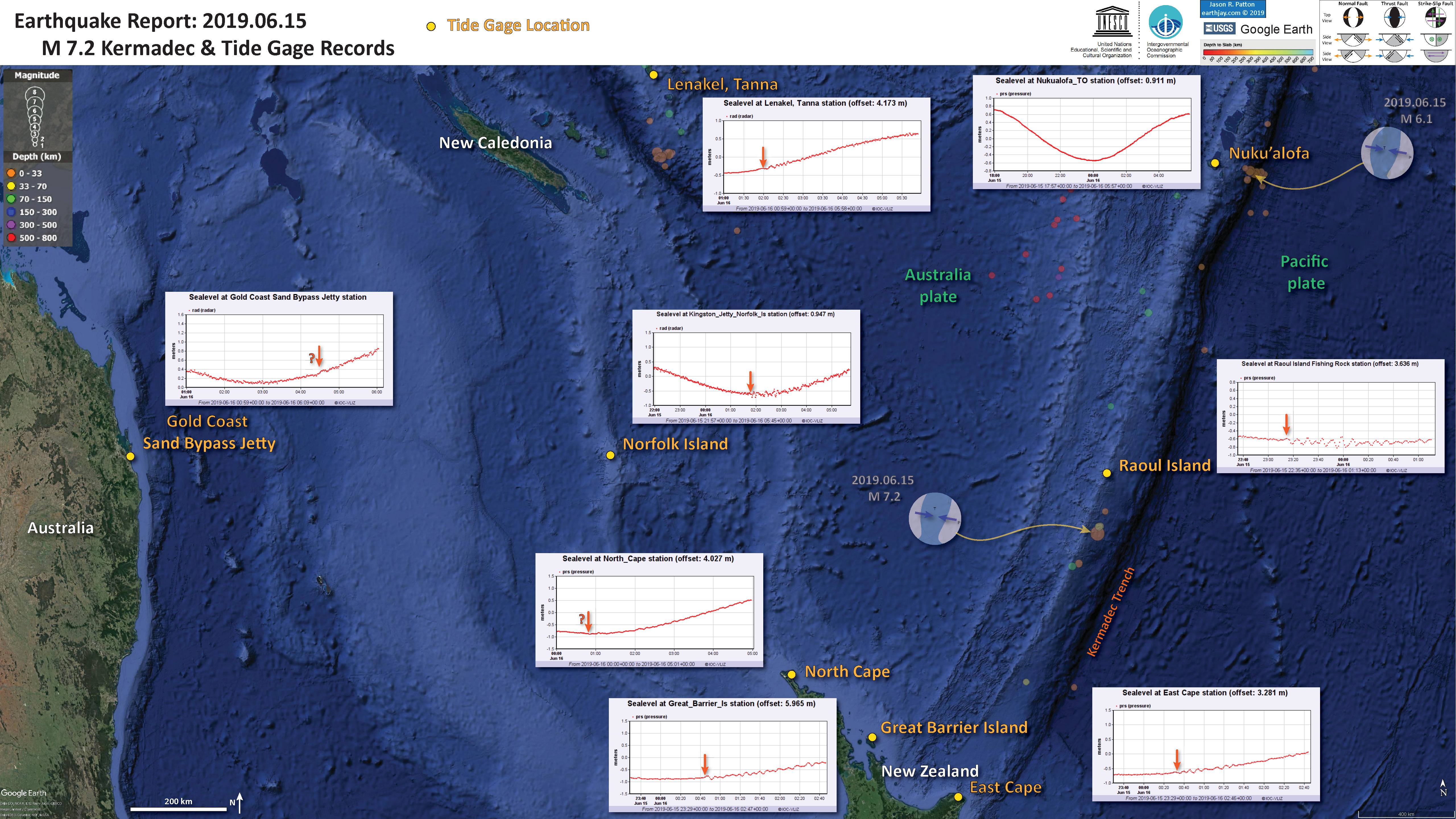

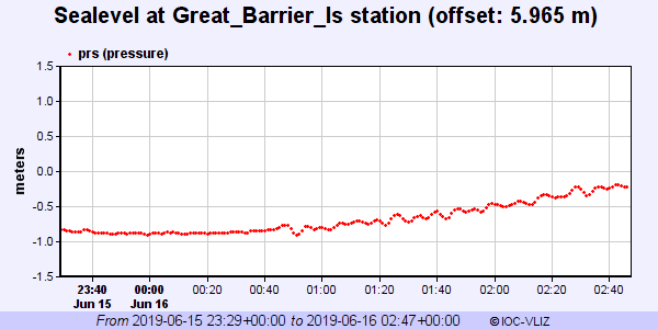

- here is a map that shows cross sections of seismicity, along with the tide gage data from the nearest station.
- Here I have congregated all the tide gage data onto a single figure, each aligned relative to GMT time. Note which sites have up-first tsunami waves, relative to those that have down-first waves. Can you make sense of this?
Some Relevant Discussion and Figures
- Here is the tectonic map from Ballance et al., 1999.
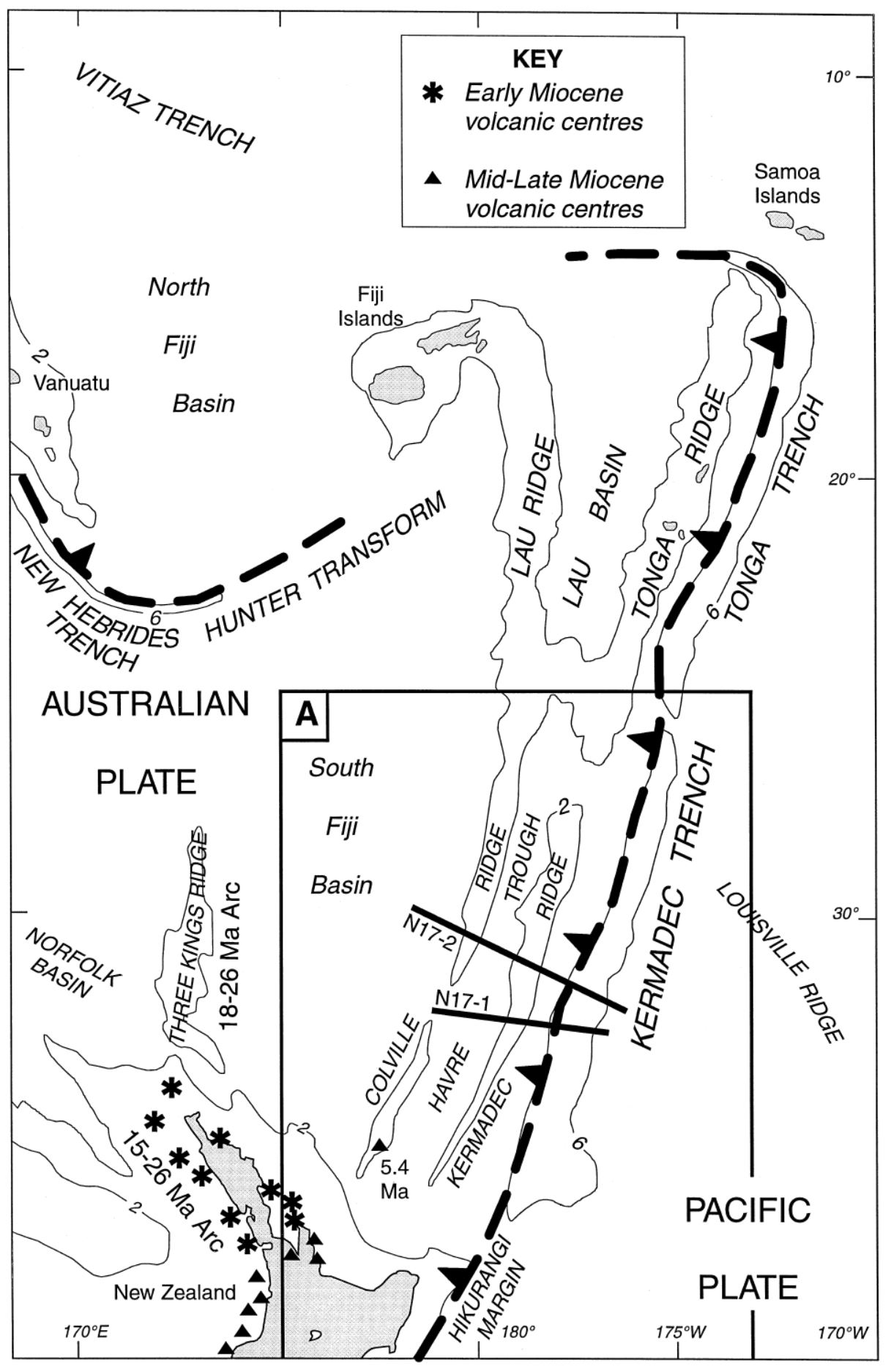
Map of the Southwest Pacific Ocean showing the regional tectonic setting and location of the two dredged profiles. Depth contours in kilometres. The presently active arcs comprise New Zealand–Kermadec Ridge–Tonga Ridge, linked with Vanuatu by transforms associated with the North Fiji Basin. Colville Ridge–Lau Ridge is the remnant arc. Havre Trough–Lau Basin is the active backarc basin. Kermadec–Tonga Trench marks the site of subduction of Pacific lithosphere westward beneath Australian plate lithosphere. North and South Fiji Basins are marginal basins of late Neogene and probable Oligocene age, respectively. 5.4sK–Ar date of dredged basalt sample (Adams et al., 1994).
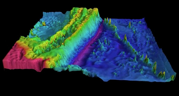
- Here is a great visualization of the Kermadec Trench from Woods Hole.
Kermadec Trench from Woods Hole Oceanographic Inst. on Vimeo.
- Here is another map of the bathymetry in this region of the Kermadec trench. This was produced by Jack Cook at the Woods Hole Oceanographic Institution. The Lousiville Seamount Chain is clearly visible in this graphic.
- I put together an animation of seismicity from 1965 – 2015 Sept. 7. Here is a map that shows the entire seismicity for this period. I plot the slab contours for the subduction zone here. These were created by the USGS (Hayes et al., 2012).
- Here is the animation. Download the mp4 file here. This animation includes earthquakes with magnitudes greater than M 6.5 and this is the kml file that I used to make this animation.
Geologic Fundamentals
- For more on the graphical representation of moment tensors and focal mechanisms, check this IRIS video out:
- Here is a fantastic infographic from Frisch et al. (2011). This figure shows some examples of earthquakes in different plate tectonic settings, and what their fault plane solutions are. There is a cross section showing these focal mechanisms for a thrust or reverse earthquake. The upper right corner includes my favorite figure of all time. This shows the first motion (up or down) for each of the four quadrants. This figure also shows how the amplitude of the seismic waves are greatest (generally) in the middle of the quadrant and decrease to zero at the nodal planes (the boundary of each quadrant).
- Here is another way to look at these beach balls.
The two beach balls show the stike-slip fault motions for the M6.4 (left) and M6.0 (right) earthquakes. Helena Buurman's primer on reading those symbols is here. pic.twitter.com/aWrrb8I9tj
— AK Earthquake Center (@AKearthquake) August 15, 2018
- There are three types of earthquakes, strike-slip, compressional (reverse or thrust, depending upon the dip of the fault), and extensional (normal). Here is are some animations of these three types of earthquake faults. The following three animations are from IRIS.
Strike Slip:
Compressional:
Extensional:
- This is an image from the USGS that shows how, when an oceanic plate moves over a hotspot, the volcanoes formed over the hotspot form a series of volcanoes that increase in age in the direction of plate motion. The presumption is that the hotspot is stable and stays in one location. Torsvik et al. (2017) use various methods to evaluate why this is a false presumption for the Hawaii Hotspot.
- Here is a map from Torsvik et al. (2017) that shows the age of volcanic rocks at different locations along the Hawaii-Emperor Seamount Chain.
- Here is a great tweet that discusses the different parts of a seismogram and how the internal structures of the Earth help control seismic waves as they propagate in the Earth.
A cutaway view along the Hawaiian island chain showing the inferred mantle plume that has fed the Hawaiian hot spot on the overriding Pacific Plate. The geologic ages of the oldest volcano on each island (Ma = millions of years ago) are progressively older to the northwest, consistent with the hot spot model for the origin of the Hawaiian Ridge-Emperor Seamount Chain. (Modified from image of Joel E. Robinson, USGS, in “This Dynamic Planet” map of Simkin and others, 2006.)
Hawaiian-Emperor Chain. White dots are the locations of radiometrically dated seamounts, atolls and islands, based on compilations of Doubrovine et al. and O’Connor et al. Features encircled with larger white circles are discussed in the text and Fig. 2. Marine gravity anomaly map is from Sandwell and Smith.
Today, on #SeismogramSaturday: what are all those strangely-named seismic phases described in seismograms from distant earthquakes? And what do they tell us about Earth’s interior? pic.twitter.com/VJ9pXJFdCy
— Jackie Caplan-Auerbach (@geophysichick) February 23, 2019
- 2019.06.15 M 7.2 Kermadec
- 2019.05.14 M 7.5 New Ireland
- 2019.05.06 M 7.2 Papua New Guinea
- 2018.12.05 M 7.5 New Caledonia
- 2018.10.10 M 7.0 New Britain, PNG
- 2018.09.09 M 6.9 Kermadec
- 2018.08.29 M 7.1 Loyalty Islands
- 2018.08.18 M 8.2 Fiji
- 2018.03.26 M 6.9 New Britain
- 2018.03.26 M 6.6 New Britain
- 2018.03.08 M 6.8 New Ireland
- 2018.02.25 M 7.5 Papua New Guinea
- 2018.02.26 M 7.5 Papua New Guinea Update #1
- 2017.11.19 M 7.0 Loyalty Islands Update #1
- 2017.11.07 M 6.5 Papua New Guinea
- 2017.11.04 M 6.8 Tonga
- 2017.10.31 M 6.8 Loyalty Islands
- 2017.08.27 M 6.4 N. Bismarck plate
- 2017.05.09 M 6.8 Vanuatu
- 2017.03.19 M 6.0 Solomon Islands
- 2017.03.05 M 6.5 New Britain
- 2017.01.22 M 7.9 Bougainville
- 2017.01.03 M 6.9 Fiji
- 2016.12.17 M 7.9 Bougainville
- 2016.12.08 M 7.8 Solomons
- 2016.10.17 M 6.9 New Britain
- 2016.10.15 M 6.4 South Bismarck Sea
- 2016.09.14 M 6.0 Solomon Islands
- 2016.08.31 M 6.7 New Britain
- 2016.08.12 M 7.2 New Hebrides Update #2
- 2016.08.12 M 7.2 New Hebrides Update #1
- 2016.08.12 M 7.2 New Hebrides
- 2016.04.06 M 6.9 Vanuatu Update #1
- 2016.04.03 M 6.9 Vanuatu
- 2015.03.30 M 7.5 New Britain (Update #5)
- 2015.03.30 M 7.5 New Britain (Update #4)
- 2015.03.29 M 7.5 New Britain (Update #3)
- 2015.03.29 M 7.5 New Britain (Update #2)
- 2015.03.29 M 7.5 New Britain (Update #1)
- 2015.03.29 M 7.5 New Britain
- 2015.11.18 M 6.8 Solomon Islands
- 2015.05.24 M 6.8, 6.8, 6.9 Santa Cruz Islands
- 2015.05.05 M 7.5 New Britain
New Britain | Solomon | Bougainville | New Hebrides | Tonga | Kermadec Earthquake Reports
General Overview
Earthquake Reports
Social Media
Mw=6.2, TONGA ISLANDS (Depth: 15 km), 2019/06/15 21:56:09 UTC – Full details here: https://t.co/5PNNCtfejY pic.twitter.com/xIF3FBF4Ba
— Earthquakes (@geoscope_ipgp) June 15, 2019
Mw=7.4, KERMADEC ISLANDS, NEW ZEALAND (Depth: 37 km), 2019/06/15 22:55:02 UTC – Full details here: https://t.co/NtMjNEXgZ1 pic.twitter.com/lacrYnNpHi
— Earthquakes (@geoscope_ipgp) June 15, 2019
Mw=6.4, KERMADEC ISLANDS REGION (Depth: 25 km), 2019/06/16 05:17:16 UTC – Full details here: https://t.co/zq4F7wwAvo pic.twitter.com/oLX1Ep8Bp1
— Earthquakes (@geoscope_ipgp) June 16, 2019
Preliminary Magnitude 7.3 #earthquake in KermadecIslandsRegion, 2019-06-15 22:54 UTC time by #RaspberryShake #CitizenScience #seismograph network. Join the largest citizen #seismic community – https://t.co/bkUOY6dBm2. https://t.co/Ten7tGxaTS pic.twitter.com/FzthIcYzHE
— Raspberry Shake (@raspishake) June 15, 2019
Meanwhile, in other news that's much nicer to think about, a large earthquake deep below the Pacific that didn't hurt people showed up beautifully in my central London flat on the @raspishake pic.twitter.com/i2F3fWGrjP
— Austin Elliott (@TTremblingEarth) June 16, 2019
Check out large amplitude long period waves from morning M7.2 kermadec's earthquake at GRZ (geonet.bottom plot) compared to more distant 2011 M7.4 but similar depth& rupture mechanism (top plot). Similarity of path, mechanism&depth points towards slow rupture mechanism. Thoughts? pic.twitter.com/6iJP4OKOdu
— Caroline Holden (@Carolinenz59) June 16, 2019
- Frisch, W., Meschede, M., Blakey, R., 2011. Plate Tectonics, Springer-Verlag, London, 213 pp.
- Hayes, G., 2018, Slab2 – A Comprehensive Subduction Zone Geometry Model: U.S. Geological Survey data release, https://doi.org/10.5066/F7PV6JNV.
- Holt, W. E., C. Kreemer, A. J. Haines, L. Estey, C. Meertens, G. Blewitt, and D. Lavall ee (2005), Project helps constrain continental dynamics and seismic hazards, Eos Trans. AGU, 86(41), 383–387, , https://doi.org/10.1029/2005EO410002. /li>
- Kreemer, C., J. Haines, W. Holt, G. Blewitt, and D. Lavallee (2000), On the determination of a global strain rate model, Geophys. J. Int., 52(10), 765–770.
- Kreemer, C., W. E. Holt, and A. J. Haines (2003), An integrated global model of present-day plate motions and plate boundary deformation, Geophys. J. Int., 154(1), 8–34, , https://doi.org/10.1046/j.1365-246X.2003.01917.x.
- Kreemer, C., G. Blewitt, E.C. Klein, 2014. A geodetic plate motion and Global Strain Rate Model in Geochemistry, Geophysics, Geosystems, v. 15, p. 3849-3889, https://doi.org/10.1002/2014GC005407.
- Meyer, B., Saltus, R., Chulliat, a., 2017. EMAG2: Earth Magnetic Anomaly Grid (2-arc-minute resolution) Version 3. National Centers for Environmental Information, NOAA. Model. https://doi.org/10.7289/V5H70CVX
- Müller, R.D., Sdrolias, M., Gaina, C. and Roest, W.R., 2008, Age spreading rates and spreading asymmetry of the world’s ocean crust in Geochemistry, Geophysics, Geosystems, 9, Q04006, https://doi.org/10.1029/2007GC001743
References:
Return to the Earthquake Reports page.