Well, I thought more to compare this ongoing earthquake sequence with the 1985 M 8.0 earthquake. This, in context with the 2010 and 2015 earthquakes. My initial report based upon the M ~4-5.9 swarm is here and my report on the “current” M 6.9 mainshock is here.
More information about the background for the tectonics along the plate boundary, please refer to those earlier reports.
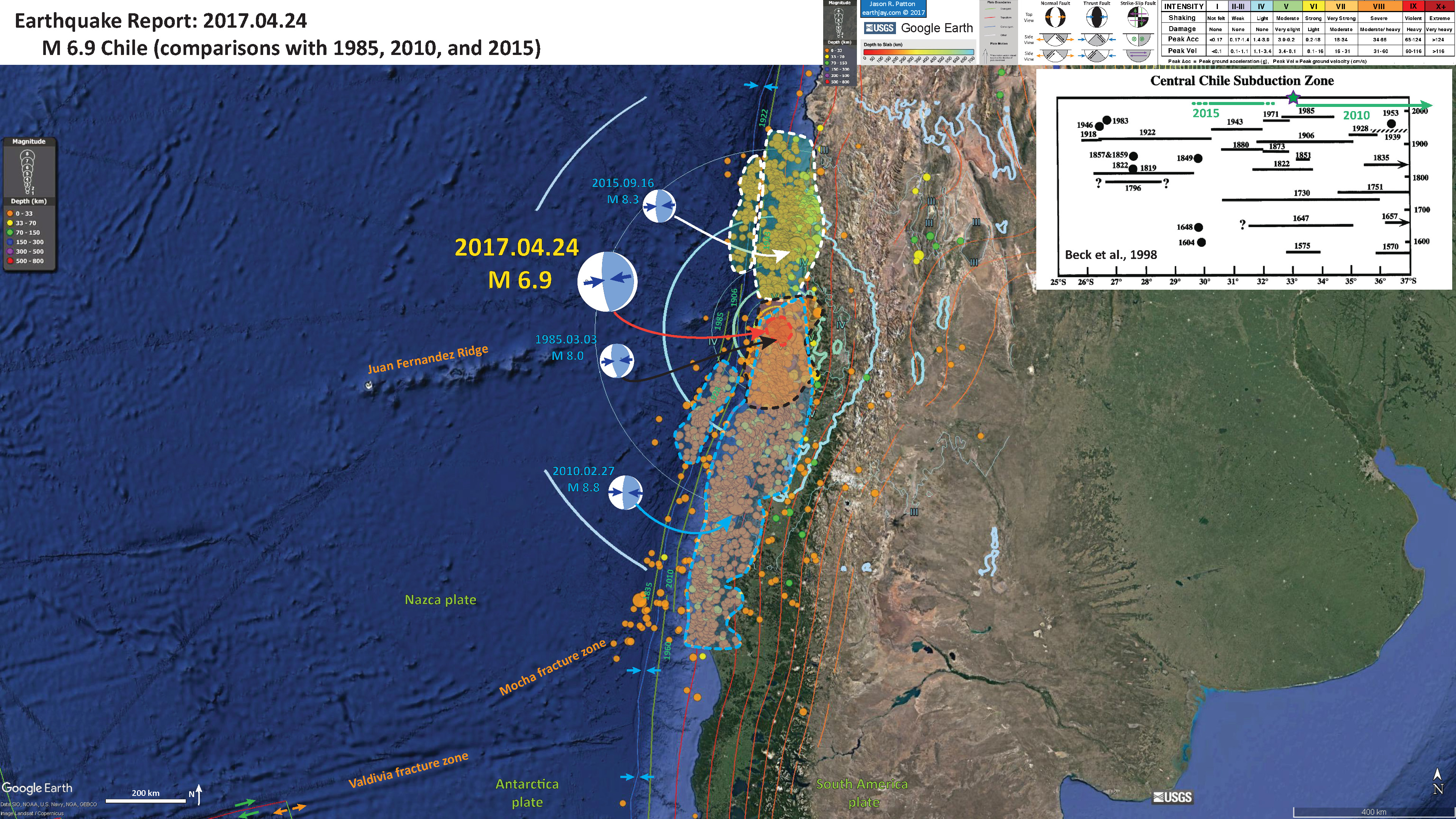
I used the USGS epicenters for earthquakes with magnitudes M ≥ 2.5. For each earthquake (1985, 2010, and 2015) I chose a month of seismicity beginning 3 days before the mainshock. Then I digitized the general outline of the earthquakes. This is a rough approximation for the slip patch for each of these earthquakes. I separated the interface earthquakes from the triggered outer rise earthquakes into separate polygons for the 2010 and 2015 earthquakes (they both appear to have triggered earthquakes in the downgoing Nazca plate to the west of the subduction zone fault, where it flexes in response to subduction here.
This current sequence is about the same magnitude and along-strike size as the 1971 earthquake (M 7.0). This sequence also lies within the 1985 earthquake aftershock region (and also within the northernmost area of the 2010 aftershock region). The M 6.9 could still be a foreshock of a larger earthquake. The 1985 earthquake was preceded by 3 earthquakes in the M 4-5.5 range. But, looking into the past, there are instances when this part of the fault only ruptures a small patch (1971, 1873, 1851). Given that this part of the fault slipped recently (2010), it seems more probable that there won’t be a larger earthquake (M > 8.0). This is difficult to know because we don’t really know the state of stress on the fault (how ready it is to rupture in an earthquake). I still cannot stop thinking about the Juan Fernandez Ridge and how this plays a part in this story.
I include the moment tensors from each of the Great Earthquakes, as well as the 2017 M 6.9 earthquake.
- In the interpretive poster below
- I outline the 1985 aftershock region in black dashed lines
- I outline the 2010 aftershock region in blue dashed lines
- I outline the 2015 aftershock region in white dashed lines
- I outline the 2017 aftershock region in red dashed lines
Other Blogs about this earthquake sequence
- Stephen Hicks, post doc at Southhampton
- AGU Trembling Blog by Austin Elliot
- Temblor a company started by Volkan Sevilgen and Ross Stein
- Here is a great app that plots hypocentral locations on cross sections. Select Valparaiso.
Below is my interpretive poster for this earthquake. Click on the map to enlarge.
- I placed a moment tensor / focal mechanism legend on the poster. There is more material from the USGS web sites about moment tensors and focal mechanisms (the beach ball symbols). Both moment tensors and focal mechanisms are solutions to seismologic data that reveal two possible interpretations for fault orientation and sense of motion. One must use other information, like the regional tectonics, to interpret which of the two possibilities is more likely.
- I also include the shaking intensity contours on the map. These use the Modified Mercalli Intensity Scale (MMI; see the legend on the map). This is based upon a computer model estimate of ground motions, different from the “Did You Feel It?” estimate of ground motions that is actually based on real observations. The MMI is a qualitative measure of shaking intensity. More on the MMI scale can be found here and here. This is based upon a computer model estimate of ground motions, different from the “Did You Feel It?” estimate of ground motions that is actually based on real observations.
- I include the slab contours plotted (Hayes et al., 2012), which are contours that represent the depth to the subduction zone fault. These are mostly based upon seismicity. The depths of the earthquakes have considerable error and do not all occur along the subduction zone faults, so these slab contours are simply the best estimate for the location of the fault.
- In the upper right corner I present Figure 2 from Beck et al. (1998 ) on the map, the space-time plot of historic and prehistoric earthquakes associated with the Chile subduction zone. I add a green line showing my interpretation for the strike length of the 2015 M 8.3 earthquake. Originally it appeared to match the 1943 and 1880 earthquakes, though it appears to extend further along strike. The 1922 and 1880 strike lengths are not well constrained, so this 2015 earthquake may indeed be slipping the same patch of this part of the subduction zone. Indeed, Juan Fernandez Ridge may be a structural boundary that may cause segmentation in this part of the subduction zone. If it does, it does not do so every time, as evidenced by the strike-length of the 1730 AD and 1647 AD earthquakes. I placed a green triangle at the approximate location of this 2017 swarm. This M 6.9 appears to be correlative in space with the 1985 earthquake (albeit a much smaller magnitude, closer to the 1971 in size).
I include one inset figure in the poster.
- Here is a great visualization from IRIS (here) that shows the seismic waves transmitting across the USA. Each dot represents a seismometer. When the seismic waves exert an upward motion, the dot turns red. When the seismic waves exert a downward motion, the dot turns blue. I present an screenshot of the animation above the video. Here is the video file as a downloadable file. (10 MB mp4).

Some background about the heterogeneous megathrust in this region
- Here is the first of two figures from Moreno et al., 2010. Note that the M 6.9 is close in space to the 1985 earthquake. Also note the along strike heterogeneous seismogenic coupling. I include the figure caption below in blockquote.
- Here is the second of the two figures from Moreno et al. (2010).
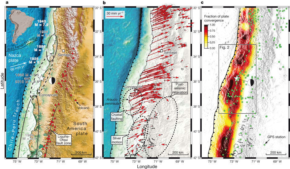
Tectonic setting of the study area, data, observations and results. a, Shaded relief map of the Andean subduction zone in South- Central Chile. Earthquake segmentation along the margin is indicated by ellipses that enclose the approximate rupture areas of historic earthquakes (updated from refs 4–6). The inset shows the location of panel a (rectangle) relative to the South American continent. b, Compilation of GPS-observed surface velocities (1996–2008) with respect to stable South America before the 2010 Maule earthquake (for references see online-only Methods). Ellipses attached to the arrows represent 95% confidence limits. c, GPS 1 FEM modelled interface locking (fraction of plate convergence) distribution along the Andean subduction zone megathrust in the decade before the 2010 Maule earthquake. The epicentre (white star, USGS NEIC) and focal mechanism (beach ball, GCMT, http://www.globalcmt.org) of the 2010 Maule earthquake are shown in panels a and c.
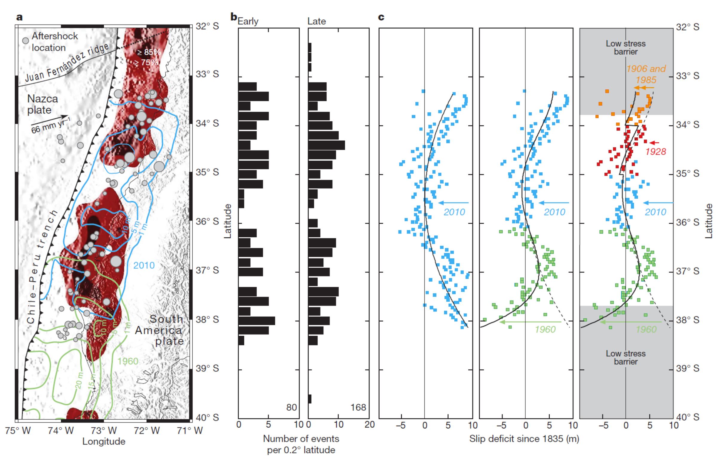
Relationship between pre, co- and postseismic deformation patterns. a, Coseismic slip distribution during the 2010 (blue contours; USGS slip model26) and 1960 (green contours; from ref. 30) earthquakes overlain onto pre-seismic locking pattern (red shading $0.75), as well as early (during the first 48 h post-shock) M$5 aftershock locations (the grey circle sizes scale with magnitude; GEOFON data29). b, Histograms of early (first 48 h; total number of events, 80) and late (first 3 months; total number of events, 168) aftershock density along a north–south profile (GEOFON data29, M$5). c, Residual slip deficits since 1835 as observed after the 2010 earthquake along a north–south profile (left column, based on the USGS slip model26). The middle and right columns show the effects on slip deficit of overlapping twentieth-century earthquakes (the black lines are polynomial fits to the data). Coloured data points and dates indicate earthquakes by year of occurrence.
References:
- Beck, S., Barientos, S., Kausel, E., and Reyes, M., 1998. Source Characteristics of Historic Earthquakes along the Central Chile Subduction Zone in Journal of South American Earth Sciences, v. 11, no. 2., p. 115-129.
- Hayes, G.P., Wald, D.J., and Johnson, R.L., 2012. Slab1.0: A three-dimensional model of global subduction zone geometries in, J. Geophys. Res., 117, B01302, doi:10.1029/2011JB008524
- Hayes, G.P., Smoczyk, G.M., Benz, H.M., Villaseñor, Antonio, and Furlong, K.P., 2015. Seismicity of the Earth 1900–2013, Seismotectonics of South America (Nazca Plate Region): U.S. Geological Survey Open-File Report 2015–1031–E, 1 sheet, scale 1:14,000,000, http://dx.doi.org/10.3133/ofr20151031E.
- Lin, Y.N., Slkaden, A., Ortega-Culaciati, F., Simons, M., Avouac, J-P., Fielding, E.J., Brooks,, B.A., Bevis, M., Genrich, J., Rietbrock, A., Vigny, C., Smalley, R., and Socquet, A., 2013. Coseismic and postseismic slip associated with the 2010 Maule Earthquake, Chile: Characterizing the Arauco Peninsula barrier effect in JGR, v. 118, p. 1-18, doi:10.1002/jgrb.50207, 2013
- Melnick, D., Bookhagen, B., Echtler, H.P., and Strecker, M.R., 2006. Coastal deformation and great subduction earthquakes, Isla Santa María, Chile (37°S) in GSA Bulletin, v. 118, no. 11/12, p. 1463-1480.
- Melnick, D., 2009. Journal of Geophysical Research 114, B01407
- Moernaut, J., Batist, M., Haeirman, K., Van Daele, M., Brümmer, R., Urrutia, R., Wolff, C., Brauer, A., Roberts, S., Kilian, R., Pino, M., 2010. Recurrence of 1960-like earthquake shaking in South-Central Chile revealed by lacustrine sedimentary records in proceedings Chapman Conference on Giant Earthquakes and Their Tsunamis Valparaíso, Viña del Mar, and Valdivia, Chile 16–24 May 2010.
- Moreno, M., Rosenau, M., and Oncken, O., 2010. 2010 Maule earthquake slip correlates with pre-seismic locking of Andean subduction zone in Nature, v. 467, p. 198-202
- Moreno, M., Melnick, D., Rosenau, M., Bolte, J., Klotz, J., Echtler, H., Basez, J., Bataille, K., Chen, J., Bevis, M., Hase, H., Oncken, O., 2011. Heterogeneous plate locking in the South–Central Chile subduction zone: Building up the next great earthquake in Earth and Planetary Science Letters, v. 305, p. 413-424.
- Rhea, Susan, Hayes, Gavin, Villaseñor, Antonio, Furlong, K.P., Tarr, A.C., and Benz, H.M., Seismicity of the earth 1900–2007, Nazca Plate and South America: U.S. Geological Survey Open-File Report 2010–1083-E, 1 sheet, scale 1:12,000,000.
- Rodrigo, C. and Lara, L.E., 2014. Plate tectonics and the origin of the Juan Fernández Ridge: analysis of bathymetry and magnetic patterns in Lat. Am. J. Aquat. Res, v. 42, no. 4, p. 907-917
- Schurr, B., Asch, G., Hainzl, S., Bedford, J., Hoechner, A., Palo, M., Wang, R., Moreno, M., Bartsch, M., Zhang, Y., Oncken, O., Tilmann, F., Dahm, T., Victor, P., Barrientos, S., and Villotte, J-P., 2014. Gradual unlocking of plate boundary controlled initiation of the 2014 Iquique earthquake in Nature, v. 512, p. 299-3202, doi:10.1038/nature13681
- von Huene, R. et al., 1997. Tectonic control of the subducting Juan Fernandez Ridge on the Andean margin near Valparaiso, Chile in Tectonics, v. 16, no. 3, p. 474-488.